


|
Edgar Allen Ho posted:This post really only makes sense if you assume all countries name themselves in english. The best Nebraska flag redesigns I've seen are just ripoffs of the Ukrainian flag.  
|
 #
?
Jun 21, 2020 18:57
#
?
Jun 21, 2020 18:57
|
|


|

|
| # ? Jun 8, 2024 08:03 |
|
|
JesustheDarkLord posted:Is there anything bad about the Tennessee tri-star? That alignment of the stars is loving awful, why would you align it like that? Did the designer read a shitload of Lovecraft and decide just to mess with perception forever?
|
|
#
?
Jun 21, 2020 19:00
|
|

|
RagnarokZ posted:That alignment of the stars is loving awful, why would you align it like that?
|
|
#
?
Jun 21, 2020 19:03
|
|


|
It's weird how five-pointed stars became the default. I get that it's geometrically simpler to draw well than a four-pointed star, six pointed stars have become a religious symbol, and and I guess 7 points is too complicated, but octograms are real neat and evoke better the look of a star.Edgar Allen Ho posted:This post really only makes sense if you assume all countries name themselves in english. I was double-checking official names on wikipedia while writing the post, and while I used the english names because that's the language I'm writing (and most countries will have an official english translation of their official name out there because of the language's prominance), but they still have their official names in their own language, like R�publique fran�aise, Bundesrepublik Deutschland, Estados Unidos Mexicanos, or Zhōnghu� R�nm�n G�ngh�gu�. I think the most famous example is the Soviet Union, whose official name was abbreviated to USSR in english, but in their native language the acronym was CCCP. Edgar Allen Ho posted:I have talked to my ukrainian friend about this and traded lots of photos, and we decided that steppe and prairie are the same thing and that ukrainian flag is inspired as gently caress compared to TX or even New Mexico There's a reason why the Great Plains are sometimes called the "American Steppe". There were even some Native American groups that developed into steppe nomads like you'd find in Asia after the introduction of horses. Also why after the accidental introduction of Russian tumbleweeds, they still are a scourge across the area to this day. Similar environmental conditions. The New Mexico flag is still one of the best state flags out there though. It's got a very simple and meaningful design that you can recognize at a glance, and it even represents the native population, which is the third-highest proportion out of any state at 9.1%. 
|
|
#
?
Jun 21, 2020 19:28
|
|

|
SlothfulCobra posted:The New Mexico flag is still one of the best state flags out there though. It's got a very simple and meaningful design that you can recognize at a glance, and it even represents the native population, which is the third-highest proportion out of any state at 9.1%. (The world flag should also have an inset of the solar system flag.)
|
|
#
?
Jun 21, 2020 19:34
|
|

|
SlothfulCobra posted:
Minor nitpick, but the native acronym would be Latinised as SSSR, the "CCCP" is just lazily ignoring that Cyrillic is a different alphabet. I've never seen SSSR used though. But I never thought about how it only mentions the form of government, not any geography or ethnicity at all. That's kind of weird, especially from a country formed by socialists.
|
|
#
?
Jun 21, 2020 19:46
|
|

|
 This is now an Admiralty Thread, subject to Maritime Law.
|
|
#
?
Jun 21, 2020 20:01
|
|


|
SlothfulCobra posted:The New Mexico flag is still one of the best state flags out there though. It's got a very simple and meaningful design that you can recognize at a glance, and it even represents the native population, which is the third-highest proportion out of any state at 9.1%. You... must be kidding, right? That flag is atrocious. Nevermind the letters, the lettering itself looks like Word Art circa 1993.
|
|
#
?
Jun 21, 2020 20:04
|
|

|
Pope Hilarius II posted:You... must be kidding, right? That flag is atrocious. Nevermind the letters, the lettering itself looks like Word Art circa 1993. quote:During the first 14 years of statehood, New Mexico did not have an official flag. During the San Diego World's Fair of 1915, the fair featured an exhibit hall in which all the state flags were displayed. Since New Mexico did not have an official flag, an unofficial flag was displayed, consisting of a blue field with the United States flag in the upper left corner, the words "New Mexico" and "47" (because New Mexico is the 47th state) in silver lettering in the center of the flag, and the state seal in the bottom right corner.[5] Some historical references (including Cram's Unrivaled Atlas of the World) also show the words "The Sunshine State" wrapped around the seal in the lower right corner. The actual and current flag is pretty kickass, however: 
|
|
#
?
Jun 21, 2020 20:10
|
|


|
Pope Hilarius II posted:You... must be kidding, right? That flag is atrocious. Nevermind the letters, the lettering itself looks like Word Art circa 1993. I competely agree. It should be in comic sans.
|
|
#
?
Jun 21, 2020 20:10
|
|
|
Some flags I redesigned: New England (Mystical)  Nevada  Liberia  Pennsylvania  Wisconsin  Maine  Upstate New York  Florida  Native Texas  Ontario  Jamaica 
Grouchio fucked around with this message at 20:19 on Jun 21, 2020 |
|
#
?
Jun 21, 2020 20:16
|
|

|
good U.S. state flags not yet posted ITT: Alaska  South Carolina  awful U.S. state flags not yet posted ITT: Washington  Iowa  Delaware 
|
|
#
?
Jun 21, 2020 20:27
|
|

|
Vermont has this sad effort: This is so much better: 
|
|
#
?
Jun 21, 2020 20:40
|
|

|
My home state of Kentucky has a pretty lame flag. It's just the state seal on a flag, and the design of that seal has, ah, aged a bit. It's also great, in an irony-poisoned sense, because I'm not sure whether an official, like, vectorized version exists, the flags and seals vary WIDELY in color, detail, and composition anywhere you see them.
|
|
#
?
Jun 21, 2020 20:43
|
|
|
Unkempt posted:Vermont has this sad effort: Freedom Vermont and Unity
|
|
#
?
Jun 21, 2020 20:49
|
|
|
SlothfulCobra posted:
Reminds me of Florida first attempt at a flag. 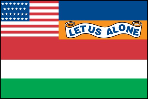 Amusingly enough, it was apparently controversy over the motto that kept it from being adopted rather than it being ugly as sin.
|
|
#
?
Jun 21, 2020 20:50
|
|


|
Pope Hilarius II posted:You... must be kidding, right? That flag is atrocious. Nevermind the letters, the lettering itself looks like Word Art circa 1993.  To be fair, I think the text on the original was probably better written, and the Wikipedia editor who made that version probably didn't know how to make shaped text. I don't think anybody's mentioned the state flag that might have the most reverence about it, the Texan flag. It's why the state is called the "Lone Star State", it's one of a set of flags that inspired a chain of theme parks, they make kids in schools recite a drat pledge to honor it, and while it may be mostly a derivative simplification of the US flag, it flew over an independent Texas for 11 ill-fated years because the president at the time didn't want any part of annexing bits of Mexico. 
|
|
#
?
Jun 21, 2020 20:51
|
|
|
Also here's the canon old flag of Maine.
|
|
#
?
Jun 21, 2020 20:52
|
|
|
SlothfulCobra posted:
That's the flag of Chile.
|
|
#
?
Jun 21, 2020 21:16
|
|
|
Shady Amish Terror posted:My home state of Kentucky has a pretty lame flag. Fun flag related fact: in Denmark, we have laws about heraldry and stuff, because we're in Europe. On of the laws of that you cannot get the rights to a specific image, only the heraldic description of it. So legally speaking, any three red lions on a field of gold or whatever are as good as the other. In actuality, most organisations use a pretty set vectorized design obviously.
|
|
#
?
Jun 21, 2020 21:36
|
|
|
Ooo, Wikipedia has a nice selection of American county flags. Anchorage is cool  Imperial County, CA is busy but striking  St. Bernard Parish, Louisiana is nice and phallic  Baltimore County is oddly pleasing  Loudoun County, Virginia has a lot going on  And Elkhart County, Indiana is, uh 
showbiz_liz fucked around with this message at 21:58 on Jun 21, 2020 |
|
#
?
Jun 21, 2020 21:56
|
|
|
I can't find any evidence of this in actual flag form but this is what Wikipedia says is Inglewood's city flag and, my god
|
|
#
?
Jun 21, 2020 22:07
|
|
|
Phlegmish posted:It looks like a Pokémon flag but that's not really their fault, I'm sure the flag was first It's clearly a nega-dragonball.
|
|
#
?
Jun 21, 2020 22:16
|
|


|
edit: there were a lot of posts between the one I was talking about and this one whoops
|
|
#
?
Jun 21, 2020 22:22
|
|

|
Bad Flags are those that are or include: -Tricolors -Seals/Coat of arms, especially on an empty blue background -Standard crosses, be they Nordic, X's, or otherwise -Putting the U.K. flag in the corner -Just being a logo in the corner of a solid color. It will never stop irking me that New Zealand came so close to adopting one of these badass designs but cowardly decided to stay under the yoke of British oppression 
|
|
#
?
Jun 21, 2020 22:59
|
|

|
Europe has pretty solid flags overall, but this one has always irked me: The pattern looks like Commodore 64 ASCII art or something snatched from grandma's home embroidery for her coffee table. It looks boorish, hokey and overcomplicated at the same time, like trying to top off a failed cake with frosting patterns meant to look like cuneiform script. And to think they could have had this: 
|
|
#
?
Jun 21, 2020 23:00
|
|
|
 Here's a flag that was used by two different US states at two different times. First by Texas as a de facto flag from 1835-1839, then later from January to September of 1861 for then seceded Florida. This was Florida's fist official flag after being not being part of Britain or Spain. British Florida flew the Red Ensign which is basically just a red field with the Union Jack in the corner. Spanish Florida had the Cross of Burgundy/Cross of St. Andrew which is the basis for it and Alabama's flag today.  Here's Alabama's Flag (created in 1895). Florida's Flag (created in 1900) is the same, but with their seal in the middle. Both were suggested by former Confederates.  St. Andrew's Cross for reference And speaking of Texas flags, here's a design during their Revolutionary period that was considered instead of the Zavala Flag  Six pointed stars are definitely useable so long as they don't have colinear edges (i.e. a hexagram) lest it resemble a star of David.
|
|
#
?
Jun 22, 2020 00:25
|
|

|
Xelkelvos posted:
First Texas steals the Liberian flag, then they steal the Chilean flag. Will their flag-stealing never cease!?
|
|
#
?
Jun 22, 2020 00:29
|
|
|
Coxswain Balls posted:Any Canadian flag that still uses the Red Ensign or the Union Jack sucks rear end, imo. You're not part of the empire any more, get over it. Goddamn, every last one of these hits so hard. Great flags all around, and proof that the Europeans' ideas of flag design are mostly dogshit. That said Macedonia and Belarus have the right idea. Here's one of my favorite indigenous flags:  The wiphala has recently been the victim of some right wing coup bullshit in Bolivia and it sucks. I personally think the US flag is terrible. The Malaysian and Liberian flags are both simpler, more distinct, and better for it. QuickbreathFinisher fucked around with this message at 02:18 on Jun 22, 2020 |
|
#
?
Jun 22, 2020 02:06
|
|

 `
`


|
I was thinking oh my god why did they have to make this thread in the agitprop forum and then I looked at the avatar lol
|
|
#
?
Jun 22, 2020 02:14
|
|

|
SlothfulCobra posted:It's weird how five-pointed stars became the default. I get that it's geometrically simpler to draw well than a four-pointed star, six pointed stars have become a religious symbol, and and I guess 7 points is too complicated, but octograms are real neat and evoke better the look of a star. It's one of the only distinctive elements on an otherwise generic flag.
|
|
#
?
Jun 22, 2020 02:23
|
|

|
 This is the flag that flew over the Alamo. Certain people might notice similarities to other flags.
|
|
#
?
Jun 22, 2020 02:54
|
|

|
Have a few unofficial flags for places which don't really need them: Antarctica:  This one's actually in fairly common use. Its similarity to the UN flag is extremely intentional. Antarctica (alternate):  Not as nice looking, but it has the distinction of being just about the only flag that uses hi-vis safety orange. Very practical out on the ice, and so is keeping the design elements to the inner edge, so that the flapping edge can be hemmed when it's worn threadbare in the howling Antarctic winds. Earth:  By far the best of the various proposed world flag designs, in my opinion. This one dates back to 1970 but it's seen only niche use, mostly among particular types of space nerd. Mars:  Symbolic of the (hypothetical, eventual) greening and bluing of the red planet. Also only in use by particular types of space nerd, but hey, one of those nerds carried this flag to space aboard the shuttle Discovery in 1999.
|
|
#
?
Jun 22, 2020 20:33
|
|


|
Powered Descent posted:Earth:
|
|
#
?
Jun 22, 2020 20:36
|
|
|
Powered Descent posted:Have a few unofficial flags for places which don't really need them: Orange flags way better what are you talking about.
|
|
#
?
Jun 22, 2020 20:37
|
|
|
goethe.cx posted:good U.S. state flags not yet posted ITT: The SC flag is funny because it�s one of the older �great� state flags, but it�s old enough that no one�s set down an official standard pattern for it: as long as you�ve got a white palmetto and a white crescent on a bluish field it�s an admissible SC flag.
|
|
#
?
Jun 22, 2020 20:51
|
|


|
A Buttery Pastry posted:Wouldn't want to see the rest of them then! There's this one, which shows up first in a google search and has a bunch of articles about it but just seems to have been designed by this one guy with a website and access to Photoshop. All the articles mentioning it say NASA was involved but this claim has mysteriously disappeared from the website, almost as if it was bullshit made to make this one design student's random project seem like a legit thing. I mean, it's not bad or anything but who let this guy say what the flag is:  This was designed by the guy who came up with Earth Day in 1969, looks like modern versions of the flag use just a picture of the Earth rather than this original slightly more abstract version:  Here is definitely 100% the best flag candidate, created by some guy called Paul Carroll:  which reminds me of this rejected proposal for the EU flag, created by combining the flags of all member states in 2002:  Can't see why it didn't catch on.
|
|
#
?
Jun 22, 2020 21:12
|
|

|
Triskelli posted:The SC flag is funny because it�s one of the older �great� state flags, but it�s old enough that no one�s set down an official standard pattern for it: as long as you�ve got a white palmetto and a white crescent on a bluish field it�s an admissible SC flag.
|
|
#
?
Jun 22, 2020 21:16
|
|


|
A Buttery Pastry posted:Wouldn't want to see the rest of them then! Well then, close your eyes, since here come a few more proposed Flags of Earth! All of these are pretty obscure, but they've gotten at least some usage in the real world (with the possible exception of the fourth one).  It's supposed to be the seven continents all interlinked, but to me it just looks like a tangled clusterfuck.  Meh. A lot of fiddly detail in the clouds, which you generally don't want on a flag.  See above, except now the extra detail is replaced by an actual photograph.  Bonus points for the Pioneer plaque reference, but once again, there's a lot of fiddly detail in that diagram. And besides, it's against the principles of good flag design to use a map.    e: Angepain 
|
|
#
?
Jun 22, 2020 21:17
|
|
|

|
| # ? Jun 8, 2024 08:03 |
|
|
Powered Descent posted:Have a few unofficial flags for places which don't really need them: Oh I forgot to add this to my "Bad Flags" list :Has a map of the location on it.
|
|
#
?
Jun 22, 2020 21:34
|
|