


|
I'm currently trying to do two things, 1. learn to draw and design and 2. write a story. Could anyone reccomend a begginer friendly pencil kit that'll allow me to self teach myself drawing and shading methods and other threads here that will put me a foot in the right direction aside from anything photoshop related? *I want to learn how to draw with pencils basically* Secondly, I'm a little afraid to completely give out the details to a story I'm writing on. Could someone be kind enough to allow me to explain the premise to them while I'm currently working on it to touch it up. *I can't exactally post it because I'm still brainstorming ideas*. I would appreciate the help.
|
 #
?
Jan 25, 2009 10:26
#
?
Jan 25, 2009 10:26
|
|

|

|
| # ? May 13, 2024 06:36 |
|
Akur0 posted:I'm currently trying to do two things, 1. learn to draw and design and 2. write a story. Re: thing number two. Sure. Send your idea to bagofghostssa@gmail.com and I'd be more than happy to give you feedback.
|
|
|
#
?
Jan 25, 2009 10:52
|
|
|
Bag Of Ghosts posted:Re: thing number two. Sure. Send your idea to bagofghostssa@gmail.com and I'd be more than happy to give you feedback. E-mail sent, appreciated. Also my aim is Rasennoinurei.
|
|
#
?
Jan 25, 2009 11:29
|
|
|
In InDesign can you set multiple page colours (for different masters)? I want some pages to be printed on coloured stock (they have their own child master of my main grid), don't want to change the paper colour to anything other than white because that will gently caress up my other pages; is the only way to get round this drawing a big coloured rectangle on the master on a non-printing layer?
|
|
#
?
Jan 25, 2009 16:20
|
|
|
Akur0 posted:Could anyone reccomend a begginer friendly pencil kit that'll allow me to self teach myself drawing and shading methods and other threads here that will put me a foot in the right direction aside from anything photoshop related? *I want to learn how to draw with pencils basically*
|
|
#
?
Jan 26, 2009 00:49
|
|

|
Spider Crusoe posted:What's your goal with learning art? Do you want to draw realistically or cartoony? Do you want to make professional-quality drawings or are you happy with a more amateur level? I want to start learning things like figures, cartoons, and surreal mental stuff off the top of my head. I'd also like to do every day things like drawing my monitor or a tree and understanding things like perspective, depth, and coloring/shading. Munoma fucked around with this message at 02:40 on Jan 26, 2009 |
|
#
?
Jan 26, 2009 02:33
|
|
|
Portfolio Question I'm designing my undergraduate admissions portfolio at letter size (8.5x11). It's landscape, and has two panels per page (2 pieces of work per page, kind of like a book). The portfolio will most likely be viewed on a computer, should I leave it in letter size for the PDF version, or should I make it smaller (and how smaller) since they're going to be reading it on a computer? The cons of leaving it letter size would be having to zoom in to read small description text. The pros to letter size would be more detail on the actual pieces.
|
|
#
?
Jan 26, 2009 02:39
|
|
|
Akur0 posted:I want to start learning things like figures, cartoons, and surreal mental stuff off the top of my head. I'd also like to do every day things like drawing my monitor or a tree and understanding things like perspective, depth, and coloring/shading. The thing about advancing in drawing is that books won't help you, only drawing things from life will. You'll want to draw a lot, and draw everyday. Hopefully the books I mentioned will provide a good starting point. Liselle posted:The portfolio will most likely be viewed on a computer, should I leave it in letter size for the PDF version, or should I make it smaller (and how smaller) since they're going to be reading it on a computer? Spider Crusoe fucked around with this message at 05:28 on Jan 26, 2009 |
|
#
?
Jan 26, 2009 05:26
|
|
|
Kivex posted:WEB DESIGNERS There is a javascript include out there (not that I can remember where) that fixes the IE6 transparency bug, sure it might not be standards compliant but it works. That way you can have every other browser use nice standards compliant png rendering and then IE6 can use the hacked up .js
|
|
#
?
Jan 26, 2009 12:44
|
|
|
Really rather dumb Paint Shop Pro x2 question- how can I create a setting that will make any black text overlapping onto black parts of my background (or for that matter other pieces of black text) become white? Something like the edge on this ridiculous thing. I'm sure it's something so simple it's been staring me in the face the entire time- thanks in advance!
|
|
#
?
Jan 26, 2009 18:42
|
|
|
I just launched a blog with a custom Wordpress theme I created from scratch. A couple people have commented that they like the boldness of my post titles, but they could still look better. Can anyone suggest something that would make them look better (or confirm that they're okay)? Website: http://www.keetee.com/
|
|
#
?
Jan 26, 2009 20:40
|
|

|
Kivex posted:I'm building my folio and a lot of what I want to do revolves around transparent images. Sure, it'll f*ck out in IE6, but should I be giving a crap? Will people who are potential employers look down upon this at all? Since it's your portfolio, I'd avoid not designing for IE6. As much as we hate that browser it's still too common to ignore. Design company employers might run your work through browsershots and think you lack browser-compatibility knowledge when they see IE6 turn up bad. And, of course, some potential employers will still be using IE6. I just wouldn't take the chance. You could always use an IE6 hack and use image alternatives or try the forementioned JS thing. Also, don't forget you can specify a matte for your PNGS that will display in IE6.
|
|
#
?
Jan 26, 2009 21:02
|
|
|
Meowf posted:I just launched a blog with a custom Wordpress theme I created from scratch. A couple people have commented that they like the boldness of my post titles, but they could still look better. Can anyone suggest something that would make them look better (or confirm that they're okay)? Website: http://www.keetee.com/ It's a nice look, but that shade of read is really tough on the eyes. At least, my eyes. Straight ff0000 red might be a bit much, maybe dial it back a bit so you still keep that crisp look but also don't hurt my eyes. Also, maybe increase the padding a bit on the headlines, so the text doesn't bump up quite so close to the edges of the red. It looks interesting, I went ahead and bookmarked it.
|
|
#
?
Jan 26, 2009 23:52
|
|
|
If I am quoting this: "Last new year's eve, while kissing his wife, a blood vessel burst in her brain. Barry Hacker's wife was two months pregnant at the time, and lingered in a coma for half a year before dying". How do I properly cut out the middle so I end up with "Last new year's eve, while kissing his wife, a blood vessel burst in her brain. [She] was two months pregnant at the time, and lingered in a coma for half a year before dying" Is that proper, or even correct? Can I not pick and choose which parts of the quote I can use? This is my first paper for this professor so I'm not that worried even though she seems really strict. I know this may be just up to the discretion of my professor, but I cant find any information and forgot to ask in class. This is not a do my homework post, I am done with it, I just need to know if this is considered okay or not. FlyingCowOfDoom fucked around with this message at 05:26 on Jan 27, 2009 |
|
#
?
Jan 27, 2009 05:18
|
|
|
[She] is entirely appropriate. You'll see that in journalism all the time.
|
|
#
?
Jan 27, 2009 15:10
|
|

|
Akur0 posted:I'm currently trying to do two things, 1. learn to draw and design and 2. write a story. re: pencils. There are many different brands, most have kits of multiple pencils. Try a variety, see what you like best. There's no cut and dry 'best' pencil, just whatever you like using. Some basics to consider: -lead hardness. There are different grades of hard or soft leads, depending on the job you want to do. On the pencil you'll see a letter code, you're probably familiar with HB. It's on a scale, from hardest to softest with H for hard, B for soft, ie: 6H, 4H, 2H, H, HB, B, 2B, 4B, 6B and so on. Harder leads will scratch into the paper more than softer leads, and so are harder to erase or leave impressions in the paper, so they're generally used for finished work or fine lines, but because they are harder are usually lighter in tone. Soft leads (i'm a 6B sketcher myself) go on darker, and erase more easily, and generally used for looser work. The same classifications apply to charcoal, conte... As for brands, there's Staedtler, General's, Derwent, and tons more. Try a few of each, they're not too pricey. Also try smooth paper versus paper with some texture. Draw as much as you can and don't worry too much about making things 'look good', just doodle, have fun, get used to the pencil in your hand until you have nice callus on your finger. Once the drawing is intuitive, then excercises from books will come more easily. Try to draw people, pets, cars, buildings, whatever you see around you. Also draw from imagination for fun. Sit at a coffee shop with your sketchbook and try not to be too creepy drawing strangers. Another thing to try would be drawing with charcoal or conte. The principles are similar to pencil work, and I find it will really make your pencil art look better. Charcoal's a little messier than conte, especially vine charcoal, but both will look good and can give you very dark blacks. Finally, don't get discouraged. I know a lot of people who stopped drawing because they didn't think they were any good but the key is to keep drawing often, just for fun. Once you're drawing with some regularity you'll see your skills improve all the time. Remember that for every good drawing there are a thousand bad ones. Also post your results here, we love a big artsy circle jerk. NOW I HAVE A QUESTION What are good papers to use for lino block printing, and later screen printing when i have some money?
|
|
#
?
Jan 27, 2009 16:37
|
|
|
gmc9987 posted:It's a nice look, but that shade of read is really tough on the eyes. I've pulled down the size of the headlines a little to lessen to amount of red, but I'm afraid the theme began with that color scheme in mind; while it may look nice without, I'm afraid it would not resemble my original vision if I removed it. I did try to find another color at your suggestion, but I just couldn't find anything with the same impact. When you say it hurts your eyes, is that just an aesthetic thing, or are you having issues with readability? (At least it's not cyan!) gmc9987 posted:Also, maybe increase the padding a bit on the headlines, so the text doesn't bump up quite so close to the edges of the red. I absolutely agree with this point, but since it's an inline element I'm not sure about a fix. I'm trying to find some help over at freelanceswitch on that, but I really, really don't want to turn it into a block element and have a big red box hovering over each of my posts. I'll see what I can do... gmc9987 posted:It looks interesting, I went ahead and bookmarked it. I just started out so little things like this mean a lot. THANK YOU! ") (Update) Actually, I can just post that padding question here. New question!: Take a look at my entry headlines here: http://www.keetee.com/ I like the red highlight effect, but it would be ideal if there was a little space between the start and end of each line and the contained text. Since it's an inline element (a tag), padding the left and right will just make it look lopsided if it's more than one line. If I turn it into a block element, I lose my aesthetic. Any fixes? Thanks. Meowf fucked around with this message at 22:06 on Jan 27, 2009 |
|
#
?
Jan 27, 2009 16:55
|
|
|
General Ripper posted:
If you want good, cheap poster paper I always printed on French Paper.
|
|
#
?
Jan 27, 2009 21:13
|
|

|
General Ripper posted:re: pencils. There are many different brands, most have kits of multiple pencils. Try a variety, see what you like best. There's no cut and dry 'best' pencil, just whatever you like using. The other guy provided a good answer but this is what I was really looking for, I also agree about the hardwork part. I'm starting to doubt wether or not I can be a writer now, but hey drawing isn't something I ever plan on being good at so thanks. Then again who knows, one thing I belive I don't have any talent at could blossom at any minute. 
|
|
#
?
Jan 27, 2009 23:11
|
|
|
A few stupid little questions regarding the novella I'm working on. The first thing I've been wondering: if my characters happen to sing a few lines from a popular song, and the song's lyrics are quoted directly in the dialogue, is it sufficient to acknowledge the song's title and original author on the inside of the front cover? I know I've seen "Lyrics from 'BlahBlah' by So-and-So used with permission of Whatever Records" on these pages so I do suspect it's actually a requirement to communicate with the party who owns the rights to the song, but I wanted to make sure. And speaking of "songs," I know some media are considered public domain due to their antiquity. I have to ask specifically, does Carmina Burana fall under this heading? (The Latin text of it, not the musical score, of course.)
|
|
#
?
Jan 29, 2009 06:50
|
|
|
is there any way to make struck-through font appear on this forum? I ask because I want to post a story here but without proper formatting the beginning (may) be ruined.
|
|
#
?
Jan 29, 2009 08:58
|
|
|
Hey so I have photoshop opened and I just noticed that for some reason half my fonts aren't showing up. I opened word and they were all there, but for some reason PS won't display them. Any ideas?
|
|
#
?
Jan 29, 2009 10:36
|
|
|
check through your fonts folder to see if the ones that are missing are all of one type, like .otf or .ttf photoshop might not support that format, and there might be a plugin or something.
|
|
#
?
Jan 29, 2009 16:48
|
|

|
oshima posted:A few stupid little questions regarding the novella I'm working on. Yep, it's a requirement. I believe there's a length limit below which constitutes "fair use," but you'd need to talk to a lawyer or agent to get a clear go-ahead on that. No publisher's going to look at anything with copyright complications. Carmina Burana is not in the public domain. Sorry.
|
|
#
?
Jan 29, 2009 16:50
|
|
|
SexyGamerGuy posted:
No, absolutely not.
|
|
#
?
Jan 29, 2009 17:30
|
|

|
what ^^ means is [s] close like other tags and you'll be fine.[/same letter]
|
|
#
?
Jan 29, 2009 17:33
|
|
|
I'm looking to print my own dvd covers, and I want them professional-looking, like real movie dvd covers. What would be the best paper for this kind of thing?
|
|
#
?
Jan 29, 2009 19:18
|
|


|
General Ripper posted:What are good papers to use for lino block printing, and later screen printing when i have some money? Rives BFK is pretty standard paper for printmaking and should work pretty well for lino blocks, as will Mulberry. Arches 88 is decent for screen printing since it has a fairly smooth surface. Canson makes some decent stuff but be careful about your selection since they make some with textures you might not want. You can use almost any paper for either. Go to an art store and check out their selection to get an idea on weight and surfaces.
|
|
#
?
Jan 29, 2009 22:12
|
|
|
So, I used to read comics as a teen. I also drew a lot then... not so much for about 8 years now, and music has been more of my creative outlet. But I came up with some ideas for a comic book (or possibly two different ones) and also feel like getting into a different creative direction again.... So, how does one write for a comic book? How would you approach balancing focus of art with the story, especially if they are both from one source? I feel like I'm suck in a chicken/egg scenario... e- spelling
|
|
#
?
Jan 30, 2009 08:01
|
|
|
I'm using Windows Vista. When I am using my tablet, a Wacom Graphire3, and hold any of the shift, ctrl, or alt buttons, a text box representing the buttons pops up near my cursor. Is there any way to shut this off? It's incredibly distracting, blocks the view of part of the work, etc. I've browsed through various areas of the Windows control panel a number of times and haven't been able to locate anything.
|
|
#
?
Jan 30, 2009 08:01
|
|
|
mojo1701a posted:I'm looking to print my own dvd covers, and I want them professional-looking, like real movie dvd covers. This isn't the answer you're looking for, but I feel like unless you have a *really* good printer you won't get the same image quality, so maybe go for something silk-screened or some other type of print that emphasizes the diy aspect...? I think that when dealing with limited means that kind of packaging is more appealing personally.
|
|
#
?
Jan 30, 2009 08:05
|
|
|
Interstitial Abs posted:So, I used to read comics as a teen. I also drew a lot then... not so much for about 8 years now, and music has been more of my creative outlet. But I came up with some ideas for a comic book (or possibly two different ones) and also feel like getting into a different creative direction again.... There are some actual professional comic writers and artists who post over in BSS. I would suggest asking here.
|
|
#
?
Jan 30, 2009 08:35
|
|
|
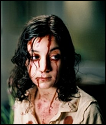
Could somebody tell me how to make a normal photo look more gloomy or war torn? For example  or 
|
|
#
?
Jan 30, 2009 11:44
|
|

|
Interstitial Abs posted:This isn't the answer you're looking for, but I feel like unless you have a *really* good printer you won't get the same image quality, so maybe go for something silk-screened or some other type of print that emphasizes the diy aspect...? I think that when dealing with limited means that kind of packaging is more appealing personally. Well, we have a pretty good printer on campus for this type of stuff, so I'm not really worried about that. But I'm not sure what you mean by 'silk-screened'.
|
|
#
?
Jan 31, 2009 04:33
|
|
|
can anyone recommend an online vendor that will sell colored gildan hoodies or something similar with a good reputation, that isn't ebay, for silk-screening onto?
|
|
#
?
Feb 2, 2009 22:19
|
|

|
Copyright question. I am thinking about adapting a work written by an English author in 1909 for an animated short. THE INTERNET says that it's in the public domain but I don't particularly trust THE INTERNET too much. Is there any way to verify that I will have the rights to adapt it? I think that I would be ok since The War of the Worlds came out a few years ago along with an assload of competitor low-budget movies but I would appreciate advice from anyone who would know.
|
|
#
?
Feb 3, 2009 19:35
|
|

|
Beat. posted:can anyone recommend an online vendor that will sell colored gildan hoodies or something similar with a good reputation, that isn't ebay, for silk-screening onto? broderbros.com ssactivewear.com You'll need an EIN and tax number. Ebjan posted:Could somebody tell me how to make a normal photo look more gloomy or war torn? I can't see the second one but uh, good light and bad retouching. They comped in some clouds and desaturated things a little bit too.
|
|
#
?
Feb 5, 2009 02:14
|
|
|
I work as a freelance graphics designer and I need some help. I need a method or system or program for keeping track of my time. I have the luxury of an extremely flexible work schedule and that causes me to gently caress around a bit more and work 18 hours one day on 2 things and then 4 hours on 10 things the next at times. My point is that I just write that poo poo down in a little marble journal and I don't want to do that anymore. I want to do this for a living or supplemental to a living if necessary, I just want to do it right. What's the best time sheet program? What system do you folks use to keep track of your business? Tips & tricks? anything useful I should do or know?
|
|
#
?
Feb 5, 2009 07:53
|
|
|
has anyone here ever painted a munny doll? I'm planning on using acrylics for mine. I've looked around at different places for tips and things on what to do, but I was curious if anyone here had anything to add.
|
|
#
?
Feb 20, 2009 23:02
|
|

|

|
| # ? May 13, 2024 06:36 |
|
|
NOS482 posted:I work as a freelance graphics designer and I need some help. I need a method or system or program for keeping track of my time. I have the luxury of an extremely flexible work schedule and that causes me to gently caress around a bit more and work 18 hours one day on 2 things and then 4 hours on 10 things the next at times. If you have an Iphone, the Timewerks app is pretty bitching. Otherwise I'd try Invotrak.com, or another invoicing thing online. Having it online in one place makes it easier, I think.
|
|
#
?
Feb 20, 2009 23:07
|
|