

|
cLin posted:Anyone have tips on reading histograms? I have a bit of colorblindness so even the slightest offset that someone spots wouldn't be noticeable for me. I'm just trying to see if there's another way to figure colors out for my photographs. I'm partly colourblind too. What is it with the histograms that you are having trouble with? I don't find any of the histogram colours being similar to the background or anything that'd make the histograms hard to read.
|
 #
?
Jan 28, 2009 20:31
#
?
Jan 28, 2009 20:31
|
|


|

|
| # ? May 16, 2024 18:20 |
|
|
You'd probably be wanting to use the eyedropper tool for this. If there's something that should have neutral cast, the RGB values for that point should be close to each other (within 1 or 2 on a scale of 0-255). That's the best way to do things. If you have a gray or white card, you can use it for that purpose too. There should only be one white balance setting (tint and temperature) that yields neutrality on a neutral object. aesthetically you might have a hard time since "accurate" white balance isn't always what you want...
|
|
#
?
Jan 28, 2009 21:15
|
|
|
Yeah setting your white balance under a bunch of colored spotlights isn't the brightest of ideas.
|
|
#
?
Jan 29, 2009 01:57
|
|

|
CanuckBassist posted:I'm partly colourblind too. What is it with the histograms that you are having trouble with? I don't find any of the histogram colours being similar to the background or anything that'd make the histograms hard to read. It's not that I'm having hard with them, I just would like some tips on how I know the color looks..correct when I am processing the photo. I always end up having my girlfriend look at them beforehand before I save/export my photos.
|
|
#
?
Jan 29, 2009 19:38
|
|
|
Re: histograms, is this accurate information? http://www.luminous-landscape.com/tutorials/understanding-series/understanding-histograms.shtml
|
|
#
?
Jan 29, 2009 20:27
|
|
|
Pretty good. I skimmed over it and I didn't see any horrible outlandish statements like you would most likely find on Ken Rockwell's site. I feel they didn't emphasize this enough though- histograms are completely subjective to what you're shooting. After I got my first lesson on histograms I ran out and tried to get everything as close to the right as possible but when it came to night photography or darker scenes this really kind of screwed me over. Basically, use some common sense to interpret the histogram. It's a great tool when it is used in conjunction with the photographer's knowledge.
|
|
#
?
Jan 29, 2009 22:00
|
|

|
germskr posted:Pretty good. I skimmed over it and I didn't see any horrible outlandish statements like you would most likely find on Ken Rockwell's site. Is there some kind of list of Ken Rockwell's BS? I've found him to be a decent reference for SOME things, as long as you understand that he's got his head stuck really far up his rear end and take most of what he says with a grain of salt. But I'd like to get a better sense of just how much of it is a load of crap, and how much of it is actually useful.
|
|
#
?
Jan 29, 2009 23:28
|
|
|
Cythrelo posted:Is there some kind of list of Ken Rockwell's BS? I've found him to be a decent reference for SOME things, as long as you understand that he's got his head stuck really far up his rear end and take most of what he says with a grain of salt. But I'd like to get a better sense of just how much of it is a load of crap, and how much of it is actually useful. Any lens he says is 'a miracle': bullshit. Anything he says is 'obsolete': bullshit. Anything he says 'doesn't matter': bullshit. Any defect he says is 'easily correctable in Photoshop': bullshit. Any settings he recommends for any camera: bullshit. Wait I think that's like 95% of what he says.
|
|
#
?
Jan 30, 2009 01:35
|
|


|
Nothing to add here. Just wanted to say that this thread is awesome. I'm learning a ton.
|
|
#
?
Jan 30, 2009 02:45
|
|

|
There's ;ike 88 billion photography websites, why would you ever need to read anything he says? It's not like he's ever touched any of the cameras or lenses he's reviewed.
|
|
#
?
Jan 30, 2009 03:34
|
|
|
He shoots Vivid +3 jpegs and calls the results fabulous. If that doesn't tell you anything...
|
|
#
?
Jan 30, 2009 11:56
|
|
|
Works for me. Thanks guys. I'm not a great fan of RAW myself, but I'm sure I'll find it much more useful once I start building up my skills, especially if I'm doing more intense post-processing. And I'm certainly not going to go around calling it useless. Cythrelo fucked around with this message at 12:13 on Jan 30, 2009 |
|
#
?
Jan 30, 2009 12:10
|
|
|
A few people asked me how I do my sharpening, so I wrote up a quick guide. This came from a few different places, I didn't really invent any stage of it.
|
|
#
?
Jan 30, 2009 15:01
|
|

|
poopinmymouth posted:A few people asked me how I do my sharpening, so I wrote up a quick guide. This came from a few different places, I didn't really invent any stage of it. Thats good stuff, thanks for the details.
|
|
#
?
Jan 31, 2009 01:31
|
|
|
I tried to do my first composite tonight, not happy with the results. This is a lot harder than I imagined, though I assume shooting the images with the purpose of compositing them would make it much easier. Any tips (in general or for this image). http://flickr.com/photos/davidchilders/3240880890/ 
|
|
#
?
Jan 31, 2009 08:14
|
|

|
Bottom Liner posted:I tried to do my first composite tonight, not happy with the results. This is a lot harder than I imagined, though I assume shooting the images with the purpose of compositing them would make it much easier. Any tips (in general or for this image). I don't know much about making composites, but I think one of the keys to selling it is having believable lighting and shadows between the subject/background. The background is an overcast day with snow on the ground, which is probably some of the softest, omni-directional lighting situations you run into in the real world. Your model, on the other hand, is getting a big dose of light from the right hand side casting all sorts of shadows around her shoulder and chin, but none into the immediate area where she's sitting. I'm not sure the DoF is quite right in this comp either. The subject is in very sharp focus (looks like pretty normal f/11 studio stuff) whereas the background looks like its shot wide open with focus about 30 feet away. Be careful about perspective/focal length too. Don't composite wide subjects onto telephoto backgrounds, and keep tele subjects in the centre of wide backgrounds, or shoot both at similar focal lengths. I don't think its a big problem here, but something to keep in mind.
|
|
#
?
Jan 31, 2009 08:50
|
|
|
Straightening a photo- This might be obvious to everyone but me, but before I was shown it I'd straighten pics using transform/rotate. I did it by eye before I learned about the rulers, but even with rulers using rotate leaves a skewed square photo with the background colors at the corners, which you then have to crop out anyway. You can do it all at once, quickly, using photoshop's crop tool as guide, rotater and cropper. Step 0: Turn off "snap to" if it's on, it'll drive you nuts on steps 5/6.  Take your crooked-rear end photo. 1: Stretch out the window that borders your photo so you have some workspace around it. 2: Hit 'c' or click to activate the crop tool. With the workspace around your photo you can sloppily click anywhere in the corner around the photo and drag it diagonally to select the entire photo with the cropper.  3: Find something in your pic you want level. In this case it's the horizon, which is nearest the top edge, so drag the top horizontal of the crop tool down until the center square is dead on the horizon. The pic here has a ship in the way, so I ended up making sure that the distance between the crop line and horizon looked equal on both ends.  4: Hover over the corner of the crop selection till the cursor turns into the rotate glyph. Rotate the crop until it's in line with what you want level.  Hard to describe, easy to do. You want to expand the crop out so it's as large as possible without going past the bounds of your image. Grab a corner (5a), using this you can manipulate both it and 5b so that they meet the edges of your photo, minimizing how much you'll lose with the crop. Grab the opposite corner (6a) and do the same. 7: Slap Return. eets straight: 
|
|
#
?
Jan 31, 2009 22:14
|
|


|
Hey guys, I have a question on how to edit this photo. I am unhappy with how much red is in her face, especially under her eyes. I do most of my editing in lightroom and desaturating the reds from her face messes up her lips. I have access to Photoshop CS3, but am not really sure how to just tone down the color in those choice spots. Any tips?
|
|
#
?
Jan 31, 2009 23:32
|
|

|
RangerScum posted:Hey guys, I have a question on how to edit this photo. Yeah, easy. Add a Hue/Saturation adjustment layer and go the "Red" channel in the dropdown at the top. Focus your eyes on her skin and desaturate to where you feel it's needed. Click okay when you're done. Click on the white mask to the right of the adjustment layer, select a small paintbrush and choose the color black. Zoom in on her face and carefully brush over the lips. This will erase the saturation adjustment wherever you paint black.
|
|
#
?
Jan 31, 2009 23:52
|
|
|
In Photoshop, try the sponge tool set to desaturate, and decrease the flow to something that won't make her completely monochrome with a single pass. EDIT: ^^ His idea is better.
|
|
#
?
Jan 31, 2009 23:53
|
|
|
Remy Marathe posted:Straightening a photo- This might be obvious to everyone but me, but before I was shown it I'd straighten pics using transform/rotate. I did it by eye before I learned about the rulers, but even with rulers using rotate leaves a skewed square photo with the background colors at the corners, which you then have to crop out anyway. Adobe Camera Raw is easier. Just use the "straighten" tool, draw a line on any line you want to be horizontal or vertical and it straightens and crops automatically (if you want, it won't crop if you tell it not to."  Click here for the full 1183x766 image.  Click here for the full 1183x766 image.
|
|
#
?
Jan 31, 2009 23:54
|
|

|
You can correct perspective with transform, but not with the straighten tool.
|
|
#
?
Feb 1, 2009 00:00
|
|

|
torgeaux posted:Adobe Camera Raw is easier. Just use the "straighten" tool, draw a line on any line you want to be horizontal or vertical and it straightens and crops automatically (if you want, it won't crop if you tell it not to. drat your fancy softwares, time hasn't passed on my computer since PS7 
|
|
#
?
Feb 1, 2009 01:19
|
|
|
Bottom Liner posted:I tried to do my first composite tonight, not happy with the results. This is a lot harder than I imagined, though I assume shooting the images with the purpose of compositing them would make it much easier. Any tips (in general or for this image). I just wanted to say that the image of her makes her look like a plastic doll. Don't know if that was the effect.
|
|
#
?
Feb 1, 2009 01:37
|
|
|
Mannequin posted:Yeah, easy. Add a Hue/Saturation adjustment layer and go the "Red" channel in the dropdown at the top. Focus your eyes on her skin and desaturate to where you feel it's needed. Click okay when you're done. Click on the white mask to the right of the adjustment layer, select a small paintbrush and choose the color black. Zoom in on her face and carefully brush over the lips. This will erase the saturation adjustment wherever you paint black. Awesome, thanks. I ended up keeping the original color in her face except directly below her eyes. Looks much nicer in my opinion.
|
|
#
?
Feb 1, 2009 05:20
|
|
|
You can also find the "straighten" tool as part of the Lens Correction filter in photoshop (which also has the ability of correcting for perspective to some extent, though nothing to rely on when shooting but it will correct small perspective shifts).
|
|
#
?
Feb 1, 2009 08:33
|
|
|
I have a somewhat basic question about using black and white adjustment layers in photoshop. I'm currently designing a few media guides for my college's athletic teams...the covers are in color and the guts are in black and white. I know a lot about typography, logo design, and page layout, but not a lot about photography (basically...I love InDesign, really like Illustrator, and hate Photoshop). In the past I have been guilty of just running an automated 'convert to grayscale' script and throwing the resulting images in the guide. The default profile using a black and white adjustment layer already looks a lot better than what I get from |Image-Mode-Grayscale| and I usually make a few minor adjustments like bringing out the blues in our team's uniforms or lightening an athlete's face if there's a bad shadow. Right now the graphical links to my InDesign document are in sRGB, and a preflight is giving me exclamation points and warnings about 515 links using RGB color space. My service bureau's prepress sheet says to stick with CMYK for color printing, as expected. But it doesn't say that for black and white printing. So to get the results I expect from these photographs, should I flatten all the images and convert to CMYK? Or does it not matter?
|
|
#
?
Feb 2, 2009 12:16
|
|

|
If you like the looks that the B&W adjustment layer gives you, flatten and then convert to grayscale. Otherwise you'll get ugly four-color black.
|
|
#
?
Feb 2, 2009 13:49
|
|

|
poopinmymouth posted:A few people asked me how I do my sharpening, so I wrote up a quick guide. This came from a few different places, I didn't really invent any stage of it.  That made 90% of the pictures I though were sharp a lot sharper. That made 90% of the pictures I though were sharp a lot sharper.Example dog (not particularly good, that's just something I'll be printing soon): Original: 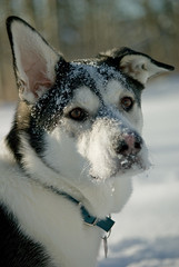 Sharpened: Sharpened: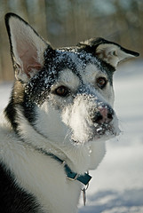 The snow just pop right out of the little dude's fur. Contribution; You seem to have forgot to note that you have to change the high pass layer render type to Overlay (I guessed), I may be blind though. Edit: VVV Did he? I'm not seeing that, still I understood the guide so everything is cool. :P IsaacNewton fucked around with this message at 00:34 on Feb 3, 2009 |
|
#
?
Feb 2, 2009 21:38
|
|
|
torgeaux posted:Adobe Camera Raw is easier. Just use the "straighten" tool, draw a line on any line you want to be horizontal or vertical and it straightens and crops automatically (if you want, it won't crop if you tell it not to." If you double-click the crop tool after that, it will rotate the preview and zoom to fit the bounds of the crop to the preview window. (Might just be CS4)
|
|
#
?
Feb 2, 2009 22:13
|
|

|
IsaacNewton posted:Contribution; You seem to have forgot to note that you have to change the high pass layer render type to Overlay (I guessed), I may be blind though.
|
|
#
?
Feb 2, 2009 23:41
|
|
|
Remy Marathe posted:He used "soft light" instead, and I wouldn't mind an explanation (non-mathematical) of the difference between the two. Soft light seems to allow the affect without you "seeing" it. One thing I dislike is when your methodology is apparent. Overlay might work in some cases, but I found I had to back off the layer transparency till it basically looked like the soft light method.
|
|
#
?
Feb 3, 2009 01:33
|
|
|
poopinmymouth posted:Soft light seems to allow the affect without you "seeing" it. One thing I dislike is when your methodology is apparent. Overlay might work in some cases, but I found I had to back off the layer transparency till it basically looked like the soft light method. When I sharpen in a similar way, I find that hard light and overlay both have harsh halos, and, as you say, you have to back off so far you might as well use soft light.
|
|
#
?
Feb 3, 2009 01:38
|
|
|
Stolen from here  quote:Blending Modes
|
|
#
?
Feb 3, 2009 16:54
|
|

|
Sometimes I wish I didn't need a CS4 PhD to feel comfortable around photoshop.
|
|
#
?
Feb 3, 2009 20:41
|
|
|
poopinmymouth posted:Soft light seems to allow the affect without you "seeing" it. One thing I dislike is when your methodology is apparent. Overlay might work in some cases, but I found I had to back off the layer transparency till it basically looked like the soft light method.
|
|
#
?
Feb 3, 2009 21:26
|
|

|
It's true, and that's all I can see now that you mentioned it. Argh! What would you guys do to select the area around hairy / furry things? I tried to mask out the background but the white snow is hard to distinguish from the dog with the colour channel shenanigan, is there a trick to it?
|
|
#
?
Feb 3, 2009 22:07
|
|
|
Just brush on the mask. Use "|" to see what you're doing.
|
|
#
?
Feb 3, 2009 22:27
|
|
|
^^^ that would'nt work for me, I suck at painting.IsaacNewton posted:It's true, and that's all I can see now that you mentioned it. Argh! I'd try curves or levels adjustments on the mask. Like in your case you might be able to use the fact that the fur along his outline is slightly darker than the snow behind him, maybe increase the contrast between the two with a curve (so the fur comes out black/dark gray and the snow white/light gray) and then invert. Don't worry about anything but distinguishing the furry edges around him at first; you can easily paint the rest black and white by hand. Also keep in mind that you can select and treat different parts of the mask differently depending on what distinguishes the edge.
|
|
#
?
Feb 3, 2009 22:33
|
|
|

|
| # ? May 16, 2024 18:20 |
|
|
Making a mask is the digital equivalent of coloring inside the lines. Unless you are Michael J Fox just turn the hardness down and take 2 seconds and do it really rough, no one can tell if it isn't perfect it just has to be close.
|
|
#
?
Feb 3, 2009 22:38
|
|