


|
-A n i m 8- posted:Welp, they turning Imageworks in to 'rows of desks' sweatshop kinda like DD and R+H. Was fun while it lasted... Uh, hi co-worker..?
|
 #
?
Jul 7, 2009 23:06
#
?
Jul 7, 2009 23:06
|
|


|

|
| # ? May 15, 2024 00:13 |
|
-A n i m 8- posted:Welp, they turning Imageworks in to 'rows of desks' sweatshop kinda like DD and R+H. Was fun while it lasted... Wow. Sounds great...
|
|
|
#
?
Jul 8, 2009 00:42
|
|
|
-A n i m 8- posted:Welp, they turning Imageworks in to 'rows of desks' sweatshop kinda like DD and R+H. Was fun while it lasted... That's the norm pretty much everywhere. With the current Sony leadership, Imageworks is expected to turn a profit now [  ]. Other than that, i find it's the kiss of death if the studio space is too posh [I've worked at a few places where I had a great office, but the company went out of business pretty quickly]. ]. Other than that, i find it's the kiss of death if the studio space is too posh [I've worked at a few places where I had a great office, but the company went out of business pretty quickly].If you're at R+H or any of those places long enough you do get your own office. R+H is moving to a new business campus [high rise style modern office complex] at the year end so they'll have more space soon. Could always be worse, I had a houdini TD friend who had his desk between the restroom and cleaning supplies cabinet at an old job. His area smelt like poo poo and lysol all day. Big K of Justice fucked around with this message at 00:49 on Jul 8, 2009 |
|
#
?
Jul 8, 2009 00:46
|
|


|
BigKOfJustice posted:Other than that, i find it's the kiss of death if the studio space is too posh [I've worked at a few places where I had a great office, but the company went out of business pretty quickly]. Isn't this what happened at ESC too, what with everyone gets hydraulic desk and Aeron chairs, oh and we're only going to use MentalRay exclusively! woop woop
|
|
#
?
Jul 8, 2009 01:08
|
|
|
Ratmann posted:Isn't this what happened at ESC too, what with everyone gets hydraulic desk and Aeron chairs, oh and we're only going to use MentalRay exclusively! woop woop Yeah, I was going to mention ESC for an example with a company with an awesome workplace but went out of business. Oddly enough 80-90% of the expense of a VFX shop is wages/manhours, but a few percent used for equipment/furniture/rent can tip the scales to bankruptcy I guess. A studio in Canada were I worked had a neat workspace, a 100+ year old brewery/warehouse. Instead of rows of desks, they had these curved desks which combined into rings, so you had rings and rings of desks here and there instead of straight lines, I thought it was a neat layout. Best way to outfit a studio is to buy desks and chairs from places that went out of business. I think many LA studios got their Aeron chairs when most of the dot-com firms imploded a few years back, you had 1000's of chairs being up for sale for fairly cheap. From a business perspective, I can understand renting a cheap warehouse in an Industrial Park, throwing together a bunch of plywood desks and cram a bunch of td's in a tight spot. People think clients would be impressed with fancy leather sofas, and nice big workspaces, but that can often backfire as the clients think they're not getting good value for the money they're spending if they're blowing it on nice studio space vs "hey we're getting our moneys worth out of these guys working out of a loading dock" Big K of Justice fucked around with this message at 01:57 on Jul 8, 2009 |
|
#
?
Jul 8, 2009 01:54
|
|
|
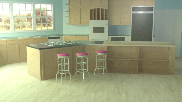
The Merkinman posted:When I've done architectural stuff in the past I've had measurements. Either measuring them myself or given to me by drawings. The distance between the bench and wall cabinets is too small, maybe increase by 25-50%. Typically this is going to be at least 650mm. Some other typical sizes that might help you scale things would be Kitchen benches tend to be about 900mm from the floor and about 600mm deep, although where you have the overhang where the stools are this could be as deep as 900mm. You don't seem to have a kickplate on the cupboards but this would tend to be 100-150mm and inset from the front of the cupboards by 30-50mm. Benchtops are typically 32mm for laminated and 20,40,60 or 80mm for granite / corian / whatever else which leaves the cabinets at the difference between. Oven units tend to be 600 or 700mm wide although there are ones that will be 800 or 900 wide but these ones usually aren't the same height. Cooktops will usually be a similar width to the oven with 600/700 units with 4 burners and 800/900 units with 5 or 6 burners (maybe 4 with a central skillet burner). It's quite rare to get a microwave that wont fit into a 600 wide cabinet (568 internal, 16mm wall thickness). Space between the two benches should be about 1000-1200mm you can go a bit larger but anything over 1500mm is going to greatly affect the workflow of the area, likewise anything under 1000mm is going to feel very tight and anything under 800 would be pretty much unusable. 90% of dishwashers will fit into a 600/610mm space (the lesser number if they're integrated with a door front). Fridge spaces shouldn't be less than 700mm (650 at a pinch) and anything over 1000mm is a seriously large fridge likely with double doors. Your fridge in this render seems to fill the space exactly, this isn't going to happen in practice for the 2 reasons of ventilation and getting the drat thing in there. Not that it is a problem with your model but you're unlikely to get a single door over 600mm unless it really isn't avoidable. A last tip for creating the kitchen, try to base all of your cupboards on sizes rounded to 100mm as any production short of bespoke high end stuff is likely to do this. Try not to have any cupboards less than 300mm in width as they become inpratical, likewise anything less than 300mm high is also a bit annoying (the only real exception to this might be something like a wine or spice rack which could go down to 150mm). I spent too long designing kitchens I think.
|
|
#
?
Jul 8, 2009 02:13
|
|

|
Edit: ^^^^ Bahaha I am like this with stages/sets for events. I am now a gala dinner visual MACHINE.-A n i m 8- posted:Welp, they turning Imageworks in to 'rows of desks' sweatshop kinda like DD and R+H. Was fun while it lasted... I'd be curious to hear some frank opinions on what it's like to work at these specific places, and any other ones of similar ilk in the area. PM me if you want to keep it off the board.
|
|
#
?
Jul 8, 2009 02:18
|
|

|
BigKOfJustice posted:A studio in Canada were I worked had a neat workspace, a 100+ year old brewery/warehouse. Instead of rows of desks, they had these curved desks which combined into rings, so you had rings and rings of desks here and there instead of straight lines, I thought it was a neat layout. i'm with a small studio where we have moved 3 times in the last 6 months, at one point we were sharing an office with a web design place, and we were literally stuffed in their hallway. i find that the working environment is a huge influence on my work habits, so i think it's worth getting somewhere not nessicarily expensive, but atleast interesting like a 100+ year old brewery.
|
|
#
?
Jul 8, 2009 02:54
|
|

|
Heintje posted:Edit: ^^^^ Bahaha I am like this with stages/sets for events. I am now a gala dinner visual MACHINE. This is all from 5 years or so ago. I now can do it for exhibition stands and events too, maybe a bit of shopfitting as well.
|
|
#
?
Jul 8, 2009 03:10
|
|
|
Kirby posted:this sounds freaking awesome What is with with web designers? We've had two offices and both are shared with web designers. Also, we've moved into a very posh studio recently which although it's quite nice, my colleague and I consider completely unnecessary for 4 guys and computers, escpecially considering the very low wages they pay us. They have only two staff and we're both desperately trying to get out so the 'kiss of death' posh office theory holds up I think.
|
|
#
?
Jul 8, 2009 03:36
|
|

|
Ratmann posted:Uh, hi co-worker..? Sup Imageworks Goon!
|
|
#
?
Jul 8, 2009 03:54
|
|
|
Aargh posted:That'd be a lot of good information if it weren't metric! Seriously though, I don't have the file open so I can't measure. I do need the kickboards regardless, can't believe I forgot that. I do know those cabinets are 2ft (slightly over 600mm). I think my problem is the reference photos are conflicting with the floor plan I saw. Of course if I followed the floor plan by the scale it had listed the doorways would be ~450mm... I doubled the floor plan, but I guess doing that AND going by the reference photos it's causing the weird conflicts of measurements.
|
|
#
?
Jul 8, 2009 04:35
|
|


|
The Merkinman posted:That'd be a lot of good information if it weren't metric! Who uses Imperial these days anyway? ")
|
|
#
?
Jul 8, 2009 04:49
|
|
|
The Merkinman posted:Of course if I followed the floor plan by the scale it had listed the doorways would be ~450mm... I didn't even have to convert that to imperial to get a chuckle out of it. Aargh posted:Who uses Imperial these days anyway? Imperialists.  please kill us
|
|
#
?
Jul 8, 2009 13:58
|
|

|
Aargh posted:Who uses Imperial these days anyway? I was at the printers here in Toronto, and they were quoting on business cards giving measurements in inches. WTF Canada, you are supposed to use metric. They said that it's OK, they would convert things to mm for me, ha.
|
|
#
?
Jul 8, 2009 14:06
|
|
|
Getting closer to something resembling finished for this piece. As a learning piece it has been really useful. Learned a lot about modeling, texturing, mental ray and compositing especially. I haven't got a decent monitor to check the colours on so it could well be wrong, also I think this pic may have a weird aspect ratio. I'm not entirely happy with it but I'm willing to learn some lessons and move on.  I've used fusion for the first time on this project, split the image out into all it's constituent parts and put it all back together again with controls on everything. It was good fun learning how it all goes together. Of course I went a bit nuts... 
EoinCannon fucked around with this message at 15:33 on Jul 8, 2009 |
|
#
?
Jul 8, 2009 15:30
|
|
|
Really trivial thing, but I'd rotate the model slightly so that the crossbow was seen in a silhouette. As it is right now it seems sort of flat in that area.
|
|
#
?
Jul 8, 2009 15:37
|
|
|
EoinCannon posted:The camera height seems stale to me. Have you tried taking it lower or more toward eye height?
|
|
#
?
Jul 8, 2009 16:19
|
|

|
-A n i m 8- posted:Sup Imageworks Goon! Not on Alice  , how's about you? , how's about you?
|
|
#
?
Jul 8, 2009 16:59
|
|
|
Started working on this 2 days ago at night, ran a long sim last night, here's how it's coming out, still needs quite a bit of work, but I'm just winging it not really planning what I want with it. http://rickfx.com/missile_hit_003.mov
|
|
#
?
Jul 8, 2009 18:20
|
|
|
EoinCannon posted:I've used fusion for the first time on this project, split the image out into all it's constituent parts and put it all back together again with controls on everything. It was good fun learning how it all goes together. Of course I went a bit nuts... It's more of a personal preference thing, but if you get into the habit of keeping your script organized, it makes everything easier. For something simple like this, keeping all the loaders even, mattes on the bottom (or something like this), everything snapped to grid -- it really does help. If you're using 5.3 (I think?) or higher, you can do underlays, so you can say 'THIS section is the shadow pass, THESE are diffuse,' etc. Maybe it's just me, but it looks way better that way. To enable snap-to-grid: Right click the flow, go to 'Arrange Tools,' hit 'to grid.' Travakian fucked around with this message at 06:02 on Feb 24, 2011 |
|
#
?
Jul 8, 2009 18:33
|
|

|
Ratmann posted:Started working on this 2 days ago at night, ran a long sim last night, here's how it's coming out, still needs quite a bit of work, but I'm just winging it not really planning what I want with it. Is that fume for the fluids? Have any of you played around with Maya's fluids (and what are they like)?
|
|
#
?
Jul 8, 2009 18:40
|
|
|
Heintje posted:Is that fume for the fluids? Have any of you played around with Maya's fluids (and what are they like)? Yeah it's fume, I started learning Maya fluids a little while back when I only had my M90 laptop, and they where good, once you get the idea of how they work and some of the quirks, the only problem is they only render with Maya Software or MentalRay right now (which I hate), so I sort of drifted apart from them, I don't really like to use Maya a whole lot unless I need to, be it at work or at home depending on what I'm doing, my Houdini RBD to Maya tool comes into mind, but that's a different story. But yeah, if you like to work in Maya they're good to know, but if you don't mind using all sorts of stuff I'd go for the fume route, as far as I'm aware Maya fluid's do not have uprezing and the light scattering I remember pretty shoddy and a bit slow.
|
|
#
?
Jul 8, 2009 18:51
|
|
|
EoinCannon posted:Sweet, looks great. I'm seconding the crit on the silhouette though.  And rather than show off another boring photo of one of my rigs, I tweaked the texture on this guy and re-rendered him. I feel like I have no idea wtf when it comes to textures. This is one of my better ones I feel but I still feel completely inadequate when it comes to texturing as a whole. I feel annoyed because I want there to be more varying color, but he's made out of just one material. I tried introducing some more subtle greens overall.
|
|
#
?
Jul 8, 2009 19:13
|
|
|
Well measured my kitchen model, and yea it's way off. I think it was that piss poor floorplan I found that did me in. I should just completely ignore it, look up the dimensions of cupboards/ovens etc and just place the stuff around like I originally had it. I don't quite understand your critique of the refrigerator though.
|
|
#
?
Jul 8, 2009 19:31
|
|
|
Hinchu posted:Sweet, looks great. I'm seconding the crit on the silhouette though. You might try examining which parts would get more use than others over the course of their lives, i.e. anywhere there's a joint with metal rubbing on metal, there would be metallic dust, leading to [apparent] increased oxidation near those areas, so lots of dark browns, sea greens, and maybe some blues. The Merkinman posted:I don't quite understand your critique of the refrigerator though. I think he was getting at a couple things; one that a fridge door is only going to be so big before it gets heavy enough to unbalance the unit when opened. The other was with the "framing" of the cabinets around the fridge itself. Personally I'd put a slight gap in there, but I have seen a lot of installations (and maybe this is just in America because we shoot first and aim later) that have the fridge effectively built in to the cabinet with practically no gaps around the moulding/fascia/whatever. edit: on second look, I see there's no cabinet panel to the right of the fridge, so there's really not much issue with ventilation, but yeah, without a gap between the top of the fridge and the bottom of the cabinets, it would be impossible to replace with a taller appliance. Handiklap fucked around with this message at 20:00 on Jul 8, 2009 |
|
#
?
Jul 8, 2009 19:52
|
|
|
Travakian posted:It's more of a personal preference thing, but if you get into the habit of keeping your script organized, it makes everything easier. For something simple like this, keeping all the loaders even, mattes on the bottom (or something like this), everything snapped to grid -- it really does help. If you're using 5.3 (I think?) or higher, you can do underlays, so you can say 'THIS section is the shadow pass, THESE are diffuse,' etc. Maybe it's just me, but it looks way better that way. Ahh thank you for that. I knew there must be a way to do that but I haven't been arsed looking for it. Thanks for the critiques those who commented. The silhouette is really weak I know, it kind of runis the piece from a composition standpoint. My focal length is too long which flattens out the image and the camera level is pretty bland. Fortunately on the showreel I'll be able to rotate around the model so it reads a bit better.
|
|
#
?
Jul 8, 2009 23:27
|
|
|
Handiklap posted:I think he was getting at a couple things; one that a fridge door is only going to be so big before it gets heavy enough to unbalance the unit when opened. The other was with the "framing" of the cabinets around the fridge itself. Personally I'd put a slight gap in there, but I have seen a lot of installations (and maybe this is just in America because we shoot first and aim later) that have the fridge effectively built in to the cabinet with practically no gaps around the moulding/fascia/whatever. Yeah you've pretty much got it. Unless the fridge has been specifically made for the kitchen it isn't going to fit perfectily (carpenters can't build poo poo to a tolerance so it aint going to work the other way around either) and there will be at least a small gap all the way around. In the image below (shamelessly stolen from google image search) you can see a small gap or shadow around the fridge. Typically i'd leave at least 12.5mm around if not 25mm (1/2"-1").
|
|
#
?
Jul 9, 2009 00:42
|
|
|
Ratmann posted:Started working on this 2 days ago at night, ran a long sim last night, here's how it's coming out, still needs quite a bit of work, but I'm just winging it not really planning what I want with it. That's really really cool, seems like the noise might jump up a bit high at the end, but I've only ever used Afterburn. I've been wanting to try Fume FX forever. I can barely get Afterburn to do anything useful with any consistency. It seems that when I finally figure something out, I change some fiddly little setting and the entire thing changes and I can't get back to where I was before. I've been screwing around with Rayfire lately and getting some fun results, probably nothing close to what Heintje can pull off with Houdini though. I'm looking to eventually make a little short and in it I want an actor to jump clean through a wall to tackle another actor running away. So far these are my results: Test 1: http://vimeo.com/5038294 Test 2: http://vimeo.com/5492115 Test 2B: http://vimeo.com/5071414 Test 3: http://vimeo.com/5501095 And if you're sick of looking at the side of my house: http://vimeo.com/5303263 I'd really like to improve my general knowledge of Max more than learning to model or anything like that. Just the ability to be able to render out different passes for exactly what I want would be great. Right now my method for rendering a mask for just one object in a scene is to select that object, and texture it with a flat black colour, then select EVERYTHING else in the scene and make it a flat white texture. There has to be a better way, like a way to flag an object, then single it out in the render options, so it just automatically gets its own render pass or something. One common theme you'll notice in those scenes is the interior of the broken wall is not textured, where the brick would be smashed, because I couldn't get the brick texture to match the real brick around the edges. I eventually just photoshopped a texture from a still of video for the texture on the brick that explodes out. In the future I think I'd plan my shot better and chose a location with a big cement wall, instead of brick because in the end I just don't think that's just what brick would do if it were smashed right through. Might just pass if it were cement though. bring back old gbs fucked around with this message at 01:04 on Jul 9, 2009 |
|
#
?
Jul 9, 2009 00:51
|
|

|
ACanofPepsi posted:rayfire, smashing, wall, stuffs Pretty cool dude, test 3 looks like you're getting there. A few tips to make it better right now I'd say would be to slow down the sim a little bit, like 20%-30%(time scale is the parameter), and also the pieces are a bit too heavy, you might want to increase the force that's doing the explosion, if you're using the rayfire bomb that is, but remember to keep track of your values, also add a destruction to it, so there are more pieces, that's always fun.Oh and a good idea and practice you should really adopt if you're getting into effects is to change one parameter at a time if you're doing sims, that way if something changes drastically you'll see what it was easier, instead of fishing the 9 parameters you changed. Camera projection is another horse, the best tip I can give you is to take reference pictures from the set, or shoot from different angles, and then have all the tracks be in the same space, though this is a bit more advanced. As for Houdini vs Max(with rayfire, fume, afterburn, TP, PFlow, Krakatoa), uh I'll write something long about this later...
|
|
#
?
Jul 9, 2009 01:41
|
|
|
Looked up (imperial) measurements for cabinets etc and brought the walls closer together so there wasn't as much space. Also added the kickboard. Still have to augment the refrigerator though.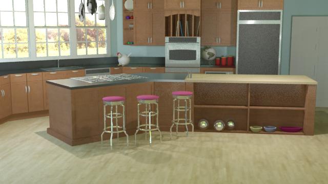
The Merkinman fucked around with this message at 03:02 on Jul 9, 2009 |
|
#
?
Jul 9, 2009 02:25
|
|
|
Ratmann posted:As for Houdini vs Max(with rayfire, fume, afterburn, TP, PFlow, Krakatoa), uh I'll write something long about this later... Yessssssssssssssssss, please do this. Not CG, but I just found this on the internet: http://news.bbc.co.uk/2/hi/uk_news/8138012.stm It's a Lamborghini on fire and the smoke plumes coming off seem like they would be a great reference to look back to for any artist looking to mimic real life. I'll be using it when I jump back into Afterburn.
|
|
#
?
Jul 9, 2009 17:19
|
|
|
Here is a 3d scene I started about a week ago. After hearing about the new Monkey Island games I wanted to do something similar to my favorite adventure game, Full Throttle. here is the render out of XSI.  The Matte Painting Background.  Here is the quick concept image. I don't like to spend a lot of time on the concept. The simpler the concept the more freedom I feel I have in the final Image.  Thanks for checking it!
|
|
#
?
Jul 10, 2009 02:19
|
|

|
SGT. Squeaks posted:I love it! It makes me feel like I'm playing an old sierra game! Also, a quick crit. I think it would look better if your shadows weren't so black. I like to make them a subtle blue hue to reflect the color of the atmosphere reflecting into the dead space. The black makes me feel like it's not exposed as well as it could be.
|
|
#
?
Jul 10, 2009 03:51
|
|
|
I don't quite get the guardrail, is that on a cliff? It looks like it in your concept image due to the stark change of light/dark on the ground. Maybe the giant rocks shadow is messing up that contrast? So either do what Hinchu suggested an lessen the shadow and/or change the angle. I looked at the intro to see the original. I see you did take some liberty, not that that's a bad thing. When I've recreated things I've been afraid to, but I suppose that's my problem.
|
|
#
?
Jul 10, 2009 05:27
|
|
|
I like your style. The rocks particularly stand out as being awesome Maybe some volume fog would gve more of a feeling of distance over the cliff and towards the horizon? Cool stuff
|
|
#
?
Jul 10, 2009 06:10
|
|
|
Yeah you definitely need to show the depth of the scene better in that image as the BG blends in too well with the FG where they meet. (Which also happens to be at the 50% mark, half way up the image. I would personally tilt the camera up and lower it so it was 70% foreground, 30% background.)
|
|
#
?
Jul 10, 2009 06:11
|
|

|
Thanks for the awesome suggestions! Your right, it's suppose to be a road up on a cliff with the valley down below. I needed some fresh eyes to check it out. It is petty hard to make out that it's suppose to be much higher than the valley below. I'll try some things. I'll try what you guys suggested like tilting the camera up. The matte background has a dark area near the bottom of the image, I think this is further confusing that edge. I'll lighten that up and see what it does. thanks guys! I appreciate it and I'll work on it some more.
|
|
#
?
Jul 10, 2009 07:00
|
|
|
VFX goons may appreciate this; it's been making the rounds on Twitter with the VFX people -- it's some home footage shot at ILM during the making of the first Star Wars. Good times were had. http://www.vimeo.com/5494280
|
|
#
?
Jul 10, 2009 07:25
|
|
|

|
| # ? May 15, 2024 00:13 |
|
|
Travakian posted:VFX goons may appreciate this; it's been making the rounds on Twitter with the VFX people -- it's some home footage shot at ILM during the making of the first Star Wars. Good times were had. Yeah that's pretty much what I wanted to do when I was thirteen. I love all of the hair and beards. It reminds me of my friends in college.
|
|
#
?
Jul 10, 2009 14:07
|
|