

|
AtomicManiac posted:The problem after reading about 7 pages of this thread is, most of the tutorials are written from an intermediate and above view-point. The links at the beginning are good but don't really offer a general starting point in what to learn. I went to the library recently to look for photo books, and surprisingly they also had basic Photoshop books, recent ones using CS3 and CS4. I would give those a shot. And theres a ton of 'wedding' photography books that have the basics you can apply to anything to get started. I forgot how wonderful the public library system is.
|
 #
?
Feb 11, 2010 20:25
#
?
Feb 11, 2010 20:25
|
|


|

|
| # ? May 16, 2024 19:13 |
|
|
tv.adobe.com has some good stuff on it. Such as the Learn Photoshop CS4 set of tutorials. Pretty easy for a beginner or intermediate user to follow. Even if you don't have CS4, alot of it is still applicable to older versions (I think).
|
|
#
?
Feb 11, 2010 23:51
|
|

|
I used the Classroom In A Book from Adobe waybackwhen to get gooder at CS and it was well laid-out. It won't show you every little function of every menu, but once you know your way around you can root them out.
|
|
#
?
Feb 12, 2010 04:21
|
|

|
Lynda.com is pretty good, I use that to fill in gaps of stuff I already know. The only book I own is the Photoshop LAB one which is cool, I like color correcting in LAB.
|
|
#
?
Feb 12, 2010 04:30
|
|

|
Anyone have any good examples or ideas of photos with text on them, or better tips even? I need it for something on my website and just cant get it to look any good, this is my failed attempt..jpg)
|
|
#
?
Feb 13, 2010 19:41
|
|

|
You need to read up on typography, especially leading and kerning. http://en.wikipedia.org/wiki/Leading http://en.wikipedia.org/wiki/Kerning Arial is almost as bad as Comic sans, get a better font. In Photoshop, select your text then hit ctrl + T. By adjusting leading and kerning I got this: 
|
|
#
?
Feb 13, 2010 19:54
|
|

|
Ringo R posted:You need to read up on typography, especially leading and kerning. Cheers for the help, good stuff.
|
|
#
?
Feb 13, 2010 20:01
|
|
|
fronkpies posted:Anyone have any good examples or ideas of photos with text on them, or better tips even? I need it for something on my website and just cant get it to look any good, this is my failed attempt. I hear there are these things called magazines, they combine photos and type or something.
|
|
#
?
Feb 13, 2010 20:02
|
|
|
brad industry posted:I hear there are these things called magazines, they combine photos and type or something. Quite right, staring at a screen sometimes you forget to actually get up and think.
|
|
#
?
Feb 13, 2010 20:09
|
|
|
miasma blues posted:- I will be battling a lot of noise over the next few days, any and all tips would be greatly appreciated. How do exposure correction, gamma correction and gamma linearity affect noise differently? Are there differences between the raw-converters noise wise? Anyone?
|
|
#
?
Feb 13, 2010 23:46
|
|
|
miasma blues posted:Anyone? Get a noise reduction program like Noise Ninja.
|
|
#
?
Feb 14, 2010 06:07
|
|

|
I did buy Noise Ninja already. I just wanted to try and keep noise down as much as possible even before actively denoising it. That's why I'd like to know whether or how exposure correction, gamma correction/linearity and messing with the base curve will influence noise differently.
|
|
#
?
Feb 14, 2010 11:08
|
|
|
miasma blues posted:I did buy Noise Ninja already. I just wanted to try and keep noise down as much as possible even before actively denoising it. That's why I'd like to know whether or how exposure correction, gamma correction/linearity and messing with the base curve will influence noise differently. Honestly if you're doing event photography like it sounds like, you need to use flash for most of your shots.
|
|
#
?
Feb 14, 2010 17:24
|
|

|
TsarAleksi posted:Honestly if you're doing event photography like it sounds like, you need to use flash for most of your shots.  Apparently I set flash exposure correction instead of just dialing down ISO. Live and learn...
|
|
#
?
Feb 14, 2010 18:33
|
|
|
miasma blues posted:Apparently I set flash exposure correction instead of just dialing down ISO. Live and learn... I did this too earlier today and lost like 5 shots before I realized. Tried to salvage, and not even worth it, it'd be too noisy.
|
|
#
?
Feb 14, 2010 23:06
|
|

|
Shmoogy posted:I did this too earlier today and lost like 5 shots before I realized. Tried to salvage, and not even worth it, it'd be too noisy. Did you try black and white? That's an old trick for music photography, since it looks like film grain and people think it's done on purpose.
|
|
#
?
Feb 15, 2010 04:36
|
|

|
AtomicManiac posted:Did you try black and white? That's an old trick for music photography, since it looks like film grain and people think it's done on purpose. Oh my god that's genius, I already marked for rejection, deleted them, and wiped my SD card though. That's an awesome tip though, thank you, I don't think I would have ever thought of that.
|
|
#
?
Feb 15, 2010 04:46
|
|
|
Would anybody happen to have a technique for getting the banding out of the sky in this photo? It's a C41 film scan from a few years back, done using my old Konica-Minolta before I got the Imacon. I'd rescan it, but I can't find the original negative.  Thanks!
|
|
#
?
Feb 16, 2010 01:08
|
|

|
Select the sky then blur it.
|
|
#
?
Feb 16, 2010 01:38
|
|
|
I don't really have a better suggestion, but that's a nice photo.
|
|
#
?
Feb 16, 2010 03:19
|
|


|
Hmm, beginning September 2008 I took a year of study abroad in Japan, and I bought a Nikon D80. I then pirated Apple Aperture 2 and used that until New Years', after which I rotated to a pirated Adobe Lightroom 2. I bought a new computer in December 2009, and in early January I downloaded trials for Aperture 2 and Lightroom 2, which have both just expired. I imported all the photos from my old computer (13.3" macbook v1.1) to work with on the new computer (27" imac). This time I intended to go legit, try out Aperture, Lightroom and Photoshop CS4 demo's, then purchase the one I like most via the Higher Education store (i'm a student). I got too busy with schoolwork, had no chance to play around with the software, and now the trials have expired. (Aperture trial had a nice feature whereby I could export all my Masters from the Aperture Library once the trial was up, I'd been looking for a clean cut way to do so forever!). Reading the Photoshop comments from the last page, I'm convinced I need to ask which program I ought to buy. Admittedly most of the photos I've taken in Japan were facebook/flickr uploads, and usually involved a quick rush job through Aperture/Lightroom where I'd click Auto Tone, Auto exposure, and mess a little if that wasn't up to my preference. I want to get serious, though, and export fewer, higher-quality photos so it's less "social networking" and more "serious amateur photography". So would Photoshop CS4, online video tutorials, lynda.com etc be the way to go? I'm keen on waiting for CS5, since I could get it via Education store if it's out before July.
|
|
#
?
Feb 20, 2010 02:03
|
|
|
Does Nikon offer something similar to Canons DPP software? It's very similar to Lightroom, although I think it's a fair bit less powerful. It's major use is for quick edits like you used to do (white balance, crops, exposure changes, whatever) I think Lightroom/Aperture is more practical to use, but Photoshop is ridiculously powerful (but so drat difficult to break into using)
|
|
#
?
Feb 20, 2010 02:14
|
|
|
jet_dee posted:Hmm, beginning September 2008 I took a year of study abroad in Japan, and I bought a Nikon D80. I then pirated Apple Aperture 2 and used that until New Years', after which I rotated to a pirated Adobe Lightroom 2. For bulk photo editing and cataloging, it's tough to beat Lightroom. I've only found myself using CS4 if I need to do more graphic-y stuff like cut things out, add text, and clone stamp. I think a big reason to get CS4 over Lightroom, is if you are really set on doing a lot of the things specific to Photoshop, like autostitching panoramas, content aware scaling, precise burning and dodging layers, and filters like woa. Otherwise, shoot RAW and Lightroom will get you there almost every time.
|
|
#
?
Feb 20, 2010 07:20
|
|
|
UserNotFound posted:So far I've learned to modify existing "Picture Control" settings (standard, vivid, neutral, b&w) using NX2 and saving them as a new file, which can be transferred between cameras easily. I believe it works with the D100/200/300/700 D2x and D3 series. I'll post back a guide once I get some screen shots. Here are samples of the first 8 listed here : http://www.neebu.net/~khuon/photography/NIKON/CUSTOMPC/
|
|
#
?
Feb 21, 2010 19:23
|
|


|
For some reason I'm stunned by the color processing in this photo. It might not be anything special to you guys, but I'd really like to know how to achieve this contrasty/cold look. What are the obvious adjustments that this photographer made to the photo to give it this look? I'm very new to any kind of processing other than HDR, so it's not quite obvious what he's done. 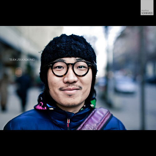
|
|
#
?
Feb 23, 2010 04:50
|
|
|
Well, it looks like that might have been taken on an overcast day, which is a great way to avoid taking photos with much warmth in them anyway. Other things that come to mind are the Curves tool or the photo filters in Photoshop.
|
|
#
?
Feb 23, 2010 06:16
|
|
|
There aren't really any "tricks" to color other than starting with a good source and then just knowing what you want. The light on that definitely had a big impact, overcast days are the best for shooting color. It just looks like he took down the yellow a lot, other than that nothing special. Learn to use the HSL adjustment layers (or Lightroom panel or whatever software you use). Subtle split toning is also a good way to get film-like color palettes.
|
|
#
?
Feb 23, 2010 06:40
|
|
|
How good of a guideline is this: Click here for the full 750x571 image. I usually just do whatever I think looks alright but I think this gives a better baseline of approximations than playing with sliders (Until I get more experience at least)
|
|
#
?
Feb 23, 2010 16:50
|
|
|
I don't think it's good at all because it doesn't take size/dpi/resolution into account.
|
|
#
?
Feb 23, 2010 17:13
|
|
|
Question, do you guys think I should clean up some of the distracting elements in this photo, or even crop at the ceiling? I love the image but the more I look at it the more little things bug me (the warning labels, for instance). 
Bottom Liner fucked around with this message at 15:40 on Feb 24, 2010 |
|
#
?
Feb 24, 2010 15:28
|
|

|
Is there any way you can retake the picture? You cut off the right end of the machine every so slightly, which is slightly annoying. I would probably get rid of the warning stickers, and (if you can't retake it) slightly raise the exposure on the right bottom half of the machine (It looks you might not be able to make it look similar to the other half.) If you get a second chance to take the photo, step back a little further if you can. It also looks slightly crooked. The most distracting parts of the ceiling are the air dict thing, the orange something or other, and the cracked tile where the screen is coming out from. Not quite sure what to do about the crop.
|
|
#
?
Feb 24, 2010 16:32
|
|
|
Yes, please crop away the ceiling, it is ugly and distracting. I'm not a fan of the blown-out whites but perhaps you were going for that look.
|
|
#
?
Feb 24, 2010 17:13
|
|
|
Have the radiologist and the MRI gone critical? Are they about to explode? That is some serious white going on there. I'd echo what the other guys said, cut out the ceiling, and if you can get away with it, crop out as much of the supporting arm for the PACS monitor as you can.
|
|
#
?
Feb 24, 2010 17:54
|
|
|
 How can I get rid of that streak of sunlight on the side of the house?
|
|
#
?
Feb 25, 2010 03:11
|
|

|
The side of the house looks pretty uniform as far as colour goes. You can probably try to clone the shingles directly above the light over it.
|
|
#
?
Feb 25, 2010 03:19
|
|

|
The pattern of the slats is pretty uniform but the light's gradient gets darker darker into the bottom, and less so into the right corner of the house. I would copy a section of slats approximately the same size and shape as the light streak and paste it over the streak, and then play with the curves, exposure, and hue/saturation until it blends in. Maybe use an eraser at 0% hardness around the edge of your patch to help the blend.
|
|
#
?
Feb 25, 2010 06:50
|
|
|
baccaruda posted:The pattern of the slats is pretty uniform but the light's gradient gets darker darker into the bottom, and less so into the right corner of the house. That or just use the patch tool, which is sort of hidden under the healing brush. Patch is an excellent tool for this kind of stuff.
|
|
#
?
Feb 25, 2010 07:37
|
|

|
Goons may be able to answer this. I'm taking files from lightroom into photoshop via "open as smart-object". Once I've done something to them there I'll generally save them as a .psd. Let's say XXXXX.psd, problem is, when I hit CTRL-S to save it saves it off as some random lightroom name along the lines of IMG_xxxx_edit.psd. Any idea why it isn't replacing the XXXXX.psd as it should?
|
|
#
?
Feb 25, 2010 08:16
|
|
|
I believe there's a "custom naming scheme" option in Lightroom for when you use an external editor?
|
|
#
?
Feb 25, 2010 12:13
|
|

|

|
| # ? May 16, 2024 19:13 |
|
|
Chase Jarvis is doing a live photo post processing http://blog.chasejarvis.com/live/ right now. Booya.
AIIAZNSK8ER fucked around with this message at 21:36 on Feb 25, 2010 |
|
#
?
Feb 25, 2010 21:34
|
|