


|
When you see a photo like this... Click here for the full 900x360 image. ...do your eyes go straight to the cameras to see what they're shooting with?
|
 #
?
Apr 27, 2010 16:40
#
?
Apr 27, 2010 16:40
|
|


|

|
| # ? May 22, 2024 16:54 |
|
|
TheAngryDrunk posted:When you see a photo like this... haha, I counted the nikons and canons before I even saw what they were shooting at.
|
|
#
?
Apr 27, 2010 16:45
|
|

|
That's pretty funny, why can't they all just make a deal and get one guy to take a few shots and then email them to everyone after? 
|
|
#
?
Apr 27, 2010 16:59
|
|


|
So cause both of us are into photography I figured a cute/fun date idea would be to go out and do some shooting, so this girl ive just started dating and I are gonna meet up at a cafe and go from there. But so far the only idea I got is do some street photography downtown and walk around, and maybe the park but what other fun ideas could we do? Ya obviously this is less for photography and more an excuse to hang out but it'd still be cool to find somethin fun/new to do with photography.
|
|
#
?
Apr 27, 2010 23:56
|
|
|
swagger like us posted:So cause both of us are into photography I figured a cute/fun date idea would be to go out and do some shooting, so this girl ive just started dating and I are gonna meet up at a cafe and go from there. But so far the only idea I got is do some street photography downtown and walk around, and maybe the park but what other fun ideas could we do? Ya obviously this is less for photography and more an excuse to hang out but it'd still be cool to find somethin fun/new to do with photography. Although it's not necessary, I find a beer or two loosens me up nicely when doing street/candid photography. Edit: or hang out at the cafe and talk about megapixels for a couple hours, chicks dig that. I'm kidding on the last part.
|
|
#
?
Apr 28, 2010 00:00
|
|
|
Pompous Rhombus posted:Although it's not necessary, I find a beer or two loosens me up nicely when doing street/candid photography. At first I read that as "street/child photography" and got really creeped out. "Hey kid, want a beer? I'll take your picture!" I hang out with photographer friends pretty frequently, and something that I've noticed that cracks me up is how much they're like lots of people in that they hate having their picture taken. Considering we're a group of people that spends lots of time photographing other people, you'd think we'd be secure/trusting enough to get over it. What I'm getting at is, maybe ya'll could do some portraits of each other. ")
|
|
#
?
Apr 28, 2010 02:22
|
|

|
I'm pretty sure this is a stupid question, but is it normal and/or (artistically) healthy to use black and white conversion as a fallback plan when the colors in a photo end up looking like poo poo (washed out, unpleasing, etc.)? I very rarely go into it with the intention of the final product being in black and white, but that's the way a lot of my photos seem to end up. A big part of me feels like it's a crutch, but another part of me feels like it shouldn't matter as long as it looks good in the end. Am I worrying about nothing?
|
|
#
?
Apr 30, 2010 21:45
|
|

|
William T. Hornaday posted:I'm pretty sure this is a stupid question, but is it normal and/or (artistically) healthy to use black and white conversion as a fallback plan when the colors in a photo end up looking like poo poo (washed out, unpleasing, etc.)? I very rarely go into it with the intention of the final product being in black and white, but that's the way a lot of my photos seem to end up. A big part of me feels like it's a crutch, but another part of me feels like it shouldn't matter as long as it looks good in the end. Am I worrying about nothing? Normal? Yes. Healthy? How dependent on it are you? It's obviously better to expose/compose correctly in the first place, but not every shot, not even every good shot is one that doesn't need to be corrected.
|
|
#
?
Apr 30, 2010 21:49
|
|

|
torgeaux posted:Normal? Yes. Healthy? How dependent on it are you? It's obviously better to expose/compose correctly in the first place, but not every shot, not even every good shot is one that doesn't need to be corrected. Now that I've thought about it a bit more, I think I'm going to chalk it up to the challenges of zoo photography. Frequently shooting through glass and wire mesh does a pretty good job of killing contrast and color vibrancy, and it seems a whole hell of a lot easier to fix that in black and white than in color. But I do suppose it would be good for me to eventually learn how to effectively correct for limitations such as those, especially when the appeal of many animals is their coloration.
|
|
#
?
Apr 30, 2010 22:37
|
|
|
William T. Hornaday posted:Now that I've thought about it a bit more, I think I'm going to chalk it up to the challenges of zoo photography. Frequently shooting through glass and wire mesh does a pretty good job of killing contrast and color vibrancy, and it seems a whole hell of a lot easier to fix that in black and white than in color. But I do suppose it would be good for me to eventually learn how to effectively correct for limitations such as those, especially when the appeal of many animals is their coloration. I think that you probably need more practice with post-processing for your particular genre. I have similar problems as you when I take photos from inside cars because the glass affects white balance, saturation and contrast. Consequently, I have to correct that in post. Doesn't take much effort if you know what tools to use and how to use them. Can you post a couple of examples of work you are displeased with?
|
|
#
?
Apr 30, 2010 22:42
|
|

|
HPL posted:I think that you probably need more practice with post-processing for your particular genre. I have similar problems as you when I take photos from inside cars because the glass affects white balance, saturation and contrast. Consequently, I have to correct that in post. Doesn't take much effort if you know what tools to use and how to use them. Can you post a couple of examples of work you are displeased with? Yeah, I've always hated doing post-processing and will often try to do as little of it as possible. I guess I've always just found black and white a little more forgiving than color when it comes to making adjustments, and have been a bit more drawn to it as a result. I was ready to give up on this one when I couldn't make it work in color, but as a last ditch effort I played around with it in black and white and I'm fairly pleased with the result.   I took this one yesterday and converted it to black and white right away because it looked like way too much work to try and fix it in color; still needs a bit of work yet.  
|
|
#
?
May 1, 2010 11:20
|
|
|
William T. Hornaday posted:I took this one yesterday and converted it to black and white right away because it looked like way too much work to try and fix it in color; still needs a bit of work yet. I dunno, I'd try hitting it with auto-levels and adding some saturation and maybe a contrast tweak before I called it a day and converted to B&W. I mainly use B&W conversions when I originally shot it intending to to be a B&W composition, or for really high-ISO shots where I don't have a lot of sharpness to spare for aggressive noise reduction. edit: lol seriously I just hit "auto color" in PS and it looks fine. (waffleimages is being lovely right now or I'd post it.) Pompous Rhombus fucked around with this message at 12:22 on May 1, 2010 |
|
#
?
May 1, 2010 12:16
|
|
|
Does anybody have experience with taking product photos of clothes? I'm about to receive a stack of t-shirts to shoot, and I'm not sure how to go about shooting them/making them look good. Like here and here, they seem to be flat but also have a bit of depth to them.
|
|
#
?
May 1, 2010 12:28
|
|

|
Pantsmaster Bill posted:Does anybody have experience with taking product photos of clothes? I'm about to receive a stack of t-shirts to shoot, and I'm not sure how to go about shooting them/making them look good. Wow the second link is just straight up "unprofessional" in my opinion. Every single shirt is wrinkled- perhaps that's what Hollister Co. wants to convey to the consumer, "hey our shirts are pre-wrinkled to give you that grungy Cali look." A model will always help put things into perspective, and you don't always have to include a face but for the love of god, please make sure it's not wrinkled. This is where safety pins come into play (especially with models). Ever notice how the clothes seem to perfectly fit the model? No creases or wrinkles, etc. well it's because they have a poo poo ton of safety pins on the back.
|
|
#
?
May 1, 2010 14:34
|
|

|
William T. Hornaday posted:Yeah, I've always hated doing post-processing and will often try to do as little of it as possible. I guess I've always just found black and white a little more forgiving than color when it comes to making adjustments, and have been a bit more drawn to it as a result. Yeah, I've always hated getting the best results out of my photos too.  Learn how to properly use the tools before you say dumb things like this.
|
|
#
?
May 1, 2010 14:36
|
|
|
germskr posted:Wow the second link is just straight up "unprofessional" in my opinion. Every single shirt is wrinkled- perhaps that's what Hollister Co. wants to convey to the consumer, "hey our shirts are pre-wrinkled to give you that grungy Cali look." You shut your mouth! Those shirts were meticulously wrinkled to reach their market! Seriously, I can't remember if it was CommArts or AdWeek, but wrinkled clothing for youth brands is in high demand because the marketroids think it optimizes their synergies or whatever. By showing the clothes wrinkled (but not too perfectly wrinkled!), shoppers better connect with the product and can imagine in it in their own lives. See Gap, Old Navy, Abercrombie, AE... If it's not on a human being, it should look like a teenager just grabbed it off his floor.
|
|
#
?
May 1, 2010 15:13
|
|

|
Molten Llama posted:You shut your mouth! Those shirts were meticulously wrinkled to reach their market! I'm glad you pointed that out since I don't follow the stupid teenager clothing trends. Still looks "unprofessional" in my opinion but whatever makes the product sell I guess.
|
|
#
?
May 1, 2010 15:18
|
|
|
I think it looks like rear end too. But at least it's not the American Apparel approach of putting too-large, wrinkled clothes onto models.
|
|
#
?
May 1, 2010 15:41
|
|
|
germskr posted:Wow the second link is just straight up "unprofessional" in my opinion. Every single shirt is wrinkled- perhaps that's what Hollister Co. wants to convey to the consumer, "hey our shirts are pre-wrinkled to give you that grungy Cali look." I am planning on using models later on, but for now I think we just want pictures of the products. I guess I could have them on a model and crop out, etc, but my boss wants the flattened wrinkled look. This could be an interesting weekend..
|
|
#
?
May 1, 2010 16:14
|
|
|
Pantsmaster Bill posted:Does anybody have experience with taking product photos of clothes? I'm about to receive a stack of t-shirts to shoot, and I'm not sure how to go about shooting them/making them look good. Look at shopping/streetwear magazines like Antenna or Complex for examples.
|
|
#
?
May 1, 2010 17:27
|
|

|
Pantsmaster Bill posted:I am planning on using models later on, but for now I think we just want pictures of the products. I guess I could have them on a model and crop out, etc, but my boss wants the flattened wrinkled look. You could try having the clothes in their "natural environment", like slung over chairs, or in a pile on the ground, all carefully strategically placed to show the clothing of course. I think if you did right, it could be good, and you could also add a picture of it flat next to them too, to show the whole shirt, like in a diptych.
|
|
#
?
May 1, 2010 17:52
|
|


|
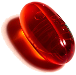
I'm doing a macro photoshoot at a diamond dealer of some of his rocks later this week, but I have no experience with that kind of subject. One of the main things I'm thinking about is what kind of background would work best - a whitebox or plain black background doesn't seem like it'd do much to bring out diamonds. Anyone have any suggestions?
|
|
#
?
May 1, 2010 18:26
|
|

|
Pompous Rhombus posted:I dunno, I'd try hitting it with auto-levels and adding some saturation and maybe a contrast tweak before I called it a day and converted to B&W. I mainly use B&W conversions when I originally shot it intending to to be a B&W composition, or for really high-ISO shots where I don't have a lot of sharpness to spare for aggressive noise reduction. Yeah, auto-levels makes it (the second picture) look better, but the overall color of the picture still looks, for lack of a better term, boring. I think if I could mute the background a bit and try to bring out the other colors that I could end up with something that I'd be satisfied with, but I guess right now I just don't really have the confidence in my abilities to make it work well. And trial and error hasn't really given me anything promising yet. I guess I'll just have to keep trying until I get better at it.
|
|
#
?
May 1, 2010 19:34
|
|
|
William T. Hornaday posted:You need to learn and practice post processing, I cant say that enough, it might be alot of work to get a nice colour image out of that picture but whats the alternative? Throw it away? Make a lovely auto black and white? That monkey picture isn't even that hard of a fix by the look of it, just looks a bit washed out. But the black and white is pretty bad anyway, it looks only a little bit better. Its just as hard to make a good black and white as it is a good colour photograph. William T. Hornaday posted:but I guess right now I just don't really have the confidence in my abilities to make it work well. And trial and error hasn't really given me anything promising yet. I guess I'll just have to keep trying until I get better at it. Go buy a processing book, or go the library, or look at the thousands upon thousands of articles and guides on the internet. Nobody knows this stuff right off the bat, you learn it like anything else.
|
|
#
?
May 1, 2010 21:46
|
|

|
So, I guess the answer to my original question is 'Yes, I am using it as a crutch' and I need to devote a lot more time and effort to post-processing, both learning it and doing it. All the advice has been much appreciated. Thanks.
|
|
#
?
May 2, 2010 00:28
|
|
|
William T. Hornaday posted:So, I guess the answer to my original question is 'Yes, I am using it as a crutch' and I need to devote a lot more time and effort to post-processing, both learning it and doing it. All the advice has been much appreciated. Thanks. I think the big question is, do you have Lightroom 2.0? If not, you need to have it. Both of those photos could probably be fixed in less than a minute in there.
|
|
#
?
May 3, 2010 17:05
|
|

|
Is it worth waiting for Lightroom 3 to be released? I'm a student but I graduate in July (my student ID card says course end 01 July 2010), and Adobe asks for a scan of the ID to be submitted within 6 days of ordering online. I'm on a Mac, so I could get Aperture 3 with student discount, but I've read that both Aperture and Lightroom are pretty much equal, and it's just a matter of preference. I'm worried about being tied into using Apple computers by using Aperture, whereas Lightroom is cross-platform. Also, I rank as a beginner wannabe amateur DSLR user, and I've asked before but the student discount makes me ask again, is it worth buying Lightroom and Photoshop together or should I just get Lightroom alone?
|
|
#
?
May 3, 2010 17:54
|
|
|
jet_dee posted:Is it worth waiting for Lightroom 3 to be released? I'm a student but I graduate in July (my student ID card says course end 01 July 2010), and Adobe asks for a scan of the ID to be submitted within 6 days of ordering online. Download the Lightroom 3 beta for free just to see if you like it.
|
|
#
?
May 3, 2010 18:00
|
|
|
William T. Hornaday posted:So, I guess the answer to my original question is 'Yes, I am using it as a crutch' and I need to devote a lot more time and effort to post-processing, both learning it and doing it. All the advice has been much appreciated. Thanks. You also need to know about color theory. For example the monkey shot, he's relatively desaturated, and that makes the green spring forward and flatten the shot, whereas when it's B&W you can focus more on the tones. You can get that in the color version by either knocking back saturation and/or brightness of the green, or bumping up the saturation and/or brightness of the monkey. Also your examples are way too flat in contrast in the color versions, so that alone is making your B&W ones pop more. If you got the contrast of the color to the same level, you'd see a lot less interesting-ness jump.
|
|
#
?
May 3, 2010 18:05
|
|

|
William T. Hornaday posted:I was ready to give up on this one when I couldn't make it work in color, but as a last ditch effort I played around with it in black and white and I'm fairly pleased with the result. I really love sloths so I could not just pass up working on him. I did this in light room in about 2min. It's not great but not washed out now and I liked it. I would say try playing around in light room, it's not hard at all after you learn what the stuff does and everything is laid out so simple.  Click here for the full 1226x815 image.
|
|
#
?
May 3, 2010 18:22
|
|

|
I guess I should have clarified when I posted the pictures, but the color versions are actually the originals; I just wanted to show what I was starting with for comparison. I can get them to look more or less like Obscurum's version and what Pompous Rhombus was describing, but even then I just like the way the black and white looks when comparing them. Maybe a lot of it is just straight up personal preference of mine, but I also like the way that black and white shows tones and texture versus what color does. And it's actually not a sloth, but a type of lemur.
|
|
#
?
May 3, 2010 19:06
|
|
|
Cute little guy had me fooled! I agree with you on the black an white too, it does have a nice feeling to it.
|
|
#
?
May 3, 2010 19:17
|
|
|
I feel bad, so here are pictures of an actual sloth. Here's her eating some leaves.  And here she is after eating a bunch of mud. 
|
|
#
?
May 3, 2010 20:02
|
|
|
William T. Hornaday posted:I feel bad, so here are pictures of an actual sloth. Aww!  That level of cute could kill. I wish I could get that up close to one.. The only ones I have ever seen in person were at the zoo and even then they are just so far away. That level of cute could kill. I wish I could get that up close to one.. The only ones I have ever seen in person were at the zoo and even then they are just so far away.
|
|
#
?
May 3, 2010 20:15
|
|
|
Pantsmaster Bill posted:Does anybody have experience with taking product photos of clothes? I'm about to receive a stack of t-shirts to shoot, and I'm not sure how to go about shooting them/making them look good. Some basic info here : http://ir.webphotoschool.com/Shooting_Apparel_In_The_Studio/index.html For reference, this was shot on a green screen (well..green felt actualy) with a silver umbrella top left and a tiny reflector bottom right. It came out way more wrinkly than I wanted it to, but in case that's what you're going for.. 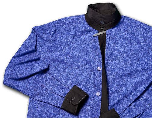
|
|
#
?
May 3, 2010 21:54
|
|
|
I shot a charity event today and now that I'm in post, I'm very glad everyone was wearing a nice white nametag. It's really helping sort out my white balance issues 
|
|
#
?
May 4, 2010 12:32
|
|

|
psylent posted:I shot a charity event today and now that I'm in post, I'm very glad everyone was wearing a nice white nametag. It's really helping sort out my white balance issues 
|
|
#
?
May 4, 2010 12:40
|
|


|
psylent posted:I shot a charity event today and now that I'm in post, I'm very glad everyone was wearing a nice white nametag. It's really helping sort out my white balance issues And effortless cutlines! You bastard!
|
|
#
?
May 4, 2010 15:04
|
|
|
Okay, that's what I'll do at my next concert shoot. Pin gray cards on everyone in the band.
|
|
#
?
May 4, 2010 15:27
|
|
|
|
| # ? May 22, 2024 16:54 |
|
|
Anything color-neutral will do. Anyone with a white instrument/shirt/sock will get you a ballpark.
|
|
#
?
May 4, 2010 15:34
|
|
