|
Xylorjax posted:Christ, is there one other than the retarded old black-and-yellow one that you DO like? no idea what you're talking about but it's not hard to make a decent badge, 90% of international teams have done it. we should just use the shield we wore in 1950.
|
 #
?
Apr 29, 2010 22:43
#
?
Apr 29, 2010 22:43
|
|


|

|
| # ? May 17, 2024 02:51 |
|
|
wicka posted:no idea what you're talking about but it's not hard to make a decent badge, 90% of international teams have done it. we should just use the shield we wore in 1950. it'll have to be a modernized version because you want the badge to be copyrightable, but yeah, that's the best possible badge.
|
|
#
?
Apr 29, 2010 22:46
|
|
|
Yeah, the 90's were a terrible time to design just about anything.
|
|
#
?
Apr 29, 2010 23:17
|
|

|
counterpoint.GutBomb posted:
|
|
#
?
Apr 30, 2010 00:43
|
|


|
HinderedUseless posted:counterpoint. Surely that's just proving the point.
|
|
#
?
Apr 30, 2010 00:46
|
|


|
Ok ok, perhaps: Minus the Project 2010 and the segment snake Gadsden Snake (even though the snake would be awesome).
|
|
#
?
Apr 30, 2010 05:26
|
|
|
Fag Boy Jim posted:it'll have to be a modernized version because you want the badge to be copyrightable, but yeah, that's the best possible badge.  1950 logo c0ldfuse fucked around with this message at 05:29 on Apr 30, 2010 |
|
#
?
Apr 30, 2010 05:27
|
|

|
Nothus posted:It could be worse. Look up Ireland and Slovenia.
|
|
#
?
Apr 30, 2010 11:41
|
|


|
irlZaphod posted:What's wrong with our crest? It's way loving better than the current US one, that's for sure. I think he was referring to the fact that Ireland and Slovenia have very similat crests that were released around the same time and that both are poo poo.
|
|
#
?
Apr 30, 2010 12:45
|
|

|
Kiros posted:this is the reason why the rest of the football world is so amused by the USA
|
|
#
?
Apr 30, 2010 12:48
|
|


|
euroboy posted:this is the reason why the rest of the football world is so amused by the USA Absolutely, it's loving rubbish.
|
|
#
?
Apr 30, 2010 12:52
|
|
|
Mickolution posted:Absolutely, it's loving rubbish. 
|
|
#
?
Apr 30, 2010 13:11
|
|
|
euroboy posted:this is the reason why the rest of the football world is so amused by the USA what reason? which one is the reason?
|
|
#
?
Apr 30, 2010 13:20
|
|


|
They could call them 'The Snakes' and have the fans hiss at opponents.
|
|
#
?
Apr 30, 2010 13:50
|
|
|
Of all the animals that the US could have on their badge, the Eagle is probably the best suited.
|
|
#
?
Apr 30, 2010 14:05
|
|


|
irlZaphod posted:What's wrong with our crest? It's way loving better than the current US one, that's for sure. There's too much white space, it has a silly font that already looks dated, and the bizarre stylized football is silly. There's nothing about that banal shield, other than the fact that it's 10 shades of green, that makes it distinctly Irish. The former crest you guys used in the 1990's was awesome. But this one looks like something a hung-over 1st year design student would poo poo out on a Sunday night with a Monday morning deadline.
|
|
#
?
Apr 30, 2010 14:19
|
|

|
Directorman posted:what reason? which one is the reason? The idea of the world's biggest athletic superpower playing at being some kind of oppressed, anti-colonial rebellion is absurd. Not to mention the fact that the rattlesnake symbol is already used by racists and hard-right nutjobs. Man, I'm grouchy this morning.
|
|
#
?
Apr 30, 2010 14:26
|
|
|
Nothus posted:The idea of the world's biggest athletic superpower playing at being some kind of oppressed, anti-colonial rebellion is absurd. Not to mention the fact that the rattlesnake symbol is already used by racists and hard-right nutjobs. Friend, we're not a footballing superpower by any means. So, in pretty much every competition outside of CONCACAF, we are huge underdogs. Also, I agree that it totally sucks the Teabaggers co-opted that flag--I have to think of another Nats-related tattoo, now 
|
|
#
?
Apr 30, 2010 14:28
|
|
|
Nothus posted:There's too much white space, it has a silly font that already looks dated, and the bizarre stylized football is silly. There's nothing about that banal shield, other than the fact that it's 10 shades of green, that makes it distinctly Irish.
|
|
#
?
Apr 30, 2010 14:30
|
|
|
Directorman posted:Friend, we're not a footballing superpower by any means. So, in pretty much every competition outside of CONCACAF, we are huge underdogs. The Eagle from the Vets Association badge, the shield from the Presidential seal, a football, and the letters USA done
|
|
#
?
Apr 30, 2010 14:32
|
|
|
Directorman posted:Friend, we're not a footballing superpower by any means. So, in pretty much every competition outside of CONCACAF, we are huge underdogs. We've hosted one World Cup and qualified for each one since 1990, we routinely win our Confederation tournament, and we frequently beat top-tier teams. We're a second-tier power and perform about as expected given the sport's relative place in the hierarchy of American athletics. The 1990 team were underdogs. Now we're merely average. This isn't to say the joy is gone. I'm pretty proud of what we've accomplished in 20 years. It's just that constantly claiming to be some kind of Miracle On Ice-style upstart gets to be a little tired as the years go by. Nothus fucked around with this message at 14:42 on Apr 30, 2010 |
|
#
?
Apr 30, 2010 14:39
|
|
|
luvd posted:If Illustrators designed football shirts So I went to this last night  and I figure y'all might want to see a bunch of low-quality, poorly composed phone camera shots of what they had.  The invite said you could customize a shirt with a special Boston-only graphic (shown here), but the shirts were $45 and not exactly as custom as I had in mind (you could pick what colors the text was printed in, that's about it). I was expecting a little more hands-on design input, with like markers and stuff, but that's probably just me.  Folding the shirts as they came off the printer.  Team polo shirts that greeted you as you entered the gallery. Told you these were lousy photos.  Each country featured had a wall, or half a wall, devoted to its design. This is South Africa.  Part of the Brazil wall. I figure the knockoffs of these should be in my neighborhood stores in a few hours.  Terrible, terrible photo of France  England's lion  Netherlands wall. They had custom foosball tables set up, pairing each of the countries in the gallery against one another, i.e. the figures on the tables were the individual country logos. Brazil vs England, Netherlands vs France, USA vs South Africa. Wish I'd gotten a photo of the tables but they were always in use.  Close-up of USA hoodie that someone needs to buy me and we were trying to figure out how to shoplift  Info on the USA artist, evidently done without a proofreader  USA wall artwork. Weird how something that's otherwise totally GIT 'ER DONE works in this setup.  The USA crest as interpreted by Mr. Cartoon. I like it.  Wall photo of the boys in white in a huddle. Goddamn, a little less than a month from now... I didn't get a t-shirt, but I did get a poster, which I'll take somewhat decent photos of later. The place was packed the whole time I was there, open bar, tasty snacks. Did not awkwardly network for design work as much as I expected. Neat non-soccer soccer event.
|
|
#
?
Apr 30, 2010 14:43
|
|

|
Directorman posted:what reason? which one is the reason? the colored stripes are on the outside, thats the reason
|
|
#
?
Apr 30, 2010 14:54
|
|
|
Nothus posted:we frequently beat top-tier teams. Aside from beating Spain in a friendly last year, I'm struggling here.
|
|
#
?
Apr 30, 2010 15:49
|
|
|
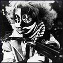
Everything Mr. Cartoon does is terrible.
|
|
#
?
Apr 30, 2010 16:44
|
|
|
Hoover Dam posted:So I went to this last night Really appreciated this post, thank you.
|
|
#
?
Apr 30, 2010 17:27
|
|

|
Thanks for the great post. You can find some of the gear for sale on the Nike site. http://www.nike.com/nikeos/p/sportswear/en_US/true_colors
|
|
#
?
Apr 30, 2010 21:10
|
|
|
AS says that Adidas has leaked the two model home Real Madrid kits... That one on the right is disgusting. The left is not so bad and looks like a return to something more traditional. Still no word on the Milan kits either.
|
|
#
?
Apr 30, 2010 23:48
|
|
|
Mickolution posted:I think he was referring to the fact that Ireland and Slovenia have very similat crests that were released around the same time and that both are poo poo. And Israel. Should never have changed the old crest.
|
|
#
?
May 1, 2010 16:01
|
|
|
Craiglen posted:And Israel. Never saw the Israeli one, ridiculous.
|
|
#
?
May 1, 2010 16:03
|
|
|
Stim posted:AS says that Adidas has leaked the two model home Real Madrid kits... Jesus, the one on the right is hideous. Might be my screen, but the one on the left looks more blueish than purple which might be reaching back to the original Real Madrid kit: 
manchego fucked around with this message at 16:09 on May 1, 2010 |
|
#
?
May 1, 2010 16:06
|
|

|
 another more recent mock up, looks like we're gonna have a very simple traditional kit
|
|
#
?
May 1, 2010 17:33
|
|
|
luvd posted:
Will retire my 2007 home shirt if this is legit, because that kit is class.
|
|
#
?
May 1, 2010 17:47
|
|

|
No chance, there'll be a stupid yellow/gold/green/blue stripe somewhere to ruin it
|
|
#
?
May 1, 2010 18:17
|
|

|
Floppy sleeves are terrible. Other than that, would be a nice kit for them.
|
|
#
?
May 1, 2010 18:44
|
|
|
manchego posted:Floppy sleeves are terrible. Other than that, would be a nice kit for them. all the mock-ups are based on the same terrible picture of the 06-07 shirt
|
|
#
?
May 1, 2010 19:36
|
|
|
A bit old , but I think this Boca jrs. shirt would sell well in Sweden.
|
|
#
?
May 1, 2010 20:33
|
|
|
hecko posted:A bit old , but I think this Boca jrs. shirt would sell well in Sweden. The team colors were picked because a boat flying the Swedish flag came into the harbor and the guy that owned the team said he would pick the colors of the next boat to come into the harbor or something like that.
|
|
#
?
May 1, 2010 22:17
|
|


|
That's the story but it wasn't the owner (argentinian clubs don't have owners). The group of people that founded the club decided that. http://en.wikipedia.org/wiki/Boca_Juniors#Team_colors hello i am phone fucked around with this message at 01:42 on May 2, 2010 |
|
#
?
May 1, 2010 22:33
|
|
|

|
| # ? May 17, 2024 02:51 |
|
|
New Spurs is mint: http://www.spursornothing.co.uk/viewtopic.php?f=6&t=8832 
|
|
#
?
May 2, 2010 00:49
|
|