


|
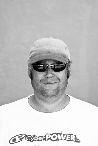
torgeaux posted:Is the haloing around him and what looks like intense over-sharpening part of the concept?
|
 #
?
May 3, 2010 02:42
#
?
May 3, 2010 02:42
|
|


|

|
| # ? May 17, 2024 18:30 |
|
|
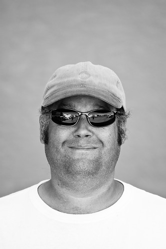
torgeaux posted:I gotta say, that's a real awkward crop. He looks like he has arm stumps.
|
|
#
?
May 3, 2010 03:44
|
|

|
McMadCow posted:I gotta say, that's a real awkward crop. He looks like he has arm stumps. It doesn't help that his shirt looks to be several sizes too big, enveloping most of his arms.
|
|
#
?
May 3, 2010 07:33
|
|
|
dik-dik posted:Well I've finally got some free time from work, so I can practice taking portraits! Sadly, however, there's no one around other than me, and occasionally my little brother, to practice on. Here's what I've got so far: ")
|
|
#
?
May 3, 2010 08:58
|
|


|
Reichstag posted:Is the haloing around him and what looks like intense over-sharpening part of the concept? No and yes...in fact, the haloing is part of the attempt to really separate him from the background, done without much subtlety. I'm going to re-examine it, as I think it may be better as b&w with less aggressive post. The intent was to really emphasize the harsh look he has...and intense, obvious sharpening was for that purpose. The shirt hanging loose on him is also good, since the sort of gaunt, even a bit haggard look is why I like this shot. Nothing I can do about the arms being severed, though. edit: In fact, I need to re-examine the crop. I don't want to lose the arms at the bottom, because how skinny those arms are in the shirt is important...but I need to figure a way to draw the eye to that as well. edit2: Not sure I like this better, despite how heavy handed the original post was. 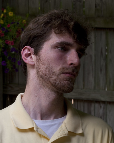
torgeaux fucked around with this message at 02:14 on May 4, 2010 |
|
#
?
May 3, 2010 15:01
|
|

|
These may be boring, but I'm still trying.  
|
|
#
?
May 4, 2010 23:54
|
|

|
@torgeaux: I have looked at this on two different screens now and it still seems really underexposed. All I notice is a bright yellow shirt and a beard- the rest is darkness. In my opinion you should at least use a reflector to cover the right side of his face if not his entire face. That would also give you the desired separation instead of using a halo. Your revised version looks a lot better than the original, but does not have the sharpness. Maybe limit unsharpen to just his face ? @AIIAZNSK8ER: That close crop looks nice except for the hideous splotchy background. There's also probably some room for increased contrast.
|
|
#
?
May 5, 2010 00:23
|
|
|
Cross_ posted:@torgeaux: I have looked at this on two different screens now and it still seems really underexposed. All I notice is a bright yellow shirt and a beard- the rest is darkness. In my opinion you should at least use a reflector to cover the right side of his face if not his entire face. That would also give you the desired separation instead of using a halo. Your revised version looks a lot better than the original, but does not have the sharpness. Maybe limit unsharpen to just his face ? Thanks. As always, good tips in here.
|
|
#
?
May 5, 2010 02:19
|
|
|

|
|
#
?
May 6, 2010 02:46
|
|
|
I really can't tell if you're being serious or not any more.
|
|
#
?
May 6, 2010 03:27
|
|

|
Humm. Words are escaping me here. That is. Nope, I got nothing.
|
|
#
?
May 6, 2010 03:30
|
|

|
HDR of a model wearing a bruce lee mask? edit: Love the one pink nipple AIIAZNSK8ER fucked around with this message at 04:07 on May 6, 2010 |
|
#
?
May 6, 2010 03:40
|
|
|
psylent posted:I really can't tell if you're being serious or not any more. I don't think he's ever been serious.
|
|
#
?
May 6, 2010 04:00
|
|
|
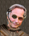
Reichstag posted:Powerful. To others, this is a questionable portrait, but I think that the Reichstag name here really carries it to the next level. The low resolution and drab overtones really emphasize the pain that he must feel.
|
|
#
?
May 6, 2010 04:03
|
|
|
Reichstag posted:Holy poo poo it's Golgo 13 
|
|
#
?
May 6, 2010 14:48
|
|


|
Reichstag posted:So Holga and Lomo making digital cameras now?
|
|
#
?
May 6, 2010 17:44
|
|

|
squidflakes posted:So Holga and Lomo making digital cameras now? Nikon D100 and a Nikkor 50 1.8 AF-D.
|
|
#
?
May 6, 2010 18:25
|
|
|
Reichstag posted:Nikon D100 and a Nikkor 50 1.8 AF-D. You used a digital camera? Get away from me... you disgust me. 
|
|
#
?
May 6, 2010 19:28
|
|

|
psylent posted:I really can't tell if you're being serious or not any more. I never was able to tell.
|
|
#
?
May 6, 2010 20:37
|
|
|
Reichstag posted:Is the artifacting around him and what looks like intense over-pixelation part of the concept? I like it, by the way.
|
|
#
?
May 7, 2010 18:03
|
|
|
|
|
#
?
May 8, 2010 04:28
|
|

|
Whitezombi posted:Is that shot in a parking lot? I would have sworn that was done in a studio. This was just a snap, but I really like it after putting a little work into it. 
|
|
#
?
May 8, 2010 05:23
|
|
|
scottch posted:Is that shot in a parking lot? I would have sworn that was done in a studio. Yes it was.
|
|
#
?
May 8, 2010 05:38
|
|
|
Whitezombi posted:I like #2 a lot more, I'd cut down on the empty space at the top.
|
|
#
?
May 8, 2010 05:40
|
|
|
A local full-timer photographer got some of us wannabes together, got a model, and let us go hog wild. I haven't really worked on anything yet, but this one caught my eye:  On camera 550ex, with a Lumiquest Softbox III Anti_Social fucked around with this message at 16:05 on May 8, 2010 |
|
#
?
May 8, 2010 16:01
|
|

|
Hey guys, I feel like a douche posting a photo for review without adding any critique of my own, but I'm only just getting started in portraiture and so I don't really know what I'm looking for yet. Hope that's okay!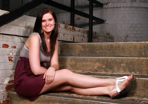 I'm looking for feedback on lighting, posing, and what you think of the crop... so, everything.
|
|
#
?
May 10, 2010 04:44
|
|

|
BobTheCow posted:Hey guys, I feel like a douche posting a photo for review without adding any critique of my own, but I'm only just getting started in portraiture and so I don't really know what I'm looking for yet. Hope that's okay! The smile looks kinda wonky, but maybe that's just how the model looks? Also it looks like she's gripping her leg unnecessarily tight. I like the location and the lighting looks nice. Why did you choose this location? Does it have any meaning to the person photographed? Just some food for thought.
|
|
#
?
May 10, 2010 06:10
|
|
|
BobTheCow posted:Hey guys, I feel like a douche posting a photo for review without adding any critique of my own, but I'm only just getting started in portraiture and so I don't really know what I'm looking for yet. Hope that's okay! The curve of her back isn't terribly flattering. She's kind of hunched over, be sure to direct models to keep their shoulders back and backs straight. The skirt/culottes she's wearing looks pretty baggy and gives the impression she has a vast rear end. I like the location and how she's being framed by the stair railing. Got any more shots from the set?
|
|
#
?
May 10, 2010 11:47
|
|

|
digitalhifi posted:The smile looks kinda wonky, but maybe that's just how the model looks? Also it looks like she's gripping her leg unnecessarily tight. I like the location and the lighting looks nice. Why did you choose this location? Does it have any meaning to the person photographed? Just some food for thought. Yeah, unfortunately she's got crazy teeth. And the hand was something I noticed after reviewing photos at home, not at the time of the shoot, and I was hoping I was just being overly nitpicky with that observation. Good to know it's as obvious as I thought. This location was actually sort of an accident. We had been shooting in two other spots in the area, and just sort of stumbled across these stairs on the way out and decided to play around. This ended up being her favorite location/pose from the day. No real meaning, but I know what you mean, something to keep in mind. Paragon8 posted:The curve of her back isn't terribly flattering. She's kind of hunched over, be sure to direct models to keep their shoulders back and backs straight. Good call on the back/shoulders, thanks, something I hadn't even considered. Same with the clothes. I have more, but I liked this one because of the relatively clean background behind her head. Most of the rest either have a railing shooting through her head or that ugly green drainpipe growing out of it. A couple uncropped/unedited originals from the same location/pose: 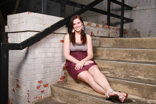 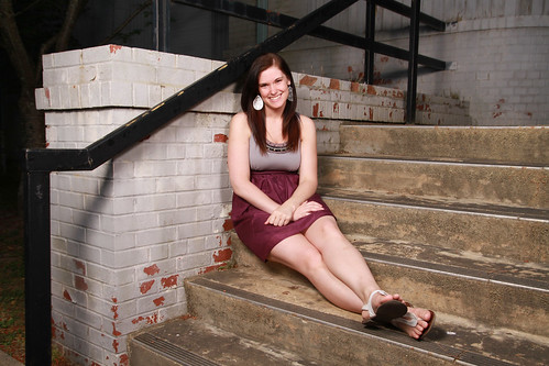 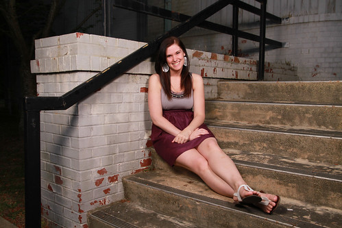 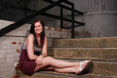
|
|
#
?
May 10, 2010 14:11
|
|
|
BobTheCow posted:I like the un-cropped version a lot more actually.
|
|
#
?
May 10, 2010 14:14
|
|
|
Paragon8 posted:I like the un-cropped version a lot more actually. Well I don't like that one because of the drainpipe head, but here's the one I do like uncropped: 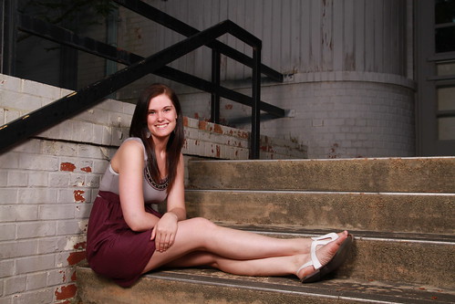 I cropped in from the right to clean up the background by getting rid of the door, and down from the top to emphasize the framing of the rails over her head. What sort of crop would you prefer?
|
|
#
?
May 10, 2010 14:24
|
|
|
BobTheCow posted:Well I don't like that one because of the drainpipe head, but here's the one I do like uncropped: Haha, it's ultimately about what you prefer. I just think it's good have a bit of space when you're working in a visually interesting environment. The lines all work really well. You've got the stairs giving "movement" towards the subject as well as the framing from the banister. I didn't really notice the drainpipe at all, but the more recent shot you posted gets rid of the problem. I think the quoted picture is the strongest crop. Giving stairs more horizontal room is nicer to me.
|
|
#
?
May 10, 2010 14:49
|
|
|
This was my first time doing an album cover. There was a lot of processing involved; I'd show the before pics but it may be better for them just to never be seen, working with "regular" people is something I've gotten out of the habit of. At least it pays better. 
|
|
#
?
May 12, 2010 02:59
|
|


|
BobTheCow posted:stairs girl It looks like she's ducking to avoid hitting her head on the railing. Her skin color looks a bit magenta to me but you can tweak that later. Those straight-on shots aren't really flattering. Also a little bright. She does have a nice smile though. If you bring her back to the stairs, have her pose parallel to the wall instead of perpendicular. Maybe not right up against it. If you can get her in focus with the railing and background blurred, it might look cool, and if her posture is at the same angle as the railing in the pic it might have a nice effect too. Play around with the angles, shoot her behind the railing from below, switch places, etc.
|
|
#
?
May 12, 2010 07:25
|
|

|

|
|
#
?
May 12, 2010 07:40
|
|
|
Oh Reichstag 
|
|
#
?
May 12, 2010 11:05
|
|
|
Honestly, I can kind of dig it. It's an interesting statement on how far you can push digital photography - basically to the point where it looks like pixel art. I've frequently hit lines in my processing where I question if what I'm still working on is a photograph or just a digital image. Is that at all what you're going for Reichstag?
|
|
#
?
May 12, 2010 13:41
|
|
|
I think he's going for "how long until people call me out on this poo poo".
|
|
#
?
May 12, 2010 15:30
|
|
|
Taz posted:I think he's going for "how long until people call me out on this poo poo". Seriously, silence works better.
|
|
#
?
May 12, 2010 16:22
|
|
|

|
| # ? May 17, 2024 18:30 |
|
|
holy crap, is that Hokuto no Ken?
|
|
#
?
May 12, 2010 16:45
|
|