


|
It's probably an art school final project. Some photo teachers love this kind of poo poo (not knocking it, don't fool yourselves if you think they always let you do whatever you want and like... drat you MY TEACHER
|
 #
?
May 12, 2010 17:09
#
?
May 12, 2010 17:09
|
|


|

|
| # ? May 17, 2024 16:19 |
|
|
Paragon8 posted:Honestly, I can kind of dig it. In these... Not quite all. Right now I'm experimenting with them to see how far I can take that aspect without it taking over the entire concept, so obviously too far right now. The series' main concept is the formation of new identities for people through avatars in popular culture, and how social (digital) media eases that by obfuscating things and encouraging selective editing of our own lives. You can't tell in the second picture, but it's a t-shirt with stallone as rambo, in the same cutout fashion as the bruce lee one.
|
|
#
?
May 12, 2010 20:55
|
|

|
Reichstag posted:In these... Not quite all. Right now I'm experimenting with them to see how far I can take that aspect without it taking over the entire concept, so obviously too far right now. The series' main concept is the formation of new identities for people through avatars in popular culture, and how social (digital) media eases that by obfuscating things and encouraging selective editing of our own lives. You can't tell in the second picture, but it's a t-shirt with stallone as rambo, in the same cutout fashion as the bruce lee one. Well, if you're talking about social media avatars, the arctifacting and pixelation are par for the course. The bruce lee one was pretty recognizable, rambo not so much, sadly. Try doing the rambo one again! Maybe Che? A dude wearing a Che shirt on his head could be a pretty strong statement.
|
|
#
?
May 12, 2010 21:10
|
|

|
Also, art school: the last place to take some real risks until you are actually successful 
|
|
#
?
May 13, 2010 04:23
|
|
|
I'd like to go to art school maybe sometime. Also, by avatars I mean the personas people construct based on archetypes in popular culture.
|
|
#
?
May 13, 2010 05:13
|
|
|
The pixelization makes it look like a poorly encoded video with a dropped keyframe, "blending" two separate frames together. I only realized it was a shirt in the second shot.
|
|
#
?
May 13, 2010 13:52
|
|
|
|
|
#
?
May 15, 2010 06:27
|
|

|
Gorgeous lighting there, is that from a window?
|
|
#
?
May 15, 2010 16:15
|
|

|
psylent posted:Gorgeous lighting there, is that from a window? Thanks. Glass door. What the hell - a few more. 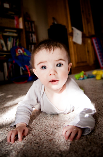 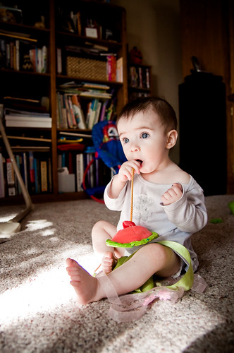  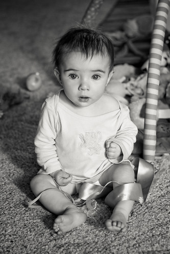
Whitezombi fucked around with this message at 04:52 on May 16, 2010 |
|
#
?
May 15, 2010 17:14
|
|
|
I've got a few more from the other week:   I'm pretty pleased for my first portrait shoot.
|
|
#
?
May 17, 2010 04:52
|
|

|
Anti_Social posted:I'm pretty pleased for my first portrait shoot. Very solid start! Here are the keepers from my shoot on Friday. First time working with an "Edgier" model or whatever you'd call her. I really liked 2 of the shots and was happy with the others. 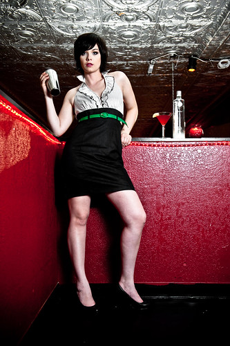 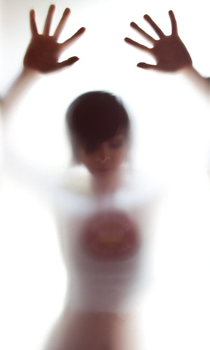 (She is flipping a mixer in case you didn't notice) 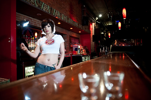 (This one was my favorite) 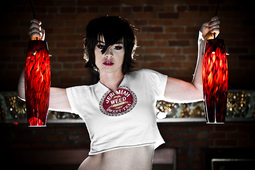
|
|
#
?
May 17, 2010 05:17
|
|

|
RangerScum posted:Very solid start! I like these, but in three of them she's doing basically the same pose. The second one is my favorite, partly for that reason.
|
|
#
?
May 17, 2010 06:01
|
|
|
orange lime posted:I like these, but in three of them she's doing basically the same pose. The second one is my favorite, partly for that reason. That is a pretty funny point. 1/3 and 2/4 are pretty similar poses. Definitely something I'll keep in mind in the future though at least I still got a decent shot for my port from the shoot.
|
|
#
?
May 17, 2010 13:38
|
|
|
Well since I killed this thread I'll post some more content and kill it twice. I wanted to do a Lady Gaga inspired shoot where things were kinda eccentric/ridiculous so I converted my living room from boring into kinda weird, tossed a red gel out on my front porch pointed at my blinds and lit the rest of the room with a B800 placed at camera left with a reflector that I extended by about 5-6 inches with the cardboard from a case of bud light. 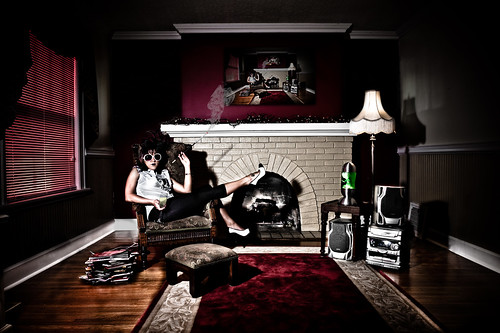 First shot is the money shot I wanted, second was just loving around because I felt bad having her do the makeup and only having a single shot where her face isn't even the focus. 
|
|
#
?
May 25, 2010 02:41
|
|
|
What makes a good portrait?
|
|
#
?
May 25, 2010 02:47
|
|
|
RangerScum posted:Well since I killed this thread I'll post some more content and kill it twice. I don't think all the pure black is working, it's not really adding much and makes it overly dark. You should try having an on axis fill light really low to fill them just a little. Ring lights are popular for this, but you could also use just a white umbrella over your head, and just keep it super lower power, just enough to see into your dark shadows. It will look much more controlled, and less contrasty in a good way.
|
|
#
?
May 25, 2010 11:11
|
|

|
Started a new series a month ago and finally got my photo-pc setup and procesed it. http://mr-chompers.blogspot.com/2010/05/redheadsseries.html 
|
|
#
?
May 25, 2010 13:14
|
|
|
poopinmymouth posted:I don't think all the pure black is working, it's not really adding much and makes it overly dark. You should try having an on axis fill light really low to fill them just a little. Ring lights are popular for this, but you could also use just a white umbrella over your head, and just keep it super lower power, just enough to see into your dark shadows. It will look much more controlled, and less contrasty in a good way. Yeah I have been wanting to get a third flash for a while and will probably do so this summer. You can do a lot with two but I'm starting to find a lot of situations where I would like a third. This room was pretty hard to work in and I had to do some decent editing to get it to look the way I wanted it to. There are a few light spots on the wall that will suddenly becomes very obvious for example. I also noticed I forgot to fully edit out one of the cords on the floor, oh well I'll do that later. Non-edited pic of the room:  After my initial edit it was just easiest me to make those areas black and have a very slight gradient on the left wall where my flash was focused.
|
|
#
?
May 25, 2010 13:23
|
|
|
I have a shoot this weekend in a studio with a proper lighting setup and professional models. I'm really excited, as this is the first time I've done anything like this. I'm pretty much a beginner, so I was wondering what I kind of glass I should use for the shoot. I want to take a range of full body and head/shoulder shots. I'm guessing I should probably stick to my 50mm prime so I get a really sharp picture, but I'm worried incase the lack of zoom will slow the shoot down whilst I have to move the tripod around and such. Any recommendations?
|
|
#
?
May 25, 2010 13:43
|
|

|
Well, what do you have, and what can you get?
|
|
#
?
May 25, 2010 14:31
|
|

|
evil_bunnY posted:Well, what do you have, and what can you get? Doh, should have mentioned that. 18-55mm IS Lens which came with the 550D, apparently it's not terrible. 50mm f/1.4 Hopefully a 70-200mm f/4.0 by this weekend. I can hire other glass though, if none of those will do.
|
|
#
?
May 25, 2010 14:39
|
|
|
You can stop way down in studio light, which means that all of your lenses will probably perform just fine, including the kit.
|
|
#
?
May 25, 2010 14:49
|
|

|
RangerScum posted:Yeah I have been wanting to get a third flash for a while and will probably do so this summer. You can do a lot with two but I'm starting to find a lot of situations where I would like a third. You don't even need a 3rd light. Just throw your camera on a tripod and either drag the shutter till the ambient lights up the dark areas enough, OR just take a shot at the very end (being careful not to move your tripod at all) with your flash bounced and get a well lit room shot like the one you posted, that is pixel perfect the same as your money shot. Then it makes it really easy to put that as a layer above, and blend to taste so your shadows have a smidge of detail.
|
|
#
?
May 25, 2010 14:52
|
|
|
poopinmymouth posted:You don't even need a 3rd light. Just throw your camera on a tripod and either drag the shutter till the ambient lights up the dark areas enough, OR just take a shot at the very end (being careful not to move your tripod at all) with your flash bounced and get a well lit room shot like the one you posted, that is pixel perfect the same as your money shot. Then it makes it really easy to put that as a layer above, and blend to taste so your shadows have a smidge of detail. That sounds like a good idea, I will try it out next time. Thanks for the advice! Edit: in this situation I would have most likely had to bounce it off the ceiling because leaving the shutter open very long causes some weird lighting coming in from those windows.
|
|
#
?
May 25, 2010 15:09
|
|
|
Hanpan posted:18-55mm IS Lens which came with the 550D, apparently it's not terrible.
|
|
#
?
May 25, 2010 21:28
|
|
|
evil_bunnY posted:TsarAleksi already mentioned that, but with studio light you can tighten your apertures up to a point where even kit lenses look really good. You seem to have the whole range covered, so you'll be fine. Keep in mind though, there's a point of diminishing returns, and most lenses start to lose quality again when stopped down too far as a result of diffraction around the aperture blades.
|
|
#
?
May 25, 2010 21:51
|
|

|
Yeah. F/8 tends to be cool though.
|
|
#
?
May 25, 2010 22:53
|
|
|
McMadCow posted:Keep in mind though, there's a point of diminishing returns, and most lenses start to lose quality again when stopped down too far as a result of diffraction around the aperture blades. Most people probably know it already, but here's an online calculator for finding your camera's diffraction limit : http://www.cambridgeincolour.com/tutorials/diffraction-photography.htm
|
|
#
?
May 26, 2010 20:20
|
|
|
I've embarked on a nut shriveling project to go up to random people in my hometown in Maine and take their picture. I absolutely loath doing it, but I need a project while I'm back at my parent's house and I'm hoping that I'll come out of it with some interesting pictures of the people of Maine, as well as a better understanding of how to use my new 50mm f1.4G lens. I figured this was tangentially related to portraiture and wondering whether you had any advice for on the fly portraits.
|
|
#
?
May 27, 2010 21:41
|
|
|
FakeHipster posted:I figured this was tangentially related to portraiture and wondering whether you had any advice for on the fly portraits. Don't look skeezy, be friendly, be open and honest, and have fun! ")
|
|
#
?
May 27, 2010 22:30
|
|

|
Is there such a thing as candid portraits? Tried doing some with my manual 1.2 wide open at an artist's bar meeting using the bar's own light sources and it was hard. The lens natural softness and high ISOs didn't help either:  
|
|
#
?
May 28, 2010 06:37
|
|
|
nerdz posted:Is there such a thing as candid portraits? Tried doing some with my manual 1.2 wide open at an artist's bar meeting using the bar's own light sources and it was hard. The lens natural softness and high ISOs didn't help either: Sure. Candid portraits at wedding receptions, for example. Use a 70-200, f/2.8, wide open for isolation, you can get some nice ones. It's different from street where you're using a normal/wide lens for stylistic reasons, as you don't want to influence the subject with the knowledge of the photography.
|
|
#
?
May 28, 2010 14:52
|
|

|
nerdz posted:Is there such a thing as candid portraits? You've got to be quick and run with fairly generic settings so you can bring up the camera, boom, photo, then bring the camera back down. If you prefocus, you can use live view for even less noise and catch people unaware.
|
|
#
?
May 28, 2010 19:46
|
|

|
So I've been reading this thread the last couple of days and it's inspired me to do some portraits. Actual portraits instead of just "Really good Snap shots" I want to do put some thought into them and make some real nice shots. Anyway, I ghetto rigged a studio using a flood-light and a bed-sheet, I've got an Alienbee on order and nicer flash coming too. I think the light turned out okay, but it looks like the focus wasn't great (especially off in the hair) and I'm not 100% on the post. I'm not too terribly thrilled on her expressions either.      I'd appreciate any critiques, also advice on getting good-sharp focus through the whole shot, it seems like the lens I was using misses on the hair a lot. (28-135mm 3.5-5.6 USM (The 7D kit lens). Lastly, What's the best way to use a reflector? I see a lot of talk on it, but no real advice on using one. AtomicManiac fucked around with this message at 20:43 on May 30, 2010 |
|
#
?
May 30, 2010 20:39
|
|

|
Just a few tips: I wouldn't use a bedsheet that's wrinkled unless there's a concept behind it. 9 times out of 10 it will show up as sloppy and amateurish. Use a roll of paper, or even a wall over something that takes the focus completely away from your subject. When I shoot portraits, I tend to think of it as a layout in a book or magazine. I think it really helps. "If I needed to add a caption or header, where would I have room, where would it look good?" Just a quick example (I tried to find a picture I took that has a lot of shadows, and has a similiar pose but is a little more dynamic)--  Play around with composition a bit more. As far as lighting, I'm a big fan of shadows, but I think they only work if it still makes the model look flattering and I think you've missed the mark here. Part of it is her expressions, she looks completely static and bored. You get a sense of awkwardness and I can almost hear you telling her "just one more test shot" coupled with unflattering lighting just makes her look bad. Also most of them are underexposed. A reflector might help here since you asked about them. A reflector bounces light, that's all it does, so if the light source is pointed at it, you can bounce some fill light onto those shadows and get some more detail. Her skin looks too oily (bright lights can do that) , so maybe give her some powder or something. somnambulist fucked around with this message at 22:07 on May 30, 2010 |
|
#
?
May 30, 2010 21:55
|
|


|
AtomicManiac posted:
While I'm glad you're interested in portraits, these are actually pretty bad. The wrinkled bedsheet (as mentioned) is not a good look. You could put more distance between the bedsheet and the subject for a darker background (would work well with her light features) - that would help with the wrinkles also. If you really wanted white background and only had the sheet you could blast it with light. The shadow of the girl on the sheet is also not good - it's very distracting. Again, separation and/or additional lighting will solve that. For reflectors, it's pretty simple, just point where you want light. The difficulty is in distance and angle. Play around with them a bit and you'll see how you can make do with fewer lights. I know this sounds discouraging but don't give up!
|
|
#
?
May 31, 2010 02:50
|
|
|
Thanks for the advice, I'm gonna keep that magazine tip in mind. I do have some questions though: 1)Do you mean "Hard Light" makes skin Oily? If I diffuse the light with an umbrella or softbox will it fix this, or is this just a "Lights make you look oily, wear make-up" issue? Pre-post her face looks 10x more oily, is there a way to fix this using soft light or is natural light the only light that doesn't suffer from this? 2)I just did a quick mock-up in photo-shop and the black does look quite a bit better. We choose white because she was wearing a black shirt, in situations like this, do you compose for the clothes, or compose for the facial features? Or a happy medium and do a dark gray? 3) Any critique on my post?
|
|
#
?
May 31, 2010 03:57
|
|
|
Reposted here from SAD. Friends of mine let me experiment on them today.  
|
|
#
?
May 31, 2010 04:18
|
|
|
Oh man, people who tuck in their chin like that, it just looks so terrible. I would suggest giving the first two photos some more shoulder room, the high cut-off is making their neck look squat. Otherwise, they look really uncomfortable, so try catching them off guard/making jokes etc to make them look more comfy. The lighting is nice, and the color scheme too, although there's big hot spot on his forehead in the 2nd photo.
|
|
#
?
May 31, 2010 05:22
|
|


|

|
| # ? May 17, 2024 16:19 |
|
|
nonanone posted:Oh man, people who tuck in their chin like that, it just looks so terrible. I would suggest giving the first two photos some more shoulder room, the high cut-off is making their neck look squat. Otherwise, they look really uncomfortable, so try catching them off guard/making jokes etc to make them look more comfy. The lighting is nice, and the color scheme too, although there's big hot spot on his forehead in the 2nd photo. Cool, thanks for the crit - I am pretty new to portraiture so this gives me something to think about next time. We actually had a lot of goofy photos but I didn't post them up.
|
|
#
?
May 31, 2010 05:28
|
|