

|
Ringo R posted:
|
 #
?
May 12, 2010 18:58
#
?
May 12, 2010 18:58
|
|


|

|
| # ? May 16, 2024 08:38 |
|
|
There's just about nothing you can do to save solids and gradients from jpeg compression, you can just make it not as bad. PNG is the way to go.
|
|
#
?
May 12, 2010 19:23
|
|


|
Silly question perhaps but do printers print png? I'm going to have this printed and don't want them to go "wtf png get out".
|
|
#
?
May 12, 2010 19:53
|
|

|
Ringo R posted:Silly question perhaps but do printers print png? I'm going to have this printed and don't want them to go "wtf png get out". You should give them tiff files. Yes - that is exactly what I say when people give me png.
|
|
#
?
May 12, 2010 19:56
|
|

|
Yeah, TIFF would be better for print. I was thinking you wanted this for web when I suggested PNG.
|
|
#
?
May 12, 2010 20:03
|
|
|
Ringo R posted:I'm having trouble getting a smooth gradient. It looks fine and smooth in Photoshop but once saved as jpeg it looks like poo poo.
|
|
#
?
May 12, 2010 20:12
|
|
|
GWBBQ posted:There's just about nothing you can do to save solids and gradients from jpeg compression, you can just make it not as bad. PNG is the way to go. You can do an inverted High Pass on the gradient/solid areas.
|
|
#
?
May 13, 2010 03:03
|
|

|
Thanks guys!
|
|
#
?
May 13, 2010 04:06
|
|
|
orange lime posted:Zoom in to 400% and use the Fixed that for you. Tweaking and refining an edge selection with paths is so much easier and more flexible than with lassos. I can't remember the last time I used a lasso for anything other than the very roughest work.
|
|
#
?
May 13, 2010 05:17
|
|

|
SirRobin posted:Fixed that for you. Tweaking and refining an edge selection with paths is so much easier and more flexible than with lassos. I can't remember the last time I used a lasso for anything other than the very roughest work. Eh, I think it depends on what you're used to. Once you get in the groove of add/remove/intersect selection, I find that the polygonal lasso works a lot better for pixel-level stuff. The pen is great if what you're selecting has a geometric curve, but when you have to start masking around things like leaves you're adding so many control points that you might as well be using the lasso in the first place. To each his own, though.
|
|
#
?
May 13, 2010 07:27
|
|

|
orange lime posted:Eh, I think it depends on what you're used to. Once you get in the groove of add/remove/intersect selection, I find that the polygonal lasso works a lot better for pixel-level stuff. The pen is great if what you're selecting has a geometric curve, but when you have to start masking around things like leaves you're adding so many control points that you might as well be using the lasso in the first place. To each his own, though.
|
|
#
?
May 13, 2010 14:59
|
|
|
Are there any good tutorials on masking and things related to it? I only have a very loose grip on the concepts of masking and what you can do with them. Ideally I want to learn how to mask well, and the various things I can do with masking.
|
|
#
?
May 13, 2010 15:21
|
|


|
There are different ways of creating a mask and they seem to be all over the place in Photoshop. Here's a page that covers 4 of the tools: http://www.lazymask.com/image-masking-tutorial.html I'd definitely add the Select/Color Range menu item to that list as well. Once you've got a mask play around with all the commands in the Select menu which act on the mask.
|
|
#
?
May 13, 2010 20:06
|
|
|
I'm after a little advice on just what the hell I should do with this photo. I took it a long while ago when I first got my DSLR and was quiet happy to have pulled off the shot, but now, looking back at it I'm kicking myself that I wasn't shooting in RAW  I have not idea what else I can do to it to really make it stand out. I'm also not too sure about the crop. I'd love some advice and some feedback! There's two.. slight variations.. I hope these aren't too massive.
|
|
#
?
May 14, 2010 03:52
|
|

|
Honestly I'd clone out the dark colored bird. The color scheme is much nicer with just the two orange ones.
|
|
#
?
May 14, 2010 04:14
|
|
|
rockcity posted:Honestly I'd clone out the dark colored bird. The color scheme is much nicer with just the two orange ones. Hmm, I kind of liked the black bird, in my mind it just gave it something different. But here's how it looks without the black, just a quick spot heal. I quiet like it actually, but I'll need to re-crop on one version of it as the two orange birds look odd stuck in the center. What do you think?
|
|
#
?
May 14, 2010 07:34
|
|
|
How the heck do I learn how to craft composite shots? I want to learn the photoshop side of some of Dave Hill's latest campaign shoots, and it's all just individual shots stitched together. Rather than just say lasso + lots of layers + lots of masks, I want to learrrrrnn. I've been specifically looking at his MGM Wet Republic Ad shoot, in his Behind the Scenes shoot here http://www.davehillphoto.com/bts/ Please note, this isn't a "How do I Dave Hill?" post, I'm just using his as an example of a well done composite ") Here's a bunch more I've admired over the years: http://www.v1gallery.com/artist/show/3
|
|
#
?
May 14, 2010 13:18
|
|
|
I tried doing a street scene like that once and didn't realize you had to have a constant aperture and manual focus otherwise the light pole in the foreground would sometimes be in focus and sometimes be oof. That's two hours of my life I'll never get back. e:typo spf3million fucked around with this message at 14:26 on May 14, 2010 |
|
#
?
May 14, 2010 14:20
|
|

|
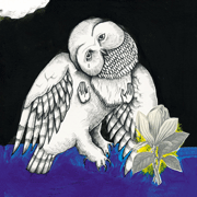
I've been trying to really put the time into post-processing recently to a point where I'm spending hours on certain photos. For the photo below I've separated the picture into 3 parts (bird, wood, background) and adjusted each separately. Is this what I should do? Does it make the photo look like a frankenstein image? Are there other adjustments that I should be making? Cropped original from RAW:  Post-processing: 
|
|
#
?
May 17, 2010 15:39
|
|

|
I am pretty unskilled with Photoshop since I have not played with it in years, but just got CS5 and decided to dive in head first. I am also doing my first panorama, so I am a novice all around. I bumped up the greens around the town on the left hand side. They were pretty pale compared to the blue of the ocean. I am not sure if I should try to do anything with the inner rim of the volcano and trees inside it. They are pretty dark since the side I was standing on was casting quite the shadow. How would I best go about making the inner edge stand out less? 
|
|
#
?
Jun 8, 2010 05:33
|
|

|
DevNull posted:I am pretty unskilled with Photoshop since I have not played with it in years, but just got CS5 and decided to dive in head first. A bit of light dodging to brighten it up a little?
|
|
#
?
Jun 8, 2010 20:47
|
|

|
Anyone download and install Adobe Lightroom 3 yet? I just bought my copy from adobe.com, and I'm still waiting on my serial number (they need to verify my educational discount first).
|
|
#
?
Jun 9, 2010 02:16
|
|
|
VermiciousKnid84 posted:Anyone download and install Adobe Lightroom 3 yet? I just bought my copy from adobe.com, and I'm still waiting on my serial number (they need to verify my educational discount first). Yeah-- Haven't had too much time to play with it yet though, but it doesn't appear to actually be any faster than 2.whatever. The most exciting thing for me was how well the noise reduction works, I probably won't even be using NoiseNinja again. There are very few lens correction settings pre-built in though .
|
|
#
?
Jun 9, 2010 03:22
|
|

|
The most exciting thing is that I will never have to use Capture One again for my own shoots.
|
|
#
?
Jun 9, 2010 03:29
|
|
|
Shmoogy posted:Yeah-- Haven't had too much time to play with it yet though, but it doesn't appear to actually be any faster than 2.whatever. The most exciting thing for me was how well the noise reduction works, I probably won't even be using NoiseNinja again. Photoshop CS5 seems to have all of my lenses covered, but I don't have anything too exotic. I hope they're accessing the same library. And, by the way, in CS5/the new version of Raw or whatever, I'm a little skeeved out by the way Adobe seems to be handling the whole lens correction profiles thing. The community calibration tool (or whatever they're calling it) does not seem really exhaustive in terms of gathering lens data, and the interface to access submitted profiles makes my brain hurt. It's not really clear which (if any) profiles were created "professionally" by Adobe.
|
|
#
?
Jun 9, 2010 04:43
|
|
|
VermiciousKnid84 posted:And, by the way, in CS5/the new version of Raw or whatever, I'm a little skeeved out by the way Adobe seems to be handling the whole lens correction profiles thing. The community calibration tool (or whatever they're calling it) does not seem really exhaustive in terms of gathering lens data, and the interface to access submitted profiles makes my brain hurt. It's not really clear which (if any) profiles were created "professionally" by Adobe. Yea, the lens correction feature was what I was most interested in seeing, but until someone creates a profile for the Tamron 17-50 it's essentially useless to me. Looks like someone finally got at least one Tamron lens in there so hopefully it'll happen soon.
|
|
#
?
Jun 9, 2010 05:20
|
|
|
Cyberbob posted:I've been specifically looking at his MGM Wet Republic Ad shoot, in his Behind the Scenes shoot here http://www.davehillphoto.com/bts/ He's using Cyber Syncs. I thought all of the pros used PW.
|
|
#
?
Jun 9, 2010 08:21
|
|

|
Cyberbob posted:How the heck do I learn how to craft composite shots? I want to learn the photoshop side of some of Dave Hill's latest campaign shoots, and it's all just individual shots stitched together. I'm getting ready to do an in depth compositing writeup this weekend about this shot: http://www.flickr.com/photos/mr_chompers/4637501114/sizes/o/ I'll post a link in here when complete.
|
|
#
?
Jun 9, 2010 11:56
|
|

|
This is a pretty amateur question so hopefully someone can help. In my career as a photographer I have never really had to worry about lighting, but I have been experimenting with more studio type of stuff lately and I cannot figure it out. There is a pretty harsh shadow around the head of this gentleman, and while I could probably fix it by placing the lights different that isn't really possible right now so I want to know about what other options I may have. Actual question: Is there a way to select around his hair without it being super choppy and obvious? 
|
|
#
?
Jun 9, 2010 22:56
|
|

|
Move him away from the wall. For selecting hair the way I prefer to do is work in the channels to make a mask with an Alpha channel. The basic idea is you choose a channel with high contrast between the background and subject (or you create one) which makes creating the selection much easier. Then you can convert the alpha channel to a selection. I didn't watch this all the way through but seems like the same way I do it and covers a few different images: http://www.tutvid.com/tutorials/photoshop/tutorials/selectionHair.php brad industry fucked around with this message at 23:15 on Jun 9, 2010 |
|
#
?
Jun 9, 2010 23:12
|
|
|
Bojanglesworth posted:Actual question: Is there a way to select around his hair without it being super choppy and obvious? A very carefully hand-painted layer mask. There are tools that will automate parts of it pretty well (mess with the refine edge tools for instance), but for the highest quality in a selection like that, you're going to want to be painting in each hair individually. VVVV You're probably right, but I'm still unable to get things masked properly with the channels. If you can put up a basic tutorial on how you'd mask that out with channels -- especially given that it's monochrome -- I'd love to see it. orange lime fucked around with this message at 23:21 on Jun 9, 2010 |
|
#
?
Jun 9, 2010 23:12
|
|
|
I think hand painted masks are actually worse than creatively using the channels. Besides, what the hell would you do if you had to do cutouts for a catalog or something? Paint hundreds of individual hair strands for hundreds of images?
|
|
#
?
Jun 9, 2010 23:14
|
|
|
brad did you get your calibration situation resolved? I need a solution for 10.6 as well because I just finally got an IPS monitor.
|
|
#
?
Jun 9, 2010 23:40
|
|

|
I still can't get the Pantone Huey software to work on my Mac Pro, but it works fine on all the 10.6 iMacs I've worked on at studios so I'm not sure what the deal is. I need to call support
|
|
#
?
Jun 10, 2010 00:10
|
|
|
Where should I start to learn the more advanced photoshop stuff? Any good book or online recommendations?
|
|
#
?
Jun 10, 2010 15:36
|
|
|
Anyone else played with Lightroom 3 much? I've been pleasantly surprised by just how much better the Noise reduction is compared to 2.
|
|
#
?
Jun 10, 2010 16:21
|
|

|
So this is just a test really, trying to improve my touching up. Ignore the background and lovely masking trying to get that white, I was concentrating more on the face. Thoughts on this? How does the skin look? Anything I'm missing that's obvious? Been reading and watching alot of stuff on touching up, and thinking about it in steps has really helped me alot, I started with the basic stuff like exposure, contrast, then moved onto blemishes, shadows, skin etc.  
|
|
#
?
Jun 12, 2010 13:21
|
|
|
I think that's really good. I especially appreciate boosting the exposure around the eyes. I think you did a good job smoothing out the skin without giving it too much of the airbrushed look.
|
|
#
?
Jun 12, 2010 14:03
|
|
|
My eyes were drawn to the dark spot next to the right side of her lip. That's the only flaw my amateur eyes noticed. It's not even a flaw, because it's in the original, but something about the touch up around it make it look almost unnatural.
|
|
#
?
Jun 12, 2010 15:35
|
|

|

|
| # ? May 16, 2024 08:38 |
|
|
fronkpies posted:So this is just a test really, trying to improve my touching up. Ignore the background and lovely masking trying to get that white, I was concentrating more on the face. Looks great! Did you shoot that against a wall or a backdrop? What color? Her right shoulder looks ever so slightly blown out, but I imagine that was part of trying to lighten up the rest of the photo. Doesn't look bad, just something I noticed.
|
|
#
?
Jun 12, 2010 16:22
|
|