|
Oh no. Those poor chinchillas. Chinchillas are desert animals. In the wild, they go their entire lives without getting wet. As a result, they have been able to evolve the thick coats for which they are renowned. Their fur is so dense that it cannot dry itself. Wet chinchillas will experience jungle rot, have their fur slough off, and be at great risk of viral and bacterial infection. A wet chinchilla must be dried with an air drier at low temperature until completely dry, given a thorough dust bath and monitored closely for several hours thereafter. For a wet chinchilla to survive the next 24 hours, extreme dedication is required. Fortunately, this lovely couple has proven their dedication twice over.
|
 #
?
Jul 16, 2010 15:56
#
?
Jul 16, 2010 15:56
|
|


|

|
| # ? May 12, 2024 19:32 |
|
|
Great now I'm worried about the chinchillas.
|
|
#
?
Jul 16, 2010 16:01
|
|


|
Noooo stay safe chinchillas 
|
|
#
?
Jul 16, 2010 17:52
|
|

|
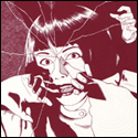
Saw this in a shop today, it reminded me of the worst Achewood strip ever ")  Click here for the full 1600x1200 image.
|
|
#
?
Jul 17, 2010 03:05
|
|


|
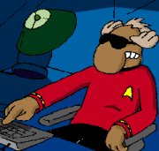
NoneMoreNegative posted:Saw this in a shop today, it reminded me of the worst Achewood strip ever What is it, a Rorschach inkblot? I see a bunch of alive people with eggs and testicles
|
|
#
?
Jul 17, 2010 03:49
|
|

|
Hey, that was a GUEST strip, pal.
|
|
#
?
Jul 17, 2010 04:51
|
|

|
NoneMoreNegative posted:Saw this in a shop today, it reminded me of the worst Achewood strip ever The strip NMN is referring to is here.
|
|
#
?
Jul 17, 2010 05:57
|
|
|
Chris Onstad posted:Hey, that was a GUEST strip, pal. So in THEORY if I made guest strip you would post it? Because I am FULL of ideas(and Kwak belgian beer). I can't draw, but that doesn't seem to be a problem with Achewood. HEYO
|
|
#
?
Jul 17, 2010 06:18
|
|


|
robot roll call posted:So in THEORY if I made guest strip you would post it? Because I am FULL of ideas(and Kwak belgian beer). I can't draw, but that doesn't seem to be a problem with Achewood. HEYO You can always post it here, stud.
|
|
#
?
Jul 17, 2010 06:49
|
|
|
Chris Onstad posted:You can always post it here, stud. I'm getting pretty uncomfortable with all of this gay stuff. Maybe you should tone it down a bit so I don't have extremely hot fantasies about it every night.
|
|
#
?
Jul 17, 2010 07:11
|
|
|
robot roll call posted:I'm getting pretty uncomfortable with all of this gay stuff. Maybe you should tone it down a bit so I don't have extremely hot fantasies about it every night. robot roll call is only comfortable with experiencing tepid fantasies every night
|
|
#
?
Jul 17, 2010 08:21
|
|
|
McGravin posted:The strip NMN is referring to is here.
|
|
#
?
Jul 17, 2010 15:29
|
|


|
CannonFodder posted:Even the skull on Lyle's shirt is shocked! I quite like the flying off ears/medallion/mustache 
|
|
#
?
Jul 17, 2010 15:36
|
|
|
Serious question for Mr Onstad. Do you see yourself ever teaming with an artist to create your comic? As in, if you met someone who just makes you think Holy Moly that is totally what Achewood looks like in my head and they were happy to work for peanuts or whatever. Or do you have aspirations as an illustrator and you couldn't live with losing that part of the process? I would say most of your fans enjoy the visual look of your strip - it totally works with the writing the way the best comics do where the two parts elevate each other, but I have met people who "can't get into achewood because it looks too vector-y". That's what got me wondering.
|
|
#
?
Jul 17, 2010 17:54
|
|
|
Why break a good thing. Everyone has hangups and you can't get everyone to like something.
|
|
#
?
Jul 17, 2010 18:02
|
|

|
ACTIVATEtheSQUARE posted:Serious question for Mr Onstad. Do you see yourself ever teaming with an artist to create your comic? As in, if you met someone who just makes you think Holy Moly that is totally what Achewood looks like in my head and they were happy to work for peanuts or whatever. Or do you have aspirations as an illustrator and you couldn't live with losing that part of the process? To be honest it took me a really long time to get into Achewood because of the art. I have friends who love it, and they'd always send me links, but I just couldn't stand looking at it. It took Pete playing basketball for the writing to finally transcend the art for me. Now I'm used to the art style and couldn't really picture it any other way, in an alternate universe where Achewood had... artier... art I'm sure I would have gotten into it sooner. I had too much trouble telling the characters apart visually, for one thing.
|
|
#
?
Jul 17, 2010 18:03
|
|

|
I'm surprised the newest strip was met with delight. Not because of its quality; I love Achewood in all of its forms, whether it be hilarious, disturbing or insightful. The "math teacher" and his wife are a great addition to the cast, even if they are temporary, but the humor of their relationship does not detract from the end conclusion. Nice Pete now believes that Teodor and he are one of a kind, that Teodor is an amateur or apprentice in an art at which Nice Pete excels. That is new, which is exciting, but it is something I witness with trepidation rather than ease.
|
|
#
?
Jul 17, 2010 18:09
|
|

|
ABOUT DRUGS posted:Nice Pete now believes that Teodor and he are one of a kind, that Teodor is an amateur or apprentice in an art at which Nice Pete excels. That is new, which is exciting, but it is something I witness with trepidation rather than ease. This had occurred to me, as well. One is typically glad to return from an evening with Nice Pete alive, but alive and him thinking you're buddies is about the worst way to do that.
|
|
#
?
Jul 18, 2010 00:02
|
|


|
Having Nice Pete like you is a bad thing, because you may become an accessory to murder; but having Nice Pete like you is a good thing, because you are likely to not become the murdered.
|
|
#
?
Jul 18, 2010 00:14
|
|

|
niteice posted:Having Nice Pete like you is a bad thing, because you may become an accessory to murder; but having Nice Pete like you is a good thing, because you are likely to not become the murdered. It's a dual-edged sword, and the handle of the sword is also an edge. Nice Pete is a triple-edged sword. No wait, four.
|
|
#
?
Jul 18, 2010 00:51
|
|

|
On the topic of Achewood's art: I dig it because to my mind, it has a sort of "retro" feel to it, even though it's not "retro" in the slightest. For some reason it has a resonance of an older style of art that I can't quite place.
|
|
#
?
Jul 18, 2010 01:31
|
|

|
What would be the worst strip that's not done by another person? I think Achewood might not have a worst strip.
|
|
#
?
Jul 18, 2010 02:05
|
|
|
Cobweb Heart posted:What would be the worst strip that's not done by another person? If I had to choose.
|
|
#
?
Jul 18, 2010 02:09
|
|
|
The Achewood artwork, for me at least, is perfect the way it is. It's clear and precise but still sparse enough to let the reader interpret things on their own. I think it compliments the writing very elegantly. Peanuts wasn't full of lavish backgrounds or astounding detail because it didn't need to be - it would've been worse for it. Same with Achewood. The vector artwork has its own atmosphere and the slight cold detachment it offers just kinda adds to what Achewood is all about. There are certain panels that are just downright beautiful too.
|
|
#
?
Jul 18, 2010 02:13
|
|
|
Ashenai posted:If I had to choose. 
|
|
#
?
Jul 18, 2010 03:29
|
|

|
Tenterhooks posted:The Achewood artwork, for me at least, is perfect the way it is. It's clear and precise but still sparse enough to let the reader interpret things on their own. I think it compliments the writing very elegantly. Peanuts wasn't full of lavish backgrounds or astounding detail because it didn't need to be - it would've been worse for it. Same with Achewood. The vector artwork has its own atmosphere and the slight cold detachment it offers just kinda adds to what Achewood is all about. There are certain panels that are just downright beautiful too. I am a vector art fan, as well. One thing I never get is how people can complain about the artwork. The important thing is, first and foremost, that artwork aids the writing, which it does wonderfully. Onstad never gets any art props, but dude can straight up have faces say more than a panel full of words could. And think about how flexible his style is: the wedding vs. cartilage head arcs for instance. Styles are the exact same, but the prop choices (vehicles / CH letterhead), the "empty" panels and just the surreal way CH moves are are beautiful touches that provide more value than you could get by just reading the text.
|
|
#
?
Jul 18, 2010 04:09
|
|

|
onomatopizza posted:I am a vector art fan, as well. One thing I never get is how people can complain about the artwork. The important thing is, first and foremost, that artwork aids the writing, which it does wonderfully. Onstad never gets any art props, but dude can straight up have faces say more than a panel full of words could. And think about how flexible his style is: the wedding vs. cartilage head arcs for instance. Styles are the exact same, but the prop choices (vehicles / CH letterhead), the "empty" panels and just the surreal way CH moves are are beautiful touches that provide more value than you could get by just reading the text. Well, with the reminder that I do like Achewood and I do realize the art style is a deliberate choice and I do think the style suits the comic and I don't want to get torn to shreds by a thread full of rabid fans even though I do know that's what will happen, if all the speech bubbles were deleted and I was looking at just the art with no context, I'd have to say that it's aesthetically unpleasant. Composition, shading, line weight, character proportions, it's all very hard to "read" visually. Onstad (intentionally, I swear to god I know) ignores most techniques artists use to make their art easy to visually parse. Looking at it kind of feels like listening to two radios at once - nothing is positioned to be "most important" in most of the compositions, so it all kind of blends together. Most of the characters don't have particularly different silhouettes either, which adds to the feeling. Sure, I can tell Ray and Beef apart easily now, but they're nowhere near as different as cartoon best-bro pairs usually are. I'm not saying artistic technique is completely absent from Achewood, I swear I swear I swear, but there's less of it than one expects, and it takes some getting used to.
|
|
#
?
Jul 18, 2010 04:31
|
|
|
One thing I like about Achewood's art is that it lends itself to people/things that are just "off". The best example of this is Zell and Cory, the terrifying burn victims. You just can't tell what the gently caress they are, or what's up with them. Also, Cartilage Head is even done in a different style than anybody else, but he still kind of fits in. At the same time he doesn't. Edit: I just went back and read the Phillipe/Transfer Station arc again. Zell and Cory don't have any lights in that tunnel, and whichever one of them stands (Cory?) clearly lacks eyes, which supports their comment that they're "blind". But the one with amputated legs is able to notice and point out Phillipe, at night, no less, instead of running into him. I guess complaining about it is just  when being strange and unnerving is the point of that scene, but it still bothers me. when being strange and unnerving is the point of that scene, but it still bothers me.
Cobweb Heart fucked around with this message at 04:58 on Jul 18, 2010 |
|
#
?
Jul 18, 2010 04:38
|
|
|
bgaesop posted:We were talking about the worst strip, not the most awesome 
|
|
#
?
Jul 18, 2010 06:52
|
|
|
Slashie posted:Well, with the reminder that I do like Achewood ... You don't have to be in love with the drafting to be a fan of Achewood. I guess my point is maybe the art isn't great sometimes, but it's sorta perfect at the same time. You sound like someone who's got some knowledge of character design, where I'm totally lacking so I'll concede those points. But the story telling is always great in Achewood. The series is consistently excellent in timing, with all the still frames and reactions having plenty of time to breathe, for example. I guess where I'm coming from is... I love Ashley Wood as an illustrator / artist. I can't imagine having his abilities. But I can't really read Popbot. Part of it is that I have trouble looking away from the art, but a lot of the times it's also the pages themselves that get in the way. Jamie Hewett is another favorite of mine, and his art was gorgeous, but every panel was so crowded that it might as well be unreadable. Achewood is a great example of balance, and playing to an Artist's strengths.
|
|
#
?
Jul 18, 2010 07:27
|
|
|
onomatopizza posted:You don't have to be in love with the drafting to be a fan of Achewood. I guess my point is maybe the art isn't great sometimes, but it's sorta perfect at the same time. You sound like someone who's got some knowledge of character design, where I'm totally lacking so I'll concede those points. But the story telling is always great in Achewood. The series is consistently excellent in timing, with all the still frames and reactions having plenty of time to breathe, for example. I don't know either of those comics but they sound like they might have composition issues too. For an example on pretty much the opposite end of the spectrum from Achewood, look at Tiny Kitten Teeth. Lots of talent, lots of effort, absolutely no consideration for color value, which leaves the art a shouty confusing mess. As I look at it now it's definitely better than when I first tried to read it, partially because there's actually some negative space now, but it's still very hard to look at. Comic art shouldn't make your eyes cross. I guess I feel that, while Tiny Kitten Teeth makes every element fight for the foreground, Achewood lets every element recede into the background.
|
|
#
?
Jul 18, 2010 08:32
|
|
|
Slashie posted:I don't know either of those comics but they sound like they might have composition issues too. For an example on pretty much the opposite end of the spectrum from Achewood, look at Tiny Kitten Teeth. Lots of talent, lots of effort, absolutely no consideration for color value, which leaves the art a shouty confusing mess. As I look at it now it's definitely better than when I first tried to read it, partially because there's actually some negative space now, but it's still very hard to look at. Comic art shouldn't make your eyes cross. I guess I feel that, while Tiny Kitten Teeth makes every element fight for the foreground, Achewood lets every element recede into the background. Lackadaisy has the best art I've seen in a webcomic ever, and I believe the sepia tone keeps the composition from becoming too busy, though I've seen previews of coloring it all in; it was still somewhat subdued, and the panels weren't nearly as eye-scalding as Tiny Kitten Teeth. Which brings me to my extremely humble opinion: Achewood has incredible writing for great characterizations. The art is not there to flash, nor dance, nor drive a world of whimsy. It is there with an air of simplicity. No pomp makes up for a good writer and a simple setting.
|
|
#
?
Jul 18, 2010 16:24
|
|
|
Lackadaisy is amazing, but I would have to give the prize to The Abominable Charles Christopher. Same deal, limited color palette that really pops. And oh god the inking. But it would be weird to see Achewood done in that style and I'm certainly not saying it should be.
|
|
#
?
Jul 18, 2010 16:42
|
|
|
The art in The Abominable Charles Christopher actually reminds me quite a great amount of the comic Bone.
|
|
#
?
Jul 18, 2010 16:46
|
|
|
Anyone dig on Order of Tales? It's a slow-moving but pretty interesting comic, good effort on the art, and it literally just finished up it's main story like a week ago, so you could go through the whole thing in one sitting
|
|
#
?
Jul 18, 2010 17:48
|
|
|
AfroSpatula posted:Lackadaisy has the best art I've seen in a webcomic ever, and I believe the sepia tone keeps the composition from becoming too busy, though I've seen previews of coloring it all in; it was still somewhat subdued, and the panels weren't nearly as eye-scalding as Tiny Kitten Teeth. It's weird, when I see something like Lackadaisy, my brain just kinda goes 'too much effort, too much going on' and I click away. Even though, as you say, it's not that busy a strip compared to a lot of stuff out there. I remember Bill Watterson talked about the eye being lazy and being attracted to empty white space or something in the C&H 10th Anniversary Book, maybe it's that. That Abominable Charles Christopher looks really nice - I could see myself getting into that much easier. Maybe simplicity just does it for me - the Moomin comics and the work of Tom Gauld are my idea of perfection.
|
|
#
?
Jul 18, 2010 17:49
|
|
|
Would anybody like to trade Achewood shirts? I have two that don't fit me. LARGE  EXTRA LARGE I should mention, the GOF shirt is a ringer tee, and it must be the smallest XL shirt in existance, so I'd consider it a Large size, really.
|
|
#
?
Jul 18, 2010 18:09
|
|
|
Ashenai posted:We were talking about the worst strip, not the most awesome Yeah I don't know what prompted me to post that in response, but I have no regrets glug posted:Anyone dig on Order of Tales? It's a slow-moving but pretty interesting comic, good effort on the art, and it literally just finished up it's main story like a week ago, so you could go through the whole thing in one sitting You know there is a general webcomics thread that rather loves the Order of Tales, yes?
|
|
#
?
Jul 18, 2010 23:28
|
|
|
Tenterhooks posted:It's weird, when I see something like Lackadaisy, my brain just kinda goes 'too much effort, too much going on' and I click away. Even though, as you say, it's not that busy a strip compared to a lot of stuff out there. I remember Bill Watterson talked about the eye being lazy and being attracted to empty white space or something in the C&H 10th Anniversary Book, maybe it's that. Also, I agree with people saying that Achewood's art fits the odd aesthetic of the comic, even if it's not very pretty. Some of my friends can't really get into it because of the art, but it's never bothered me. Locus fucked around with this message at 01:20 on Jul 19, 2010 |
|
#
?
Jul 19, 2010 01:16
|
|

|

|
| # ? May 12, 2024 19:32 |
|
|
While on the topic of comic strip art...Dan Kim is by far my favorite. The dude's a beast. Achewood's art has always felt right to me. I think I'd be disappointed if it were too realistic looking. I think its oddness is fitting for all the strange poo poo that occurs. Gives it some sort of dream or alternate/unseen reality feel.
|
|
#
?
Jul 19, 2010 01:37
|
|