|
Took this just as the sun set behind the mountain peak: Then drove down to the water to catch the last of the light:  
|
|
|
|

|
| # ? May 15, 2024 08:14 |
|
Not bad but they're too obviously HDR (or tonemapped, rather). The sky just looks off in the last two shots. It's like the mountains are glowing, especially on the far left and right of the pictures. They'd be nice sunset shots if you could actually fix that. I'll get to the first one as well in a bit, but here's some random critiques for the last two shots: - In the second shot, your horizon is almost straight down the middle. I'd shift + crop it from the bottom left to get rid of the empty space at the bottom and lower the horizon at the same time - It also seems like you have some barrel distortion on the horizon in the second shot, it looks curved. I didn't bother pixel-peeping and I might be wrong due to perspective or something, but you might want to double check that. - I'd also clone out that tiny-rear end moon, it's kinda cool but at the same time it's so small that it just jumps out at you and distracts you from the rest of the shot. It's literally the first thing I noticed. - The white thing on the right in the third shot is really distracting. I'd consider cropping that. - You have a couple red pixels in the shot which draw the eye to them. I'd clone those out. - Again, glowy mountains. It's somewhat better in dynamic range than the second shot, but you can really tell something's up by looking at the mountain on the left. Notice how areas near its center are darker than areas closer to both the water and the sky? Really distracting. And now let's talk about your first shot. This should would be pretty dope if: - You got rid of that half-a-house in the bottom left. - You color-corrected the really blue tinge in the mountains with maybe a masked color balance tool, adding more yellow or something. - Fixed the tonemapping in your HDR process so that the forest in the foreground has somewhat of a similar toning, ie. trees in the foreground aren't lighter than trees in the background, as it makes no sense for that to be the case, you had no light source illuminating said trees. Anyway, overall, when shooting HDR I'm really way less concerned about preserving all/most shadow detail in shadow areas. Go for a more natural look (ie. slightly blown highlights and/or dark shadows) when shooting HDR, rather than think "I'm shooting HDR, I need to have detail in both shadows and highlights!". If I had to choose, I'd say go with details in the highlights, and personally I feel you kinda nailed that with this first shot. Shadow detail, however (and again, this is only my opinion) isn't nearly as important, as long as it's not pitch black. To kinda show what I mean, here's a couple HDRs I made myself that kinda follow that:  Note how the shadows are really dark, but there's still visible detail in them. I'm not saying it's a great shot or anything (it's not), but this is generally what I look for when I'm making an HDR.  Again, almost pitch-black shadows in the foreground, due to the sun's angle. I don't really care, as they would've been completely without detail had I not shot an HDR, but what I was really hoping to capture was detail in the clouds, which were blown out in a single exposure. I probably could've eased up on the shadows in the foreground, too, but it didn't really look natural to me so I just left them dark like that. Anyway, hope this helps, sorry for the long-winded critique. edit: I think this shot is my favorite of yours out of the ones you have from that evening. Strong foreground, good colors and it's not overly obvious it's an HDR composite. The obscured peak is slightly bothersome, though, I would've tried a lower camera angle to see if you could fit that under the ferry terminal (or whatever that is). All in all, though, it's a pretty sweet shot. edit 2: I think this would've been a pretty fantastic shot if you had taken it 10-15 minutes earlier and with a longer lens to magnify the moon (or did some post-processing fuckery to get the moon larger, ie. masking in a different shot of the moon shot at a longer focal length). As it stands, though, I think you have way too much empty space on the right side of the picture, leaving the composition unbalanced. It's also way too dark (or, I should say, the moon's too bright). I'd recommend moving the moon in post, but you have a bit of a reflection going on in the water and a keen eye would notice that right away. The picture also seems noisy to me for some reason. The gradient between the dark magenta and the blue towards the bottom seems to be noised up. Did you pull the exposure up on the raw or something? Smekerman fucked around with this message at 09:06 on Jul 26, 2010 |
|
|
|
Smekerman posted:Not bad but they're too obviously HDR (or tonemapped, rather). The sky just looks off in the last two shots. It's like the mountains are glowing, especially on the far left and right of the pictures. They'd be nice sunset shots if you could actually fix that. I'll get to the first one as well in a bit, but here's some random critiques for the last two shots: Thanks for the good comments. I pretty much had to HDR it much to my chagrin because without it, it was either totally lose the ground or totally lose the sky in all three situations. I agree that more contrast would do it some good, in fact these photo already have it bumped up a bit from what the program spit out. It was one of those things where I was a bit concerned that what might look good on my monitor might not translate to others, but since you seem to share the same concerns as me, I might as well go back and tweak it some more. I wouldn't be surprised about the barrel distortion. I used an 11-16 and a 17-50 for the shots. I think one reason it looks distorted is because the islands/coastline aren't dead flat across the horizon. They are staggered a little bit. I did level the horizon in post though. The mountains appear to be glowing largely because of atmospheric haze (bad smog and crap from the city) combined with the twilight and a light mist on the water. For the most part, I tried to back off the HDR to the point where it was as the scene appeared in real life. I tried to avoid that halo-y effect as much as possible. Unfortunately, there always will be a bit of it when shooting wide at that time of day since there's a natural gradient of light in the sky. The first shot was tough because the sun was setting so fast that I barely had time to set up my tripod and get things dialed in. What you're seeing is the moment just as the sun ducked behind the mountain, which probably lasted about five seconds. And then the dynamic range was so crazy that +/- 2 stops over three exposures still wasn't enough. I'm not a big fan of how the light appears as kind of a blob on the mountain top. I'm at work right now, but I'll definitely give your suggestions a swing when I get home.
|
|
|
|
what do you guys think about this as an HDR? I have my own opinions, but I'd like to see others before I skew any thoughts:
|
|
|
|
Fbi2thegrave posted:what do you guys think about this as an HDR? I have my own opinions, but I'd like to see others before I skew any thoughts: On first glance it looks fine to me. Scrutinizing it more closely made me realize that given the strong horizontal light hitting the hills those clouds should really be a lot brighter, but I'm not sure I'd have noticed that if you didn't point it out. About 6 weeks ago I went on a hike with my wife that ended at a beautiful lake on the backside of the mountain I climbed on the last page. It was a gorgeous view, but unfortunately it was late afternoon when we got up there and the light was absolutely atrocious. I took a few shots, but I know they weren't going to turn out well. I was became briefly obsessed with trying to get up there for sunrise and finally made it up on Sunday morning. Still processing the shots but here is a 6 shot stitch.  The orange of the mountain looks fine at home but terrible and unnatural on my work laptop. One of these days I need to get a good IPS display and a calibration puck. BeastOfExmoor fucked around with this message at 18:16 on Jul 27, 2010 |
|
|
|
Where were these taken? They look like they're from my old hiking trail.
|
|
|
|
BeastOfExmoor posted:
|
|
|
|
Thanks for the comments. I must've been a bit sleep deprived still when I did that first edit because in retrospect it looks like utter poo poo. After looking at it a bit of the last couple days I came to some of the same conclusions you did and went back and did another edit. To me this one looks a lot more natural.  BeastOfExmoor fucked around with this message at 04:00 on Jul 29, 2010 |
|
|
|
I think that version of the edit has taken the picture in a much better direction. Can't see properly because the sun is bouncing all over my screen but it looks much more natural. Missed the sunset colours with this one, sky was a really nice pink/red for about 2 minutes. 
|
|
|
|
Yeah the second version is definitely much better BeastOfExmoor, the mountain in the first reminded me of the color of cheetos!
|
|
|
|
BeastOfExmoor, you've been posting some grand work. I love saturated colours, personally, and didn't mind the first post of your stitched panorama. The second is more true to life, but, meh, it's art -- I prefer to think of landscape photography as a way to get away from reality. DreadHead, excellent images as per the norm. Click the images to view them on a black background (easier on the eyes). Healing Garden Soft light gently falls through the canopy, filters through medium density fog, and onto this ordered array of bare trunks. I made this image whilst trekking through the Great Otway National Forest, in Victoria. Canon EOS 5D Mark II, Canon EF 17-40mm f/4L USM 1.3s f/16.0 at 40.0mm iso160  Stream in Tutuko Late afternoon sunlight illuminates submerged rocks in a stream in the Tutuko Valley in Milford Sound. Typically, this region would be wet, but, after having experienced the heaviest rain in a decade, the entire valley was full of streams, creeks and rivers which made trekking a lot of fun! Light was fading quickly, and I had a couple of hours to get back to my lodge for the evening, so I packed up, turned around and headed back straight after having nabbed this image. Note, this was an attempt at an abstract piece. Some feel it works, others don't. I tend to liken it to a kind of zen garden. Canon EOS 5D Mark II, Canon EF 17-40mm f/4L USM 4s f/16.0 at 36.0mm iso200 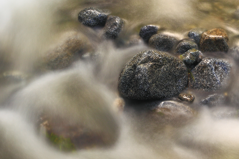 Milford by Moonlight Milford Sound captured moments after our satellite had reached full status. In this 16-minute exposure, we can see streaking clouds, misty spray (to the right) caused by the full force of Lady Bowen Falls, Mitre Peak to central left, the Elephant and the Lion are centre right; nestled between these two is my favourite waterfall -- Stirling Falls. To give you an idea as to the sheer scale of the landscape presented in this composition, Stirling Falls is at least 8 kilometres (approximately 5 miles) away. RAW blend for clouds. Canon EOS 5D Mark II, Canon EF 17-40mm f/4L USM 960s f/8.0 at 17.0mm iso400  In the Hooker Valley Mid-afternoon trek through the Hooker Valley. In the distance, the tallest mountain in New Zealand, Mount Cook, stands proud at 3754 metres (12316 feet). Canon EOS 5D Mark II, Canon EF 17-40mm f/4L USM 1/30s f/16.0 at 17.0mm iso100 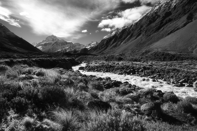 Cut sick, let me have it. Tell me what sucks and what can be improved upon. H octane2 fucked around with this message at 16:45 on Jul 29, 2010 |
|
|
|
octane2 posted:Healing Garden The dynamic range of your photos blows me away. I know the 5d2 has higher dynamic range than crop cameras, but it seems like you must be doing something special with your post processing I imagine as well? Healing garden: There is really detailed and relaxing mood to this one. Everything looks so natural that I can practically feel the cool, humid air in my lungs. The weakest part to me is the composition. I love the pieces of the photo (the seemingly endless trees and lush green ferns), but the way the whole thing is framed doesn't really grab me. Stream in Tutuko: Probably my least favorite of the bunch. The softness of the water and dynamic range of the rocks is great, but the image comes off as forgettable. Milford by Moonlight: Definitely my favorite of the four. The composition is phenomenal. My eyes can run around the entire thing repeatedly without finding a part that isn't pleasing. the lack of detail in the sides of the two peaks closest to the camera is my only possible complaint, but that's really nitpicking a great shot. In the Hooker Valley: I really want to like this one, but the contrast of all the bright light kinda kills it for me. A polarizing filter might have helped bring down the reflections off the rocks and plants (assuming you weren't using one). The composition is great though.
|
|
|
|
BeastOfExmoor posted:Thanks for the comments. I must've been a bit sleep deprived still when I did that first edit because in retrospect it looks like utter poo poo. After looking at it a bit of the last couple days I came to some of the same conclusions you did and went back and did another edit. To me this one looks a lot more natural. Did you shoot in raw? Please say yes  Ok, so your first shot was overly saturated in the sunlit areas, but the foreground + shadows looked really good (maybe a tad too saturated, but I wouldn't even worry about that at this point). Your second shot looks like a flat, muddy mess, unfortunately, which is kinda how my shots of scenes like that looked like before I learned about masking layers. I don't even know how to make this post a cohesive critique, so I'll just pretend I'm processing a shot similar to yours and assume you shot in RAW. First off, I'd open all 6 shots in Adobe Camera RAW, select all of them, set the shadows to 0 (my default is 5, I'm too lazy to change it to 0). I'd look at the histogram in each of the shots, to make sure the sky isn't blown out, especially in the first and last shot of the stitch (where the blown out sky is the most noticeable). If it is, I'd select all of them again and crank up the recovery slider a bit and hope that fixes the problem (it generally should, it doesn't look like you have unrecoverable areas there). I'd leave the curves settings as they are, you can always do a curves adjustment layer after you stitch the thing together (this is because you run the risk of getting vignetting in the sky when you adjust the curves prior to stitching a panorama, which would mess up your sky tones), maybe set sharpness and uh... the third slider (the one after radius - I don't have photoshop open atm) to 50 (my default's 25), and that'd be it. I'd then open all of them in Photoshop and do the Photomerging thing. After getting a (hopefully) useable panorama, I'd crop off the distorted edges and maybe make a curves adjustment layer for the shadow areas. You might have to do more than just curves (like dodging/burning or something), but let's just assume that's really all you need. Ignore the highlights in the shot, just focus on making the shadows look nice and contrasty. After you're satisfied with the shadows, select the layer mask (ie. the white square to the right of the layer icon in the layers field), press B (for brush), set hardness to 0 or close to, make sure your background/foreground colors (bottom left, in the toolbar - the two squares) are black and white, set brush opacity to 100% and paint over the blown out areas. If nothing happens, press X to switch background/foreground colors. Do a rough selection of the blown out areas. Now, the contrast between the two sections (curve-layered shadows and original highlights) is probably gonna be pretty insane (and if it isn't, good, just skip over this part), so you're gonna press X again (to remove stuff from the mask this time), set the opacity to... I dunno, say 40-50%, zoom in so you can actually do some fine-tuning on the mask selection and start painting over the highlight areas until they're bright enough to look natural when combined with the shadow areas. If the contrast between the two areas seems fine to you, sweet. Ignore what I previously said and just zoom in and blend in the mask to be as seamless as possible. Here's an old shot where I used the above mask blending technique (it's not a panorama though  ): ): I took two exposures about 2 stops apart, I think, then blended/masked the clouds/sunrise area from one into the other one (which is kinda similar to adding a curves adjustment layer and masking it, really) edit: actually you should send your raws my way so I could try my hand at processing them, I haven't shot in a while and I got a hankerin' to do some landscape processing Smekerman fucked around with this message at 09:06 on Jul 30, 2010 |
|
|
|
|
|
|
|
A couple from last year. Just going through a big file organise session =/ 
|
|
|
|
|
|
|
|

|
|
|
|
Really wish the sky had been a bit clearer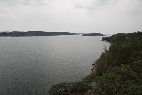 Another shot from the same island 
|
|
|
|
Toss a 1.5 stop gradient on it if you shot raw, it'll surprise you.
|
|
|
|
mind posting a 1680x1050 version of this? The processing reminds me a lot of some of Anton Corbijn's color work.
|
|
|
|

|
|
|
|
Dude, that is sick.
|
|
|
|
This is my favorite landscape of yours that you've posted.
|
|
|
|
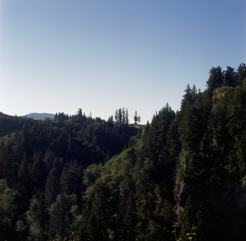 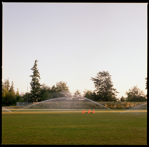 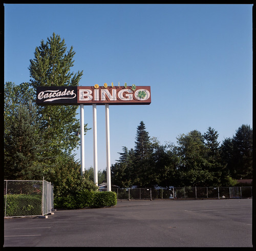 
|
|
|
|
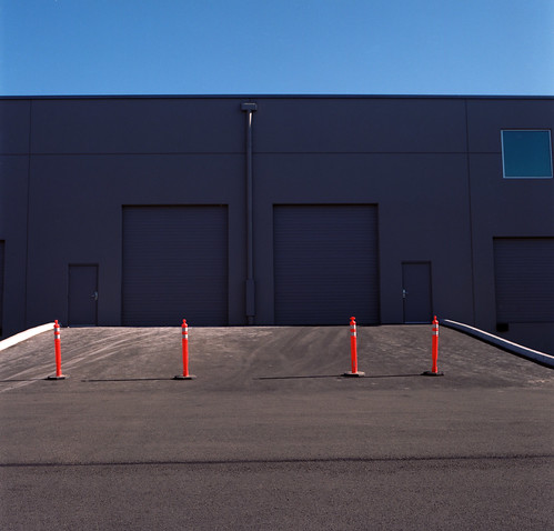
The square format really likes the strong geometry in these, I like'm along with the other similar styled shots you posted earlier on.
|
|
|
|
This would have been fly as hell if it wasn't all off kilter and unbalanced what happened
|
|
|
|
Twenties Superstar posted:This would have been fly as hell if it wasn't all off kilter and unbalanced what happened I sort of liked it being just slightly off. You think it would work better if I cropped it to place the cones more centralized?
|
|
|
|
Well I think things being off centre is a problem (I think stepping to the left ever so slightly and maybe turning left a little bit would have done wonders to make the scene "lock in") but there is also that the whole scene seems to be tilted a little relative to the edges of the frame. I noticed that you were very careful to make sure the top of the building was level but that seems to be the only edge in the whole photo that has that property. I would have been more particular about getting the lines on the building to make the same angle with the edge of the frame as it's symmetrical double. These kinds of photos are candy for me I love to take them and love to see them but this one seems a little sloppy.
|
|
|
|
Twenties Superstar posted:Well I think things being off centre is a problem (I think stepping to the left ever so slightly and maybe turning left a little bit would have done wonders to make the scene "lock in") but there is also that the whole scene seems to be tilted a little relative to the edges of the frame. I noticed that you were very careful to make sure the top of the building was level but that seems to be the only edge in the whole photo that has that property. I would have been more particular about getting the lines on the building to make the same angle with the edge of the frame as it's symmetrical double. These kinds of photos are candy for me I love to take them and love to see them but this one seems a little sloppy. Hhhmm. I was never really happy with that window on the right side. I think this is a scene I will have to revisit now that I have a longer lens for my 'blad.
|
|
|
|
Lost Lakes, El Dorado County, CA  The Nipple: 
|
|
|
|
MMD3 posted:mind posting a 1680x1050 version of this? Thanks. I love his stuff. Here you go.   Whitezombi fucked around with this message at 01:12 on Aug 12, 2010 |
|
|
|
I decided to cut a large pano down to my favourite three frames. I think it looks far better.
|
|
|
|
SAD cross-post.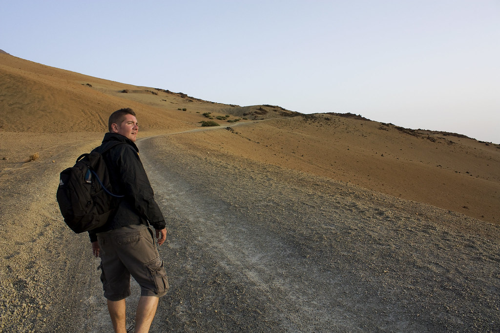
|
|
|
|
PAD cross post. You guys have such wonderful, sharp, vibrant images and I can't seem to get anywhere near them. I suspect it's a combination of crappy glass, no real post software, and no polarizer but short of spending money I don't have at the moment is there something I can do to take shots that have better color or should I just keep saving?
|
|
|
|
wins32767 posted:PAD cross post. The biggest improvement would probably come from post-processing. A polarizer does wonders, too.
|
|
|
|
I'm assuming storms count as landscape? All taken this year on my Canon T2i with no post processing. I currently have a UV filter now, but that's more to stop things from scratching my lens. Polarizing filter will be purchased this weekend, and I'm trying to learn post in Photoshop/Lightroom although it's a lot to take in all at once if you're fairly new. Minor HDR has been the only way I've been able to pop the colors a little more, but it still looks too crazy for my tastes.   
luchadornado fucked around with this message at 00:22 on Aug 16, 2010 |
|
|
|
From a recent bike trip through europe 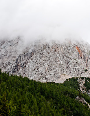  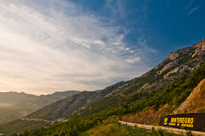
|
|
|
|
So rad - The only critique I'd offer is trying to exaggerate/warm up the light (saturate more?) that's hitting the windmills - a patch of orange in the middle of dark blue/green would fantastic
|
|
|
|
wins32767 posted:You guys have such wonderful, sharp, vibrant images and I can't seem to get anywhere near them. I suspect it's a combination of crappy glass, no real post software, and no polarizer but short of spending money I don't have at the moment is there something I can do to take shots that have better color or should I just keep saving?
|
|
|
|

|
| # ? May 15, 2024 08:14 |
|
This is an excellent example to show the sharpness of that 14mm manual lens. I liked the impact of the rocky beach in the foreground. 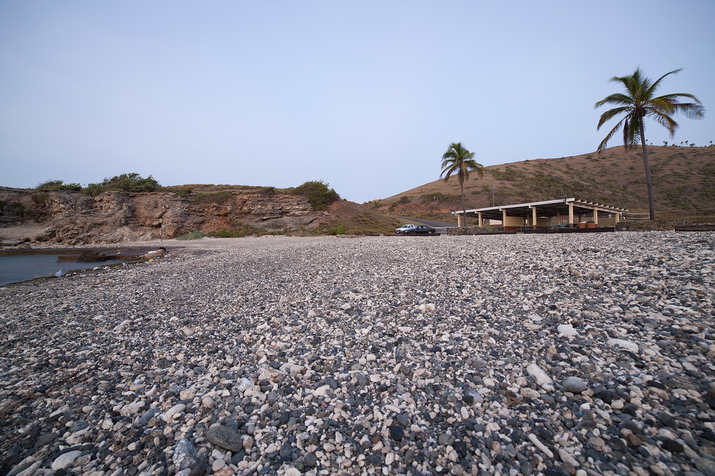 cable beach by torgeaux, on Flickr Shot when I was just feeling my way around proper exposure for sunrise/new moon, liked the effect. 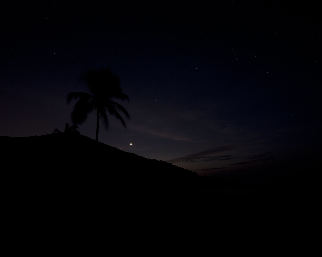 pre-dawn by torgeaux, on Flickr 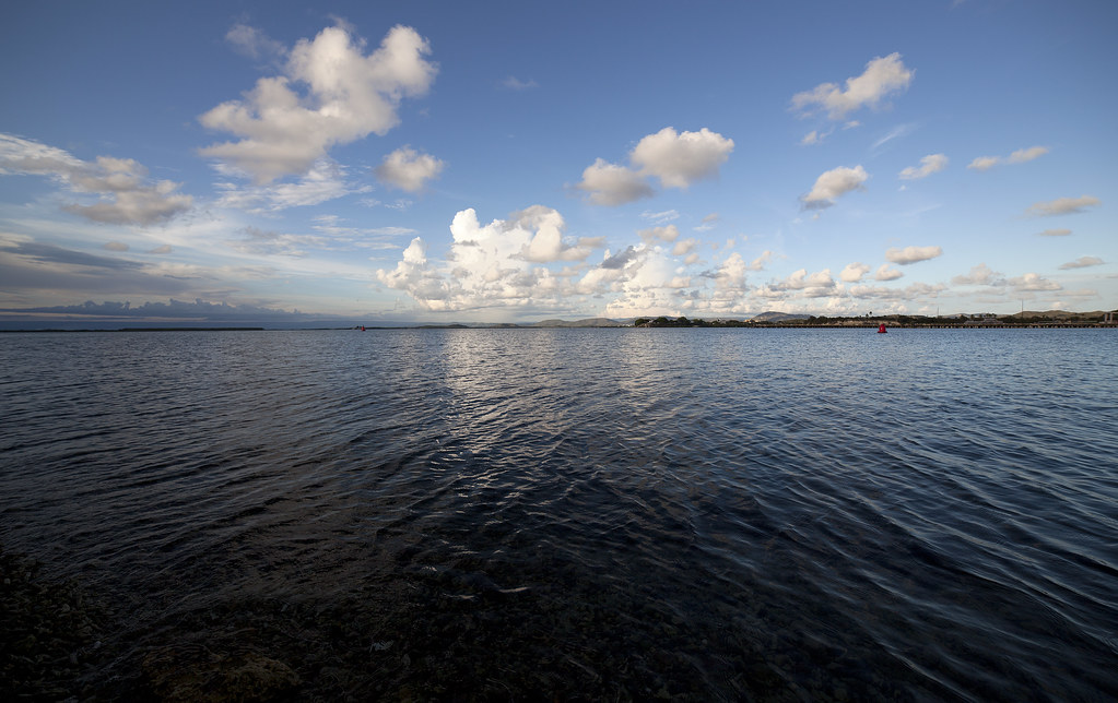 bay by torgeaux, on Flickr
|
|
|


