|
spf3million, keep the catalog on the SSD, import to the SSD then move the pics (from within LR) to your platters drive.
|
 #
?
Sep 21, 2010 00:47
#
?
Sep 21, 2010 00:47
|
|


|

|
| # ? Jun 5, 2024 20:21 |
|
|
Does anybody know of any tutorials that show you how to create the effect in this ad? I swear to god I saw something like it somewhere and I want to try it but of course I can't find it now.
|
|
#
?
Sep 21, 2010 02:21
|
|

|
I've seen it referred to as "vectorizing" and searching for vectorizing in youtube yielded results that would confirm. Not certain what tutorials are any good though. (Maybe knowing the term would help you browse through your bookmarks, if you're like me and keep a few hundred around)
|
|
#
?
Sep 21, 2010 02:41
|
|

|
Import photo into Illustrator and use Live Trace.
|
|
#
?
Sep 21, 2010 04:36
|
|

|
poopinmymouth posted:Blend if gives you some p powerful options, I might do that tonight. Basically lets you use the mathematical brightness of either the current layer, or layers below, to say whether the actual layer you're doing it on is visible or not. Whenever I try to do blend-ifs, I end up with something that looks dithered. As if a dissolve layer mode was involved or something. Alt-clicking and spreading the sliders helps a little but the grain is still there.  What is flickr / LR3 export doing to my photos ? Left is what I see on my screen in Lightroom. Right-side is the photo exported at 1024 width as seen in flickr via Chrome. Why is it more saturated and greenish ?  ETA: Did some more testing. I see the same saturation problem when exporting JPGs from LR3, tagged as sRGB and then viewed in a browser. I tested Chrome which has no color management and IE9 which has extensive CM support. Both show the JPG with too much saturation and a color shift. Then I tried the basic MS Photo Viewer that comes with Win7 and it displays the JPG the way it is shown in LR3. Cross_ fucked around with this message at 20:43 on Sep 21, 2010 |
|
#
?
Sep 21, 2010 08:22
|
|
|
Cross_ posted:Whenever I try to do blend-ifs, I end up with something that looks dithered. As if a dissolve layer mode was involved or something. Alt-clicking and spreading the sliders helps a little but the grain is still there. Unless your image has crazy speckles of light on dark (or vice versa) it should be impossible to have grain if you've separated them. Watch this and keep in mind you can then add masks on top. I've never had the problem of grain remaining after using the blend if sliders separated. Post an example if you have one. http://mr-chompers.blogspot.com/2010/09/blendifblendingoptionsinphotoshop.html Here is a quick one on blend-if layer blending in photoshop. I used one example of blending in a sky, and a 2nd of using blend-if to control where your curves layer is working (though it could be used on any layer affect) 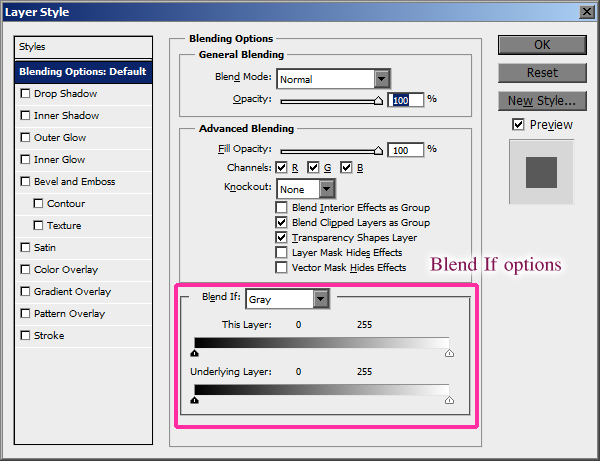
|
|
#
?
Sep 21, 2010 10:44
|
|

|
poopinmymouth posted:http://mr-chompers.blogspot.com/2010/09/blendifblendingoptionsinphotoshop.html That's a very useful trick! Really liking these posts, Ben. I'm trying to incorporate a totally new workflow into my photos. I may have rushed the sharpening on this one, but in general do any of you have thoughts/critiques on this regarding post processing? Here's a before & after shot:  before and after post by Eric Heiden, on Flickr Basically I did some perspective correction, cloned & flipped the left bannister, cloned out the alter child on the right side, gave the windows some "sunshine," upped the red saturation... and yeah a bunch of curves on individual people. Oh! And I had to reconstruct what was originally blocked of the little groomsman using pieces from the other guys. That was fun. Make me better at this! Cannister fucked around with this message at 12:09 on Sep 21, 2010 |
|
#
?
Sep 21, 2010 12:02
|
|

|
Cannister posted:
The main problem is that there is just too much to look at. I'd probably try to reduce contrast a bit on the upper part so it's not so attention drawing, let it be a bit more flat, it will still be grand by sheer design. Also the bride and the alter behind her are very flattening, I would do some kind of cutout on her to either make her bright on a dark background, or make her dark on a bright background, and then fade it till it looks more natural, but right now it's all so very flat because everything is contrasty and all the areas have almost full contrast range.
|
|
#
?
Sep 21, 2010 12:40
|
|
|
evil_bunnY posted:spf3million, keep the catalog on the SSD, import to the SSD then move the pics (from within LR) to your platters drive.
|
|
#
?
Sep 21, 2010 19:52
|
|

|
poopinmymouth posted:The main problem is that there is just too much to look at. I'd probably try to reduce contrast a bit on the upper part so it's not so attention drawing, let it be a bit more flat, it will still be grand by sheer design. Also the bride and the alter behind her are very flattening, I would do some kind of cutout on her to either make her bright on a dark background, or make her dark on a bright background, and then fade it till it looks more natural, but right now it's all so very flat because everything is contrasty and all the areas have almost full contrast range. Wait, what? It's all so flat because everything is contrasty? I don't know what you mean by that.
|
|
#
?
Sep 21, 2010 19:58
|
|
|
Why the hell is there no integrated LR3 correction profile for the Nikkor 85/1.8 
|
|
#
?
Sep 21, 2010 20:46
|
|
|
Cannister posted:Wait, what? It's all so flat because everything is contrasty? I think cloning out those lights at the top was a good idea.
|
|
#
?
Sep 21, 2010 20:50
|
|
|
Cannister posted:Wait, what? It's all so flat because everything is contrasty? Tell you what. Because I like you so much, send me the raw file, bjm foto at gmail dot com. I'll show you what I mean. (also, what Cross_ said)
|
|
#
?
Sep 21, 2010 21:50
|
|
|
I just got my new lappy and it has a "15.6" FHD Display (95% Gamut, 270nit) with LED Backlight" and holy crap the reds are burning my eyeballs out.
|
|
#
?
Sep 23, 2010 22:34
|
|
|
spf3million posted:I just got my new lappy and it has a "15.6" FHD Display (95% Gamut, 270nit) with LED Backlight" and holy crap the reds are burning my eyeballs out. I hear ya. When I first hooked up my Dell U2211H it was like getting punched in the back of the eyes. I rented a calibrator and tuned things up a little and I'm much happier.
|
|
#
?
Sep 24, 2010 03:21
|
|

|
I'd like to think I've learned a lot about editing by giving this thread a thorough read-through. Here's a photo I just re-edited from a couple of months ago: Old edit:  Elephant Beach, Westport, MA by Eric Heiden, on Flickr New edit:  The Beach, re-edit by Eric Heiden, on Flickr Improvements: Better sharpening, Much more full dynamic range, dodging and burning on the whitecaps, houses, & clouds, and what I think is a much nicer color palette. Thoughts/critiques? Cannister fucked around with this message at 03:30 on Oct 1, 2010 |
|
#
?
Oct 1, 2010 03:27
|
|
|
I liked the dark purple of the before more.
|
|
#
?
Oct 1, 2010 16:07
|
|
|
I like the sky in the original better, but the beach and buildings are more interesting in the retouched version. I think if I had never seen the two images together, I'd say they hold up well on their own.
|
|
#
?
Oct 1, 2010 16:10
|
|

|
poopinmymouth posted:I liked the dark purple of the before more. xzzy posted:I like the sky in the original better, but the beach and buildings are more interesting in the retouched version. Alright - I get both of these. I was really happy with the colors on the 2nd edit until I put it up next to the first edit in that post. I think on it's own though, without having seen the other edit, it works pretty well. I don't think I'll put any more time into that one though. I'd like to see this thread turn more into a "critique my post-work" thread. Like post originals and edit(s) of that photo and then have critiques like this one. I think that post is (can be, anyway) such a huge part of the end result that we should spend more time helping each other out with that. Anybody with me? If so: post a before/after!
|
|
#
?
Oct 1, 2010 16:46
|
|
|
Generic question: is there an easy way to remove hard flash shadows in post ? My process so far has been to create a duplicate layer with extreme Shadow/Highlight filtering and then soft brushing it over the original. Yet it seems like there should be some really simple way to automatically detect hard edges, turn it into a feathered edge and put it on a lighten layer.
|
|
#
?
Oct 1, 2010 21:11
|
|
|
I've noticed a lot in current films that everything looks coated in brown sugar or has a honey colored look to it while still retaining a perfect white. I can't for the life of me figure out how they do it since every time I get close my white balance is all off, is it more than just playing with HSL?
|
|
#
?
Oct 2, 2010 02:29
|
|

 Have you seen my apex seals? I seem to have lost them.

|
Can't you achieve it with a bit of split toning?
|
|
#
?
Oct 2, 2010 05:12
|
|

|
I'm wondering about best practices for renaming Lightroom catalogs. Right now I use one named "Lightroom Catalog". I'd like to switch over to "YYYY_LIghtroom_Catalog" or something, Basically to switch out catalogs every year just to keep things nice and clean. I'd like to rename my current catalog to 2007-2010_Lightroom_Catalog. Will just renaming the folder be enough? There's also a bunch of .lrcat files inside the "Lightroom Catalog" folder. Do I need to worry about those?
|
|
#
?
Oct 2, 2010 08:34
|
|

|
Aeka 2.0 posted:I've noticed a lot in current films that everything looks coated in brown sugar or has a honey colored look to it while still retaining a perfect white. I can't for the life of me figure out how they do it since every time I get close my white balance is all off, is it more than just playing with HSL? HSL or whatever. I think the look you are talking about is the result of killing the saturation in some channels to accentuate others (ie. -100 saturation on blues or cool tones to get warmer images and possibly bringing in something with split filtering on a curve). It's not solely color balance. quote:I'm wondering about best practices for renaming Lightroom catalogs. You just rename the lrcat file, LR isn't very picky about what things are called or if you rename them. If the catalog file you rename is set as the default it will just ask you what you want to open when you start it. quote:Generic question: is there an easy way to remove hard flash shadows in post ? Lighting things are really hard to correct in post and look good. The easy way is to light it correctly ") . What you did is pretty much how I would approach it. Usually it just requires a lot of dodging and burning to look natural. I just did this for a client the other day where there were harsh strobe shadows within a larger shadow and it was just a long slow process of 5% brushes on two curves, one for dodging and one for burning. It looked pretty drat good though in the end - it just takes forever. If you bracketed or can fake bracket from a RAW file sometimes that will give you a higher quality result than dodge/burn the existing information if you can mask it in the same way. In my experience the more texture the surface has the more manually you have to go in and fix it. If it's a smooth seamless or something you might be able to get away with fudging it with a quickly clone stamping with light brushes or maybe gaussian blurring an adjustment layer, but if it's something like fabric the benefits of a good tablet start to become apparent. . What you did is pretty much how I would approach it. Usually it just requires a lot of dodging and burning to look natural. I just did this for a client the other day where there were harsh strobe shadows within a larger shadow and it was just a long slow process of 5% brushes on two curves, one for dodging and one for burning. It looked pretty drat good though in the end - it just takes forever. If you bracketed or can fake bracket from a RAW file sometimes that will give you a higher quality result than dodge/burn the existing information if you can mask it in the same way. In my experience the more texture the surface has the more manually you have to go in and fix it. If it's a smooth seamless or something you might be able to get away with fudging it with a quickly clone stamping with light brushes or maybe gaussian blurring an adjustment layer, but if it's something like fabric the benefits of a good tablet start to become apparent.
brad industry fucked around with this message at 04:15 on Oct 3, 2010 |
|
#
?
Oct 3, 2010 04:12
|
|
|
dukeku posted:Can't you achieve it with a bit of split toning? brad industry posted:HSL or whatever. I think the look you are talking about is the result of killing the saturation in some channels to accentuate others (ie. -100 saturation on blues or cool tones to get warmer images and possibly bringing in something with split filtering on a curve). It's not solely color balance. well it appears I need to read up on split toning. Thanks. edit: which isn't hard to do at all. Aeka 2.0 fucked around with this message at 16:51 on Oct 4, 2010 |
|
#
?
Oct 4, 2010 08:22
|
|
|
I may go get Photoshop Elements because figuring out denoise in the UF RAW add-on for GIMP is really goofy. Would I be better-served going that way?
|
|
#
?
Oct 7, 2010 01:17
|
|


|
DJExile posted:I may go get Photoshop Elements because figuring out denoise in the UF RAW add-on for GIMP is really goofy. Would I be better-served going that way? I don't know if its the same thing but noise reduction in LR3 is phenomenal.
|
|
#
?
Oct 7, 2010 11:57
|
|
|
Fungah posted:I don't know if its the same thing but noise reduction in LR3 is phenomenal. Seconding this, I never used noise reduction in LR2 and had a trial of noise ninja and never felt like it was worth the money for my D90 shots. But the functionality built into LR3 gives me no fear of 3200 anymore.
|
|
#
?
Oct 7, 2010 21:33
|
|

|
What else do you use GIMP for, DJExile? If it's just noise then you would be better off investing in a copy of Lightroom 3 which is like magic in terms of noise reduction. If you actually use GIMP for touchups then you will obviously be better suited with a copy of Elements. Are you a student anywhere? Maybe see if you can find a student edition of Photoshop CS5, or try to find an older copy of CS4 which is still 100% useful. Hell, for all the editing I do I think I'd still be perfectly OK with Photoshop 7 or the original CS. I would probably look for a copy of CS3 or CS4 before I invested in Elements, but that's just me.
|
|
#
?
Oct 7, 2010 21:40
|
|
|
OK, so I have a Photoshop question. I'm fairly sure it's something simple, and because I've taught myself and not been taught properly, it'll be something pretty basic that I know nothing of, and probably to do with me working clumsily and destructively. Anyway, basically, I have this image I've created:  I want to flatten it and use it as a JPEG to add to other images and the like, but when I flatten it, it changes, like this:  What painfully basic thing am I doing wrong? I want to save this "as is", as one layer, in a jpeg, without it changing when I hit "flatten image". The blend modes in the layers you can see, from top to bottom, are soft light, multiply, normal and colour dodge. If that helps. EDIT: It seems that the image brightens up when I zoom out, and becomes much closer, and in some cases identical, to the actual image. So I'm getting an inaccurate preview unless I zoom right in. That's impossibly frustrating. Gazmachine fucked around with this message at 10:28 on Oct 8, 2010 |
|
#
?
Oct 8, 2010 09:41
|
|

|
The best solution I have found for this problem is to begin merging layers from the bottom up individually. I run across this problem occasionally, and that is the least frustrating solution I have found.
|
|
#
?
Oct 8, 2010 15:58
|
|
|
Martytoof posted:What else do you use GIMP for, DJExile? If it's just noise then you would be better off investing in a copy of Lightroom 3 which is like magic in terms of noise reduction. If you actually use GIMP for touchups then you will obviously be better suited with a copy of Elements. The situation: Until I found the WF RAW extension or whatever, I only shot in "Large Superfine" JPEG mode because I didn't have any way to edit RAW files. Now, my biggest issue is noise (Oly shootin' gently caress yeah  ) when I can get bitchin' moments like this... ) when I can get bitchin' moments like this... ...that are so noisy that a black kid has specks of orange in his skin  Outside of this, I'm really just adjusting W/B when needed, maybe rotating pictures a bit, then crop and resize. The noise is the biggest issue. I graduated college in 2006, so that's out.
|
|
#
?
Oct 8, 2010 17:49
|
|
|
So I honestly think that LightRoom3 is what you should invest in. Elements might be OK, but you'll still want some kind of third party noise reducer like Noise Ninja or Dfine, which will run you at least thirty bucks and most likely more if you want 16bit image support. My suggestion is to download the LR3 trial and run a few of your files through its noise reduction panel.
|
|
#
?
Oct 8, 2010 18:32
|
|
|
Martytoof posted:So I honestly think that LightRoom3 is what you should invest in. Elements might be OK, but you'll still want some kind of third party noise reducer like Noise Ninja or Dfine, which will run you at least thirty bucks and most likely more if you want 16bit image support.
|
|
#
?
Oct 8, 2010 19:16
|
|


|
Elemeno^P posted:The best solution I have found for this problem is to begin merging layers from the bottom up individually. I run across this problem occasionally, and that is the least frustrating solution I have found. Thanks, still no joy though I'm afraid. Not to worry, I'm working around it. Slowly.
|
|
#
?
Oct 8, 2010 20:58
|
|
|
Why not do Save for Web and Devices and keep that file as a PSD? I always use SWD since it automatically assigns a good color profile, since my working space isn't a standard one.
|
|
#
?
Oct 10, 2010 21:40
|
|


|
Gazmachine posted:
One other thing you could try is hitting Alt+ctrl+shift+E , which should merge everything visible onto a new layer while leaving your other layers intact below it. You then delete the other layers and save for web or save as to get your jpg. Don't ever delete the original with all layers unless you are sure you'll never use it again and don't have the hard drive space. I agree with Kazy on save for web, it works great, and may work by itself without the merging step I talked about. A quick tip for you, it looks like you are making your changes to a specific area by erasing that part of the layer. Look up some tutorials on layer masks. It is a much less destructive way of working; it makes it very easy to go back and change the area you want to adjust.
|
|
#
?
Oct 11, 2010 01:39
|
|
|
Anyone got a nice shot that is a bit noisy they'd be willing to give me as a full resolution to demonstrate my noise reduction technique? b j m foto (at) g mail dot com
|
|
#
?
Oct 12, 2010 11:07
|
|
|
When sharpening images I can easily see the impact of the Masking slider in LR, but Amount, Radius, and Detail are somewhat elusive. Typically I just drag them around until something looks kind of okay. Is there any "by numbers" approach to sharpening images? E.g. if your image size is X by Y, and it's a portrait, use Radius amount Z ?
|
|
#
?
Oct 12, 2010 23:37
|
|
|

|
| # ? Jun 5, 2024 20:21 |
|
|
No idea where to post this so it's going here. Anyone know how to adjust the EXIF date by one year for a group of photographs? I have a collection of shots that were sent to me and they managed to miss setting the year on the camera so it's loving with lightroom
|
|
#
?
Oct 13, 2010 07:36
|
|