|
Try isolating the raindrops on their own layer and then embossing and playing with the angle of the light. Then flatten that layer and find a way to kill the smooth edge from the effect so it blends back better. I'm just sort of imagining what I'd try, I don't know how it'll look.
|
 #
?
Nov 4, 2010 01:46
#
?
Nov 4, 2010 01:46
|
|


|

|
| # ? May 16, 2024 08:31 |
|
|
rear end is my canvas posted:Try isolating the raindrops on their own layer and then embossing and playing with the angle of the light. Then flatten that layer and find a way to kill the smooth edge from the effect so it blends back better. I'm just sort of imagining what I'd try, I don't know how it'll look. They're already on their own layer (actually quite a few of them) so that won't be that hard to try. I'm not sure how much I want to play with them though, I wanted the drops to be a little more subtle since rain drops wouldn't be splashing all that much, it's already a bit exaggerated, so I'm not trying to draw that much attention to it.
|
|
#
?
Nov 4, 2010 01:50
|
|
|
Maybe bring down the opacity of the rain over his arms a little, get some of his natural skin tones coming though. I don't mean like 50%, but see how it looks a little more transparent.
|
|
#
?
Nov 4, 2010 01:58
|
|

|
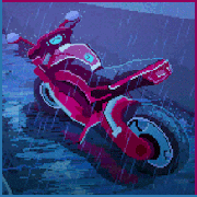
Do you dudes like this? Or is it too over the top? My first real attempt at any sort of artistic post.
|
|
#
?
Nov 4, 2010 02:01
|
|


|
I don't think the toning on the image matches the subject of the photo in the slightest. You have two bright colors on the car itself (that and the car itself is visually loud, but you toned the images to have sort of a dark, muted tobacco hue to it. I'd suggest masking off the car and doing color work on them separately dropping the saturation of the background more than that of the car, so the car stands out more.
|
|
#
?
Nov 4, 2010 02:18
|
|
|
rockcity posted:I don't think the toning on the image matches the subject of the photo in the slightest. You have two bright colors on the car itself (that and the car itself is visually loud, but you toned the images to have sort of a dark, muted tobacco hue to it. I'd suggest masking off the car and doing color work on them separately dropping the saturation of the background more than that of the car, so the car stands out more. I'll give that a go. Thanks man  Is there a quick way to mask stuff out? Or just do it manually with pentool/selection tool?
|
|
#
?
Nov 4, 2010 02:51
|
|
|
A5H posted:I'll give that a go. Thanks man Well, with sharp edges like that I'd use a polygon lasso tool and then just feather it a bit to round out the sharp edges.
|
|
#
?
Nov 4, 2010 03:05
|
|
|
AIIAZNSK8ER posted:I've always kind of wondered about how much of a team effort goes into this stuff. Does a producer freelance out the photographer, hair/makeup, and retoucher? Or do you belong to one production house? I work at a retouching house (we publish and as of recently do movie editing as well), the photogs choose us though we have some contracts with certain companies quote:I don't think you can really equate the two in terms of actual result. I use clone/heal/patch a lot and it up close it isn't that satisfactory in preserving skin texture detail. Dodging and burning is the best for skin, I say this a lot. But god don't do it at 300% or 500% or whatever that sounds painful. Switch between 100% and more zoomed out, blend shapes. That one goon posted tutorial is a good start for learning
|
|
#
?
Nov 4, 2010 06:19
|
|
|
Due to some less then ideal circumstances I am going to be forced to return to editing on a G4 iMac instead of the much faster vista machine that I have been using for the past six months or so. Currently I am using Lightroom 3.2 and CS5 with a catalog of about 11,000 images. The catalog is entirely raw files from a 10d and 40d that have not been converted to dng. What is the best way to export my catalog so that I will be able to see my lightroom edits when I am using PS CS4 on the old mac? On the iMac I do have a copy of Lightroom 2.x but it runs far too slow to use and so bridge/photoshop make for a better workflow.
|
|
#
?
Nov 6, 2010 16:04
|
|
|
Just tried my first ever 'tone-map' What do you guys think? I tried to not go over the top but I may have still done. Before:  After:  Ideally I'd like to take a bit of colour out of the tarmac. But I don't know how to  . .
|
|
#
?
Nov 6, 2010 17:20
|
|
|
Not bad, not over the top. The vignette in the upper left corner is bugging me though. I'm sure it's not, but it feels like it's the only dark corner. I'd dodge that corner a little to make it a little (lot?) lighter. Alternately, are you using lightroom 3? Try turning on lens profile correction on your source image to get rid of the vignette, or crank the post-crop vignette slider in the positive direction.
|
|
#
?
Nov 6, 2010 18:30
|
|
|
Martytoof posted:Not bad, not over the top. The vignette in the upper left corner is bugging me though. I'm sure it's not, but it feels like it's the only dark corner. I'd dodge that corner a little to make it a little (lot?) lighter. Thanks buddy!  Fixed?
|
|
#
?
Nov 6, 2010 18:35
|
|
|
Yeah, feels much better to me. You can try to mask off the asphalt from the crowd and car and desaturate the magentas to get rid of the pinkish hues if that's bothering you. I think as far as HDR images go, it's fairly good ")
|
|
#
?
Nov 6, 2010 18:38
|
|
|
AIIAZNSK8ER posted:I've always kind of wondered about how much of a team effort goes into this stuff. Does a producer freelance out the photographer, hair/makeup, and retoucher? Or do you belong to one production house? Well, commercial jobs are definitely a huge team effort. Generally the photographer hires the retoucher and rest of the crew who are all freelancers. If there's a producer or rep they might make the actual phone calls to book the crew but it's the photographer who makes the decision. The only in-house retouchers or techs I know work at huge volume places (ie. The Gap's in house production studio) where everyone is on the payroll and they color correct catalog images or something boring like that all day every day. quote:The confusing part comes at the very end when I actually convert to the printer profile You don't convert the actual file to the printer profile, you just choose it in the drop down list on the print dialog. The file should be in whatever color space your profile target was.
|
|
#
?
Nov 7, 2010 02:33
|
|

|
I've just done a batch resize in irfanview. With all the advanced settings unticked apart from resize. For some reason it's slightly changed my colours? It's annoying as gently caress because everything looks a lot more desaturated after the resize. Thoughts?
|
|
#
?
Nov 8, 2010 03:06
|
|
|
Irfanview only recognizes sRGB so it's probably a color space issue.
|
|
#
?
Nov 8, 2010 03:21
|
|
|
TheLastManStanding posted:Irfanview only recognizes sRGB so it's probably a color space issue. So if I resize individually in Photoshop then upload to the Internet will all my colors be screwed up? I really don't understand colour profiles .
|
|
#
?
Nov 8, 2010 03:32
|
|
|
A5H posted:So if I resize individually in Photoshop then upload to the Internet will all my colors be screwed up? If you're uploading for anyone to see, your colours will be all screwed up on the viewer's end. Not only will they all be screwed up, they will be screwed up in ways you cannot forsee or imagine and there is nothing you can do about it. Edit: It seems I have ranted about this before SirRobin fucked around with this message at 05:54 on Nov 8, 2010 |
|
#
?
Nov 8, 2010 05:49
|
|

|
SirRobin posted:If you're uploading to the internet for anyone to browse you might as well just forget about colour profiles. A5H posted:So if I resize individually in Photoshop then upload to the Internet will all my colors be screwed up? I really don't understand colour profiles
|
|
#
?
Nov 8, 2010 08:13
|
|
|
TheLastManStanding posted:Even if you are posting to the net you should still deal with your color profile. I'd rather have my colors wonky for most people than for everyone. TheLastManStanding posted:Using photoshops 'save for web' feature is the best way to deal with it. When converting from raw you can set your colorspace. Unless I plan to print something then I'll always work in sRGB. SirRobin fucked around with this message at 09:10 on Nov 8, 2010 |
|
#
?
Nov 8, 2010 09:03
|
|
|
flyingbathtubpirate posted:Don't know if this is of any use to the OP but if you want to add a goon-written tutorial for beginners that introduces proper D&B work for skin; I just want to say this is an awesome tutorial, and thanks. No more 40%blur-layer-with-mask-and-fade for me!
|
|
#
?
Nov 9, 2010 09:29
|
|

|
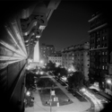
I'm wanting to pull off some ultra high contrast B&W landscape/cityscape shots.(pretty much only solid blacks and solid whites and not much inbetween) I'm wondering what preparations I can make to help, rather than just take a normal shot and push the contrast in post.. example:  marcin_stawiarz-hongkong02 by Marcin Stawiarz, on Flickr
|
|
#
?
Nov 10, 2010 10:51
|
|
|
Cyberbob posted:I'm wanting to pull off some ultra high contrast B&W landscape/cityscape shots.(pretty much only solid blacks and solid whites and not much inbetween) I love the gently caress out of high contrast stuff either way though. http://www.flickr.com/photos/robertdx/3339561271 (city) http://www.flickr.com/photos/robertdx/3427338143 (urbex) http://www.flickr.com/photos/robertdx/4420435093 (sports) http://www.flickr.com/photos/robertdx/3275905476 (city) http://www.flickr.com/photos/robertdx/4810631251 (sports) Textures play an important role. Selective sharpening helps. Incorporating the sky as a highlight area is a good place to start. Shadows are very important, both strong and gradual ones depending on style. Although pushing the contrast bar in lightroom helps a lot, learning how to use curves in Photoshop goes a long way too. For some of those above I would simply desaturate the image, make an adjustment levels layer with high contrast, and then mask in the parts that looked good. You play around with things and try different layer blending modes. I'm sure there is a proper way to do it, but just experimenting is pretty fun.
|
|
#
?
Nov 10, 2010 19:28
|
|

|
I just picked up a Wacom Bamboo Fun to better hone my (non existant) post skills. Mostly for my studio shots. Anyone have a good tutorial for it? The one I find out youtube are terrible. I'm starting from basically "let's adjust the clarity slider from -10 to 10 and see if that looks better, and oh hey, maybe up the blacks a bit here. Vibrance? Who even knows what that does but lets put that at 25. Yeah there we go that's about right" and would like to get past that. Something along the lines of airbrushing amateur models in to not as amateur. Edit: Wow. I just re-read the OP, and my eyes glazed over the "Tutorials" section the first time. I even asked myself "why aren't there links to tutorials in here" milquetoast child fucked around with this message at 07:32 on Nov 11, 2010 |
|
#
?
Nov 11, 2010 06:55
|
|
|
The one thing that I learned from owning a wacom tablet is that learning the keyboard shortcuts for Photoshop are a MUST. There's nothing like losing your little precise cursor over a gray background trying to hunt through your tool menu. [ and ] will be your best friends when you have a pen in the other hand.
|
|
#
?
Nov 11, 2010 18:54
|
|
|
Martytoof posted:
If I recall correctly, the Fun has a wheel that can be programmed to brush size. My Intuos has a wheel with a button in the middle, and I can switch between Zoom, Brush Size, Softness, and canvas rotation. It's also really handy to put the most common shortcuts you use on the tablet's programmable buttons. I usually only use my tablet for selections/masking, I have trouble using sliders with it.
|
|
#
?
Nov 11, 2010 21:56
|
|


|
I think it's odd how the ergonomics of a mouse change with the task. I can play TF2 for hours without any problem, but if I'm using the mouse for post processing, after an hour my wrist is killing me. That's why I jumped to a tablet alone.
|
|
#
?
Nov 11, 2010 23:24
|
|

|
My wife owns a small wacom tablet but I almost never use it for post.. I use a mouse, and I'm happy. I try and use a tablet, and I'm always tapping in the wrong place.. How long does it take to learn how to use one properly? For now, mouse is king, but I know that if I learnt how to use a tablet properly, it'd be much better.
|
|
#
?
Nov 11, 2010 23:53
|
|
|
Cyberbob posted:My wife owns a small wacom tablet but I almost never use it for post.. Probably depends on how frequently you use it. I did some coloring for work with a tablet and during the week or so it went smoothly. Since then the tablet's been gathering dust since I am faster and more accurate with a mouse for the occasional masking/dodging/burning.
|
|
#
?
Nov 12, 2010 22:21
|
|
|
It takes maybe a day or two to get used to it. I do a lot of retouching on set, and am at least twice as fast with a tablet for things like clone stamping and and mask making. Using a mouse feels clumsy to me, everything takes 2-3 passes and you often have to backtrack to get things right where it would take 1 with a tablet. It's like scalpel vs. crappy paintbrush.
|
|
#
?
Nov 12, 2010 22:45
|
|
|
brad industry posted:It takes maybe a day or two to get used to it. I do a lot of retouching on set, and am at least twice as fast with a tablet for things like clone stamping and and mask making. Using a mouse feels clumsy to me, everything takes 2-3 passes and you often have to backtrack to get things right where it would take 1 with a tablet. It's like scalpel vs. crappy paintbrush. I just got an Intuos4, and I was kind of worried that I was just too naturally uncoordinated to use it. After a couple of hours, it felt alot more natural. The radial menu is pretty kickass.
|
|
#
?
Nov 13, 2010 00:51
|
|
|
brad industry posted:It takes maybe a day or two to get used to it. I do a lot of retouching on set, and am at least twice as fast with a tablet for things like clone stamping and and mask making. Using a mouse feels clumsy to me, everything takes 2-3 passes and you often have to backtrack to get things right where it would take 1 with a tablet. It's like scalpel vs. crappy paintbrush. Plus you can't replace pen pressure with a mouse. Fine work needs control in opacity or flow to properly mask and blend.
|
|
#
?
Nov 13, 2010 13:26
|
|

|
Hey guys. I put up my article of pictures using the previous advice I got! Think it came out quite nice on the whole? http://www.driftworks.com/2010/11/car-feature-dans-datsun/ Thoughts on the images?
|
|
#
?
Nov 14, 2010 15:16
|
|
|
Found a quick overview of using channels and how they are related between color spaces: http://retouchpro.com/tutorials/?m=show&id=291 If you're comfortable doing most retouching tasks in PS the thing you should concentrate on is channels, there is so much you can do that will speed up a lot of things and improve the quality of your files. There is this ancient out of print book called "Photoshop Channel Chops" that is loving amazing for information like this, even though it was written for PS4 I think.
|
|
#
?
Nov 17, 2010 20:23
|
|
|
Martytoof posted:The one thing that I learned from owning a wacom tablet is that learning the keyboard shortcuts for Photoshop are a MUST. There's nothing like losing your little precise cursor over a gray background trying to hunt through your tool menu. I've been using a tablet so long (at my job mostly, boss replacing mice with tablets years ago for ergonomic reasons) it's become second nature to tuck the stylus in a balancing position on the inside of my right thumb rather than putting it down when I go to touch-type. I flip between that and using it on the tablet with just the one hand. I didn't even realize I was doing it until I looked down one day 
|
|
#
?
Nov 18, 2010 06:14
|
|
|
photos of mine in Lightroom 3 and Windows Photo Gallery are warm. photos of mine in IE/Chrome/Firefox/Paint.net are cool. I just want them consistent one way or another... I have searched around and still cannot find an answer on how I can get LR3 to show photos to me the same as they'll be seen on most browsers. I realize that still doesn't mean everyone will see them the way I want but this would put me closer. Any ideas? I'm on Vista if that makes any difference.
|
|
#
?
Nov 20, 2010 20:52
|
|

|
Make sure you always export from lightroom as sRGB if you want your images to look right on the web. Some browsers (Chrome) still assume everything is sRGB / untagged. Also, if you're shooting JPEG, make sure your camera is set to sRGB and not AdobeRGB. gib fucked around with this message at 23:42 on Nov 20, 2010 |
|
#
?
Nov 20, 2010 23:35
|
|
|
thanks gib - though I was already doing both (exporting as sRGB and shooting RAW). Since I wasn't having much luck googling around lightroom/browsers I started searching the windows photo gallery viewer that was having the problem too -- top hit was about the background in the viewer having a yellow tint which mine did too and I always thought odd. A boring story short I had a bad monitor color profile that I removed and all is good now.
|
|
#
?
Nov 21, 2010 05:45
|
|
|
I am trying to apply some heavy contrast + clarity + exposure compensation to some black and white images in Lightroom. They look like I want to in the preview inside Lightroom. Here's a screenshot: Clipboard01 by helmstedt, on Flickr But when I export the files, even as 100% JPG files, I get some annoying white artifacts (check out the hair):  IMG_6975 by helmstedt, on Flickr Why does this happen? Anything I can do to fix it?
|
|
#
?
Nov 21, 2010 21:21
|
|

|

|
| # ? May 16, 2024 08:31 |
|
|
I can't tell you what's happening but it appears that the exposure on the whole image is changing. Look at the shadows and you'll see the extra shadow detail. I suppose its possible that its sharpening during export that's doing it (the only export setting I can think of that would cause this), but it's definitely not just artifacts.
|
|
#
?
Nov 21, 2010 22:01
|
|