


|
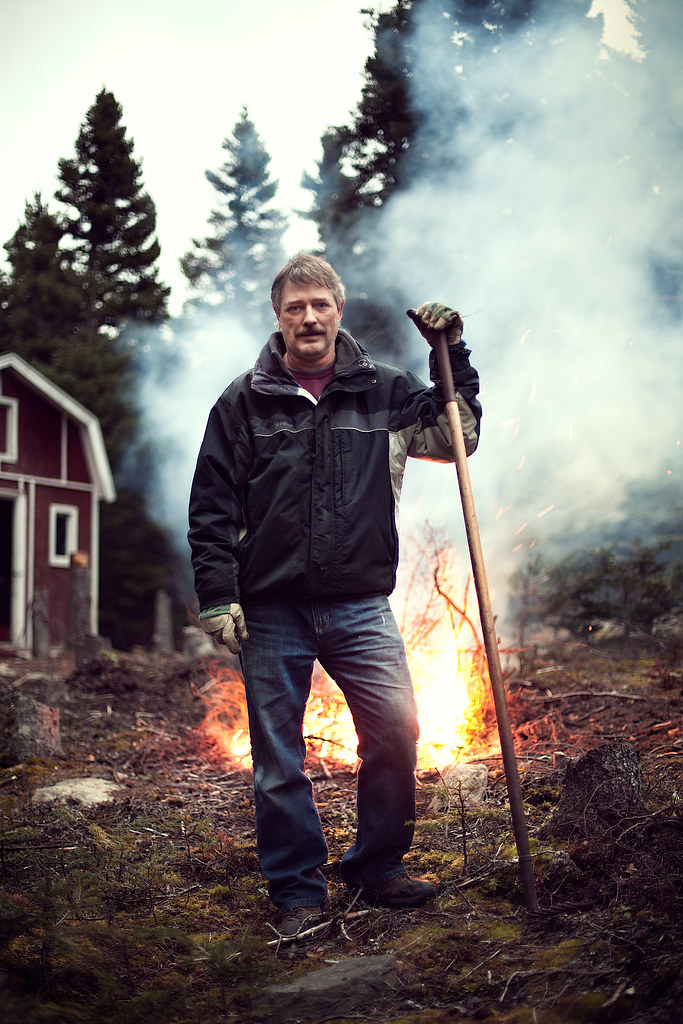
Penpal posted:my dad was burning some fuckin' wood so I ran out really quick and took a pic There are no words for how great this is. Everything about it just really works for me. Nice one.
|
 #
?
Nov 21, 2010 04:14
#
?
Nov 21, 2010 04:14
|
|


|

|
| # ? May 17, 2024 15:01 |
|
|
Penpal posted:my dad was burning some fuckin' wood so I ran out really quick and took a pic It's pretty bad rear end, though I would've liked the fire a bit more to camera right. or have him centered more in front of it. His pose is great.
|
|
#
?
Nov 21, 2010 05:49
|
|

|
Penpal posted:my dad was burning some fuckin' wood so I ran out really quick and took a pic This is a great shot because it speaks volumes about your dad for others, while still being a great picture for the family. Some pictures for the new page. It was certainly a learning experience.   
|
|
#
?
Nov 21, 2010 11:14
|
|

|
Penpal posted:my dad was burning some fuckin' wood so I ran out really quick and took a pic This owns. The one thing I dislike is the blur of the trees against the sky is kind of busy and grating. It could be sharpening on the bokeh, or just a lens with unpleasing blur, but my fix would be to mask out all sharpening effects from there, and if it's still there, duplicate the layer, use the blur > lens blur with an 8 bladed curve aperture setting just high enough to get rid of the grating look, then mask it all out, and mask back in just on the edges of the tree.
|
|
#
?
Nov 22, 2010 11:41
|
|

|
DanTheFryingPan posted:This is a great shot because it speaks volumes about your dad for others, while still being a great picture for the family. Man that first guy is handsome. On the lighting, you should try not to make your rim light so hot. It not only flattens the face, but it also makes it feel like you should care about the source. My eye wants to go out of the frame camera right to see the source of the light because of the brightness and prominence of the effect. Dim it by at least one stop, maybe 2.
|
|
#
?
Nov 22, 2010 11:43
|
|
|
poopinmymouth posted:This owns. The one thing I dislike is the blur of the trees against the sky is kind of busy and grating. It could be sharpening on the bokeh, or just a lens with unpleasing blur, but my fix would be to mask out all sharpening effects from there, and if it's still there, duplicate the layer, use the blur > lens blur with an 8 bladed curve aperture setting just high enough to get rid of the grating look, then mask it all out, and mask back in just on the edges of the tree. I don't think that's what's distracting there at all, it's the extreme contrast that's drawing your eye to it. Nobody likes recovered highlights, but a little burning there, and some dodging of the trees (and perhaps lower overall scene contrast) would control it nicely.
|
|
#
?
Nov 22, 2010 11:47
|
|

|
Reichstag posted:I don't think that's what's distracting there at all, it's the extreme contrast that's drawing your eye to it. Actually now looking at the full size, it looks like it's just super aggressive sharpening applied to the entire image. Mask that poo poo. And potentially burn the sky like Reichstag suggested.
|
|
#
?
Nov 22, 2010 12:03
|
|
|
New shoot from this weekend. http://mr-chompers.blogspot.com/2010/11/svavarshoot.html 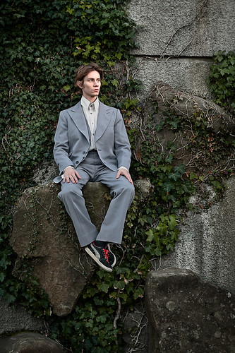
|
|
#
?
Nov 23, 2010 11:09
|
|
|
poopinmymouth posted:New shoot from this weekend. Just one note composition wise- I think the photo would be a lot more interesting if you cloned out or cropped out that rock in the lower left. If you do that it'll remove the ground from the image and make it look more like he's randomly sitting on a wall with no sense of bottom or top. I like the styling on it a whole lot.
|
|
#
?
Nov 23, 2010 15:36
|
|

|
 One part of me wishes I'd thrown in some fill on the right of the front girls dress but the other part likes the fall off from left to right.
|
|
#
?
Nov 23, 2010 18:25
|
|
|
I just got my ABs, hence started playing around with them. I'm not comfortable enough to get people to model for me. So.. here's your truly.  Portrait de moi-m�me by Maxime Theriault, on Flickr I had the huge lightbox camera left and a golden reflector camera right. Seems pretty good to me, what did I do wrong? I ordered a proper background stand, that was a make shift back drop made from a wrinkled white curtain BTW, an intervalometer is essential to the making of self-portrait, I've found. I set it to take 20 pics at 2 sec intervals and simply made faces until it was done. IsaacNewton fucked around with this message at 19:11 on Nov 24, 2010 |
|
#
?
Nov 24, 2010 19:06
|
|
|
DanTheFryingPan posted:This is a great shot because it speaks volumes about your dad for others, while still being a great picture for the family. Clone the stray hairs on your female models, they're really distracting. I like the lighting overall, but I agree the rim light is a bit too hot. Good job ")
|
|
#
?
Nov 24, 2010 21:57
|
|


|
poopinmymouth posted:Actually now looking at the full size, it looks like it's just super aggressive sharpening applied to the entire image. Mask that poo poo. And potentially burn the sky like Reichstag suggested. so I know basically next to nothing about masking. I have done it very few times, probably very shoddily, going through tutorials AS I did it. Any good places to start? If you don't know off hand, just say so and I will google around. 
|
|
#
?
Nov 29, 2010 03:56
|
|


|
For sharpening, an easy way is to flatten your final image, duplicate it, then apply your sharpening technique. Click the mask button, and then brush in the areas you don't want sharpened. You'll likely want to use 100% opacity for most OoF areas; but grass, water, skin, etc. will usually require less, so use a lower value.
|
|
#
?
Nov 29, 2010 04:59
|
|
|
A better way is to duplicate your final flattened image and use Filter > Other > High Pass and apply the desired amount. You'll usually not use very much so keep the slider on the left side :-p Then overlay this layer, and then mask it with brushes of various opacities.
|
|
#
?
Nov 29, 2010 06:18
|
|
|
I've been using the high-pass filter for a while now, it makes hair and other fine textures (wet streets) really pop. It's just masking that I'm poo poo at. I want to become a masking wizard. Help me, someone.
|
|
#
?
Nov 29, 2010 06:35
|
|
|
Penpal posted:I've been using the high-pass filter for a while now, it makes hair and other fine textures (wet streets) really pop. It's just masking that I'm poo poo at. I want to become a masking wizard. Help me, someone. For Masking: d - resets the fore/background colors to white/black x - swaps between fore/background colors [ / ] - make your brush smaller/larger alt + clicking mask - makes the mask visible (useful for checking things) hold alt - color picker hold space - move around (hand tool) White shows that layer/Black shows the lower layers Masking is one of the most important skills since you will use it on nearly every picture to some extent. You need to make yourself comfortable with it.
|
|
#
?
Nov 29, 2010 06:51
|
|
|
Fuuuuuck high-pass and the haloing it rode in on. Try this instead- In PS go into channels. Ctrl click RGB and copy the selection. Go back to layers and paste onto a new layer. Do the same thing again except this time invert the selection before you copy. This is how you keep the cool, cool and the hot, hot (I remember McDLT) Now use unsharp mask on each layer. Max out the amount, threshold to zero and the radius is the variable. Tweak the dark layer first till the image comes into focus. Use the same settings on the light layer. Take both these layers and dump them into a folder. Add a mask to the folder and paint out any moire patterns.
|
|
#
?
Nov 29, 2010 08:32
|
|

|
Penpal posted:I've been using the high-pass filter for a while now, it makes hair and other fine textures (wet streets) really pop. It's just masking that I'm poo poo at. I want to become a masking wizard. Help me, someone. Here: http://www.poopinmymouth.com/tutorial/masks.htm don't say I never gave you nothing.
|
|
#
?
Nov 29, 2010 11:39
|
|
|
haha holy poo poo, I'm learning photoshop! I just used masking legitimately for the first time. Like using different gradients to let poo poo seep through. How I got by without this so far is weird. I guess that's what you get when you teach yourself everything
|
|
#
?
Nov 30, 2010 01:19
|
|
|
DanTheFryingPan posted:These are really solid.
|
|
#
?
Nov 30, 2010 06:34
|
|
|
I guess I'll add some content. I think I've been getting better but at the same time getting much worse. Better at talking to people and posing them, worse at taking correctly exposed and composed photos. Afterwards I'm able to get some referrals and follow up conversations. These are all portraits for a business magazine.  endurance network solutions by AIIAZNSK8ER, on Flickr President of an IT firm, all I had access to was a medium sized conference room. 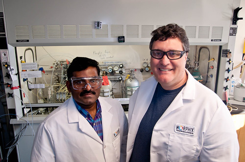 morphix by AIIAZNSK8ER, on Flickr 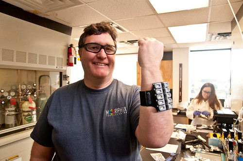 morphix by AIIAZNSK8ER, on Flickr These guys make wearable tags that change color in the presence of dangerous chemicals. The big dude is the CEO. The lab was super cluttered and cramped. The experiments they were running are precisely timed, so I only had a few minutes in between to move things around. Excuses I know. 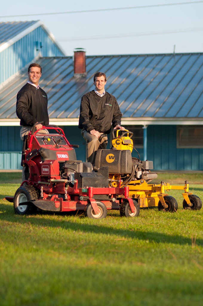 townscapes by AIIAZNSK8ER, on Flickr They own a full service landscaping company. This was in between two huge warehouses in an industrial park, where they house all the equipment.  work for dad by AIIAZNSK8ER, on Flickr She runs a company that creates W2 income for kids by doing chores for their parents so they can open retirement accounts. Really insane concept.
|
|
#
?
Dec 1, 2010 17:58
|
|
|
Great separation of background and subject on that first shot, but the slight lean of the picture frame is irking me horribly  Did you approach the business magazine and ask if they had anything you could do?
|
|
#
?
Dec 2, 2010 00:27
|
|
|
I'm going to throw out some critique as I'm waiting for class to start. Hopefully it'll help!AIIAZNSK8ER posted:
Too much negative space on top. Don't worry about cutting into the frame behind him, it doesn't have any significant meaning to add to the photo and "tilts" the image pretty heavily anyway. There are a few distracting splotches of light on the left side of his face that could easily be healing brushed out. Consider also cloning out the buttonhole on his jacket. AIIAZNSK8ER posted:
I may be reading too into this, but the placement of the two subjects, given their ethnicities and difference in expression make me think "outsourcing". If you had shot more at eye level and perhaps had them sort of near the same height in the image with similar expression it would be a better convey the feeling of a "team". The second one is kind of goofy cool. AIIAZNSK8ER posted:
You can definitely crop from the top and bottom. This is essentially a portrait of the two and the empty space don't do the image any favors. You'll still see the large warehouses and grass, which keep the idea of landscaping and equipment relevant. If they are going to be dressed up, it may have been good to clean the mowers as well. Having the guy on the right in the direct sunlight is forcing an unflattering squint and make him seem "weaker" than the one on the right. AIIAZNSK8ER posted:
Not much to say, perhaps heal the gleam on her upper gumline?
|
|
#
?
Dec 2, 2010 01:36
|
|
|
Oprah Haza posted:"outsourcing". If you had shot more at eye level and perhaps had them sort of near the same height in the image with similar expression it would be a better convey the feeling of a "team". I didn't think outsourcing but that's a good point. What struck me is that he put the darker-skinned guy farther from the light source... than the big white guy... big white guy blocking his light. So the dark-skinned guy has a nearly featureless shade side.
|
|
#
?
Dec 2, 2010 02:01
|
|

|
Thanks guys, I swear I thought that I was parallel to the picture frame at the time. I will keep the skin tone difference in mind next time I come across it. It seems so obvious after you pointed it out. I don't know why I like the arm band photo so much. I wanted to get this science superhero kind of thing going. The nerdiness of it really appeals to me. I worked with him for a while to get that pose, at first his arm was too foreshortened. I had to keep cranking it over just enough so it wouldn't cut off his shoulder and give a sense that his arm was actually connected to his body. I work for a financial planning firm, and the concept of the magazine was started by someone who works in my office. It's goal is to create a resource and a community of small business owners. I don't get paid much by the mag, but I sell the images back to the company, and also get to network with the owners. It's all about building relationships.
|
|
#
?
Dec 2, 2010 04:15
|
|
|
AIIAZNSK8ER posted:
|
|
#
?
Dec 3, 2010 01:29
|
|
|
Cross_ posted:I quite like this picture. What did you do lighten the right side of her face ? 32 inch reflector, I think I used white side. The sun was in a cool position though. It was 10am, the sun was being reflected off a glass building and it made a beam of nice golden light, while she was standing in the shade of an adjacent building. It was like the light was sneaking through an alleyway. I had her stand in it and then filled with reflector.
|
|
#
?
Dec 3, 2010 17:32
|
|
|
I don't remember posting these but here are some of my teammates for a head-shave we did for cancer research. 10 minutes to shoot the four of us + group shot. It was fun but a little annoying to have so little time.  
|
|
#
?
Dec 3, 2010 18:05
|
|
|
I've had a photo shoot session with a friend, she wanted pictures of her daughter for her scrap booking. I was there to learn how to make proper portrait as that was the first ever portrait session I've had. (excluding the self portraits shoots I've tried to do) Anyone have pointers on photographing kids that age? They get bored VERY quickly and I have a very hard time conveying my pose ideas to them, like sometimes I try to mimic the pose I want them to have and they don't really get it even through explanations. Do I just suck or is that something normal for kids 6 ish year old? I wasn't quite sure of what to expect. Also, my backdrop sucks, I want to try to use the environment more but It's more often than not very hard to find a clean backdrop that isn't too busy and overwhelm the person I'm photographing. Do you guys move stuff around at location to make portraits? So, I'm really open to constructive critics.  Osaka et son jolie sourire by Maxime Theriault, on Flickr
|
|
#
?
Dec 3, 2010 18:14
|
|
|
Have them step away from the backdrop so you can light it independently (and throw it OOF if you like).
|
|
#
?
Dec 3, 2010 18:38
|
|

|
http://www.behance.net/gallery/Current-Work/812363 I saw this earlier. It was on the front page of Behance, which usually means its a pretty great project. But this... there was something about it that I didn't like. Pretty much all the photos seem amateurishly processed. Like, when someone first gets Lightroom and pushes the Clarity and Vibrance sliders all the way. There's even some HDR. I feel like it comes down to that topic of celebrities being in photos somehow magically makes them "seem" better. I mean, this guy has decent photo content, but honestly I like Penpal's photo of his dad more than anything in that portfolio. Kind of a lot more. I mean, what is this?  This looks like a lovely graduation picture from the 90's. From some "studio" in a small town where this guy's the only photographer. The blacks are crushed to oblivion, and the whites are totally 'sploded. I wasn't sure where to post this, as they surely aren't bad enough for "terrible photography", and "No Advice..." seems to be in the heat of a debate of sorts. I just feel these are overrated, and they would never have gotten as much (or any) recognition if not for the fact that there are celebrities in them.
|
|
#
?
Dec 4, 2010 06:38
|
|
|
drat, those are some famous people. I really like the concept of including the color markers and showing all the lighting equipment, but there's too many where you are right. The over processing kills it. Looking at his main site, there are some really neat images. I think he's just taken it too far for a few of them, although he may be trying to make a point. Brad Trent posted:A number of years ago it occured to me that just about 99% of what I did was a fake. For a guy who began his career shooting photo essays for Life and Time, my work had become, by its very nature, the type of thing that requires a large amount of preparation and styling and lighting and therefore... it ain't real!
|
|
#
?
Dec 4, 2010 07:08
|
|
|
Looking for advice... I only just got my first DSLR less than a week ago, along with lightroom. Before that I was using a Fujifilm S7000 for a year, with no post. I need any constructive criticism at all, it's all very welcome. I am simply amazed at the levels of quality displayed by the majority of posters in this forum. I am embarrassed to be posting my own, but I know that there's a lot be learnt from doing so. These first two are my first ever photos taken in RAW! I was amazed at how post can be so much more fruitful with it. I know I can be a bit of a whore when it comes to high contrast black and white.      
|
|
#
?
Dec 6, 2010 00:02
|
|
|
Manny Calavera posted:Looking for advice... I only just got my first DSLR less than a week ago, along with lightroom. Before that I was using a Fujifilm S7000 for a year, with no post. I kind of like how you processed the first three. I like that you went for more muted colors, rather than going saturation-crazy.
|
|
#
?
Dec 6, 2010 01:07
|
|
|
Manny Calavera posted:Looking for advice... I only just got my first DSLR less than a week ago, along with lightroom. Before that I was using a Fujifilm S7000 for a year, with no post. The mirror shot, you have neither the girl, nor her reflection in focus. Pick one. The blown highlights are killer in a couple of these.
|
|
#
?
Dec 6, 2010 01:13
|
|

|
I'm having trouble figuring out the no smile portrait. Sometimes getting a smile turns into a cheesy or poo poo eating grin. Part of it is getting the subject to relax, but also getting them to express some kind of emotion other than boredom. What sort of direction have you guys had success with? I deal with business owners, so I tell them to think about how they feel when they land a new contract/client or their latest shipment gets out the door. Or when they hear positive feedback from a happy customer. It tends to help, but I look at other business portraits and there's a sense of power and confidence that comes from the 'no smile' look.
|
|
#
?
Dec 6, 2010 20:20
|
|
|
I converse with them and push the shutter right at that moment when their eyes light up. I've had experience with two non-smiler and got nice-ish smile out of it that way. You don't want them to old it for a while; that quickly become a fake smile.
|
|
#
?
Dec 6, 2010 20:56
|
|
|
AIIAZNSK8ER posted:I'm having trouble figuring out the no smile portrait. Sometimes getting a smile turns into a cheesy or poo poo eating grin. Part of it is getting the subject to relax, but also getting them to express some kind of emotion other than boredom. What sort of direction have you guys had success with? I deal with business owners, so I tell them to think about how they feel when they land a new contract/client or their latest shipment gets out the door. Or when they hear positive feedback from a happy customer. It tends to help, but I look at other business portraits and there's a sense of power and confidence that comes from the 'no smile' look. Wait.
|
|
#
?
Dec 6, 2010 21:02
|
|
|

|
| # ? May 17, 2024 15:01 |
|
|
Yeah, I like to converse with the subject during the shooting if I'm getting close in. I'll usually start by having them look OFF camera to give them something to be "doing". Once there's some back-and-forth going on I'll have them look back at the camera. That seems to break down the mental cue that says to smile/pose for the camera.
|
|
#
?
Dec 6, 2010 21:09
|
|
