


|
I was at a gothic picnic invasion of a park (don't ask. I swear, I am not a goff!) and managed to get some ... well .. smokin' portrait shots done!  le_goff_picnic_smoker_by_sildar_god-d37ojr6 by sildargod, on Flickr  le_goff_picnic_by_sildar_god-d37ojjc by sildargod, on Flickr At the beach with my sister in law and sneaked in this :  jeanine_on_the_beach_by_sildar_god-d36jkuz by sildargod, on Flickr I'm not entirely sure about the large negative space but the dunes were absolutely massive and I felt I had to include them. It looks very confined when the crop is closer. Interrupting Moss posted:http://stepheneastwood.com/tutorials/lensdistortion/strippage.htm Edit : fixed links. Finally relogged into my (neglected) flickr and uploaded from there. sildargod fucked around with this message at 15:48 on Jan 24, 2011 |
 #
?
Jan 24, 2011 09:44
#
?
Jan 24, 2011 09:44
|
|


|

|
| # ? May 21, 2024 08:31 |
|
|
I think the image links are broken.
|
|
#
?
Jan 24, 2011 14:01
|
|

|
drat, is Imageshack STILL blocked on SA? Try uploading somewhere else.
|
|
#
?
Jan 24, 2011 15:36
|
|

|
Heh, guess it's reason enough to use my flickr again.
|
|
#
?
Jan 24, 2011 15:48
|
|
|
Paragon8 posted:cool the white balance or desat your reds, her skin tone looks like she's a lobster. Or just do the easy headshot fix and make it b&w.
|
|
#
?
Jan 24, 2011 15:58
|
|


|
sildargod posted:
This could have been cool with her facing the other direction so that you can actually see her face without the hair being blown all over it.
|
|
#
?
Jan 26, 2011 03:33
|
|
|
Cross_ posted:This could have been cool with her facing the other direction so that you can actually see her face without the hair being blown all over it. Ah, would that I could, but it was a spur of the moment shot at the time, I imagine if I'd posed her, it would have changed the whole feel of it. When I next go to the beach though, I'll retry. ")
|
|
#
?
Jan 26, 2011 07:25
|
|
|
The problem I have with showing the dune is that there isn't really a point of reference to see how large it is.
|
|
#
?
Jan 26, 2011 15:43
|
|

|
We're doing a feature on religion; I went with a writer to interview a pastor who is also a student for a human interest piece. We showed up at the tiny, tiny church in the downtown suburb he pastors at. He was a really, really weird dude. This one might be a bit dark 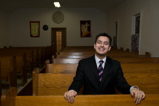 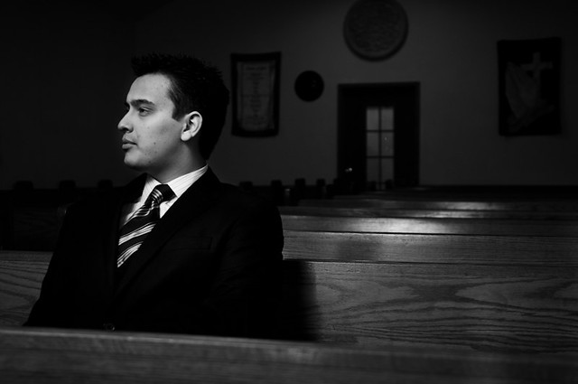 I don't think I could quite balance the color temperatures in this one 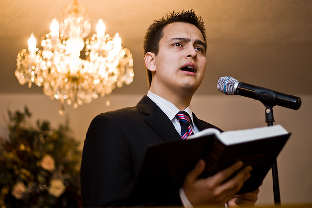  Overall, I was a bit frustrated because I wasn't given any idea as to what the main focus of the story was going to be (probably because we did these photos _before_ the interview; regardless, I feel I could have been a bit more creative with working with the space. I need more environmental portrait practice, for sure.
|
|
#
?
Jan 26, 2011 18:59
|
|
|
If you were able to pose him, I would not have had the microphone in the shot. It would have been cleaner and still had the same message.
|
|
#
?
Jan 26, 2011 20:03
|
|
|
For the bench shots I think you underexposed the background too much. Obviously you don't want it to distract from the subject, but it looks too much like a point & shoot trying to light up an entire room with a tiny flash. Along the same lines those highlights on the benches are distracting. I like the third shot though.
|
|
#
?
Jan 26, 2011 21:53
|
|
|
The last two shots are great. The highlights on the bench in the first one kind of take away from that shot, the second one seems more like a candid street picture. The last two are great though. I probably would have shot him on the pulpit and the confessionals (assuming they had some) rather than the pews, but that's just me.
|
|
#
?
Jan 26, 2011 22:18
|
|

|
AIIAZNSK8ER posted:If you were able to pose him, I would not have had the microphone in the shot. It would have been cleaner and still had the same message.
|
|
#
?
Jan 27, 2011 06:42
|
|

|
I like the microphone, though if there was more podium than I'd probably say cut it, but as he has it I'd say keep it.
|
|
#
?
Jan 27, 2011 06:59
|
|
|
I'm going to be taking engagement photos for a friend of mine here soon and I've never done anything like it before. I picked up a 50mm 1.8 to use on my D90 for them. Anyways, I got the gf to pose for me so I could practice a little and here are the results: 331of365 by PictoriousPhoto, on Flickr  Ashley Portrait by PictoriousPhoto, on Flickr  Ashley Portrait 2 by PictoriousPhoto, on Flickr All shot with the 50mm at F/2.8 with a SB600 mounted on camera at 1/64th power. ANy pointers would be appreciated as these are my first "real" portrait shots.
|
|
#
?
Jan 31, 2011 14:43
|
|

 Cat Army
|
A crit I get all the time and hard for me to remember is to make sure that the persons head is not being intersected by lines or shapes. Give their head some clear space to be in. The bottom one has part of the roof sticking out of her head. I've ruined so many shots that would be really strong otherwise. You could also start messing around with off camera lighting, I've used cls outside without any problems. I started by using the base plate for the sb-600 screwed into a cheap $10 tripod, it's not as flexible as a real light stand, but the price was right. The single hardest part of portraits is just posing and making people comfortable, be ready with things to say and ways to steer the conversation.
|
|
#
?
Jan 31, 2011 16:40
|
|
|
Ouhei posted:I think those are great, they have a really cool vintage-ish feel to them. I'm sure you'll do great. Like was said, probably the most important thing about portraits is to make them feel comfortable. Don't stop the conversation, which can be tough when shooting. If you have trouble just keep asking questions. From my portrait work it seems like these "rules of thumb" are kind of recipes for success: 1) Aim to shoot the hour before, and the hour during magic hour (hour before sun-set). You should be able to find the exact time on a weather website. 2)Aim for 3 locations, look for versatility. You want to maximize your photo-ops while minimizing time spent changing locations. At the same time, see if the couple has any ideas. Input from the client usually turns into the best photos that they like the most. 3)The couple will be late. Plan on it and tell them to show up earlier than you want. In my portrait work I've had less than 50% of the clients show up on time, ready to go, and I've only had one group show up early. If they seem punctual plan a 4th location that's kind of a throw-away. 4) On the subject of locations, the first will be the worst, shoot a lot to make them comfortable/play the numbers game. The second spot is usually the best, so plan your best location there. The third is usually the quickest to nail shots, so pick the spot with the most photo ops and keep moving or you may bore your subjects. 5) Don't stop talking. Don't say "Oh poo poo". Don't make a face if you take a bad shot. Always tell them the shots look great, you had fun, etc. Realize that your expectations are probably 10x what theirs is.
|
|
#
?
Jan 31, 2011 17:44
|
|

|
Ouhei posted:words and pictures Exposure is good so you'll be fine in that area. I'm not really a fan of the setting in any of them but if you were just practicing then who cares. #3 probably needs a slightly closer crop. The hardest thing for me when I started out was instructing people and coming up with poses. It looks like you probably had that problem as well, especially in #3. Look at lots of different engagement session photos and find some poses you like and will fit the personalities of the people you are photographing. Figure out how you are going to direct the couple to get in those poses. As for using the 50mm, that will be fine for what you're doing but don't be afraid to experiment with some wide-angle shots too.. engagement sessions are usually used to convey happiness and shooting wide can help if you're coming up short on ideas.
|
|
#
?
Jan 31, 2011 18:10
|
|
|
AtomicManiac posted:1) Aim to shoot the hour before, and the hour during magic hour (hour before sun-set). You should be able to find the exact time on a weather website. This is one of my most frequently used bookmarks: http://www.golden-hour.com/
|
|
#
?
Jan 31, 2011 18:15
|
|
|
Thanks for all the tips guys, I'll be sure to keep all of it in mind when I go out to shoot the engagement pics. I know the setting of those wasn't great, but it was just right outside her apartment, I just wanted to get a few shots to make sure the camera settings I was using were right. I have the 18-105 kit lens that I'll use for wide shots, just wanted the 50mm to get the tighter shots/nicer bokeh.
|
|
#
?
Jan 31, 2011 19:20
|
|
|
http://photography-on-the.net/forum/forumdisplay.php?f=78 In case you need any ideas. 
|
|
#
?
Feb 1, 2011 08:17
|
|
|
One from a party the other night. I'm still trying to learn how to use and hopefully attain some level of consistency with my flash,.
|
|
#
?
Feb 1, 2011 08:47
|
|

|
^^ I'd say you've got it dialed in pretty good, that's a great shot. Here's two from a fun portrait shoot I did with my singer/Best friend a few days before my last wedding, thank god we did it, my Cybersync transmitter battery died after like 10 shots, which could have been a disaster for the wedding. On that note I'm pretty happy I got these two in only 10 shots.  Ashley by Ben Semisch, on Flickr  Ashley by Ben Semisch, on Flickr AtomicManiac fucked around with this message at 09:45 on Feb 1, 2011 |
|
#
?
Feb 1, 2011 09:17
|
|
|
Ouhei posted:Engagement Aside from the little things that have already been mentioned (things intersecting peoples' heads) the final shots looks just fine technically speaking. A little tip I'd like to add about making the couple comfortable and getting the best out of them is to ask them about each other while you're shooting. Wait til you're a few minutes in and have got them a little more used to the camera. The reason I like this approach is because if you can get them talking and joking about each other, you'll bring out some of the chemistry between them and they won't just be two people stood next to each other. So my technique is, pose them, take a couple in a pose you had in mind, ask them something (how did he propose?) this will probably result in a joke or a look at the other person / smile, something and just be ready to snap it. The previous shots should have set you up nicely in terms of exactly what exposure etc you were after.
|
|
#
?
Feb 1, 2011 09:23
|
|

|
AtomicManiac posted:^^ I'd say you've got it dialed in pretty good, that's a great shot. You should really have been dragging the shutter to let in more ambient. It's near-black.
|
|
#
?
Feb 1, 2011 10:42
|
|

|
poopinmymouth posted:You should really have been dragging the shutter to let in more ambient. It's near-black. At first I wanted to do a low-key all black shot, but when I was dialing that in I liked the way the sky looked, and I thought her black coat would have thrown it off. I think what I really should have used was a second light coming in from the other side as fill or a nice rim-light to show her form off, rather than have it slink into darkness. Of course I don't have 2 lights right now since my Vagabond is broken.  . .
|
|
#
?
Feb 1, 2011 11:16
|
|
|
AtomicManiac posted:At first I wanted to do a low-key all black shot, but when I was dialing that in I liked the way the sky looked, and I thought her black coat would have thrown it off. I think what I really should have used was a second light coming in from the other side as fill or a nice rim-light to show her form off, rather than have it slink into darkness. Of course I don't have 2 lights right now since my Vagabond is broken. The problem is that you have properly exposed her face and everywhere else the flash's light is hitting. This makes the dark areas very noticeable, and they don't seem to be purposefully dark. It doesn't offer anything letting her jacket fall into nothing and losing her silhouette. A rim light would have separated her, yes, but it would just make her look even more cut out. You need to figure out how to make her look a part of the background unless you're saying something visually about her being set apart or somesuch. I think dragging the shutter and then selectively darkening the parts of the background that might be too attention grabbing would be best. You might also want to think of someway to ground her in the environment with placement, right now she is probably 10 meters or more away from any environment chunk, making her seem to float in darkness.
|
|
#
?
Feb 1, 2011 13:53
|
|
|
Hello , i am new to the world of photography and i would like to get a better. This is why i am ready to get humiliated by posting these photo here and expecting harsh critic. I am shooting with a T2i (550d) with a 18-55mm lens on. I tried to do the DOF thing but i think i failed miserably. I think these photo are O.K but there room for improvement. Help a poor dad with a 3rd kid on the way to get wayyyyy better! I hope these smiles brighten your day.    
Niagalack fucked around with this message at 14:12 on Feb 2, 2011 |
|
#
?
Feb 2, 2011 14:05
|
|

|
I think the framing/composition of the 3rd one is pretty cool. Maybe if it was slightly to the left more, so you saw the hallway it looks like he's peeking down more. In general your shots are suffering from the popup flash, if your budget is short there are some products that help it bounce off ceilings or diffuse it some to soften the harsh light it gives. In the long run you'll probably want to get an external flash unit to use to bounce off the ceilings and the like. I'm not expert enough to really guide you past that, but looking at those shots it's what immediately came to mind.
|
|
#
?
Feb 2, 2011 14:23
|
|
|
Don't cut limbs/hands. Frame your stuff purposefully (include stuff you want, exclude things that don't contribute to what you're trying to say with your pictures). Shoot wide open (on the kit lens it's not much but every bit helps). Push up your ISO even when shooting flash so you don't cut ambient light down so much. Use as long a shutter time as possible (again, to let in some ambient).
|
|
#
?
Feb 2, 2011 14:42
|
|

|
Ouhei posted:I think the framing/composition of the 3rd one is pretty cool. Maybe if it was slightly to the left more, so you saw the hallway it looks like he's peeking down more. Yes i did use the popup flash (ugh!) id love to get one better in the future. evil_bunnY posted:Don't cut limbs/hands. The don't cut limbs thing just rang a bell in my head. It does perfect sense and now i cant stop seeing it in those picture. Practices makes perfect!
|
|
#
?
Feb 2, 2011 21:21
|
|
|
Pop-up flash can be sufficient but only during daytime or with a long shutter speed (not a good option for active kids). Once it becomes your main light source you typically get a cave look (subject white, background black) and unflattering highlights on the skin. Buy a flash! Something in the $100 range like this one here would be sufficient : http://cgi.ebay.com/Yongnuo-Manual-Flash-YN560-Canon-1000D-550D-50D-5D-/400192409780?pt=Digital_Camera_Flashes&hash=item5d2d5390b4 Keep your photos simple- one or two kids and a background that is uncluttered. This is why photo #3 is nice, whereas #1 & #4 are not.
|
|
#
?
Feb 2, 2011 21:47
|
|
|
Niagalack posted:I tried to do the DOF thing but i think i failed miserably. Can you explain this further, I don't really understand this statement. Did you try to get less depth of field, but missed focus? Do you not like having so much depth of field and want more bokeh?
|
|
#
?
Feb 2, 2011 21:59
|
|
|
AIIAZNSK8ER posted:Do you not like having so much depth of field and want more bokeh? This! English isn't my native language, i sometime have trouble expressing myself. Cross_ posted:Pop-up flash can be sufficient but only during daytime or with a long shutter speed (not a good option for active kids). Once it becomes your main light source you typically get a cave look (subject white, background black) and unflattering highlights on the skin. I take it you dont like little girl ! (photo #1 #4 are my daughter) Woah that is cheap i am interested in it! ill probably buy one in the following weeks ( i have so many photo gear i want) I need a spare battery , my father gave me a tripod today (hurray) I would love a polarizing filter ( i love taking picture of landscape when i travel with the pop-up trailer) Niagalack fucked around with this message at 01:44 on Feb 3, 2011 |
|
#
?
Feb 3, 2011 01:37
|
|
|
Niagalack posted:This! English isn't my native language, i sometime have trouble expressing myself. To get those blurry backgrounds, it's easier with a lens that has a larger maximum aperture. Something like a 50mm f/1.8 can be had for around $100. Get one take your kid outside, be amazed, and then report back to us. Oh yea, that reminds me, all these photos are inside with a pop up flash, so it's good considering. Really gorgeous kid photos are outside playing in the sunshine. Sunlight is cheap, plentiful, and good for you. Here's some portraits I'm really happy with, so I need some crit to tear me down again.      
|
|
#
?
Feb 4, 2011 05:16
|
|
|
AIIAZNSK8ER posted:To get those blurry backgrounds, it's easier with a lens that has a larger maximum aperture. Something like a 50mm f/1.8 can be had for around $100. Get one take your kid outside, be amazed, and then report back to us. Oh yea, that reminds me, all these photos are inside with a pop up flash, so it's good considering. Really gorgeous kid photos are outside playing in the sunshine. Sunlight is cheap, plentiful, and good for you. These two are the best. The person is the focus (these are more business owners I'm assuming?) and they look comfy and bright, and with enough context. The first one is a little crowded feeling, and the lighting brings out the JODY'S POPCORN so it competes with her face for attention. In the second, the light that's on grabs attention, and the composition of light feels... uncomfortable, with the dark background. Again, I feel like she could have used some more light. The first two of the second set also have the same problems, I think you should light the subject more or even just dodge them in post to bring em out a little.
|
|
#
?
Feb 4, 2011 05:24
|
|


|
AIIAZNSK8ER posted:Here's some portraits I'm really happy with, so I need some crit to tear me down again.
|
|
#
?
Feb 4, 2011 09:08
|
|
 Also, I don't like her leg raised in front of her as it looks awkward.
|
AIIAZNSK8ER posted:To get those blurry backgrounds, it's easier with a lens that has a larger maximum aperture. Something like a 50mm f/1.8 can be had for around $100. Get one take your kid outside, be amazed, and then report back to us. Oh yea, that reminds me, all these photos are inside with a pop up flash, so it's good considering. Really gorgeous kid photos are outside playing in the sunshine. Sunlight is cheap, plentiful, and good for you. Definitely the third one for Jody's popcorn - the first one she isn't looking into the lens. Was this earlier in the shoot? I find that happens early in the shoot if people are very nervous about it, which happens a lot with business / "ordinary" people. They tend to have a sort of subconscious fear of looking right into the lens, so a friendly reminder for them to look right into the lens can be a good idea. Don't tell them they've been doing it wrong, though, something more along the lines of "great, and for this one look right into the lens for me" and point at it. Seriously, I sometimes work with pro wrestlers and there's a couple of them that I have to remind every 2 shots to actually look at me and not past me, pointing at the centre of the lens. Bless 'em. With the second Jody's pic, the pose is quite forced, there's far too much going on in the background and that lamp growing out of her head, of course. You nail it in the third, though - not too busy, the stand tells us who she is and what the company is, and the background is simple and uncluttered. The out of focus background actually adds a lot to the story - there's enough colour in there to allow us to extrapolate and realise that this is a big, colourful popcorn store. With IBI - I actually think the second one is closer to what you should be trying to do than the third one, but I think some stuff needed to be different. The angle seems a bit too high, especially for a business shot, as it gives a feeling of superiority to the viewer, rather than the subject (in my opinion). I like the incidental detail of the small table and the...things on it (Kryptonite Smarties?) but I think the lamp takes up too much room and is almost vying for our attention. I know this all depends on your subject, and some people can be absolutely hopeless, but her expression is insane. She was clearly massively terrified of having her photo taken, so bust out the charm and get her relaxed. She looks sort of like she's digging into the seat with her nails in the first one. Third one is the best portrait, though - she looks a little more relaxed. I'd have just liked an IBI logo in it somewhere, though. In conclusion, my favourite of the lot is the third Jody's one - she looks totally relaxed, we know where she is, and the uncluttered bg gives us a feel of the shop itself. You nailed it with that one, so look at what made that work and do it again for the next shoot. Relaxing people can be so difficult, so just keep at it. I find lots of eye contact and communication and not holding the camera up to your face for too long per shot helps a lot. Sorry if that's all a bit rambly.
|
|
#
?
Feb 4, 2011 14:43
|
|
|
Cross_ posted:Pop-up flash can be sufficient but only during daytime or with a long shutter speed (not a good option for active kids). Once it becomes your main light source you typically get a cave look (subject white, background black) and unflattering highlights on the skin. Try to find a seller that ships from the US, mine shipped fomr Hong Kong and took 2.5 months to get here. When they finally did arrive I figured out why, they just stuck 28 stamps on the fucker and sent it out.
|
|
#
?
Feb 4, 2011 15:58
|
|
|

|
| # ? May 21, 2024 08:31 |
|
|
AIIAZNSK8ER posted:Here's some portraits I'm really happy with, so I need some crit to tear me down again. I really don't feel like you used the location to its maximum potential here. She's got such a colorful, interesting, and fun place, but you put her in the same poses you would shooting a dentist in their waiting room. I can't tell you what I would have done with it because I wasn't there, but from where I sit it seems like a bit of a missed opportunity to do something out of the ordinary. Also, her arms are crossed in two of the shots. A door-to-door salesman once told me that's a closed pose, and that it looks defensive to the customer. The proprietor of such a fun place shouldn't look inaccessible! EDIT: Less "suck", more "such". 
McMadCow fucked around with this message at 20:16 on Feb 4, 2011 |
|
#
?
Feb 4, 2011 18:26
|
|
