

|
RizieN posted:Also this kind of washed out hipster look; Could try doing this with exclusion layers. Might not be exactly what you're looking for, but here's an overdone example:  With solid blue fill layer (exclusion, 50% fill opacity):  With color balance layer (played with color tone; set to midtones, preserve luminosity, 50% fill opacity): 
Instrumedley fucked around with this message at 07:52 on Mar 3, 2011 |
 #
?
Mar 1, 2011 06:58
#
?
Mar 1, 2011 06:58
|
|


|

|
| # ? May 30, 2024 21:58 |
|
|
Has anyone 'scanned' negatives using a camera with a lens mounted film holder like this? http://www.dpbestflow.org/camera/camera-scanning http://www.dpbestflow.org/camera-scan-workflow I have a flatbed that is great for 120 or larger but is a pain for 35mm, seems like this would speed it up a lot if it works ok.
|
|
#
?
Mar 3, 2011 06:40
|
|

|
Does anybody know how often Adobe releases new revisions of their software? I'm debating whether to buy Photoshop CS5 now or wait until CS6 comes out (whenever that may be.)
|
|
#
?
Mar 3, 2011 23:22
|
|
|
krnhotwings posted:Does anybody know how often Adobe releases new revisions of their software? I'm debating whether to buy Photoshop CS5 now or wait until CS6 comes out (whenever that may be.) http://en.wikipedia.org/wiki/Adobe_Photoshop_release_history
|
|
#
?
Mar 3, 2011 23:40
|
|
|
brandino posted:http://en.wikipedia.org/wiki/Adobe_Photoshop_release_history
|
|
#
?
Mar 4, 2011 00:48
|
|
|
Instrumedley posted:Could try doing this with exclusion layers. Might not be exactly what you're looking for, but here's an overdone example: thanks, I think experimenting with this will be better than what I've been doing.
|
|
#
?
Mar 4, 2011 01:34
|
|


|
brad industry posted:Has anyone 'scanned' negatives using a camera with a lens mounted film holder like this?
|
|
#
?
Mar 4, 2011 02:10
|
|


|
Yeah, but I made my own because all the film is different, other than the miles of 35mm I haven't even looked at. I would think a dedicated 35mm scanner would be best. For all the oddball junk I have the setup I'm using is great. I have two plates of glass to hold the negative and I just move it to position with live view, focus and take the photo. Watch the histogram to make sure nothing is clipped. Invert the curve in lightroom. I made two presets, one for colour and one for black and white. It's running very smoothly now. The problem is when you flip the curve in lightroom half the sliders work backwards than normal. The blacks slider becomes the whites slider, something I wish there was anyway.
|
|
#
?
Mar 4, 2011 03:32
|
|
|
I do the camera-scanning thing and it works about as well as a V500 flatbed. It's MUCH faster than my dedicated Scan Dual, though probably slightly lower quality. I've found that Photoshop actions work better than Lightroom for working with negatives. Also, I just use a lightbox and a macro lens on a tripod mounted vertically. It's a little more wonky than the bellows systems but it works pretty well. You can go through negatives VERY quickly once you have it set up right.
|
|
#
?
Mar 4, 2011 08:41
|
|
|
brad industry posted:Has anyone 'scanned' negatives using a camera with a lens mounted film holder like this?
|
|
#
?
Mar 4, 2011 09:29
|
|

|
Can anyone explain what's going on in this guys work? http://www.mariusaasheim.com/IMGaudia805.html Somehow he's making everything look really weird and not real. But I have no clue how it's done?
|
|
#
?
Mar 4, 2011 16:41
|
|


|
A5H posted:Can anyone explain what's going on in this guys work? GWBBQ fucked around with this message at 17:00 on Mar 4, 2011 |
|
#
?
Mar 4, 2011 16:58
|
|
|
brad industry posted:Has anyone 'scanned' negatives using a camera with a lens mounted film holder like this? evil_bunnY posted:Pretty sure Pompous has a similar setup. Yeah, I built one for work last year: 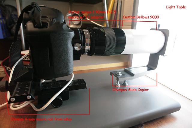 Slide Digitization Station by ethics_gradient, on Flickr If you're doing a bunch of old stuff in one go, makes sense to rent a 5mk2 for the resolution bump. I dunno if you get a live preview with the tethering software on a mk1, never tried it with my personal camera. 10X LiveView makes focusing on the negative a breeze though. Boss wants me to go through a few thousand strips of C-41 negatives now, which I think is going to require fitting a different stage. But for mounted slides, the setup in the picture works like a champ and is a hell of a lot faster than a flatbed.
|
|
#
?
Mar 4, 2011 18:44
|
|
|
Walking downtown and snapped this one, but the only light source was a green rear end H&R block sign. Tried to 'save' it I guess you could say. Here's the before and after from Lightroom (also just now started using lightroom) Anything you think I should do differently to try and get the lighting more whitish/normal and less...like the original/before picture? I assume I'm going to have to embrace the green unless I wanna go B&W.  Also I didn't touch the details sliders, but lightroom is kind of giving me this airbrushed surface blur vibe...unless I just lost some blacks and contrast in the after photo?
|
|
#
?
Mar 5, 2011 02:11
|
|
|
/\/\/\ I like the before picture as it is, personally. It looks like she's lit by some weird artificial light, because the background is more normal. In the after shot, everything is funky so it looks like you're trying for some artistic effect that I'm not artistic enough to follow.gib posted:Also, I just use a lightbox and a macro lens on a tripod mounted vertically. It's a little more wonky than the bellows systems but it works pretty well. You can go through negatives VERY quickly once you have it set up right.
|
|
#
?
Mar 5, 2011 02:21
|
|

|
RizieN posted:Walking downtown and snapped this one, but the only light source was a green rear end H&R block sign. Tried to 'save' it I guess you could say. Here's the before and after from Lightroom (also just now started using lightroom) Can you host up the raw file, I wanna take a quick try at it to see something. I had a file like that and it was relatively painless to fix, but yours is in a bit lower light so it might be harder than I think.
|
|
#
?
Mar 5, 2011 02:29
|
|

|
Definitely, let me know if this link works e; Execudork : I do kind of like the artificial light thing on one hand (it basically was an artifical big rear end green softbox in a storefront), but on the other hand I want see what I could do to 'normalize' it...per se, if anything just so I learn more about post-processing. I don't know, I just really need to keep learning as much as possible. It was a bad area of town so I couldn't stop and edit my white balance settings (was on auto) and other stuff, cause in Cincinnati the nice little art galleries and coffee shops and general art kid poo poo is mixed in with hood rat poo poo, so I just snapped what I could and we kept moving, otherwise I would've tried to get it more 'accurate' in camera. RizieN fucked around with this message at 02:44 on Mar 5, 2011 |
|
#
?
Mar 5, 2011 02:39
|
|
|
RizieN posted:Definitely, let me know if this link works 
|
|
#
?
Mar 5, 2011 07:31
|
|
|
evil_bunnY posted:I use a catalog for each year Me too. It was a rough blow to my ego when I realized I only had like 5-600 photos in there for 2010  Really need to go shoot more. Now that I have a good camera and lens combo I expect to ")
|
|
#
?
Mar 5, 2011 08:14
|
|


|
Pompous Rhombus posted:Yeah, I built one for work last year: Can you post some examples? Or a 100% crop from something?
|
|
#
?
Mar 5, 2011 16:31
|
|
|
brad industry posted:Can you post some examples? Or a 100% crop from something? Yeah I have one example up on my Flickr, although results are obviously continent on what lens you're using (I used a Vivitar Series 1 90mm in Oly mount with the 1:1 adapter at f/8). I'm not sure if the second image is a 100% crop or not, but it does show off the detail/sharpeness pretty well. 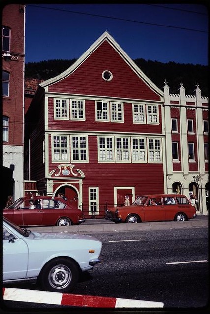 Bergen, Norway by ethics_gradient, on Flickr 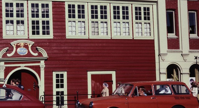 Sample by ethics_gradient, on Flickr
|
|
#
?
Mar 5, 2011 16:44
|
|
|
TheLastManStanding posted:Link doesn't work. Shouldn't be hard with the raw though. Her shoulder looks like it was supposed to be white so you can use that as a reference point. This is a 2 minute attempt in photoshop using a photo filter layer to neutralize the green and a warming filter to try and bring back some skin tone. It's a bit flat and the shadows are a pretty strong magenta, but that's preferable to a giant green light. If you want to get rid of the magenta you could paint over it with a hue layer with a low opacity. Fixed the link if anyone still wants the RAW. Also I'll have to try those things out, thanks. https://g4direct.box.net/shared/static/bfssp2yz2b.nef
|
|
#
?
Mar 5, 2011 20:17
|
|
|
TheLastManStanding posted:Link doesn't work. Shouldn't be hard with the raw though. Her shoulder looks like it was supposed to be white so you can use that as a reference point. This is a 2 minute attempt in photoshop using a photo filter layer to neutralize the green and a warming filter to try and bring back some skin tone. It's a bit flat and the shadows are a pretty strong magenta, but that's preferable to a giant green light. If you want to get rid of the magenta you could paint over it with a hue layer with a low opacity. You're some kind of wizard. I didn't want to post mine because you bested me, and in a lot less time and I couldn't really get it the way I wanted to, but I can't really put any more time into it. My best attempt:  e: I figured she was a bit pale, but I couldn't get rid of the magenta/yellow without desaturating her skin too much.
|
|
#
?
Mar 6, 2011 00:11
|
|
|
Anyone here use Capture One RAW? Is it worth the time of setting it up as an alternative to Lightroom? I'll still be using Lightroom but just want to muck around with this.
|
|
#
?
Mar 7, 2011 05:06
|
|
|
Can someone explain the DNG file thing Lightroom uses? Should I be converting and copying my poo poo to a DNG, or can I tell Lightroom to just leave it as a .NEF and gently caress with the original RAW my camera gives me?
|
|
#
?
Mar 7, 2011 05:17
|
|
|
DNG is an open standard. The benefit is that, in a really long time, there's a better chance you'll be able to find software that can read it. NEF files are proprietary and may not have the same level of support. There's no real difference beyond that.
|
|
#
?
Mar 7, 2011 13:16
|
|
|
I have a Lightroom 2 question that I can't seem to get a straight answer to through Adobe help. In documents/gaz (my lightroom profile), I have two enormous folders called gaz previews.lrdata and gaz-2 Preview.lrdata (I think this was when I bought version 2). They are taking up so much room on my hard drive, what information do they actually keep and what should happen if I deleted them? Are they just records of what I did every session? Will it unremember actions I've performed on various images? All I really care about is whether it will delete my user presets. VVV EDIT: Thanks Scottch VVV Gazmachine fucked around with this message at 17:10 on Mar 7, 2011 |
|
#
?
Mar 7, 2011 13:41
|
|

|
They only contain the 1:1 previews that Lightroom has generated. You can delete them as it will just generate them again when needed.
|
|
#
?
Mar 7, 2011 14:16
|
|
|
scottch posted:DNG is an open standard. The benefit is that, in a really long time, there's a better chance you'll be able to find software that can read it. NEF files are proprietary and may not have the same level of support. There's no real difference beyond that. They have said that they would be willing to make it an open format someday, if necessary.
|
|
#
?
Mar 7, 2011 15:22
|
|
|
You're right, it is misleading to call it open.
|
|
#
?
Mar 7, 2011 16:29
|
|
|
Ah thanks for the clarification. Seeing as Adobe has a lock down on design and photoshop stuff and I don't see myself switching to another company I might as well embrace the DNG.
|
|
#
?
Mar 7, 2011 17:05
|
|
|
ExecuDork posted:What do you use to hold the negatives? I'm sure there are simple, obvious devices for this, but I'm having no luck with my google-fu today. I've got 135 and 120 B&W sitting at home waiting to be shot, I've got pretty much everything sorted out in my mind except scanning the 120 negatives. I have an old film scanner, so I typically use the holders from that. Homemade cardboard contraptions also work quite well as long as you make sure nothing sharp is getting inside and scratching your film. A third option is to buy a slide copier for a dead MF mount on eBay and use that.
|
|
#
?
Mar 8, 2011 00:29
|
|
|
Greetings dorkroom, I've been asked to post a write up of my processing technique. Before we get started let me state beforehand that I started shooting digitally in early 2009 and up until now I have never stopped playing around with how I process my images. Practicing your technique and looking at your work and knowing when to stop adding a specific setting in your RAW image is something you need to train yourself to do (unless you take photo editing classes or something). Another big piece of advice I can give other goons is to look at other people's work you admire and try and emulate their style. FYI DO NOT FEEL BAD ABOUT THIS, IT'S OKAY. If you have no idea what you're doing initially, trying to make your image look like another person's is a great way to refine your technique and finalize your own style when you get the hang of things. I personally like to look at Jonas Peterson's work because I absolutely love the way he makes weddings look. Anyway my workflow is pretty much as follows: load images from camera to harddrive -> import and fiddle with in lightroom -> look in bridge -> then open and fiddle in photoshop Starter:  Took this shot Saturday morning during an engagement shoot I assisted. Usually I try out a few ready made presets that I know are good starting points but I'm going to go au naturale for this and start from scratch. This is what lightroom's initial settings give me when I import an image into my library:  Generally I like to play with my contrast/brightness and blacks before I do anything to the image first. There's no real magic trick for this part of lightroom. Fiddle with brightness/contrast/blacks till you think it looks good or leave it as is. I personally like to set my blacks to 0 and only adjust my contrast as I�m working with my image. As far as exposure, recovery, fill light, and blacks are concerned, I only mess with them when I�ve over or underexposed an image. In this case, the starter image is intentionally overexposed so I�ve added some fill light to lighten up the couple a little more and added in recovery to reduce the highlights and bring out more color in the sky. Screenshot:  So after I feel that my image looks good I move on over to tone curve. Tone curve can be your best friend or your worst enemy in lightroom because I often find that this is one of trickier things to get right when it comes to processing. The best piece of advice I can give to newbies with tone curve is to literally just play with it. There's no real perfect curve because it's dependent on how your image was exposed and how you want it to look like. I generally stick with adjusting darks and lights because it stays within the midtone range and that's the two common areas in a photo I see that need to be brought out or darkened. Also I find that a curve adjustment layer in photoshop does a better job of it anyway (we will get into this later on). After tone curve I fiddle with split-toning. This is another feature in lightroom I strongly suggest you have a light hand with because if you overdo split-toning, your picture will look like poo poo. When I pick the colors I want to use in split-tone, I generally stick with greens/yellows for highlights and blues/purples for shadows because they tend to compliment the natural colors in most pictures and add that film/vintage look. Split-tone setting screeny:  End results of lightroom fiddling:  After lightroom I open up my image again in photoshop and get to work with adjustment layers, the color efex plug-in program, a high pass filter, and other touch up work. Opening photoshop screen:  The first thing I adjust in photoshop is the color of my image using the efex plug-in�s �film effects� filter. Detail screen:  If you look closely at the screenshot, you�ll see I�ve reduced the saturation and sensitivity of mainly the red, yellows, and greens. What this does in most pictures is soften the tone of skin, reduce highlights, and also mute the color of grass/leaves so they don�t become super distracting. For those of you who don�t have the color efex program and want to replicate the same kind of color alterations there are ways of doing this through old fashioned selective coloring, color balance, and vibrance/saturation layers, the only thing is that it takes quite a bit of experimentation to get down correctly. I personally haven�t quite figured how to do it effectively yet but I will post another write up when I do. Oh and a note of warning for those of you interested in getting this plug-in: there are a lot of lovely/gimmicky filters in the efex program. The only ones I�ve found that are particularly useful are �pro contrast�, �film effects�, �darken/lighten center�, and �reflector effects�. And of course, you need to do your own customization with the filters because their default options are really bad. Other than that it�s a really useful program and does make a big difference for the most part. Anyway, after altering colors, I apply a �pro contrast� filter to add a bit of extra contrast and additional color boost to the photo. Screenshot:  The main difference between the slider contrast setting in lightroom and this program is that the efex plug-in directly targets contrast areas in highlight/shadow regions (this can be customized) so it just tends to look a little more balanced. When I�m happy with the colors and contrast, I usually stamp my visible layers into a single merged layer or apply a �darken/lighten center� filter (this is literally what it does) then move on to applying a curve adjustment layer. Curve adjustments, in my experience, is the one of the most powerful and useful tools in photoshop that�ll make or break your images. Practice is definitely recommended so you get comfortable with it. It�s similar to the tone curve setting in lightroom except it doesn�t make a bias towards shadows/midtones/highlights with region sliders like in lightroom. Unless of course you add a point spot on the curve. Screenshot:  In the screenshot, you�ll notice that I only slightly increased the midtones, lightened my shadows, set my �blackpoint� (tone of blacks, farthest left and lowest portion of curve) to 25, and set my �whitepoint� (tone of highlights, farthest right and highest portion of curve) to 247. This is all I needed to do to get a good balance of light/darks and bring out the couple in this picture. Blackpoint and whitepoint are honestly just technical things that are just for printing but it doesn�t hurt to set them to a specific value so if you decide to print a picture you�ve edited they�ll generally come out more consistent. Anyway speaking more about curve, as I mentioned before, there is no perfect curve in photoshop or lightroom. It ultimately boggles down to how you want your image to look like and how you exposed it before hand. I personally like to just adjust shadows and midtones so they pop out more and everything looks a bit punchier. REMEMBER: practice practice practice. Curve adjustments are extremely finicky and you do not want to overwhelm your image with too much or too little of a highlight, midtone, or shadow region. Less is more in most cases. After I�m satisfied with my curves, I stamp merge visible my layers (shift+cntrl+alt+e while selecting layers) to make a duplicate of my adjustments and then apply a high pass filter to sharpen my image. High pass filters mainly pick up the fine details of a photo by masking pixels in the image and overlaying them over the original image. However if you oversharpen or select too many pixels with highpass, you�ll get a HDR halo effect around everything and is something you definitely want to avoid. Also the amount of pixels you pick up in the image is dependent on your image size so the setting I�m using won�t work for everyone else�s photos. Look at the pixels that are picked up in the mask first before overlaying it to avoid this problem. Screenshot(s):  Once you�ve selected the number of pixels picked up with high pass, overlay them.  I personally like to use the �hard light� overlay because it adds some very fine grain and edge sharpness which I find pleasing to the eye. To wrap things up, I merge stamp visible again to apply everything to a final layer and save my image. Final:  Hope this helps! NebZ fucked around with this message at 07:05 on Mar 14, 2011 |
|
#
?
Mar 14, 2011 05:15
|
|
|
Thanks NebZ, I'm bookmarking the hell out of this.
|
|
#
?
Mar 14, 2011 12:42
|
|

|
Thanks NebZ! I love your look, and the writeup is the perfect amount of information to play around with!
|
|
#
?
Mar 14, 2011 17:57
|
|
|
I've only had a camera for about a month, and I went back and fiddled with an older shot of mine, trying different lighting effects etc. I can't tell if what I've changed is "good" or not. I'm trying to make it more dramatic...more striking, but also trying to avoid the pit other new photographers fall into and end up making bad HDR's n poo poo. Origional:  New: 
|
|
#
?
Mar 15, 2011 06:48
|
|

|
The crop is nice but it looks like you cranked the poo poo out of the sharpness control.
|
|
#
?
Mar 17, 2011 00:06
|
|

|
Yeah that's what I was worried about. Knowing when to say "oops, let's back off a tad, there" is so hard I always keep the original so I can start from scratch.
|
|
#
?
Mar 17, 2011 06:37
|
|
|
Ak Gara posted:Yeah that's what I was worried about. Knowing when to say "oops, let's back off a tad, there" is so hard The rule of thumb is never push a slider in Lightroom as far as it'll go. 50% seems to be about the useful limit. Pretend that +100 doesn't even exist.
|
|
#
?
Mar 17, 2011 15:16
|
|

|

|
| # ? May 30, 2024 21:58 |
|
|
Ak Gara posted:Yeah that's what I was worried about. Knowing when to say "oops, let's back off a tad, there" is so hard I had the same exact problem when I first got my camera. I sharpened the poo poo out of everything because it was so amazing to be able to see so much detail in a photograph. Then after a while you realize that there are times where less is more and just a smidgen of sharpening will do a whole lot more than cranking it all the way.
|
|
#
?
Mar 17, 2011 16:19
|
|

