|
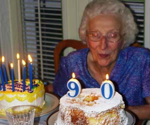
AIIAZNSK8ER posted:This lady owns a bunch of local radio stations. Not to dog you on the backgrounds again, but the conclusion I draw from these photos is that she's the announcer for a shipyard. #2 and #3 also have hella reflections going on. It's a part of the office and she probably likes the view, but I would have just focused on the sound recording equipment and left the window out if possible.
|
|
|
|
|
| # ? May 17, 2024 14:42 |
|
This is awesome and very creepy at the same time.
|
|
|
|
Pompous Rhombus posted:Not to dog you on the backgrounds again, but the conclusion I draw from these photos is that she's the announcer for a shipyard. #2 and #3 also have hella reflections going on. It's a part of the office and she probably likes the view, but I would have just focused on the sound recording equipment and left the window out if possible. Dangit, I was wondering whether or not the water would help or not. Not to make excuses but I had my back to the wall and it was a small studio, I did rotate a bit to cut out the water. But at the time, I really like the water.   I will now really think about whether or not the object makes sense to the subject. No more parking lots or shipyards. Thanks guys. What If I had overexposed the window and you couldn't see what was out of it?
|
|
|
|
AIIAZNSK8ER posted:
Yeah... elements of a photo, one should try and make sure everything is in for a reason. I would crop a bit from the first there to crop out the speakers and next time close the blinds - the left side of the frame in both have light coming in that draws the eye from the focus (the woman). Crosspost from PAD: Three of the girlfriend today - the thing I'm happiest about is the fact that she's now getting comfortable in front of the camera (she's very self-conscious). I found that it helps to direct her 100% for now so she doesn't have to worry about how she looks. Straight OOC except for a bit of touch-up, WB and dodge/burn on the second.   
|
|
|
|
AIIAZNSK8ER posted:Dangit, I was wondering whether or not the water would help or not. Not to make excuses but I had my back to the wall and it was a small studio, I did rotate a bit to cut out the water. But at the time, I really like the water. awkward poses/smile. The technical elements of taking a picture are only half of the battle, getting a person to respond naturally and be comfortable with you is of equal importance. edit: then again everything about this woman would seem to suggest she is incapable of doing anything without an air of awkward cheesiness so drat dude, do your best
|
|
|
|
Oprah Haza posted:All three are fine, the second one looks like you lost some detail in the highlights. But, I quoted this one for a reason. This is a shot where I think you've shown how beautiful she can be, without tricks or dodges. This is the photo that should convince her to be more comfortable posing with you. Very nice job.
|
|
|
|
 Thoughts? Started with a softbox, then an umbrella off to the side, and topped it off with a strobe shooting up to the ceiling to provide some hair light.
|
|
|
|
Oprah Haza posted:Yeah... elements of a photo, one should try and make sure everything is in for a reason. I would crop a bit from the first there to crop out the speakers and next time close the blinds - the left side of the frame in both have light coming in that draws the eye from the focus (the woman). tighten your aperture to get both eyes in focus - the face positioning in the last one isn't flattering. It seems like it's close to dead on but that half her face is larger than the other half. DuckBOT - you don't really need a hair light when you're shooting on a white background - in this case you're getting light bleeding over the edges. One of her irises looks completely black which is something you should avoid.
|
|
|
|
torgeaux posted:All three are fine, the second one looks like you lost some detail in the highlights. Thanks for the comments - do you mean the highlights on the ridge of the nose, cheeks, or chest? I did a bit of dodging on the nose to even out the exposure (leaf shadow I think) but may have overdone it. Hopefully we'll be shooting a bit more often - she really likes these. Paragon8 posted:tighten your aperture to get both eyes in focus - the face positioning in the last one isn't flattering. It seems like it's close to dead on but that half her face is larger than the other half. I have a few shots at a tighter aperture but those had horrible trees growing out of her head. We also liked the "lighter" aesthetic of the wider aperture. I didn't see what you meant by the face positioning but sort of see it now. I didn't want the chin to align too much with her neck and blend in but didn't want her face to be turned any further. What would you have recommended?
|
|
|
|
DuckBOT posted:
I think starting off with less is better. You don't need half those lights. I mean, if you want that light-pumped look it's cool, but it should be done with purpose and intent. You've kind of lost her dimensionality.
|
|
|
|
DuckBOT posted:
For all that light her left eye socket (on the right side) is in shadow. And that smile is super uncomfortable. Also the flower, that we can only see three petals of, should either be more of a feature or not there at all.
|
|
|
|
The strobe to the right was at full power, and it did fire which is why I'm confused it didn't light up the back part of the face. Strange, thanks for the comments.
|
|
|
|
I'm still trying to get the hang of posing. I'm starting to improve a lot as far as lighting goes. You guys have some really great talent! I work with a studio and most of my portraits are done with their equipment, but I've begun to invest in some flashes, stands, umbrellas, etc. This is some of my recent stuff: This first one was just a random challenge to myself. I had to make a decent portrait with really crappy lighting. In this case it was in a classroom with florescent lights and a projector screen used for fill.  Day 13 by Open Eyes Photo, on Flickr  Joe by Open Eyes Photo, on Flickr  Tyler by Open Eyes Photo, on Flickr  Day 1 by Open Eyes Photo, on Flickr  Day 45 by Open Eyes Photo, on Flickr  Tryptich by Open Eyes Photo, on Flickr This last one isn't really a portrait per say. I'm not really sure what category this would be under.  Awake by Open Eyes Photo, on Flickr nudalBrains fucked around with this message at 19:51 on Mar 10, 2011 |
|
|
|
Rintycakes posted:This is some of my recent stuff: 1, direct link to your flickr - it's flickr policy plus I want to follow you. 2, good stuff in general. Would like to see more detail with the eyes but you did say you had lighting limitations! 3, Posing on the girl is a bit meh, she looks like she has a back problem. Location and processing is definitely your strong point
|
|
|
|
Paragon8 posted:1, direct link to your flickr - it's flickr policy plus I want to follow you. I apologize I'm a new poster here. I honestly haven't the slightest clue how to direct link to flickr other than, http://www.flickr.com/photos/openeyesphoto/ Edit: found it, I'm retarded.
|
|
|
|
Rintycakes posted:I apologize I'm a new poster here. I honestly haven't the slightest clue how to direct link to flickr other than, http://www.flickr.com/photos/openeyesphoto/ oh it's cool. I'm glad you're posting. In flickr there's a button above your photo that says "share this" click on the Grab html/bbcode button and make sure you grab the bbcode version and just copy and paste here!
|
|
|
|
Paragon8 posted:oh it's cool. I'm glad you're posting. Thanks, I didn't see your post at first and ended up grabbing every code but the right one.
|
|
|
|
Rintycakes you have a nice style but you need to be more aware about getting enough light into your subjects' eyes.
|
|
|
|
McMadCow posted:Rintycakes you have a nice style but you need to be more aware about getting enough light into your subjects' eyes. Noted. Thanks for your advice, I rarely get specific pointers like that (mostly due to the fact that I go to AI where good critique is almost non-existent).
|
|
|
|
Rintycakes posted:
I really, really like these two Pretty meh on the rest for the aforementioned awkward/bland posing/expressions. The tryptich is almost cool but I don't quite feel that the tryptich format really adds anything that isn't already present in the standalone photos. The processing is great on everything.
|
|
|
|
 Osaka by Maxime Theriault, on Flickr What did I do wrong?
|
|
|
|
IsaacNewton posted:
I'm more interested in the door than the kid. She doesn't stand out from the background enough. Might try darkening the surroundings a bit so she "pops" more. Her glasses are blocking her left eye which at first makes it seem like she's not looking at the camera. I like the lighting although there's a bit of glare in the top left that's distracting.
|
|
|
|
Thank you! I really appreciate you taking the time to write all that up. I'm fixing what I can in post now to see if I can somehow help the picture. She wears her glasses like that though! Seriously annoying. I should have used a circular polarizer to get those glares out right? I like how the light falls on her but not on the shinny wood.
|
|
|
|
Also, IsaacNewton, there's no reason to include the white wall in the upper left corner of the frame. It's distracting and it doesn't add anything to the shot. I'd crop it out.
|
|
|
|
I think the door is okay - the girl has enough variation/contrast to pull the eye. The spot in the top left really needs to go though.
|
|
|
|
psylent posted:I did a couple of corporate headshot dealies a while back for a company I used to work for but never got around to posting them here for some savage crit. These are all from separate sessions hence the inconsistency in head sizes. The last one was shot landscape as the lady was 8 months pregnant and didn't want her belly showing. The two on black look a little soft, were you shooting wide open? The one on white is fantastic. Would go well on a white webpage for seamlessness too. The company I'm contracting for would kill for some good corporate headshots, and I'm keen to do them, I just know I have to approach it and ask them in the right way for them to treat me professionally (see also, pay me for it.)
|
|
|
|
They were shot on a Canon 7D/85mm at f/8 | 1/250 - I see what you mean about the softness though. I have no idea where that came from  I'm going to attempt to take 40 street portraits in Sydney's red light district this Wednesday evening as part of an assignment a photography class I'm attending. Hope I don't get beaten up!
|
|
|
|
Rintycakes posted:
I really like your stuff. The processing is good and your art direction is solid to me. My favorite is the triptych, it's a great idea and I like how the flow of detail from texture to person to person in texture. The one I don't like is the girl with the broken back, she looks like she's just hurt herself. IsaacNewton posted:
I wish her eyes were brighter somehow, they seem to be cut a bit by the glasses frames. In a photo like this I think the kid should really light up and be bright and forward. Here's she's lost in the photo because of the busy clothing against that door texture.
|
|
|
|
A few weeks ago we had this kid, Lion, doing a working experience were I work. Never really tried portraiture and I kinda liked his outfit.. so yeah, we figured it was worth a try.  Light setup is nothing spectacular. Just a softbox next to the camera (a little bit higher though).  lion by haaaarald, on Flickr  lion by haaaarald, on Flickr  lion by haaaarald, on Flickr  lion by haaaarald, on Flickr  lion by haaaarald, on Flickr
|
|
|
|
Shooting like mad at the moment and getting feedback from lecturers twice a week, but wouldn't mind some fresh eyes. These are two shots taken for assignments, the first as a book cover (a concept that I completely scrapped and re-shot) but I still don't mind the image (minus the A-Z). The second is just a portrait taken in-between setups. _H6T9031_greyljpeg by Peita Louise Photography, on Flickr  _H6T8949_3small by Peita Louise Photography, on Flickr Oh, and Esno, I quite like your shots, I think the lack of contrast (I think I mean lack of contrast? It's late, I can't think of descriptive words right now) works with these as a set, though I'm not sure about the 4th shot. I think the darkness of the pants pulls to far away from the lightness of the other images.
|
|
|
|
Poopy posted:
Mh, you might be right. Never really noticed it, but now that you've said it.. thanks. Glad you like the set. 
|
|
|
|
Cross-posted from SAD: _MG_1944-Edit copy by zjohnson16, on Flickr  _MG_1918 by zjohnson16, on Flickr  _MG_1952-Edit by zjohnson16, on Flickr I just got a pair of strobes and was fooling around with a friend of mine. Any advice appreciated, since I don't have a lot of experience with lighting.
|
|
|
|
I like 1 and 3, though in #1 I'd play with exposure a bit or in the future pay attention to how the pipe is kinda getting lost into his suit since they are both darker colors. A small posing or perspective change where it would be silhouetted by the white background would have been an easy fix.
|
|
|
|
Shot some stuff for my roommate since she wanted to have some photos to pick out for a graduation announcement. I wanted to do some flash stuff outside since I never really have, but I liked the natural light available so maybe next time. Besides one practice shoot, this is my first time shooting as if I had a real client. It wasn't easy. I've learned that I need to learn stuff about posing since every third shot was "uh...put your hands on your hips?" Also, I need to learn to make a model feel more comfortable and loose instead of forcing smiles. Oh, and I suck at focusing. Overall, she loved the photos, which in the end is what matters. But here, any critiques are welcome. I have lots more, but here is just a sample from three different locations. Need to turn down the exposure a bit.  1-6461 by Alvination, on Flickr  1-6398 by Alvination, on Flickr  1-6355 by Alvination, on Flickr
|
|
|
|
Alvination posted:Shot some stuff for my roommate since she wanted to have some photos to pick out for a graduation announcement. I wanted to do some flash stuff outside since I never really have, but I liked the natural light available so maybe next time. I'm a big advocate of a happy client = good photos no matter what other people might say. So you've at least achieved that. Posing is always tricky, I would suggest tell her to adjust poses every time she hears the shutter basically. Look at magazines and reference images together so you can show her what you mean. Looking at the rest of the stuff on your flickr I'd say the third one you posted was the weakest of them all - seems to rely too much on processing rather than the subject. I think your exposure is fine, they're supposed to be bright and airy. The now showing one is super cute. The amount of progress you've shown compared to the rest of your stream is really impressive.
|
|
|
|
Hey guys, just like to share a couple of my favorites from a recent trip to India / Nepal, hope you enjoy it   IMG_2055.jpg by ian.teo, on Flickr  IMG_2181.jpg by ian.teo, on Flickr  IMG_4118.jpg by ian.teo, on Flickr  IMG_5590.jpg by ian.teo, on Flickr  IMG_5957.jpg by ian.teo, on Flickr  IMG_6031.jpg by ian.teo, on Flickr  IMG_6092.jpg by ian.teo, on Flickr  IMG_6159.jpg by ian.teo, on Flickr  IMG_6204.jpg by ian.teo, on Flickr  IMG_6206.jpg by ian.teo, on Flickr  IMG_6223.jpg by ian.teo, on Flickr  IMG_6491.jpg by ian.teo, on Flickr  IMG_6935.jpg by ian.teo, on Flickr  IMG_7064.jpg by ian.teo, on Flickr  IMG_7105.jpg by ian.teo, on Flickr  IMG_7194.jpg by ian.teo, on Flickr  IMG_7222.jpg by ian.teo, on Flickr  IMG_7228.jpg by ian.teo, on Flickr  IMG_7233.jpg by ian.teo, on Flickr  IMG_7238.jpg by ian.teo, on Flickr  IMG_7251.jpg by ian.teo, on Flickr  IMG_7480.jpg by ian.teo, on Flickr[/QUOTE]
|
|
|
|
Alvination posted:
That poor girl lost her hands. 
|
|
|
|
McMadCow posted:That poor girl lost her hands. Haha, that kind of crit is one of my pet peeves. If I had to nitpick I'd rather see her slightly at an angle as the head on pose isn't as flattering for her jawline as it could be. With regards to limb cropping in general I'd say avoid cropping along joint lines, but at the end of the day if it works - it works. DracZ great poo poo man. Can't really say much more about it.
|
|
|
|
Paragon8 posted:With regards to limb cropping in general I'd say avoid cropping along joint lines, but at the end of the day if it works - it works. It doesn't, though. Not for this shot, at least. It really does appear as though her arms are stumps. I'm all for breaking rules when it strengthens the picture, but this is a textbook example of why that rule came about in the first place. e: spelling McMadCow fucked around with this message at 18:12 on Mar 24, 2011 |
|
|
|

|
| # ? May 17, 2024 14:42 |
|
McMadCow posted:It doesn't, though. Not for this shot, at least. It really does appear as though her arms are stumps. I'm all for breaking rules when it strengthens the picture, but this is a textbook example of why that rule came about in the first place. It's a pretty obvious inference that she has hands. Nobody that isn't looking to nitpick is going to think she's an amputee. I know you were going for hyperbole but it's just a pet peeve of mine. You can reasonably expect your audience to fill in beyond the frame for a lot of photography. Strong crops are sacrificing visual information to put emphasis on other visual information. Usually by getting closer to the subject and filling the frame with certain elements. That's why this photo in particular isn't a good use of that strong crop, because it has so much empty space that you're not gaining anything that way but still losing the visual information of her hands. So instead of an aesthetic decision it looks like a mistake. I don't think including her hands would have made the photo that much better, I think the pose was a little too straight on and her expression wasn't the best. His other photos of her are much better. Drac's photos show that you can produce great images without worrying about cropping that much. I mean obviously it's not posed portraiture and more street than anything but you can see that the images aren't losing anything because a guy's hand is cropped on its fingers or some kids feet are cut off - because the DracZ wants to get close to his subjects to show intimacy and that's worth cutting the fingers and feet off occasionally because you're filling the frame that much more with interesting and good information. Paragon8 fucked around with this message at 18:41 on Mar 24, 2011 |
|
|


