|
I'm going to sound like a dick, but would it kill illustrators to draw Wolverine in a pose that is not "arms crossed claws out" for once. Not that I care, if I looked carefully I would fine a billion examples in this post x-men-saturated age.
|
 #
?
Apr 11, 2011 05:11
#
?
Apr 11, 2011 05:11
|
|


|

|
| # ? May 13, 2024 08:40 |
|
|
muscles like this? posted:While I like Paul Pope in general he has this problem where characters he draws end up kind of... ugly. Not poorly drawn but just kind of ugly in general. I've always felt that his characters often come across as very deliberately imperfect. Even the good-looking ones can feel more real because they're rarely drawn with perfect, model-like expressions.
|
|
#
?
Apr 11, 2011 10:31
|
|

|
Heresiarch posted:I've always felt that his characters often come across as very deliberately imperfect. Even the good-looking ones can feel more real because they're rarely drawn with perfect, model-like expressions. See: Frank Quitely, Richard Corben, any artist that is actually good but is untypical of "comic book art".
|
|
#
?
Apr 11, 2011 18:39
|
|

|
HUNDU THE BEAST GOD posted:See: Frank Quitely, Richard Corben, any artist that is actually good but is untypical of "comic book art". Cefte posted:I've always felt that his characters often come across as very deliberately imperfect. Zachack fucked around with this message at 01:14 on Apr 12, 2011 |
|
#
?
Apr 12, 2011 01:10
|
|


|
HUNDU THE BEAST GOD posted:See: Frank Quitely, Richard Corben, any artist that is actually good but is untypical of "comic book art". Nathan Fox is probably one of the most extreme artists in this category. I still love his stuff, tho. It's so dynamic and awesome to look at. It kinda sucks that no one has mentioned John Paul Leon yet. People keep referring to him as the successor to Toth and it's so true. If you still haven't picked up The Wintermen you're a big fat dummy and you're missing out on some of the best art ever seen in a comic book.
|
|
#
?
Apr 12, 2011 01:15
|
|
|
Wasn't rear end colored directly on top of pencils?
|
|
#
?
Apr 12, 2011 01:16
|
|
|
The Missing Link posted:Wasn't rear end colored directly on top of pencils? Frank Quitely posted:Now, I've had traditional inking on my pencils on The Invisibles, The Authority, and New X-Men - four or five different inkers on X-Men. And what I like about inking is the different weights of line that you get. But what I don't like about having different inkers working on my stuff is that very small changes to eyes and mouths and things, for example, can really change an expression altogether. So the type of digital inking that Jamie Grant's been doing for me, what happens is that I draw the pencils to a very tight finish � I pencil them in blue-line first, and then I effectively "ink" with graphite pencils on top of that. Jamie then takes that finished linework, scans it, and puts it into Photoshop. from this interview with Quitely: http://www.denofgeek.com/comics/119685/the_den_of_geek_interview_frank_quitely.html
|
|
#
?
Apr 12, 2011 02:21
|
|
|
You know who actually sucks? Greg Horn Go away Greg Horn you've never drawn anything good ever.
|
|
#
?
Apr 12, 2011 05:09
|
|

|
Mr Wind Up Bird posted:You know who actually sucks? Greg Horn Yeah, all of those prints he was showing off at Wondercon made me want to vomit. He's basically got it all, in terms of poo poo I hate about art in the comic industry: � Overly photo referenced to the point where everything looks plastic and dead � Completely garbage content � Gross sexual exploitation of characters. The only reason this exists is to give a fat dork a fat dork. EDIT: I just noticed that Batman's left leg just disappears after it goes behind Catwoman, and her left leg doesn't even connect to the ground plane. It's like she's lifting her leg to pee or somethinaww gently caress it it's not even worth dissecting gently caress you Greg Horn gently caress you Beanpants fucked around with this message at 06:44 on Apr 12, 2011 |
|
#
?
Apr 12, 2011 06:41
|
|

|
Mr Wind Up Bird posted:You know who actually sucks? Greg Horn I like how her mask, formerly face-covering goggles, has now become absolutely extraneous.
|
|
#
?
Apr 12, 2011 07:17
|
|
|
Zachack posted:
This isn't the first time this has happened, but I am not Cefte. I do understand the confusion, as there are a number of us with b/w avatars of a dead author and I understand we tend to blend together like supernatural investigators wearing trenchcoats.
|
|
#
?
Apr 12, 2011 10:12
|
|
|
Mr Wind Up Bird posted:You know who actually sucks? Greg Horn You can't be serious. Under what possible context did this cover fly?
|
|
#
?
Apr 12, 2011 12:27
|
|

|
Mr Wind Up Bird posted:You know who actually sucks? Greg Horn Where's his cape
|
|
#
?
Apr 12, 2011 12:41
|
|

|
Octaviar Polexa posted:Where's his cape I think the black zepplin following him is it
|
|
#
?
Apr 12, 2011 13:36
|
|


|
Mister Roboto posted:You can't be serious. Under what possible context did this cover fly? I don't think it's an actual cover, just something he drew to sell.
|
|
#
?
Apr 12, 2011 13:43
|
|

|
Mr Wind Up Bird posted:You know who actually sucks? Greg Horn I thought I'd seen the worst of Greg Horn with his ridiculous Emma Frost and Elektra covers but that's just beyond disgusting.
|
|
#
?
Apr 12, 2011 14:07
|
|

|
Mr Wind Up Bird posted:You know who actually sucks? Greg Horn The mask looks a lot like glasses and combined with the brownish hair it looks nothing like Catwoman. That right there is the creepiest part, because I have to assume there is some poor woman who lives in his apartment building that has no idea he is drawing her face onto these horrors/expressions of severe sexual frustration.
|
|
#
?
Apr 12, 2011 14:24
|
|
|
Zachack posted:I think Quitely is pretty "typical" (albeit better than average) until you get to the potato-heads, and I consider that more of a very focused ineptitude unlike Pope's specific style. I think rear end succeeds in large part due to excellent inking and coloring. Yeah, no. The fact that you can compare Quitely to Paul Pope and not, say Ale Garza or whoever suggests a pretty wide gulf.    You may not like the way he draws, but clearly there is a great level of craft in the way he composes scenes, gives a sense of weight and geometry, conveys really expressive body language, and so on. You'd have to read a lot of comics to come up with good examples of even one of these things, much less all of them, and even then you're comparing him to the best in the mainstream comics industry.
|
|
#
?
Apr 12, 2011 15:49
|
|
|
We3 should be used as a textbook on how to convey action with animals. Everything he does is brilliant from conveying their size and speed to how they perceive their environment. He took what was undoubtedly a difficult script and concept and knocked it out of the goddamn park. The only artist better than Quietly at giving things a sense of scale and power is probably Geoff Darrow and even then he doesn't really have the story telling ability Quietly does. edit: seriously look at this 
Mr Wind Up Bird fucked around with this message at 16:14 on Apr 12, 2011 |
|
#
?
Apr 12, 2011 16:02
|
|
|
Mr Wind Up Bird posted:We3 should be used as a textbook on how to convey action with animals. Everything he does is brilliant from conveying their size and speed to how they perceive their environment. He took what was undoubtedly a difficult script and concept and knocked it out of the goddamn park. I think James Stokoe is an excellent example of this, too.
|
|
#
?
Apr 12, 2011 16:07
|
|
|
HUNDU THE BEAST GOD posted:I think James Stokoe is an excellent example of this, too. I didn't post Brandon Graham because I assumed someone else had. Either way, I can't hear Stokoe's name without thinking of Graham, if only because they keep praising each other's work. Nobody does cities like Graham.  
bairfanx fucked around with this message at 16:36 on Apr 12, 2011 |
|
#
?
Apr 12, 2011 16:34
|
|

|
My only problem with Brandon Graham is that it's really hard to find back issues of King City and there's no trade!
|
|
#
?
Apr 12, 2011 16:45
|
|
|
Mr Wind Up Bird posted:My only problem with Brandon Graham is that it's really hard to find back issues of King City and there's no trade! Graham's said that talks of a trade are in the works (and he's hoping to do it with Image, which assumedly means it'll be Cowboy/Ninja/Viking size rather than digest), but yeah, finding back issues is kind of a pain. I'm pretty sure that if you look around the online back-issue shops, you can piece together most of it.
|
|
#
?
Apr 12, 2011 16:55
|
|
|
Mr Wind Up Bird posted:You know who actually sucks? Greg Horn There's some weird things going on with gaze in this pic. Super sexualized catwoman but the composition leads your eye right to batman's batwang. Humboldt Squid fucked around with this message at 17:01 on Apr 12, 2011 |
|
#
?
Apr 12, 2011 16:57
|
|

|
Mr Wind Up Bird posted:You know who actually sucks? Greg Horn "Adam Hughes does those sexyish, funny covers right? Lemme give it a try!"
|
|
#
?
Apr 12, 2011 17:08
|
|

|
I always kind of admired Adam Hughes because even though he's basically built his whole career on Power Girl popping out of her outfit I don't think I've ever looked at something he's drawn and been repulsed like I am when I'm subjected something Greg Horn has done. Something about his pinups just feel more...fun? I guess? It's kind of hard to pin down. And speaking of pinups did y'all see Quitely's thing he was selling for CBLDF?  Adorable.
|
|
#
?
Apr 12, 2011 17:18
|
|
|
Mr Wind Up Bird posted:I always kind of admired Adam Hughes because even though he's basically built his whole career on Power Girl popping out of her outfit I don't think I've ever looked at something he's drawn and been repulsed like I am when I'm subjected something Greg Horn has done. I agree with that. But I still kinda rolled my eyes when I saw his covers for Catwoman, maybe especially because the Brubaker run was almost no focus on t&a. But suddenly Catwoman's cleavage and not her personality was important (this is as much the new writer's fault as the artists though). And none of those covers were as bad as Greg Horn's. But I really liked this cover though:  IS the one cover where Catwoman seems like a human.
|
|
#
?
Apr 12, 2011 18:01
|
|


|
I love that cover except for her hand blaughh what happened?
|
|
#
?
Apr 12, 2011 18:05
|
|
|
Crappy art - Humberto Ramos: Excellent art - Steve Epting:  That Greg Horn art is basically a war crime though.
|
|
#
?
Apr 12, 2011 18:32
|
|
|
DarkCrawler posted:Crappy art - Humberto Ramos: I like Humberto Ramos he definitely knows what he is doing and has a mastery of the craft, that being said his work does split people into they either like it or hate it. He isn't crappy though, you just don't like his style, he's a pretty fantastic storyteller.
|
|
#
?
Apr 12, 2011 18:35
|
|
|
Bad art: Juan Jose Ryp Awesome art:  Peter Madsen
|
|
#
?
Apr 12, 2011 19:11
|
|
|
Not really sure what there is to like about Ramos, all his characters look like they have been made out of silly putty, there are like three different faces he can pull off and whenever I read a comic with him on art my eyes just glaze over because I can't be bothered to start looking and what the mess on the page is supposed to be. His style would be good for conveying motion but it doesn't matter because his characters look wonky as hell regardless of what they are doing. Despite extremely busy scenes when you focus on a certain part you see that the characters don't have really that much detail on them if there are more then a single character in the panel. but whatever, I guess
|
|
#
?
Apr 12, 2011 19:16
|
|
|
bairfanx posted:I didn't post Brandon Graham because I assumed someone else had. Either way, I can't hear Stokoe's name without thinking of Graham, if only because they keep praising each other's work. Nobody does cities like Graham. Someone posted some Sean Gordon Murphy, and he's another guy whose inks look about ten times better than the final colored product unless the coloring is handled with a light, subdued touch.  Inking and coloring a book is an unreasonable amount of work to ask of every artist, but I think there's a clear difference in quality between guys like Cameron Stewart (and sometimes Sean Murphy) who produce beautiful, careful inking that often gets destroyed by over-rendered "house style" coloring, and guys like Stokoe who color their own work and the results are a huge enhancement - or even Mignola, who works closely with his colorist and makes a lot of the decisions. Oh, and here's some Sheldon Vella, who's done art for Deadpool, Strange Tales, Kill Audio and SUPERTRON. He's the other corner of the Stokoe-Graham triad.  
|
|
#
?
Apr 12, 2011 20:48
|
|
|
Alhazred posted:I agree with that. But I still kinda rolled my eyes when I saw his covers for Catwoman, maybe especially because the Brubaker run was almost no focus on t&a. But suddenly Catwoman's cleavage and not her personality was important (this is as much the new writer's fault as the artists though). And none of those covers were as bad as Greg Horn's. I might be wrong but wasn't there a bit of a case where the edited the Catwoman covers to make her look more....er.....sexualised? Like lowering the zip to show her chest and stuff like that. I don't really remember much but I recall something like that.
|
|
#
?
Apr 12, 2011 21:45
|
|

|
Humberto Ramos is like Madureira in respect that he is never going to bother learning to draw a human face which remotely looks human.
|
|
#
?
Apr 12, 2011 21:57
|
|
|
Ka0 posted:Humberto Ramos is like Madureira in respect that he is never going to bother learning to draw a human face which remotely looks human. It's stylised and exaggerated, but you can tell what the expression is. I honestly really dig the expressiveness and character he puts into it, and movement and flow of his work, I think he's an ideal Spider-man artist. Optional smart-rear end answer; Thor isn't human.
|
|
#
?
Apr 12, 2011 22:56
|
|
|
Madkal posted:I might be wrong but wasn't there a bit of a case where the edited the Catwoman covers to make her look more....er.....sexualised? Like lowering the zip to show her chest and stuff like that. I don't really remember much but I recall something like that. Anyway more cool art: Inio Asano does some really great stuff with facial expressions and body language that really sell whatever emotions he's trying to convey. A certain ex-mod typed up a blog post about how he managed to make one of the most satisfying kisses in comic books. There's a lot of really neat stuff going on in those panels that really requires a sharp eye for how humans tend to interact. It's a delicate thing that can be easy to overdo or just as easily lapse into cliche. Plus he draws cute hipster girls in a neat minimalistic style  He's certainly able to draw a photo-realistic face but instead he goes for more of cartoony look to make the girls more expressive and fun to look at. I dig it a lot.
|
|
#
?
Apr 12, 2011 22:58
|
|
|
BizarroAzrael posted:Optional smart-rear end answer; Thor isn't human. Yeah I saw that coming the second I hit the reply button.
|
|
#
?
Apr 12, 2011 23:05
|
|
|
Mr Wind Up Bird posted:Inio Asano does some really great stuff with facial expressions and body language that really sell whatever emotions he's trying to convey. A certain ex-mod typed up a blog post about how he managed to make one of the most satisfying kisses in comic books. There's a lot of really neat stuff going on in those panels that really requires a sharp eye for how humans tend to interact. It's a delicate thing that can be easy to overdo or just as easily lapse into cliche. Thanks for the link! I've never considered the subject in much depth before, but it's got me thinking (and Googling).
|
|
#
?
Apr 12, 2011 23:12
|
|
|
|
| # ? May 13, 2024 08:40 |
|
|
Inio Asano's totally tits, it's true, but I want to look at some more Humberto Ramos. 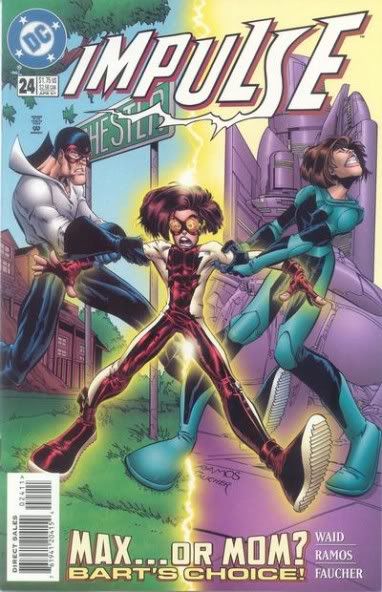 Ramos has some problems, but I always thought he was the ideal guy for drawing a book like Impulse. Usually just the right amount of cartoony with the big feet and big head. Facial features not bound by the mortal constraints of what can fit on a face. Then again, he does go overboard. This is from Crimson, Ish #1. It's very late nineties and there's vampires and angels and demons and a sexy red riding hood. 
|
|
#
?
Apr 13, 2011 00:08
|
|