


|
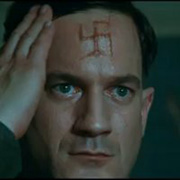
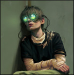
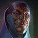
EthanEde posted:Greg Horn is so terrible, that catwoman is terrible in every way. And then there is this The thing I love about this drawing is the odd mix of military uniforms. You have a Marine Corps Drill instructor yelling at Powergirl (probably because she can't break 90 degrees due to her huge boobs). Next to them you have two Marines without their tops on at a half-assed attention. Notice how they are apparently wearing ABU hats. The other horrified male might be a Marine due to his undershirt, but he has an ABU hat with specialist rank on. Behind him is a sailor (or an airman in white dress undershirt) with another specialist rank ABU hat on. The DI has no rank (or if he does it seems he is a private). Ugh. Yggrasilll fucked around with this message at 07:10 on Apr 21, 2011 |
 #
?
Apr 21, 2011 06:59
#
?
Apr 21, 2011 06:59
|
|


|

|
| # ? May 9, 2024 23:25 |
|
|
seigfox posted:This might be beating a dead horse but I just happened across this; Really surprised he didn't trace some porno.
|
|
#
?
Apr 21, 2011 07:39
|
|


|
Ka0 posted:Really surprised he didn't trace some porno. That's Greg LAND.
|
|
#
?
Apr 21, 2011 07:46
|
|

|
Ka0 posted:Really surprised he didn't trace some porno. If you've ever had to search for stuff on a royalty free stock photo website, you'll know that half of what is on there is usually light porn.
|
|
#
?
Apr 21, 2011 07:54
|
|
|
No mention of Eduardo Risso? Steve Dillon? Gabriel Ba? Fabio Moon?
|
|
#
?
Apr 21, 2011 10:30
|
|

|
geeksauce posted:No mention of Eduardo Risso? Steve Dillon? Gabriel Ba? Fabio Moon? So post some examples or quit whinin' why don't you?
|
|
#
?
Apr 21, 2011 13:29
|
|

|
But don't post Steve Dillon. Ugh.
|
|
#
?
Apr 21, 2011 14:16
|
|
|
 Hater's gonna hate. (Punisher vs. Bullseye #4) God something about Punisher and Bullseye's matching broken noses is just endlessly funny to me. Plus, Steve Dillon draws "Angry Frank" better than just about anyone.
|
|
#
?
Apr 21, 2011 14:55
|
|
|
Another sadly departed artist: Seth Fisher.   
|
|
#
?
Apr 21, 2011 15:18
|
|


|
LtKenFrankenstein posted:
I absolutely hate Dillon's artwork except in two contexts: The Punisher and Judge Dredd. He just does big mean angry bastards right.
|
|
#
?
Apr 21, 2011 16:09
|
|

|
SynthOrange posted:Another sadly departed artist: Seth Fisher. What is this beautiful book oh god I need it.
|
|
#
?
Apr 21, 2011 16:15
|
|
|
The first and last have the titles in them, the middle two are Vertigo Pop: Tokyo, and Green Lantern: Willworld respectively.
|
|
#
?
Apr 21, 2011 16:49
|
|
|
You know whose art is so weird? Chaykins. It goes from complete crap to somewhat passable back to crap with each page. It's clear he HAD talent at some point, but he's 60 years old now and his lack of detail is showing...  
|
|
#
?
Apr 21, 2011 17:00
|
|
|
SynthOrange posted:The first and last have the titles in them, the middle two are Vertigo Pop: Tokyo, and Green Lantern: Willworld respectively. I have Vertigo Pop: Tokyo #1-4 if anyone is interested. Fisher's art really was mindblowing. He could have been huge now, especially with detail-heavy artists like Stokoe becoming so popular.
|
|
#
?
Apr 21, 2011 18:30
|
|
|
Mr Wind Up Bird posted:You know who actually sucks? Greg Horn  
|
|
#
?
Apr 21, 2011 19:29
|
|


|
The one thing I usually kind of like about Frank Cho is that his women that are supposed to be strong or good fighters have a little bit of meat on their bones as opposed to the usual default supermodel body. They've still usually got the ridiculous gigantic boobs, but at least they're not tiny little waifs punching out the Hulk or something.
|
|
#
?
Apr 21, 2011 19:40
|
|

|
EthanEde posted:Greg Horn is so terrible, that catwoman is terrible in every way. And then there is this Stuff like that makes me cherish the times Amanda Conner draws Powergirl. Conner does plenty of cheesecake but its not even in the same galaxy as crap like that.
|
|
#
?
Apr 21, 2011 23:18
|
|

|
Trast posted:Stuff like that makes me cherish the times Amanda Conner draws Powergirl. Conner does plenty of cheesecake but its not even in the same galaxy as crap like that. Conner did Power Girl really well, capturing the essence of her being a 20something woman who knows everyone's checking out her stripperific outfit and the ridiculousness that would surround that lifestyle.
|
|
#
?
Apr 22, 2011 01:55
|
|
|
Mister Roboto posted:You know whose art is so weird? Chaykins. It goes from complete crap to somewhat passable back to crap with each page. It's clear he HAD talent at some point, but he's 60 years old now and his lack of detail is showing... Chaykin's art basically ruins comics for me. I dropped Punisher: War Journal because I couldn't get past the art, and I've been skimming past his pages in the last few New Avengers issues. I think my main problem with his art isn't the pencils, but rather the coloring. Everything looks so drat shiny and plasticky. The bottom two examples you posted actually look good in black & white and more traditional colors.
|
|
#
?
Apr 22, 2011 19:10
|
|


|
Moai Ou posted:Chaykin's art basically ruins comics for me. I dropped Punisher: War Journal because I couldn't get past the art, and I've been skimming past his pages in the last few New Avengers issues. I still contend that Chaykin used to be one of the greats. In the '80s, his artwork and especially layouts in American Flagg! were groundbreaking. He might not be at the top of his game anymore, but neither are Stan Lee, Frank Miller, Byrne, Claremont, or most of the other top creators of decades past.
|
|
#
?
Apr 22, 2011 19:28
|
|
|
The other problem with Chaykin is that all his recent linework looks like it was made in MSPaint. All the lines are really pixelated.
|
|
#
?
Apr 22, 2011 22:38
|
|
|
I am a huge fan of Moritat's work on the Spirit, which is easily the most underrated book being put out by either of the Big Two right now. The amount of detail and life in his backgrounds is just stuning.  
|
|
#
?
Apr 23, 2011 00:42
|
|
|
Been out of comics for a while. But I'll post ones that inspire me when I look at them. They make me pull out a pencil and just draw. Possibly Eastman and Laird, they started having guests do covers at some point. (Edit: Laird did this one.)  Adam Kubert I believe.  Mark Nelson - Have many of his prints and a few signatures.  Den Beauvais - Have a large signed print of this framed on my wall minus the text/etc.  Scott Wegener (Art) & Lawrence Bass (Color) This cover in particular is amazing to me. The colors. Aesthetically perfect. I would really love to see this as a print on my wall. (Hint to the Goons to sell more prints!)  Haven't seen anything that truly turns me off yet to be honest. Maybe some of the guest artists that they did for TMNT back in the day where it just didn't look right. Philthy fucked around with this message at 07:10 on Apr 23, 2011 |
|
#
?
Apr 23, 2011 06:55
|
|
|
I just picked up the Sonic comics app on iTunes, and downloaded a couple of issues, including the 100th. I've always had issues with the art on that series, since Spaz's look is frequently too pointy for me (ironic considering the subject matter, I know), but the Knuckles strip absolutely took the cake: What even the hell is this:  That musculature and bone structure is just weird, and the whole strip is full of examples of Knuckles looking like a big-jawed anorexic cosplayer. I can't seem to find the images with his insane calf muscles and weird abdomen, but I'll keep searching around. (Oh, the artist is apparently the now-infamous Ken Penders, who I did not know was an artist as well as a writer. I almost feel a bit bad going after his art since his life seems to have kind of bottomed out lately due to the ruination his career over his insistance on waging legal war on an entity he cannot concievably beat over the rights to a bunch of derivative characters that it makes no sense for him to own the rights to.) ChuckDHead fucked around with this message at 17:23 on Apr 23, 2011 |
|
#
?
Apr 23, 2011 15:42
|
|
|
EthanEde posted:Greg Horn is so terrible, that catwoman is terrible in every way. And then there is this All I can see. 
|
|
#
?
Apr 23, 2011 17:58
|
|

|
Darth Nat posted:The one thing I usually kind of like about Frank Cho is that his women that are supposed to be strong or good fighters have a little bit of meat on their bones as opposed to the usual default supermodel body. They've still usually got the ridiculous gigantic boobs, but at least they're not tiny little waifs punching out the Hulk or something. Cho is just good in general about giving both male and female characters their own bodies, rather than just headswapping on basic bodybuilder/swimsuit model bodies. I think he's a really good artist period, not just for cheesecake.
|
|
#
?
Apr 23, 2011 18:02
|
|

|
Dr. Destructo posted:I think he's a really good artist period, not just for cheesecake. 
|
|
#
?
Apr 23, 2011 18:55
|
|
|
Alhazred posted:Yeah, pretty much: Dinosaurs= always cool no matter what age/sex/race/culture you are. Always 
|
|
#
?
Apr 23, 2011 19:39
|
|

|
Alhazred posted:Bad art: I think I agree that Ryp is bad. I think. I just read the Frank Miller Robocop trade that this panel comes from and it often had sequencing issues. It wasn't unreadable but the action was hard to follow. He tries to imitate Geoff Darrow (which considering the similarities between Robocop and the Miller/Darrow Hard Boiled makes him look bad), but he misses the important things which make that style work. It's like the worst aspects of Darrow's style fused with Jim Lee. There's a couple of panels that I actually thought were outstanding such as one in which Robocop punches through a brick wall. Great sense of motion conveyed. But he draws everything to look so grotesque. When drawing things that are meant to be grotesque it works, but he fails to really understand the idea of comic art as conveying information so too much gets drawn the same. As a result his panels are cluttered and hard to discern. Ugh.
|
|
#
?
Apr 23, 2011 19:59
|
|

|
Talking about good artists that have become crappy (Chaykin) what are peoples opinions about Kyle Baker? I like his earlier stuff but his most recent stuff has been rather offputting.
|
|
#
?
Apr 24, 2011 00:56
|
|

|
Madkal posted:Talking about good artists that have become crappy (Chaykin) what are peoples opinions about Kyle Baker? Deadpool Max to me looks great, but Hawkman I thought didn't look too good.
|
|
#
?
Apr 24, 2011 01:07
|
|
|
Madkal posted:Talking about good artists that have become crappy (Chaykin) what are peoples opinions about Kyle Baker? Much like Chaykin, depends on whether he gives a poo poo that day.
|
|
#
?
Apr 24, 2011 18:20
|
|

|
Gotta give props to Art Adams. Like Cho, he likes to draw babes and monsters, and boy does he draw them well. Too well in fact - he works at a snail's pace. But it's a small price to pay for work as detailed as his. His inks are unparalleled in the industry.  
|
|
#
?
Apr 24, 2011 20:04
|
|
|
Hatter106 posted:Gotta give props to Art Adams. Oh man, I had never seen this before, that's awesome. Ro-Man, a Mu-tant, Audrey II, and "It" that tried to conquer the world? I'm not sure about the guy on the right, he might be an invader from mars.
|
|
#
?
Apr 24, 2011 20:35
|
|
|
LtKenFrankenstein posted:Oh man, I had never seen this before, that's awesome. Ro-Man, a Mu-tant, Audrey II, and "It" that tried to conquer the world? I'm not sure about the guy on the right, he might be an invader from mars. You should check out the Creature From the Black Lagoon comic he made, it's all kinda awesome: 
|
|
#
?
Apr 24, 2011 22:00
|
|
|
I think Art Adams has been my favorite comic artist ever since I got the X-Men: The Asgardian Wars TPB when I was a kid, with the New Mutants Special Edition and Uncanny X-Men Annual #9, where they all go to Asgard. I had never seen an artist draw more detail or cuter women. I was thrilled that he drew so many of the Marvel Universe trading cards back in the early '90s, especially the second series, which I wheeled and dealed in the summer between 7th and 8th grades. I even met him at a convention around that time and got him to sign my Excalibur: Mojo Mayhem OGN and the "New" Fantastic Four issues he drew, with Spidey, Hulk, Wolverine, and Ghost Rider. He was a huge influence on J. Scott Campbell, who I like a lot but consider more of a "guilty pleasure" artist. How I wish Adams could crank out a good team book for DC or Marvel today!
|
|
#
?
Apr 24, 2011 22:14
|
|
|
LtKenFrankenstein posted:
I think this shows both what Dillon can and can't do. He does the consummate modern Frank in my mind, possibly due to his work on the Ennis run, but he puts a lot more detail into the faces of people like Frank and the criminals he targets than good or normal folk, who tend to look pretty similar. His high-tech stuff doesn't look great either, but the problem I see here is the Bullsey costume being solid black, which I'm pretty sure is down to him and not an inker, and even though his classic Punisher outfit looks okay.
|
|
#
?
Apr 24, 2011 22:35
|
|
|
Sprecherscrow posted:Great sense of motion conveyed. But he draws everything to look so grotesque. When drawing things that are meant to be grotesque it works, but he fails to really understand the idea of comic art as conveying information so too much gets drawn the same. As a result his panels are cluttered and hard to discern. Ugh. There's a Swedish artist called Hans Lindahl which I really like. I think that he's pretty great at drawing grotesque things but unlike Ryp he can also draw normal humans good too:   
|
|
#
?
Apr 24, 2011 22:37
|
|
|
Alhazred posted:There's a Swedish artist called Hans Lindahl which I really like. I think that he's pretty great at drawing grotesque things but unlike Ryp he can also draw normal humans good too: Have any of you checked out his work on Moon Knight? He did plenty of normal looking faces there. He's an artist that draws what is asked of him and Wolverine's the best there is, is asking for ugly and lots of it.  Source is Vengeance of Moon Knight probably issue 10 or something. I don't have my trade with me, but it was a good issue.
|
|
#
?
Apr 24, 2011 22:42
|
|
|

|
| # ? May 9, 2024 23:25 |
|
|
Alhazred posted:This is all shapes of impressive.
|
|
#
?
Apr 26, 2011 03:24
|
|