


|
INTJ Mastermind posted:Dramatic wrinkled faces might be artistic but your old clients don't want to pay money to be reminded they're old and ugly. See if you can smoothen out the faces a little. Try some fill light in the shadows and then go softer on the skin not sharper. Paragon8 posted:They aren't hotspots. Hotspots are more blown out. 
|
 #
?
May 21, 2011 18:43
#
?
May 21, 2011 18:43
|
|

|

|
| # ? May 21, 2024 08:18 |
|
|
Just wanted to share the final image, incorporating all the feedback I received. Thanks for helping me make my best portrait yet!  Smiling couple by JoshuaVanHorsen, on Flickr
|
|
#
?
May 22, 2011 04:18
|
|
|
Just a couple outside with the sun behind cloud Outside: Andrea N by downtown_man, on Flickr  Outside 2: Andrea N by downtown_man, on Flickr Processed it in two different styles. I'm a bit more partial to the bottom style than the top.
|
|
#
?
May 22, 2011 21:24
|
|
|
Took some headshots for a friend in my living room.  [/url [/url[url=http://www.flickr.com/photos/nickkneer/5748445186/]  
dakana fucked around with this message at 23:08 on May 22, 2011 |
|
#
?
May 22, 2011 23:03
|
|
|
Random photo from an event I shot today that came out pretty decent IMO. Its all hazy because he was standing behind a grill cooking food so there was smoke everywhere: IMG_9238.jpg by www.ShootJoeC.com, on Flickr
|
|
#
?
May 23, 2011 05:13
|
|


|
downtown_man posted:Just a couple outside with the sun behind cloud I really, really like the top one. The bottom one is really uninteresting. What do you prefer about the processing? The sky could maybe be toned down a hair in the top one, but the bottom one just looks flat and underexposed. It's also way less interesting compositionally.
|
|
#
?
May 25, 2011 19:41
|
|


|
dakana posted:Took some headshots for a friend in my living room. All I can see in 2 and 4 is the poo poo on his teeth, it's gross. Maybe try to make his mouth look less disgusting in post? 1 and 3 look great, I would say I prefer number 3 over number 1 because of the clipped chin in 1
|
|
#
?
May 25, 2011 20:01
|
|

|
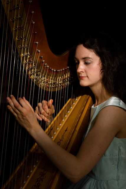 IMG_2160 by The original David L, on Flickr 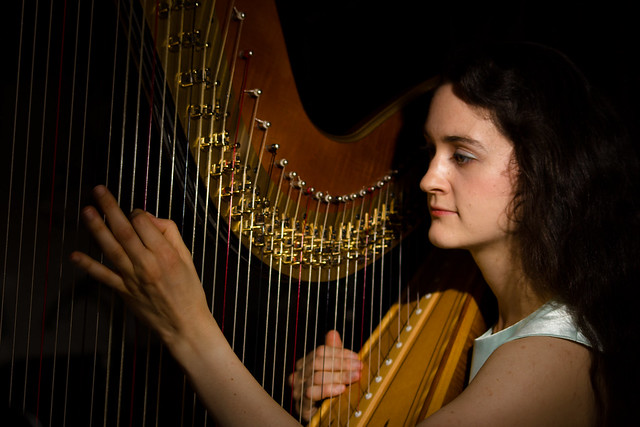 IMG_2135 by The original David L, on Flickr 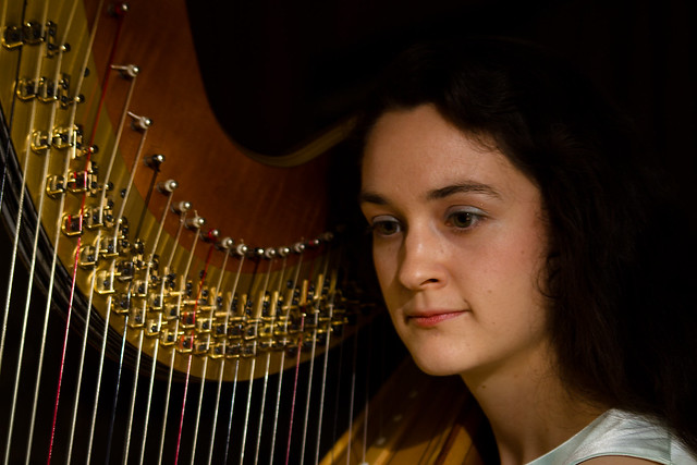 IMG_2126 by The original David L, on Flickr 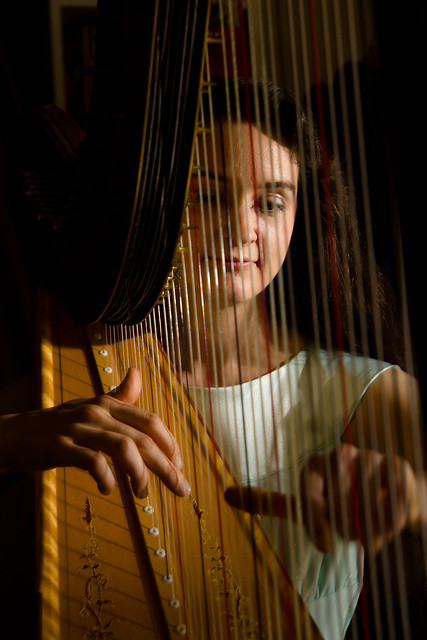 IMG_2096 by The original David L, on Flickr Did a photo shoot for a friend of mine who plays the harp. This was my first portrait session, and it was also complicated because we were in her small studio apartment, which was kind of cluttered and messy. I tried to use off-camera flash to darken the apartment to hide that. I think it came out pretty well. Suggestions / comments? Edit: The setup I was working with... 
INTJ Mastermind fucked around with this message at 04:51 on May 27, 2011 |
|
#
?
May 27, 2011 04:49
|
|
|
mr. mephistopheles posted:I really, really like the top one. The bottom one is really uninteresting. What do you prefer about the processing? The sky could maybe be toned down a hair in the top one, but the bottom one just looks flat and underexposed. It's also way less interesting compositionally. I was liking it more mainly because I was looking at a lot of washed out brownish retro photos. But looking at it again after letting it sit a few days, the style has soured a bit for me. Might take another stab at it. But yeah, the composition is not really doing it for me anymore. The top just looks more dynamic I guess. Thanks for the feedback!
|
|
#
?
May 27, 2011 05:05
|
|
|
INTJ Mastermind posted:
The shadow created by her head is way too hard.
|
|
#
?
May 27, 2011 13:34
|
|
|
INTJ Mastermind posted:
I think only #4 is really successful from these. In the first 3- especially #3- she doesn't look like she's involved or at all invested in playing the harp. That's not entirely your fault since she may be a tough model to get a genuine moment out of, but it's pretty much the most important aspect of a shot like this. You can't have a musician's instrument look like a generic prop. Printed this last night. Figured I'd post it here since it is a portrait... 
|
|
#
?
May 27, 2011 17:05
|
|


|
Thanks for the feedback guys! Pompous Rhombus posted:The shadow created by her head is way too hard. I'm not too happy about the bare lighting either, but I couldn't think of a way to have both soft lighting and to control the light hitting the background. If I had a second flash with me, maybe shooting that one up through the harp from the left would have helped balance things out a bit? McMadCow posted:I think only #4 is really successful from these. In the first 3- especially #3- she doesn't look like she's involved or at all invested in playing the harp. That's not entirely your fault since she may be a tough model to get a genuine moment out of, but it's pretty much the most important aspect of a shot like this. You can't have a musician's instrument look like a generic prop. These shots were taken while she was practicing a piece for a performance. She's been playing harp for 14 years, so it wasn't hard to get a genuine performance, no modelling there. But afterwards it was a matter of sorting through 100+ shots to find ones that had good hand positions. I did select ones where she had her eyes open too, figuring it would make for a better portrait. But maybe eyes closed would make her seem more lost in the music? McMadCow posted:Printed this last night. Figured I'd post it here since it is a portrait... I liked how you posed her head and shoulder, but the hand is a bit distracting. That wrinkly claw hand doesn't work well with the pretty young model. INTJ Mastermind fucked around with this message at 18:30 on May 27, 2011 |
|
#
?
May 27, 2011 18:27
|
|
|
INTJ Mastermind posted:But maybe eyes closed would make her seem more lost in the music? It's possible. I singled out #3 because there seemed to be no relationship at all between the performer and her instrument. Having closed eyes may improve on that. Also, we're pretty used to seeing classical musicians being very expressive with their body and their face when they're playing. She's got the same exact expression in all 4 shots, so if you use more than one, I'd take only one from this group and seek out another where she's got a different look, or maybe one without a direct shot of her face.
|
|
#
?
May 27, 2011 19:12
|
|
|
INTJ Mastermind posted:I'm not too happy about the bare lighting either, but I couldn't think of a way to have both soft lighting and to control the light hitting the background. If I had a second flash with me, maybe shooting that one up through the harp from the left would have helped balance things out a bit? quote:These shots were taken while she was practicing a piece for a performance. She's been playing harp for 14 years, so it wasn't hard to get a genuine performance, no modelling there.
|
|
#
?
May 27, 2011 21:27
|
|
|
Cross_ posted:Looks like you had some brown cloth in the background. Get something black instead and whatever light remains can be removed in post. A second flash could make things even worse since now you need to keep the instrument's shadow from obscuring her face. Some white reflective material on the other hand wouldn't hurt. I didn't have much control over the area, which made it more challenging, but also more fun I think. The brown sheet is what she had in her apartment, and is covering up a refrigerator with colorful fridge magnets. That took care of the most distracting background element. There wasn't any way to pull the cloth all the way across the room, which I agree would have been ideal. We tried doing posing shots at first, but those all came out unnatural. Playing some music helped make the shots feel more genuine. I guess that could also mean I need to learn to pose my subjects better. Any good resources for that? Edit: Looking at that room picture again, I should have hung the sheet from the fridge and the bed post to get more coverage.
|
|
#
?
May 27, 2011 22:25
|
|
|
I was asking for posing guides here a while back and didn't get any responses. Meanwhilee I bought this booklet. It's useful and quirky- just a bit overpriced for what you get : http://www.amazon.com/Portrait-Photographers-Posing-Guide-portraits/dp/1419652338/ref=sr_1_3?ie=UTF8&qid=1306534074&sr=8-3
|
|
#
?
May 27, 2011 23:08
|
|
|
Posing guides never seemed to help me because every person situates themselves differently. I talk to people until they slump into something comfortable and then tell them to straighten up but hold the same pose and weight their body around. I also practice a bunch of stuff in a mirror and look at a ton of magazines to mimic poses that I see.
|
|
#
?
May 27, 2011 23:14
|
|

|
 Dreaming by downtown_man, on Flickr My attempt at a "Dreamy" portrait. Was playing around with hot lights and blew out the highlights on her head and hand. Also wondering is it too yellow? I was pleased when I first did it but now a month later I'm questioning the yellowcast.
|
|
#
?
May 29, 2011 04:25
|
|
|
Messing around with some friends last night. flickr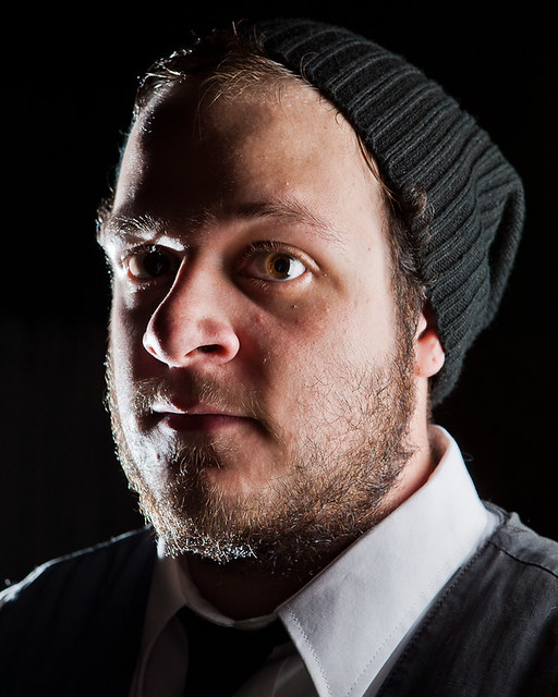 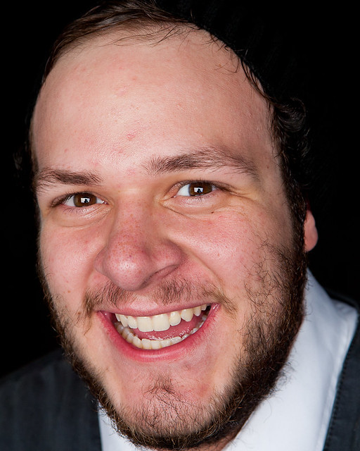 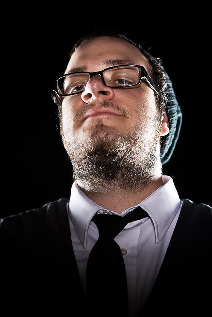      I have no idea.
|
|
#
?
Jun 1, 2011 20:02
|
|
|
downtown_man posted:
I feel like it's too purple to be honest. The edge of the shadow on her forehead is super rough. I'd see if you could fiddle that maybe.
|
|
#
?
Jun 1, 2011 20:32
|
|

|
dakana posted:Messing around with some friends last night. flickr This is a very dramatic look and all, but unless you have a very good reason for leaving it like that, neither eye is properly lit, and it's a bit distracting. I'm not saying it can't work, but it's not working for me in this case. The other shots are pretty solid, though.
|
|
#
?
Jun 1, 2011 20:32
|
|
|
I like how his eye appears to be backlit. Not flattering by any means, but it's interesting to look at.
|
|
#
?
Jun 1, 2011 22:58
|
|
|
dakana posted:Messing around with some friends last night. flickr Totally reminds me of an octopus eye. Somewhat hypnotic..must...look...away. Doing a whole slew of portraits this week. This is the first of a string of 8 I will have done by Sunday. Biggest regrets: The boy was totally uncomfortable sitting to close to the girl (cooties and all...), so I was moving them around to hide the space between them. By doing so I lost my warm rim light on the left. Other regret, wish I had bounced a cool gelled strobe off the foreground paintbrushes to give them some dimension and texture.  110601_ArtRoom_52 by JoshuaVanHorsen, on Flickr
|
|
#
?
Jun 2, 2011 04:16
|
|
|
Did you gaussian blur the background? It looks odd.
|
|
#
?
Jun 2, 2011 05:51
|
|

|
Yea it looks like theres some blurring around parts of their arms and I feel like the paintbrushes in the top left should be out of focus too...at first glance all looks ok, but digging deeper it does seem odd.
|
|
#
?
Jun 2, 2011 06:19
|
|


|
i cannot keep my eyes off the paintbrush on the left that is not blurred.
|
|
#
?
Jun 2, 2011 06:35
|
|

|
RizieN posted:Yea it looks like theres some blurring around parts of their arms and I feel like the paintbrushes in the top left should be out of focus too...at first glance all looks ok, but digging deeper it does seem odd. Guilty! I posted this prematurely, as I was just excited with how it was coming out. I was in the middle of working with it. I did do a lens blur, and am slowly masking it out and cleaning up the edges. The problem I had was that I wanted to ensure that both my subjects were sharp so I was shooting at 7.1 or something. The background in the final shot, while lightly out of focus, was still pretty distracting, and wasn't allowing the kids to own the scene. I decided I would work on fabricating a reduced depth of field to give them more of the spotlight. I like the overall look, and I enjoy the fact that there is something instinctively unsettling about the depth of field. That said, the final image with be presented in a tight crop at 930px x 285px. I think It will be near impossible to pick out any visual ques that break the illusion. Or at least I hope.
|
|
#
?
Jun 2, 2011 17:37
|
|
|
I feel like I'm being poked in the eye by the blurry brushes in the foreground.
|
|
#
?
Jun 2, 2011 17:45
|
|
|
Mightaswell posted:I feel like I'm being poked in the eye by the blurry brushes in the foreground. hahaha! This is all i see now...
|
|
#
?
Jun 2, 2011 21:43
|
|
|
doing the 'new poster' thing in relevant threads...here's some of my favorites from the past few years. the last one is a composite type of thing.      
|
|
#
?
Jun 2, 2011 21:55
|
|

|
Welcome. I really like the second shot you've posted. Nice, simple lighting!
|
|
#
?
Jun 2, 2011 22:21
|
|
|
Those photos make me want to get into strobes. This is the first time doing a business shoot. Natural light:   I've been second guessing my monitor calibration. Is there a good calibrator that works with LED monitors? Aeka 2.0 fucked around with this message at 03:17 on Jun 3, 2011 |
|
#
?
Jun 3, 2011 03:14
|
|

 Have you seen my apex seals? I seem to have lost them.

|
Shot a friend of mine today. Started with some simple headshots, then moved onto something a bit more interesting... IMG_2435 by The original David L, on Flickr  IMG_2445 by The original David L, on Flickr  IMG_2549 by The original David L, on Flickr
|
|
#
?
Jun 6, 2011 04:48
|
|
|
Elite Taco posted:Welcome. I really like the second shot you've posted. Nice, simple lighting! thanks :-) there was a bare head behind her towards the camera (gelled), and a 4 foot softbox above the camera.
|
|
#
?
Jun 6, 2011 08:56
|
|
|
INTJ Mastermind posted:
Took me a bit to pinpoint what I didn't like about this shot, but I think it's with the shadows on your friend. Take a look at how dark they are and compare them to the background- I don't like how strong the difference is. The harsh light drop off as soon as it goes around the corner of his face kind of makes him look a little weird too. I'd try lowering the contrast in the photo or perhaps boosting the shadows, and also bringing up the background a bit. Is there a specific reason you underexposed the scene?
|
|
#
?
Jun 6, 2011 15:36
|
|

|
RangerScum posted:Took me a bit to pinpoint what I didn't like about this shot, but I think it's with the shadows on your friend. Take a look at how dark they are and compare them to the background- I don't like how strong the difference is. The harsh light drop off as soon as it goes around the corner of his face kind of makes him look a little weird too. I'd try lowering the contrast in the photo or perhaps boosting the shadows, and also bringing up the background a bit. Is there a specific reason you underexposed the scene? The first picture of that set was my attempt at a nice "normal" portrait. For the second, I was experimenting with off camera flash, and knocking down the ambient. I wanted to create a more dramatic look with the dark sky and background contrasting against the sharply lit subject. I only had one flash, so I wasn't able to do anything to fill in the shadows on his face, but I do agree that the shadows need some filling. Time to order a second flash? ")
|
|
#
?
Jun 6, 2011 19:09
|
|
|
No, just don't shoot at 1/200, f/16.0. Just increase the ambient exposure a bit and the contrast between the flash-lit areas and the shadows won't be nearly as bad. RangerScum fucked around with this message at 19:57 on Jun 6, 2011 |
|
#
?
Jun 6, 2011 19:55
|
|
|
gh0st posted:doing the 'new poster' thing in relevant threads...here's some of my favorites from the past few years. the last one is a composite type of thing. First is perfect. The second I like a lot, but I wish the background was a different color. I think red would be cool. The white is too much.
|
|
#
?
Jun 6, 2011 20:04
|
|
|
RangerScum posted:No, just don't shoot at 1/200, f/16.0. The shot was taken in broad daylight, so that setting was the only way to darken the sky enough. Ideally I needed some way of lightening the shadows on his face, while keeping the ambient at the same low level. I tried adding fill light in post but that lightened the sky as well as the shadows on his face, which kind of ruined my original intent. I think increasing the ambient exposure during the shot would have done the same. 
|
|
#
?
Jun 6, 2011 20:22
|
|
|

|
| # ? May 21, 2024 08:18 |
|
|
That makes sense, I still think your background/sky is underexposed though. Look at how grey those clouds are, while a better exposed sky would result in white clouds. Also, if taken in broad daylight did you even need a flash? He doesn't appear to be standing in shade or anything.
|
|
#
?
Jun 6, 2011 20:32
|
|