


|
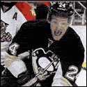
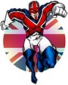
Would actually love David Haye at centre back.
|
 #
?
Jul 1, 2011 11:48
#
?
Jul 1, 2011 11:48
|
|

|

|
| # ? May 30, 2024 05:22 |
|
|
e: oops
|
|
#
?
Jul 1, 2011 11:48
|
|
|
Thirteenth Step posted:
Pretty meh. The red was much better.
|
|
#
?
Jul 1, 2011 12:13
|
|

|
Raptor Jesus posted:the away kit isnt very inspired. Neither is "just make it all blue"
|
|
#
?
Jul 1, 2011 12:58
|
|


Uh... e;rehosted TwoDogs1Cup fucked around with this message at 15:57 on Jul 1, 2011 |
|
|
#
?
Jul 1, 2011 13:54
|
|
|
TwoDogs1Cup posted:Uh... Story. STORY! That is HORRIBLE E: oh my god E2: Rehost the image good sir Thirteenth Step fucked around with this message at 14:06 on Jul 1, 2011 |
|
#
?
Jul 1, 2011 14:02
|
|


|
TwoDogs1Cup posted:Uh... Holy poo poo that's real
|
|
#
?
Jul 1, 2011 14:02
|
|

|
Wow, when Umbro loses the plot, they really lose it.
|
|
#
?
Jul 1, 2011 14:08
|
|
|
What the hell Umbro? You were doing so well  England used navy as their away kit in the 90's, no?
|
|
#
?
Jul 1, 2011 14:09
|
|

|
TwoDogs1Cup posted:Uh... aaaaaaaaahhahahahahahahaha
|
|
#
?
Jul 1, 2011 14:13
|
|


|
I'm so tempted to get one
|
|
#
?
Jul 1, 2011 14:15
|
|
|
TwoDogs1Cup posted:Uh...
|
|
#
?
Jul 1, 2011 14:19
|
|
|
It must be some sort of optical illusion that completely fucks with the striker's eyes in a 1-on-1, there's no other reason for that to exist. Efb. Got interrupted at work while I was typing.
|
|
#
?
Jul 1, 2011 14:36
|
|
|
TwoDogs1Cup posted:Uh... ***barfs/laughs uncontrollably***
|
|
#
?
Jul 1, 2011 14:44
|
|
|
I kind of like it because I like ridiculous keeper shirts. African teams should dress up their keepers in dashikis.
|
|
#
?
Jul 1, 2011 14:45
|
|
")
|
Holy loving poo poo. The away kit looks like someone sewed an England crest on a �2.50 Primark polo, the gk shirt though is totally poo poo. Why does the Engloflage stop at the elbows?
|
|
#
?
Jul 1, 2011 14:54
|
|

|
Fooly Cooly 25 posted:What the hell Umbro? You were doing so well Lighter blue iirc at least it was at Italia 90. We should stick with the red and holy fuckballs at that keeper top 
|
|
#
?
Jul 1, 2011 15:05
|
|

|
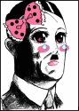
Joe Hart is too handsome how can we make him less appealing..
|
|
#
?
Jul 1, 2011 15:39
|
|


|
thehappyprince posted:Joe Hart is too handsome how can we make him less appealing.. I thought this was also supposed to distract incoming attackers "...the striker seemed clean through on goal until he collapsed in surprise, nearby spectators claim they heard him yell 'what is Legolas doing here?' before tumbling into a useless heap twenty yards from goal..."
|
|
#
?
Jul 1, 2011 16:22
|
|


|
Isn't the main part of the shirt David Haye is modeling actually blue? The shirt pic posted after seems to be black with a baby blue collar.
|
|
#
?
Jul 1, 2011 16:27
|
|
|
TwoDogs1Cup posted:Uh... It's dazzle camoflage!  The other team won't be able to tell the keepers distance or direction, thus saving him from torpedos 
|
|
#
?
Jul 1, 2011 16:36
|
|
|
Sadsack posted:It's dazzle camoflage! Was searching for a picture of this but couldn't remember what it was called. Just gave it another look hoping it would be a little bit better than when I saw it earlier. It's not.
|
|
#
?
Jul 1, 2011 18:14
|
|
|
TwoDogs1Cup posted:Uh...  seriously this is a great keeper kit seriously this is a great keeper kit
|
|
#
?
Jul 1, 2011 22:03
|
|
|
I wonder whether a goalkeeper kit with an arrow pointing left on it would actually make people shoot to the left more. Or maybe one that simply says you're gonna miss this shot.
|
|
#
?
Jul 1, 2011 23:08
|
|

|
New Bradford kits are a load of shite. Looks like Nike forgot how to do straight vertical stripes properly and then just decided to go with an ugly shade of pink for the away, nice one!!         
|
|
#
?
Jul 2, 2011 13:46
|
|
|
sweek0 posted:I wonder whether a goalkeeper kit with an arrow pointing left on it would actually make people shoot to the left more. Or maybe one that simply says you're gonna miss this shot. Maybe one that tells the story about a girl who died and how her ghost haunts football games and will kill you in your sleep unless you miss 5 shots today.
|
|
#
?
Jul 3, 2011 00:35
|
|
|
new millwall kits are being unveilled officially in the next few days (away on monday, home on thursday), but really you can see the whole thing from the teasers so  looking very, very class imo; particularly like that they've moved the macron logos down off the shoulders. might actually shell out the �40 or whatever if i can get the sponsor taken off. our best kit for a good while, hope we stick with macron for some time.
|
|
#
?
Jul 3, 2011 00:51
|
|


|
They look nice but that's the shittest teaser job I've seen in a long time.
|
|
#
?
Jul 3, 2011 06:28
|
|
|
Hmmm
|
|
#
?
Jul 3, 2011 10:23
|
|

|
good detective work pissflaps
|
|
#
?
Jul 3, 2011 12:20
|
|
|
CSI: Middlesbrough
|
|
#
?
Jul 3, 2011 16:46
|
|
|
Raightning posted:particularly like that they've moved the macron logos down off the shoulders. Kappa, you're on the clock.
|
|
#
?
Jul 3, 2011 21:59
|
|
|
 First teaser of our new kit  Here's the one I posted weeks ago and said ours would blatantly be almost identical to. 
|
|
#
?
Jul 4, 2011 10:35
|
|
|
deletebeepbeepbeep posted:
The bird is backward. e: Argh, stupid impulse OCD post.
|
|
#
?
Jul 4, 2011 14:23
|
|


 Yeah...
|
|
|
#
?
Jul 5, 2011 00:22
|
|
|
Pissflaps, why have you not posted the new Boro away kit yet? Because it's loving smart as.  (Apart from the loving awful sponsor logo, naturally.)
|
|
#
?
Jul 5, 2011 00:25
|
|


|
Good to see every single team in the entire world is getting a "revolutionary" all black away kit next year. Also I love the Everton Camo keeper kits and would buy one of each if I had the misfortune of being an Everton fan, which I do not.
|
|
#
?
Jul 5, 2011 00:45
|
|
|
TwoDogs1Cup posted:
|
|
#
?
Jul 5, 2011 00:53
|
|
|
Botany As Optimism posted:Good to see every single team in the entire world is getting a "revolutionary" all black away kit next year. I love the away Everton keeper kit, the home one is awful though. Though not as bad as England's GK away, jesus christ.
|
|
#
?
Jul 5, 2011 01:00
|
|
|
|
| # ? May 30, 2024 05:22 |
|
|
  Snot green.
|
|
#
?
Jul 5, 2011 01:17
|
|