|
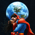
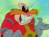
ChairMaster posted:Dude. Using abbreviations in real life means you are a piece of garbage. I mean your argument makes sense if it's "well yea horrible people are gonna say stupid things in real life because the internet is so big" but not if it's "the internet is so big that it's okay for horrible people to say stupid things". Teenagers who say internet abbreviations in real life suck and i hope they die. At first I thought you were being sarcastic and I thought this post was funny but then I realized it wasn't a joke and you should feel bad because everybody uses acronyms/abbreviations in real life. Also, I hate JRJr's art for the most part. Seriously, this is hideous: 
|
 #
?
Jul 4, 2011 04:41
#
?
Jul 4, 2011 04:41
|
|


|

|
| # ? May 9, 2024 22:30 |
|
|
Internet Wizard posted:At first I thought you were being sarcastic and I thought this post was funny but then I realized it wasn't a joke and you should feel bad because everybody uses acronyms/abbreviations in real life. JRJR is one of those guys where sometimes (Uncanny X-Men) I think his work is horrible, and other times (The first 25 issues of the Thor relaunch) I think his work is amazing. This image from Eternals made my jaw drop though: 
|
|
#
?
Jul 4, 2011 04:51
|
|

|
His Eternals stuff was pretty great, even if everybody had giant square faces with super thin lips, but it makes no sense that he would produce something like the picture I posted and think, "Yeah, that is totally good enough for the cover for the very first issue of the Avengers relaunch." Just look at it, even if you don't agree with my hate on his super blocky style, the posing is stiff, and the perspective is headache inducing. Wolverine is standing behind Cap, except for his gigantic bicep and forearm, there. And then there's the Thor and Iron Man's pose. What are they doing? Flying at the viewer? They look like they're just sort of falling over. Not to mention whatever the hell is going on with Spider-man and his web, there.
|
|
#
?
Jul 4, 2011 04:56
|
|
|
Super-blocky stiff poses? It was ok when Kirby did it. You guys are being sour grapes.
|
|
#
?
Jul 4, 2011 05:02
|
|

|
Internet Wizard posted:Cap looks okay but please tell me that Thor and Iron Man are edited to look like that. Those faces look hideously stretched. I noticed too that Wolverine has a rather distracting white outline.
|
|
#
?
Jul 4, 2011 05:07
|
|
|
Tracula posted:Cap looks okay but please tell me that Thor and Iron Man are edited to look like that. Those faces look hideously stretched. I noticed too that Wolverine has a rather distracting white outline. Haha nope I got that straight from Marvel's site.
|
|
#
?
Jul 4, 2011 05:09
|
|
|
I love JRJr, but I can't really blame those who don't. I see him as an artist who has certain things he's really good at, but when outside those parameters, he's maybe not so hot. Women are definitely not his best work, but I couldn't imagine a better choice for World War Hulk.
|
|
#
?
Jul 4, 2011 05:32
|
|

|
Internet Wizard posted:At first I thought you were being sarcastic and I thought this post was funny but then I realized it wasn't a joke and you should feel bad because everybody uses acronyms/abbreviations in real life. Man you know as well as i do that i just mean internet abbreviations for actions or expressions like omg or lmfao or whatever. Not like saying CIA or FBI or CSI. Anyways this is kinda a dumb derail and it's not even about comics so i'll post some pictures instead. I don't think there's been any Planetary in this thread yet so i will post some great stuff from it.    Those are all from Planetary 19.
|
|
#
?
Jul 4, 2011 06:15
|
|

|
Why's there a bunch of skeletons clinging to his nipple?
|
|
#
?
Jul 4, 2011 11:55
|
|
|
Dr I am a Doctor posted:Why's there a bunch of skeletons clinging to his nipple? A dead space god's breast milk is highly addictive? (I am only half joking).
|
|
#
?
Jul 4, 2011 12:22
|
|

|
Maybe it's poisonous but it took like 10 dudes to figure it out.
|
|
#
?
Jul 5, 2011 02:10
|
|
|
ChairMaster posted:Maybe it's poisonous but it took like 10 dudes to figure it out. So that's where Oglaf got the idea from. (Most of the comics are  but this one is.) but this one is.)
|
|
#
?
Jul 5, 2011 02:32
|
|
|
I think they were just worshiping the nipple.
|
|
#
?
Jul 12, 2011 23:44
|
|
|
Rhyno posted:It just shows how Bendis is falling out of touch. Sure his slang was pretty good back when USM started but now he's going down the same road every other old man writer has walked. Don't be an herb dude.
|
|
#
?
Jul 13, 2011 02:42
|
|

|
Jeremy Bastian, best known for his work in Cursed Pirate Girl. Dude inks with a brush at PRINT SIZE holy loving shiiiiiiit 
Crisco Kid fucked around with this message at 06:31 on Sep 3, 2011 |
|
#
?
Sep 3, 2011 06:26
|
|
|
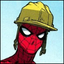
Internet Wizard posted:At first I thought you were being sarcastic and I thought this post was funny but then I realized it wasn't a joke and you should feel bad because everybody uses acronyms/abbreviations in real life. This is cover art for the LEGO Avengers game isn't it? Look at those block heads.
|
|
#
?
Sep 3, 2011 23:03
|
|

|
Crisco Kid posted:Jeremy Bastian, best known for his work in Cursed Pirate Girl. gently caress. FUUUUCK now I feel like everything I've done in my life is a waste compared to this.
|
|
#
?
Sep 4, 2011 05:59
|
|


|
Crisco Kid posted:Jeremy Bastian, best known for his work in Cursed Pirate Girl. I met this guy at Emerald City 2009 I believe. He was inking a page as I was looking over his prints, talking. The subject of tools came up and I asked "What size nib do you use? Crowquill?" He looks up and I realize the black tip at the end of the object he was holding were bristles, not a loving nib. I bought four prints on the spot. He dyes them by hand and crinkles them up to look old and wicked cool. At first I thought the guy did woodblock prints or etchings but no, that poo poo's all brush.
|
|
#
?
Sep 4, 2011 07:20
|
|


|
Lurdiak posted:I too love still frames of anime. Its called Manga you dodo brain.
|
|
#
?
Sep 14, 2011 05:30
|
|

|
Resurrecting this thread because the sketch variant for the new issue of New Avengers really made me realize that, drat, JRjr's pencils look way better without Dean White's Colors. Observe:  Pretty dramatic difference, no?
|
|
#
?
Sep 18, 2011 00:40
|
|

|
Yikes. That is not a match made in heaven. JrJr's exaggerated blocky style doesn't need a colorist working his hardest to make his linework less bold and his shapes flatter.
|
|
|
#
?
Sep 18, 2011 01:38
|
|


|
Back in 1997, WWF tried to do this comic called Krozor that didn't go farther than the prologue (an insert in WWF Magazine). This art is by Wayne J. Meyer.   That's supposed to be the Undertaker. I have a full review here.
|
|
#
?
Sep 18, 2011 05:16
|
|

|
I actually had to check to make sure that is how you spell Connecticut. I so do not pronounce that the way it is spelled.
|
|
#
?
Sep 18, 2011 05:47
|
|


|
LtKenFrankenstein posted:Resurrecting this thread because the sketch variant for the new issue of New Avengers really made me realize that, drat, JRjr's pencils look way better without Dean White's Colors. Observe: Jesus. I've been complaining about bad computer coloring forever now (and my complaint is that it's bad, not that it's done on a computer) but this example is just ridiculous. You can do literally anything with color when you're putting it through a computer. There are no limitations I can think of unless you want to start talking about physical texture or go way out there, but as far as practical limitations within a printed comic book using standard techniques, the possibilities are endless. What do we get? Unimaginative garbage. Lens flares, motion blurs, muddy shading, and no idea that colors can possibly mean something. I was having this discussion once online and someone posted a Red Rider BB Gun ad from the 50's as an example of "bad" old coloring to prove me wrong and they actually ended up proving my point for me. Flat color applied by someone who has some artistic training and a little bit of design sense will look better than over-rendered schlock any and every day of the week. Personally, I love JRjr (and Senior, but that just means I have eyeballs because everyone should love JRsr) and have often wondered why some of his pieces just haven't grabbed me the same way things he did in the 80's did. I hate to just think someone has lost their touch and it was pretty easy to see he hadn't when I started really looking but eventually I just sort of dropped it. Now it's all coming together. loving colorists. Why must most of them suck? Oh, and the wrestling comic is hurting my brain. There is never any excuse for that kind of garbage. Norm Breyfogle is working for Archie right now. There are plenty of really great comic book artists who just can't seem to find work that would love to get paid to draw a real comic for a giant organization with millions of dollars to spend. You don't have to let your VP of Finance's nephew that still lives at home and can't find a steady job "draw" it for you. Geekboy fucked around with this message at 06:39 on Sep 18, 2011 |
|
#
?
Sep 18, 2011 06:37
|
|
|
I'd so be down with a comeback for cheaper black and white or grayscale comics. The only colorist I even like is Dave Stewart.
|
|
#
?
Sep 18, 2011 11:29
|
|
|
SkellingTon Loc posted:I'd so be down with a comeback for cheaper black and white or grayscale comics.
|
|
#
?
Sep 18, 2011 14:49
|
|

|
JRJr might not be everyone's cup of tea, but he can draw a great Spider-Man. For some reason I absolutely love this cover, and got it signed by him at Kapow.
|
|
#
?
Sep 18, 2011 14:57
|
|
|
I love Clayton Crain. He's been my fave for a few years now...   Super explosion thumbnailed for hugeness. 
|
|
#
?
Sep 18, 2011 20:01
|
|
|
invalid user posted:This one's actually Mike Choi. You can tell because it's way better than Clayton Crain.
|
|
#
?
Sep 18, 2011 20:09
|
|
|
Wolverine's making me really uncomfortable there. It looks like he's trying to smell the inside of her neck while performing an impromptu mastectomy.
|
|
#
?
Sep 18, 2011 20:17
|
|
|
 He's been mentioned here before but Dave Mazzucchelli is great, the born again run of Daredevil started me on comics and it's still brilliant, the ability to make superheroes look like real people, whilst still having an artistic style of your own, is pretty difficult to pull of.
|
|
#
?
Sep 18, 2011 21:17
|
|

|
LtKenFrankenstein posted:This one's actually Mike Choi. You can tell because it's way better than Clayton Crain. Mike Choi is amazing, I wish he could swing a monthly schedule.
|
|
#
?
Sep 18, 2011 21:21
|
|

|
yaffle posted:
Frank Miller's Daredevil is what got me seriously into comics (That and Bendis' Ultimate Spider-Man). It just blew my pre-teen mind back in the day.
|
|
#
?
Sep 18, 2011 22:04
|
|

|
invalid user posted:I love Clayton Crain. He's been my fave for a few years now... I love when artists remember that Logan is supposed to be really short. What's the giant explosion from? I can make out some woman and Archangel but I don't recall ever seeing that spread before.
|
|
#
?
Sep 19, 2011 01:48
|
|

|
ChuckDHead posted:JRJr might not be everyone's cup of tea, but he can draw a great Spider-Man. I wonder if this would have looked better before the colour, as it is it looks like New York rain is really sudsy.
|
|
#
?
Sep 19, 2011 02:23
|
|
|
FutureBoy posted:I love when artists remember that Logan is supposed to be really short. What's the giant explosion from? I can make out some woman and Archangel but I don't recall ever seeing that spread before. It's from the first run of the new X-Force strike team. The woman is X23, I think.
|
|
#
?
Sep 19, 2011 07:32
|
|


|
Pretty sure that's Domino, actually. She's got the dark mark on her one eye. And guns. Lots of guns.
|
|
#
?
Sep 19, 2011 07:40
|
|
|
DJ Turbo Punch posted:It's from the first run of the new X-Force strike team. The woman is X23, I think. That would be very, very wrong.
|
|
#
?
Sep 19, 2011 07:45
|
|

|
DJ Turbo Punch posted:It's from the first run of the new X-Force strike team. The woman is X23, I think. It's right before...the Messiah War crossover I think? Bastion is using one of his people (the woman with mask) to kidnap mutants and overload their powers in crowded public places.
|
|
#
?
Sep 19, 2011 08:57
|
|

|

|
| # ? May 9, 2024 22:30 |
|
|
Mister Roboto posted:That would be very, very wrong.
|
|
#
?
Sep 19, 2011 11:46
|
|