


|
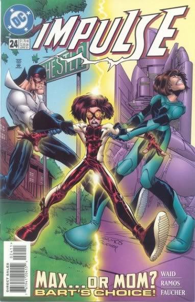
browsin' my ASOIAF communities and came across this masterpiece remember what your preschool teacher said about using puffy paint on your arms, kids!
|
 #
?
Sep 20, 2011 22:41
#
?
Sep 20, 2011 22:41
|
|


|

|
| # ? May 9, 2024 22:31 |
|
|
Why would you put that on your front cover? Put a dude scheming or with an awesome sword or pretty much anything other than telling everyone "Hey, there will be some uncomfortable sex scenes that will remind you of rape in this story. Buy it now!"
|
|
#
?
Sep 21, 2011 00:07
|
|


|
bobkatt013 posted:So a Rusty Venture? No no no, a Rusty Venture is when you take a girl behind the fast food restaurant and she bleeps you while you bleep off into a bleep and then you talk into the box and order three bleeps to bleep the bleeps with.
|
|
#
?
Sep 21, 2011 00:45
|
|
|
The Werle posted:No no no, a Rusty Venture is when you take a girl behind the fast food restaurant and she bleeps you while you bleep off into a bleep and then you talk into the box and order three bleeps to bleep the bleeps with. as Brock said quote:Brock Samson: Don't believe the hype. A Rusty Venture is the name for when you jerk off so much your dick gets red and sore." For content Steranko is the best, if I could ever afford it I would love to own some of his original art. 
|
|
#
?
Sep 21, 2011 00:56
|
|
|
At my library we have two books by Shaun Tan. The Arrival and Lost and Found. The Arrival is the story of an immigrant moving to a strange land looking for work so he can eventually move his family over. He is looking for a better life in other words. The entire story is told in pictures only, and it really captures the amazement and experience of going somewhere new. It helps when the pictures look like these:   His story telling is so superb that you just have to look at the artwork to know what is going on. Lost and Found is an anthology of sorts. The first story, the Red Tree has pictures like this   I would love to show you more from the other two stories in the book but I think you get the point. For the red Tree Tan said he tried to draw emotions that you can't put into words (all while telling a story). If you look at his work you will get the feeling that he accomplished it.
|
|
#
?
Sep 21, 2011 01:15
|
|

|
Madkal posted:At my library we have two books by Shaun Tan. The Arrival and Lost and Found. These are probably the best in this thread so far, holy poo poo. Is there anywhere I can get this one as a print?
|
|
#
?
Sep 21, 2011 08:11
|
|

|
Madkal posted:At my library we have two books by Shaun Tan. The Arrival and Lost and Found. What the heck, I had these recommended to me ten minutes ago and just came here to check the thread for other inspiration before googling him. Looks incredible. He also made an oscar winning short film that I'm keen to see.
|
|
#
?
Sep 21, 2011 14:46
|
|
|
Speaking of X23 I've always been a really big fan of Josh Middleton's stuff  Mostly because I love the softness of it all and he's a really nice guy. What do you guys think?
|
|
#
?
Sep 21, 2011 15:29
|
|

|
Hells yes, I only brought x-23 because of his art, then they got someone crap to draw it and it turned into disappointing poop.
|
|
#
?
Sep 21, 2011 19:26
|
|

|
Humboldt squid posted:These are probably the best in this thread so far, holy poo poo. Is there anywhere I can get this one Infor about getting prints can be found here. I have looked into it and seriously if I had the money to spend (they go for around $195 dollars excluding shipping I would do it.
|
|
#
?
Sep 21, 2011 23:21
|
|
|
Madkal posted:At my library we have two books by Shaun Tan. The Arrival and Lost and Found. See? See this right here? This is why seeing the same overpolished superhero stuff drives me insane sometimes. Here we have this wonderful art form where we can do literally anything someone can draw and we use it for power fantasies. I mean, I love me some superheroes, but look at what we're capable of. Thanks for recommending these. I'm definitely going to have to track them down when I have some time/money.
|
|
#
?
Sep 22, 2011 01:08
|
|
|
FutureBoy posted:I love when artists remember that Logan is supposed to be really short. What's the giant explosion from? I can make out some woman and Archangel but I don't recall ever seeing that spread before. I like that, too. It always cracks me up whenever I see a picture of Wolverine with claws that are much longer than his forearm.
|
|
#
?
Sep 26, 2011 00:54
|
|

|
So I just had the pleasure of meeting Dominique Goblet, who is a Belgian artist with art all over the place in terms of style and purpose. We had a group discussion on the difference between fine art, illustration, and comics.   She just finished a book that she made with her daughter where they draw each others portraits every week or so since she was seven- which I guess blends that, but to her it still had a narrative. They talk about it here, but it's all in French, of course; http://www.youtube.com/watch?v=TfLKGJ9ibIw We also got to see something that she's working on currently; the northern lights play a big part, and she made some of the most gorgeous illustrations with just a green highlighter and a ballpoint pen. And then at some point the narrative shifts so it looks like she moves to colored pencil, paint, all in a completely different style. It works. I wish I had more questions to ask her, I also wish I could find more colorful images online, because she uses a lot of color. The only thing I could really find about her in English is this review; http://www.metabunker.dk/?tag=dominique-goblet. It focuses on the story more than the art, and I got the impression that while she is determined that these are comics with narratives, she prefers an ambiguous plot.
|
|
#
?
Sep 27, 2011 08:42
|
|
|
So apparently DuckTales #3 sets new lows in art-on-the-cheap (esp. when you compare it to the stellar work seen in Darkwing Duck month after month--hopefully not a portent of THINGS TO COME). Copy and paste ahoy! Those last two panels! The kids flipped wholesale from panel 1 to 3! The airplane drawn with the least effort possible! Launchpad's feet! source
|
|
#
?
Sep 27, 2011 21:21
|
|

|
Not only are the kids flipped, they're in the exact same position  If I didn't know better I'd say that was just a copy-paste and reverse. If I didn't know better I'd say that was just a copy-paste and reverse.
|
|
#
?
Sep 27, 2011 21:27
|
|
|
Malachite_Dragon posted:If I didn't know better I'd say that was just a copy-paste and reverse. redbackground fucked around with this message at 21:44 on Sep 27, 2011 |
|
#
?
Sep 27, 2011 21:30
|
|
|
Oh man that's painful, especially if you compare it to Rosa's old amazing stuff. If anyone isn't familiar with the source, it's The Life and Times of Scrooge McDuck. Didn't even go looking very hard for impressive pages here, it's all pretty awesome.   Edit: Holy poo poo the other page in that review you linked to is even worse!  I particularly like the Beagle Boy going from grimacing to manically grinning while pointing at nothing, and the sheer motion of him putting the kid down. And how Scrooge teleports away from him after giving him his orders. Even the perspective of the featureless room they're in is wildly off, unless it's all a big slope up to the door in that second panel. Someone got paid for this? Kojiro fucked around with this message at 22:22 on Sep 27, 2011 |
|
#
?
Sep 27, 2011 22:09
|
|

|
I'm not sure who's to blame here, but goddamn.
|
|
#
?
Sep 29, 2011 16:03
|
|


|
DJ Turbo Punch posted:I'm not sure who's to blame here, but goddamn.
|
|
#
?
Sep 29, 2011 16:23
|
|

|
DJ Turbo Punch posted:I'm not sure who's to blame here, but goddamn. Maybe I'm just blinded because I like that series, but I don't really see that much wrong with that cover. Can you go into a bit more detail?
|
|
#
?
Sep 29, 2011 16:58
|
|


|
IUG posted:Maybe I'm just blinded because I like that series, but I don't really see that much wrong with that cover. Can you go into a bit more detail?
|
|
#
?
Sep 29, 2011 17:47
|
|

|
Ditch posted:I think the only thing 'off' is Wolverine's face. And maybe the pointy mask tips looking like bat ears (as Pablo referenced)
|
|
#
?
Sep 29, 2011 18:13
|
|
|
IUG posted:Maybe I'm just blinded because I like that series, but I don't really see that much wrong with that cover. Can you go into a bit more detail? The face is completely off for Wolverine. He looks like a mouse or something. It reminds me of those awful covers someone linked a few pages back except those had good art aside from their covers. Also his pose is just weird and awkward. There's nothing about him that looks like he's in the middle of natural movement. He's just squatty and creepy looking.
|
|
#
?
Sep 29, 2011 18:34
|
|
|
EndOfTheWorld posted:Inio Asano's totally tits, it's true, but I want to look at some more Humberto Ramos. I like that cover if only for the callback to the cover Flash #203 which (speaking of good art) is one of my favorite covers of all time.  (It does kind of look like Flash is going to kick Sigmund Freud though)
|
|
#
?
Sep 29, 2011 21:08
|
|

|
This is by a concept artist called Matt Rhodes, I just really dig it. I imagine this thing slowly drifting closer until the planet is engulfed in darkness in its chest cavity and it feels Devourer of Worlds as hell to me.
|
|
#
?
Oct 12, 2011 23:13
|
|

|
TJO posted:This is by a concept artist called Matt Rhodes, I just really dig it. I imagine this thing slowly drifting closer until the planet is engulfed in darkness in its chest cavity and it feels Devourer of Worlds as hell to me.
|
|
#
?
Oct 13, 2011 02:08
|
|


|
I found the best comic panel in Books of Doom #1 today. It's Doom when he first discovers his mother's magic books. But look at the studiousness and innocence put into that pose, the way his hands are, it's so simple and just works. edit: Also, I just realized that as Doom gets older, he slowly moves from a white shirt, to the green sweatshirt he is wearing there. After the first time he kills a man, he is shown shirtless sitting on a green blanket strewn out behind him like the robe he ends up wearing. Also, I love the way stands behind his childhood self, since it is just his memories being shown anyways. He's frequently looking into mirrors, especially around the time of his disfiguring accident. Okay, done gushing now. Jonny Nox fucked around with this message at 04:44 on Oct 13, 2011 |
|
#
?
Oct 13, 2011 04:36
|
|


|
TJO posted:This is by a concept artist called Matt Rhodes, I just really dig it. I imagine this thing slowly drifting closer until the planet is engulfed in darkness in its chest cavity and it feels Devourer of Worlds as hell to me. This is absolutely brilliant.
|
|
#
?
Oct 14, 2011 22:56
|
|

|
Matt Rhodes is a concept artist for Bioware. His (NWS for nipples, cock, and awesome John Carter of Mars img) blog is right here: http://mattrhodesart.blogspot.com/ and has some amazingly well realized ideas in it. also just sketches etc. here is another Comics related doodle (that "got out of control")  also, because I really like this image so I'm going to include it because it needs to be seen. 
|
|
#
?
Oct 15, 2011 04:27
|
|
|
Holy motherfucking poo poo: Jack Kirby's 'Space Busters' concept art surfaces The older that comic book art gets, the less like it is that I enjoy it. I know I'm wrong about this, but the masters usually just don't do anything for me. But lately, I've discovered that Jack Kirby knocks my socks off. Especially when it's just his inks. There's just nothing better.
|
|
#
?
Oct 16, 2011 16:03
|
|

|
Revol posted:Holy motherfucking poo poo: Jack Kirby's 'Space Busters' concept art surfaces Man. I've been readin the old X-Men Omnibuses, and Kirby did some of the work in the early issues of X-Men. And you bring up a good point about seeing his work in raw ink. Now that I think of it, the part of the art that I generally don't like is probably because of the color work from back then.
|
|
#
?
Oct 16, 2011 17:56
|
|
|
Colorists from that era of comics tended to be butchers who ruined great pencils and inks with cheap rush jobs.
|
|
#
?
Oct 16, 2011 18:30
|
|
|
I think horrible print quality, especially when it comes to colors, has a lot more to do with how old artwork holds up. I mean we're talking Archie-level "you can see the pigmentation dots" awfulness here. Such a drat shame that print quality was so dire back when you had some of the cleanest and most amazing comic book artists working in the industry. Marvel recently printed some unpublished Ditko comic but the colorist tried to make it look "modern" and it was like watching some dude pee on the Mona Lisa.
|
|
|
#
?
Oct 16, 2011 22:22
|
|


|
Semper Fudge posted:Colorists Fixed that for you. Back then they at least had some idea of color concepts and did interesting things with the tools and time available to them. Now they can just gently caress up the artwork even more by adding lens flares and motion blurs and all sorts of other garbage to make it even harder than ever to tell if what's underneath is any good or not. Geekboy fucked around with this message at 22:31 on Oct 16, 2011 |
|
#
?
Oct 16, 2011 22:28
|
|
|
Oh Dear, Betsy. It appears your head has becom disconnected from your spine.  From an upcoming X-Men title previewed at NYCC
|
|
#
?
Oct 17, 2011 04:55
|
|
|
That is not in any way how a woman's torso is shaped.
|
|
#
?
Oct 17, 2011 04:58
|
|


|
When did chiropterans from Blood+ become a thing in the X-Men 'verse? Also, female anatomy does not work that way.
|
|
#
?
Oct 17, 2011 06:44
|
|
|
Geekboy posted:Fixed that for you. That being said, have you seen the recolour of The Killing Joke? It's pretty much head and shoulders above the original.
|
|
#
?
Oct 17, 2011 09:01
|
|
Breetai posted:That being said, have you seen the recolour of The Killing Joke? No, it really isn't.
|
|
|
#
?
Oct 17, 2011 09:03
|
|
|

|
| # ? May 9, 2024 22:31 |
|
|
Okay, I can see the top of a knee above that wing, let's try rebuilding that anatomy.
|
|
#
?
Oct 17, 2011 09:04
|
|

