


|
The thing is that female anatomy DOES work that way or else Land wouldn't have been able to trace it.
|
 #
?
Oct 17, 2011 12:23
#
?
Oct 17, 2011 12:23
|
|


|

|
| # ? May 10, 2024 22:34 |
|
|
Dacap posted:Oh Dear, Betsy. Good lord, all I can think of when I see that is: 
|
|
#
?
Oct 17, 2011 12:30
|
|

|
Lurdiak posted:No, it really isn't. I beg to differ. Killing Joke's original colors were distracting, loud and garish and contrasted horribly with Bolland's pencils. The new coloring is nice and subdued.
|
|
#
?
Oct 17, 2011 15:10
|
|


|
Happy Hippo posted:I beg to differ. Killing Joke's original colors were distracting, loud and garish and contrasted horribly with Bolland's pencils. The new coloring is nice and subdued. ") I actually don't mind the new color scheme too much, but I definitely prefer the original "loud" look.
|
|
#
?
Oct 17, 2011 15:19
|
|

|
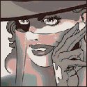
Internet Wizard posted:That is not in any way how a woman's torso is shaped. It might be how Biance Beauchamp's is. I bet you its where its traced from.
|
|
#
?
Oct 17, 2011 15:46
|
|

|
Dacap posted:Oh Dear, Betsy. It appears your head has becom disconnected from your spine.  Hmm, maybe Yannick_B got it right.
|
|
#
?
Oct 17, 2011 16:05
|
|


|
no guys you don't get it it's his style. aesthetic taste is subjective, just because you are personally against Liefeldian Revival doesn't mean it'sajghdcfjhfvgh
|
|
#
?
Oct 17, 2011 16:27
|
|
|
Breetai posted:That being said, have you seen the recolour of [insert literally any comic before 1990]? This is always false. Always. Okay, now I'm sure that isn't literally true. I'm sure someone has done something worth looking at, but it's so few and far between that it's ludicrous. What's really sad to me is that most original coloring doesn't look that great in reprints anymore because the paper's too slick and it makes the colors too garish. I've spent years trying to understand why a guy who had maybe 16 colors available to him (I should ask my Dad about this since he worked at print shops all his adult life until he retired a few years ago) and probably less than an hour a page to spot the colors whose work would be printed on stuff that was so cheap it would occasionally have wood chips in it could do a better job than someone with a nearly infinite number of colors, loads more time, better printing processes, and better paper. I think what it comes down to is that there is simply no one who is doing modern coloring who has an understanding of color concepts and how they apply mainly to advertising. There's a reason McDonald's is white, red, and yellow. It is a stimulating set of colors that appears all over the place in advertising. These old comic colorists were probably old ad men who were used to making kids buy Howdy Doody dolls and Red Rider b-b guns, so it wasn't anything approaching an art to them. They knew "red means this, green means this, purple means this," and brought in that mind set and just ran with it. Yeah, it was very assembly-line-driven and there was little to no "art" behind it, but it worked and it worked damned well. Today, the obsession is applying shading and effects to make it look "real," when that isn't always what best serves the story or the artwork. If you complained to a colorist from 1963 that his work wasn't realistic, he'd probably blow cigar smoke in your face and look at you like you were insane. Now, the colorists view their work as an art form (and it's not that it isn't or shouldn't be) that is equally important to the pencils and inks and they spend too much time on all the wrong things. I haven't taken the time to do detailed biographical searches on all the colorists out there, but the impression I get from looking at their work is that their primary focus tends to be on fine arts and/or computer work with no real experience in straight graphic design with an eye on advertising. They also tend to lean far more towards realism than expressionism or any other art movements (and I'd even argue most of them only took art history classes because it was required for their major and then slept through them). These don't tend to serve them well in an industry full of stylistic interpretations of reality that are pounded out at a breakneck pace. I'm at work or I'd find an example (actually, no I wouldn't because I'm too lazy), but imagine a scene where a slezy noir-ish detective is alone in his office. There's a blind letting in some bleak light, but it's dark and it's dirty. A modern colorist would look at what color everything was supposed to be (brown coat, red and yellow tie, white shirt) and start applying shading based on those colors and the angle of the light source. Some of the linework would of course be lost to the shading, but that's the price of giving these shapes real form. The end result would almost certainly include highlights too bright for the scene and give little to no feeling of mood. A colorist from the silver or bronze age would color the whole thing a couple shades of purple, maybe throw in some zip-a-tone if they were feeling really inspired and had the time, then plop a couple of stripes of yellow to show the light coming through the blinds. There might be a dull yellow highlight here or there, but that's about it. In my eyes, that second one will always look better. It tells the story better, sets the mood more effectively, and doesn't destroy the linework. I am so sick of seeing gorgeous pencils and inks destroyed by overzealous colorists who completely ignore all the work that the other artists put in because they want to lay a shadow down or apply a motion blur or something equally ridiculous and unnecessary. Obviously, this is something I've spent way too much time thinking about. As I get older, I see through the Emporer's clothes more and more when it comes to my beloved past time and distraction. I still love comics, but I'm done pretending all the writers are great (or have ever actually talked to or thought about a woman who wasn't a prostitute or stripper), that all the art is incredible, and that the business is interested in giving us something artistic. Just like the movies, the point is to sell and if there happens to be something worthwhile artistically that slips through, that's just an added but unintentional bonus. I think it speaks for the raw talent of the heroes of yester-year (men like Kirby and Ditko and everyone who worked along side them) that they created things that still blow our minds today when their primary goal was paying their rent. I am not crapping on the artists, but rather trying to lift them up a little more so that we realize how special it is when something remarkable gets through despite everything the business side does to stifle it. None of these are new complaints from me, though. I'll take something flawed but visceral over something clean but lifeless any and every day of the week.
|
|
#
?
Oct 17, 2011 17:48
|
|
|
Dacap posted:Oh Dear, Betsy. It appears your head has becom disconnected from your spine. Head disconnection is running rampart throughout the Marvel Universe  (Amazing Spider-Man #671) And that left hand. 
|
|
#
?
Oct 17, 2011 17:53
|
|


|
Geekboy posted:This is always false. Always. Man, you must've borrowed Cyclops glasses. The art today isn't all lifeless, and a lot of the color from yesterday was god awful and no matter the reasons it won't change the fact that it was god awful. Not all of it even, just some of it. Add to that it's subjective. Hell, just take a look at the recently posted Batman concept art, the page of Doom as a child, and Galactus. Those are great looking, and a lot of it is the color, plus the actual art. And that Scrooge McDuck page is a great example of older art and coloring doing something great with what they had. They both have their goods and their bads. To say one is subjectively worse then the other is silly.
|
|
#
?
Oct 17, 2011 18:04
|
|


|
^^^ Of course there have always been a few great colourists among rafts of crummy colourists. It's not a black and white ( ) issue. However, the batman art that you cited in particular is a modern example of limited palette, mood-directed colouring. Likewise Galactus. The point is that limited colour schemes were an artistic restriction that (often accidentally) ended in better results from average or bad colourists than the absolute freedom currently enjoyed. And yes, it is subjective to an extent, but that doesn't make it silly to express an opinion about it. ) issue. However, the batman art that you cited in particular is a modern example of limited palette, mood-directed colouring. Likewise Galactus. The point is that limited colour schemes were an artistic restriction that (often accidentally) ended in better results from average or bad colourists than the absolute freedom currently enjoyed. And yes, it is subjective to an extent, but that doesn't make it silly to express an opinion about it.Geekboy posted:This is always false. Always. I pretty much agree with this, and you've put into words a lot of feelings I've had without ever being able to precisely articulate them. It's no coincidence that a lot of the most nuanced and atmospheric artists/colourists working currently are moving back towards limited palettes, and away from the technicolour wonders of quasi-realism. To me, comics are at their best when they're emotive, and The Killing Joke remains one of my all time favourite examples of inspirational visual language. Interestingly, I think video game design has been the genre to most exploit that symbolic understanding of colour in recent years, making great use of atmospheric lighting states, emotive palettes and signal accents to direct and manipulate its audience - perhaps because much of the technology is too recent to have been through a transformative 'move to full colour' in the same way as film or print.
|
|
#
?
Oct 17, 2011 18:16
|
|
|
Bluetooth human being posted:Man, you must've borrowed Cyclops glasses. You do realize that according to everything I just said, this would be an improvement right? Kismet, the first lesson I learned in art school was that having a limited criteria made me create better work than when I was sitting at home doing whatever I wanted. So that makes perfect sense to me. I'm not saying that there's no ability for people today to do better things than what was done yesterday. This isn't an old man rant, this is an art snob rant wondering why nobody can take their limitless tools and do awesome things with them. It's exactly like wondering why movies with practical effects look so great and people with CGI who can do literally anything often don't manage to outdo a guy making things out of latex in his garage. In the end, I'm blaming the industry and its fans, who should be demanding better.
|
|
#
?
Oct 17, 2011 20:59
|
|
|
Happy Noodle Boy posted:Head disconnection is running rampart throughout the Marvel Universe With so many regenerating mutants in the Marvel universe, medical technology has fallen behind. They were able to save her left hand, but not her wrist- It is now grafted directly to her forearm 
|
|
#
?
Oct 17, 2011 21:37
|
|
|
Happy Noodle Boy posted:Head disconnection is running rampart throughout the Marvel Universe In a way that does look rather...weird but then again I find it hard to compare that to the Greg Land stuff. One artist is working with a style that doesn't lend itself to realism and another is trying to different approaches that clash (realistic and....well....not realistic). Land tries to make his look as real as possible (hence the tracing) while showing people doing comic booky style action moves which aren't meant to be performed by people with a properly functioning spine. I like the Mary Jane stuff a lot more than the Greg Land stuff because it is more interesting to look at. You might wonder "how can someone stand like that?" but at least it comes down to the style of the artist, and sometimes artists work more for a specific style (maybe to emphasize atmosphere/mood/etc)over realism. One of my favourite examples would be Kelly Jones. He draws his Batman with a very square jaw, long batears and an extremely long fluidish cape. Does it look real? Not a chance. But it does set up the stories to have a darker more gothic atmosphere.
|
|
#
?
Oct 17, 2011 22:14
|
|

Happy Hippo posted:I beg to differ. Killing Joke's original colors were distracting, loud and garish and contrasted horribly with Bolland's pencils. The new coloring is nice and subdued. YOU CAN DIFFER IN HELL!!! I mean... I fundamentally disagree with the very idea of altering older comics to fit modern sensibilities on its face (outside of color restoration work and things like that), so I may have a bit a bias here, but to me the Killing Joke reprint is especially egregious because it's so lazy. The colors used are what you'd see in a modern DC comic, making it indistinguishable from any modern print. Which is very bad, because that means whoever did the work just used the techniques that are popular now, without putting any thought into the context of the original comic or the color choices of the original work. It's absolutely no different than if they'd changed the dialog to be "more modern" in the 90s and had everyone talking in outdated slang. It may "look good" today (it doesn't, it looks bad) but it's going to be dated tomorrow, because it was just a generic coloring effort that treated the work just like any of the forgettable modern crap DC spews out on a weekly basis. More than that, though, I really think all the muted colors and the high use of greys just clashes horribly with the pencil work and the mood of the comic, and looks really bad. I get the same feeling looking at it than I do looking at people who took those Diablo 3 screenshots with vibrant palettes and colors and greyscaled everything and tagged it "Necromancer's choice" while calling the original artists faggots. It's a shallow attempt to match the dark tone of the story through a muted dark palette that completely ignores the power of striking color contrasts and the way it works into the theme of the story. It adds nothing and detracts badly from the work. It's unimaginative, unnecessary, and disrespectful to the original colorist to boot.
|
|
|
#
?
Oct 18, 2011 03:01
|
|


|
Maybe all of you people posting all of those words should post pictures instead.
|
|
#
?
Oct 18, 2011 03:34
|
|


|
Geekboy posted:This isn't an old man rant, this is an art snob rant wondering why nobody can take their limitless tools and do awesome things with them Orc Stain?
|
|
#
?
Oct 18, 2011 03:34
|
|

|
Internet Wizard posted:Maybe all of you people posting all of those words should post pictures instead. Do this people. While you're expected to add content nobody wants to read increasingly long paragraphs about why you hate/love certain coloring.
|
|
#
?
Oct 18, 2011 13:24
|
|

|
Waterhaul posted:Do this people. 
|
|
#
?
Oct 19, 2011 06:46
|
|


|
Another problem with that Psylocke piece is that her abdomen is far too narrow, like she's had excessive liposuction or something. Even by "thin" model standards there's too little there and it catches the eye with how off it is.Happy Noodle Boy posted:Head disconnection is running rampart throughout the Marvel Universe "On no U DID-N'T!!!" face, right there. Hopefully not to become a meme.
|
|
#
?
Oct 19, 2011 11:46
|
|

|
Fair enough. I was at work waiting for something to process, so I had some free time with limited access to the internet. My inherent laziness is also a factor, but that's a topic for an e/n thread. Rather than reaching way, way back I'll go with some things that really stuck out to me as a kid. The first comic book I ever had a subscription to (back in the days when I couldn't drive yet and I couldn't talk Mom and Dad into constantly taking me to the comic book store) was the Australian era of X-Men. They had just gone through the Siege Perilous and the world thought they were dead. Anyway, the Marc Silvestri art was great and the pre-computer coloring was probably about as good as it got. Here are a couple of covers that stood out to me in my memory.  Here's another using the same palette for a similar result:  The limited palette and use of expressionist techniques for color choice evoke a tremendous amount of mood and feeling in these. They aren't high art, but the flat colors don't obscure the great pencil and inking work while enhancing the mood of the pieces. Now, in contrast here's a page from the recent Superman: Secret Origins, which I thought had amazing artwork and really unimpressive colors. This is a great piece in black and white, evoking mood and using the spot blacks to really make Superman, the beacon of hope, stand out from the darkness of the city behind him. You even have the sky opening up behind him, signifying the way he brings light to the world around him. It's carefully thought out and besides just being a great, iconic shot of Clark changing to Superman, it actually has some meaning behind it.  Now, let's look at the coloring job that was done.  The coloring does absolutely nothing to support the themes that Frank put into the piece and is, in fact, completely ignorant of them. There's nothing in the coloring that supports the themes of light breaking out of darkness and very little to make that S-Shield stand out the way it was clearly meant to in the original piece. So this is why it fails to do anything on an emotional level, despite having access to a million different color choices. As far as realism goes, it fails there, too. Colors tend to fade as they are thrown into darkness, which you can see just by walking around in low light. Light is necessary for us to perceive color. The shade of blue used in that blue suit (which I kind of respect, since it's the iconic "Clark Kent Suit," after all) does not change from one section to another. The value (amount of darkness or light) changes, but not the actual hue (the saturation of color). There are also way too many highlights and even if you give it the squint test, the colors aren't separate enough to make the different elements stand out. Clark doesn't stand out from the skyline behind him enough, either. If you squint, it all turns into a single bluish blob because the colors in the foreground are not significantly separated from the ones in the background. They're even lazy enough that they turned all the background lines gray to hide the fact that they couldn't separate the foreground and background enough. I've already been told I'm typing too much so I guess I'll stop there, but I hope that gives some idea of what I'm talking about. Modern coloring tends to take away detail and kill a lot of the work that the penciller and inker put into it, but there's no reason that it has to. It just does. Not everything is made of perfectly rounded plastic cylinders with highlights and shadows. There's no sense of texture or expression anymore. It's all plastic cylinders all the time and I hate it.
|
|
#
?
Oct 19, 2011 17:48
|
|
|
Happy Noodle Boy posted:Head disconnection is running rampart throughout the Marvel Universe gently caress Humberto Ramos. Seriously, I can barely sketch a stick figure but I'm pretty sure that given a few months of drawing training I could at least replicate this bullshit. He is an horrible artist whose "art" isn't worth the paper it's printed on and unlike other horrible artists his stuff actually seems to get worse and lazier, at least his early stuff is sometimes tolerable.
|
|
#
?
Oct 19, 2011 22:24
|
|

|
DarkCrawler posted:gently caress Humberto Ramos. Seriously, I can barely sketch a stick figure but I'm pretty sure that given a few months of drawing training I could at least replicate this bullshit. He is an horrible artist whose "art" isn't worth the paper it's printed on and unlike other horrible artists his stuff actually seems to get worse and lazier, at least his early stuff is sometimes tolerable. How dare he draw in a stylized manner! Like him or don't, but this hyperbole of "I can do better despite never having drawn before" is ridiculous. Heresiarch posted:Incompetence is not a "style", regardless of how much DeviantArt kids want it to be. Are you kidding me? Not liking the guy's style (and there are plenty of reasons not to) is different from stupid hyperbole. Geekboy fucked around with this message at 03:14 on Oct 20, 2011 |
|
#
?
Oct 20, 2011 02:34
|
|
|
Geekboy posted:How dare he draw in a stylized manner! Incompetence is not a "style", regardless of how much DeviantArt kids want it to be.
|
|
#
?
Oct 20, 2011 02:45
|
|

|
Heresiarch posted:Incompetence is not a "style", regardless of how much DeviantArt kids want it to be. Incompetent means you cannot read the physical and emotional content of a scene. Style generally means the art doesn't really mesh with what the subject actually looks like. That Ramos page is the definition of strong style but still competent.
|
|
#
?
Oct 20, 2011 03:43
|
|

|
StumblyWumbly posted:Incompetent means you cannot read the physical and emotional content of a scene. That's not the only definition of incompetence in art, I'm pretty sure. Ramos is incompetent either way, because regardless of what his characters are doing their poses are unrealistic and exaggerated. His art is so terrible that my eyes glaze over them because I don't want stare at them any longer then necessary to figure out what is going on at any given moment. StumblyWumbly posted:Style generally means the art doesn't really mesh with what the subject actually looks like. Style means the particular way an artist draws something. An artist's style can be realistic or unrealistic. Ramos's style, whatever it is, is horrible. Some artists are good at unrealistic style. Some artists have boring art but at least conform into physics and anatomy. Ramos is capable of neither. Geekboy posted:How dare he draw in a stylized manner! I didn't say I can do better. I said I could replicate him. He isn't doing anything in those pages that an average person wouldn't be able to do if given enough practice. Not sure what is hyperbolic about it, are you sure you understand the definition of that word? Plenty of people, some of which don't get paid for their work, are able to do incredibly superior art to Ramos's current crap. Ramos himself has done much superior work in the past, which is why his current direction is frustrating - it's like how Greg Land is actually a pretty great artist if he didn't waste his time in tracing poo poo off porn movies.
|
|
#
?
Oct 20, 2011 09:36
|
|
|
Even 'stylised' art needs to have good fundamental anatomical basics. Ramos' stuff often doesn't- It's why some people dislike it, but the same people don't have a problem with say, the TF2 characters' design, or Stuart Immonen's art, or Mignola's.. They're also stylised, but there's a strong structure underneath it. It's sort of hard to explain the exact issue, but Ramos irritates me personally because it's close to being great because cartoony and exaggerated art is fun, but these basics are off so it's a bit of a mess instead. I'll see if I can explain with some visuals. Check out Elsa Bloodstone here.  Now look at MJ in the last panel. They're both kicking rear end or about to be, and there's tension, aggression and a little grace in both of them, but the anatomical details are stronger in Elsa. She's sat in an unrealistic postion, sure, but it only compliments her design, she's exaggerated, but obviously human. Poor MJ, on the other hand, her neck and torso have gone utterly insane in that last panel, her eyes are crossed, and her cheekbones are Lovecraftian. I understand the animation principle of stretch and squash but that has to be based on correct anatomy before to distort, and this isn't. All of his stuff is like that, it's taken over the line of stylised and pitched into inhuman. I stopped reading Runaways because of him. I don't know if that cleared anything up- It's just an opinion, because everything in art is, at the end of the day. Kojiro fucked around with this message at 14:41 on Oct 20, 2011 |
|
#
?
Oct 20, 2011 14:39
|
|

|
What bothers me most about Ramos is his style is very similar to Bachalo's, whose art I love. There has been at least one time when Bachalo did the art for an arc or two, but then Ramos gets switched in, and if you aren't paying attention all you'll notice is that suddenly the art doesn't feel as nice anymore. A nice Bachalo I found GISing around:  Completely unrelated, but I'm also a huge fan of Jae Lee's stuff, and I wish he did more interiors.  As a bonus he's also one of the few comic book artists that understands what a gun looks like.
|
|
#
?
Oct 20, 2011 16:42
|
|
|
Internet Wizard posted:
Talking of Jae Lee, Andrea Sorrentino is the artist on I, Vampire and his art reminds me of Jae Lee (and I also find it beautiful.  (I, Vampire no. 1) He also has a website showing off her artwork over here. Some really beautiful stuff there too.
|
|
#
?
Oct 20, 2011 19:39
|
|
|
I really dislike Humberto Ramos. His style is a toxic mix of bad figures/poses, anime, and cartoonish limbs/faces that distracts me when I'm reading.
|
|
#
?
Oct 20, 2011 21:48
|
|
|
Ramos loves that one pose. hunched over, head sticking out sideways on a neck twice as long as it should be, jaw swinging wildly like a euphoric, ecstasy addled numbskull. Every mouth is open. With highly visible teeth. He does not grasp at all how the human body bends around knees, elbows, wrists, hips. In addition, he likes to somehow paste pectoral muscles onto a characters clavicles and make their abs twice as long. Because hey, why the gently caress not, right? It's gaudy, it's ugly, it's distracting. There is nothing enjoyable about his art for me, at all.
|
|
#
?
Oct 21, 2011 00:26
|
|

|
Rand alPaul posted:I really dislike Humberto Ramos. His style is a toxic mix of bad figures/poses, anime, and cartoonish limbs/faces that distracts me when I'm reading. It's kind of a mish-mash of American comics/anime/cartoony tropes that evolved into what he thinks is good artistic "shorthand." If the writing's good, it's fine and I generally don't mind it. But in a lot of cases he overworks that poo poo. I get what he's trying to do with Mary Jane in that panel. Problem is...the writing already did it for him. It's like he doesn't trust the writer has adequately conveyed what he thinks you should feel, but he does a poor job of "fixing" it. If that makes sense.
|
|
#
?
Oct 21, 2011 00:31
|
|

|
Ramos' style reminds me of Madureira. I write this in the most negative sense possible.
|
|
#
?
Oct 21, 2011 03:21
|
|

Ka0 posted:Ramos' style reminds me of Madureira. I write this in the most negative sense possible. I agree, but I feel Madueira has a much better grasp on the fundamentals.
|
|
|
#
?
Oct 21, 2011 04:47
|
|
|
Ka0 posted:Ramos' style reminds me of Madureira. I write this in the most negative sense possible. Yeah, but can Ramos rip off Final Fantasy as blatantly? I think not.
|
|
#
?
Oct 21, 2011 06:58
|
|
|
Man, this "Battle Chasers is a rip off of Final Fantasy" thing is ridiculous.
|
|
#
?
Oct 21, 2011 19:04
|
|

|
Ramos is going for a completely different thing with his style and his influences are very different from Bachalo's. They look similar because a lot of you view them as cartoony but that is about it. Ramos has complete understanding of the fundamentals the rules he breaks he knows he's breaking. If you don't like it you just don't find his aesthetic style pleasing, but his storytelling is almost never bad.
|
|
#
?
Oct 23, 2011 20:01
|
|
|
JackDarko posted:Ramos has complete understanding of the fundamentals the rules he breaks he knows he's breaking.
|
|
#
?
Oct 23, 2011 20:42
|
|
|
I don't really know if this is true, but I bet the answer to why Ramos gets work and why he sucks is cause he draws fast.
|
|
#
?
Oct 23, 2011 20:48
|
|
|

|
| # ? May 10, 2024 22:34 |
|
|
Kojiro posted:If he does, he's doing a really good job of hiding it. Can you tell what is going on in a comic he draws? You must have a conniption when you look at Eric Canete's art, it's exaggerated for a reason. As to above poster yes some of his best work comes out when he doesn't have to fit a bi monthly schedule.  I love this piece by him. I do with he would get a different colorist. JackDarko fucked around with this message at 22:24 on Oct 23, 2011 |
|
#
?
Oct 23, 2011 22:14
|
|