|
Accusing people who dislike Ramos as having a problem with stylization in general is kind of insulting.
|
 #
?
Oct 23, 2011 22:47
#
?
Oct 23, 2011 22:47
|
|


|

|
| # ? May 13, 2024 08:52 |
|
|
If you are going to try and poo poo on Ramos's art, please come with something harder than "it is ugly and it sucks." JackDarko laid it all out. The guy has refined his style over a long period and while he definitely had some issues early on, his work is much more awesome now. Great storytelling, fun layouts, is kinetic, and I personally really enjoy the fun and energy he brings to the book. I wasn't a fan of his before hand, but he really won me over. Yeah you may not like his style or think it is ugly, but I would still take him over Greg Land, Ed Benes and a majority of other artists.
|
|
#
?
Oct 23, 2011 22:59
|
|


|
I think we've been pretty drat specific about why we don't like Ramos. His anatomy is consistently bad. It is not bad because it is stylized; it is bad because it is wrong. Other artists with heavy levels of stylization make anatomical mistakes sometimes. Ramos does it constantly. Therefore, we think he is not a good artist and do not like looking at his material.
|
|
#
?
Oct 23, 2011 23:07
|
|
|
Heresiarch posted:I think we've been pretty drat specific about why we don't like Ramos. His anatomy is consistently bad. It is not bad because it is stylized; it is bad because it is wrong.
|
|
#
?
Oct 23, 2011 23:21
|
|


|
Heresiarch posted:Accusing people who dislike Ramos as having a problem with stylization in general is kind of insulting. I merely meant that form of stylization and Canete is really similar, don't get offended. Yeah everything you said could be applied to Kirby. 
JackDarko fucked around with this message at 23:43 on Oct 23, 2011 |
|
#
?
Oct 23, 2011 23:33
|
|
|
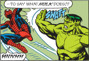
JackDarko posted:I merely meant that form of stylization and Canete is really similar, don't get offended. Yeah everything you said could be applied to Kirby. To be fair, I think this picture is also ridiculous and I have no idea what's going on. I don't have an issue with the stylization, that's fine and adds a very strong sense of movement. I just have no idea what that movement is.
|
|
#
?
Oct 24, 2011 00:19
|
|


|
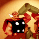
Internet Wizard posted:To be fair, I think this picture is also ridiculous and I have no idea what's going on. I don't have an issue with the stylization, that's fine and adds a very strong sense of movement. I just have no idea what that movement is. Spidey is winging away from Stiltman. That is an awesome Stilttman!
|
|
#
?
Oct 24, 2011 00:21
|
|


|
Endless Mike posted:You could change Ramos to Kirby here and it would be just as accurate. So yo are saying Kirby's art is bad?
|
|
#
?
Oct 24, 2011 00:21
|
|
|
I don't think "You can tell what's going on" is a sign of good art or storytelling. Otherwise Greg Land is a good artist and a storyteller. But he isn't, neither is Humberto Ramos. Neither is myself drawing a stick figure on a paper punching another stick figure - you can tell what's going on, but it's not worth paying for in a major comic book.
|
|
#
?
Oct 24, 2011 00:29
|
|

|
DarkCrawler posted:I don't think "You can tell what's going on" is a sign of good art or storytelling. Otherwise Greg Land is a good artist and a storyteller. But he isn't, neither is Humberto Ramos. Neither is myself drawing a stick figure on a paper punching another stick figure - you can tell what's going on, but it's not worth paying for in a major comic book. Storytelling is how you tell the story, being able to understand what is going on in a story whether that be through the action and movement or being able to discern which characters are which IS storytelling. Land can't properly portray a characters age because he traces supermodels and porn stars. Ramos does not do that do not lump them into the same category. If that isn't storytelling then what is? Have you created your own definition for it? bobkatt013 posted:So yo are saying Kirby's art is bad? He's saying those criticisms could be applied to Kirby, or are you just trying to be clever? JackDarko fucked around with this message at 00:40 on Oct 24, 2011 |
|
#
?
Oct 24, 2011 00:38
|
|
|
Endless Mike posted:You could change Ramos to Kirby here and it would be just as accurate. No, not really. If you're not capable of recognizing the difference between "stylized" and "wrong", then I can't really say anything to change your mind. I'm glad you have a wider variety of artists whose work you can enjoy, I guess?
|
|
#
?
Oct 24, 2011 00:41
|
|
|
JackDarko posted:Storytelling is how you tell the story, being able to understand what is going on in a story whether that be through the action and movement or being able to discern which characters are which IS storytelling. Land can't properly portray a characters age because he traces supermodels and porn stars. Ramos does not do that do not lump them into the same category. Just the way it is written makes it seem that he is saying that Kirby is as bad as Ramos.
|
|
#
?
Oct 24, 2011 00:42
|
|
|
bobkatt013 posted:Just the way it is written makes it seem that he is saying that Kirby is as bad as Ramos. Ah ok I understand what you mean now. This is in my opinion good storytelling  You don't need any text to understand what is going on in this page. There is no need for captions that explain exactly what is happening because the art can't convey it on the page. I am totally cool with people not digging his style, but to say he's in the same league as Greg Land just hurts. Especially when the guy isn't tracing porno mags has a crazy work ethic and inks his own work. JackDarko fucked around with this message at 00:47 on Oct 24, 2011 |
|
#
?
Oct 24, 2011 00:44
|
|
|
That page conveys to me that there is a new superhero named Giraffeman. No words required.
|
|
#
?
Oct 24, 2011 00:45
|
|
|
Heresiarch posted:That page conveys to me that there is a new superhero named Giraffeman. No words required. Exactly all you are referring to is his drat style not the storytelling. You don't like his anatomy so he's a bad artist.
|
|
#
?
Oct 24, 2011 00:48
|
|
|
JackDarko posted:I merely meant that form of stylization and Canete is really similar, don't get offended. Yeah everything you said could be applied to Kirby. Goddamn, that's beautiful. I'm such a sucker for drawings with that springy Paul Pope-ish energy.
|
|
#
?
Oct 24, 2011 01:00
|
|
|
JackDarko posted:Exactly all you are referring to is his drat style not the storytelling. You don't like his anatomy so he's a bad artist. Well, yes. His anatomy is demonstrably bad. Therefore he is a bad artist. This is not a subjective thing, any more than perspective is. And giving Spiderman a monstrously long neck in a static profile shot does not serve any purpose, either. He's not supposed to have one. It doesn't make him look more Spiderman-like. It doesn't make the page layouts better, it doesn't improve the action in the panel (since it doesn't have any). It just makes him look weird. Stylization is supposed to serve a purpose. Drawing things incorrectly without any reason isn't a style, it's just incompetence, or possibly laziness. I don't know if Ramos doesn't know how to draw people consistently correct, or if he just doesn't give a poo poo, but either way I don't like looking at his comics.
|
|
#
?
Oct 24, 2011 01:09
|
|
|
SkellingTon Loc posted:Goddamn, that's beautiful. I'm such a sucker for drawings with that springy Paul Pope-ish energy. Yeah I wish Canete did more work in comics.
|
|
#
?
Oct 24, 2011 01:11
|
|
|
Heresiarch posted:And giving Spiderman a monstrously long neck in a static profile shot does not serve any purpose, either. He's not supposed to have one. It doesn't make him look more Spiderman-like. It doesn't make the page layouts better, it doesn't improve the action in the panel (since it doesn't have any). It just makes him look weird. The elongated neck actually does help show the relationship between Spiderman and Dr Oct. It helps show Spiderman as taller but more slender and fragile, conveying someone more powerful but who can still be taken down, while Ock is small and blocky, like a pitbull. Compare that with someone who really doesn't have any skill, like Land, and the difference is really clear.
|
|
#
?
Oct 24, 2011 01:44
|
|

|
StumblyWumbly posted:The elongated neck actually does help show the relationship between Spiderman and Dr Oct. It helps show Spiderman as taller but more slender and fragile, conveying someone more powerful but who can still be taken down, while Ock is small and blocky, like a pitbull. Oh, I see, Ramos is trying to convey things, he's just terrible at it, so Spiderman looks deformed instead of slender. Got it.
|
|
#
?
Oct 24, 2011 02:38
|
|
|
God forbid he do his job and convey things! He must adhere to the strict guidelines set forth by Ditko on exactly how Spider-man must look in every instance he is ever drawn in.
|
|
#
?
Oct 24, 2011 02:59
|
|
|
Heresiarch posted:That page conveys to me that there is a new superhero named Giraffeman. No words required. 
|
|
#
?
Oct 24, 2011 03:17
|
|
|
Heresiarch posted:You keep moving the goal posts because you're the only one saying things that are "demonstrably" wrong. No one who is defending Ramos is saying that you have to like him. Most of them aren't even saying he's particularly good (though when he's not under a monstrous deadline, he is). Your criticisms are vague and constantly changing so that you can still feel like you're right despite evidence to the contrary. I haven't quite figured out how heavily stylized anatomy can be "wrong," though. It's one thing when mid-90's artists were doing wildly inconsistent nonsense or had different rules for men and women (because they were barely the first and had never actually seen the other in real life). For example, I love Kelley Jones' Batman. It has little to do with actual human anatomy, but it evokes incredible mood and is just genuinely visually striking.  His anatomy is "wrong," but that is meaningless. It is exaggerated and stylish, but no moreso than the work of other favorites of mine, like Bernie Wrightson or Hieronymus Bosch. Again, there are plenty of reasons not to like Ramos' work (especially some of the really rushed stuff he'd done lately), but most of what you're saying is just not correct.
|
|
#
?
Oct 24, 2011 03:28
|
|

|
Heresiarch posted:Oh, I see, Ramos is trying to convey things, he's just terrible at it, so Spiderman looks deformed instead of slender. It's not like he just slapped a skinny neck and exaggerated proportions on an otherwise realistically-proportioned scene. The design of Spider-Man and Ock in that scene are consistent with each other, which is why the argument that the anatomy's hosed up is a dumb one. As mentioned, Ramos exaggerates Spidey's look to the same degree he does to any of his characters, which brings a real dynamism to his work. Someone earlier also mentioned that he has a complete understanding of fundamentals, and that's absolutely right. You have to know what a human form looks like and how it can be pushed to its limits before you can change it around. It's not that he CAN'T draw realistic human proportions, it's that he CHOOSES to draw that way because it works.  Ramos works in shapes, as seen here in his version of the Runaways. They're obviously not anatomically correct, but at a quick glance I can easily tell who's who, because he made a point to distinguish that Chase is big and blocky, Karolina's long and flowy, and Nico has big hair on top of a skinny frame. Stylistically, that's way more interesting to look at (character-wise) than something like, say, Jim Cheung's work, whose characters all have the same face and you can only tell who's who when they're in costume.
|
|
#
?
Oct 24, 2011 03:30
|
|

|
JackDarko posted:Ah ok I understand what you mean now. Not all of his figures are like this but I just wanted to make the point that there are some very obvious flaws in his anatomy a lot of the time and I don't know why anyone would defend his technical skill as I'd be hard pressed to name any currently working professional comic artists worse than him in this area.
|
|
#
?
Oct 24, 2011 03:43
|
|

|
The Mary Jane page does look weird but I do normally like Ramos' art. It's got good shape design and gets the idea across. The Runaway designs are good examples, although they're not very subtle. I preferred the original Runaways artist's work.
|
|
#
?
Oct 24, 2011 03:49
|
|

|
Geekboy posted:For example, I love (*) It has little to do with actual human anatomy, but it evokes incredible mood and is just genuinely visually striking. People say and said the same thing about Liefeld.
|
|
#
?
Oct 24, 2011 04:28
|
|

|
fritz posted:People say and said the same thing about Liefeld. The problem between someone like Jones and Liefeld is that Jones purposely contorts anatomy. Liefeld just draws badly because he is a lovely artist. There is no mood or atmosphere in Liefeld's drawings. edit: for example this:  This is such a great cover for conveying mood. The imposing Swamp Thing, the malicious Killer Croc. Batman crouching and looking rather out of his element. I really love Kelley Jones. Madkal fucked around with this message at 04:38 on Oct 24, 2011 |
|
#
?
Oct 24, 2011 04:33
|
|

Geekboy posted:You keep moving the goal posts because you're the only one saying things that are "demonstrably" wrong. I'm saying it. Humberto Ramos is a demonstrably bad artist that draws badly and gets paid to draw badly and if you like his bad drawings you have bad art fundamentals and bad taste. The main reason most people aren't saying anything is that there will always be retards that will incessantly defend lovely art with "THAT'S MY STYLE" and it's a tango we've all danced way too many times so at the first sign of people trying to write off lovely fundamentals as an artistic choice we just let out a very long and tired sigh and give up. Heresiarch is apparently more patient than the rest of us, or more stubborn.
|
|
|
#
?
Oct 24, 2011 05:00
|
|


|
fritz posted:People say and said the same thing about Liefeld. To add some content, here's some pages from Cameron Stewart:  I like this one because the 3rd panel has Doc Hero imagining himself in his magical helmet or whatever, shown in a way unique to comics.  Pretty sure this page is a metaphor for growing up in some way. I like it. From the building, pants-wetting terror of Doc Hero to the smug satisfaction at the end.
|
|
#
?
Oct 24, 2011 05:05
|
|
|
Lurdiak posted:I'm saying it. Humberto Ramos is a demonstrably bad artist that draws badly and gets paid to draw badly and if you like his bad drawings you have bad art fundamentals and bad taste. Why you gotta be so mean man, you act like your an opinion is a fact. Don't go around calling people retards, that isn't nice!
|
|
#
?
Oct 24, 2011 05:18
|
|
|
Lurdiak posted:Heresiarch is apparently more patient than the rest of us, or more stubborn. No, I just plain forgot that this is an argument that never goes anywhere. Heresiarch fucked around with this message at 05:25 on Oct 24, 2011 |
|
#
?
Oct 24, 2011 05:20
|
|
|
Heresiarch posted:No, I just plain forgot that this is argument never goes anywhere. I can agree to disagree, you weren't calling me names or anything so I felt it was ok to continue the discussion. Lurdiak posted:War embitters a man, JackDarko. Can't you love me and my one defect opinion?
|
|
#
?
Oct 24, 2011 05:22
|
|
JackDarko posted:Why you gotta be so mean man, you act like your an opinion is a fact. Don't go around calling people retards, that isn't nice! War embitters a man, JackDarko.
|
|
|
#
?
Oct 24, 2011 05:22
|
|
|
Does anyone have any examples of Ramos's work that isn't in his typical style? That illustrates an understanding of artistic fundamentals? Generally I don't like to judge the style of an artist (in any media) if I don't know if they grasp the foundations first. I mean, you could argue that Picassos cubism is ugly, but he'd mastered the traditional before taking the form to an extreme. Not that I think that's a truly fair comparison, and I'm ambivalent to Ramos for the most part, but I'd like to see what he can do beyond the stuff he cranks out on a tight schedule for a paycheck.
|
|
#
?
Oct 24, 2011 05:35
|
|

|
StumblyWumbly posted:To add some content, here's some pages from Cameron Stewart: Is this from the Slaves of Mickey Eye? I really just want Seaguy Eternal to come out. Partially for more Cameron Stewart art. Here's one of my favorite pages from Slaves of Mickey Eye #2. The sheer joy the jump conveys without even seeing Seaguy's face just makes it for me. 
|
|
#
?
Oct 24, 2011 08:23
|
|

|
Dr. Hurt posted:Is this from the Slaves of Mickey Eye? I really just want Seaguy Eternal to come out. Partially for more Cameron Stewart art. Stewart was talking about finally getting a script for a project that's ending was long overdue on twitter months before NYCC. He then mentioned he would have some announcements during NYCC but nothing about his work was announced. So it stands to reason it could be Seaguy Eternal, since other creators with DC projects didn't get their work announced either. I hope anyway 
|
|
#
?
Oct 24, 2011 08:46
|
|
|
Lurdiak posted:I'm saying it. Humberto Ramos is a demonstrably bad artist that draws badly and gets paid to draw badly and if you like his bad drawings you have bad art fundamentals and bad taste. Ah, yes. The "no u" defense. Very clever and well reasoned. Why, you have certainly pulled from a myriad of examples and backed up your opinions with facts and principles. I am not a fan of Ramos and doubt I've bought any of his books since that vampire thing he did ages ago. It isn't appealing to me because of what I enjoy and am drawn to, but I see what he is working to achieve with his style and he succeeds at it. Just like I'm not a fan of cubism but don't talk about it being dumb, I don't poo poo on artists in comics who do things I am not a fan of on a purely stylistic level as being untalented hacks, especially when they're good storytellers. Except for Joe Mad. gently caress that guy. Art is more than just comics and I love when people pull in influences besides Romita, Perez, and Buscema. I love those guys, but there are other ways to tell stories through the juxtaposition of images.
|
|
#
?
Oct 24, 2011 11:29
|
|
|
Dr. Hurt posted:Is this from the Slaves of Mickey Eye? I really just want Seaguy Eternal to come out. Partially for more Cameron Stewart art. JackDarko posted:Stewart was talking about finally getting a script for a project that's ending was long overdue on twitter months before NYCC. He then mentioned he would have some announcements during NYCC but nothing about his work was announced. So it stands to reason it could be Seaguy Eternal, since other creators with DC projects didn't get their work announced either. I am 100% with you, but soon after NYCC Stewart posted a few pages about some girl's school thing, maybe a Batman Inc related Batgirl? It really didn't look very Seaguy. I am so worried.
|
|
#
?
Oct 24, 2011 14:39
|
|
|

|
| # ? May 13, 2024 08:52 |
|
|
JackDarko posted:Ah ok I understand what you mean now.
|
|
#
?
Oct 24, 2011 16:25
|
|