


|
Hopefully I wouldn't be too out of line asking for some advice here. A coworker and I have decided to offer the other colleagues to have their photos re-taken, as the stuff that currently shows up in the address book and various presentations is really terrible (think blackberry in a dimly lit office), and having your team look like a bunch of zombies gives an unprofessional impression of the whole operation. We aren't a customer facing team, and basically anything would be better than what's currently available, but I'd like to do as well as I can given the circumstances. Long story short, here's probably the best photo from a test shoot I did with that coworker: There's a wider crop, but the cut off hands look worse there to me. Apparently EXIF was stripped at some point, but it's 50mm, f/2.8, ISO 200. At 1.8 the same shot seemed to be a bit soft. There are a few things that make this interesting:
 That's the room setup (the large empty space is a huge table), minus the flipchart this is exactly how the above photo was taken. I read through the posing guide from the OP and would try to use something from it, maybe replacing books with laptops and other office props. The results don't have to be pro-tier or very formal and serious, but I'd appreciate any suggestions, you guys seem to generally know what the hell you're doing.
|
 #
?
Nov 30, 2011 21:16
#
?
Nov 30, 2011 21:16
|
|


|

|
| # ? May 17, 2024 13:47 |
|
|
Two things jump out at me first (besides breaking tables  ) )1) Chin up! With his chin down in his neck he looks uncomfortable and unnatural. Shoot from slightly above the subject so he's looking up and have him raise his chin out of his chest. 2) Decide if you want a 3/4 length or headshot. You're right that cutting off a bit of the hands looks weird, but I don't know that they're necessary at all. That's your choice, but make a conscious effort to either shoot tighter or wider for effect. e: and if they're going to be displayed as large as that first image as an end product, take the couple of seconds to clone out pimples.
|
|
#
?
Dec 1, 2011 18:29
|
|

|
How does it feel posting from 1989? I head it was a nice time, but I'm not sure if I could go back to using 640x480 monitors  Seriously though, the photo I posted is only 427x640 so I don't know how it manages to break tables. Seriously though, the photo I posted is only 427x640 so I don't know how it manages to break tables.Anyway, thanks for these suggestions; I didn't realize it initially but now that you say, chin up would be a definite improvement here. For our purposes a headshot would make more sense, I think, as the 3/4 length shot would end up getting cropped most of the times anyway. On the other hand, wouldn't this ability to crop make the 3/4 shot more flexible? There's certainly plenty of (sometimes somewhat scary) detail being captured as it is, or are there other concerns as well?
|
|
#
?
Dec 1, 2011 21:48
|
|
|
mobby_6kl posted:How does it feel posting from 1989? I head it was a nice time, but I'm not sure if I could go back to using 640x480 monitors I'd just shoot a bunch of headshots. Your lighting is plain, but more than adequate. However, the pose is awkward as hell. Good rule of thumb: your pose should make logical sense. If someone's leaning, show what they're leaning on. An elbow, a wall, an arm, a desk, whatever. If someone's body is going to be tilted like that, it needs a base, and right now you don't have a base. Also, chin up, and check for details. His collar is uneven. His shirt is twisted under his left arm. There's a bright dot on his right shoulder, I assume it's a shaft of light through a tiny hole in the blinds. That kind of thing.
|
|
#
?
Dec 1, 2011 22:26
|
|


|
mobby_6kl posted:How does it feel posting from 1989? I head it was a nice time, but I'm not sure if I could go back to using 640x480 monitors Haha maybe SALR is converting it to the original or something but it's showing up 1267 � 1900 for me. If you think you'll need both shots, just go ahead and shoot both. You never want to rely on cropping an image down when you could just as well shoot it properly the first time. Plus, if you're framing specifically for a headshot you can do some more interesting things that way.
|
|
#
?
Dec 1, 2011 22:28
|
|
|
ConfusedUs posted:If someone's body is going to be tilted like that, it needs a base, and right now you don't have a base. This is my only critique to offer. When I first glanced at the image, I thought maybe he had an unfortunate body deformity, but then I realized that it was just an awkward pose. More of the hands in the photo may help with that, or just re-pose him and cut out the hands.
|
|
#
?
Dec 1, 2011 22:32
|
|

|
He also looks like he's either just farted, or smelled someone else's fart.
|
|
#
?
Dec 1, 2011 22:35
|
|

|
everytime I look at that picture it just screams that he has a poo poo eating look on his face. Why is his mouth doing that?
|
|
#
?
Dec 1, 2011 22:35
|
|
|
wizard sticks posted:everytime I look at that picture it just screams that he has a poo poo eating look on his face. Why is his mouth doing that? He's trying to look cool, in that annoying ironic hipster way. I'd put money on it. Either that or he really did just fart.
|
|
#
?
Dec 1, 2011 22:40
|
|
|
ConfusedUs posted:He's trying to look cool, in that annoying ironic hipster way. I'd put money on it. Definitely fart
|
|
#
?
Dec 1, 2011 22:56
|
|
|
I can neither confirm nor deny that it was a fart as I was not close enough at the moment. All the posing suggestions are probably the most helpful, as this seems to be the biggest remaining challenge considering I can't do anything about the lighting anyway. My instructions were basically "sit in that chair over there", so this explains the awkward pose, I'll try to do better next time. I did notice the sun spot on the shoulder, but all the other details are probably going to drive me nuts now. Shooting people isn't all that easy, is it? ")
|
|
#
?
Dec 1, 2011 23:53
|
|
|
mobby_6kl posted:Shooting people isn't all that easy, is it? Sure it is. Posing is simple, use your ABCs Avoid bored expression. Build from the base. Check for details. SUCCESS!
|
|
#
?
Dec 2, 2011 00:34
|
|
|
mobby_6kl posted:
- Camera is on a tripod and there's no noisy background so you can use a smaller aperture for better image quality (f/5.6 or f/8). - When doing the final shoot avoid direct sun light through the window. If feasible add a frosted shower curtain, white bed cloth or similar diffuser. - White clothing attracts attention. Either block some light from hitting the shirt or tell them to wear something a little darker.
|
|
#
?
Dec 2, 2011 01:24
|
|
|
Cross_ posted:- Camera is on a tripod and there's no noisy background so you can use a smaller aperture for better image quality (f/5.6 or f/8). You're crazy. Reading this is like watching someone who's seen the end of True Lies try to teach others to do the tango. In this case, I'd actually recommend going WIDER on the aperture, not smaller, to blur the wall/background behind the subject more evenly. As it is, there's just a hint of detail. Unless the sun is literally straight out the window (rising sun out an east-facing window, for example), windows are essentially a huge softbox without any diffusion necessary. If the sun IS directly out there, then you can use something to diffuse it, like you said. Nothing about his clothing is distracting except the sloppiness of it--the wrinkles and uneven collar.
|
|
#
?
Dec 2, 2011 01:29
|
|
|
You can only teach tango once you've seen Scent of a Woman. True fact. What's more important, a blurred wallpaper or the subject being sharp? Sorry to hear that your windows are so dirty. Those wrinkles don't stand out much- unless this is a portrait for a fashion store. Now focus on his eyes without that BRIGHT WHITE collar pulling you aside.
|
|
#
?
Dec 2, 2011 02:36
|
|
|
just do the exact same thing except have him sit up straight and frame the bottom at nipple height.
|
|
#
?
Dec 2, 2011 02:54
|
|

|
Cross_ posted:You can only teach tango once you've seen Scent of a Woman. True fact. You don't have to further diffuse a window to get great light. Period. End of story. Glass optional. All that matters is that the only light coming through is not direct from the sun. Your light source is now large (the size of the window/other opening) and therefore, diffuse. EDIT: I should clarify that the diffusion material will become necessary IF the sun is shining directly into the window. It is not necessary in any other circumstance. As far as the other stuff goes, I feel that portrait is plenty sharp enough for the use he intends. The collar thing is just ridiculous. ConfusedUs fucked around with this message at 03:11 on Dec 2, 2011 |
|
#
?
Dec 2, 2011 03:06
|
|
|
Paragon8 posted:just do the exact same thing except have him sit up straight and frame the bottom at nipple height. This, not that hard people. It's just a headshot.
|
|
#
?
Dec 2, 2011 03:10
|
|


|
This is something a bit different for me. I was just fooling around with my digital(!) camera and got a few shots I like. I won't be putting down my film gear for my DSLR any time soon, but I thought this was in interesting little group. http://i.imgur.com/6bjip.jpg http://i.imgur.com/6bjip.jpg
|
|
#
?
Dec 2, 2011 18:02
|
|

|
Cross_ posted:What's more important, a blurred wallpaper or the subject being sharp? Look at how wrong you are. At any shutter speed you actually need a tripod for, the subject will move enough from breathing and generally being a human that it's going to offset any marginal sharpness increase from stopping down. Also, the DoF at that distance will be more than enough to keep the subject in the focal plane. Open up the aperture (and/or get closer and get rid of the hands entirely) because the dirty / textured wall is more distracting than anything else. As it is now there's a line going through his head. Also, you don't understand how light works. Light coming in through a window, except in cases of a rising or setting sun coming through an east or west-facing window, it never going to be a point source. It's an aggregate of all the sunlight bounced off the ground, trees, walls, the sky, clouds, etc and ends up being as large as the window is. You don't need "diffusion" when the light source is that large. Diffusion is necessary in a softbox because it takes a bare flash bulb -- essentially a point source -- and spreads it out. The sun's light has already been spread out.
|
|
#
?
Dec 2, 2011 20:19
|
|
|
I fear interrupting, but I shan't let that stop me. I'm looking to do some family portraits (6 kids, no not all mine) for grandparental Christmas presents, and I'm wondering what the best way of getting a reasonably professional background is? I'm thinking seamless white, but I own nothing seamless and very little white. Any DIY advice for a good background on the cheap?
|
|
#
?
Dec 2, 2011 21:29
|
|

|
Jiblet posted:Any DIY advice for a good background on the cheap? Paint
|
|
#
?
Dec 2, 2011 21:41
|
|
|
Jiblet posted:I fear interrupting, but I shan't let that stop me. What do you have to start with? Any light stands or any support? You can use 2 light stands if you have them, attach a broom stick or PVC pipe across the two. If you don't have either, use ladders and a broom stick for an ultra ghetto method. Buy a fabric shower curtain, or just a large piece of fabric. I know some people like to use large rolls of paper, but I can't imagine they are very cheap. Separate your subjects from the backdrop enough so that the depth of field blurs out the background enough so that it doesn't really matter. If you need white, just use a sheet, shine light at it and blow out the background, it will become white.
|
|
#
?
Dec 2, 2011 21:49
|
|
|
a 4 foot roll of white seamless is going to be like, 50 bucks. just buy the paper - bedsheets/shower curtains/fabric almost always looks like poo poo.
|
|
#
?
Dec 3, 2011 00:06
|
|
|
Jiblet posted:I fear interrupting, but I shan't let that stop me. Don't even bother with a DIY background unless you know how to make it look good. Unless you know how to blur it, make it pure black or pure white, or are really good at getting rid of wrinkles, any cobbled-together thing is probably going to look terrible. My advice? Find a nice outdoor location, or do a google image search for "window lighting" and try to copy some of the angles you find that minimize walls/room presence.
|
|
#
?
Dec 3, 2011 01:37
|
|
|
My light set came in on Tuesday, and I was in Austin two days later to see Wilco live (AWESOME set!) and for a five-man band shoot. It was a good first experience that put me out of my comfort zone early. We could only shoot at their place and at midnight, so I didn't have a lot of options.      http://www.flickr.com/photos/48111742@N05/6454635187/in/set-72157628278612723/lightbox/ Other than the lack of a key light on that group shot, I made a mistake that I bet a lot of people new to portraits make -- I didn't pay nearly enough attention to the expression and direction of their faces. I was worried more about the exposure, how the light was hitting the face, and just getting caught up in the moment. It was a bit of a rush. Luckily these guys are friends, and I think they'll be happy with the results. I know I've learned from it.
|
|
#
?
Dec 4, 2011 22:22
|
|
|
You need to double check your background masking. Not sure what technique you're using, but it feels like a magic wand when you should be using a blending mode or an alpha channel mask. Use temporary levels adjustment layers to check your work.chadxor posted:
|
|
#
?
Dec 5, 2011 01:28
|
|
|
Thanks for the heads up. All things that I definitely did not notice.
|
|
#
?
Dec 5, 2011 03:53
|
|
|
 I've always preferred the "bloopers" to the "keepers".
|
|
#
?
Dec 5, 2011 06:22
|
|
|
^^ Same here. I got to this one and laughed out loud: I think my favorite portraits are the ones where folks are showing some personality. I find it pretty hard to deliver on the standard posed portrait.
|
|
#
?
Dec 5, 2011 06:47
|
|
|
Oprah Haza posted:
This rocks.
|
|
#
?
Dec 5, 2011 08:35
|
|

|
Oprah Haza posted:
He is going to love this when he grows up. I love pictures that really sums up a person's character... posing is "fake" in my book especially with kids.
|
|
#
?
Dec 5, 2011 11:58
|
|

|
This is my favorite holiday picture. Imperfect Moment by Myotomy, on Flickr
|
|
#
?
Dec 5, 2011 17:03
|
|

|
Oprah Haza posted:
This owns so much.
|
|
#
?
Dec 5, 2011 17:52
|
|
|
I've got one from a wedding that cracks me up every time.
|
|
#
?
Dec 6, 2011 00:29
|
|
|
ConfusedUs posted:I've got one from a wedding that cracks me up every time. Pretty much sums up what happens when I ask strangers "Can I take your picture?"
|
|
#
?
Dec 6, 2011 02:06
|
|

|
Hopefully not a blooper  I'm messing around with processing a bit and as usual I'm unsure what's working or not. I've tried to up the saturation on the clouds, clone out some distracting background stuff and dodged the facial features a bit. Thoughts? Ignore the border, I framed it a bit tight and the printers need extra material for wrapping the canvas.
|
|
#
?
Dec 7, 2011 23:56
|
|

|
Too much haloing around the subjects, unless said subjects are Jesus or whatever.
|
|
#
?
Dec 8, 2011 02:00
|
|

|
A few I did recently on film. The three in shades are of a co-worker who was relocating away from my current office. Saw him in the shades and jacket and wanted to do something a bit cinematic. le samoura� by thetzar, on Flickr 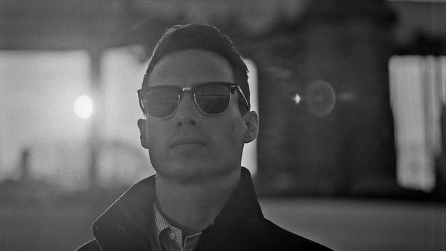 flared by thetzar, on Flickr 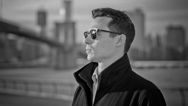 into the sunset by thetzar, on Flickr  two chrises, hands in pockets by thetzar, on Flickr
|
|
#
?
Dec 8, 2011 04:08
|
|

|
|
| # ? May 17, 2024 13:47 |
|
|
 I'm wary about the shadows at his feet -- I think I should 'shop one of them out. I thought I might want to clone them both out, but then he'd look pasted into the scene (which I don't want). The one on the left looks all blobby, but it makes more sense, given the lighting. The one on the right is cleaner, but makes less lighting sense. I just don't know which shadow to remove, or if I should. Also, I'm quite aware of the loving wrinkled shorts. Note to self: always bring an iron/steamer/spray bottle if models are self-styling. Other thoughts?
|
|
#
?
Dec 8, 2011 07:45
|
|