


|
Niagalack posted:Nice lighting between the leg! Thank God someone else noticed that too. I was agonizing over how to bring that up.
|
 #
?
Dec 17, 2011 05:30
#
?
Dec 17, 2011 05:30
|
|


|

|
| # ? May 17, 2024 18:17 |
|
|
So I did another session with a girl I've posted here earlier.   Have a b&w one too:  More here (both sessions in the same set): http://www.flickr.com/photos/nebuchadnezzariii/sets/72157628008074176/with/6524207833/
|
|
#
?
Dec 17, 2011 07:03
|
|
|
Auditore posted:I'm partial to this one, the composition with that huge branch running through the middle is really nice.
|
|
#
?
Dec 17, 2011 09:31
|
|
|
Auditore posted:So I did another session with a girl I've posted here earlier.
|
|
#
?
Dec 17, 2011 09:45
|
|

|
doctor 7 posted:I like the one in the centre the most because the other two look like she's fake smiling. It's also the well posed/framed as well. She does have a tendency to make a fake smile look really obvious and almost like a grimace. I've tried the "think of ice cream" line someone else told me in this thread but I did forget to say it a few times. Note she's not actually a proper 'model' as such, just a friend. Looks like I made the correct decision to give her a large print of the middle photo out of those three. I used my Sigma 24-70mm f2.8 (the new one), for this session and it does front-focus a little but when I get my 5D mark II that shouldn't be too much of a problem to fix.
|
|
#
?
Dec 17, 2011 10:15
|
|
|
Auditore posted:She does have a tendency to make a fake smile look really obvious and almost like a grimace. I've tried the "think of ice cream" line someone else told me in this thread but I did forget to say it a few times. Note she's not actually a proper 'model' as such, just a friend. Looks like I made the correct decision to give her a large print of the middle photo out of those three. You could try having her not smile, I saw the pictures where she wasn't doing it and they look find.
|
|
#
?
Dec 17, 2011 10:44
|
|
|
CB_Tube_Knight posted:I'm partial to this one, the composition with that huge branch running through the middle is really nice. The only problem I have with this photo is that due to the sunlight, it looks like her boob is a flashlight or something. A most unfortunate placement if I do say so myself.
|
|
#
?
Dec 17, 2011 14:36
|
|

|
RangerScum posted:The only problem I have with this photo is that due to the sunlight, it looks like her boob is a flashlight or something. A most unfortunate placement if I do say so myself. I can imagine a new Comic book hero coming on here... Flashboob? Flashtit?
|
|
#
?
Dec 17, 2011 15:00
|
|

|
ConfusedUs posted:Here's something I've discovered about cloth backdrops. Thank you for all of this. I'll try the dryer trick next time. I wish I could have moved her away from the back drop but the room was 12x12. I was against the back wall and was still struggling to get full length shots. Though I did do some head shots with her that seemed to work doing that! (You can still kind of see it though.)  An BW by Chad Larson Photography, on Flickr McMadCow posted:Thank God someone else noticed that too. I was agonizing over how to bring that up. I swear it wasn't intentional, that's just how the lights fell in her lap. When I noticed it, I zoomed in specifically to make sure nothing was unintentionally...revealed. (really!) ")
|
|
#
?
Dec 17, 2011 17:12
|
|

|
RangerScum posted:The only problem I have with this photo is that due to the sunlight, it looks like her boob is a flashlight or something. A most unfortunate placement if I do say so myself. I didn't notice it till you said, now glow boob is all I can see. Yeah he should have redirected some of the light to soften the shadows up and light all of her, or moved her into a more shadowy area.
|
|
#
?
Dec 17, 2011 18:07
|
|
|
First time using my hand me down tripod. Didn't have to balance on counter tops or coffee tables or the back of the couch. I'm sure I could have made it more interesting, but I quite like it. Have I mentioned how much I love that 50mm I bought from a goon? Because I love my goon bought 50mm.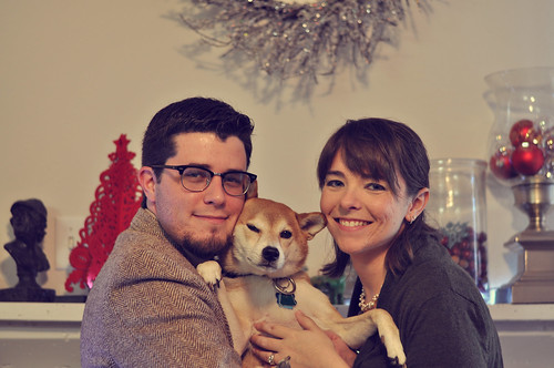 50/52 by thepaisleyfox, on Flickr
|
|
#
?
Dec 17, 2011 19:10
|
|


|
RangerScum posted:The only problem I have with this photo is that due to the sunlight, it looks like her boob is a flashlight or something. A most unfortunate placement if I do say so myself. I saw it beforehand. Mum kept mentioning it whenever she saw the shot.
|
|
#
?
Dec 17, 2011 21:08
|
|
|
Rather proud of this shot from a Christmas party, I was testing my settings. 
|
|
#
?
Dec 19, 2011 12:54
|
|
|
Half his face is hidden in shadow. You desperately needed some fill flash. Any time your light source is directly overhead you'll get those deep shadows under the brow, in the eye sockets, and sometimes under the cheekbones if the person's face is angular enough.
|
|
#
?
Dec 19, 2011 17:48
|
|


|
CB_Tube_Knight posted:Rather proud of this shot Please expand on why?
|
|
#
?
Dec 19, 2011 23:02
|
|

|
Jiblet posted:Please expand on why? Mostly because of the personality captured on accident, I just told him to hold still for a second and snapped this and it came out like that and it's basically a pretty good representation of the person in the photo as far as personality. As for the flash I try not to use it and most of the time at that party I was just metering light to make sure I was doing decently at it. I'm still learning and I treat all of this like a learning experience. When I buy my off camera flash I think that I'll use it more.
|
|
#
?
Dec 20, 2011 08:51
|
|
|
Had a chance to shoot in a studio with a makeup/hair girl and my light kit for the first time.  http://www.flickr.com/photos/48111742@N05/6539861569/in/set-72157628492885289/lightbox/
|
|
#
?
Dec 21, 2011 01:17
|
|
|
I love that chair.
|
|
#
?
Dec 21, 2011 02:53
|
|
|
My friend wants me to do a portrait of his family. Only problem is, I've never done an actual session before so I don't really know what I should do. Are there any goon-recommended guides of dos and do not dos for a family portrait? In terms of gear, I have a tripod and 2 speedlites.
|
|
#
?
Dec 21, 2011 19:28
|
|
|
Turd Nelson posted:My friend wants me to do a portrait of his family. Only problem is, I've never done an actual session before so I don't really know what I should do. Are there any goon-recommended guides of dos and do not dos for a family portrait? In terms of gear, I have a tripod and 2 speedlites. I found The Speedliter's Handbook to be really useful in learning what lighting setups are best for certain situations. The book is jam packed with a ton of info: mutiple speedlite setups, gelling for colour corrections, what light looks best, etc. I play around a lot with my light when I use it because I'm still learning, but it definitely put me in the right ballpark. I don't recall if they have specific big group shot setups, but you should be able to get an idea of what to do from the rest of the information.
|
|
#
?
Dec 21, 2011 19:42
|
|

|
MrOpus posted:I love that chair. Haha, thanks. I thought it fit the scene well. I also wasn't sure whether to call it a couch or a chair.
|
|
#
?
Dec 21, 2011 20:04
|
|
|
I got chance to shoot another friend. I did use Christmas lights again, as she saw the last shoot and liked them. I don't want to show you those photos, though. I want to show you these photos. SB600 speedlight through an umbrella, with some continuous fluorescent lights for fill as needed. Am I improving? Ciara by Chad Larson Photography, on Flickr  Ciara by Chad Larson Photography, on Flickr  Ciara by Chad Larson Photography, on Flickr
|
|
#
?
Dec 22, 2011 01:02
|
|
|
MrOpus posted:I got chance to shoot another friend. I did use Christmas lights again, as she saw the last shoot and liked them. I don't want to show you those photos, though. I want to show you these photos. SB600 speedlight through an umbrella, with some continuous fluorescent lights for fill as needed. Am I improving? I think these are an improvement over the last ones you posted, although I would like to see some definition in the eyes on the first shot. It seems like her eyes are set in pretty far and in shadow. I like the direction you're going though. The second shot turned out pretty well and really sharp. I know its just my taste by my eye gravitated towards the barbell in her ear and the tattoo on her arm. The background is leaps and bounds above the last time you posted. Even in the third, the background is quite nice for what I'm assuming is either a shower curtain/bed sheet/curtain. The orange lighting throws me off a little bit because its mixed with what looks like daylight flash. Also, its a weird crop, I feel like if she is going to be looking over her shoulder, there should be more room behind her so that shes not looking down into the corner of the photo. Overall I see improvement, nice work.
|
|
#
?
Dec 22, 2011 02:04
|
|
|
chadxor posted:Had a chance to shoot in a studio with a makeup/hair girl and my light kit for the first time. Lovely pictures! Props.
|
|
#
?
Dec 22, 2011 22:38
|
|

|
Ok, so I have some more photos, which are kinda old.   So, I'm aware of the first 2 being a little OOF, and I think I should've kicked some more light into her face (I had a reflector there, but didn't think it needed adjusting at the time...). I'm also curious about the composition of the third. And the hair at the top of her head. I kinda think it's distracting, but I hesitate at cleaning up portraits too much so as to remove the naturalness of them. But I might do it.
|
|
#
?
Dec 29, 2011 05:52
|
|
|
The hair is fine. The main things I see is that the light wrap is way too strong, it overpowers your edges in a non-intentionally bad way and washes out your colors. There's also some poo poo on the background of the 2nd you might want to clean up. The last one, the composition is fine, but the horizon is tilted, making everything feel a little unsteady.
|
|
#
?
Dec 29, 2011 09:55
|
|

|
I also think the first two are too warm.
|
|
#
?
Dec 29, 2011 18:23
|
|
|
How would you fix the horizon line? I have no idea how to overcome such a problem.
|
|
#
?
Dec 29, 2011 20:21
|
|

|
Niagalack posted:How would you fix the horizon line? I have no idea how to overcome such a problem. rotate the image until the horizon becomes straight Lightroom does it pretty efficiently.As for some of my portraits in Korea:  IMG_4573 by avoyer, on Flickr  IMG_4930 by avoyer, on Flickr  IMG_4946 by avoyer, on Flickr  IMG_4965 by avoyer, on Flickr xenilk fucked around with this message at 20:39 on Dec 29, 2011 |
|
#
?
Dec 29, 2011 20:30
|
|
|
If you rotate the horizon it will rotate the subject so how can it make the photo better ?
|
|
#
?
Dec 29, 2011 21:58
|
|
|
Niagalack posted:If you rotate the horizon it will rotate the subject so how can it make the photo better ?  It just looks cleaner/aesthetically pleasant plus in my humble opinion it doesn't screw up your picture even if the subject is a tad rotated as well. Edit: Okay the horizon is still not perfect but you get what I'm saying, hopefully.
|
|
#
?
Dec 29, 2011 22:06
|
|
|
^^ beaten in possibly the lowest traffic forum on SA. For shame. Niagalack posted:If you rotate the horizon it will rotate the subject so how can it make the photo better ? Is there a reason you want your subject tilted? The only downside of rotating images is that it results in cropping parts of the image, but that's usually a price worth paying. 
|
|
#
?
Dec 29, 2011 22:07
|
|
|
Wow , I am amazed at how fast you guys replyed and even showed me the difference. You guys rocks!! I need to try it in LR now.
Niagalack fucked around with this message at 22:48 on Dec 29, 2011 |
|
#
?
Dec 29, 2011 22:43
|
|
|
Niagalack posted:Wow , I am amazed at how fast you guys replyed and even showed me the difference. You guys rocks!! I need to try it in LR now. It's surprisingly easy, you can even use the ruler tool to draw a line along the horizon to make it straight.
|
|
#
?
Dec 29, 2011 23:42
|
|

|
I'm all over the place with what I want to shoot lately. Have some black and whites:  IMG_2502 by Breanne Unger, on Flickr  IMG_2507 by Breanne Unger, on Flickr
|
|
#
?
Dec 30, 2011 01:00
|
|
|
I should probably post this in SAD but I want to post it here . This is a candid shot of my last son. Adam by J-YG, on Flickr Niagalack fucked around with this message at 03:30 on Dec 30, 2011 |
|
#
?
Dec 30, 2011 03:28
|
|
|
Ah, yes, the first 2 are too warm. I thought I took care of that to look more pleasant in ACR, but probably not enough. (I processed them down from 6500 to 5500 just now, and they do look better, without losing her skin tone.) I think the hard light wrap comes from the ill-positioned reflector. I had it more camera-right, and should've pulled it around the front more to more evenly balance the backlight from the window. Ugh. Also, the canted angle crop is intentional on the 3rd. I still like my canted angle better than the even horizon line. I don't generally prefer canted angles, and I know the Dorkroom doesn't either (see: Terrible Photos thread w/ plenty of 45-deg canted angles) , but I think if it creates some interest and you have a line in your photo that parallels the dominant edge of the photo, it can work out (and I think my version closely parallels her back with the vertical edge). I also think she looks hunched over when the horizon is straight, where she would otherwise look stiff if I told her to straighten up, and the canted angle leaves her looking poised and relaxed/approachable at the same time. It may benefit from a closer crop, though I did want to leave plenty of space around the subject.
|
|
#
?
Dec 30, 2011 08:59
|
|
|
I apologise in advance if this is an obnoxious amount of images - it's just I've not posted for a while because I've been busy mainly doing commissions and looking after my then pregnant, now not pregnant-due-to-the-whole-birth-bit-at-the-end wife and subsequently looking after the little lady herself. So I have a few pics for you. Also, I wanted to add a couple of shots from my "drier" shoots like Web Designer Magazine to show you it's not all glamour and girls. Like: The eyes Dislike: Don't know if there's enough going on in her expression. She looks kinda bored.  Like: Her eyes, her expression. She's my favourite model to work with, her stare is totally mesmerising, plus she's really funny, down to earth and fun to work with. Dislike: I feel like my lighting isn't quite right - her chin sort of disappears into her neck a bit due to a lack of definition. Also, the way her top isn't symmetrical and shows bare shoulder on one side bothers the hell out of me.  Like: The hair and the outfit. Profile was the way to go to get all the shapes and lines out of this one. Dislike: My slightly crappy retouch job. Should have had her eyes looking a touch higher than they are. Can't decide whether it makes her look a bit bored or not.  Like: I guess the composition is OK. I think her gaze is quite engaging. I can't remember what I liked about this one - it was a while ago. Dislike: A bit boring? She was a pale, Eastern European girl but I think the pp might make her a bit too pale? Dunno. Too plasticky a retouch job? Stupid vignette? OK, so some on-location mag stuff (this already feels like too many photos) A couple for Web Designer Magazine, where I try to not terrify some very shy but very nice individuals who spend all day tucked away from the world making websites.  Like: Interesting background, composition is different for me, as I seem to have an aversion to landscape oriented images. Dislike: He looks terrified (the least terrified of the series), stuff behind the head too distracting?  Like: Good ol' window lighting, was pleasantly surprised at how confident his expression turned out. Dislike: I left the cactus in in purpose because I thought it was a little quirky and fun, but I'm starting to wonder whether it looks like a mistake and just distracts you from the image. I shot Justin and Arne from Naughty Dog for GamesTM  Like: The background choice - the first level of UC3 is in London, so we went onto the streets of London. Dislike: Not sure about the poses - directing people on the other side of the street is hard. So there you go - all up to date and that. Oh and here is the little lady that is responsible for my absence and subsequent over-posting. Sorry if this is too many photos for one post. 
|
|
#
?
Dec 30, 2011 17:44
|
|

|
Subjunctivitis posted:Ah, yes, the first 2 are too warm. I thought I took care of that to look more pleasant in ACR, but probably not enough. (I processed them down from 6500 to 5500 just now, and they do look better, without losing her skin tone.) Well the thing is the reason why she looks hunched over when the photo is straight is because she is. I think that (very) occasionally the whole crazy angle can work, but in this case I just feel like everything is sliding over. It doesn't add anything except that it looks like everything is on an angle. This is, of course, just my personal opinion. If the angle is that important, perhaps you could move in closer and also edit the horizon so that it's all ocean, making the horizon unimportant altogether. It's just at such a prominent place in the photo, right at her head.
|
|
#
?
Dec 30, 2011 18:41
|
|
|

|
| # ? May 17, 2024 18:17 |
|
|
Gazmachine posted:
Isn't Ramilles St. one of those ones with a ton of hooker walkups? The cactus thing is fine!
|
|
#
?
Dec 30, 2011 18:51
|
|
