


|
Baron Bifford posted:From Flashpoint: Lois Lane and the Resistance #1, art by Eddie Nunez. While not really terrible art per se, it was rather striking to see Lois drawn with such voluptuous curves and gigantic boobs. I actually enjoyed the writing in that issue, but the art looked rushed and awakard to me. From my layman's view, I think a lot of the Flashpoint minis suffered from rushed art, though I only picked up the first issues of most of them to get the badge, because I am easily lead by gimmicky giveaways, and I'm still somewhat annoyed by my incomplete set of Blackest Night promotional rings  Though the Batman mini looked pretty good, as did the Frankenstein one.
|
 #
?
Jan 1, 2012 01:55
#
?
Jan 1, 2012 01:55
|
|

|

|
| # ? May 12, 2024 19:30 |
|
|
OldMemes posted:I actually enjoyed the writing in that issue, but the art looked rushed and awakard to me. From my layman's view, I think a lot of the Flashpoint minis suffered from rushed art, though I only picked up the first issues of most of them to get the badge, because I am easily lead by gimmicky giveaways, and I'm still somewhat annoyed by my incomplete set of Blackest Night promotional rings
|
|
#
?
Jan 1, 2012 05:23
|
|
|
I know Juan Jose Ryp was already mentioned as a bad artist, but  I love it, it's incredibly detailed and beautiful in a grotesque way V  V VThe problem is when it gets so detailed and gross that you can't actually tell what's going on. There was one panel I remember where it looked like a dude tried to punch a woman in the face and and missed, only scraping the side of her head. Then in the next panel her face was split down the middle (can't find it on Google, sorry). The blood and debris flying around only made it more unclear. FourLeaf fucked around with this message at 08:44 on Jan 1, 2012 |
|
#
?
Jan 1, 2012 08:40
|
|

|
Baron Bifford posted:From Flashpoint: Lois Lane and the Resistance #1, art by Eddie Nunez. While not really terrible art per se, it was rather striking to see Lois drawn with such voluptuous curves and gigantic boobs. Eddie Nunez tends to draw every female character with, um... interesting proportions. Him being put on a book about Lois Lane, who I wouldn't really considered a major sex symbol in comics, is pretty baffling. As well as the writer making it so that she's in that awful dress for that whole issue. I felt like that whole mini was false advertising, since the cover depicted her in a cool trenchcoat that covered her whole body and holding a gun, ready to defend herself against some monsters. And then you opened the book, and she was in an awful torn dress, posing awkwardly all the time. edit: Here's that cover so you can see what I expected, and then what I got: 
Darth Nat fucked around with this message at 15:14 on Jan 1, 2012 |
|
#
?
Jan 1, 2012 15:10
|
|

|
Gone gone the coat of trench Wear ye now the dress of wench
|
|
#
?
Jan 1, 2012 15:59
|
|

|
Baron Bifford posted:I don't know what your problem is with this panel. I know plenty of women whose areola are roughly 3/4 the size of their face.
|
|
#
?
Jan 1, 2012 19:23
|
|

|
FourLeaf posted:I know Juan Jose Ryp was already mentioned as a bad artist, but Why do people not like Juan Jose Ryp? I love him he's one of my favorites  His work on Wolverine the Best there is was great. It was really toned down somewhat and looked great, at least i thought. His work on Wolverine the Best there is was great. It was really toned down somewhat and looked great, at least i thought.
|
|
#
?
Jan 1, 2012 19:45
|
|
|
Hollis posted:Why do people not like Juan Jose Ryp? I love him he's one of my favorites He's definitely not a bad artist I think sometimes his art is just so detailed that it can become confusing. Dacap fucked around with this message at 20:39 on Jan 1, 2012 |
|
#
?
Jan 1, 2012 20:35
|
|

|
A good writer will be able to play to his strengths. I've only seen those two pages, but they do a good job of giving me a dreadful feeling. Trying to take in all those lines is almost maddening. A good writer can sometimes be the difference between bad and good art, strangely enough.
|
|
#
?
Jan 1, 2012 21:07
|
|


|
For best I'd have to go with Marcus To: It might be more thanks to the colorist John Dell, but something about his proportions just feels right: statuesque is a good way of putting it. For worst, Frank Miller.  I don't like his style when he draws people. His angles are harsh, his facial features are grotesque, and his aesthetics overall are very garish.
|
|
#
?
Jan 1, 2012 21:23
|
|
|
cyberpunksurvivor posted:For worst, Frank Miller. Dark Knight Returns was Miller at his best.
|
|
#
?
Jan 1, 2012 23:02
|
|

|
Big Bad Voodoo Lou posted:Do you need an Indigo ring, by any chance? I ended up with one today, somehow. How did you manage that? I think I might just give in a get some off eBay (I've avoided eBay for years now) - I do have a complete set of Flashpoint badges though! Darth Nat posted:Why does that one have such different colouring to the actual released cover, I wonder?
|
|
#
?
Jan 1, 2012 23:03
|
|
|
cyberpunksurvivor posted:For best I'd have to go with Marcus To: Wow that is one of the best Frank Miller images. Seeing as how you like To I can totally see why you don't like Miller though. To can't draw middle aged looking people everyone must look pretty and young.
|
|
#
?
Jan 1, 2012 23:06
|
|
|
Madkal posted:I finished reading Wizard of Oz last night with Skottie Young and I find the art to be mindblowingly good. After I read a page I would go back to the top of the page and just look at the pictures. Scottie Young is way too talented. I wish he was interested in working on comics I'm actually interested in though. OldMemes posted:and I'm still somewhat annoyed by my incomplete set of Blackest Night promotional rings Which rings do you need?
|
|
#
?
Jan 1, 2012 23:13
|
|


|
Rhyno posted:Which rings do you need? I have Green, White, Black ans Sinestro (and the Flash ring), so I'm missing the rest. As for art, Batman: Snow is an interesting,(presumably) non-canon take on the origin of Mr. Freeze, and has some fantastic art from the late Seth Fisher, and the colouring really complents the pencils. I got a copy in a discount book shop - it's an unexpected gem. 
|
|
#
?
Jan 1, 2012 23:45
|
|
|
OldMemes posted:I have Green, White, Black ans Sinestro (and the Flash ring), so I'm missing the rest. I have orange, pink and indigo handy, yours for cost of shipping. PM me dude.
|
|
#
?
Jan 1, 2012 23:49
|
|
|
OldMemes posted:I have Green, White, Black ans Sinestro (and the Flash ring), so I'm missing the rest. drat. It's too bad Seth never got to work with Grant Morrison. That would have been amazing.
|
|
#
?
Jan 2, 2012 00:43
|
|
|
Hollis posted:Why do people not like Juan Jose Ryp? I love him he's one of my favorites Ryp is a brilliant artist, but like Dacap said, he needs the right writer. He needs, I suspect, a helping hand in controlling his urge to fill in every spot of blank paper with something. If he lets that tendency run away with him his art gets busy and overwhelming, but when he keeps it under control he's a spectacular artist and a fine storyteller.
|
|
#
?
Jan 2, 2012 01:02
|
|


|
Rhyno posted:I have orange, pink and indigo handy, yours for cost of shipping. PM me dude. I don't have PMs right now - I'll buy myself the upgrade tommorow, and get back to you then, ok? SkellingTon Loc posted:drat. It's too bad Seth never got to work with Grant Morrison. That would have been amazing. He would have been perfect for Batman & Robin Batman: Snow is well worth a look - it's co-written by J.H. Williams III! Well worth the �2.99 I paid for it.
|
|
#
?
Jan 2, 2012 02:12
|
|
|
OldMemes posted:I don't have PMs right now - I'll buy myself the upgrade tommorow, and get back to you then, ok? Email me at ryancharleswhite@yahoo.com, that way you don't have to spend money.
|
|
#
?
Jan 2, 2012 02:14
|
|
|
SkellingTon Loc posted:drat. It's too bad Seth never got to work with Grant Morrison. That would have been amazing. He's one of Chris Burnham's biggest influences so in a way that's kind of fitting.
|
|
#
?
Jan 2, 2012 02:31
|
|
|
Baron Bifford posted:Dark Knight Returns was Miller at his best. JackDarko posted:Wow that is one of the best Frank Miller images. Seeing as how you like To I can totally see why you don't like Miller though. To can't draw middle aged looking people everyone must look pretty and young.  My issue with Miller is that everyone looks positively grotesque; Sale, unlike Miller, has a sense of aesthetics. Femme Fatales look gorgeous, Two-Face looks ugly, the Joker looks like a twisted Cheshire Cat, and Gordon looks like he just stopped chain smoking about two weeks ago. With Miller, even Wonder Woman looks off to me. My philosophy with comic art is that it must serve the story at all times. I don't want all comic book characters to look like supermodels, but at a bare minimum the art to match the tone and logic of the story. And even then, there are some artists that rub my aesthetics the wrong way.
|
|
#
?
Jan 2, 2012 06:09
|
|
|
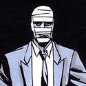
Modus Operandi posted:What we need is one issue where we just see Xavier pumping iron in his chair. Just panels and panels of him sweating and cranking out reps and sets on various machines with no explanation while pausing every now and then to shout out telepathic orders through a portable cerebro. I am almost positive that there is something somewhere with him doing exercises on parallel bars. It may have been the animated series. I wouldn't mind him looking athletic, but that's completely ridiculous. Anyway, my own contribution is- Crap. ...Okay, I don't know the artist or the issue, I think I may have literally burned the comic for its awfulness. Goddamnit, what... Maybe Google can help me. They did X-Men for some period of time, and the crowning panel of horrible involved Wolverine with a wrist tinier than mine (arms like coathangers) and a fist the size of a watermelon. It was so scratchy that it was almost completely impossible to tell what was going on. I actually did NOT know half of what happened, it was so bad. Like scratches on paper in the fog and rain. There was not one solid piece of it. The atmosphere was terrible, the sequential nature of the thing was unreadable, and the backgrounds all seemed to be cloudy splotches. Okay, after some searching, I think I may have finally remembered one single event from the thing, which involved someone trying to drill into Wolverine's spine for some reason. Does this ring any bells for anyone, or did I just hallucinate that ugly monster of a comic? ...ah. Silly me. you guys have mentioned them. Ashley Wood did some of the most monstrously abjectly terrible art in X-Men that I have ever seen in my life. I have seen some of their work and it looks stylized and moody! And then... Well, this was my first exposure to them at all. (Please note that, if you Google Ashley Wood's art, you will find a whoooole lot of NSFW of the "ladies splaying their bits" kind, as I have just learned)  Do you know who all of them are? Do you know who is positioned where in each panel? Do you know what is happening? Neither did I, and I read it in English. They did a LOT of these horrible, tiny panels where you cannot distinguish who is who and what is going on without really obvious tells, like the tail and wings.  This is when I began to suspect that they were given ten minutes to draw each page. At gunpoint.  I have no idea what happened in this spread.  What? Again, I do not think the artist is necessarily terrible, in and of themselves. I am just saying this work is bad. Check this:  This is not bad. If someone finds me tinywrist hugefist Wolverine, though, I'll be happy. I am 50% sure the scene happened in a sewer. A flamethrower might have been involved in the next issue... it was an issue-end cliffhanger deal. FAKE EDIT: Looking back, I think I see the problem. None of it looks finished. Some of the examples I found may or may not be just the lines, but I CANNOT TELL. This is a bad sign. If they are just lines, they are vastly more legible than the finished product. Everything colored is covered with vague smudges. They look more like experimental sketch pages than finished works, colored or not. And they absolutely never use proper color in any way. It's all tea-stained at best.
|
|
#
?
Jan 2, 2012 06:16
|
|

|
Skottie Young is great. If I can find it I'll upload the Mr. Freeze he drew me.
|
|
#
?
Jan 2, 2012 16:16
|
|

Spaceman Bill posted:Skottie Young is great. If I can find it I'll upload the Mr. Freeze he drew me. You're not sure where it is? Just how much art do you own?
|
|
|
#
?
Jan 2, 2012 16:47
|
|


|
Rhyno posted:Email me at ryancharleswhite@yahoo.com, that way you don't have to spend money. I've just sent you one ") cyberpunksurvivor posted:My issue with Miller is that everyone looks positively grotesque I'm not a huge fan of Miller's art, but he can still draw dinosaurs pretty well.  That's the variation cover for IDW's Jurassic Park: Redemption #1 - the interior art is pretty bad. If I can find my copy, and get my sacnner working, I'll post some examples later.
|
|
#
?
Jan 2, 2012 20:11
|
|
OldMemes posted:I've just sent you one That's the lame dinosaur from the third movie, right? The one that was EVEN MORE badass-er than a T-rex.
|
|
|
#
?
Jan 2, 2012 20:24
|
|
|
I haven't been in a comic shop in forever, but saw some preview art online from Cloak & Dagger: Spider-Island by Emma Rios, and had to have it: Somewhat reminiscent of Paul Pope's work, not quite as grotesque, but softer with a shojo manga influence... and a bit of Paolo Rivera (although that just might be colouring). Amazing brushwork, the kind you don't see much anymore... I regret not picking up #2 and #3 while I was in the store.
|
|
#
?
Jan 2, 2012 21:24
|
|
|
OldMemes posted:I've just sent you one Pfff... He didn't even bother with drawing the toilet.
|
|
#
?
Jan 2, 2012 21:33
|
|
|
cyberpunksurvivor posted:And I couldn't stand his art any more than I could in The Dark Knight Strikes Again. I used Returns to show that even at Miller's best I can't stand it. Yeah that's absolutely fair and I agree. Miller usually isn't telling romance high school stories so I don't mind his style. He's a pretty drat good storyteller as well. Tim Sale is pretty excellent as well good choice.
|
|
#
?
Jan 2, 2012 21:41
|
|
|
Is it just me or do the periods in Morrison's New X-Men look WAY too much like commas? (Issue 116) Because to me they do, and it's making the issues a bitch to read. Edit: THE FACT THAT ALL THE DIALOGUE IS WRITTEN IN ALL CAPS LIKE THIS MAKES IT EVEN TOUGHER SpeedofLife fucked around with this message at 02:18 on Jan 4, 2012 |
|
#
?
Jan 3, 2012 02:17
|
|
|
edit: sorry
|
|
#
?
Jan 3, 2012 02:18
|
|
|
SpeedofLife posted:Edit: THE FACT THAT ALL THE DIALOGUE IS WRITTEN IN ALL CAPS LIKE THIS MAKES IT EVEN TOUGHER Serious question, have you never read a comic book before? Anyway I got a few collections today I feel go well with this thread. First I got Jack Kirby's The Demon  I wouldn't call this Kirby's best work, but I do feel it's his most interesting. Just a great take on the fantasy and macabre. I can't wait to dig in and see all the monsters he created. Speaking of monsters though, the other books I got were the two collection of the unique Fletcher Hanks. I Shall Destroy All The Civilized Planets and You Shall Die by Your Own Evil Creation!  His work is ugly and yet so appealing. I'd never defend his art, but I love it so.
|
|
#
?
Jan 4, 2012 06:03
|
|

|
I was introduced to his work by this forum (possibly this very thread) and I loving love it. It's so...earnest in its terribleness. Also, Stardust loving owns. He's the most brutal motherfucker to ever walk the planet.
|
|
#
?
Jan 4, 2012 07:40
|
|

|
Every single Stardust comic could simultaneously be posted in the funny and badass threads. God bless that horrible creation. Yet I think the art's somewhat appealing in the very early comic sense. I could almost see pages of it in a folk art museum.
|
|
#
?
Jan 4, 2012 07:59
|
|

|
Dude was also a alcoholic wife beater who died frozen to a park bench. So there's also that aspect to his work.
|
|
#
?
Jan 4, 2012 10:06
|
|

|
Rough Lobster posted:I was introduced to his work by this forum (possibly this very thread) and I loving love it. It's so...earnest in its terribleness. I'm pretty sure I learned about his work here too, and you hit on the head with the earnest comment, I love his comics the same way I love Ed Wood's films. And yeah, Stardust and Fantomah are terrifying, Superman might punch you into the ocean, Batman might snap your neck (well in the few issues before Robin showed up anyway) but Stardust and Fantomah will rip your head off, and then turn you into a lizard before killing you, just because they can. Humboldt squid posted:Dude was also a alcoholic wife beater who died frozen to a park bench. So there's also that aspect to his work. Yeah, one of my favourite parts of The League of Extraordinary Gentlemen: 1910, was when it's revealed that Captain Universe defeated the obviously drunk Stardust by freezing him in ice-nine. 
|
|
#
?
Jan 4, 2012 10:53
|
|
|
wyoming posted:Serious question, have you never read a comic book before? No, I have, and it usually isn't a problem. But combined with the ambiguous commas/periods it sometimes makes it difficult to tell where one sentence ends and another begins.
|
|
#
?
Jan 4, 2012 16:47
|
|
|
The new Batwoman stuff is perfect to me.
|
|
#
?
Jan 4, 2012 18:16
|
|

|

|
| # ? May 12, 2024 19:30 |
|
|
jimcunningham posted:The new Batwoman stuff is perfect to me. That's great, love me some J. H. Williams III, even if it's hard to follow what's going on sometimes (mainly in Promethea)
|
|
#
?
Jan 5, 2012 02:33
|
|
