


|
Straighten that vertical and it would be awesome.
|
 #
?
Dec 30, 2011 18:52
#
?
Dec 30, 2011 18:52
|
|


|

|
| # ? May 17, 2024 20:20 |
|
|
Paragon8 posted:Isn't Ramilles St. one of those ones with a ton of hooker walkups? Haha, is it? I had no idea. Well that certainly gives the photo a new story. A5H posted:Straighten that vertical and it would be awesome. Oh poo poo, it is slightly off, isn't it? I plain didn't see that. FAKE EDIT: Just checked it and they fixed it in the mag, making me look better than I actually am! Woop!
|
|
#
?
Dec 30, 2011 19:46
|
|

|
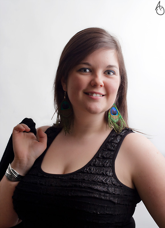
Had some time with a friend the other day when she came into state from DC, we took a lot of pictures but this was easily the best. 
|
|
#
?
Dec 31, 2011 23:54
|
|
|
CB_Tube_Knight posted:Had some time with a friend the other day when she came into state from DC, we took a lot of pictures but this was easily the best. Not sure if you want feedback for these pics, but here's some anyway! The background is quite distracting - that angled vertical where the wall ends would be much better if it wasn't there and was just a plain wall. More on the background - that painting cuts awkwardly into the back of her head. I wouldn't necessarily remove it completely, but I would have it feature in a way that looks like it was in the photo on purpose. For example, have it to the left of her. It also needs to be straight. Her smile is a bit weird - she looks quite scared and has a fixed smile. She doesn't seem massively uncomfortable, but she could look more relaxed. She's not looking at us, either. She's doing that thing that people often do, which is to look at the viewfinder instead of down the lens, which you can tell because her eyes are looking slightly higher than where she would if she were looking right at us. People also sometimes look a little to the left or right of the lens because they're nervous and subconsciously don't want to look directly into the lens. You might want to mess with the colour balance a little, which is easier to do if you shoot in RAW. This pic is a bit yellow from the lights in the room and it makes her hair look a bit sickly. The stuff on her seat behind her is untidy and distracting, get rid. Finally, standing over her like that puts a lot of emphasis on her boobs, as in a little too much. She doesn't have to hide them, but when I saw the picture my thought process went "boobs, awkward smile, picture, tilted wall, a little too warm / yellowy". If I reshot that, I would back up, get a seat of my own so we were equal height, put her chair flat to the wall, remove the stuff off it, position her so she didn't have her head intersecting any background objects, get her to relax a little more by chatting and snapping, taking a little more time to take a few more shots and finally, fixing the white balance so it's a bit less yellowy.
|
|
#
?
Jan 1, 2012 14:58
|
|
|
Additionally, did you do a lot of skin smoothing on her face? She looks very airbrushed.
|
|
#
?
Jan 1, 2012 15:21
|
|

|
And further more, the way her shoulder are placed does not advantage her. I don't want to insult but this would look more like a snapshot.
|
|
#
?
Jan 1, 2012 15:52
|
|

|
Gazmachine posted:Not sure if you want feedback for these pics, but here's some anyway! It was a bit of a snap shot, she was putting her shoes on when I took it though I don't think I was standing when I took it, if I remember I was sitting across from her, she leaned over and put her breasts up like that but those things are huge and yeah I would hate to have to take a shot where they were hidden because that'd be a challenge. I mostly wanted to know what to do with the skin color, so thanks for that advice. I do have the RAWs so I might need to try editing in them because I have never done it but I shoot in RAW kind of as a "just in case". I used Photoshop and Lightroom to edit, but I think the Lightroom skin soften is too much here so I'd be better sticking to spot treatments. Hopefully in RAW I can correct most of this.
|
|
#
?
Jan 1, 2012 19:16
|
|
|
 Claudia Jour de l'an by king colliwog, on Flickr There's something weird going on with her eyes... Not sure what/why exactly. Not the best composition, but I couldn't get an inch large since I had very limited space.
|
|
#
?
Jan 2, 2012 00:07
|
|

|
You didn't put in a hot light so her eyes are ridiculously dilated. Your soft box was also a bit large and you could have used a lower angle for the fill.
|
|
#
?
Jan 2, 2012 00:34
|
|
|
Just a couple of the better shots (I think) of my wife. Would love to get some feedback on anything I can do better (Composition or post-processing) as I didn't put much thought into either. Thanks! Costa Rican Beauty by poindexter6_, on Flickr  Emily by the Tree by poindexter6_, on Flickr  Emily By The Tree redux by poindexter6_, on Flickr
|
|
#
?
Jan 2, 2012 01:19
|
|
|
TheLastManStanding posted:You didn't put in a hot light so her eyes are ridiculously dilated. Your soft box was also a bit large and you could have used a lower angle for the fill. Ah, great now I see it clearly. Thanks a lot, I'll keep an eye on things like that in the future. I used a 43'' umbrella just to the side of her face, slightly higher than her. You think it would have been better to lower it so the shadow of the nose was a bit higher and to the left (basically going for a Rembrandt?) Thanks a lot for your input. I'm pretty knew to this whole flash photography thing.
|
|
#
?
Jan 2, 2012 01:29
|
|
|
Revisiting some old pictures. I was the helper on that set but got to snap a few shots ")  IMG_3567 by avoyer, on Flickr  IMG_3543 by avoyer, on Flickr  IMG_3611 by avoyer, on Flickr
|
|
#
?
Jan 2, 2012 04:13
|
|

|
dexter6 posted:Just a couple of the better shots (I think) of my wife. Would love to get some feedback on anything I can do better (Composition or post-processing) as I didn't put much thought into either. Thanks! I'm all about context. I think if you can present your subject in a context that is clear to the viewer, you'll have a good success rate. For instance, in the first shot, I feel like you've clipped too much from her head and have shown too much of her neck and chest. Maybe if you backed up a little and included a little more of the background, it would have worked better. You could still keep it tight -- if you were going for a tight headshot type of picture. But I feel like there should be more emphasis on the upper part of her head and face, and less emphasis on the shoulders and below. After all, the eyes are really where we first connect when we look at a person. It's important to make sure the eyes are in the right place in the frame. In a shot like this context is not as important as the other two, just the composition. To me the blinds in the second picture are an ugly contrast to your wife who is very pretty. I would have framed her differently. I may have asked her to stand somewhere else, maybe so that the Christmas tree was to her left and she was on the right, and the blinds were not part of your composition. In your picture she is actually blocking the tree. I think it would have been nice to see some of that. Sometimes the constraints against you, the photographer, are very difficult and your options are limited. But I think you have to make the best of the situation, and I don't know if you did that here. I think again, with the third, I'm not happy with the blinds, and I don't like that you clipped her right arm. Think about putting her in context with the tree. If you're going to put something in context, you want to show all of it. Just like if I read you only part of a sentence and ask you what it means, you'll say "put it in context." I'll read the whole paragraph and then it will make sense. So in your pictures here I would say, think about the viewer. Don't just think about your wife, but think about how this picture will look to others, and ask yourself if it is successful in presenting the full story? I would say no it doesn't. You could (hopefully) position your wife so that the tree is in view but those distracting blinds are not, and you could frame her so that at least the sides are all in view. It looks like some of the limitations here are your lens. You're working with a prime lens that doesn't give you the width necessary to compose these correctly. The 35mm you appear to be using is an equivalent 50mm lens on full frame. That's not a wide lens. You should have perhaps considered the Tamron 17-50 and using it at the longer end, which would have given you a lot more freedom in your compositions.
|
|
#
?
Jan 2, 2012 05:39
|
|
|
dexter6 posted:Just a couple of the better shots (I think) of my wife. Would love to get some feedback on anything I can do better (Composition or post-processing) as I didn't put much thought into either. Thanks! Here's a tip to start you off: start putting thought into those things.
|
|
#
?
Jan 2, 2012 08:24
|
|

|
Just as a rule for those looking for feedback - don't put up your defensive walls before you even begin. I know that it's a daunting process putting your work up for review from others who will critique it fully and mercilessly, but that's a good thing. Don't be precious with your work and don't make excuses. It might feel initially demoralising, but to have your image ripped apart by the exceptional photographers in this forum is the absolute best thing that could happen to you, providing you listen to them. I know it's helped me a hell of a lot, and I also realise I have much, much more to learn. The worst thing that could happen would be for everyone who sees your image to go "lovely capture! I like the colours", because you learn nothing (see: Flickr). I see it all the time, the "yeah well it was just a snapshot" response, or the "I didn't really try too hard on these pics but what do you think anyway?" statement, so I understand why these comments crop up, but just try to let go of the work, allow it to be battered into submission, and learn a ton from the experience. It gets less painful the more you do it, I promise.
|
|
#
?
Jan 2, 2012 12:29
|
|
|
Mannequin posted:I'm all about context. I think if you can present your subject in a context that is clear to the viewer, you'll have a good success rate. For instance, in the first shot, I feel like you've clipped too much from her head and have shown too much of her neck and chest. Maybe if you backed up a little and included a little more of the background, it would have worked better. You could still keep it tight -- if you were going for a tight headshot type of picture. But I feel like there should be more emphasis on the upper part of her head and face, and less emphasis on the shoulders and below. After all, the eyes are really where we first connect when we look at a person. It's important to make sure the eyes are in the right place in the frame. In a shot like this context is not as important as the other two, just the composition.  DSC_3176 by poindexter6_, on Flickr Any better? Gazmachine posted:Just as a rule for those looking for feedback - don't put up your defensive walls before you even begin. I know that it's a daunting process putting your work up for review from others who will critique it fully and mercilessly, but that's a good thing.
|
|
#
?
Jan 2, 2012 14:24
|
|
|
Disclaimer: this is a very general post, it doesn't necessarily have anything to do with your image, dexter6.Gazmachine posted:Don't be precious with your work and don't make excuses. It might feel initially demoralising, but to have your image ripped apart by the exceptional photographers in this forum is the absolute best thing that could happen to you, providing you listen to them. I know it's helped me a hell of a lot, and I also realise I have much, much more to learn. This is one thing that I had to hear time and time again before it sunk in. It's also one of the best lessons I've learned as a photographer - when people look at your image, you're not always going to be there to say "oh, but you have to understand, the sun wasn't great, and I was having to make the best with the lighting, and really it was just a snapshot that turned out well, and you see it's funny because THIS was happening in the background, and it's interesting to me because THIS, and oh man the model was so funny because she was saying THIS, etc." Every picture has a story, sure. But you're not always going be there to tell it. Every picture HAS a story, but a good picture TELLS a story. Always remember that. And that's QPZIL's two cents for the day. Now run on, ya little scamps 
|
|
#
?
Jan 2, 2012 16:48
|
|

|
QPZIL posted:
Wise words
|
|
#
?
Jan 2, 2012 18:10
|
|
|
 2012-17 by Tom Rintjema, on Flickr Yeah, got a baby photo!
|
|
#
?
Jan 3, 2012 01:42
|
|
|
Hi, I mostly shoot cosplay, I would like to share a picture which I have shot recently at a friend's house.  Guilty Crown: Yuzuriha Inori by CorneliusK, on Flickr I should have taken more care with the wig, but it was a huge hassle throughout the shoot. Hope to hear your comments about this picture!
|
|
#
?
Jan 3, 2012 05:48
|
|

|
I'd say it looks very solid. Good consistent color palette, the dof is great, catchlights are interesting. The one thing I'd warn you about is taking care of your highlights. Looks like you've either blown or are extremely close to blowing them on the wig right near her eyes, and it also gets lost in the background there too. That's what jumps out at me.
|
|
#
?
Jan 3, 2012 07:41
|
|
|
I did a shoot with a friend, shooting less petite girls is a real chore. any way I could have improved these? Also, any advice on the post? I really don't know if the tones are flattering at all. december2011-27 by sildargod, on Flickr  december2011-18 by sildargod, on Flickr  december2011-21 by sildargod, on Flickr
|
|
#
?
Jan 3, 2012 14:22
|
|

|
sildargod posted:I did a shoot with a friend, shooting less petite girls is a real chore. any way I could have improved these? Also, any advice on the post? I really don't know if the tones are flattering at all. Love the first one, the light/vibe is great. As for the second one, what's up with her hair?! That's all I could see really... next time she needs to fix that.
|
|
#
?
Jan 3, 2012 14:41
|
|
|
xenilk posted:Love the first one, the light/vibe is great. Thank you! Man, her hair... The whole point of the shoot was because she'd had her hair done and wanted to show it off and when she arrived it was all .. meh. I dunno. I'm male and stupid in that sense, but even I could see that it was unruly, misbehaved and slightly unkempt. Didn't know how to tell her though, so shot anyways.
|
|
#
?
Jan 3, 2012 14:55
|
|
|
The first and third shots are great, in my opinion. Angular shooting and angular lighting will make her appear slimmer. I think the second shot suffers from being shot and lit pretty much straight-on. Also she looks like she's frowning, which I think is a side effect of people with bigger cheeks (edit: and being lit from above). the last shot works really well in part because of her smiling. Just my two cents!
|
|
#
?
Jan 3, 2012 14:56
|
|
|
dakana posted:I'd say it looks very solid. Good consistent color palette, the dof is great, catchlights are interesting. Thanks for pointing that out, I am often too fixated with getting the skintone to look great that I am often willing to let other parts of the picture blow. She is not that fair in real life and the wig is very light, so its quite a challenge. Nothing that some careful burning can't fix though!
|
|
#
?
Jan 3, 2012 17:28
|
|
|
sildargod posted:I did a shoot with a friend, shooting less petite girls is a real chore. any way I could have improved these? Also, any advice on the post? I really don't know if the tones are flattering at all. ...is your friend's name Megan? She looks like someone I used to work with. Remo, great shot. How do you get lighting like that, is it mostly reflection or do you have one of those crazy circle flashes?
|
|
#
?
Jan 3, 2012 20:28
|
|


|
Thanks paisleyfox! The main light was from a flash bounced off her white bedroom wall, and the fill (to her left and rear) was from a softbox. The bedroom was rather small so I had to improvise. Would like to add that there was quite a fair bit of editing done firstly to match the skintone to the overall color of the photo, and some tweaking of the overall color as well, so its not purely due to the lighting. P.S. some of the catchlights were added in post, so they are not representative of the actual lighting used. Remo fucked around with this message at 20:55 on Jan 3, 2012 |
|
#
?
Jan 3, 2012 20:53
|
|
|
Remo posted:Thanks paisleyfox! The main light was from a flash bounced off her white bedroom wall, and the fill (to her left and rear) was from a softbox. The bedroom was rather small so I had to improvise. I think you did a really good job of faking it, then! I think post is just as important as the actual raw photo. I'm not super familiar with cosplay photos, but I like the aesthetic of this one - it's bright and fun and technically looks very good! The only thing that looks slightly off to me is her eyes - they look a little plasticy, but since I assume that's not her real eye colour, that doll-like look may be what you were going for?
|
|
#
?
Jan 3, 2012 21:24
|
|

|
What size softbox is perfect for headshots? Got a 22" and I kinda feel it's too small.
|
|
#
?
Jan 3, 2012 21:56
|
|
|
Mathturbator posted:What size softbox is perfect for headshots? Got a 22" and I kinda feel it's too small. I have 2 - 24x36's and I feel like they are a good size.
|
|
#
?
Jan 3, 2012 21:58
|
|
|
I'd just get a large softbox and adjust/angle it as you see fit... no use having a softbox JUST for headshots when you can get a larger one that can have more uses. I believe mine is a 32x40.
|
|
#
?
Jan 3, 2012 22:27
|
|
|
Mathturbator posted:What size softbox is perfect for headshots? Got a 22" and I kinda feel it's too small. The very very general rule for soft boxes is that you want it to be the same size as your subject, so in this case a 22" one is fine. You don't want the box to be too large because then all your features start to flatten and lose contrast. If you want to even your lighting out more, then use reflectors.
|
|
#
?
Jan 3, 2012 22:57
|
|
|
Off to get an octabox tomorrow actually. Really want a 130 but the light heads I own get weighed down by a 130, so may have to go smaller. I bloody love a 130, though 
|
|
#
?
Jan 3, 2012 23:08
|
|
|
CarrotFlowers posted:I think you did a really good job of faking it, then! I think post is just as important as the actual raw photo. I'm not super familiar with cosplay photos, but I like the aesthetic of this one - it's bright and fun and technically looks very good! The only thing that looks slightly off to me is her eyes - they look a little plasticy, but since I assume that's not her real eye colour, that doll-like look may be what you were going for? Thanks CarrotFlowers! I did enhance the color of the colored contacts as well but I think the main contributor to the plasticky eyes effect is the catchlights which I added, its a bit too diffuse and hence looks slightly off. Eyes are always the most challenging part to edit! I admit that the doll-like look is not exactly what I was going for, but my attempts to get the eyes to resemble the anime version tends to have this effect. Thanks for pointing out all these small things, its precisely these things which I tend to overlook.
|
|
#
?
Jan 4, 2012 03:05
|
|
|
TheLastManStanding posted:The very very general rule for soft boxes is that you want it to be the same size as your subject, so in this case a 22" one is fine. You don't want the box to be too large because then all your features start to flatten and lose contrast. If you want to even your lighting out more, then use reflectors. Thanks, I'll work a bit with that! I felt that my 500w Elinchrom was overpowering the subject at the distance I'd use with a 22"x22" softbox (even at the lowest output), but my subject yesterday was quite dark and that may have thrown me off a bit.
|
|
#
?
Jan 4, 2012 04:38
|
|
|
edit: This post was a terrible idea.
Pimblor fucked around with this message at 15:55 on Jan 5, 2012 |
|
#
?
Jan 5, 2012 04:32
|
|
|
Hu Fa Ted posted:I would like feedback. This seems to be more of a snapshot than it is a portrait. Your lighting is very lacking in this picture, your background is not very well lit nor very interesting to look at. It's usually not a good idea to frame your subject in the center either.
|
|
#
?
Jan 5, 2012 07:52
|
|

|
Hu Fa Ted posted:I would like feedback. Needs more lens flare. 
|
|
#
?
Jan 5, 2012 07:59
|
|


|

|
| # ? May 17, 2024 20:20 |
|
|
Hu Fa Ted posted:I would like feedback. - Establish some kind of rapport with your subject, or at least have him look at the camera - Establish some kind of lighting on the subject, usually done with a flash or some other sort of non-ambient lighting when indoors - Consider and light the background, usually done with a dedicated photo backdrop, a white wall or something else, unless the situation is part of the portrait in which case it still needs light - Consider your composition, the rule of thirds is a good starting point
|
|
#
?
Jan 5, 2012 08:46
|
|