|
I don't know why I haven't posted any photos here before. I've been a portrait photographer going on four years now. I shoot a bit of everything, weddings, musicians, portraits, seniors, and some commercial. This year is the big leap for me, opening a studio. Here are some of my favorite recent shots (all from 2011 but the first). (this one is two years old but one of my favorite portraits I've taken)   IMG_5005 by David Childers, on Flickr  IMG_7569 by David Childers, on Flickr  IMG_8175 by David Childers, on Flickr  IMG_8804 by David Childers, on Flickr  IMG_9030 by David Childers, on Flickr  IMG_9332 by David Childers, on Flickr  IMG_0067 by David Childers, on Flickr  IMG_0216 by David Childers, on Flickr  IMG_1358 by David Childers, on Flickr  IMG_1508 by David Childers, on Flickr  IMG_1778 by David Childers, on Flickr  IMG_2601 by David Childers, on Flickr  IMG_2846 by David Childers, on Flickr  IMG_3500 by David Childers, on Flickr Hu Fa Ted posted:I would like feedback. Honestly, was that a serious attempt at a portrait or a snapshot you thought turned out well? If it's the first, read up on some basics of photography to get a grasp on things like aperture and composition. If it was the second, then go back and reshoot it with an honest attempt at taking a good portrait. Snapshots can turn out well, especially when you have a grasp of how to use your camera and you can anticipate a good shot and have your settings right beforehand, but a snapshot without foresight will very rarely make a good portrait. Here's an example of a snapshot I recently got.  IMG_3396 by David Childers, on Flickr It turned out great because I had my camera set for the lighting and environment I was in, so when I turned and saw the light hitting her well I snapped a quick shot and the result was great. I call it a snap shot because it was a spur of the moment, mid movement photo with no planning or posing. It is still a portrait, but this just illustrates my point that you can get great candid portraits by knowing your camera and anticipating your needs.
|
|
|
|
|
| # ? May 17, 2024 14:12 |
|
My main criticism would be to pull back on your post processing in a couple. 1778 and 2601 stand out as particularly noticeable. My feeling is when people push processing like that they're basically saying the image isn't interesting without. They'd be fine more "natural" - obviously tweak levels and curves but be careful not to introduce a noticeably unnatural colour cast. IMG 9030 could be better with a slightly warmer cast You're getting some rough eye shadows on a couple. I used to completely eliminate them but now I just lightly dodge them just to take some of the dark out of it. IMG 8804 is really good and you should be happy with that one on multiple levels. I'll just jump and do some specific notes per picture. IMG 5005 - just the eye shadows but they kind of work in enhancing her expression. There's really nothing wrong with this. I'm not a fan of white backdrops - I do like working with white walls though. I think maybe a slight cross process to this? Really it's fine and I'm sure she's happy with it. Lighting is good and properly exposed. As far as retouching - she's got some dapples on the tip of her chin I'd just lighten up a bit. IMG 7569 - I really really like the wallpaper and blue sofa as a location, it's a shame he's not a more interesting subject but it can be hard to get an older guy to open up and be comfortable. If it's just sort of a standard fluffy portrait for an article or something I'd say it's fine. Just sort of push yourself to joke more with him or something. The hand clasp is a bit off and slightly out of focus as far as technical criticisms. IMG 8175 - This is fine, it's not really something I'd have you go back and redo. There's no real changes you could make that would drastically improve this as an image. It's a fun snap. Is he dressed like a science teacher or actually one? IMG 8804 - this is very solid. aesthetically I'm not a fan of her hair but that's on her. Everything you've done is good. Processing is well done, composition is excellent, makeup is good. It looks like a dramatic departure from everything else you've posted so it looks a bit incongruent with all the rest so I'm not sure if you plan on doing more like it or you prefer the other stuff - but if you're putting together a portfolio I'd try and stick with one or the other. IMG 9030 - This is definitely your best shot in terms of concept but I really think the processing is over done. Her skin looks really off and inhuman. It looks like you've inelegantly slapped on a photoshop action. I really want to like it based on the concept and pose but the processing kills it. Please fix it!  9332 - Lights/makeup good. The pose isn't the most flattering. It makes it look like she's bigger than she is, and including below her nipple line doesn't add anything to the picture. I'd severely crop it. I'd imagine she wouldn't like how her arm looks either. 0067 - a landscape orientation feels a bit awkward as she fills enough of the frame that it sort of looks portraity. Include more of the landscape in shots like this or make it a portrait. 0216 - it's okay, nothing special. senior portrait? 1358 - Groom looks handsome as gently caress, the bride is a bit derpy. not sure if that's just how her face looks though 1508 - lighting is good and clean. There is not enough of the wrist/arm to give that hand context. we can't know for sure if that's her hand or you're creepily reaching out to touch her face. 1778 - overprocessed to the detriment of the image. otherwise okay - eye shadows a bit too harsh. 2601 - everything good except the processing, really throws their skin tones out of whack. They look waxy and alien. 2846 - touch warm maybe but otherwise good. 3500 - for a family portrait it rarely gets better than this. Clean and crisp, well lit. Hope all that is helpful!
|
|
|
|
Yikes. Ok, I'll go read a book. Thanks for the feedback.
|
|
|
|
Paragon8 posted:
I wish I could get criticisms like that, great job Paragon8! IMG_9030 is my favorite as well, I remember when you first posted it.
|
|
|
|
xenilk posted:I wish I could get criticisms like that, great job Paragon8! What would you like criticism on?
|
|
|
|
Paragon8 posted:What would you like criticism on? I'd like brutally honest opinions on a few pictures I took in 2011:  IMG_1742 by avoyer, on Flickr  IMG_1182 by avoyer, on Flickr  IMG_0348-Edit-2 by avoyer, on Flickr  IMG_0596 by avoyer, on Flickr  IMG_7099 by avoyer, on Flickr  IMG_4825 by avoyer, on Flickr  IMG_6938 by avoyer, on Flickr I also need to develop my eye/vocabulary to critique others... I find it very challenging to explain exactly what's off with a picture except the common things like "Watch your horizon line". I'll have to work on that.
|
|
|
|
xenilk posted:I also need to develop my eye/vocabulary to critique others... I find it very challenging to explain exactly what's off with a picture except the common things like "Watch your horizon line". I'll have to work on that. Really there's something "wrong" with most pictures. Even the ones you see in magazines. Photography is extremely subjective and it helps to be able to identity compelling elements in images over negative ones. At least to me. Like when there's the annual "how is this picture of a bush fine art photography?" discussion it helps to really push yourself to see what is pleasing about the image. Is it the composition, colours etc? And once you can do that you can look at other imagery. I talk a bit about assessing photographers in my blog over at (blog.smread.com) - I look at Terry Richardson and Ellen Von Unwerth specifically. It's more towards the beginning. There's only like 10 posts though so it should be easy to find. Just generally I'd say you veer a little bit towards over processing your pictures in post. I think this is a really common thing people do in part because visually distinct things tend to draw the eye on flickr and the internet a lot more so there's a degree of pressure in pushing a picture a bit further than you might otherwise just to feel relevant. IMG_1742 - I think this image is a bit too green, it gives it a touch of a sickly cast. Baby photography tends to be pretty easy because parents are thrilled to poo poo about pictures of their kids so it's easy to kind of coast. It's a great expression and shot. I would try and do it in a purer black and white - actually have your blacks be black and your whites be white. Other than the colourcast you really nailed this. IMG_1182 - It's good, I like the different lighting on this. I think you could stand to lighten up her body just a little bit. Sort of just selectively bump up the brightness a couple of points in the lower half of the image. That's really just a nitpick. It's a good image. It feels very russian. IMG_0348 - I think I made you tilt this one ages ago? It's good and a solid senior portrait shot. I'd really like to see it in colour. I'm always a bit biased in my black and white processing as I like my whites to be white and my blacks to be black. There's a bit of sepia leaking into this. That might not be a bad thing depending on what you want though. IMG_ 0596 - it feels a little unfinished to me. Ironic I know after my main criticisms being over processing. Brighten slightly and maybe warm the image up a bit. Especially her skin tones. With both I feel that in the US Rail shots are considered a little cliche, but I don't really mind them as I'm in the UK. Here the railways are used much more frequently so it kind of scares the poo poo out of me a little to see people using rail tracks because around me there's like 10 trains per hour on the closest set of tracks. I'd like to see more of the railway sleepers in this particular shot, I think you may have overdid the depth of field. That way it sort of ties in with her pose as she's sleeping on the sleepers. IMG_7999 - this is my favourite. I wish I took it. She's great, the pose is good, the lighting is nice. Most importantly you didn't really push the processing so it still feels natural and that the photoshop doesn't feel artificially induced. Compositionally it's a bit weak. I'd like to see more of her - either stepping back a bit or doing a portrait orientation. IMG_4825 - I like her, and that makes the picture stronger than it otherwise should be. It's fairly bland and looks like it's running on a story about a girl living in a graffitied tunnel in the local paper. The dead on pose isn't anything terribly special and the background you include by making it a landscape doesn't really add much context to the "story" of the picture. My gut initially thinks its a nice picture because of the model which hides the weaker elements. IMG 6938 - I think this is the *best* image even though the other is my emotional favourite. The composition is great, I love lines and frame sin frame interplay. The dude is handsome and great, the styling suits him. The black and white is the best you've done but still feels a little off to me, I want to say it's a little green? That might be it. I'm not sure what your processing style is like for black and white though. I'm liking a lot of the other shots on your flickr though. Are there any reason you chose these particular shots? http://www.flickr.com/photos/iamnophotographer/6084292699/lightbox/ I change my favourite to this one, haha. This is the black and white I prefer - http://www.flickr.com/photos/iamnophotographer/6084292635/lightbox/ - and wow, this shot is really good. http://www.flickr.com/photos/iamnophotographer/6078303893/lightbox/ Haha, I feel a little bamboozled looking through your other shots now. Like going back to 4825- http://www.flickr.com/photos/iamnophotographer/5986458462/in/photostream this shot is so much better even though it's essentially the same elements. She's actually interacting with the environment which immediately makes the tunnel and such more relevant to the image.
|
|
|
|
Paragon8 posted:My main criticism would be to pull back on your post processing in a couple. Hey man, thanks for taking the time to do that. I agree with you on most points, I'm still working out the kinks in developing my own look and style for everything I shoot, so sometimes I try some out of the ordinary things. 8804 was a headshot for her America's Next Top Model auditions. She made it to the final round of auditions (50 out of however many auditioned nationally) before being cut for being "too pudgy", at 5' 11" 115 lbs. Derp. The color with this one was done to match the other two in the series, but otherwise I would make it warmer, I agree.  IMG_9030 by David Childers, on Flickr  IMG_9062 by David Childers, on Flickr  IMG_9107 by David Childers, on Flickr The last one was lit with an iphone  xenilk posted:I'd like brutally honest opinions on a few pictures I took in 2011: First off, all of your photos look underexposed on my ipad. Not by much, but enough to think they would almost all look better if bumped. Keep an eye on your histogram while shooting, or you may need to calibrate your monitor. 1742 is cute, and the sepia look is fine. Parents love shots like that. I'm not a fan of the dark background behind him but that might not have been under your control. 1182 is really good, definitely my favorite. It has a fine art feel which works great for it. Only thing I would change would be the red/blue color cast going on if possible. A nice warm or dark cool look would work better. 9348 is underexposed, and I'm not a fan of her pose. I would like her more towards the middle of the frame just a little, or you could crop off some of that right side to balance it a little better, it just feels like shes falling off the left side of the picture. Also, those boots are awful.  0596 Good shot, very underexposed. 7099 My other favorite. Good expression and composition, and her hair is great. I would brighten her face a little. 4825 is weird because the sun on her face contrasts so heavily with the dark tunnel. She also has a weird squint going on. Another good model though, and as paragon mentioned you have some better shots with her. 6938 is great. He's a drat good model, and I'm jealous. I never get good guys to work with. B&W is spot on here. One minor thing with window shots from the outside; I usually prefer to shoot dead on perpendicular to the wall, just something to try next time. Overall your work is fine, you have a nice style working for you in all of the color shots. They look like a cohesive body of work, and that's a great thing.
|
|
|
|
Re: Xenlik's stuff, just wanted to chime in and say Paragon is spot on with the alternative picks he picked out for you. I loved 7133 as soon as I opened it. Personally, I'm not that into your model in tunnel ones, but 4858 is compositionally miles better. Finally, I do like 6938, as in "yep, that's a solid shot" but I love 6934 and think it's ten times better. To play Devil's Advocate on some of Bottom Liner's exposure comments - I don't think the underexposure on some of the images is necessarily a problem, personally. I also don't agree with altering the colour cast on 1182, as I think it adds an interesting dynamic (and I'm sure you didn't do it by accident). What I do find interesting is how you didn't pick the other shots Paragon found on your flickr. Or is it because you know those are better shots and you want to deconstruct what is wrong with the less effective shots? I suppose that would make sense, as you'll learn more putting those ones up.
|
|
|
|
Paragon8 posted:Woa! Thank you for such a lengthy critique, I did not expect that at all! Gotta love SA for that. I agree with the slightly over-processing comment, I'm starting to take a step back from this habit and tone it down a notch. As for my black and white, for guys I usually try to lean toward more standard black and white, I'll have to look back and see what tones I set to that picture because I agree, now that you've mentioned it, it's a bit green. For girls I usually have a hint of purple:  IMG_0412 by avoyer, on Flickr I find it adds a little something to a girl, but maybe this is me over-processing again, I'm not sure. I'll have to play around, that's for sure  I sent a message to the girl you liked the picture of, we might do a winter shoot this weekend, that'd be cool  As for the shot with the tunnel, I'm not really sure why I chose that one but I agree with the comparison you made with another of my pictures. It does seem more fluid when she's actually interacting with the scene/tunnel itself, good tip. Again, thank you for taking the time to give me such an exhaustive critique.. it gives me a lot of great little things to work on that I wouldn't have noticed! Bottom Liner posted:First off, all of your photos look underexposed on my ipad. Not by much, but enough to think they would almost all look better if bumped. Keep an eye on your histogram while shooting, or you may need to calibrate your monitor. They look underexposed? I'll have to calibrate my screens at home, that's the only thing I can think about. Also, I need to take a class about the histogram, I'll be honest and say I don't understand much about it (other than knowing what's where because of lightroom, mostly.). I do know my camera inside/out mostly because of reading the manual/watching the creative live video on my 60D, so I guess I'm not a lost cause, ha ha! Thank you for the objective comments I'll recalibrate my monitors first and then give those pictures a shot with your comments! Gazmachine posted:Re: Xenlik's stuff, just wanted to chime in and say Paragon is spot on with the alternative picks he picked out for you. I loved 7133 as soon as I opened it. Personally, I'm not that into your model in tunnel ones, but 4858 is compositionally miles better. To answer your last question first I chose some that I liked, knew something was slightly off but couldn't pin point exactly what it was. I also posted a few pictures that are my favorites just to see what kind of critique I could get to make them even better  As for the color cast I didn't do it by accident and personally like how it turned out, but I can understand his critique  Thanks everyone, I've printed out the critiques to keep them in mind when I'll go over the pictures to re-touch them but also for the other pictures I'll take in the upcoming weeks (Already have 4 shoots for the next two weeks!) xenilk fucked around with this message at 19:08 on Jan 5, 2012 |
|
|
|
I have a potentially great shoot this Saturday, providing I deliver on my ideas and actual end product and providing the weather holds out just a little bit. I won't say too much until they're done and processed, but I'm looking to push myself a little. All will be revealed next week!
|
|
|
|
xenilk posted:Thank you for such a lengthy critique, I did not expect that at all! Gotta love SA for that. I dig that a lot. The black and white helps tone down how busy the background is and adds it some great texture I actually have been experimenting with adding a purple gradient layer to some of my black and white images - http://blog.smread.com/2011/11/peeling-layers.html I think there's a lot of depth in black and white processing. There's so many different ways to do it which do various things to the images. I actually have been criticised for doing too much black and white as colour is seen to be much harder to get right. It is in a lot of ways but I think there's a level of complexity in simplicity. Never be afraid to experiment around with lighting or processing. With digital you can always go back and redo it in the future! I was editing while talking to a friend and taking screen caps frequently for her so I actually ended up with a pretty decent step by step. http://imgur.com/a/h8c9K The first is the original file. The second is me just trying to get something but it ending up too light. The third was deemed by my friend to be too magenta and the last was the "final" - although I really like the 2nd one too. I've actually started going back to try and get something between the two.
|
|
|
|
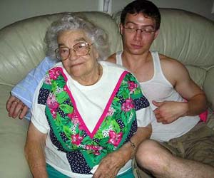
Crossposting these here, since I'd like to hear some thoughts because I'm biased because of the people. These are my grandparents, and I feel like my grandpa's personality comes across really well, but perhaps not my grandma's since she's got alzheimers (and she's at the stage where she's forgetting things, but still remembers that's she's got an illness and forgets everything, thus the sadness). 
|
|
|
|
nonanone posted:Crossposting these here, since I'd like to hear some thoughts because I'm biased because of the people. These are my grandparents, and I feel like my grandpa's personality comes across really well, but perhaps not my grandma's since she's got alzheimers (and she's at the stage where she's forgetting things, but still remembers that's she's got an illness and forgets everything, thus the sadness). They're very intimate and I appreciate you sharing them. The only thing I'd really comment on technically is the chair in the grandma shot. I feel like your grandpa is like "Still with this photography business?" haha
|
|
|
|
Thanks, intimacy is what I was shooting for (haha arrrgh pun). Chair was unfortunate side of effect of the moment, but I wanted to keep a specific balance that wouldn't let me crop in further. I might play around with that more. Also on B&W vs Color, I definitely don't think one is easier than the other; I think it's just easier to ignore bad tones on a B&W photo than it is on a color one. But textures and tones are so much more important if there's no color to distract from it.
|
|
|
|
They're both great for what they are. They just can't always turn out the way you wish they would.
|
|
|
|
I love the "when are you going to get a real job?" face your grandpa seems to be pulling.
|
|
|
|
What's your approach to doing a headshot on a model with completely black hair, against a somewhat dark background? Snoot aimed at her hair? Grid? Softbox?
|
|
|
|
Mathturbator posted:What's your approach to doing a headshot on a model with completely black hair, against a somewhat dark background? Snoot aimed at her hair? Grid? Softbox? Shoot her without a top on. That way, no one notices. I've pretty much based my whole portfolio on that principle.
|
|
|
|
Mathturbator posted:What's your approach to doing a headshot on a model with completely black hair, against a somewhat dark background? Snoot aimed at her hair? Grid? Softbox? Rim lights work rather well in this situation.
|
|
|
|
I was volunteered to shoot the photos at my son's daycare. I had a great time, and frankly liked my "outtakes" shots more than the "they posed correctly" shots. It helps that I didn't have to try to fix the backdrop issues in the "rejects." Outtakes30 by torgeaux, on Flickr  Outtakes29 by torgeaux, on Flickr  Outtakes1 by torgeaux, on Flickr  Outtakes15 by torgeaux, on Flickr
|
|
|
|
torgeaux posted:I had a great time, and frankly liked my "out takes" shots more than the "they posed correctly" shots. I feel like when trying to photograph children, its all about what you can get albeit through "proper" posed pictures or through the out takes. Most of the out takes end up looking better because it allows the kids personality to show through. There was a post in here a few pages back (cant remember who shot it) but it was a kid being lit very nicely and he was sticking his tongue out that worked so well.
|
|
|
|
Hi guys, haven't read through the entire thread(ack had to stop, I respect those trying to learn(as am I) but there are some serious eyesores  I'm starting to shoot a lot of young women. I have two studio lights; how can I best position them to make the most flattering effect. Generally we are going for glamour/sensuality. I'm starting to shoot a lot of young women. I have two studio lights; how can I best position them to make the most flattering effect. Generally we are going for glamour/sensuality. Also, would it be worthwhile putting a speedlite externally for flash fill? Also, are there any recommended lightroom presets specifically for this work? I was using aperture, very nice program, but got fed up with the raw processing and speed. I'll crosspost this on the processing thread. Kind regards, and thank you for any suggestions
|
|
|
|
jwvgoethe posted:Hi guys, haven't read through the entire thread(ack had to stop, I respect those trying to learn(as am I) but there are some serious eyesores I'm still learning as well, but I would suggest picking up The Speedliter's Handbook. I read through it, and it's got a ton of information and is really handy for starting out. It's got setup examples and the resulting images as well.
|
|
|
|
new year's photo resolution numero uno...more people pictures. here's an environmental portrait i just made for a singer/songwriter (and her band) from new orleans. it's a six light setup with most of it happening thru the doorways and the two main lights on an overhead rail.
|
|
|
|
gh0st posted:new year's photo resolution numero uno...more people pictures. If you've got six lights you could probably stand to put a bit more fill on her face. She's got some pretty hard edged shadows on it and you can't see her eyes very well.
|
|
|
|
I was invited to take pictures of a girl with body painting tonight in a old church. Anyone has references/tips/postures advice? It'll be my first time posing "nude", eep.
|
|
|
|
xenilk posted:I was invited to take pictures of a girl with body painting tonight in a old church. Anyone has references/tips/postures advice? It'll be my first time posing "nude", eep. well firstly don't make a big deal that it's nude. The body painting will really dictate the poses you want to do. Think about it in relation to the location. Is the body painting the central part of the image, or is it more of an accessory to the model.
|
|
|
|
Paragon8 posted:well firstly don't make a big deal that it's nude. The body painting will really dictate the poses you want to do. Think about it in relation to the location. Yeah I don't really mind having a nude model. It's the line between trashy/artsy that really stresses me. I'll try to act like she had clothes and go with non-sexual pictures.. see how that goes.
|
|
|
|
xenilk posted:Yeah I don't really mind having a nude model. It's the line between trashy/artsy that really stresses me. I'll try to act like she had clothes and go with non-sexual pictures.. see how that goes. I think it'll depend on her body type as well. I was watching America's Next Top Model (it's my vice, whatevs) where they did bodypainting and one girl was quite busty, and the way they were posing the girls, she kept sticking her chest out and it ended up looking really quite sexual, almost porn star-ish (I think they even said she looked like a porn star on that one). Whereas for the girls with less of a chest, it looked more artsy and fashiony. So it depends on the look you're going for, and what you want to emphasise, I think. I have never done body painting photography myself, so this is all what is in my head and probably not very useful, but that one episode is something that stuck out to me and figured I'd share. I hope you post them though, even if they are nudes, as I'm really interested in seeing what you come up with!
|
|
|
|
CarrotFlowers posted:I think it'll depend on her body type as well. I was watching America's Next Top Model (it's my vice, whatevs) where they did bodypainting and one girl was quite busty, and the way they were posing the girls, she kept sticking her chest out and it ended up looking really quite sexual, almost porn star-ish (I think they even said she looked like a porn star on that one). Whereas for the girls with less of a chest, it looked more artsy and fashiony. So it depends on the look you're going for, and what you want to emphasise, I think. I have never done body painting photography myself, so this is all what is in my head and probably not very useful, but that one episode is something that stuck out to me and figured I'd share. I'll post a few even if I end up screwing the shoot. I'll also experiment with my flash + wireless triggers... should be fun! P.S: I watch Australia's Next Top Model and I'm a guy ;-) I find the Australian version has way less drama and more details on the shoots which is always fun!
|
|
|
|
xenilk posted:I'll post a few even if I end up screwing the shoot. I'll also experiment with my flash + wireless triggers... should be fun! I'll have to see if I get that channel. I always fast forward through the drama poo poo and just watch the challenges/shoots. Good luck on the shoot! I'm sure you'll come out with some awesome stuff 
|
|
|
|
I had the most funnest everest fun ever ever shoot today. I have A LOT of poo poo to get through, but I will post some up here as soon as for your face enjoyment. EDIT: Here's a taster.  Gazmachine fucked around with this message at 01:48 on Jan 8, 2012 |
|
|
|
Gazmachine posted:I had the most funnest everest fun ever ever shoot today. I have A LOT of poo poo to get through, but I will post some up here as soon as for your face enjoyment. I am scared of what I see! Makes me think of the guy in pulp fiction.
|
|
|
|
Gazmachine posted:I had the most funnest everest fun ever ever shoot today. I have A LOT of poo poo to get through, but I will post some up here as soon as for your face enjoyment. Little bit old but I had a promo shoot with a independent production company recently, these guys are awesome and they make awesome stuff. The show these were for had some discussion of actor/character relationships, the huge negative space at the bottom was for poster text.  AGFYTYA Elliot by TimFPictures, on Flickr  AGFYTYA Isk by TimFPictures, on Flickr Bonus rehersal shot. 
|
|
|
|
XTimmy posted:Wanna visit that bar. What was the lighting setup with these? Did you move the lights between shots and use a given shot as the "base" image? Did you light the scene with nobody in it at first, then introduce the subjects to it, or did you leave the lights where they were? I want to do a massive composite at some point like this. Had an attempt at one with the Bakewell Boys (the lemon considering duo) but I didn't have the kit for it and it was spur of the moment. I will see if it works when I get around to putting it together. But yes, just wondering what your approach to it was.
|
|
|
|
Gazmachine posted:What was the lighting setup with these? Did you move the lights between shots and use a given shot as the "base" image? Did you light the scene with nobody in it at first, then introduce the subjects to it, or did you leave the lights where they were? I want to do a massive composite at some point like this. Had an attempt at one with the Bakewell Boys (the lemon considering duo) but I didn't have the kit for it and it was spur of the moment. I will see if it works when I get around to putting it together. The lighting set up is real simple, a gridded speedlight firing directly at the centre subject then a homemade beauty dish providing fill. Keep the lighting the same, take a slate ( a subject-less image) if you want, be really loving wary of where shadows fall. The main reason those work is that lighting is totally front on, so you don't get many shadows falling onto or from the 'ghosts'. The other way to deal with this is massive and expensive softboxes for shadowless lighting, or subject spaced wide apart. You can't see it in these, but when people are sitting on a couch the couch deforms (duh) leaving a ghostly edge between the sat on and un-sat-on couch the easiest way to deal with this is to liquefy the unsat on couch to match the sat on.
|
|
|
|
Mathturbator posted:What size softbox is perfect for headshots? Got a 22" and I kinda feel it's too small. Answer: All of them. Lighting isn't a one size fits all solution. It's like asking what lens to use for a landscape photo. The answer depends on your intentions. You can do beautiful headshots with almost any sized softbox or umbrella. If you're just after bog standard safe Sears-portrait lighting, just get a middle sized one, 45 degrees up and to one side, and you're good, but if you want to learn how to light, learn what different sizes and distances will do for the image. gh0st posted:new year's photo resolution numero uno...more people pictures. I like it for the most part, but I can't understand what type of real world situation would create lighting like this. It just kind of screams flash without any dynamic or engaging reason why.
|
|
|
|
gh0st posted:new year's photo resolution numero uno...more people pictures. I would love this if the middle guy weren't there. He throws it all off. The pose, the instrument's glare, and his lighting being flatter than the other models all bother me. Otherwise it's great.
|
|
|
|
|
| # ? May 17, 2024 14:12 |
|
Hey guys, shot for the first time today using my lighting, here are some photos of my friend, don't know how to upload the (large) full res other than dropbox links. No retouching has been done yet. http://dl.dropbox.com/u/33476113/mbest/IMG_6077.jpg http://dl.dropbox.com/u/33476113/mbest/IMG_6078.jpg http://dl.dropbox.com/u/33476113/mbest/IMG_6207.jpg http://dl.dropbox.com/u/33476113/mbest/IMG_6247.jpg e: criticism very welcome, I know the background is not ideal, but we went with what we had for the time. In the process of putting some kind of studio in my basement. jwvgoethe fucked around with this message at 01:20 on Jan 9, 2012 |
|
|


