


|
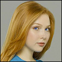
Gazmachine posted:Are these from a second shoot with this girl or the same shoot? They are better. I will critique at some point for you (although I'm sure someone will beat me to it). They're from the same shoot, I messed with the RAWs some though on many of them and then others were just in better light. These are from about two hours before the others you saw. We took 479 images in all.
|
 #
?
Jan 11, 2012 14:26
#
?
Jan 11, 2012 14:26
|
|

|

|
| # ? May 17, 2024 16:18 |
|
|
CB_Tube_Knight posted:I think these pictures are way better than the original ones. The first image strikes me because there's a shadow effectively cutting off a third of her face. The pose is awesome, but the shadow breaks me. img_1934 is awesome, but I have a fondness for portraits of people looking off into the distance. you could perhaps have cropped it a little tighter to her left and slightly down to bring her face more towards a third point. the colours are saturated better and much clearer to me. the last image has a strong change in her skin tone and doesn't seem to fit with the others. I do this too and it annoys me greatly when I go through a set and realise that the model's skintone has gradually gone from one cast to another altogether without my being aware of it till the very end. it also has shadows crossing her face which appears a bit of an eyesore for me. Overall though, the processing is much cleaner in these, so that's a definite improvement.
|
|
#
?
Jan 11, 2012 15:39
|
|


|
CB_Tube_Knight posted:Pictures Less headroom! I don't know why but it's a really common first mistake, half of my first films have actors scooting along the bottom of the screen. Also, buy/make a reflector, large slabs of ")
XTimmy fucked around with this message at 16:36 on Jan 11, 2012 |
|
#
?
Jan 11, 2012 16:34
|
|
|
I don't usually take portraits, but I like how this one came out. Granny by atomicthumbs, on Flickr
|
|
#
?
Jan 12, 2012 05:17
|
|

|
atomicthumbs posted:I don't usually take portraits, but I like how this one came out. I'm usually not a fan of split lighting, but this came out really well.
|
|
#
?
Jan 12, 2012 14:05
|
|

|
One last warm day before Chicago gets killed with snow. Had to shoot outside one last time! 
|
|
#
?
Jan 12, 2012 16:54
|
|
|
I really like the location in the first one, and love how the horizon and waterline are coming together at the right, but the model looks weird to me, like she's been composited in. She doesn't seem to be casting a shadow and her feet have weird lighting and look oversharpened. I'm pretty keen on your colour palette, though. The second one is pretty cool, although I can't decide whether I'd like it better with less sky or not. My only niggle is that her skin tone seems too purple. I like the dress and the whole dancing on the sand idea - do you have any other shots like the second with a more active pose?
|
|
#
?
Jan 12, 2012 17:17
|
|

|
it looks like you're overdoing the clarity slider a bit. they're good shots except the processing kills them for me.
|
|
#
?
Jan 12, 2012 17:27
|
|

|
big scary monsters posted:I really like the location in the first one, and love how the horizon and waterline are coming together at the right, but the model looks weird to me, like she's been composited in. She doesn't seem to be casting a shadow and her feet have weird lighting and look oversharpened. I'm pretty keen on your colour palette, though. Thanks for the input. For the record, which is my fault with the way it was composed because you can't really notice - she was jumping in the first pic (hence no shadow).
|
|
#
?
Jan 12, 2012 17:30
|
|
|
Paragon8 posted:it looks like you're overdoing the clarity slider a bit. they're good shots except the processing kills them for me. My exact thought... post-process needs to be toned down a by a notch. It's just too present for me.
|
|
#
?
Jan 12, 2012 17:52
|
|

|
sw1gger posted:One last warm day before Chicago gets killed with snow. Had to shoot outside one last time! These would make some great large prints. I like the processing, it's especially nice in the first photo.
|
|
#
?
Jan 12, 2012 17:59
|
|

|
xenilk posted:My exact thought... post-process needs to be toned down a by a notch. It's just too present for me. Also, Clarity is at -5, haoehoeheo
|
|
#
?
Jan 12, 2012 18:08
|
|
|
sw1gger, I'm not feeling a strong reason why her face is obscured in both of those photos. I'm assuming is was a conscious decision to go with that in both shots- can you share what you were going for?
|
|
#
?
Jan 12, 2012 18:40
|
|

|
McMadCow posted:sw1gger, I'm not feeling a strong reason why her face is obscured in both of those photos. I'm assuming is was a conscious decision to go with that in both shots- can you share what you were going for? Been looking at too much of Brooke Shaden's work, really. With the first one, I wanted to convey dramatic motion and felt hair over the face is a good way to achieve that. I'm still new to posing models, which I feel is certainly a weakness of mine. With the second one, I was competing with the sun and was having difficulty getting an exact focus on her face so I decided to have her do a similar motion to the first as backup. The backup turned out to be the one I used.
|
|
#
?
Jan 12, 2012 19:09
|
|
|
sw1gger posted:Been looking at too much of Brooke Shaden's work, really. With the first one, I wanted to convey dramatic motion and felt hair over the face is a good way to achieve that. I'm still new to posing models, which I feel is certainly a weakness of mine. you're certainly nailing brooke's style in terms of composition and subject but I would be more careful of your processing. Your blacks are extremely harsh and come out looking a bit HDR/clarity slid. Are you applying the same adjustments to the whole image - I'd suggest trying to break it down and adjust certain elements independently.
|
|
#
?
Jan 12, 2012 20:36
|
|
|
QPZIL posted:I'm usually not a fan of split lighting, but this came out really well. The split lighting is because of the fact that I own no lighting equipment and there's a large window on one side of her apartment 
|
|
#
?
Jan 12, 2012 22:48
|
|
|
Window light is the best light.
|
|
#
?
Jan 12, 2012 22:54
|
|

|
Here's some more from the shoot I had last Saturday. Jesus, that seems like yesterday. Protip: if you want a fully working mind, or at least one that can discern the difference between days, don't get yourself one of them baby things. Anyway, yes, this shoot was fun as hell. I got paid to have fun, shoot two dudes in masks, drink beer with them, then shoot some more in the park. Other jobs just don't measure up really, do they?     
|
|
#
?
Jan 12, 2012 23:26
|
|

|
Luchavdores?
|
|
#
?
Jan 12, 2012 23:28
|
|
|
McMadCow posted:Luchavdores? I love that. They're more old school Northeners, decent folk, but basically, yeah.
|
|
#
?
Jan 12, 2012 23:40
|
|
|
I think you're being a bit aggressive with some of your vignetting but otherwise I like. Fun theme.
|
|
#
?
Jan 13, 2012 01:12
|
|

|
Sorry for the late response, just wanted to say yeah. Once I learned what DNGs do I pretty much was able to fix the problem pictures very easily. I'm starting to think that late day, tree filtered light is my favorite.
|
|
#
?
Jan 13, 2012 04:29
|
|
|
I'm cross posting these because it seems like this thread is a bit more active than Photo a Day, but please let me know if I shouldn't post in both. Feel free to offer advice or critique, that's the point of this project! I just started a 365 project, with the aim of staying active, developing better previsualization, pushing my comfort zone, and refining my style. I'm keeping a notebook with sketches for any ideas I have, then I refine them and shoot them for each days photo. I tend to lean towards what I call a cinematic style, and a lot of shots in this project will be made towards developing that further. I want my shots to look like a singular frame from a movie basically. I don't know how better to explain that but I hope it comes through in the works (where appropriate). Day 1  Day 1 by David Childers, on Flickr Day 2 This was a drastically different style from my typical work, and I feel like it shows. I was going for an editorial look, like Wired or ESPN magazines. The arms are blown out because the lights were too close to me and the handlebars gave off a nasty shadow on my legs, but overall I learned a lot from trying out this kind of shot, but I'm eager to hear any tips or ideas to improve it.  Day 2 by David Childers, on Flickr Day 3  Day 3 by David Childers, on Flickr
|
|
#
?
Jan 13, 2012 08:46
|
|
|
These are really nice, well done, especially the last one. Much better than a lot of 365 projects I've seen so far.
|
|
#
?
Jan 13, 2012 09:03
|
|


|
RangerScum posted:I think you're being a bit aggressive with some of your vignetting but otherwise I like. Fun theme. Yeah, I feel like it's becoming a bit of a habit of mine which I probably need to stop. I think it's fine for the stone bench one but it looks a bit weird on the park bench one and it's a cop out on the one in the bar, because I like the unusualness of the pose but felt the background was too distracting. However, slapping a massive vignette on it is not the way forward. Bottom Liner posted:
I don't know if it's because you explained your intentions before I looked at it, but I feel like you've nailed your goal on the Day 1 photo - that really does look like a still from a music video. I like Day 3, too. Day 2 looks great up until the start of your forearms, where the lighting suffers (as you have said yourself) and it loses the glossy magazine look. The helmet lighting looks fantastic, though. I would have been tempted to dodge the highlights on the helmet more. How did you light this one? (Edit: Sorry, just seen your setup images on Flickr) I think lighting this would need some large softboxes fairly close at least for the arms and legs. If budget isn't an issue, something like two softboxes either side at arm level to light under the bars and remove the leg shadow and one fairly large octa (1m perhaps) situated centrally, pointing down for the head and face. Obviously that asks for a lot of lighting, so maybe it's not a brilliant option. You could feasibly do it with two softboxes instead with careful placement: both central, one above pointing down, one below pointing up, maybe? Gazmachine fucked around with this message at 10:43 on Jan 13, 2012 |
|
#
?
Jan 13, 2012 10:37
|
|
|
Bottom Liner posted:
You have a great friend. Looks like laying out in the cold for 15 mins paid out My fav of the set, definitively.
|
|
#
?
Jan 13, 2012 13:53
|
|
|
I like to do a lot of PP to create a certain mood for the pictures I take, not sure whether it is too much or not. The Demon's Wedding by CorneliusK, on Flickr The pics from the rest of the shoot can be found here Remo fucked around with this message at 14:17 on Jan 13, 2012 |
|
#
?
Jan 13, 2012 14:06
|
|

|
Remo posted:I like to do a lot of PP to create a certain mood for the pictures I take, not sure whether it is too much or not. I guess it works if the mood is "boy I sure am hungry for some blueberries." otherwise it looks pretty ridiculous. You also appear to have gone overboard with your dodging as well.
|
|
#
?
Jan 13, 2012 14:22
|
|
|
The bluish tone is intentional as I was attempting to follow the original artwork for the cosplay that I am shooting for. For the dodging and burning, I wanted the character to look like she is glowing against the background, to make it look more striking but yeah I may have overdone it.
|
|
#
?
Jan 13, 2012 14:53
|
|
|
Remo posted:The bluish tone is intentional as I was attempting to follow the original artwork for the cosplay that I am shooting for. For the dodging and burning, I wanted the character to look like she is glowing against the background, to make it look more striking but yeah I may have overdone it. I think you will get alot of hate here for the look you got going on. I understand the intent behind it and will ignore that portion. General critique based on the set of photos on G+, not just the one you posted here. I notice that you have not paid attention to how the dress blends into the environment in some of these photos. Photo 2 has the little dress extension on her right hand blending into the background a bit (maybe cause this is a pretty small image so detail is semi lost). It just catches me as a bit odd, maybe you need to do some more dodging and burning there? In photos 4, 6, 7, and 10, the dress is really blown out to make it look like it is glowing, but this causes it to look "incorrect". You loose alot of the texture, volume and shape of the dress when you do this. In 7 you can see the edges of the dress, where the really interesting texture etc right at the edge of the image, and then they are cut off. Also, in image 6 and 7 the positioning of the dress just looks really poor. The last thing is not really a nitpik with your photos, but rather what I often see in Cosplay photos and that is that you have reworked the skin into a totally smooth surface. I know that is the general style of these photos, see if you can maybe work without doing that? I guess the tldr is, if someone has an elaborate costume, remember that the costume is just as much the subject as the person.
|
|
#
?
Jan 13, 2012 17:40
|
|

|
Thanks Evilkikass for your helpful critique, especially on my errors with the costume. Its always these small things which trip me up, that I really need to work on.
|
|
#
?
Jan 13, 2012 18:12
|
|
|
If you can post the source material, perhaps we can help you come up with a better way to reproduce it.
|
|
#
?
Jan 13, 2012 18:31
|
|
|
What I was going to say, which is essentially a boiling down of what Evilkikass was saying, I don't think you've overdone the post: more that you've not done it carefully enough. If you're going to do a massive amount of pp (which I get is absolutely the point for anime stuff) you need to spend a long time carefully editing to get that extreme pp look. The level of PP in that pic would be fine if it were done carefully and well.
|
|
#
?
Jan 13, 2012 18:34
|
|
|
I totally agree with this. I will revisit these pics again when I have more time.
|
|
#
?
Jan 13, 2012 19:57
|
|
|
Bottom Liner posted:I'm cross posting these because it seems like this thread is a bit more active than Photo a Day, but please let me know if I shouldn't post in both. Feel free to offer advice or critique, that's the point of this project! I worry that you'll be creatively drained by day 100 though  That's a compliment to the photos you've already done, btw. That's a compliment to the photos you've already done, btw.
|
|
#
?
Jan 13, 2012 23:46
|
|

|
Gazmachine posted:"A TAAAAAAART!" I fuckin' love this one.
|
|
#
?
Jan 14, 2012 00:22
|
|
|
EDIT: This was a bit of rubbish idea.
Gazmachine fucked around with this message at 13:44 on Jan 14, 2012 |
|
#
?
Jan 14, 2012 02:33
|
|
|
Gazmachine posted:I know this isn't exactly desperately relevant, but I made this (in about 3 minutes using templates) in Windows Movie Maker Consider that you as a creator of copywriten works, illegally took another copyright owners audio and used it without permission or paying royalty. Especially if you think of it as a Gazmachine posted:"additional services" that can be provided to clients
|
|
#
?
Jan 14, 2012 03:07
|
|
|
Portrait of Devo's stage mask.
|
|
#
?
Jan 14, 2012 07:17
|
|
|

|
| # ? May 17, 2024 16:18 |
|
|
Evilkiksass posted:You bad. Yeah I know, you're dead right. I don't actually think of it as an additional service in this instance, and I'm not making money from it - it was more a dumb thing that I thought would be fun. But you're right and I should probably sort it out. Gazmachine fucked around with this message at 13:46 on Jan 14, 2012 |
|
#
?
Jan 14, 2012 12:33
|
|