


|
Bottom Liner posted:The first one is perfect. Awesome. It's a candidate for getting printed. Bottom Liner posted:
Day 7: Interesting color tinting, but the purply-red skin tones are getting a bit strong. I think I like it, even though it would be hypocritical of me to criticize someone's use of vignetting and color filters to make a photo look aged.  Good separation from the background, and still there's enough info to communicate the perspective of the road. The straight-on pose seems a bit forced, but I really have no idea how to critique portraits. Day 8: It brings out the "NOPE!" in me, but I'll tough it out. The light totally makes this. It makes me wonder whether this is something the hand from the Apple iPhone marketing photos does on its day off. One technical issue though -- the part of the snake behind the thumb seems a bit hard-edged for being that far out of the shallow depth of field. Did you do use any lens blur filters? Day 9: Maybe it's my monitor, but the contrast seems really crunchy. I'm not getting any detail up where you're saying the clouds should be. I'm also not getting a sense of depth. Everything is scrunched in mid field, there's no foreground or background. ("Day 7" has more depth.) Also, the trash cans aren't really doing it for me. Now despite me sounding all complainy, there's some really good potential between those trees and that light. Try some more shots in this area! With landscape shots, the location of the photographer is almost more important than the subject -- they are built around communicating space rather than an object. Experiment with shooting from different angles; position yourself so a subject or two comes into the foreground. (Temporarily move a trash can to the middle of the road?) The easiest way is to use leading lines along the ground from the bottom of the frame (say, if the road extended toward us.) Once that happens, that necessary "space" appears out of nowhere. --- Here's some more photo fiddling. With how much manipulation is going on, I'm not sure how well these work in a strict photography thread. And even though the compositions are new, the source images aren't. Some of the source photos were taken a month ago, others are around six years old. It's really easy to meander around with no goal, but I probably need to focus on a point for these things. "What am I trying to say?" is really difficult to answer given that these aren't done for commission work. The ground and trees are from here. The 'sky' is from the uncropped version of this Antelope Canyon photo. The structure is from after this house fell over. There's a couple more photos in there for texture. 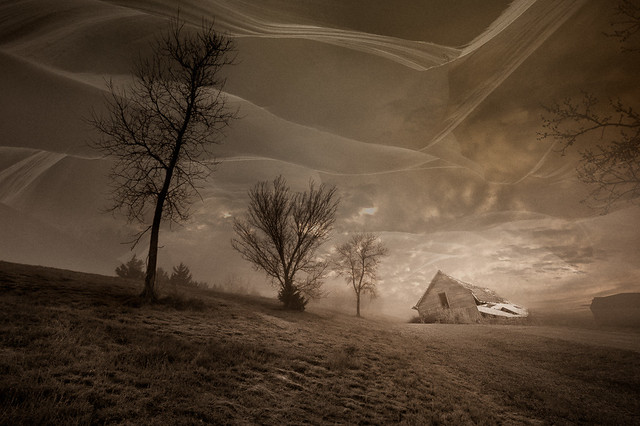 golden slumbers by jwallacephoto, on Flickr One of the source images. The sky is made of two cloud photos stacked up. The water is from a close up shot of this spring. 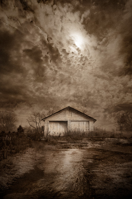 last place to look by jwallacephoto, on Flickr Not to lead you guys on, but I'll admit this one feels the most contrived of the three. Some 'landscaping' around the base of the mountain might help to break up that hard edge. (It's just sitting there! Yeah, I'm turbo lazy.) Anyway, the mountain is one of the walls of Antelope Canyon, but this is more an experiment of how many sky photos I can stack up. (Not sure, but I think there's five here.) 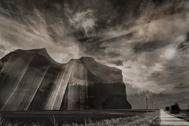 north of perry by jwallacephoto, on Flickr
|
 #
?
Jan 20, 2012 00:05
#
?
Jan 20, 2012 00:05
|
|


|

|
| # ? May 21, 2024 16:40 |
|
|
The 2nd one doesn't grab me at all. I think that without the obvious dreamy nature of the composites, (the 2nd is not obvious enough to me as a composite) the processing doesn't add much. The first and third though are really great and they are all definitely photography. This kind of layering and photo manipulation have been around as long as photography. I'm a big fan of the lines in the sky on the first one, suggesting winds and curves and shapes, and the bottom one is quite nice too, except I think the mountain could be even more prominent/larger like unreal-large. Just my personal 2-cents but I think you could really push the visual boundaries in terms of reality. It reminds me a lot of this one photographer that I cannot for the life of me remember her name who did a lot of similar works juxtaposing nature and the human body.
|
|
#
?
Jan 20, 2012 03:02
|
|


|
I'm starting to really like those, Quazi: you're almost getting me interested in landscape! What I think you should do next is composite elements from three very different images shot from a similar perspective / angle, so that they look more believable when composited, and make a really unusual fantasy scene. Nothing too 80s prog metal album cover, though - something like a skyscraper in the middle of a rural landscape surrounded by a river or something. I think if you spent a lot of time very carefully piecing it together so it doesn't look artificial, some urban buildings isolated within a breathtaking rural landscape could look really cool.
|
|
#
?
Jan 20, 2012 12:56
|
|

|
I like where you're going quazi! I have been wanting to try similar stuff ever since I stumbled on John Doogan and Darby Hudson. Darby Hudson is actually an illustrator but he uses parts of images and PS in a lot of his work. I have a magazine with a tutorial in it of the 1st image of a circus
Hotwax Residue fucked around with this message at 02:34 on Jan 21, 2012 |
|
#
?
Jan 21, 2012 02:31
|
|
|
miketh posted:I know this has been commented on quite a bit, but here's my input: I find these photos boring. The first photo is just some sunglasses on some ice, I kind of like the light coming through the lenses but there is not much interest there. I think if you wanted to show the texture of the ice you should have concentrated on that. The glasses distract and totally overwhelm what you said you where trying to show (the ice). Texture photos are pretty tough to pull off, usually lighting has a huge impact on them (like all photos I guess). The 2nd photo I think you already have pointed out the 2 main issue I see with the image, it was taken in broad daylight and the framing is off. The top right is distracting but so is how the water jets are positioned. I think if you want a shot of this fountain you should go back when it is darker out and try to include the whole thing instead of just a small corner of it. The 3rd photo is defiantly the strongest of the ones you posted. It looks like you maybe missed the focus a bit but that is pretty minor, I would probably not have centered the spider as much as you did but once again minor. I feel like this photo would have been more exciting if the light was a bit more interesting, it feels very flat which is nice for black/dark subjects but this also makes the image kind of boring. It would have been nice to be able to have a bit of light catching some of the web for example. ---- 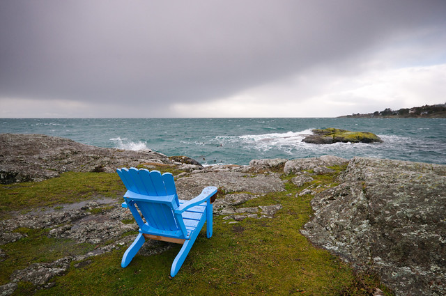
|
|
#
?
Jan 22, 2012 00:14
|
|


|
Dread Head posted:This is one of those shots that just have that "dslr" look. I can't explain it, it's just crisp, sharp, and a little too clean. It sounds counter-intuitive, but it makes it dull. The composition is fine enough, but I don't like the blob of a cloud taking up most of the sky, and the chair isn't interesting enough for my eye to fix on it. quazi posted:Anyway, the mountain is one of the walls of Antelope Canyon, but this is more an experiment of how many sky photos I can stack up. (Not sure, but I think there's five here.) You said it yourself, but this is way too busy. The first two have a subtler touch that works, especially the second. I like the first a lot because it took me a while to figure out the waves in the sky (are they cliff edges/mountain faces?) but it's a nice effect that draws you in. Here are the next three from me.  Day 10 by David Childers, on Flickr  Day 11 by David Childers, on Flickr  Day 12 by David Childers, on Flickr
|
|
#
?
Jan 22, 2012 08:42
|
|

|
So, I just got my T1i a couple days ago I have been messing around with it, waiting for my tripod, case, and new lens to come in. I build myself a small temporary light box and decided to see what I could do with the kit lens and manual focusing on Av mode. Be  IMG_0882.jpg by Dradien, on Flickr
|
|
#
?
Jan 23, 2012 17:53
|
|

|
Bottom Liner posted:
I like this a lot. The depth of field makes it look like a photo of a diorama - a little bit uncanny-valley, which is interesting to me, although I'm probably the only one who sees it that way (edit - proves how much I don't know yet - I jest found out about tilt/shift stuff). My dad's into scale models and I used to flick through his magazines and look at all the dioramas in them. The warmth and saturation of the lighting is something I like, as well as the blacks. I took a sneak at day 13 - so cute! Dradien posted:So, I just got my T1i a couple days ago I have been messing around with it, waiting for my tripod, case, and new lens to come in. The focus seems a little soft - not sure if it's the lens or the 1/4 second exposure that blurred it a little as you pressed the button. I'm assuming you had it resting on something and wasn't handheld? truncated aardvar fucked around with this message at 09:15 on Jan 24, 2012 |
|
#
?
Jan 23, 2012 18:22
|
|
|
Dradien posted:So, I just got my T1i a couple days ago I have been messing around with it, waiting for my tripod, case, and new lens to come in. Color balance is off (too warm), you need more light (and more even light, see that shadow in the back right corner?) and depth of field is too shallow. You could probably also do with a little more room on each edge, no need to have the photo chopped right at the edge of the product. I know you said you weren't "going for anything" but if it's a picture of a phone with no other context in a light box, I'm going to assume it's a product photo and it needs those things at the very least. The easiest way to make it look way better is give it a ton more light, or expose for more light. Use manual, not AV because the automatic exposure may make it rather grey, since the background should actually be white.
|
|
#
?
Jan 23, 2012 18:43
|
|
|
truncated aardvar posted:The focus seems a little soft - not sure if it's the lens or the 1/4 second exposure that blurred it a little as you pressed the button. I'm assuming you had it resting on something and wasn't handheld? I was kind of half resting my hand on a roll of tape, so it was kind of held, but I could have wiggled it, it's not entirely impossible. I can try it with a longer exposure, see how it is. nonanone posted:Color balance is off (too warm), you need more light (and more even light, see that shadow in the back right corner?) and depth of field is too shallow. You could probably also do with a little more room on each edge, no need to have the photo chopped right at the edge of the product. I know you said you weren't "going for anything" but if it's a picture of a phone with no other context in a light box, I'm going to assume it's a product photo and it needs those things at the very least. The easiest way to make it look way better is give it a ton more light, or expose for more light. Use manual, not AV because the automatic exposure may make it rather grey, since the background should actually be white. I tried to get rid of the shadow in the corner. No easy way (that I could find) in LR3. Thanks both of you for the comments, I'll try shooting more in manual mode, seeing what I can improve upon.
|
|
#
?
Jan 23, 2012 19:17
|
|
|
Fog rolled in this evening, so I met up with a friend to take some shots. This is my first attempt at shooting long exposures at night (well, and anything other than pets and the wife). I am happy with the results I got, especially this image in particular. Looking for some feedback on what direction to take this. Here is a version fairly raw.  IMG_2969-2.jpg by omgitsdave, on Flickr I did a bit of post on this, and I like the tighter crop, but I feel like a bit of the fog is lost.  IMG_2969.jpg by omgitsdave, on Flickr
|
|
#
?
Jan 24, 2012 06:39
|
|

|
I know you can't do this, but I would have preferred the photo without any headlight traffic. It would seem much "spookier" in my opinion.
|
|
#
?
Jan 25, 2012 03:30
|
|

|
omgitsdave posted:Fog rolled in this evening, so I met up with a friend to take some shots. This is my first attempt at shooting long exposures at night (well, and anything other than pets and the wife). I am happy with the results I got, especially this image in particular. Looking for some feedback on what direction to take this. Fog is pretty much the opposite of contrast, so by increasing the contrast, upping the blacks or sharpening in your post (I'm guessing this is what you did) you'll naturally lose some fog effect. Perhaps you could experiment by selectively masking off things like the street sign and the railings and increase their contrast whilst leaving the background fog as originally shot.
|
|
#
?
Jan 25, 2012 04:37
|
|
|
This is my first post here in a long time, but here goes..omgitsdave posted:Fog rolled in this evening, so I met up with a friend to take some shots. This is my first attempt at shooting long exposures at night (well, and anything other than pets and the wife). I am happy with the results I got, especially this image in particular. Looking for some feedback on what direction to take this. I feel that with fog, you should avoid the headlights, and go with some moon light, or just ambient light that is more white than what you have here. Try for the natural fog look where nothing is moving, maybe see if you can lose part of the image in fog. I think the moving lights would look better crisper. I also think with night time long exposures location is really key, you need space to work. I only say this because this was the exact thought process I had while taking these the other night. -- 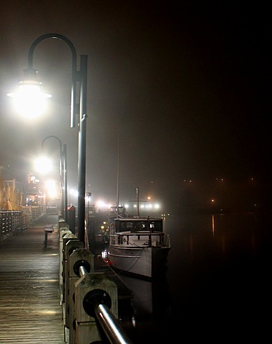 boat by bandaid14, on Flickr This one was taken with a folded up, one broken leg, tripod leaned up against that railing at a 30 degree angle. Widest the kit lens will go. Cropped and rotated in post to get what I wanted to get. Not sure I like the rounding of the lights because of the long exposures but not sure what to do about that besides making a grainy mess with all the fog. 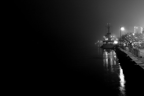 foggy by bandaid14, on Flickr I don't have too much to say about this one. I kept a color version that should be linked on the Flickr, but it looked too warm for what I was going for. Like I said, I haven't been here for a while, and forgot a lot of the technical stuff from when I was first getting into photography. Most of my pictures are night time half baked long exposures that give me a chance to get out of the house when not sleeping. Lay it on me, be tough, I want to get back into this. bandaid fucked around with this message at 06:13 on Jan 25, 2012 |
|
#
?
Jan 25, 2012 06:10
|
|

|
bandaid posted:
|
|
#
?
Jan 25, 2012 07:21
|
|
|
I like it and give zero fucks about the negative space except for the fact that the edge between the content and the negative space is too harsh -- I think there should be a smoother transition, especially if the photo is going to have that proportion. That harsh transition makes me feel like its "blank" space instead of negative space.
|
|
#
?
Jan 25, 2012 08:03
|
|
|
Thanks. I agree your both right about that. I went to town on the brightness/contrast sliders, so I should be able to get a better gradient.
|
|
#
?
Jan 25, 2012 08:32
|
|
|
Bottom Liner posted:
The light is a little hot on the top of the forward foot, but I like this a lot.
|
|
#
?
Jan 25, 2012 20:56
|
|

|
the posted:I know you can't do this, but I would have preferred the photo without any headlight traffic. It would seem much "spookier" in my opinion. bandaid posted:This is my first post here in a long time, but here goes.. My intent was to capture this without the headlights. This road is not very busy so I didn't expect difficulty, but a single car rode by multiple times and ruined it for me. They also called the cops (  ), who stopped by to check us out, which wasted a lot of the time we had. Also, the lights are not as crisp in this shot because 2 cars actually came down the hill during my 30 second exposure. I do have another shot with crisper headlights, but they start about halfway down the hill and there was less visible fog. ), who stopped by to check us out, which wasted a lot of the time we had. Also, the lights are not as crisp in this shot because 2 cars actually came down the hill during my 30 second exposure. I do have another shot with crisper headlights, but they start about halfway down the hill and there was less visible fog.truncated aardvar posted:I prefer the second one for it's contrast, but I'm not a fan of the big black area in the top left. Hard to say what you could do about that area though. I do like the darkening in the bottom right corner. I see what you mean about the top left. As far as the editing, you are pretty much on the money. I corrected the white balance, bumped up the blacks, and used just a bit of highlight recovery. I will give it a run with your suggestions. Thanks all.
|
|
#
?
Jan 26, 2012 00:03
|
|
|
If you're using bulb mode, you can just cover up the lens with a piece of cardboard and wait for the car to pass before continuing your exposure.
|
|
#
?
Jan 26, 2012 00:42
|
|

|
quazi posted:bandaid posted:The negative space in the second one is fine and it seems to be emphasizing the inky darkness of the night and open water, but it just seems too dark and too completely featureless. Like you were holding your hand over the left 2/3 of the frame when you took the picture. Something in me just really wants to see something out there, no matter how small or trivial; reflection off a ripple in the water, a distant boat light, or even just some more dim foggy, haze. Just something. � Intermission � Here are a couple recent photos that I want some critique on, particularly the processing. It seems to be a direction I've been unconsciously going in lately with my photos and I'm really fighting myself as to whether I like it or hate it. I'd love a second and unbiased opinion. Does it look bad? Fake? Gimmicky? Good?  
|
|
#
?
Jan 26, 2012 01:11
|
|

|
Dude, you could publish a tabletop book of your animal pictures. They are incredible. There is no content in this post because these are so good it's well beyond my ability to critque them.
|
|
#
?
Jan 26, 2012 01:21
|
|

|
Agreed. But I do think the Tiger looks like CGI. Maybe it's just my eyes though. I've been staring at a screen all day. I loving hate public accounting
|
|
#
?
Jan 26, 2012 01:57
|
|
|
William T. Hornaday posted:Here are a couple recent photos that I want some critique on, particularly the processing. It seems to be a direction I've been unconsciously going in lately with my photos and I'm really fighting myself as to whether I like it or hate it. I'd love a second and unbiased opinion. Does it look bad? Fake? Gimmicky? Good? I like them, although I can see them being mistaken for paintings. They remind me of formal painted portraits actually, which gives the subjects a certain air of nobility.
|
|
#
?
Jan 26, 2012 07:36
|
|
|
They're good. The way the lighting is reminds me of the dioramas you see at science/history museums. Whether they're gimmicky or not I couldn't quite say. I was browsing through Nat Geo's stock photos and I saw one of some primate that reminded me of yours, but less contrast heavy. I don't see wildlife like this often but I don't search for it either. If you're worried about it you can always change your technique in increments instead of scrapping the style.
|
|
#
?
Jan 26, 2012 09:16
|
|

|
William T. Hornaday posted:Here are a couple recent photos that I want some critique on, particularly the processing. It seems to be a direction I've been unconsciously going in lately with my photos and I'm really fighting myself as to whether I like it or hate it. I'd love a second and unbiased opinion. Does it look bad? Fake? Gimmicky? Good? I honestly can't decide whether I like them or not. I don't necessarily see anything wrong with the processing, but I wonder how exciting they would be if you just relied on your composition. I think that's the problem I have. I'd like to see you do a safari and come back with nicely processed animal stuff with more exciting backgrounds and a bit of action from the animals themselves. Whilst I love a tiger and I think they are utterly beautiful, it is just kinda sat there. I know you want comments on the processing, but it's the processing that makes me think of the composition, in that it's such a dramatic look for such an inactive animal. I feel like you've possibly pushed the lights and highlights too far with your dodging. For my tastes, at least. I'd quite like to see a more painterly look for these. Could be nice. I feel like the processing doesn't look right for the baboon in that photo. I think it's an interesting pp style, but I don't think it fits a photo with that background. It needs more drama to work. That all might be a load of horseshit so take it with a pinch of salt, but it's an accurate description of my first impressions of the shots.
|
|
#
?
Jan 26, 2012 14:04
|
|
|
Bottom Liner posted:
They all seem to have a sense of a narrative, even though they don't feel like they're in the same universe together (in a storytelling sense). I like the transparency of the feet in Day 11. It makes me think that the subject of Day 10 could be slightly transparent, to connect the two. To further the thematic connection, try rotating Day 10 as a vertical. (The waves are great. You could have easily shot this with flat water; glad you didn't!) Not sure where to go with Day 12. It seems a bit straightforward and grounded in comparison. There's no sense of weightlessness which the other two images have. If anything, the noise reduction in 12 is a bit too smooth. It could use a little more grain. William T. Hornaday posted:Here are a couple recent photos that I want some critique on, particularly the processing. It seems to be a direction I've been unconsciously going in lately with my photos and I'm really fighting myself as to whether I like it or hate it. I'd love a second and unbiased opinion. Does it look bad? Fake? Gimmicky? Good? The processing might work better on images with more action.
|
|
#
?
Jan 26, 2012 17:14
|
|
|
quazi posted:I like the transparency of the feet in Day 11. It makes me think that the subject of Day 10 could be slightly transparent, to connect the two. Oh poo poo David, please tell me you shot a shot of this without you in the water, so you can clone it in underneath yourself and then make yourself semi transparent in the water, because that would be rad.
|
|
#
?
Jan 26, 2012 17:28
|
|
|
Gazmachine posted:Oh poo poo David, please tell me you shot a shot of this without you in the water, so you can clone it in underneath yourself and then make yourself semi transparent in the water, because that would be rad. drat, that's a good idea.
|
|
#
?
Jan 26, 2012 19:25
|
|
|
Bottom Liner posted:drat, that's a good idea. You'll need still water, though, if you're going to reshoot. I think. Who knows? I've never done it before.
|
|
#
?
Jan 27, 2012 02:24
|
|
|
William T. Hornaday posted:Here are a couple recent photos that I want some critique on, particularly the processing. It seems to be a direction I've been unconsciously going in lately with my photos and I'm really fighting myself as to whether I like it or hate it. I'd love a second and unbiased opinion. Does it look bad? Fake? Gimmicky? Good? The processing is obviously quite heavy on these, but I don't think it's a bad thing. I want to see the dramatic, almost posed look like you have with these. It separates them from the rest of the crowd and makes me wonder how the hell you got animals to pose for you like that (if I didn't know they were taken in a zoo, I wouldn't assume it). I love the tiger shot. The light and the pose really make it work for me. It's like a portrait, almost like you set up lights and asked him to pose a certain way. You don't see that a lot with animal photos. Yes, the processing is heavy, but I don't think it hurts the images at all. It gives your photos a distinctive, unique look and I like that. I like being able to scroll through SAD (obviously not snapshots, btw) and be able to pick our yours without looking at the username.
|
|
#
?
Jan 27, 2012 05:44
|
|

|
Yeah, how the hell are you lighting those or getting that lighting from the ambient? EDIT; To expand on my thoughts of them, I agree with the sentiment that they look almost artificial, like museum models. They're just so clean, I don't know if it hurts or helps more. I feel like wild exotic animals shouldn't look so pretty, they lose some of that feral nature about them. quazi posted:I like the transparency of the feet in Day 11. It makes me think that the subject of Day 10 could be slightly transparent, to connect the two. To further the thematic connection, try rotating Day 10 as a vertical. (The waves are great. You could have easily shot this with flat water; glad you didn't!) Not sure where to go with Day 12. It seems a bit straightforward and grounded in comparison. There's no sense of weightlessness which the other two images have. If anything, the noise reduction in 12 is a bit too smooth. It could use a little more grain. Thanks for the ideas. I agree, 10 and 11 definitely connect, though I didn't think about that until a few days afterwards. I'm already starting to see some trends (just finished day 17) and I'm eager to see the end and how themes develop further. Day 15 A landscape. I'm terrible at this.  Day 15 by David Childers, on Flickr Day 16 A luthier.  Day 16 by David Childers, on Flickr Day 17 My grandmother.  Day 17 by David Childers, on Flickr Bottom Liner fucked around with this message at 06:44 on Jan 27, 2012 |
|
#
?
Jan 27, 2012 05:51
|
|
|
A lot of good comments. A bunch I agree with, a few that I kinda don't, and a couple I'm still trying to wrap my head around. I think there's a lot more practice and fine-tuning that I need to do with this particular style of post before I'm happy with it. I think I may ultimately try to pull reign it back in a bit and see what it looks like. I guess I'm trying to keep a relatively believably 'natural' look with almost a studio lighting kind of feel to it, and to not cross the very fine line into over-proccessing where people just look at it and wonder what the hell I was thinking and why I would garishly ruin an otherwise good photo. Sometimes I'm successful, a lot of times I'm probably not. The diorama comments struck me as slightly disturbing, as the look of taxidermy is something I'd kind of like to avoid; but they actually hit a lot closer to the mark of what I'm going for than I initially realized when I read them. Generally, I like creating these portraits where the subjects sometimes seem almost surreally still and pensive. A lot of it is due to my educational and professional background, but I'm really, really attached to the idea that an animal doesn't have to be doing anything particularly interesting or remotely active in order to be incredibly fascinating. I guess I just really never developed much of an interest, photographically or otherwise, in animals doing things that most people would find exciting. It's my style, I suppose. Bottom Liner posted:Yeah, how the hell are you lighting those or getting that lighting from the ambient?
|
|
#
?
Jan 27, 2012 06:51
|
|
|
You may have done this already somewhere else, but could you post a before and after shot? It might help with opinions regarding the post processing.
|
|
#
?
Jan 27, 2012 07:17
|
|

|
Saint Fu posted:You may have done this already somewhere else, but could you post a before and after shot? It might help with opinions regarding the post processing. They definitely look ridiculous compared side-by-side, but I always remind myself that nobody (except the fine people of the Dorkroom) ever sees the originals. Straight Out Of The Camera >>> Lightroom Edits >>> Photoshop Edits       And for good measure, another one that I've felt conflicted about.   
|
|
#
?
Jan 27, 2012 14:37
|
|
|
William T. Hornaday posted:They definitely look ridiculous compared side-by-side, but I always remind myself that nobody (except the fine people of the Dorkroom) ever sees the originals. ")
|
|
#
?
Jan 27, 2012 15:53
|
|
|
I think the post is quite good. You're taking average, sort of meh pictures of animals and turning them into some of the most talked about photos in the dork room. The fact that they look studio lit makes them look fake (who can get a tiger to pose for a studio production?) and I think that's what makes them remarkable. Additionally, when they come in groups or when I consider the many many shots with similar post you've produced over the last year or whatever, I think they all go together really well and that adds to the awesomeness of the whole thing. I've heard it said a half dozen times but all of your shots together in a photo book would be spectacular. e:  _MG_0181 by spf3million, on Flickr spf3million fucked around with this message at 17:41 on Jan 27, 2012 |
|
#
?
Jan 27, 2012 16:00
|
|
|
William T. Hornaday posted:While the processing is quite good, I don't think this one is up to snuff. Usually your animal photos function very well as portraits, but I just don't feel any personality in or connection to the subject here. The tiger one kicks all sorts of rear end. I wouldn't change a thing. Also, thanks for the step-by-step shots, they're really insightful. burzum karaoke fucked around with this message at 19:38 on Jan 27, 2012 |
|
#
?
Jan 27, 2012 19:35
|
|

|
aliencowboy posted:While the processing is quite good, I don't think this one is up to snuff. Usually your animal photos function very well as portraits, but I just don't feel any personality in or connection to the subject here. Yeah, I agree that the baboon one is a little weak, but I thought it was a good example of the post-processing that I was having issues with.
|
|
#
?
Jan 27, 2012 19:52
|
|
|

|
| # ? May 21, 2024 16:40 |
|
|
William T. Hornaday posted:It's been said many times before, but the tiger one is just...striking. I think you really capture the "majestic" feel about them. Looking to clean for a wild animal or to "staged" is obviously a personal feel. I just felt awe while looking at that. Such a nice capture Now, last time I posted here was with a picture that was not color corrected, kind of crappy with a nasty shadow on it, too narrow focus, etc etc. My wife and I went out shooting today on the route we walk every morning. Nothing too exciting, but we pass this farm quite often and I figured it would make a nice picture. So...what are your thoughts?  IMG_1164.jpg by Dradien, on Flickr Dradien fucked around with this message at 07:22 on Jan 29, 2012 |
|
#
?
Jan 29, 2012 07:20
|
|