|
Paragon8 posted:are you exporting to sRGB? Chrome has appalling colour management so it shits itself at any other profile than sRGB. 
|
|
|
|

|
| # ? May 31, 2024 02:24 |
|
xzzy posted:Not necessarily, every single program can implement color in a completely unique way if it so chooses! http://hubblesite.org/gallery/behind_the_pictures/
|
|
|
|
tijag posted:Everything I do in Lightroom looks substantially different when I look at it in Chrome later. 
|
|
|
|
I tried experienting with other colour profiles(using adobe in camera instead of sRGB) a while back and nothing worked properly. I'm back at sRGB which appears to be the only one not broken in various browsers. Lightroom also used a different colour profile, in some cases when I worked with high bit depth images. That also turned out bad, so forcing sRGB was necessary. goattrails fucked around with this message at 08:23 on Jan 27, 2012 |
|
|
|
Which OS are you guys on that are noticing the large difference?
|
|
|
|
I'm using macs primarily.
|
|
|
|
I'm using a Macbook Pro as well
|
|
|
|
My last few from LR to Flickr exports from my Mac seemed to come out ok. Shot in 14 bit RAW. I'll have to review more tomorrow I'm on my PC now and what I have on Flickr seems ok in Chrome.
|
|
|
|
Instrumedley posted:Guide on washed out effect JaundiceDave posted:Split toning in lightroom is laughably easy, if a bit dumbed down from photoshop, but it fits to a tee lightroom's goal of being able to do 90% of post without having to open op photoshop. To get that look - that's not a film look btw - you should have the highlights set to a light green, and the shadows set to a dark purple. Adjust saturation and balance to taste. Thank you both for the help, I've been playing around in lightroom heaps to get this. I've nailed the washed out feel. The split toning is easy to learn but hard to master, greens and yellows for highlights and purples and blues for shadows seem to work best but getting the exact tone is hard, it also seems to be different for every photo, or maybe I'm just bad at this.
|
|
|
|
I find that getting a consistent tone from one photo to the next is the most difficult part of split toning. Unless the photos share a similar lighting, I mean.
|
|
|
|
I'm on Windows 7. I'm just wondering how these photos look to my clients.
|
|
|
|
Medpak posted:Which OS are you guys on that are noticing the large difference? Win 7 here. The largest difference between lightroom/web browser is how much darker the pictures are when I export them.
|
|
|
|
tijag posted:Win 7 here. This is always a problem for me. Edit: on osx 10.6.8 fwiw
|
|
|
|
My pics look exactly the same on both desktops in LR 2, 3, and beta 4. I'm lucky I guess?
|
|
|
|
Bottom Liner posted:My pics look exactly the same on both desktops in LR 2, 3, and beta 4. I'm lucky I guess? Did you hit the button to "update process"?
|
|
|
|
I mean I never had that issue in any of the 3 versions with any pics. I generally don't move catalogs from version to version.
|
|
|
|
Like an idiot, I set Lightroom 4 to import the RAW files to My Pictures folder leaving about 10GB of storage left on my main hard drive. I need to relocate these files to my storage drive. The only problem is, if I move the RAW files out of the designated folder, Lightroom will say "File Not Found". Is there a way to move the RAW files out of the C:/ drive and still keep all the adjustments that I've made?
Bioshuffle fucked around with this message at 10:33 on Feb 5, 2012 |
|
|
|
So my LR 2 export dialogue has decided it only wants to show the desktop and my user folder as viable locations to export to. They're the only two places listed, this makes it hard to export to the external that I've been exporting to for several years. Anyone encountered this issue before?
|
|
|
|
Bioshuffle posted:Like an idiot, I set Lightroom 4 to import the RAW files to My Pictures folder leaving about 10GB of storage left on my main hard drive. I need to relocate these files to my storage drive. The only problem is, if I move the RAW files out of the designated folder, Lightroom will say "File Not Found". Is there a way to move the RAW files out of the C:/ drive and still keep all the adjustments that I've made?
|
|
|
|
I've moved them outside, and then gone to the collection in LR and repointed it at them and things updated magically. I'm not sure where the 'darker' picture exports are coming from for you guys. Multiple browsers across a Mac/PC at my house and all the browsers produce the same results. Maybe your color calibration is off or even your monitor is acting odd in LR or PS?
|
|
|
|
I have a question about if something is possible. I have a photo of a blouse that I'd like to alter to use as a listing. Other post-processing advice is always welcome, I really know very little about altering photos at all. Basically, I have this image:  And I'd like to replace the blouse with this pattern:  Is it possible to do so without making the whole thing look incredibly obviously photoshopped? I know a lot of stores use the same image and just adjust the pattern/color, but I don't know if it's possible starting with a graphic print and replacing it with another. I'm not even sure how to frame my question correctly, sorry! I looked around a bunch and this seemed like the best place to ask this, any advice? I'd rather not have to make an individual shirt for every pattern available.
|
|
|
|
Gonktastic posted:
You could do it if you were wanting to put that fabric pattern on a solid, but trying to put it on another pattern is going to be insanely difficult. If you had to do it, I'd make a new layer over the existing shirt, and with white and black brushes I'd try to replicate the shading of the dress wrinkles. Then I'd lay the new pattern over top, use liquify to distort it around the volume of her torso, use the magic lasso and masking (or the pen tool) to mask the new pattern to the right shape, then use that black and white wrinkle layer overlayed on soft light or overlay to get it to look like fabric. I'd follow with some dodge and burning to further get it to look like it's draped on her figure. And finally a split tone layer to try to match the lighting color. So yeah, a lot of work.
|
|
|
|
poopinmymouth posted:You could do it if you were wanting to put that fabric pattern on a solid, but trying to put it on another pattern is going to be insanely difficult.
|
|
|
|
Yeah it will be a lot less trouble that way. The way big e-stores switch out colors and patterns is with rendering programs, which makes it much easier.
|
|
|
|
I had a moment so I figured I'd show you what I meant. Obviously if this was commercial I'd have been tighter with details on the shading, but this gives you the general workflow idea.  
|
|
|
|
Of course, the guy who textures video game characters and 3D models professionally makes it look easy.
|
|
|
|
Hahaha, loving bravo. I hate doing anything like that, but I let out a loud chuckle watching it look so easy.
|
|
|
|
You can probably also use the warp grid in PS to wrap the contours a little too, negate some of the straight-line-across-chest look that this sort of job tends to have.
|
|
|
|
What's the opinion on Aperture versus Lightroom? Specifically for working on scanned negatives. But other general management and basic duties also. I have some Adobe product experience from earlier and I'll probably try the Lightroom beta anyway but I'll be picking up a new Mac at the end of the month and I'm not willing to rule out Aperture, especially as cheap as it is.
|
|
|
|
Laser Cow posted:What's the opinion on Aperture versus Lightroom? Specifically for working on scanned negatives. But other general management and basic duties also. The consensus is they both work well and whichever you feel more comfortable with is the right one.
|
|
|
|
Laser Cow posted:What's the opinion on Aperture versus Lightroom? Specifically for working on scanned negatives. But other general management and basic duties also. Try lightroom, the beta of 4 is even better, and now supports light video editing too. If you have access to the student version, lightroom isn't that much more expensive than aperture.
|
|
|
|
Yeah, they both have betas so just pick whichever you prefer. That said, I think the majority of us in here use Lightroom for one reason or another. It worked great with my scanned negatives, though I can't imagine Aperture would have done any worse.
|
|
|
|
lightroom is better in pretty much any way except user interface. try both (i think there's a free trial for both) and unless you find yourself really loving aperture or hating lightroom, go with lightroom.
|
|
|
|
The monolithic library is one reason I use LR3 instead of aperture even though I'm on a Mac more often than not. Also, I know how it works.
|
|
|
|
Is Photoshop available at a student price? I can only find it for Lightroom. I swore I saw PS for like $200 for students. Oh, I just stumbled on CS5 extended. CarrotFlowers fucked around with this message at 03:49 on Feb 14, 2012 |
|
|
|
Yeah, see if you can't find an old (old-ish) version maybe. I still contend that for like 99% of my daily needs I could probably get by with Photoshop 7 If it wasn't PPC only, I mean.
|
|
|
|
I have PS3 on CD/1.4MB floppies if you need it, original packaging with manuals and warranty cards and everything.
|
|
|
|
|
Can I get some critiques on the way I processed this image (or just critiques in general really)? I can't decide if I like the effect I got here or if I went a bit overboard with the split toning. I've read Understanding Exposure a few times, which book should I tackle next? Instead of playing around with the slider randomly, I'd love to know what I was actually doing. Please feel free to download the image and process it yourself to illustrate a point. I'll even post the RAW if that helps.  Processed  The original crop
|
|
|
|
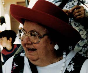
Bioshuffle posted:Can I get some critiques on the way I processed this image (or just critiques in general really)? I can't decide if I like the effect I got here or if I went a bit overboard with the split toning. I've read Understanding Exposure a few times, which book should I tackle next? Instead of playing around with the slider randomly, I'd love to know what I was actually doing. Please feel free to download the image and process it yourself to illustrate a point. I'll even post the RAW if that helps. I'm not a big fan over the strong green/cyan cross processed look (but plenty of people are), but if you're kind of going for a more vintage/film look, I like going this way with it:  It's a bit of a cliche look maybe, but I like it. That said, I mostly do black and white so I'm maybe not the best person to advise you. EDIT: Or maybe that's not what you were going for? You'll probably get better help if you explain what you were trying to do. eggsovereasy fucked around with this message at 22:35 on Feb 14, 2012 |
|
|
|
|
| # ? May 31, 2024 02:24 |
|
Your edit actually looks too grey to me. Though I guess it could be because you were editing a jpeg? It makes the subject look like a ghost, while the background keeps more of its contrast.
|
|
|


