


|
 IMG_8325 by avoyer, on Flickr I thought that was a fun portrait for adult siblings
|
 #
?
Feb 12, 2012 00:26
#
?
Feb 12, 2012 00:26
|
|


|

|
| # ? May 17, 2024 16:46 |
|
|
The guy in the rear is terribly distracting!
|
|
#
?
Feb 12, 2012 04:13
|
|

|
Niagalack posted:The guy in the rear is terribly distracting! I thought it was cute, she's the one with the strong character. It's the "story" I was telling to tell since it was a paid assignment family photo stuff ") Here's another one:  IMG_8524 by avoyer, on Flickr
|
|
#
?
Feb 12, 2012 04:43
|
|
|
Really loving the 24mm FOV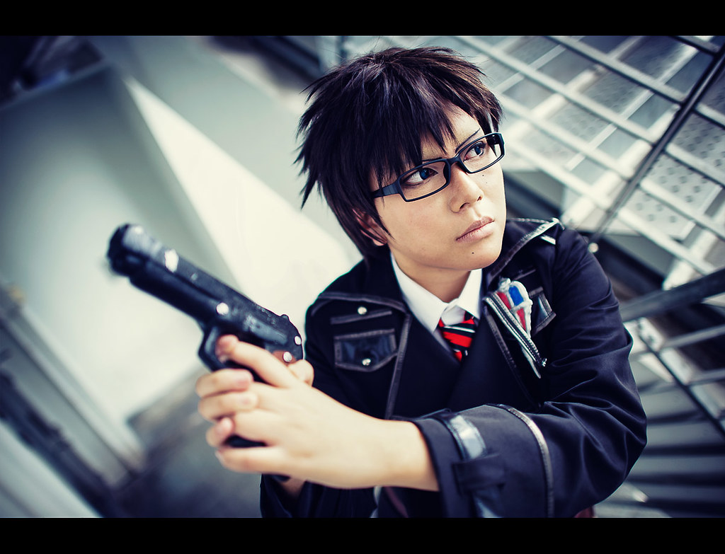 Ao no Exorcist: Yukio Okumura by CorneliusK, on Flickr
|
|
#
?
Feb 12, 2012 04:46
|
|

|
xenilk posted:I thought it was cute, she's the one with the strong character. It's the "story" I was telling to tell since it was a paid assignment family photo stuff I prefer the first one - this one has a feel of homeless couple on the streets to me, mainly because the guy looks kinda sad. First one is really nice and a bit different. I wouldn't say he's distracting, because it's obvious you placed him there on purpose, like a band shoot where the rest of the band is behind the frontman. Remo posted:Really loving the 24mm FOV The background make me think of Resident Evil. I like how abstracted it is. Is it a stairwell or something?
|
|
#
?
Feb 12, 2012 11:29
|
|

|
thetzar posted:A couple more new ones from me; a co-worker who's leaving the company shortly. Really love both of these. The tones and color on the first one are particularly pleasing. I love how light and airy it feels while still defining the planes of his face.
|
|
#
?
Feb 12, 2012 14:38
|
|

|
Remo posted:A couple of cosplay shots which I took recently. I'm not into cosplay at all, but these are pretty well done!
|
|
#
?
Feb 12, 2012 15:28
|
|
|
Thanks Pompous Rhombus! Gazmachine - yes, this was shot in a stairwell.
|
|
#
?
Feb 12, 2012 17:14
|
|
|
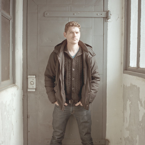
I made a really big light box kinda thing at work. Allan by Tom Rintjema, on Flickr
|
|
#
?
Feb 12, 2012 17:19
|
|
|
TomR posted:I made a really big light box kinda thing at work. His expression actually looks like he's thinking "yep, thats a really big lightbox"
|
|
#
?
Feb 12, 2012 17:42
|
|
|
I guess I just did not understand the concept !
|
|
#
?
Feb 12, 2012 17:43
|
|
|
boudoir  
|
|
#
?
Feb 12, 2012 22:56
|
|
|
poopinmymouth posted:Really love both of these. The tones and color on the first one are particularly pleasing. I love how light and airy it feels while still defining the planes of his face. Thanks! Remo posted:Really loving the 24mm FOV I'm really enjoying the color tones here.
|
|
#
?
Feb 12, 2012 23:09
|
|

|
sw1gger posted:boudoir Really like the set up and ides of the images. Especially the lying one. I would caution the use of the black and white you're doing, it seems to be pretty low contrast and makes the shadows a bit ruddy on her legs especially in the balloon picture. I think if you went with a more blacks are black and whites are white style of bw they might come out much stronger.
|
|
#
?
Feb 12, 2012 23:12
|
|

|
Serious question for those doing 'budoir' shoots: Are the people in these paying clients, are you shooting for publication, or is it just personal work? If the latter, are you working with professional models, friends, or just shooting with models looking to pad their portfolios?
|
|
#
?
Feb 13, 2012 00:51
|
|

|
Reichstag posted:Serious question for those doing 'budoir' shoots: Are the people in these paying clients, are you shooting for publication, or is it just personal work? If the latter, are you working with professional models, friends, or just shooting with models looking to pad their portfolios? For me, it's almost always paid clients. I don't think I've ever done a "boudoir" style shoot as a favor or for personal work. Most of the time it's a girl looking to get photos done for her boyfriend/fiance/husband/whatever. Others just want to feel good about themselves and have fun with cool photos. Sometimes they're aspiring models looking to pad their portfolio. A bit of everything, really (though I have yet to be published).
|
|
#
?
Feb 13, 2012 01:06
|
|
|
Did a little mini session this afternoon. Trying to get away from the super friendly vibe, and I wanted a really contrasty look for these. I have heard short lighting is apparently more flattering, especially for females, but I liked these ones better. IMG_0091 by Breanne Unger, on Flickr  IMG_0113 by Breanne Unger, on Flickr  IMG_0118 by Breanne Unger, on Flickr
|
|
#
?
Feb 13, 2012 04:31
|
|

|
^^^^^^^^^^^^ I like that you're trying new stuff, very neat The 3rd picture is my fav, looks very raw (no pun intended) and nice connection with the model. ... ...
|
|
#
?
Feb 13, 2012 04:36
|
|
|
Everyone's throwing out some really nice work right now - good stuff! Starting the first of a series of ports this afternoon. As my artistic process if so very thorough and watertight, I have no idea what I'm going to get my sitter to do. I have the general idea of the series and that's it. Let's see where it goes! EDIT: For a slightly less low-effort post, I like this: CarrotFlowers posted:
For its directness and the confidence in her expression. and this: xenilk posted:That angle for her face is really nice, plus the pose doesn't look too awkward but she looks fairly "normal" and not too model-y, if you catch my meaning. Plus, she be pretty 
Gazmachine fucked around with this message at 11:46 on Feb 13, 2012 |
|
#
?
Feb 13, 2012 11:33
|
|
|
xenilk posted:
|
|
#
?
Feb 13, 2012 15:15
|
|
|
Ooh ooh, let's guess! I think you've put pink / rose in the highlights and yellow in the shadows. Or maybe warmed up the RAW file and then added a pink layer, possibly kept to the highlights / light tones.
|
|
#
?
Feb 13, 2012 15:30
|
|
|
Mathturbator posted:I love the PP - would you mind sharing what you did? (Or even post the unprocessed image for comparison, if that's not too much to ask?) Sure here's the unprocessed  vs vs And what I did: In LR: Recrop slightly (so the trees and the lines on what she's sitting on are straight) Adjust my tone curve (+12 highlights / -12 darks), vibrance (+51) and saturation (-17) Added burn (exposure -.14) brush strokes on the eyebrows + around her nose and chin ( separate head from neck ) In Photoshop: - Removed the blemishes from her face using the Patch tool. - Used Florabella's Pandora action from her Luxe set ( http://www.florabellacollection.com/florabella-luxe-photoshop-actions.html ) and dropped the opacity at 75% since actions are usually too heavy
|
|
#
?
Feb 13, 2012 18:00
|
|
|
I like the shot and the pose, but I think you should have turned her body a bit more so there wasn't so much leg-spreading crotch action.
|
|
#
?
Feb 13, 2012 18:08
|
|

|
You use actions! Respect for you shattered ;_; I joke, but you can get something like that effect with a selective colour layer and playing around with the magenta channel in the reds and yellows. I'm curious what the base adjustment layer of the action was. PS. I use actions too 
|
|
#
?
Feb 13, 2012 18:22
|
|
|
Paragon8 posted:You use actions! Respect for you shattered ;_; hahha actions and presets are a godsend for me. She uses a Gradient for Grayscale Mapping which she calls "Dull Pop", which helps a lot and a blue exclusion (excluding #0b207c) from the image. Other than that it's pretty much hue/saturation , tone curve and levels adjustment. I figured the purists were going to cringe but what can I say, I love actions/presets... It works well for me so why not And I'm not one to take credits over something I didn't create myselfP.S: I'd be curious as to which actions you use
xenilk fucked around with this message at 19:14 on Feb 13, 2012 |
|
#
?
Feb 13, 2012 18:32
|
|
|
RangerScum posted:I like the shot and the pose, but I think you should have turned her body a bit more so there wasn't so much leg-spreading crotch action. Seconding this.
|
|
#
?
Feb 13, 2012 20:06
|
|


|
ConfusedUs posted:Seconding this. Yeah I took a chance with this, I thought it was giving her a more "boyish" look, which is what I was looking for
|
|
#
?
Feb 13, 2012 22:46
|
|
|
xenilk posted:Yeah I took a chance with this, I thought it was giving her a more "boyish" look, which is what I was looking for There's nothing even a little bit boyish about her though. It just screams look at my crotch! Which is a little off putting considering the rest of the (very good!) style.
|
|
#
?
Feb 13, 2012 23:13
|
|

|
I have mixed feelings about the crotchiness of the photo. Generally, I like lots of crotch (if going through the tearsheets I pull from magazines is any indication of what my tastes are). But these are usually coupled with "hard" or "bold" or "sexual" expressions on the faces of the models and/or a very leggy pose. Her face is less "in your face" -- it's soft and approachable, maybe a bit sensual, and while her legs are a very big factor of the photo, I wouldn't call it "leggy." So, yeah, I guess I agree with what everyone else is saying about crotch, in this photo.
|
|
#
?
Feb 13, 2012 23:25
|
|
|
I guess it's worse because the crotch is in the center of the picture which I guess makes it more obvious. I understand where the comments come from but yeah, I still like that picture for the vibe/posture/horse. Anyhow I'll have other one where this isn't much of an issue that I hope you'll enjoy Edit: On another note... a closeup (no crotch!)  IMG_8382 by avoyer, on Flickr xenilk fucked around with this message at 23:46 on Feb 13, 2012 |
|
#
?
Feb 13, 2012 23:42
|
|
|
xenilk posted:
what? automatically a failure in my book then 
|
|
#
?
Feb 13, 2012 23:48
|
|
|
Paragon8 posted:what? automatically a failure in my book then HAHA! I might have a few close up crotch shots, let me get back to you on this. :P
|
|
#
?
Feb 13, 2012 23:52
|
|
|
I wonder if she knows how many people have been looking at and discussing her crotch today. Also, crotch now looks like a weird word, it's been said that often on this page.
|
|
#
?
Feb 14, 2012 00:01
|
|
|
I ruined my phone for this shot. Model vs Ocean by McMadCow, on Flickr
|
|
#
?
Feb 14, 2012 00:25
|
|

|
 IMG_0021-2-2 by Breanne Unger, on Flickr I re-edited this pic from the summer in preparation for my boudoir shoot coming up (soo excited). How is the processing on this? Too much? edit: I wanted it a bit brighter, but my in house critique said her skin looked weird when I do that so I eased up on that a bit. That being said, he prefers the raw file, which looks like she's dead so I don't know what to believe. I want a bright, poppy look. I don't mind losing a few details in the skin to brighten it up a lot, but I don't want it to hurt the eyes. CarrotFlowers fucked around with this message at 06:03 on Feb 14, 2012 |
|
#
?
Feb 14, 2012 05:27
|
|
|
I really liked the feel of this shot, love the expressions on their faces.  No. 6 by CorneliusK, on Flickr
|
|
#
?
Feb 14, 2012 06:11
|
|
|
CarrotFlowers posted:
Looks pretty good to me. The colors (shirt, in particular) seem just a tad too boosted for my taste, though; skin looks fine. I don't know if you did anything to them, but she's got nice eyes. Remo posted:I really liked the feel of this shot, love the expressions on their faces. I'm not gonna lie, I'm getting a pretty strong uncanny valley feeling from this picture. They feel almost mannequin-like. William T. Hornaday fucked around with this message at 06:20 on Feb 14, 2012 |
|
#
?
Feb 14, 2012 06:16
|
|

|
I can see where you are coming from, but sometimes it can't be helped - the whole point of cosplay makeup and photography is to replicate the look of the original artwork, whether it ends up looking natural is secondary. That being said, I do recognize that it is very possible to take this to an extreme where it totally spoils the picture.
|
|
#
?
Feb 14, 2012 07:12
|
|
|
Remo posted:I can see where you are coming from, but sometimes it can't be helped - the whole point of cosplay makeup and photography is to replicate the look of the original artwork, whether it ends up looking natural is secondary. Do you make money off this? It seems like a pretty active niche (if I can call it that).
|
|
#
?
Feb 14, 2012 07:25
|
|
|

|
| # ? May 17, 2024 16:46 |
|
|
No, this is on a wholly amateur basis. Most of these kids are still in school ahahaha.
|
|
#
?
Feb 14, 2012 07:36
|
|