


|
Yeah, tonally, I possibly flattened the first two a bit too much. I can see that now after sleeping on it. I was thinking of an aged painting look without putting too much processing in to make it look like that, that is to say no overlaid textures that looks like scratches and all the crud. I think I may have pulled myself in two directions by doing that and, as you're all saying, should try whacking a touch more contrast in #1 and #2. I think I fell into the trap of doing a bit more, then doing a bit more, then a bit more etc etc. I don't think I appreciated how monumentally difficult it is to try and find a processing / tonal style that is properly different. As for the emo thing, I was attempting to remove all temporal context to make it look more like "religious emo", as is the phrase I have just coined, as opposed to sad rockstar girl. Maybe if the subject was different this pose would work, as you don't have the modern day connotations. A middle-aged man, perhaps?
|
 #
?
Feb 16, 2012 12:20
#
?
Feb 16, 2012 12:20
|
|


|

|
| # ? May 21, 2024 06:25 |
|
|
So I watched the Zack Arias OneLight DVD, and thought I would try it out on my next portrait shoot. This is the client's favorite: and this is my favorite:  One speedlight with a silver umbrella to right. I think the ambient is -1EV from the flash. It was wet, sloppy snow, so I was rushing a bit. I used showFoto, an LR 'equivalent' for Linux, to do the global adjustments to saturation, WB, exposure, sharpness, etc., then GIMP for blemish removal and rough cleanup. What do you think? I think I need to outsource my PP to someone that knows what they're doing. vvv Thanks, that's very reassuring. For some reason I hate the hotspot over her eyebrow in the first, and I prefer contrastier lighting overall, especially since she has a rounder face. Here's the other pick: 
red19fire fucked around with this message at 17:38 on Feb 16, 2012 |
|
#
?
Feb 16, 2012 16:56
|
|

|
red19fire posted:So I watched the Zack Arias OneLight DVD, and thought I would try it out on my next portrait shoot. This is the client's favorite: I like the first one better. the light is more even, which I think looks better for beauty type portraits like her makeup seems to suggest. I edited the last one again. Brightened up her skin, dodged and burned a bit and made her skin a touch warmer. Better? Worse? gently caress it I just want to buy some actions at this point...  IMG_0021-2-2 by Breanne Unger, on Flickr Old:  IMG_0021-2-2 by Breanne Unger, on Flickr E: hmmmm, seeing them side by side, I think her skin looks better in the old one. CarrotFlowers fucked around with this message at 17:18 on Feb 16, 2012 |
|
#
?
Feb 16, 2012 17:14
|
|

|
red19fire posted:So I watched the Zack Arias OneLight DVD, and thought I would try it out on my next portrait shoot. This is the client's favorite: First one is also my favorite, the second one is nice but I think the first one stands out more. Great lightning, I'll have to look into that DVD... since flash is my weakness. I don't think you'd need more post-process, it's great as is.
|
|
#
?
Feb 16, 2012 17:19
|
|

|
Few from me of a new model we haven't used before ")  Cherry Le'Minx #1 by Rick0r McZany, on Flickr 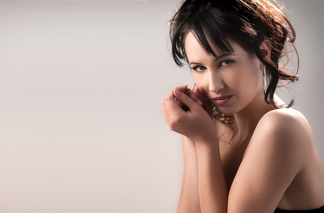 Cherry Le'Minx #2 by Rick0r McZany, on Flickr  Cherry Le'Minx #3 by Rick0r McZany, on Flickr
|
|
#
?
Feb 17, 2012 01:46
|
|
|
what do you mean by camera back right bare? Solid beauty stuff, not sold on the outside one. You probably need to tilt it a bit, but that would cut off a bit of her heel.
|
|
#
?
Feb 17, 2012 02:00
|
|

|
Cyberbob posted:Few from me of a new model we haven't used before I really like this one; her expression is really great. I just don't like the bit of tube top bottom-right. I'd show a touch more, or crop it out, or just build some skin over it to remove it (I don't like this method too much, but only if it "makes the most sense").
|
|
#
?
Feb 17, 2012 02:05
|
|
|
Paragon8 posted:what do you mean by camera back right bare? Probably a little ambiguous. The light was behind the model, to the right of me with the camera (as opposed to her right), and it was bare, no soft box or modifiers or anything. Subjunctivitis posted:I really like this one; her expression is really great. I just don't like the bit of tube top bottom-right. I'd show a touch more, or crop it out, or just build some skin over it to remove it (I don't like this method too much, but only if it "makes the most sense"). Cheers, Yea I toyed with those ideas too. Decided to keep a little in for initial publishing. Might change it again for my portfolio.
|
|
#
?
Feb 17, 2012 02:11
|
|
|
oh like bouncing against the background or as a rim?
|
|
#
?
Feb 17, 2012 02:14
|
|
|
Cyberbob posted:Few from me of a new model we haven't used before
|
|
#
?
Feb 17, 2012 02:14
|
|

|
Paragon8 posted:oh like bouncing against the background or as a rim? Rim doctor 7 posted:Do you mind if I ask a basic question of what software you use to airbrush out all the blemishes? I really like these, especially the post work. Very light opacity clone stamping or spot healing brush in Photoshop for blemishes. For the overall, more global work, Lightroom 4 beta and Color Efex.
|
|
#
?
Feb 17, 2012 02:18
|
|
|
Cyberbob, I really like all of those. Nice lighting especially on the first 2! Another reedit from the summer. Probably my favorite portrait I've done so far:  IMG_0065-3 by Breanne Unger, on Flickr Since I can't get color processing down, gonna do a lot of black and whites for a while probably.
|
|
#
?
Feb 17, 2012 18:32
|
|
|
CarrotFlowers posted:Cyberbob, I really like all of those. Nice lighting especially on the first 2! I know a lot of people treat black and white as E Z mode but there's so many different ways you can do it. I know I used to struggle a lot with bw. I like what you're going with on the pic you've posted (y)
|
|
#
?
Feb 17, 2012 18:47
|
|
|
drat those are solid shots Cyberbob.
|
|
#
?
Feb 17, 2012 21:37
|
|
|
CarrotFlowers posted:Cyberbob, I really like all of those. Nice lighting especially on the first 2! Oddly enough, I feel like the black and white gives it a very composited look. It's almost like the background is made of paper. Still a great expression/shot though.
|
|
#
?
Feb 18, 2012 00:50
|
|


|
I think you can go two ways with black and white, you can go for super noisy and filmy which I'm personally digging right now or very pure and crisp like CF went for. This is one from me that I'm super happy with. 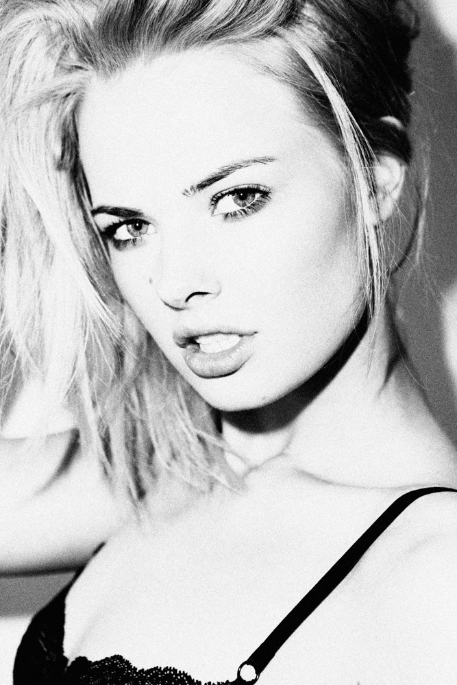 Went noisy and raw because I felt like it fit with the theme of the photo and I sort of wanted to emulate Ellen Von Unwerth's black and whites.
|
|
#
?
Feb 18, 2012 00:58
|
|
|
My personal favorite portrait that I've taken is B&W
|
|
#
?
Feb 18, 2012 02:17
|
|


|
nonanone posted:Oddly enough, I feel like the black and white gives it a very composited look. It's almost like the background is made of paper. Still a great expression/shot though. Haha dammit, there always seems to be something that's not quite right. Do you know what about it makes it look like a composite? I darkened the grass a bit, but that's it. Paragon8 posted:I know a lot of people treat black and white as E Z mode but there's so many different ways you can do it. I know I used to struggle a lot with bw. Yeah, I wasn't trying to imply that black and white is easier, I just think I'm visualizing better in black and white right now. I can't tell what looks good in colour, and I keep loving it up, whereas I can at least get the look of what I want with black and white. That being said I just edited another one in black and white and colour and I prefer the colour version so I don't know what the gently caress. Freckles and a bad complexion throw my skin editing skills out the window. CarrotFlowers fucked around with this message at 05:57 on Feb 18, 2012 |
|
#
?
Feb 18, 2012 04:27
|
|
|
 .. .. My favs for today. Kind of don't like that on the second picture the structure is coming out of her head but I tried to blur it to make it less obvious. xenilk fucked around with this message at 06:17 on Feb 18, 2012 |
|
#
?
Feb 18, 2012 06:13
|
|
|
xenilk posted:
I wish I could see the end of the..whip? stick thing in her hand in the first one, but I much prefer the colours in the first one. I can't tell if it's because I see them side by side, I might like the colours in the second one better if I saw it on it's own, but right now it looks too green. I do like my pictures really warm though. I like the poses and the photos themselves though! Also to comment on the crotch issue on that picture you posted a while ago, I didn't notice it at all and I still didn't even really see the "problem" after it was pointed out.
|
|
#
?
Feb 18, 2012 06:31
|
|
|
I tried some portraiture. I'm not very good at it, but I'd like to learn properly... I'm more interested in people than buildings and rocks. I need more practice.  D. by Clwn, on Flickr  D. by Clwn, on Flickr  D. by Clwn, on Flickr  D. by Clwn, on Flickr
|
|
#
?
Feb 18, 2012 21:24
|
|
|
Those are pretty good. Diggin the third one - nicely done
|
|
#
?
Feb 19, 2012 00:01
|
|
|
long blanket.  too gritty?
|
|
#
?
Feb 19, 2012 00:04
|
|
|
Clown posted:I tried some portraiture. I'm not very good at it, but I'd like to learn properly... I'm more interested in people than buildings and rocks.
|
|
#
?
Feb 19, 2012 00:19
|
|

|
 IMG_8824 by avoyer, on Flickr  IMG_8811 by avoyer, on Flickr Casual shoot today on an abandoned bridge
|
|
#
?
Feb 19, 2012 00:29
|
|
|
You did fine, I think her hair is way over the top though but the locations are used well!
|
|
#
?
Feb 19, 2012 00:38
|
|
|
Clown posted:I tried some portraiture. I'm not very good at it, but I'd like to learn properly... I'm more interested in people than buildings and rocks. I think the second could stand to be a touch darker, but that's mostly because I love the moodiness of the third, like Clive Owen in those BMW films years ago. xenilk posted:I love the first one, the color contrast between her hair and the bridge is great. Zack Arias was right, horizontal portraits are way better.
|
|
#
?
Feb 19, 2012 00:38
|
|
|
Clown posted:I tried some portraiture. I'm not very good at it, but I'd like to learn properly... I'm more interested in people than buildings and rocks. These two are my favorite. The other one in the car looks a bit awkward (looks like he's going reverse and making sure he doesn't hit a car). The very first pic is a nice standard portrait, I might have stepped back to include the hands but it's not that big of a deal Good job!red19fire posted:I love the first one, the color contrast between her hair and the bridge is great. Zack Arias was right, horizontal portraits are way better. I love horizontal portraits! for me it's easier to do rule of third that way, it's just how I see things... but I need to get used to vertical portraits so that I'm comfortable with both. Paragon8 posted:You did fine, I think her hair is way over the top though but the locations are used well! Hahah yeah, her hair is a bit out there, I asked her to put a tuque on afterwards, I think it was a good way to deal with it. Oh and I just bought a Canon S90 from the SA Camera thread... I asked a model I've already shot with (Jessie-Ann) to have a shoot with her and only using that camera, I'm curious to see if it'll go well ha ha. VVVVVVVVVVV-------- Love both edit. Second picture gets a no from be because her fist makes it look like she has no hand... but I've seen you're over that type of mistakes now so it's not worth pointing out
xenilk fucked around with this message at 00:48 on Feb 19, 2012 |
|
#
?
Feb 19, 2012 00:44
|
|
|
sw1gger posted:long blanket. Depends what you and the parents want. It's definitely not your typical soft baby look, but I think it works in its own way, if that's what you were going for. More edits from the summer. I have a shoot tomorrow with my sister, so I'll have new stuff soon! Also I hate finding models...such a headache.  IMG_0302-2 by Breanne Unger, on Flickr  IMG_0012-2 by Breanne Unger, on Flickr
|
|
#
?
Feb 19, 2012 00:46
|
|
|
CarrotFlowers posted:IMG_0012-2 by Breanne Unger, on Flickr Thanks for all your feedback guys. I have some other from the day that I don't think were as strong as my previous four, so I put them on Facebook. I'm pretty conscious that I change processing styles throughout all my shots. How important is it to keep consistency?  D. by Clwn, on Flickr    I wanted to make the walking three into a diptych or a triptych but I don't have the software to do it. I think the set of the three might be stronger in one image rather than three separate ones.
|
|
#
?
Feb 19, 2012 01:07
|
|
|
xenilk posted:
That's hilarious, I have an s90 and I'm planning to shoot some frames on it soon too (tried some at the end of my last shoot which look awful) Great stuff too Clown - I didn't realise you were in the UK until I saw the oyster reader sign! I think you could probably afford to make the background a bit more contrasty with the park pictures.
|
|
#
?
Feb 19, 2012 01:13
|
|
|
Clown posted:I love smiley people. I need to take more pictures of people actually smiling! I wish I was more qualified to give feedback but I would just be guessing and would sound like an idiot. I like that one, but all your pictures are screaming "hands out of pockets!" ha ha As for processing, I think as long as we can sense your style and it's not Photoshoped to the max it's usually fine. Also, don't be afraid to work with postures/poses... for example on that first picture I think a good idea would have been for him to sit on the edge and for you to get at eye level with him and have him on the right side and have the tracks/overpass on the left side of the picture. Paragon8 posted:That's hilarious, I have an s90 and I'm planning to shoot some frames on it soon too (tried some at the end of my last shoot which look awful) Eep, wish me luck :/ ha ha I think I'll bring an assistant with a huge reflector to make the the light is perfect. xenilk fucked around with this message at 01:20 on Feb 19, 2012 |
|
#
?
Feb 19, 2012 01:15
|
|
|
Sit on the edge of the platform? He would have died, there's a train in the background! I'll try and coax my people to be more relaxed in future, it was a pretty cold and miserable day in London today, though that's no excuse. I saw some portraits in the snow in this thread! Paragon8, do you know any decent locations in and around London?
|
|
#
?
Feb 19, 2012 01:21
|
|
|
Clown posted:Paragon8, do you know any decent locations in and around London? I quite like the Hammersmith area, you've got the river and some nice parks (Ravenscourt Park specifically) where the groundskeepers aren't up their asses. A lot of the green spaces properly central and some of the bigger royal parks are really anal about hustling off photographers. I have a friend who lives there so I usually use his place for hair/makeup and as a home base. If you want urban stuff you can always try out Brick Lane/Shoreditch which is where I've managed to catch this gem -  I've honestly been hibernating a bit and focusing on inside things or very close to my place which is just in suburbia.
|
|
#
?
Feb 19, 2012 01:30
|
|
|
I'm in South West London. I was looking for an urbanish backdop today but I get lost in the roads around Clapham, let alone places I don't even know. I'll have a look around Brick Lane actually, then I can get a curry when I'm finished  Having a free Oyster rocks!
|
|
#
?
Feb 19, 2012 01:39
|
|
|
Hah, I'm technically south west london too - but zone six so a little further out than Clapham! Honestly I think Battersea might be a pretty cool location, I was wandering around Clapham/Battersea once looking for a scuba diving store and it was a pretty neat area. Fulham too perhaps. I assisted once at this cool place - http://www.lemonadefactory.co.uk/ which is in battersea. It'd be my ideal studio, but way too expensive for me  That's the lovely thing about assisting - going to all these cool places with insane day rates. Paragon8 fucked around with this message at 02:06 on Feb 19, 2012 |
|
#
?
Feb 19, 2012 02:03
|
|
|
Dunno how I get into assisting... Probably need a bit of knowledge about stuff. I've just realised who you are - we had that conversation on G+ about not knowing any history or photographers, and not having studied photography. Now I'm stalking you on 500px and Flickr
|
|
#
?
Feb 19, 2012 02:18
|
|
|
haha, 500px is probably the place I post most now, that and Facebook. I have no idea what to really make of G+ I'd like to be more active on it, but it just seems so cluttered and hard to find good people to follow.
|
|
#
?
Feb 19, 2012 02:21
|
|
|
I'm just waiting for it to blow up really. I don't think it's something Google will want to fail on so they'll keep trying. I might make a Facebook page one day. I just need more good content to put on it
|
|
#
?
Feb 19, 2012 02:36
|
|
|

|
| # ? May 21, 2024 06:25 |
|
|
quote:I need to outsource my PP to someone that knows what they're doing. I make my living PPing for all my photog friends. Email architectureplusone@gmail.com. I'm cheap! Thanks!
|
|
#
?
Feb 19, 2012 03:07
|
|