


|
drat NIGGA posted:Yeah I have a bunch of ideas I want to do with him. He loves it, couldn't get him to stop smiling. I want to see this dude from the front. Cockwhore posted:This is fantastic. If it wasn't for the cluttered background, I could have mistaken this for a woot fatigue photo. (is he still around?) Thanks man! I'm not the biggest fan of manipulating an image quite that much, but at this point I am more into trying everything to learn - so I might give that a shot. Thanks for the suggestion. I guess the other option is too post in some DoF, but I don't even know if it is possible to do that realistically.
|
 #
?
Feb 17, 2012 04:17
#
?
Feb 17, 2012 04:17
|
|


|

|
| # ? May 11, 2024 21:53 |
|
|
Ambihelical Hexnut posted:Thanks for the insights and such. In regards to environmental conditions and such, it goes to show that imagination, problem solving and compromises are essential for shooting in non-controlled conditions.
|
|
#
?
Feb 17, 2012 10:51
|
|

|
Ambihelical Hexnut posted:I'm confused about the subject here. If you're trying to do what I think you are trying to do in the second photo, then I find the non-parallel lines that are obviously parallel in real life to be sort of distracting because it seems unintentional. Thanks for the crit. The first and second photos are unrelated - the first is more about this meticulously groomed juniper bush that really isn't uniformly shaped at all, whereas the second is meant to be about the uncomfortable arrangement of space that you get at the margins of buildings when they're built on a 15% grade. All of those pictures (and the following ones) were taken in a 1/2-mile radius area in Oakland/Piedmont, California, where my parents live. Xerxes17 posted:Today I decided to finally get of my arse and take a few photos. My reasoning being that the best way to learn how to swim is to throw oneself into the sea. I'd encourage you to think more deliberately about composition. For example, in OldSoldier, why did you cut off the clock tower? Why did you cut off the sides of the artillery piece where you did? That one in particular would benefit, I think, from a much looser composition. Bottom Liner posted:
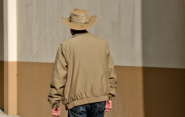
I think what's throwing people off about the pairing of these two in a diptych is how different the light is in each. drat NIGGA posted:Yeah I have a bunch of ideas I want to do with him. He loves it, couldn't get him to stop smiling. Don't just tell us, show us how cool he is. -------------------------------------------- 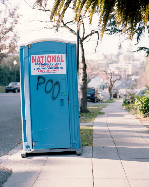 POO by RHITMrB, on Flickr  No! by RHITMrB, on Flickr  580 by RHITMrB, on Flickr edit: rules 
MrBlandAverage fucked around with this message at 15:14 on Feb 17, 2012 |
|
#
?
Feb 17, 2012 14:44
|
|


|
rio posted:Been a bit too busy to pop on for the past couple days, but I defintely wanted to say thanks for the help. The advice and crops are really illuminating, and have given me a lot to think about in terms of trying to improve. I'm torn on this one, because I agree with you that the first one has more details and tells a better story-- I think that the best answer would have been to shoot this one, then open up wider and get closer and closer, so that you can fill the frame with your sleepy attendent (who I'm sure would think, if he woke up, that you were going to get him fired, so be careful...) while still showing us the deserted surroundings. ... Editing a few pictures from my last trip.  
|
|
#
?
Feb 18, 2012 18:35
|
|


|
Bottom Liner posted:
Really like this photo. I don't have much to say that would improve it because the feel is spot on, the only complaint is maybe that it's a bit underexposed. Bottom Liner posted:I tried layering lighting with a long exposure. I wish I had gotten the back trees more to really add that extra depth. Oh well, the owl is cool. The fill flash is really jarring and kind of washes out what would otherwise be a cool scene. I see what you were going for and see the possibility, just not sure how you would accomplish it with a softer foreground light and still exposed enough to see the detail. 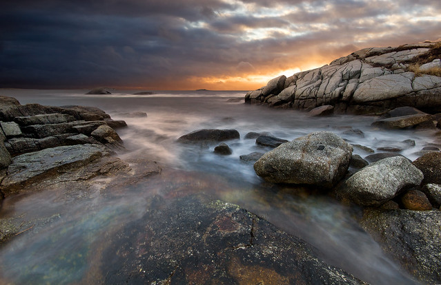 Been to this spot about 10 times now and something is always wrong, tide, light, wind. Everything lined up finally this time, hoping I don't have to go back there any more.
|
|
#
?
Feb 19, 2012 14:21
|
|


|
These two are begging to be shown together. Very funny. TsarAleksi posted:
That portrait is so so good. The second is a great capture too, very good journalistic quality to it. Where did you go? whaam posted:
That's definitely a great spot. The only thing I think could be improved would be having the large rocks in the upper right on the left side so they capture some of that light and even out the left side. The top left corner is a good bit darker than the rest of the photo, and it traps my eyes. You could probably just bring it up in post a little and even it out. The next installment of this series I'm working on within my 365. I'm starting to hate the days when I don't have anything lined up to shoot, because I am terrible at just walking around and finding a photo. My strength is planning things out then shooting, ugh.  day 39 by David Childers, on Flickr  day 40 by David Childers, on Flickr
|
|
#
?
Feb 19, 2012 15:40
|
|

|
 Criminals by Victor's adorable world of pixels ...still getting the hang of the whole 'camera' and 'light' and 'post-processing' thing TsarAleksi posted:Editing a few pictures from my last trip. Not much to be said about the first one; it seems absolutely flawless. The light is great, the expression is great, the post-processing is great, and while I'm not sure you were responsible for the styling, it's also great. As to the second one, I wanted to say it's a bit too saturated, but the more I look at it, the less I'm convinced that's the case. It actually seems to kind of compliment the energy of the children. Maybe decrease it just a tad? Bottom Liner posted:I really like this one. It feels off, almost creepy, in a good way. I expect something to be hiding in that window, but maybe that's because I've been watching some horror films lately. Already commented on your self-portrait, but as a small follow-up, I partly agree with whoever said it's awkward as a diptych due to the different lighting, but I'll add that the different sizes of the two pictures upset my internal sense of balance. So there's that. I'll also reiterate that I think the one on the right is incredibly strong, and is being weighed down by the format you chose to present it in. Regarding day 32, I love the concept, but I find that the strings really compete for attention with the model. That's fine in itself (they're interesting, and an important part of the picture), but they're out of focus, and I want the things I'm supposed to be looking at to be in focus. The light is really fantastic, and this is one of the few pictures, where I don't mind not being able to see the subject's face. Day 35 I feel is the weakest of the bunch. I agree completely with you that brighter trees in the background would have helped the picture a lot - that was my first thought before I read your comment. I also didn't immediately notice the owl. Have you considered a much tighter crop? Something like this (but less crude and lovely):  would get rid of the bushes in the foreground, and make the fill a larger part of the frame, while also making sure it's not in the middle of it (like it is with the original image). Cockwhore fucked around with this message at 21:09 on Feb 20, 2012 |
|
#
?
Feb 19, 2012 17:03
|
|
|
Cockwhore posted:
I like their expressions and the color temperature a lot, I think it suits the mood you're going for. I'm not sure if I like the pipes in it though. It's a little distracting but provides a little bit of asymmetry. I think I'd prefer the shot without the pipes. I think the lighting on their face is good, it's dramatic without hiding their eye on the opposite side of the face. Had my first engagement session yesterday, but had some trouble because the girl was overweight. I really didn't want to stick to just head/bust shots of them. I'd say these are my three best.   
|
|
#
?
Feb 20, 2012 13:59
|
|
|
Tamgerine posted:I like their expressions and the color temperature a lot, I think it suits the mood you're going for. I'm not sure if I like the pipes in it though. It's a little distracting but provides a little bit of asymmetry. I think I'd prefer the shot without the pipes. I think the lighting on their face is good, it's dramatic without hiding their eye on the opposite side of the face. Have you considered converting some of these to B&W? I know it seems to be overdone in wedding and engagement shooting but the colour from their clothes (the third shot in particular) is really distracting and in your face. The second one isn't doing much for me, because together they just look like a single mass. Any silhouettes when working with a plus size subject aren't going be flattering. day 40 by David Childers, on Flickr This is just stellar.
|
|
#
?
Feb 20, 2012 15:13
|
|
|
Tamgerine posted:Unfortunately this last one really isn't working. The 'looking up' shot is not flattering for just about any woman, especially not with a shot right up her nose, which gives her a rather porcine appearance, which is not exactly wildly popular with women these days...
|
|
#
?
Feb 20, 2012 23:22
|
|
|
Tamgerine posted:Had my first engagement session yesterday, but had some trouble because the girl was overweight. I feel like this is a really bad way to view a session with less than perfect clients. If the photographer is uncomfortable with your weight, how are you supposed to feel comfortable enough to pose? I'm sure you didn't say anything outright, but that's a vibe people can pick up on. I would try to just portray them as a beautiful, fun, happy couple rather than worry about her looking "typically" beautiful or something. Obviously there are poses that will work better than others for overweight girls, but trying to avoid it altogether and making her look like a size 4 won't work. I would try looking at various posing guides and seeing what they have to say for flattering larger figures. For the photos, I feel like overall they are too far away and too dark to really give an intimate feel that I personally think an engagement session should give. The first one, they are way too small in the frame, and the colour of the light is too cool to mesh with the rest of the scene; their faces look a little green. I think if you had gone in closer again, and maybe had her sit cross-legged or had her tuck her legs in to the side, it might make them look a bit longer. They look kind of unflattering in that photo. The second one is kind of a neat idea, but I think if you had gotten in closer and gotten just their waist up, it would be stronger. For the third one, it was already pointed out about going up the nose, but I would also watch out for having girls lean on their arms like that. I used to do it a lot too, but it makes the arm look much bigger than it actually is. -------------------------- My photos: I wanted to practice more moody shots. Unfortunately due to space I wasn't able to move the light around much, or zoom out so they're all headshots. Mostly looking for critique on the processing and lighting.  IMG_0178 by Breanne Unger, on Flickr  IMG_0212 by Breanne Unger, on Flickr  IMG_0227 by Breanne Unger, on Flickr Also as much as I appreciate her modeling for me, I can't wait to work with someone who has a little more latitude in facial expressions and has some modeling experience. This is the only expression that doesn't look really awkward, other than the friendly smiles, but I'm trying to get away from that, so yes they are all the same.
|
|
#
?
Feb 21, 2012 03:12
|
|

|
Cockwhore posted:Day 35 I feel is the weakest of the bunch. I agree completely with you that brighter trees in the background would have helped the picture a lot - that was my first thought before I read your comment. I also didn't immediately notice the owl. Have you considered a much tighter crop? Something like this (but less crude and lovely): Thank you for the idea and the thoughts, I agree that crop is a good fix for it. Tamgerine posted:The first one is way too wide and they're lost in the frame, and it also draws too much attention to the lighting. I like the second the best, but as said the couples form isn't quite clear. I think the rim light is too harsh as well. I like the sky and ground balance though. The third has potential but that is a bad angle for her. Also his hand is really akward, I can't tell if he's trying to hold her hair back or turn her chin for a kiss, but it looks like he's going to grab her throat. CarrotFlowers posted:
The second one is really nice. The first one could benefit from having a dark background like the others, and her expression doesn't really fit the hood. Overall they're a little dark, and the back of her face is brighter than the front in all, something I try to avoid. I like for the brightest part of the face to be the closest cheek/nose for headshot style portraits. Also, be mindful of models' jaw lines, she could push out her chin more in all of these and really help her look. I always tell subjects to push it out until it feels awkward, then when they inevitably relax a little it usually ends up in the right place. I'm going to post 4 today because they are a set, sorry for breaking the rules.  day 41 by David Childers, on Flickr  day 42 by David Childers, on Flickr  day 43 by David Childers, on Flickr  day 44 by David Childers, on Flickr
|
|
#
?
Feb 21, 2012 04:37
|
|
|
Bottom Liner posted:Thank you for the idea and the thoughts, I agree that crop is a good fix for it. I really like these, the concept is a great one and it's nice to see a well thought out set that works well together. I like the lighting and the processing on these you've managed to get a very nice style across the board. The first 2 are the odd ones for me, in the first the smoke/powder looks too uniform, it's hard to explain but the area behind her back leading to the edge of the frame looks odd. The second one is the only one that looks out of place on the set, it looks like a crop of the first and they look too similar in her pose and facial expression. I think it would work better as a triptych without the second one. The last one is my hands down favorite, fantastic shot. 3 of mine from inside Meadowhall Shopping Center (before we were asked to put the cameras away)   
|
|
#
?
Feb 21, 2012 18:00
|
|
|
Bottom Liner posted:The second one is really nice. The first one could benefit from having a dark background like the others, and her expression doesn't really fit the hood. Overall they're a little dark, and the back of her face is brighter than the front in all, something I try to avoid. I like for the brightest part of the face to be the closest cheek/nose for headshot style portraits. Also, be mindful of models' jaw lines, she could push out her chin more in all of these and really help her look. I always tell subjects to push it out until it feels awkward, then when they inevitably relax a little it usually ends up in the right place. Thanks for taking a look. I agree with the background on the first. I debated adjusting it - I didn't want the black on black look, but making it white made it look weird so I just left it. It's not my favourite so I'll admit I didn't put as much effort into that one as I should have. Just wanted something a bit different with the hood. The expression thing - yeah we were trying to work on that, but she's kind of a one trick pony unfortunately, and any other expression looked really weird and stiff so I just said gently caress it. I'm looking into getting other models who aren't close friends or family so hopefully that will help. As for the lighting - normally I have the light like you suggested, but I wanted to try something differently, and a video of a fairly well known portrait photographer said she always lit females with short lighting (dark side closest to camera) because it was more flattering. Figured I'd try it out anyway. I don't really prefer one way over the other, I think they both have their places. I find this way look a little moodier, so I like it for this shoot. Same goes for upping the exposure, I normally have faces super bright, but I didn't want that look for these ones so I left it a little dark. I agree about the chin thing - usually I remember because girls will sometimes get a little double chin when they tuck it in, but since she's so thin she didn't get one, so I just forgot. Anyway, I hope it doesn't sound like I'm debating your critique too much. I appreciate it, I just wanted to go over my thoughts on why I did it this way. It was my first shoot where I made really conscious decisions about things like lighting and stuff, so I wanted to explain that. And while I'm here: For yours, I really like the last one, I think it's definitely the strongest of the set. I think in the first 3, the whites of the eyes and the teeth could stand to be reduced a bit - they really stand out too much when the rest of the photo is darker like that. The third one, she has kind of a crazy rear end expression, but it fits if you want it to be taken that way. I also like the closer crop of the second one over the first one.
|
|
#
?
Feb 22, 2012 03:21
|
|
|
AceClown posted:I'm a sucker for retail shots, but I think with this one you could have done a little better providing some context. By putting her right in the middle you're forcing the composition to be about her, when I think it's really more about her and the space she's occupying. Maybe I'm nuts. Here's a few from a "project" I've been doing that I could use a little input on:    The series I'm doing is mostly about the more rural/agricultural side of Oregon that's often overlooked. I'm still not particularly good at fleshing out my ideas into writing, but I'm trying to invoke the feeling of standing in what amounts to an empty area while still feeling the connection to human life - scenes where people could be, but aren't. How do these work, with that in mind?
|
|
#
?
Feb 23, 2012 00:50
|
|

|
dukeku posted:I'm a sucker for retail shots, but I think with this one you could have done a little better providing some context. By putting her right in the middle you're forcing the composition to be about her, when I think it's really more about her and the space she's occupying. Maybe I'm nuts. I definitely get a lonely vibe from these. The fact that it seems so clean negates the desolation feeling they might have conveyed, but it seems like everyone was abducted. It evokes images, especially with the processing, of those towns and vehicles used in nuclear bomb tests in the 50s. I don't know what this is what you were going for but that's my take away from those. Perhaps some shots obviously taken from the middle of the street will enhance that - the feeling that there's so little going on that it's possible to just be in the middle of the street. The truck I like the most - I've found it difficult to get compelling shots of the sides of vehicles, so it's good to see one here. It's pretty much the perfect balance between blending in with it's environment and also sticking out. -------- I revisited some shots of a forklift I took some weeks ago and delved once more into b&w (or in this case kinda sepia). Thoughts on contrast, sharpness, etc would be appreciated. 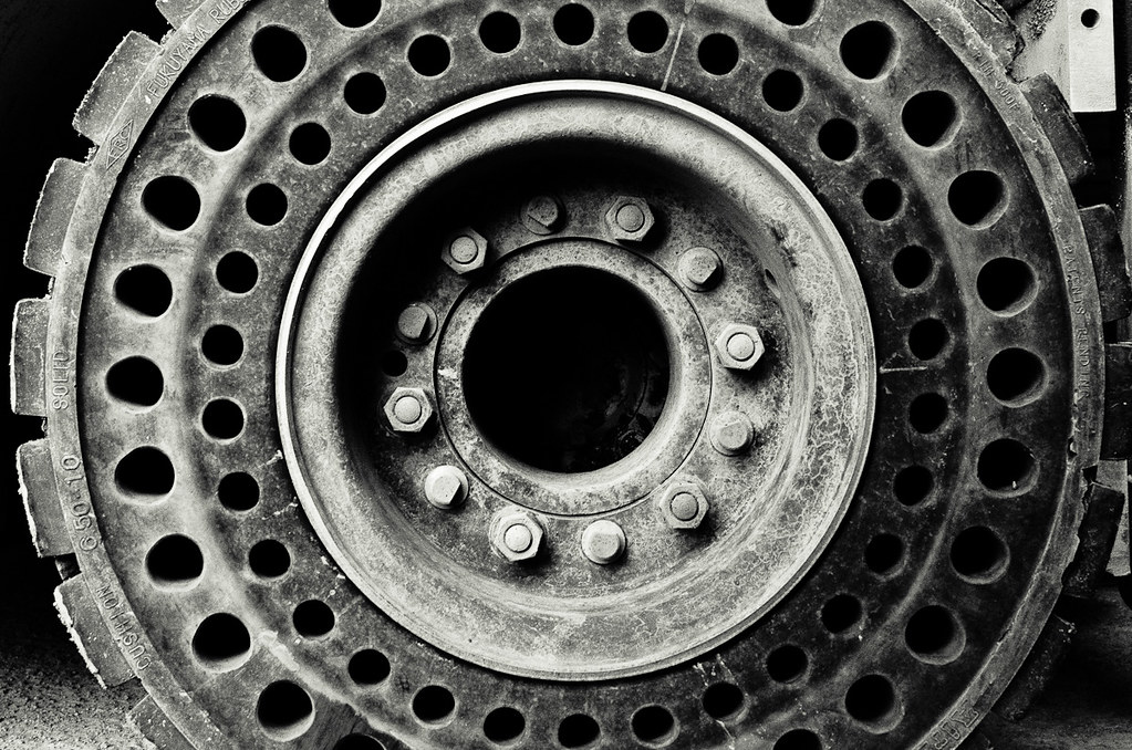 DSC_1143.jpg by dj stevens, on Flickr
|
|
#
?
Feb 23, 2012 12:09
|
|
|
truncated aardvar posted:I revisited some shots of a forklift I took some weeks ago and delved once more into b&w (or in this case kinda sepia). Thoughts on contrast, sharpness, etc would be appreciated.
|
|
#
?
Feb 25, 2012 00:27
|
|

|
Yeah, not a fan of the comp myself, but I was standing on my head kinda! Plus I was a bit rushed, because I was at work and had things to do. It does make a good backdrop though. Actually I posted this one mainly in an exercise in processing b&w after my last post in this thread had some good points made about it I wanted to work on. Thanks for your comments.
|
|
#
?
Feb 25, 2012 04:36
|
|
|
Went to the rennaisance festival east of Phoenix this weekend. I'm still getting the hang of how to get everything set properly for each shot, and was a little disappointed when I saw that most everything came out over or underexposed. Many were my fault was I wasn't always conscious of keeping the sun at my back, but I think I started having more fun just walking around the place and lost focus at taking better shots ")  DSC_0340 by dkwildz, on Flickr  DSC_0313 by dkwildz, on Flickr  DSC_0265 by dkwildz, on Flickr
|
|
#
?
Feb 26, 2012 10:57
|
|
|
Bottom Liner posted:
You're going to hate me, because there's nothing you can actually do about it now, but I would like this if it weren't for her expression. If she had a super serious expression or something with an emotion other than "boy this is a goofy thing I'm doing" on her face, I would really like it. As it is, and as I know you're going for "movie style" shots with a lot of your images, this takes me out of the magic considerably. I think the reason the last one works the best is because you can see less of the workings. If I'm thinking "oh, that's some sparkly dust he's using as an effect" it takes me out of the magic, whereas the final shot has a little more mystery. I'm imagining a shot of her emerging from behind a tree with mist coming from various sources in the scene, maybe something like her emerging from the dust/smoke.
|
|
#
?
Feb 26, 2012 15:35
|
|

|
I live in a housing cooperative and I'm shooting a project which is essentially a collection of pictures I take of the members. One thing I'm trying to do is to get a head shot of everybody. I have these so far: 20120223-_MG_2323.jpg by OOPRCT, on Flickr  20120223-_MG_2325.jpg by OOPRCT, on Flickr  20120223-_MG_2319.jpg by OOPRCT, on Flickr What can I do to improve? The majority of the pictures I take are at night. I have a 1 speedlite and an off-camera cable.
|
|
#
?
Feb 28, 2012 00:49
|
|
|
DKWildz posted:Went to the rennaisance festival east of Phoenix this weekend. I'm still getting the hang of how to get everything set properly for each shot, and was a little disappointed when I saw that most everything came out over or underexposed. Many were my fault was I wasn't always conscious of keeping the sun at my back, but I think I started having more fun just walking around the place and lost focus at taking better shots It seems to me that your pictures were probably taken mid-day in some pretty harsh sunlight. You may want to learn how to use fill flash, which would probably be useful for the first and second pictures.
|
|
#
?
Feb 28, 2012 02:01
|
|
|
OOPRCT posted:I live in a housing cooperative and I'm shooting a project which is essentially a collection of pictures I take of the members. One thing I'm trying to do is to get a head shot of everybody. I have these so far: I am not really a portrait expert but there are a few things I can mention. The first thing I would look at changing is the backgrounds, seems like most of the are pretty distracting. A good background can make or break a photo. Usually you dont want something that is too busy (like your 1st and 2nd photos). The other problem is with how you are using your flash with them being so close to the BG which is why you end up with shadows (like in the 2nd photo). If you have to take them at night get them to stand out from a plain wall or something that is not going to be super distracting. Depending on the situation/location I would try to bounce the flash off the ceiling but this is really not my area of expertise. Edit: if this is a collection you may want to consider having all of them with the same BG, not exactly sure what you are aiming for. --- 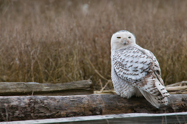 
|
|
#
?
Feb 28, 2012 08:48
|
|

|
AceClown posted:I swear every time I open this thread, I have to look at this picture, I like how you've captured her expression and it kinda tells the viewer about her. Sorry or being so gushy ha.
|
|
#
?
Feb 28, 2012 10:05
|
|

|
Bottom Liner posted:
One more thing about this - I don't know if you were looking for a natural looking thing where it actually looked like she was throwing the powder, but it was almost immediately apparent that the dust is photoshopped due to the symmetry. I would have liked to see a more natural looking dust pattern, even if you had done what you did but then went further to add some randomness to the dust patterns. I am always looking at symmetry, so this might not even be a noticeable issue for a general audience, but I thought it was worth mentioning. It takes me to a place where I question what I am seeing and what was actually happening in the scene vs. what was added by a computer - like, was she even throwing the dust? Is the weird look on her face because she was just standing there in place like that and then you added the dust effect later? That is the road my brain goes down while looking at it. OOPRCT posted:I live in a housing cooperative and I'm shooting a project which is essentially a collection of pictures I take of the members. One thing I'm trying to do is to get a head shot of everybody. I have these so far: I will be curious to hear what people might give in terms of advice here, because I know very little about the flash and how to actually make it look good. I hate that harsh flash look. I'm still learning, so here is some basic stuff that has worked for me to keep you busy until others reply with more. Take it for what you will. What I've done so far to deal with low light portraits is not use a flash, and stop down to f1.8 (the largest aperture I have currently), focus on the eyes (you have to nail the focus) and shoot. If you are using the kit lens, invest in a 50mm f1.4 (or 1.8 to save some bucks) and use that instead of the kit lens with flash. This will also fix some of your background issues by drawing attention to your subject instead of those busy backgrounds (but think about the background before shooting as well). Then post in proper white balance if the interior lighting was coloring the photo poorly, do the other standard post stuff. What lens and f stop were you using for these? Was there any manual setting involved or was it auto? Shooting RAW? Any post processing? Sorry for the questions if they seem basic, just covering the easy questions. rio fucked around with this message at 19:58 on Feb 28, 2012 |
|
#
?
Feb 28, 2012 19:46
|
|
|
rio posted:One more thing about this - I don't know if you were looking for a natural looking thing where it actually looked like she was throwing the powder, but it was almost immediately apparent that the dust is photoshopped due to the symmetry. I would have liked to see a more natural looking dust pattern, even if you had done what you did but then went further to add some randomness to the dust patterns. I am always looking at symmetry, so this might not even be a noticeable issue for a general audience, but I thought it was worth mentioning. Actually it was real, at least most of it. I mirrored the right bottom to the left bottom for symmetry but the rest is real. Good point though, I may do some clone work to change it up some.
|
|
#
?
Feb 28, 2012 20:57
|
|
|
OOPRCT posted:... For portrait shots of people with glasses, angle the speedlight upwards and if you don't have a reflector card, you can use a makeshift by rubber banding an index card to it. Also, have the person tip their glasses downward but not too far. That should solve that part.
|
|
#
?
Feb 28, 2012 23:31
|
|

|
DKWildz posted:Went to the rennaisance festival east of Phoenix this weekend. I'm still getting the hang of how to get everything set properly for each shot, and was a little disappointed when I saw that most everything came out over or underexposed. Many were my fault was I wasn't always conscious of keeping the sun at my back, but I think I started having more fun just walking around the place and lost focus at taking better shots The other two are lovely shots, but the shadow is all distracting from them. You've got really great natural expressions from the bunch, so whether you asked them to pose, or just happened by while they were smiling, I think the shadows the only real critique I can think of (which is a good thing!). A few pictures from a recent fierce snow we had. It didn't last, but it was coming down pretty heavily. I'm not actually sure if my camera is waterproof or not, so concern over making sure I don't destroy my camera between shots led to a lot of hassle and less completely intentionally composed shots, but I still really like the way these turned out.    Which to me is odd, because they're just street shots. Especially the second one, I can't pin point why I like it.
|
|
#
?
Mar 2, 2012 05:50
|
|
|
EatinCake posted:
I always find it hard to capture snow fall in an interesting way. It always ends up looking like noise or grain. But I very much enjoy the first one. It feels like a silent night where you can even hear the snow hit the ground. It also feels like it's set up extraordinarily late at night. Can't put my finger on why though. As for the technical aspects, I feel the image is a little warm. You can still keep a street light look by making it only slightly cooler. I love all the contrasting details in the tree branches brought on by the snow accumulation. The second image comes across as sort of boring to me. I think it's due to all that dead space up in the sky scrapers. Nothing notable happening there. However the white balance in my opinion is much better here. The third one I enjoy. The lights and colors make for a pretty vibrant image. The only thing I don't like are the size of the snowflakes. They detract from the image. But it's not like you could control that though. 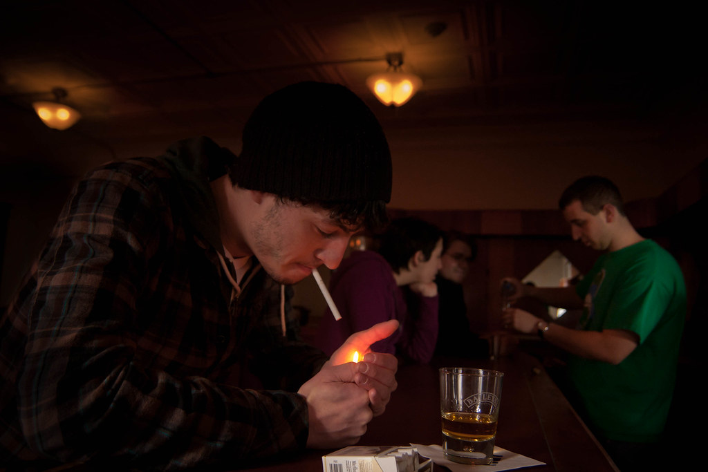 Rough Day by TFordPhoto, on Flickr I'm relatively new to portrait photography. However I think this is probably one of my better photos. I was trying to generate a sort of depressing bar scene here. Warm, low lighting was an objective but I think I made it too dark. The entire scene was also set up. What does the Dorkroom think?
|
|
#
?
Mar 3, 2012 21:04
|
|
|
rcman50166 posted:
I think it looks quite warm and inviting - like it's cold outside and the warm tones suggest comfort and sanctuary. Everyone looks pretty chilled.
|
|
#
?
Mar 4, 2012 11:47
|
|
|
Gazmachine posted:I think it looks quite warm and inviting - like it's cold outside and the warm tones suggest comfort and sanctuary. Everyone looks pretty chilled. Yea, I wasn't getting the right vibe either. Suggestions?
|
|
#
?
Mar 4, 2012 13:06
|
|
|
rcman50166 posted:Yea, I wasn't getting the right vibe either. Suggestions? I would alter the angle you've shot it at to show more of, at least, the face of the guy at the front. He needs to act a little more and look fed up or weary. I like the idea of set up shot but maybe try sketching how you want everyone in the scene first, or something like that. More of everyone's faces and more expressions. I'm seeing one guy with his head in one hand, fingers through hair, heel of the palm of the hand on the cheek, looking slumped, whiskey in front of him, him looking into it, like he's searching for an answer in its contents. That kind of poo poo. Also, cool it temperature-wise, too.
|
|
#
?
Mar 4, 2012 14:25
|
|
|
rcman50166 posted:
I'm having a really hard time articulating why, but something about this picture screams "no-budget indie film with friends as actors" to me. It might be the green t-shirt on the bartender. It might be the poses in the background that struck me as people pretending to do something, rather than people doing something. My initial impression was "staged photo" before I read your description. That said, I don't think it's bad. I might like it better if, say, the background were a little farther away (though obviously you're probably limited by the length of the bar) to emphasize the loneliness, or if the background was a little darker. As it is, it's kind of flat to me. Even the flame in his hands barely stands out.
|
|
#
?
Mar 4, 2012 16:52
|
|

|
EatinCake posted:The third one on here is by far the best, as the shadow allows us to see his face instead of obstructing it. I've run into this problem a lot going to out door events, and as long as you catch on early that it's happening, people usually don't mind re-positioning themselves in a better angle. True, you lose the instant capture of it, but if they're posing anyway you'll just end up with better captures. I think you need to play with the white balance in these specially the first one, it looks far to warm. The first one I feel like I want to be over to the left more and have the stair thing more centered or on the right. On the second one I find the branch in the upper right corner a little annoying, it is something I noticed and is all I can see now  I think I like the last the best due to the different light sources, not sure about the bus on the right but I think it still works. ---- 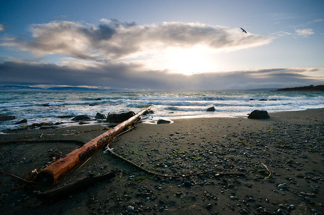 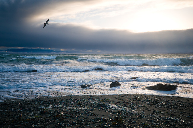
|
|
#
?
Mar 4, 2012 18:19
|
|
|
Dread Head posted:I think the first is a bit heavy on the contrast. The shot directly into the sun and the lost shadows are hard on the eyes. I do like the leading line of the log but its leading me into the harsh light at the center of the image. The second I like quite a bit more. It suffers from some of the same issues but the seagull really makes it. I feel like it focuses more on the rough seas and the ocean rather than the foreground, and the bird soaring gives the impression that there is wind to go with that surf. Maybe crop the second one a bit and lose some of the foreground? 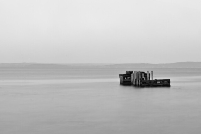 I'm trying to take less photos that are loaded with too much stuff going on. It's hard because I really like colourful, detail-oriented seascapes and landscapes but I'm getting a lot of criticism about only shooting one thing. It was overcast today and with the low fog everything looked very flat so I tried to just go with the whole "flat" theme. Used a 10s exposure to try and lighten the water a bit to make the transition to the sky a bit smoother. I'm unsure about the tones as I don't do B/W conversions often, any recommendations are very welcome. Also holy jesus I don't know what happened to my camera but I had to clone out about 300 bits of sensor dust on this one. Maybe they were always there but I hadn't shot anything this plain to see them.
|
|
#
?
Mar 5, 2012 00:41
|
|
|
truncated aardvar posted:I revisited some shots of a forklift I took some weeks ago and delved once more into b&w (or in this case kinda sepia). Thoughts on contrast, sharpness, etc would be appreciated. I actually like the crop of this, and I love the different patterns and textures with this amount of contrast. I wish the tread on the right side was a little brighter to balance things out though. whaam posted:
I think I would like this a lot more if that pier thing took up more of the image. The contrast between the detail of the wood on that thing and the flatness of the rest of the image could be neat. Maybe a closer crop, or it's possible that if I was looking at a bigger copy of the photo that would be enough to pull that off without changing the crop. As is though, there's just not enough going on to draw me in without being able to see more in that pier. Despite being somewhat colorblind, I've been trying to do some color post as I really enjoy color photography. I'd love any advice that you all have to offer on what I've done so far. Did I take the split toning too far on this one? I was going for that dusk look that I like so much.  I'm also torn between that and this crop:  And did I take the saturation too far with this one? I wanted to emphasize the center of the image but feel like I might have gotten carried away.  Pre-wedding shot I took for a friend: 
|
|
#
?
Mar 5, 2012 03:26
|
|

|
rcman50166 posted:
I would have liked more attention brought to the subject's face rather than to the cuticles of his nails (did you focus on his finger tips intentionally?) His eye is in a nice place in the frame, so that would be a good place to start - nice and sharp there. The flame and fingers seem too low down the fame to be the focal point. Also, the glass looks like it about to slide right off of that counter.
|
|
#
?
Mar 5, 2012 11:04
|
|
|
I haven't been here in a while, but I like to contribute...Dread Head posted:I actually prefer the second one - it evokes images of the timeless sea. There are enough focal points to provide some interest, but it's not too busy and you can just "be" in the scene, if you know what I mean. whaam posted:
I like that - I think you've done well in your foray into "flatness". I think the composition works very well. Personally I would have been a bit more traditional and framed/cropped out some water from the bottom but as it is the whole thing is enigmatic. I love uncluttered pictures so this is right up my alley. I also like the juxtaposition between the high contrast and the low contrast elements. I wish I could point out some negatives, but for me it's great. There are boundless ways in which you could have treated this scene and a lot of them would have been good but it's nice to have some variation in the collection. How do you feel about the shot? Are you encouraged to explore this avenue a bit more? rcman50166 posted:
It's hard to be depressing when the scene seems so inviting. The FOV you used and the distance to the subject makes it seem like I'm sitting next to him and we're settling down for a cosy evening. Perhaps some more stark lighting would have presented a less pleasant scene, as well as a wider angle lens or coming back from the subject to show that he's actually sitting alone, with some bare bar either side of him. I do like the tones, but it doesn't reach your intended vision, unless of course you have an aversion to dark, cosy bars. Man_of_Teflon posted:
The first two don't do much for me. I think the scene is a little too cluttered to be interesting. I prefer the second crop. I'm not sure what I don't like about the colour, but I don't like it - too much blue perhaps? I like the city scene - the way the cars come out of the dark canyon into the brighter light of the open city makes it for me. I think the saturation is fine. The portrait is great!
|
|
#
?
Mar 5, 2012 13:18
|
|
|
Man_of_Teflon posted:Did I take the split toning too far on this one? I was going for that dusk look that I like so much. This doesn't look split toned to me, just magenta. OOPRCT posted:I live in a housing cooperative and I'm shooting a project which is essentially a collection of pictures I take of the members. One thing I'm trying to do is to get a head shot of everybody. I have these so far: Try bouncing the light - all of these are still pretty harsh. It'd also be a super easy way to avoid things like the reflections in the glasses in the second one. -------------------------------------------- I tried to approach the subject of my friend's dragster a little more abstractly than I might otherwise. What works? What doesn't work?  Fronts by RHITMrB, on Flickr  Strange by RHITMrB, on Flickr  Rubber by RHITMrB, on Flickr
|
|
#
?
Mar 6, 2012 05:45
|
|
|

|
| # ? May 11, 2024 21:53 |
|
|
The first one is ok. I'd have tried looking down between the wheels for a symmetrical shot. The second one is great. The third one is a bit boring and doesn't have a strong subject. The grainy texture isn't enough to hold the eye - I'm more interested in the spring in the background but it's out of focus.
|
|
#
?
Mar 9, 2012 23:13
|
|