


|
rcman50166 posted:
rcman50166 posted:
|
 #
?
Mar 30, 2012 08:28
#
?
Mar 30, 2012 08:28
|
|


|

|
| # ? May 11, 2024 05:24 |
|
|
AtomicManiac posted:
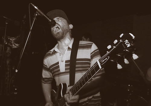
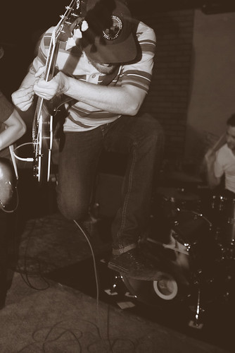
I like this. I'm a sucker for band photos and feel you captured the energy of their music in this shot. Gives me a pretty good indication of what to expect if I were to go see this band play. I am going to echo the previous critique in that there's not a whole lot to separate this photo from other band photos of punk/hardcore bands. Do you know this band personally or were you just in the crowd? See if they wouldn't mind you getting in there with them instead of the more onlooker perspective you have going on here. Also if the crowd is interacting in any way (dancing, moshing, general arm throwing) try and see if you can get them in the shot as well. I personally love a photo that shows the relationship between band and audience rather if it's the band interacting directly or the audience reacting to the music.  Self portrait on Tri-x 400. Bluntly spelling out my mindset. I have this whole meaning/explanation set aside but afraid of going into it for fear of taking poo poo far too seriously. Does this come off as cliche? I personally like it in that it looks a lot like how I imagined it would when going in to shoot it. I wish I could have gotten the top of my head to show as I had messed my hair up to reflect the "craziness" that I felt happening in my life at the moment.
|
|
#
?
Mar 30, 2012 08:44
|
|

|
removed.
Revolucion fucked around with this message at 21:43 on Nov 29, 2020 |
|
#
?
Mar 30, 2012 10:27
|
|

|
rcman50166 posted:Good verticals and good exposure. But I can't help but ask myself here, what am I supposed to be looking at? I generally try to find the good things about a photo and attempt to imagine the photographers intent. I actually really like that you said that you don't know what you're supposed to look at, as that's the point of a lot of the stuff i shoot - it's meant to be viewed very objectively and abstract and have no real "subject". These were also shots i didn't really spend a whole lot of time on, it was an experimental roll where i ripped through 36 frames in like half an hour so to see if the film was okay. thanks for writing that up though, i appreciate it.
|
|
#
?
Mar 30, 2012 15:09
|
|

|
Den of Lies posted:Took this shot in the capitol building on a trip to Austin, TX. Like dukeku mentioned you definitely need to straighten this up. But I think it would be a lot better if there was just the one guy in the hall instead of two. The second person really distracts me. I went to the National Portrait Gallery last weekend, found these ladies hanging out there:  Chillin' by makev, on Flickr And this little guy  Hmmmm by makev, on Flickr
|
|
#
?
Mar 30, 2012 15:12
|
|


|
rcman50166 posted:
rcman50166 posted:
rcman50166 posted:
Its a good foundation, but needs to pop more. Seems like the colors are totally muted and it just doesn't keep me interested. An overcast day doesnt help the color. Again the idea is great, but the overall final product could be vastly improved by either playing with contrast and color, or retaking on a sunnier day and more centered to the road.
|
|
#
?
Mar 30, 2012 15:14
|
|
|
Revolucion posted:Have confidence in your work buddy, if you do it will continue to shine through what you do. Knowing your intention is a handy thing to have when trying to give you a critique that relates to what you want the photo to be viewed as. As far as I see it, cliché is only ever cliché if you intend it to be, if an idea is something of your own will and want, it can never really be cliché Yeah I have been going through one of those "Everything I shoot is poo poo and unoriginal" mindsets as of late. I feel like I have gotten the technical aspects down of taking a good photo but artistically it all falls flat. As for the meaning (apologies up front if this is too e/n), like I said the words "this is a boy" are reflecting my mindset. I don't mean "child like wonder" I mean I am emotionally stunted and haven't developed emotionally past a 16 year old. I have come to the conclusion that I put on a face and hide my true emotions. How I act when I am around people and how I actually feel are two completely different things. So I decided to hide my face behind how I feel instead of showing my face and hiding my emotions. I included the map in the background to kind of represent an "educational experience" (world maps/globes always make think of history classes) in that I have never dove too deeply into my own mindset. A death and some therapy kind of forced me to have an outside perspective on my life, actions and emotions and to say it has been enlightening is an understatement. If the top of my head was in the frame it would show a very chaotic hair style that reflected how chaotic I felt my life was at that point. I have my hand on my heart to reflect "This is me, this is how I am and I accept that." I wish there was something I could have included that reflects change as this mindset is something I am working on and realize is unhealthy and don't plan on keeping up. Apologies again for the e/n explanation but it's an e/n type photo (in my eyes) so I guess it fits. As for the color I agree. Not owning photoshop and working with film limits a lot of the extra post production work I could do. That said I am still pleased with it in that it does match pretty close to what I had in mind visually.
|
|
#
?
Mar 30, 2012 16:37
|
|
|
pootiebigwang posted:
I like this general idea and can easily see it turning into a pretty neat series that tells a story. I'd push it a bit further and see what happens, worst case scenario you end up making something "too serious" and you keep it to yourself. Best case, people want to touch your genitals and/or give you money. I like those odds for the cost of a few rolls of film.
|
|
#
?
Mar 30, 2012 16:37
|
|

|
AtomicManiac posted:This one is composed on the "Golden Spiral" which I guess is just an augmented form of the rule of thirds + it has symmetry? I don't know I'm not good at this stuff. I guess it is kind of generic though, here's two others from the night that are a bit more exciting. If you ever want to elevate your work past "snaps that people put on MySpace Band Sites" you need to get away from the direct flash look. Figure out how to shoot ambient or a way to light shots that is more interesting, or something. These are really boring. Working with horrible ambient light is a pain, and it can make it very tough to get good band shots. Off camera lighting is one way to do it, though you run into the risk (probability) of your shots being too "clean" in terms of bright white light. You can overcome this with gels or post-processing, or simply embrace it. Ideally, you will so impress people that real bands with real lights will hire you and you won't have to worry about it any more.
|
|
#
?
Mar 30, 2012 17:01
|
|

|
rcman50166 posted:
I don't understand what you're going for here, aside from the "photowalk" look. Your critique of whereismyshoe is pretty apt in this case: "But I can't help but ask myself here, what am I supposed to be looking at? "
|
|
#
?
Mar 30, 2012 17:10
|
|

|
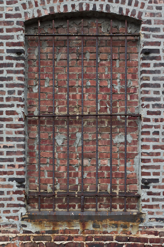
rcman50166 posted:
This one suffers a bit from the subject. It's pretty dull. I'm bad for shooting stuff like this as well, I find stuff like the bricked up windows, or textured brick walls interesting and think it will make an good picture, but it very rarely does. AtomicManiac posted:I like this general idea and can easily see it turning into a pretty neat series that tells a story. I'd push it a bit further and see what happens, worst case scenario you end up making something "too serious" and you keep it to yourself. Best case, people want to touch your genitals and/or give you money. I like those odds for the cost of a few rolls of film. You are the worst.
|
|
#
?
Mar 30, 2012 17:13
|
|

|
...
TsarAleksi fucked around with this message at 21:36 on Apr 20, 2019 |
|
#
?
Mar 30, 2012 17:14
|
|
|
MAkev posted:I went to the National Portrait Gallery last weekend, found these ladies hanging out there: This is a picture of someone else's work AND it's selectively colored? You're killing me. I still don't like that you're trying to make a creative photo out of some other piece of art, but this one is much more throughtfully composed and executed. I don't like that I can see another museum visitor in the background, though.
|
|
#
?
Mar 30, 2012 17:43
|
|

|
...
TsarAleksi fucked around with this message at 21:36 on Apr 20, 2019 |
|
#
?
Mar 30, 2012 17:52
|
|
|
McMadCow posted:This is a picture of someone else's work AND it's selectively colored? You're killing me. Its not selectively colored, but it does look like it (this was not my intention and I don't like selective color either). The walls in there are pretty gray and when I fixed the white balance that's how it came out.
|
|
#
?
Mar 30, 2012 18:54
|
|
|
TsarAleksi posted:Concur; RCMan these really do not belong in Photo a Day in the sense that there is no self-awareness. As Dukeu points out, all of your critique applies much more significantly to your photos than the one you are commenting upon. Just picking up your camera and pointing it at things does not a good photo make. I never said I was a good critique. I only try to put effort into what I am saying for the sake of the person I am critiquing. Cause, you know, it's point of the thread. I'm trying here. I generally don't feel good judging other peoples' photos. As for the critique on my photos. Some are constructive, some are not. I'll leave it at that and refer to the OP that says critique needs to be constructive and provide reasoning. Splashing words I say back into my face doesn't help anything. I was once told in the snapshot a day thread to post in here for some good criticism, and not to fear photo a day. I think I was mislead. I'll think twice about posting in this thread again. rcman50166 fucked around with this message at 22:03 on Mar 30, 2012 |
|
#
?
Mar 30, 2012 21:59
|
|

|
rcman50166 posted:I'll think twice about posting here in the future. You should think twice about what kind of images you post, not what kind of critiques you give or what kind of feedback you may see. Constructive criticism doesn't always seem nice when you're the person being criticized. edit after edit: rcman50166 posted:I was once told in the snapshot a day thread to post in here for some good criticism, and not to fear photo a day. I think I was mislead. Critique is how you improve. Dumping photos with hopes of someone saying "Nice job!" will not cause you to advance as a photographer, it will just encourage you to continue to take horrible photos.
|
|
#
?
Mar 30, 2012 22:02
|
|
|
dukeku posted:You should think twice about what kind of images you post, not what kind of critiques you give or what kind of feedback you may see. Constructive criticism doesn't always seem nice when you're the person being criticized. I generally post a photo here if I think it is decent. I don't post garbage on purpose. I know I am not the best photographer in the world and have much to learn, and that more experienced photographers might have something to tell me that I didn't see before. That's the kind of advice I am looking for, not people jumping on my back about a criticism I was not comfortable doing.
|
|
#
?
Mar 30, 2012 22:07
|
|
|
rcman50166 posted:I generally post a photo here if I think it is decent. I don't post garbage on purpose. I know I am not the best photographer in the world and have much to learn, and that more experienced photographers might have something to tell me that I didn't see before. That's the kind of advice I am looking for, not people jumping on my back about a criticism I was not comfortable doing. Any criticism you give is good criticism, don't feel bad about giving your opinion on something - that's why people are posting here.
|
|
#
?
Mar 30, 2012 22:09
|
|
|
...
TsarAleksi fucked around with this message at 21:37 on Apr 20, 2019 |
|
#
?
Mar 30, 2012 22:09
|
|
|
rcman50166 posted:I generally post a photo here if I think it is decent. I don't post garbage on purpose. I know I am not the best photographer in the world and have much to learn, and that more experienced photographers might have something to tell me that I didn't see before. That's the kind of advice I am looking for, not people jumping on my back about a criticism I was not comfortable doing. People aren't jumping on you for your critique. They are saying that rcman50166 posted:But I can't help but ask myself here, what am I supposed to be looking at? I generally try to find the good things about a photo and attempt to imagine the photographers intent. Applies to your photos. By that they are saying that these look like random snap shots that didn't have much thought put into them. Which may or not be true. This isn't Flickr where you get a gold star for posting. You will get honest critiques of the shots you post. Which can take some getting used to. edit: It may sound like we are being mean, but we do want you to get better. Demon_Corsair fucked around with this message at 22:59 on Mar 30, 2012 |
|
#
?
Mar 30, 2012 22:14
|
|
|
I just don't want to be made out to be some rear end in a top hat hypocrite. That is what I didn't like about the responses I got. That was not my intention at all. I'm used to most (obviously not all) criticism that comes from this thread. That wasn't the issue.
|
|
#
?
Mar 30, 2012 22:42
|
|
|
rcman50166 posted:I just don't want to be made out to be some rear end in a top hat hypocrite. That is what I didn't like about the responses I got. That was not my intention at all. I'm used to most (obviously not all) criticism that comes from this thread. That wasn't the issue. Then try not to misread the responses you get next time?
|
|
#
?
Mar 30, 2012 23:00
|
|
|
rcman, you REALLY weren't "jumped on" here - all you've experienced here is an honest critique. You need to get a thicker skin about it. This place is good for you, if you want to improve. You should never worry about being "good", just about being better than you were last week. "good" is arbitrary, relative. If you can't see the value in being critically battered, stick to SAD. Just ask yourself, how important is it to you that you improve?
|
|
#
?
Mar 30, 2012 23:06
|
|

|
I'm sure another person weighing in here is not required to get the point across, rcman, but maybe hearing this from someone who is also fairly new and also (was and still to some extent) not comfortable critiquing others will make this easier. I have not had time lately due to somewhat of a demon child newborn to post in this thread, but it is a GREAT resource for any photographer - especially for those who are inexperienced. The attitude I try to have is to shoot confidently, but still regard your work as poo poo. Come here or do your own homework and apply what you learn or what people say here to your next attempts and rinse and repeat. I think an important distinction that has been made here is that it is not flickr, it is not Facebook, and it is not Instagram - you will not get slews of "Nice capture, great shot!" comments, but you will get honest opinions from your peers and those who are one to many steps past you in the field. That brick window shot is something I tried - not exactly the same but the same idea - and seeing other people get critiqued on that type of thing not being good, as well as when I have a chance to post here is the direct road to improving yourself. Anyway, nowadays I will still shoot boring poo poo like that window, thinking it is interesting at the time, but will at least have the presence of mind to delete it upon later review because that critical part of mind in beginning to develop - largely in part to critiques here. There are some very thoughtful critiques, and even something like "this photo is poo poo" is useful if you know it is coming from someone whose work you respect. I'm typing this up as a kind of critique in its own right, which is the only reason I would add another *words* post instead of getting back to the pictures. You and I cannot get complacent and have to constantly work to improve, unless basking in mediocrity and getting sustainment from friends being impressed that your camera takes suck good pictures and how do you blur things like that? etc. So stop being such a baby, you don't have to save face - just go shoot more and come back. With that said, I am hoping to finally put some shot here tonight because being stuck in baby land I could really use some direction. p.s. the more you accept critiques, the better you will get at giving them after internalizing what you are being told. e: fixing typos - typing with one arm holding a baby is not easy. Also, \/ below, 
rio fucked around with this message at 00:43 on Mar 31, 2012 |
|
#
?
Mar 30, 2012 23:24
|
|

|
rio posted:You and I cannot get complacent and have to constantly work to improve Great post, but I wanted to point out that "you and I cannot get complacent" should be changed to "nobody can get complacent".
|
|
#
?
Mar 30, 2012 23:33
|
|
|
This thread is Photo A Day, wherein you are post a photographs and comment on photographs. Just, y'know, as a reminder. EDIT: Oh god I guess I should actually effortpost or something. Ok, in the rules in the OP, both being mean to people and getting colondamaged over negative crit are against the rules. Luckily neither of these things actually happened here. The crit given to rcman certainly qualified as negative, and may even have been mildly harsh, but nobody was calling him names. Having said that, do try to take critique in good spirits, even if you think it's total bullshit and/or hate the person who gave it or whatever else. Ok now post photos. SoundMonkey fucked around with this message at 23:47 on Mar 30, 2012 |
|
#
?
Mar 30, 2012 23:33
|
|


|
OK, I'm gonna try and get this back on the rails. I don't normally shoot portraits, so I wasn't too sure how this would turn out. Untitled by trip9, on Flickr  Untitled by trip9, on Flickr  Untitled by trip9, on Flickr
|
|
#
?
Mar 31, 2012 00:02
|
|
|
removed.
Revolucion fucked around with this message at 21:43 on Nov 29, 2020 |
|
#
?
Mar 31, 2012 00:12
|
|
|
David Pratt posted:Experimental I quite like this, but I think it would be a lot better if the light were coming round both sides of the head. ohrwurm posted:
I agree with others that the road is distracting. I think this could work really well much more tightly composed, so you're using the first set of pillars to frame the vaulting further back. Maybe even in landscape? I can't get a crop that shows what I mean, but if you took a few steps forward you'd probably have it. trip9 posted:
I rate these basically in the order you posted them. The first one is great, minor nitpick is I think it would look better if her mouth were closed. Somehow the light on her face is too strong for me in the second one, although I like pretty much everything else about it. I'm not keen on the shadow on the bottom left of her face in the third, and even disregarding that it feels like a weaker image than the other two. Some pretty dissimilar pictures from me:  I know this one is slightly out of focus, it's a crop from a wedding reception hall - the balloons are on separate tables, causing the apparent size difference. I really like it, but am keen for other opinions.  For this one I thought I had an interesting subject which I really struggled to get an interesting photo out of. Those glass heads are pretty tricky to photograph while maintaining any detail or definition, and I'm not really happy with what I ended up with. More than technical criticisms, I'd really like to hear ideas on how other people might have shot something like this.  I was walking past this field and on seeing it immediately knew the photo I wanted to take, and this is exactly it. Something about the dull, empty sky and grass and the curving lines of the horizon, ground and tractor trails speaks to me. Does it do the same for anyone else or is this just a boring image of nothing going on?
|
|
#
?
Mar 31, 2012 01:22
|
|


|
big scary monsters posted:
|
|
#
?
Mar 31, 2012 01:28
|
|

|
MAkev posted:Its not selectively colored, but it does look like it (this was not my intention and I don't like selective color either). The walls in there are pretty gray and when I fixed the white balance that's how it came out. If that's the case then I would have un-done the color correction to the white balance around where the lights hit the wall. If those are tungsten lights, they should be coloring the wall with their red/yellow colored light. The pure white look is what is telling my brain you took out the color. But really, the most important thing to take away from this is that if you shoot someone else's work in a setting presented by yet another person (curator), then you're never going to be the driving artistic force of the photograph. Shoot something you have more control over.
|
|
#
?
Mar 31, 2012 01:33
|
|
|
alkanphel posted:I'm afraid this does look like a dull and boring photo because the colors feel muted and low-contrast. But I can see why you took it, so perhaps you can consider a b&w conversion and adjust the green and blue values to make it more dramatic. Carefully, though, because on film, green grass is a zone V. A conversion in post is going to net a similar value. Having half your frame taken up with middle grey is a recipe for a seriously boring photo.
|
|
#
?
Mar 31, 2012 01:35
|
|
|
trip9 posted:
I like these a lot. Good subject, great light, great location. The only issues I have are the framing is a bit wide and loose. The first one would look tons better cropped for 8x10, the second could stand to lose a bit from the side, the third is probably the best but could stand to lose a little from the top and bottom. A little more effort on placing your subject in the scene and I think these would be great.
|
|
#
?
Mar 31, 2012 02:44
|
|
|
big scary monsters posted:
For the first, did you crop from the top or the bottom? I like the concept, but I think the uneven line of candles at the bottom combined with the bright walls on the left and right are doing everything they can to lead the eye right out of the frame. For the second, think of what makes them interesting. Is it symmetrically arranged on a shelf? the shelf above can work as a frame, if you step back with a long lens to show the symmetry. Is it the details of the hat? Get closer and show the details. For the third, the first thing I thought of was Paul Octavious's "Same Hill, Different Day." It also smacks of the Rhine photograph. It's not bad, but it's also not interesting. What interests me is the two curves (hill top vs tractor trails), I'd say pan right and tilt up, then wait for better clouds and directional light, or maybe a tractor.
|
|
#
?
Mar 31, 2012 04:09
|
|

|
Since I have started posting critiques I may as well post some arts. My work is kind of in a transitional phase right now. Since I moved to Seattle I have been heavily into landscapes. My work isn't really of the "pretty hills and trees" variety, it's about people and how we fit into the space around us.   
|
|
#
?
Mar 31, 2012 05:21
|
|
|
Thanks for the comments. I cropped the bottom from the balloons photo. The candles are sat on a stage at the far end of the hall, which becomes visible if I include any more of the bottom of the image. I also liked a crop ending just beyond the "largest" balloons, but in the end decided I wanted to keep the balconies fading into the darkness. Maybe it is stronger without them, though. Possibly even just the balloons with no candles? The second one, good question about what I found interesting. I think it was really trying to find personality in these identical human-looking things. There were more heads than the four there, and I really wanted to have them interacting in some way, posed like they were in conversation or kissing, but it just looked awkward. Those are EEG caps they're wearing, apart from the one with my woolly hat on. I tried to make them look like clothing: hats, scarves and necklaces, but I'm not sure it really comes across. For the hill picture, I haven't managed to get a good B&W out of it, perhaps the answer is just to go back and reshoot. In some ways the flat grey sky is what I really wanted (I didn't do it consciously but I suppose it does owe something to Rhein II), but it may well be there's a more interesting angle I could get.
|
|
#
?
Mar 31, 2012 05:31
|
|
|
8th-samurai posted:Since I have started posting critiques I may as well post some arts. My work is kind of in a transitional phase right now. Since I moved to Seattle I have been heavily into landscapes. My work isn't really of the "pretty hills and trees" variety, it's about people and how we fit into the space around us. I really like the last two, especially the last one the more I look at it. I can definitely see you're approaching stuff from more of an "art" angle. Were these shot medium format?
|
|
#
?
Mar 31, 2012 05:41
|
|
|
trip9 posted:I really like the last two, especially the last one the more I look at it. I can definitely see you're approaching stuff from more of an "art" angle. Were these shot medium format? Yes, they first and last were shot on a Pentax 6x7 with expired Portra 400UC and the middle one on a Hasselblad with Portra 160NC.
|
|
#
?
Mar 31, 2012 05:51
|
|
|

|
| # ? May 11, 2024 05:24 |
|
|
8th-samurai posted:Yes, they first and last were shot on a Pentax 6x7 with expired Portra 400UC and the middle one on a Hasselblad with Portra 160NC. So are these part of a thought-out series, or when you were talking about the theme was it just something that kind of manifested itself in the photos you posted?
|
|
#
?
Mar 31, 2012 06:43
|
|