


|
trip9 posted:So are these part of a thought-out series, or when you were talking about the theme was it just something that kind of manifested itself in the photos you posted? These are part of two different series. The overarching themes of both are similar though. I don't have a specific goal or end in sight for either of them.
|
 #
?
Mar 31, 2012 06:54
#
?
Mar 31, 2012 06:54
|
|


|

|
| # ? May 21, 2024 16:29 |
|
|
8th-samurai posted:Since I have started posting critiques I may as well post some arts. My work is kind of in a transitional phase right now. Since I moved to Seattle I have been heavily into landscapes. My work isn't really of the "pretty hills and trees" variety, it's about people and how we fit into the space around us. The first one doesn't really land with me, and if I hadn't read your intent for these I wouldn't have been able to read it from that photo. The second is getting there with relating your idea, but I can't really see any of 'the space around' it because it's pretty tight. I am not an art photog, so take this for what it's worth, but I see this scene being more effectively used as the backdrop for some kind of subject or context that establishes your idea clearly. A dude dumping out trash into the grass, a wider shot relating proximity to a manicured lawn, something like that would help my artless brain look at this and say "I get it!" Third is my favorite. I feel like there is a house that has been swallowed by a plant in there. I'd like to see more of the frame showing the other houses to clearly display the contrast between the two. Probably difficult with the greenery layout of the neighborhood, though.
|
|
#
?
Mar 31, 2012 08:01
|
|


|
big scary monsters posted:
I do like this one, but the crop is kind of playing against it, I feel. It's almost like the balloons are bit players in the photo because of how low they hang, and there's too much negative space in between each bunch, so I'm not having an easy time reading the photo across the crop. That said, if it were to be used as a website banner, it would be really good, but as a stand-alone photo, I feel that it could use some perspective tweaking.  DSC01834.jpg by chidona, on Flickr I really bumped up the vibrancy here - I think the simple, blocky colours and simple shadows allow me to get away with it, but I could be talking out of my rear end!  DSC01845.jpg by chidona, on Flickr This one I liked because of the 3 ice-cream feel to it. You know the tubs of ice cream that have a strip of chocolate, a strip of strawberry and a strip of vanilla? I took out the contrast from it because I didn't want small details getting in the way of the broader 'trends' going on, and I'm also a sucker for the washed out aesthetic. Is it justified?  DSC01906.jpg by chidona, on Flickr This one has a fair amount of problems (highlights are shot to hell, tree appears to dissolve). I think it has promise though, I like the composition and subject matter. How do you deal with blown out skies like this?
|
|
#
?
Mar 31, 2012 12:39
|
|


|
 _DSC0302 by jwvgoethe, on Flickr
|
|
#
?
Mar 31, 2012 16:30
|
|
|
This isn't Snapshot A Day, if you're going to post here and not give critique on other people's work (don't feel that you're not qualified, figuring out what you like and don't like about other photos makes you better at judging your own) then the least you can do is say what you think about the picture you're posting. Why you took it, what you think could be improved about it, and so on. That said, your photo is ok, but could do with tighter cropping. The empty space at the top isn't adding much to the composition, and the out-of-focus woman on the left, while helping frame the subject, is a little distracting. The contrast also feels too high to me. Hope you don't mind reposting your image, but I'd have cropped something like this: 
|
|
#
?
Mar 31, 2012 18:31
|
|
|
8th-samurai posted:As a series I'm interested in seeing more. The first photo is the weakest of the three, but is definitely a part of the mood and atmosphere of the set. The first photo is all about the stop sign for me, but it's not drawing me into the photo as much as it could. The second photo is awesome. Are you able to recover the sky any more in the original print? I think it would be really stunning if you could see some more detail in the clouds. The layers you have found with light/shadow, artificial horizons, and colors really make me enjoy this photo. Good Stuff! The third photo really makes me want to go out and shoot more. You captured some amazing light and soft colors. This really succeeds as a landscape about people. Since snapshot has been kidnapped, have a scene I found interesting, instead of cat photos. 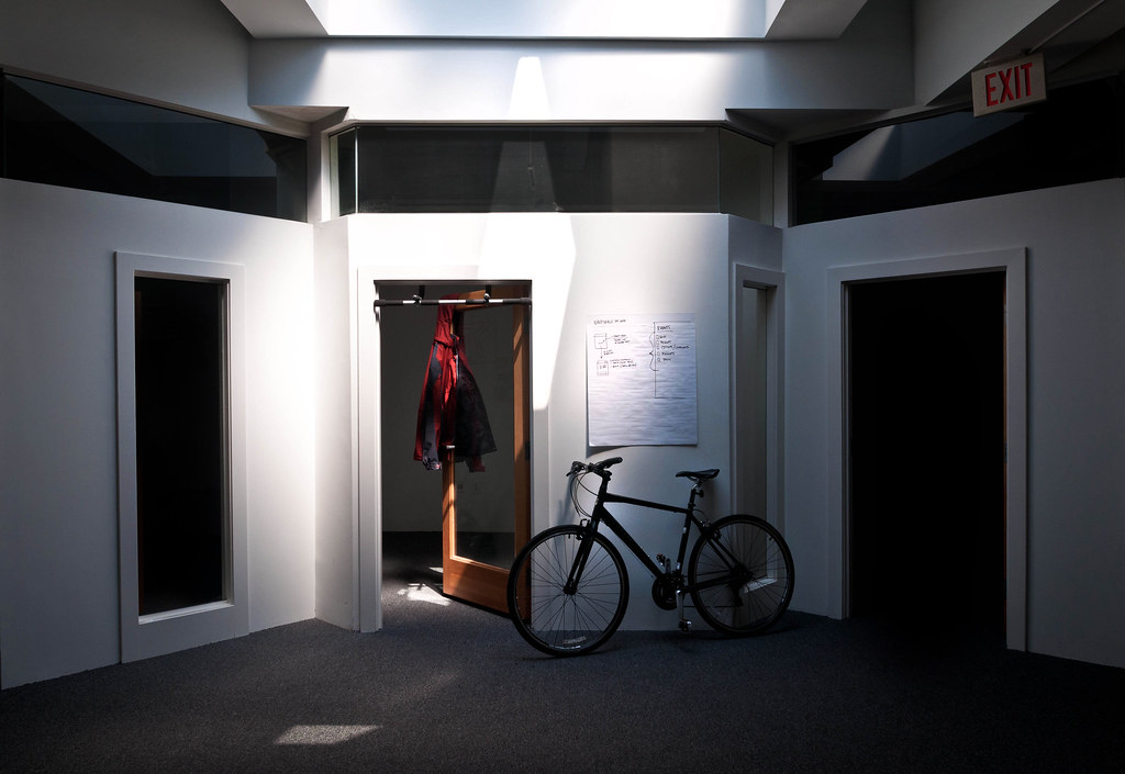 rice bowls-0379 by AIIAZNSK8ER, on Flickr
|
|
#
?
Mar 31, 2012 19:18
|
|

|
No SAD makes me sad, but I'll play along. Recent critique a few posts above this one. We're in the middle of a short spring, a new fighting season, and the brief period between snow and dust where the shaded side of the wind carved hills is fertile enough to bear grasses. The dots on the hillside is a herd of sheep.  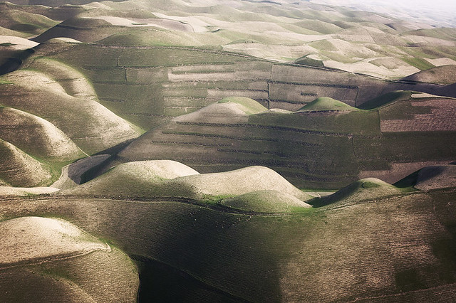  I hate my processing on all of these but I just feel stuck. The dust and haze in the air makes a properly exposed picture occupy the central 1/4th of the histogram and nothing else, then trying to recover the contrast blows the detail out of the highs and lows. It's pretty challenging to maintain a realistic look that isn't also harsh and ugly, and that's what is frustrating me about processing landscapes lately, arrgh. 
Ambihelical Hexnut fucked around with this message at 04:21 on Apr 1, 2012 |
|
#
?
Apr 1, 2012 04:19
|
|
|
Chidona posted:-I like single photo triptychs, but I think this should have been shot head on from a lower level; as it is the floor boards don't seem to have much thought in them and the buildings are just clutter. -Aside from needing to cut back on the vibrancy slider, I really like the middle of the picture and the perspective meet nicely at an edge. The large negative space in the bottom left though doesn't contrast well with the cluttered tree in the top right, which throws the balance of the photo off. Try a 2:1 crop with the bottom just below the benches and the top just above the hut, it should mitigate the problem of space and get rid of that blown sky. Don't forget to cut back the green saturation by a lot. AIIAZNSK8ER posted:
Ambihelical Hexnut posted:I hate my processing on all of these but I just feel stuck. The dust and haze in the air makes a properly exposed picture occupy the central 1/4th of the histogram and nothing else, then trying to recover the contrast blows the detail out of the highs and lows. It's pretty challenging to maintain a realistic look that isn't also harsh and ugly, and that's what is frustrating me about processing landscapes lately, arrgh. ---------------------------------------------------- I went to the zoo a couple weeks ago but I've been so busy that I hadn't even seen the pictures until today. The trip really reinforced the fact that I really need a better zoom lens.  Tamron 75-300 Tamron 75-300  
|
|
#
?
Apr 1, 2012 06:20
|
|
|
AIIAZNSK8ER posted:
I have no really new photos to post but i just wanted to say that i love this. it almost seems black and white but then you've got the brown of the door and the red in the jacket and the really nice subtle blues to bring you back into the reality that you're looking at a color photo. it's like real life selective coloring which is the only good type of selective coloring. the lighting is perfect. cool shot. i like.
|
|
#
?
Apr 1, 2012 06:20
|
|

|
TheLastManStanding posted:I assume you wanted to frame the tiger with the shadows but I find it looks unnatural as they are completely pitch black and there's not detail in it and th-AAHAHA who am I kidding, I can't critique and I just want to post my crap somewhere now that SAD is gone     (USER WAS PUT ON PROBATION FOR THIS POST)
|
|
#
?
Apr 1, 2012 08:38
|
|

|
Ringo R posted:This photo is really ruined by the reflection of yourself on the trunk. If you cleaned up that section it would be really nice. AIIAZNSK8ER posted:
There is some really nice light there but too much clutter that makes it just look like a normal room, nothing to draw you in or make your eyes care to explore the space and gorgeous light. There either needs to be more stuff or nothing, it's just kind of bland as is. A few recent shots of mine, I've been busy and haven't been able to post here   
Bottom Liner fucked around with this message at 09:06 on Apr 1, 2012 |
|
#
?
Apr 1, 2012 09:00
|
|

|
E: Wrong button
|
|
#
?
Apr 1, 2012 09:50
|
|
|
Chidona posted:I do like this one, but the crop is kind of playing against it, I feel. It's almost like the balloons are bit players in the photo because of how low they hang, and there's too much negative space in between each bunch, so I'm not having an easy time reading the photo across the crop. That said, if it were to be used as a website banner, it would be really good, but as a stand-alone photo, I feel that it could use some perspective tweaking. I don't find the lighting to be helping you here much at all. It might be worth the effort to revisit the locations from the first two pictures at a different time of day. The last one you beat me to my own critique of it. Two from this weekend. This stuck out to me because of how the sun created some interesting shadows and changing light throughout the front of the building. My post-processing work was mostly to cool the picture down some and raise the levels of black a touch. I just wanted to emphasize the lighting without going cartoonish.  This one I had to step away from in Lightroom. The unedited image was a much larger scene so this was a crop to get rid of what I felt was distracting. I actually shot this one slightly over exposed intentionally to bring it down some in LR but ended up liking how it all looked 'sun-baked'. Did some work to boost the blue of the sign some more as well. I'll revisit this photo later in the week to find another way to work it. 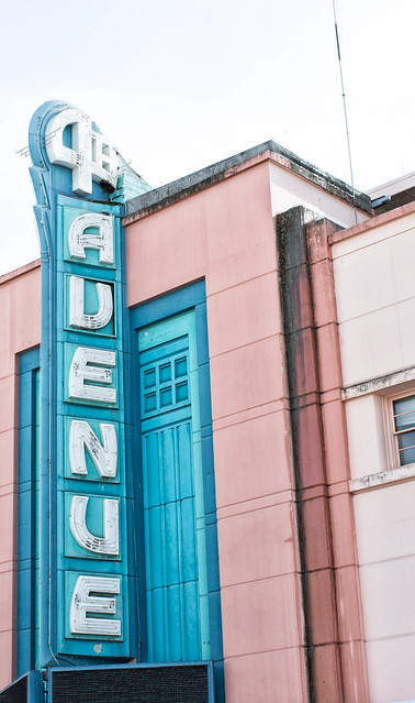
bloops fucked around with this message at 18:33 on Apr 1, 2012 |
|
#
?
Apr 1, 2012 17:57
|
|


|
TheLastManStanding posted:The Spice must flow... HeyEng posted:Two from this weekend. Since you didn't feel like critiquing someone else, why don't you explain what you were going for with these shots.
|
|
#
?
Apr 1, 2012 18:08
|
|

|
Bottom Liner posted:This photo is really ruined by the reflection of yourself on the trunk. If you cleaned up that section it would be really nice. I think you nailed all three of these. The off camera lighting, dof all look great and make subjects really stand out. If I had to nitpick the only thing I'd say is restrooms sign in the third is a little distracting. ____ Here is one for today so far:  Botany Bay Road by Ryan-Tamm, on Flickr
|
|
#
?
Apr 1, 2012 18:30
|
|

|
Demon_Corsair posted:The Spice must flow... Edited.
|
|
#
?
Apr 1, 2012 18:34
|
|
|
Haggins posted:Here is one for today so far: I really like this and don't really have too much to say about it other than I think you did a good job. The only thing that bothers me about it is that there is a stick or something right near the patch of sun which I find a bit distracting. Looks like such a cool place.
|
|
#
?
Apr 1, 2012 19:57
|
|

|
TheLastManStanding posted:That bike looks really out of place there.
|
|
#
?
Apr 1, 2012 20:13
|
|

|
Dread Head posted:I really like this and don't really have too much to say about it other than I think you did a good job. The only thing that bothers me about it is that there is a stick or something right near the patch of sun which I find a bit distracting. Looks like such a cool place. Good catch. I might print this one and put it up on the wall so I'll probably clone it out before then. Thanks.
|
|
#
?
Apr 1, 2012 20:58
|
|
|
Ringo R posted:Like this one but the vignetting is a little distracting. Here are a few from a bike ride today 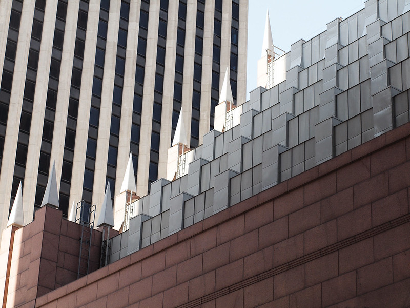 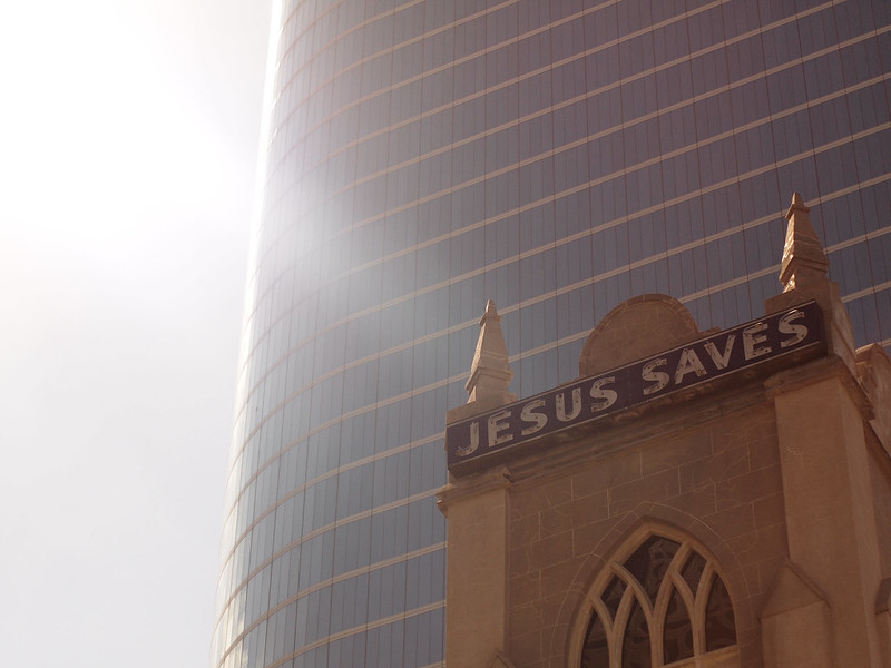  I never know if shots like the last one are interesting at all- I was mainly going for the textures (and surprisingly well-penned graffiti) I guess. Does that 'work'? Bouillon Rube fucked around with this message at 03:59 on Apr 2, 2012 |
|
#
?
Apr 2, 2012 01:10
|
|


|
Augmented Dickey posted:drat, this is gorgeous.  Gonna need a bit more than that, man.
|
|
#
?
Apr 2, 2012 01:38
|
|


|
Augmented Dickey posted:drat, this is gorgeous. What do you like about the photo that makes it gorgeous?
|
|
#
?
Apr 2, 2012 01:46
|
|
|
Sorry, I guess reading the rules would have been beneficial. Haggins posted:
But really this is an awesome shot, I love how the light falls through the trees and illuminates the foliage on the left side of the shot. It feels like the patches of light sort of help establish depth in this type of shot- I've tried to shoot similar scenes before and they always seem to come out a bit flat and lifeless. Like dread head mentioned, the little black object in front of the largest patch of sunlight is a little distracting- it should be pretty easy to remove though.
|
|
#
?
Apr 2, 2012 03:00
|
|
|
quote:quote:quote:Here are a few from myself.    The first is from a event I shot for a newspaper on the beginning of construction for a new library. The other two I don't think are technically good photos, but I'd like to think I captured these wonderful fellows personalities pretty strongly through them.
|
|
#
?
Apr 2, 2012 05:58
|
|

|
HeyEng posted:This stuck out to me because of how the sun created some interesting shadows and changing light throughout the front of the building. My post-processing work was mostly to cool the picture down some and raise the levels of black a touch. I just wanted to emphasize the lighting without going cartoonish. I like way the light accentuates the lines and shadows on the building, but I wish the center column thing wasn't cut off at the top. Augmented Dickey posted:I like the contrast of the squares on one building to the lines on the other. The lack of lines parallel to the frame edge (as someone else mentioned) doesn't really bother me, but the left edge of the building in front feels a bit cramped that close to the edge of the photo, I'd prefer more space or for the building to just be cut off. I'd try some crops to see if there is one that looks a bit better. Here are a couple of mine.  Cables by jhunter!, on Flickr I liked the way the sidewalk was cracked and had plants growing up through it and really like diagonals in square format though I do wish there were some more contrast between the cables and the road behind them.  Rambler by jhunter!, on Flickr I decided to stick the car right in the middle as it takes about one third of the frame, then one third house above it and one third road below it. I thought it had a nice symmetry. I don't like that the car has a flat tire (can't fix that though) and I got some pretty strong flare off the chrome. Not sure how to fix the flare though, polarizing filter maybe? I think that would be hard to use on a rangefinder.
|
|
#
?
Apr 2, 2012 06:36
|
|

|
HeyEng posted:Two from this weekend. The light/shadows are nice on the first one but how you have cut off the top, especially the part running up the middle is really distracting. The 2nd one I find more problematic, while the sign is straight the rest of the building is not and this is kind of off putting. The other thing is the white sky, I know it can be a pain to deal with but it is pretty distracting in this photo. I think it is particularly so because it takes up a large enough portion of the photo but does not add anything. The last thing that bothers me is the antenna that is sticking up, with it being on the white sky it really stands out. ----- Two from the weekend. 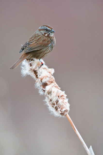 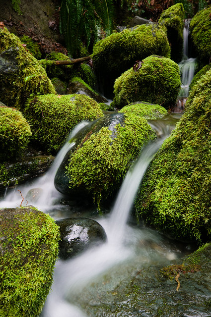
|
|
#
?
Apr 2, 2012 07:39
|
|
|
Edit: nm
Bip Roberts fucked around with this message at 11:07 on Apr 2, 2012 |
|
#
?
Apr 2, 2012 10:58
|
|
|
I'm going to post this here to help both people that are shy about posting critiques and those that are shy about posting photos. quote:How do I give another photographer a critique? So with every photo that catches your eye you have plenty to think about there. You can also apply these same thoughts to your own images, and if you can't answer or justify why you took the photo or why you shot it the way you did, you're not putting enough thought into your images. If you know your photo is weak technically, say you missed the focus, you should probably withhold sharing it, unless there is a compelling reason otherwise. I am a firm believer in getting down the basic technical skills of any creative outlet first so that you can actually flex your creative muscles with it. If you don't understand exposure or focus, you need to spend some time working on that before you post. We're mostly here to improve our craft while sharing with one another, so let's put more effort into both sides of that relationship. EatinCake posted:Here are a few from myself. You need to resize these. They are too small as thumbnails and way too large at full size to really take the photo in. I will say they are all out of focus and the second shot is particularly effortless. The third shot has the most potential given the crazy scene, but the technical issues hurt it too much. Augmented Dickey posted:Like this one but the vignetting is a little distracting. Senior portraits with a super photogenic friend of mine. These were all taken outside, the first with one strobe/softbox, the seconds using a reflector and shade to create a studio feel (with the sun providing a nice hair light), and the third with no flash.   
Bottom Liner fucked around with this message at 11:42 on Apr 2, 2012 |
|
#
?
Apr 2, 2012 11:22
|
|
|
AIIAZNSK8ER posted:
I like this one, but there's something that's just not working for me. I don't know, but somehow I feel that the jacket is taking too much of my notice. Maybe if the door was a bit more open it would have worked better. Bottom Liner posted:There is some really nice light there but too much clutter that makes it just look like a normal room, nothing to draw you in or make your eyes care to explore the space and gorgeous light. There either needs to be more stuff or nothing, it's just kind of bland as is. The more I think of it I think it's just that the jacket brings too much clutter straight to me. I don't think it should be completely removed, but slightly reduced in the picture. If that makes any sense.  I'm not sure if I like this or not.
|
|
#
?
Apr 2, 2012 18:27
|
|
|
Bottom Liner posted:
I really like the strength and vibrance of all the colors here. The red-blue-yellow contrast stands out first; they balance each other out very well. There's a second, similar area of less vibrance with the red jars-yellow jars-green glasses, and the red areas persist, more muted, into the background, overall creating three areas of varied intensity. My only gripe is the shirt's reflection invading the yellow area, but you don't really notice that until second glance. Mine: not-quite-focused duck. 
|
|
#
?
Apr 2, 2012 19:09
|
|


|
fnif posted:
Why do you think you like it? There's nothing there.
|
|
#
?
Apr 2, 2012 19:20
|
|

|
fnif posted:
Im very sure I dont like it. What is this? The intent? I really want to know where you are going with this shot. Color is ok, but composition, subject matter, framing are all bad. PAD is for Effort photos, which this is not.
|
|
#
?
Apr 2, 2012 19:22
|
|
|
Bottom Liner posted:I'm going to post this here to help both people that are shy about posting critiques and those that are shy about posting photos. I feel that with the strength of the lighting in these and how easy it is to clean up skin, you should remove those blemishes, especially on her chin. Easy fix and no one wants to remember bad skin.
|
|
#
?
Apr 2, 2012 19:25
|
|

|
Musket posted:
It's not an effort shot for you, but he could very well have taken the time to think about it, frame it and shoot it a certain way. Is it good? No. but that didn't mean effort wasn't put in. for all the bitching about having pad more active, we seem to be saying "don't post that here" a lot. It's fine to post it, just make sure you actually did put effort in and can learn why it doesn't work. Just saying "this sucks, stop posting crap" isn't going to help him.
|
|
#
?
Apr 2, 2012 19:30
|
|
|
fivre posted:Mine: not-quite-focused duck. I think this may have worked better if the duck was just a silhouette, so being out of focus wouldn't matter. A 4x5 from a recent outing in an abandoned school. I found out the hard way that the shutter sticks at 1 second. 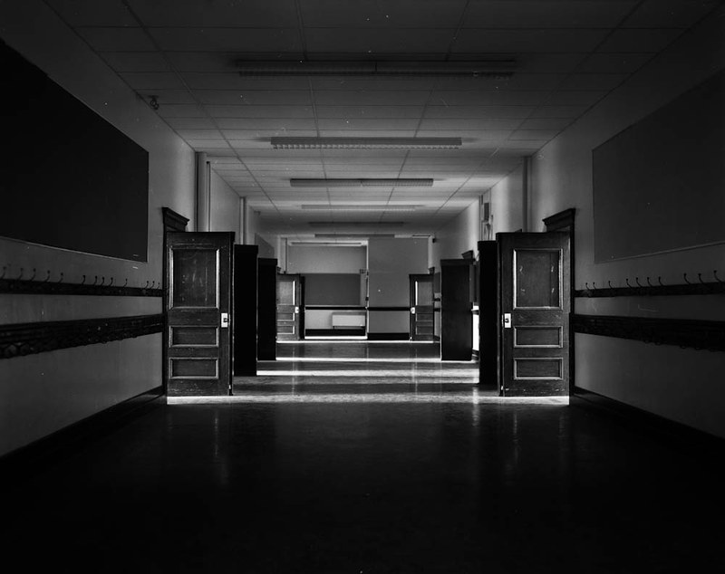 King Edward School by TheOneTrueDevo, on Flickr
|
|
#
?
Apr 2, 2012 19:38
|
|
|
fnif posted:
I want to like this, but I don't. The light is very interesting but but composition is a little sloppy. What interested you about this? Try to show it's relationship to it;s surroundings a bit more. On the technical side of things looks like you shot at f/5 with 1/800 shutter speed you could have got at least another stop of DOF if you shot it at something like 1/250. Even better use a tripod tat way you can lower the ISO and use a slow shutter speed for maximum sharpness.
|
|
#
?
Apr 2, 2012 19:40
|
|
|
Demon_Corsair posted:I think this may have worked better if the duck was just a silhouette, so being out of focus wouldn't matter. I really, really like this although I think it would be a bit more effective if you had made the perspective lines created in the ceiling intersect with the edges of the frame. Were you perfectly centered when you took the shot? Here's a "discard" from a recent roll that I could use some feedback on: 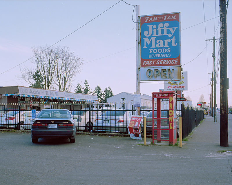
|
|
#
?
Apr 2, 2012 19:48
|
|
|
Demon_Corsair posted:I think this may have worked better if the duck was just a silhouette, so being out of focus wouldn't matter. I really like the way that the shot lines up-- the symmetry is really pleasing to the eye and interesting to look at. I hate to say "nice lines" but at the end of the day, those are some nice lines. To be picky and fussy, you should spot/clean your shots. It's a painful fact of life for film photography, but it's still something you need to do for presentation type work.
|
|
#
?
Apr 2, 2012 20:10
|
|

|
Bottom Liner posted:- Any time you're dealing with an increase in contrast it's best to add some desaturation (adding contrast increases saturation); this is especially true for skin tones where people can start looking like oompa loompas pretty quick. Her skin isn't that bad, but it's noticeable in the arm. I also somewhat question the color temperature of the first image; I can see that that palate is white, but everything else looks very warm. - Second photo is great. I agree with the previous person that you should spend the 30 seconds required to get rid of the blemishes. You should also have cropped the bottom (your reflector is in the shot). - The third photo is also really nice. I don't mind the large negative space much but I do think it could use a little less headroom. As a personal thing I would add some slight blur to the background and make sure to avoid sharpening it to try and tame the rough bokeh that the nifty fifty gives. You might also add some lens blur to the ground on either corner as that dead branch is a bit distracting.
|
|
#
?
Apr 2, 2012 21:15
|
|
|

|
| # ? May 21, 2024 16:29 |
|
|
Dread Head posted:Two from the weekend. The bird photo is composed well and I feel the entire frame has been used effectively. The colour pallet is pleasing. The subject is engaging and well posed. I feel a distant connection with the subject, engaged, but not welcome any closer. The sharp red collar on the subjects leg highlights a point about it's past. This photo tells a real story. The deep shadows and dark rocks make a nice contrast with the vibrant moss and flowing water. The photo is pretty, but it doesn't say much. One from me:  2012-94 by Tom Rintjema, on Flickr
|
|
#
?
Apr 2, 2012 22:53
|
|