


|
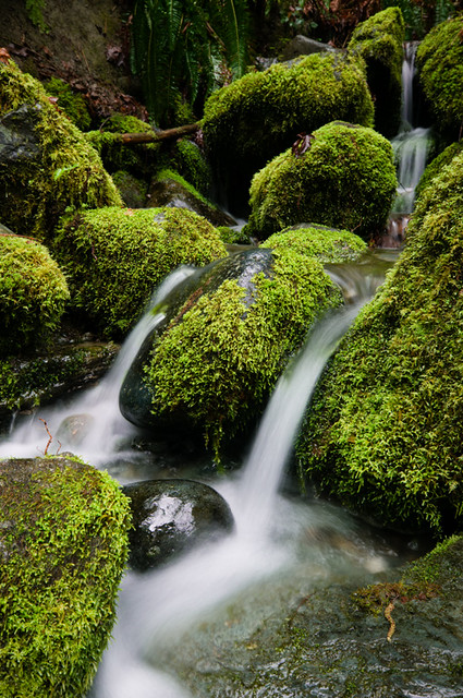
Dread Head posted:I quite like this. The composition is very good, you really get across the beauty of the area you're in (or the beauty of the immediate area anyway.) The stepping effect from the retreating stones is the epitome of woodland waterfall. I do think you've overexposed a little and gone for slightly too long am exposure time. The glare from two of the rocks takes from the image, I think, it just draws my eyes, and then that makes me think that overall it's too bright for what I'm picturing as a secluded, canopy covered forest stream. With the exposure time, I think it's a little more of my personal taste. To me that smooth water is more to do with seascapes. Waterfalls, especially those forest stream ones should be bubbling and gurgling. I think if you had a shorter exposure time you would have still gotten an ethereal effect of the blurred water, but you would have captured some of the bubbling and spitting coming from it, and made it very much akin to a rugged stream, while keeping the idea that it's eroding the boulders. I asked about the image hosting situation, and was still left a little confused. So to avoid all doubt (and because I needed it anyway) I just bought a domain name and some hosting. I've checked with a few people and the DNS has propagated for them, if it hasn't for you then you haven't missed much anyway.  This is an image I shot last year. It was taken on a photowalk, probably a few weeks after I started trying to shoot as much as I read about photography. What I was going for was the alien-ness and scale of the buoys. I took about a hundred shots on that photowalk, and there are only two I'm happy with now. And I'm only happy with them after converting to black and white. And that's partly the reason I'm mostly shooting black and white film now. My thoughts on it are that I should have just ignored the sky. It was a very bright day, with almost total but very thin cloud cover. I should have just let the sky blow even more, and gotten a bit more depth in the black. I've also gone back and forth between this image and one with the second buoy back in focus. I prefer this one, as I think the eye is drawn to the bottom right, then it moves back towards the out of focus second one, before maybe noticing the third one and all movement gives a sense of scale between the three.
|
 #
?
Apr 2, 2012 23:35
#
?
Apr 2, 2012 23:35
|
|


|

|
| # ? May 12, 2024 19:19 |
|
|
Buceph posted:My thoughts on it are that I should have just ignored the sky. It was a very bright day, with almost total but very thin cloud cover. I should have just let the sky blow even more, and gotten a bit more depth in the black. Aren't the buoys black? They're already fairly grey in the final image, bringing the blacks up any would make it look pretty unnatural, IMO.
|
|
#
?
Apr 3, 2012 00:49
|
|

|
Buceph posted:
The eye is led between the 3 buoys naturally in the way you described, although I don't think it really reinforces any difference in scale. To me when the phrase "a sense of scale" is used, it means to use something to show how big/small another thing is. To me the buoys all look the same size because the size of the tires are about the same. Finally, I don't think the subject matter is interesting enough, but that's probably subjective. I notice the radial pattern of chains and tires, but that's pretty much all and I'd just move on to another photo.
|
|
#
?
Apr 3, 2012 00:51
|
|

|
Buceph posted:I quite like this. The composition is very good, you really get across the beauty of the area you're in (or the beauty of the immediate area anyway.) The stepping effect from the retreating stones is the epitome of woodland waterfall. I do think you've overexposed a little and gone for slightly too long am exposure time. The glare from two of the rocks takes from the image, I think, it just draws my eyes, and then that makes me think that overall it's too bright for what I'm picturing as a secluded, canopy covered forest stream.  those are fenders those are fendersI think this isn't a failed shot by any means. You saw something interesting and tried to come up with an interesting way to photograph it. I think where you could have gone a different direction is in how you used the patterns and shapes of the fenders. The radial shapes and lines of the tires stretched across the gray/black expanse would have probably been more interesting than just a photograph of them sitting there. TsarAleksi fucked around with this message at 01:00 on Apr 3, 2012 |
|
#
?
Apr 3, 2012 00:57
|
|

|
Yeah, I don't know what I was thinking with the "buoy" thing, they are fenders. It may be because I was just looking at a site for a boat-things jumble sale and maybe that confused me. I'm definitely in agreement over deepening the blacks. I'll see if I still have the raw file and take a look. (I should have it.) I guess the sense of scale isn't coming through, because the fender in the foreground was about half the size of the other two in the background. I'd say I was more going for a weird/alien feel with scale as a secondary factor, because those fenders were pretty drat weird. I'd love to have been able to get the third to "step" again out of the second, but they weren't placed that way. And as for the radial patterns and geometric lines thing, that's just not something I have an eye for yet and I don't remember "seeing" anything at the time. Although looking at it, I probably should have tried for the chain sprouting from the end of the second fender, and having the tyres at the edge of that surface framing the shot. Thanks for the comments, I appreciate the helpfulness. I think having heard what you have to say I'll try a trip back out there, seeing as it's twenty minutes from the city centre. Mrenda fucked around with this message at 01:50 on Apr 3, 2012 |
|
#
?
Apr 3, 2012 01:45
|
|
|
Bottom Liner posted:I really want to love this, but as it is my eye keeps going to the large tree right behind her. TomR posted:One from me: This is really cool. It took me a minute to figure out what I was looking at, and I mean that in a good way. Might want to try taking care of the hair and dust on the film though- it's very easy to remove in post with b&w film. Here's a shot from a few months ago- I liked the contrast between old and new. The SUV in the back is bugging me, though. 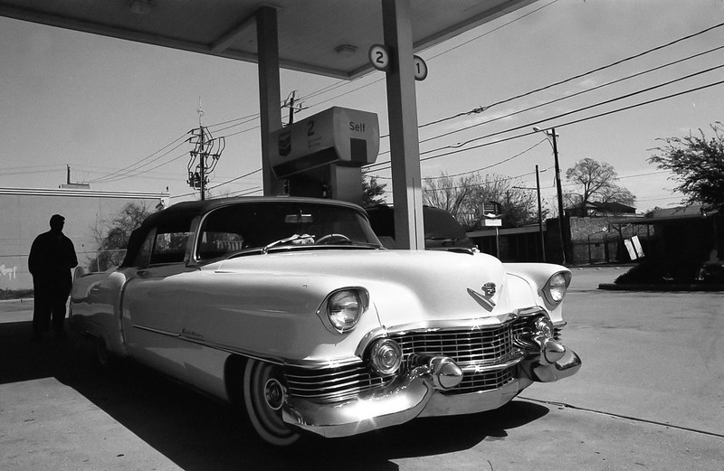 Another older one- it's a simple shot but I liked the symmetry and depth. 
Bouillon Rube fucked around with this message at 03:06 on Apr 3, 2012 |
|
#
?
Apr 3, 2012 02:01
|
|


|
Bottom Liner posted:First off, I love the way this photo is composed. The expression and white knuckles holding the bow set off the attitude of the photo for me. There is a light spot on the tree in the lower middle of the frame that is distracting. It takes away from this picture for me. Bottom Liner posted:Saying your friend is very photogenic is an understatement, she's a very naturally beautiful girl. From what I've seen, you tend to have a knack of bringing out that natural beauty in your subjects. That said, I agree with taking out the few small blemishes and cropping the sliver of the bottom off, also I feel it could use slightly less contrast. On a side note packing a hairbrush would have made that ever more perfect. For the black and white photo, I love the natural lighting you were able to get. I think if the contrast is toned down, it will even out the lighting with the sky, trunk, and branches so she'll have a little more detail without losing your blacks.  Falls revisited. by samjack56, on Flickr  Circling by samjack56, on Flickr  The Morning Feed. by samjack56, on Flickr
|
|
#
?
Apr 3, 2012 02:44
|
|


|
Augmented Dickey posted:
OK, I've been in a slump. Just miserable and uninspired for MONTHS. I did that thing you're never supposed to do, I went and threw money at the problem (bought a new camera), and it probably didn't help anything in any permanent fashion, but it got me out and off my rear end for a couple of hours this weekend. I already know this isn't staggering work, but I had an idea of what I wanted to accomplish in terms of theme, and I feel like I succeeded on at least a small level in terms of trying to express something visually. I wanted to capture that point between winter and spring, where nothing is as perfect or as beautiful as it will be yet, but change is evident and in progress everywhere. Color is emerging from a tangle of gray and things seemingly dead are starting to resemble something living again. To that end, here are 3 pictures that try to tell of that transition.  Emerge by Trip Sixes, on Flickr  pod by Trip Sixes, on Flickr  blossoms by Trip Sixes, on Flickr yeah, that sounds as pretentious to me as it probably reads to you, LOL 
krackmonkey fucked around with this message at 03:03 on Apr 3, 2012 |
|
#
?
Apr 3, 2012 02:54
|
|
|
Bottom Liner posted:First photo: The subject and composition are interesting, but the lighting setup is too artificial and a bit harsh. There's not enough tension in the frame as is and there is not enough mood in the lighting either. Think about showing more stiffness, like an out of place mannequin, or more action to show the middle of a scene. Second Photo: Really nice, I like the scene, I like the characters in it and everything kind of fits. It's got a nice moment. My one complaint is that I want to see more his face and not the back of his head. Third Photo: I love this kind of portrait. It makes me feel good to just look at it. It feels natural and has a ton of personality behind it. My complaints here are to remove the glasses from the counter, either put them on her head or switch out the pen in her hand with the glasses. The glass case should be displaying some more products rather than being empty, but not sure how much control you had on that. The final thing would be that unfortunate rest room sign in the back. I guess you'd have to shoot an even longer focal length to compress it out of the scene or get up higher and shoot down to get it out of the frame. TheLastManStanding posted:-Maybe it's just me, but I kind of wish the bike, jacket, and pull up bar weren't there. The lighting and architecture are really cool, the rest kind of detract from it. I'd probably also get rid of that exit sign. whereismyshoe posted:I have no really new photos to post but i just wanted to say that i love this. it almost seems black and white but then you've got the brown of the door and the red in the jacket and the really nice subtle blues to bring you back into the reality that you're looking at a color photo. it's like real life selective coloring which is the only good type of selective coloring. the lighting is perfect. cool shot. i like. Bottom Liner posted:There is some really nice light there but too much clutter that makes it just look like a normal room, nothing to draw you in or make your eyes care to explore the space and gorgeous light. There either needs to be more stuff or nothing, it's just kind of bland as is. fnif posted:I like this one, but there's something that's just not working for me. I don't know, but somehow I feel that the jacket is taking too much of my notice. Thanks for the response everyone. I was focusing on the light first and how it made this space more interesting. The jacket was meant to add color and something to think about. The bike I found to be an interesting shape that is held against the white walls. I wanted to include the empty dark spaces on the side to bring out depth and shape to the weirdly angled walls. Anyways, I appreciate the feedback. Thing I found interesting tonight: 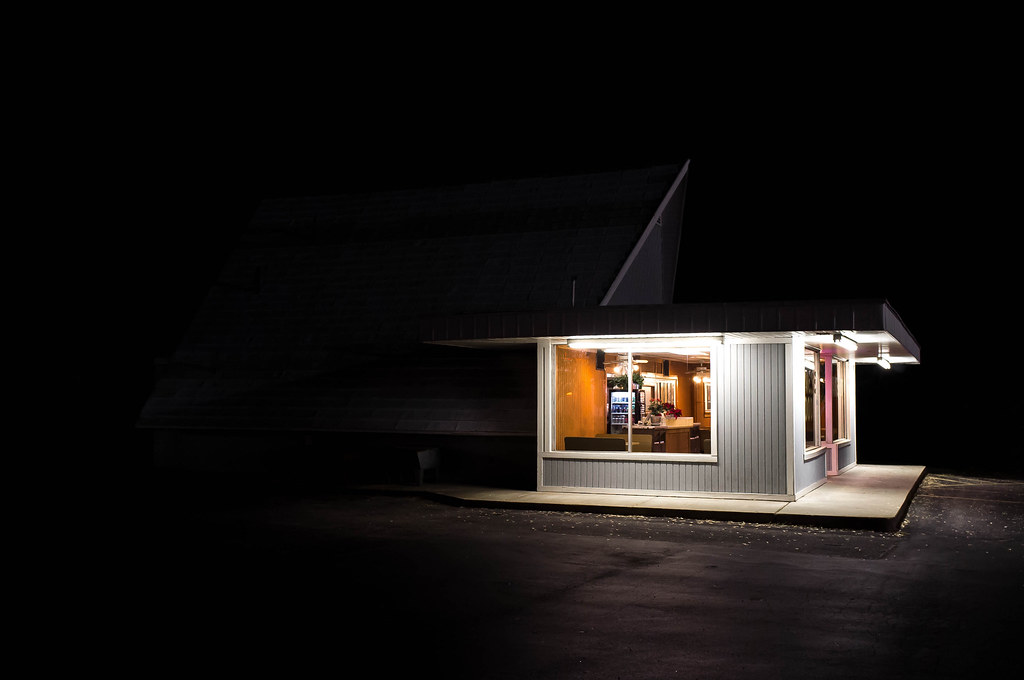 unwined-1260 by AIIAZNSK8ER, on Flickr
|
|
#
?
Apr 3, 2012 03:09
|
|


|
samjack56 posted:
This is just fantastic. Lighting is beautiful, very well composed and the little cloud of dust gives you a nice sense of motion as well as climate. The little pile of poop (is it?) could probably go though ")
|
|
#
?
Apr 3, 2012 03:13
|
|
|
AIIAZNSK8ER posted:Thing I found interesting tonight: I like this. The negative space is too overbearing though. I think it would be a much stronger composition cropped square. Blank space really needs a reason to be there, in this photo it seems superfluous, like an afterthought.
|
|
#
?
Apr 3, 2012 03:15
|
|


|
...
TsarAleksi fucked around with this message at 21:37 on Apr 20, 2019 |
|
#
?
Apr 3, 2012 03:16
|
|
|
AIIAZNSK8ER posted:Thing I found interesting tonight: 8th-samurai posted:I like this. The negative space is too overbearing though. I think it would be a much stronger composition cropped square. Blank space really needs a reason to be there, in this photo it seems superfluous, like an afterthought.
|
|
#
?
Apr 3, 2012 03:29
|
|
|
TheLastManStanding posted:I disagree. The current position puts it more toward the one third line, the bright edges of the building almost split the image into perfect quadrants, and there is just enough detail to make out where the building ends on the left. I do agree that it could work as a square crop, but I think the negative space is justified in its current form. I disagree with your disagreement! The black feels too dominant, my eyes keep getting sucked into it looking for some silhouette that isn't there, so much that it's hard to look at the lit building. I think a tighter crop is appropriate.
|
|
#
?
Apr 3, 2012 03:34
|
|

|
TheLastManStanding posted:I disagree. The current position puts it more toward the one third line, the bright edges of the building almost split the image into perfect quadrants, and there is just enough detail to make out where the building ends on the left. I do agree that it could work as a square crop, but I think the negative space is justified in its current form. Breaking up a photo into thirds or quadrants is great if there is a reason or substance there. The space doesn't really say anything to me here.
|
|
#
?
Apr 3, 2012 03:34
|
|
|
Augmented Dickey posted:This is just fantastic. Lighting is beautiful, very well composed and the little cloud of dust gives you a nice sense of motion as well as climate. Why thank you! That was actually breath and not dust, as it was quite chilly out. You are the first to mention removing said pile o' poop. Thanks for the suggestion.
|
|
#
?
Apr 3, 2012 03:35
|
|
|
Thanks for all the posts guys, you guys help me notice the little things I miss when going over hundreds of photos a week. Lot's of great activity here too, glad to see this thread back. AIIAZNSK8ER posted:
You nailed that one. I would love to see a person sitting inside but I love the scene as is and I like the blackness surrounding the building.
|
|
#
?
Apr 3, 2012 03:39
|
|

|
AIIAZNSK8ER posted:
I really like the structural quality and the way that the building emerges from the darkness/the darkness threatens to overwhelm it. It's a very cool photo. Is this place in/near Hampton Roads? With regards to the back and forth about the negative space, I think cropping it square makes a very different photo. Not in a bad way, but it looks really different. In this one, the black is a dominant player in the photo, becoming present in the scene and lending it an ominous feeling. In the cropped version, it becomes all about the structural quality of the building and the light emerging from the darkness. I think it's all a matter of which version you prefer.
|
|
#
?
Apr 3, 2012 03:42
|
|
|
TsarAleksi posted:I really like the structural quality and the way that the building emerges from the darkness/the darkness threatens to overwhelm it. It's a very cool photo. Is this place in/near Hampton Roads? Also, unfortunately (or not, I love the photo), it's one of those photos that needs to be on either a good print or a good monitor to fully appreciate (on the darker part of it). If I'm looking at my screen any way other than like DEAD on, half the frame pretty much drops off to black.
|
|
#
?
Apr 3, 2012 04:02
|
|


|
AIIAZNSK8ER posted:Thing I found interesting tonight: You can put me on the "love it the way it is" side. The blackness is overwhelming, but I like it. It reminds me of those summer nights when it's still warm and I'm way out in a little campground and I'm coming up to the convenience store which is the only source of light for miles and everything else it just pitch black. Makes me remember the feelings of being terrified because I can't see 3 feet in front of me, and then there's that little oasis of light. Love it. And that's why, to me, it's a great photo. It makes me feel something fairly strongly rather than just say "oh, that's a pretty shot". Nice job.
|
|
#
?
Apr 3, 2012 04:21
|
|

|
samjack56 posted:
I really like all three of them but the second one sticks out to me. It's wonderfully composed. My one thing with it is that it feels under-exposed. I'd like for there to be just some more overall brightness to it. The third shot is all-around terrific. Good work on that. I'd like to know if and what post-processing you did on that and the first one. Here's one from flying today. Usually I take the camera to go snapshot the landscape or whatever but I figured might as well try to capture just how complex and dingy a flight deck really is. 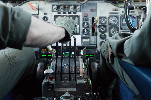
|
|
#
?
Apr 3, 2012 04:29
|
|


|
AIIAZNSK8ER posted:Thing I found interesting tonight: I absolutely love this. There's something about lighting like that, it just makes me want to only take pictures of gas stations at night. I've never been able to properly put it in words, maybe it's just because I love light that comes from above (which is how I light like 95% of my portraits). Here's a frame from a charity boxing match between cops and fire-fighters. Pretty happy with how it came out.  Guns and Hoses
|
|
#
?
Apr 3, 2012 04:34
|
|

|
AtomicManiac posted:I absolutely love this. There's something about lighting like that, it just makes me want to only take pictures of gas stations at night. I've never been able to properly put it in words, maybe it's just because I love light that comes from above (which is how I light like 95% of my portraits). You caught a nice expression but the composition is all sorts of wonky. I don't know if there's much you could have done differently, sometimes you're just the one... taking the punch. You might, however, try a square crop, it could work better. Also, looking at the larger version it's pretty clear that your focus stayed on the guy taking the punch-- in the future you should make sure that you are focusing where you want attention to fall. TsarAleksi fucked around with this message at 04:52 on Apr 3, 2012 |
|
#
?
Apr 3, 2012 04:49
|
|
|
AtomicManiac posted:I absolutely love this. There's something about lighting like that, it just makes me want to only take pictures of gas stations at night. I've never been able to properly put it in words, maybe it's just because I love light that comes from above (which is how I light like 95% of my portraits). I also find the processing very odd. Usually this sort of low contrast look works well with modern portraits that want to portray a feeling of warmth and softness, but for something like this, I would expect a harsher, more gritty processing. Like way higher contrast and deepen up those blacks.
|
|
#
?
Apr 3, 2012 04:54
|
|
|
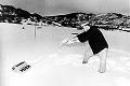
dukeku posted:Why do you think you like it? There's nothing there. Musket posted:Im very sure I dont like it. What is this? The intent? I really want to know where you are going with this shot. 8th-samurai posted:I want to like this, but I don't. The light is very interesting but but composition is a little sloppy. What interested you about this? Try to show it's relationship to it;s surroundings a bit more. On the technical side of things looks like you shot at f/5 with 1/800 shutter speed you could have got at least another stop of DOF if you shot it at something like 1/250. Even better use a tripod tat way you can lower the ISO and use a slow shutter speed for maximum sharpness. Thanks for these. For me the light brought out the spring feel. The ice is melting and sun is coming up again. I guess your critiques brought out why I wasn't sure about it either.
|
|
#
?
Apr 3, 2012 04:55
|
|
|
samjack56 posted:
I find the pool and reflections distract my eye from the actual waterfall. If you cropped some or all of it out you could fill more of the frame with the waterfall, which I think would bring out the contrast in the different layers of rock, which gets lost a bit compared to the greyness of the pool and the highlights reflected in it. I get that you have the pool as the bottom third but I think the lines of the rocks would work well enough to give it some compositional structure on their own. Here's a couple from me. I'm not sure about my processing on the second one - the focus was a little soft which I tried to hide with the clarity and sharpening sliders in lightroom, but maybe I overdid it?  Wood by euannz, on Flickr 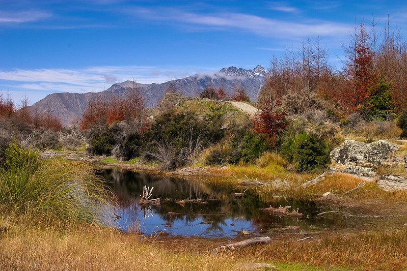 Queenstown Hill by euannz, on Flickr
|
|
#
?
Apr 3, 2012 05:24
|
|


|
Wafflecopper posted:Here's a couple from me. I'm not sure about my processing on the second one - the focus was a little soft which I tried to hide with the clarity and sharpening sliders in lightroom, but maybe I overdid it? I shot this with a subtle light but I was told that it was a bit too dark for sushi , though I think a brighter look might have reduced the richness of the colors.  Sushi by alkanphel, on Flickr A simple environmental street portraiture  Valet by alkanphel, on Flickr I wanted to invoke a bright and sunny feel from this photo, but I think the colors might be too blue/green, and maybe make the photo brighter as well?  RVP50 R01-07 by alkanphel, on Flickr
|
|
#
?
Apr 3, 2012 05:51
|
|
|
Augmented Dickey posted:Here's a shot from a few months ago- I liked the contrast between old and new. The SUV in the back is bugging me, though. 1. The location for this kind of shot is pretty terrible. Sometimes a gas station can work, but only if it's not cluttered. The horizon is not straight. Composition wise, I think you could have pulled back a little bit. BW procesing looks ok. I do not mind the silhouette, but again, the photo is too cluttered in the background. I know you don't see this kind of car every day but next time you pass by one, talk to the driver and ask him or her if you can take a photo of it. Those people love it when people take photos of their pride and joy. Ask them to pull over to the side and compose the shot. 2. The subject matter is clich�. I have taken shots like this so many times I can't even remember. So has everyone else. That being said, it's good to practice taking these shots because I feel like they teach you how to look for symmetry, no matter how obvious it is. Try and play more with power lines, try from a different point of view, try with other/more towers behind it/in front of it, try with at a different time of day/night or weather. -- My thoughts on my photo are that I like the sense of scale within. I also like the "lines" - the path, the river and the trees - I like how it goes from left to right with the tall tree to smaller trees to small person to bigger trees and finish with a tall tree on the right. What I can do without is the guy and replace him with a model, so I guess the next time I go to Banff I'll keep that in mind. 
|
|
#
?
Apr 3, 2012 06:36
|
|


|
HeyEng posted:I really like all three of them but the second one sticks out to me. It's wonderfully composed. My one thing with it is that it feels under-exposed. I'd like for there to be just some more overall brightness to it. I've always wondered what it would be like to be airborne at the controls of a larger plane. This shot just makes it feel so far over my head that I doubt I'll ever experience that! And it makes those guys look like complete bad-asses to be able to nonchalantly handle it. For critique I feel as though the bright blue of the armrest/chair throw the balance of the photo off slightly. But I like how you framed it off center. Here are the originals unedited: http://flickr.com/gp/samjack56/RNDgdr/ Wafflecopper posted:I find the pool and reflections distract my eye from the actual waterfall. If you cropped some or all of it out you could fill more of the frame with the waterfall, which I think would bring out the contrast in the different layers of rock, which gets lost a bit compared to the greyness of the pool and the highlights reflected in it. I get that you have the pool as the bottom third but I think the lines of the rocks would work well enough to give it some compositional structure on their own. 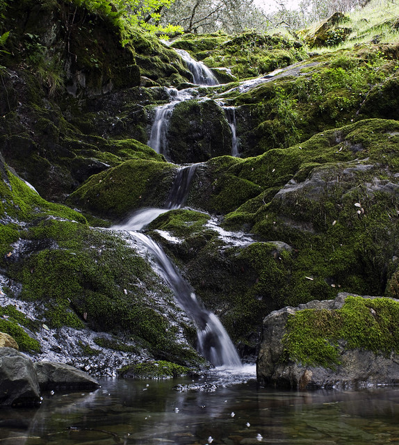 Falls Revisited crop by samjack56, on Flickr I darkened it slightly and cropped out a small amount of the top and chunk from the bottom. Does this feel better to you? I took the shot farther down as the pool of water was clearer on this trip than the last time so I found the rocks on the bottom to be interesting. Related, here was the first venture and the reason I revisited the location a year later: (taken with a point and shoot handheld) 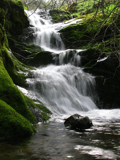 Middle Bar Falls by samjack56, on Flickr samjack56 fucked around with this message at 07:58 on Apr 3, 2012 |
|
#
?
Apr 3, 2012 07:09
|
|
|
This is great, I like the feel of the texture even more than the color. I have no problems with the lightning. If I were to nitpick- I find that depth of field might be a bit shallow. I'd like to see more of that tasty/great texture. Hm. This shot seems to be the weakest out of these three. I like the color and the subject though. My eyes tend to drift off to the right, I guess the white space is pulling me away from your main subject. Also the sign in front of him is kind of irking me. I'd try a tighter crop to get rid of some of the white space. alkanphel posted:
Also I've seen these kinds of photos a lot from you - obviously that's not a valid critique but... yeah. Okay. Time for my pictures. These are self developed, and this is probably why I have some emotional attachment to these pictures. I'm not sure if they work for anyone else- so I would like to hear some critiques/input. I like the feeling of openness and emptiness of this particular shot.  The tonality and texture of this one speaks to me even though it is quite simplistic. I guess the composition could be better.  And with this one I might be breaking an unwritten PAD rule. Because this shot does not work for me, but I can't exactly work out why that is. When I managed to sneakily take this shot I was glad I got it and then- cue the disappointment when I scanned/printed it. 
|
|
#
?
Apr 3, 2012 09:48
|
|

|
VomitOnLino posted:Okay. First one, absolutely love the openness, the loneliness, like a ghosttown.. something you'd see in North Korea or on the outskirts of an Indian city, etc. Tone is spot on, but I do find the trees on the left to be a little distracting. Their tone is darker than everything else in the image. Second one I really like too, but I want to know more about it. What's its setting, why is it there etc. Not a critique but I feel like I want to know more  Third one I think is a little simplistic. I wanna either see more of the man, or more of what he's looking at. Having either of those would make it more interesting. Mine: Three entirely different shoots.  Angelo with Fire #1 by Rick0r McZany, on Flickr 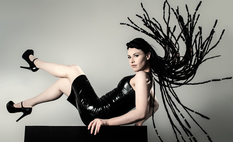 Ayr Lox'ide #1 by Rick0r McZany, on Flickr  Punk D'Amour by Rick0r McZany, on Flickr
|
|
#
?
Apr 3, 2012 11:05
|
|
|
Cyberbob posted:First one, absolutely love the openness, the loneliness, like a ghosttown.. something you'd see in North Korea or on the outskirts of an Indian city, etc. Tone is spot on, but I do find the trees on the left to be a little distracting. Their tone is darker than everything else in the image. 1st one - I feel like that rim light is just a bit too hot on his face. I also feel like you should have one coming from the opposite side since everything else about the shot is so symmetrical. 2nd One - Pretty awesome hair flip. I'll bet that was awkward to get. The only thing I might change is to smooth out the dress a bit. The humps on her stomach make her look like she's got fat rolls.
|
|
#
?
Apr 3, 2012 14:53
|
|
|
Impromptu shoot last night in a park. IMG_3758 by avoyer, on Flickr  IMG_3777 by avoyer, on Flickr  IMG_3836 by avoyer, on Flickr
|
|
#
?
Apr 3, 2012 16:53
|
|

|
...
TsarAleksi fucked around with this message at 21:38 on Apr 20, 2019 |
|
#
?
Apr 3, 2012 17:09
|
|
|
TsarAleksi posted:Crossposting in multiple threads is just like submitting to groups, right???
|
|
#
?
Apr 3, 2012 17:20
|
|

|
xenilk posted:Not a word of critique.  As of now I'm probating for zero-crit posts.
|
|
#
?
Apr 3, 2012 17:37
|
|
|
Ambihelical Hexnut posted:I really like this series- between the strange shapes and colors it's a very alien looking landscape. AIIAZNSK8ER posted:Thing I found interesting tonight: I also think there is too much empty space in this. A square or even a 4x5 crop would benefit the photo as-is. Alternatively, just up your shadows a bit or dodge the very dark building a bit. I've viewed the photo on three different monitors and an iPad, and only when I look down at the screen at about a 160 degree angle can I start to make out any of the darker parts. Cyberbob posted:
I really like this portrait and I think the composition is fine as is, but I'd lose the vignette- at least at the top of the photo. It kills the detail in her hair which is a shame. I do like how it looks outside of the model though, so if you could just layers/masking to remove the vignette from her hair, I think that'd be optimal. Also I really like her outfit, nice styling. Three from me:  Untitled by Myotomy, on Flickr  Untitled by Myotomy, on Flickr  Untitled by Myotomy, on Flickr
|
|
#
?
Apr 3, 2012 17:58
|
|

|
VomitOnLino posted:This is great, I like the feel of the texture even more than the color. I have no problems with the lightning. If I were to nitpick- I find that depth of field might be a bit shallow. I'd like to see more of that tasty/great texture. quote:My eyes tend to drift off to the right, I guess the white space is pulling me away from your main subject. Also the sign in front of him is kind of irking me. quote:I like this one, like your other macro shots. But if I were to criticize something here I feel the colors are okay, but the little leaf in the bottom left corner is distracting and probably should be cropped out. quote:I like the feeling of openness and emptiness of this particular shot. quote:quote:
|
|
#
?
Apr 3, 2012 18:01
|
|
|
ButtMonkey posted:
I think you should read the OP where it says quote:Critiques are I'm not good with critiques, and I'm not good at saying "this picture makes me feel lonely inside blablabla". I liked the Post a picture a day since it allowed me to quote people and say that I enjoyed their pictures, the tones and whatever else great without having to make up a lengthy bullshit story about it. So all in all, what's wrong with simply appreciating people's picture? And if you noticed on my flickr feed I don't add my pictures to groups and crap like that to seek useless attention, but thanks. Edit: I'll just stick to the portrait thread from now on, sorry that I was foolish enough to crosspost portraits I enjoyed doing. (USER WAS PUT ON PROBATION FOR THIS POST)
|
|
#
?
Apr 3, 2012 18:51
|
|
|

|
| # ? May 12, 2024 19:19 |
|
|
xenilk posted:I think you should read the OP where it says
|
|
#
?
Apr 3, 2012 19:01
|
|