|
RangerScum posted:I like this, but I'd take the heal brush to her armpit to get rid of those wrinkles. Noted, thank you. I tend to spend a lot of time on the face and not enough time elsewhere on the body. alkanphel posted:I quite like this shot, she's got a strong look. Only problem is her shoulder is too high up, making me think that she is very tensed up and makes her shoulder and arm look kinda large. Yeah, I definitely was struggling with making her arm look huge. Next time I'll try and lower it a tad and keep it away from the wall a bit. I do like the more posey look as I didn't want it to be super casual, but she does look too tense. Mannequin posted:I think the first one generally works as a general portrait that kind-of shows who the person is. She's leaning up against a wall of graffiti, I would be curious to know if she is somehow linked to that either personally or professionally, (does she work for the town council responsible for cleaning that up? I can't picture her being a graffiti artist. Or is she just showing her fun side by leaning up against a colorful wall?) Thanks for the in depth look. For the first one, she wasn't linked to the wall in any way - it's just so hard to find any colour outdoors this time of year and I wanted to bring some colour to the pictures. I have a bunch of her in other places as well in case she didn't like the background. I do agree that it's quite busy, but I can't help but like the colours. Sick of winter I guess. She is a graphic designer though and I wanted to bring some fun to the portraits, and I was hoping to achieve that through the colours and shapes. The second one does look a tad unatural, but I'm not sure if I would have changed the pose at all. I think the majority is from the jacket being so bulky as another poster pointed out. I felt she was feeling quite comfortable and natural the whole time so I didn't really have an issue with it. Basically all I said was "sit forward and cross your arms over your knees" and she just sat comfortably like that. The third one however, I would agree with you in that it looks too forced. She is extremely uncomfortable in front of a camera and needs very explicit directions. If I had said "lean up against the wall" she would do exactly that, with no shape or contours to her body and would say "what do I do with my hands" or something and get frustrated (this has happened before). So while I agree that it looks a bit unnatural, I disagree on the method of getting her to look more natural. I take the blame for that one and should have specifically told her to lower her shoulder a tad. I would rather be in control of the poses completely rather than let them think about it because people start doing weird things when they have to think about posing themselves. Like I asked her to bring her shoulder up and she basically forgot about the rest of her arm and body and it just kind of hung there and looked even worse. So being comfortable doesn't always translate to being pretty on camera. Obviously it failed in this instance as she looks too forced, but there's a happy medium in there somewhere. That being said, I think our style of photography is completely different, so we just have different experiences. I used to just tell or show people the general pose and I got the question 'well what do you want me to do with my hands, feet, arms, hips, etc' too many times or people would have no idea how they were actually looking. I find I get way better results this way, even if it's not perfect yet. Obviously your style works great for you, but I don't think we are going for the same feel with our portraits and it doesn't work for me (having tried it before). The advice about modeling the pose for them to copy is great though. I actually did that here, she just doesn't have a lot of body awareness in terms of posing herself so things didn't go that smoothly. All in all she's one of my most difficult models to pose, so I am still fairly happy with the shot, especially considering most of my clients in the future may feel very similar. I will definitely reshoot her when she has some more time so I can get the practice in. ZoCrowes posted:I like the feel of the first two. I don't know what the purpose of the shoot is but your subject looks very friendly and approachable. It feels very bright and sunny without being over the top. As for the nitpicks I think that the wall in the first one is waaaaaay too busy. It distracts me away from her and the colors are are pretty garish. Her coat in that second shot is not built for that pose. It makes her look a little hunched over and a bit on the frumpy side. The silhouette is jacked all to hell by that shoulder flap sticking out too far. Thanks as well for the in depth critique. The point of the first two were just for fun shots that she could use to promote herself and her business. She sent me a bunch of example pictures that she liked and we tried to emulate the feeling of those a bit. It appears the background is too busy, yeah. I did take a very similar shot with a brick wall and a stone wall so she's free to use either of those as well, thankfully. Or she might really like that one! Looking at the second picture again, I completely agree. Her coat was way too bulky for that. Unfortunately it was really cold that day and it wasn't until later that she was comfortable taking her jacket off, but I should have asked to reshoot a few of the stairs pics. Noted for next time! I appreciate all of the comments, everyone! Everything discussed gives me lots to think about and make note of for next time. Cheers  Oprah Haza posted:Here are my three (I posted critique three posts up). Holy spots on the first one. Is your sensor that dirty? What happened? It's incredibly distracting. I don't think I've ever seen a sensor that dirty before. Did you drop it in a pile of dust? The third one doesn't work becase the crop is weird, and her eyes are completely dead. Cropping at the neck like that doesn't really give any context to ground the head, and looks quite awkward. It also gives no context for the hand reaching up and touching her face, and that combined with the dead look in her eyes makes me feel like it's someone else reaching up to touch her face. She's not really connecting with the camera at all, but I can see she's trying to give off a sultry vibe. She has to know that the intensity has to be in the eyes for that to work, as it's extremely obvious when it doesn't.
|
|
|
|
|
| # ? May 12, 2024 15:28 |
|
Mannequin posted:What would you do to improve it? Or if you didn't like the other two, what would you do differently with them? I'm more or less just starting out myself, started in February, so honestly, I don't have much to offer in the way of improvements. It looks drat good as it is. I did like the other two, but not as much as the one I quoted. I can't quite put my finger on /why/ I like it more, I just do. Could be the subject, the composition, I don't know really, I just know I was really drawn to that one. The other two were by no means bad, in any way, just the one with the guy lost in his vice just grabbed me for some reason.
|
|
|
|
harperdc posted:as much as I could. Depends what you're trying to say, I would probably go face just because it's a portrait but if you where more interested in his action go hands. Or turn to cinematography and do both!. ----------------------------- So I've been out of the game recently due to film commitments. Went location scouting for a shoot I want to do before April end. Looking to emulate McMadcow a little with the shoot since I'm sick of making pretty things look prettier in pretty environments till pretty comes out my loving ears and I throw myself off a building in a pink tutu with a cutesy expression on my face.  Too over processed? I don't know, I try to keep everything to stuff you could probably do in a darkroom. VVVV hahah I know! We had a chat and I can't bring myself to take him out (also lazy). The dog was a rottweiler who was SO HAPPY TO SEE ME OH MY GOD JUMP JUMP JUMP XTimmy fucked around with this message at 06:45 on Apr 6, 2012 |
|
|
|
XTimmy posted:
You should title this "A Man and His Dog".
|
|
|
|
Edmond Dantes posted:
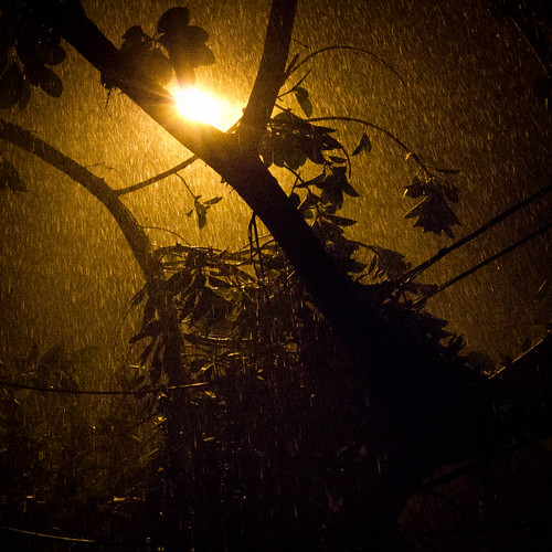
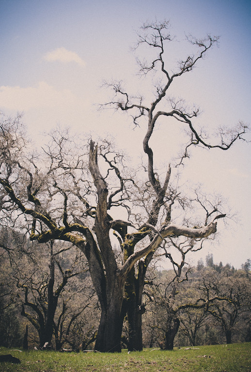
It's a simple shot but I like it. The rain is well lit by that streetlight, good find. The processing in the first doesn't read as 'film like' to me except that it's lower contrast and saturation. What I see in the processing here is uncontrolled use of the Shadow/Highlights filter; I'm not saying that's what you did, I'm just saying that's what it looks like to me. CONTEMPLATE THIS ON THE TREE OF WOE. I think the processing on the second one is more appropriate for what you were going for. The third picture is best for me. The light on that tree is nice and it's an interesting shape. Next time I would work on separating it from the background a little more. Tshirt Ninja posted:I dunno if it's missed focus or a soft image or what but it is distracting. The whole thing is a little flat, and while I think the super dark shadow looks great in the thumbnail it bugs me in full size. I DO like the ducks in a row composition and I think it's a good spot that you could massage in lightroom a little better. After looking at these for a minute the first is my favorite, which is funny because it was my least favorite of the three upon first glance. The smile and pose feel natural and intimate, like the viewer is her friend. The second is good but I want a tiny bit more detail in the background- I understand what other people are saying with the 'step out of the world' sentiment, but I felt I had to look a little hard to get his context/setting. The third is also good but the facial expression feels to me like the same "I'm being polite but are you done yet?" expression I get out of everyone. ZoCrowes posted:
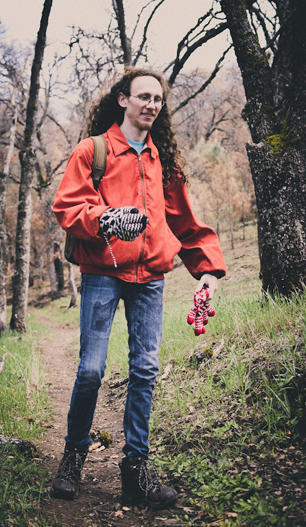
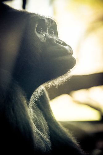
Is that a living animal in the second one? Because it looks like a stuffed animal posed under a spotlight. It's very expressive, I like it. Branch on the right could go, but it's not that big of a deal. I would have no idea what the third picture guy did if not for the caption. I don't think it describes him very well, and without color all is wacky accouterments kind of blend together.
|
|
|
|
sensy v2.0 posted:
I would have liked to have seen more of the building. Beautiful shot otherwise! Dradien posted:
From my experience dealing with kids, (and this is strictly my own experience with my sister's daughters, not necessarily the general rule), I've had the best luck capturing them in their own element. They will pose for you without even knowing it because kids do cute and funny things. You just have to be there to take the picture. I don't think this picture is a success. The background is a mess and I don't like that he's looking away from the camera. Surely your son has made you laugh or done something silly or made a silly face. Take advantage of these moments in his own relaxed environment without forcing a pose and I think you will get better results. ...    I'm kind of done with street portraits, although I might have a few more to post here before I'm officially done. I did a shoot with a model last weekend and I'm waiting to get the film back. It was harder work (required more thought and planning) but it was really fun and I got to spend more time with one person which meant it was easier to build a theme. So hopefully that will be the direction I will be moving in in the future.
|
|
|
|
Critiques a few posts up. Here are some more loving landscapes. Again.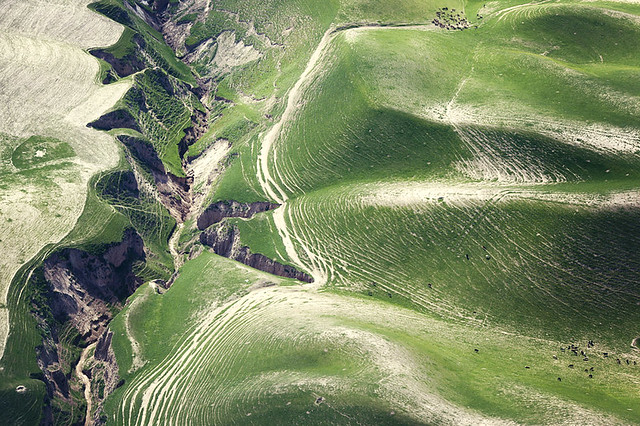 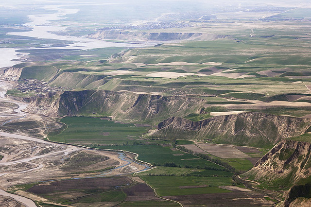 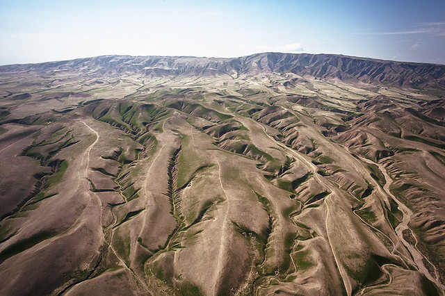
|
|
|
|
For what these are, they are nothing short of amazing. The only thing I could wish for would be that they are just a bit wider.
|
|
|
|
Sevn posted:For what these are, they are nothing short of amazing. The only thing I could wish for would be that they are just a bit wider. Why do you think them being wider would help?
|
|
|
|
Mannequin posted:
Thank you! I will keep this in mind, however, I don't always have my camera out and about with me, but I should probably change that...
|
|
|
|
I really like these, although I think the sky is a bit blown out in the last one. Maybe a mask over the horizon to lower the highlights and bring the clouds/blue back out? Also there's a dust spot in the sky on the right half that's bugging me now that I've noticed it. This is a shot I took a few months ago in the evening as some snow flurries were coming in. I like how there's a nice split down the middle between the incoming snow and the blue skies. I'm not sure which of these crops work better, or if I should try something else with this. 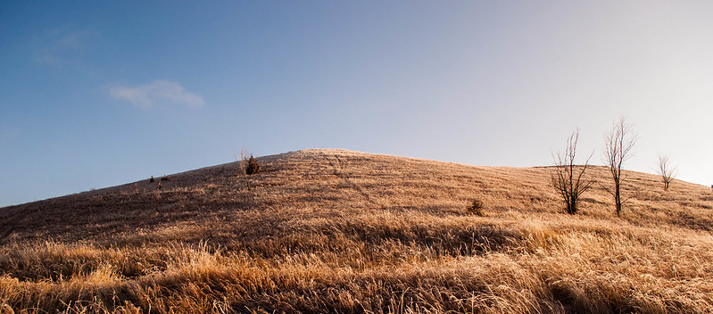 DSC_1259.jpg by MrDespair, on Flickr 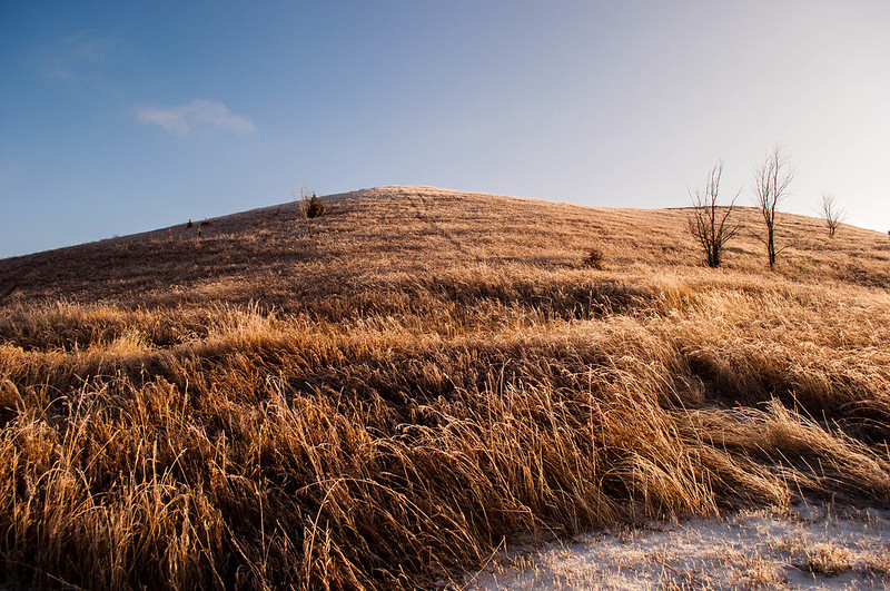 DSC_1259.jpg by MrDespair, on Flickr
|
|
|
|
Mr. Despair posted:This is a shot I took a few months ago in the evening as some snow flurries were coming in. I like how there's a nice split down the middle between the incoming snow and the blue skies. I'm not sure which of these crops work better, or if I should try something else with this.  Tekapo Canal by Paul.Simpson, on Flickr  Mackenzie Country by Paul.Simpson, on Flickr
|
|
|
|
Hotwax Residue posted:
This broke my brain for a few seconds. Amazing.
|
|
|
|
Mannequin posted:How did you manage to turn that New York street into a funhouse?
|
|
|
|
fnif posted:Did you mean something like this? I finally got my camera out of my trunk after it being locked in there for half a year. Here's a couple of my favorites from a wildflower center. First time shooting on full manual focus. Olympus E-520 body with a 70-300mm F4.0-5.6   
|
|
|
|
Mannequin posted:
This is really sad to hear because I really like your street portraits. The first shot is my favourite, the DoF is pretty much bang on perfect for isolating the subject in context. Looking forward to seeing the model shoot results. EDIT Bit of somethin somethin from me Pentax: 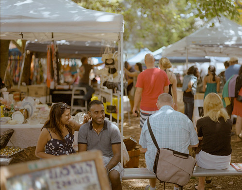 Glebe Markets by Josh Conliffe, on Flickr  The Best Man by Josh Conliffe, on Flickr 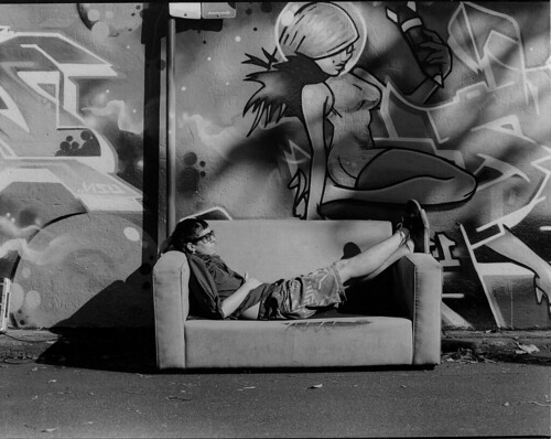 Glebe by Josh Conliffe, on Flickr Schofferhofer fucked around with this message at 10:31 on Apr 7, 2012 |
|
|
|
First trip out with my first DSLR. Tell me what I did wrong! DSC_0520 by tigheclops, on Flickr  DSC_0449 by tigheclops, on Flickr 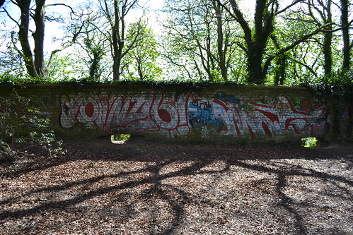 DSC_0396 by tigheclops, on Flickr 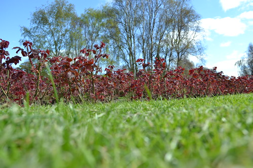 DSC_0276 by tigheclops, on Flickr  DSC_0211 by tigheclops, on Flickr (USER WAS PUT ON PROBATION FOR THIS POST)
|
|
|
|
Hotwax Residue posted:
This broke my brain as well. Incredible shot, and lucky to have so little wind. One question, the color blue is slightly different from the sky to the reflection...did you do some saturation adjustment on the water?
|
|
|
|
Schofferhofer posted:
I really like this one, but I may have framed it a bit more to the right. I keep seeing both the guy in the couch and the graffiti in the back as a single subject, and it appears to be off-centre. 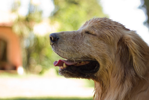 Simon by AxelDR, on Flickr I posted this one on the snapshot thread, but never got any input on it. The big guy is a tiny bit out of focus (didn't realize and was using f/1.8), but should I have used the flash to get a bit more fill light on his face? We were both in the shade at the time so I think it kind of contrasts with the background a bit too much, color-wise.
|
|
|
|
adamarama posted:(USER WAS PUT ON PROBATION FOR THIS POST) Contrary to popular belief, I don't actually derive that much joy from lighting people up for breaking rules, so I've re-written the OP of this thread to make everything really, really clear, so nobody has to get karate done to their account. Hop on back and have a look at them just so we're all on the same page, but it's mostly standard PAD rules. Also, thank you Dorkroom, for making PAD something close to what it once was. It hasn't been this good for a long, long time. A special thanks to all the new people who grew a pair and put their work out there for people to comment on. EDIT: That probate was for a double-rule-break of more than three photos + absolutely no critique, by the way. SoundMonkey fucked around with this message at 20:33 on Apr 7, 2012 |
|
|
|
onezero posted:This broke my brain as well. Incredible shot, and lucky to have so little wind. One question, the color blue is slightly different from the sky to the reflection...did you do some saturation adjustment on the water?
|
|
|
|
Magnus Condomus posted:I really like this one actually. I mean, it's the sort of generic Orange and Teal color scheme, but it works really well with the spot lighting and the disturbances in the blue water. Framing wise the bent angle helps draw the eyes across the image to that light focal point. First shot: Seems to be focused a bit to close- the flower seems slightly out of focus so my attention goes straight to the somewhat boring lily pad. The white spots in the background(reflections in the water I guess) are also very harsh and distracting. Second shot: Definitely my favorite of the three, composition is pretty good (maybe give the subject a tiny bit more room on the right). The flower in the background nicely fills in the negative space and gives the subject a little context. Third shot: I like it- the tones, detail and composition are all very pleasing. I think this one could benefit from slightly more aggressive noise reduction, though- it's a little distracting as is. I feel like I'm using the term 'distracting' way too often in my critiques. Here are a few shots that I've been playing with for a while.   I really love shooting interesting vehicles that I spot on the street, but I feel like I never quite do them justice. Bouillon Rube fucked around with this message at 00:57 on Apr 8, 2012 |
|
|
|
Augmented Dickey posted:Here are a few shots that I've been playing with for a while. As for my photo, I was trying to go for a black & white nature abstract, with the curves and the patterns. 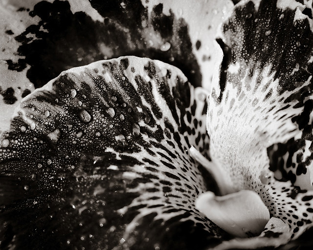 Botanic Gardens 7-2 by alkanphel, on Flickr
|
|
|
|
Edmond Dantes posted:I really like this one, but I may have framed it a bit more to the right. I keep seeing both the guy in the couch and the graffiti in the back as a single subject, and it appears to be off-centre. Yeah I struggle with the 6*7 a bit in terms of not having as much horizontal room to move when I want to compose. I see what you mean about the blending of figure and graffiti. I guess I could hav moved the couch but it was gross and it's not there anymore  alkanphel posted:
This is really cool. It took me a couple of minutes to figure out what it was in my morning state. Seems like everything is exploding out of the bottom right corner of the image in a really cool way. Unfortunately, this means my eye is drawn to the bottom right quarter of the image where a lot of it is OOF.
|
|
|
|
Augmented Dickey posted:
First picture : The concept is really cool but drat there is dirt on the bottom right corner of the car. Also why did you not crop the tire out? I don't want to see a tire I want to see the awesome logo of VIPER!  Second picture : The composition is cool you left room on the left side which seem to be the way the vespa is going. I have a feeling the exposure is not right , the white is pretty strong on the right side. I am not sure if it's caused by the bokeh or not. I am in the process of moving house, yes I know excuse excuse ... But I don't have the luxury of shooting much lately. There was a nice sunset in my backyard and voila !  coucher (1 of 1) by J-YG, on Flickr I was on the way to a workshop and I got stuck in the traffic. I finally saw what it was about! This picture was taken inside my car while driving with the other hand on the steering wheel , crazy I know.  crash (1 of 1) by J-YG, on Flickr
|
|
|
|
Niagalack posted:
Let me preface this by saying thank you for critiquing other photos when posting your own. Every little bit helps. Also I'm not intending to be mean or anything. First photo: Probably the better of the two, photographically. That is indeed an awesome sunset. If I'd seen it I would also have taken a picture of it and maybe posted it. The problem here for me is that a sunset is largely about the sky, and if the ground is included, then what leads up to the sky. In this photo we have neither. The ground is the next row of buildings, which actually MIGHT still work, except almost the entire sky is obscured by trees or power lines. I think it's obvious what you were trying to capture with this picture, but I don't think it comes across to the viewer. Second photo: It's documentary. By this I mean you recorded the a scene that you saw in what is probably almost the exact same way it looked if I'd been sitting in the car beside you. Journalistically, that's what you want. From a journalistic standpoint though, we can't actually see the accident behind the K-rails. If you hadn't mentioned it was a crash, it probably would have taken me half a minute to piece together what happened based on "wow the back of that truck looks hosed up" and "it's a highway and everyone's stopped and there's a crane". I appreciate wanting to capture the drama of the scene - we've all driven past accidents on the highway, and especially bad ones can be dramatic and attention-getting and interesting (and possibly horrifying). The problem you run into here is this: we're not driving down the highway. We're looking at a still frame of what someone saw while they were driving down the highway. The experience isn't the same. From what you've posted previously, I like your work in general, could I ask what made you choose these two photos, other than I assume being photos that you recently took?
|
|
|
|
ButtMonkey posted:Let me preface this by saying thank you for critiquing other photos when posting your own. Every little bit helps. Also I'm not intending to be mean or anything. It's the only photo I took in 2012  I intend to take more when I am at my new place. I bought a set of strobe and I plan on using them I intend to take more when I am at my new place. I bought a set of strobe and I plan on using them
|
|
|
|
Augmented Dickey posted:Here are a few shots that I've been playing with for a while. I actually really like the ideas on both of those. The second-gen Vipers don't have great "classic" lines but this looks good. And I would like to see the rest of the shot - as a car geek I like seeing some seriously huge tires. Nothing like the wheel turned out so you can see the tread, especially when it's a really sporty pattern. I really like the Vespa picture. So many people think of the side profile of them, but I like how it's framed and the colors. It's juuuuuuust a little over-exposed, though, for my tastes.
|
|
|
Augmented Dickey posted:
In the first shot, the fact that the logo is tilted makes it look off to me. I don't know if the logo is like that on the bike, but it makes it look uneven. The second I think could have used 1/2 stop lower exposure. The highlights are juuuust barely blown out a little bit. I would have done a lower exposure combined with split toning to give it the bright airy feel. Here's a few snaps from the last few days in Paris:  Egypt Louvre by hookshot88, on Flickr  People looking at Venus de Milo by hookshot88, on Flickr  Montmartre by hookshot88, on Flickr
|
|
|
|
|
Evilkiksass posted:Why do you think them being wider would help? 2 of them are at 135mm. I just thought if they were at 85mm or even 50mm, I could see even more awesomeness 
|
|
|
|
HookShot posted:
The slight tilt of the second one is bothering me. I think if you adjusted that, it'd be better. The other two are fantastic. I love the lighting in the first one. These are from Valapraiso, Chile  
|
|
|
|
King Metal posted:The slight tilt of the second one is bothering me. I think if you adjusted that, it'd be better. The other two are fantastic. I love the lighting in the first one. Next time cut the dull sky and put more ground instead. The picture looks foggy? I wished it was more sharp, the rocks has a lot of nice texture in it.
|
|
|
|
Niagalack posted:Next time cut the dull sky and put more ground instead. The picture looks foggy? I wished it was more sharp, the rocks has a lot of nice texture in it. I should just crop it, there was nothing interesting forward of those rocks. I did soften that one a bit, I didn't like it sharp, there's not a whole lot of detail. It was a very dull grey day. This is the original. http://dl.dropbox.com/u/553036/DSC_7516.1.jpg King Metal fucked around with this message at 18:39 on Apr 8, 2012 |
|
|
|
King Metal posted:I should just crop it, there was nothing interesting forward of those rocks. I did soften that one a bit, I didn't like it sharp, there's not a whole lot of detail. It was a very dull grey day. Could you post a cropped version of it so we could compare? I took the courtesy of doing it my way hope you do not mind  
Niagalack fucked around with this message at 20:40 on Apr 8, 2012 |
|
|
|
Any particular reason that you didn't clone out the thing in the bottom right corner? It's a nice shot other than that, though I wish you had gotten a bit more of the Bahia Negra into the frame. I want to do something with this one, but something just doesn't look quite right to me. Maybe i would benefit from a tighter crop? 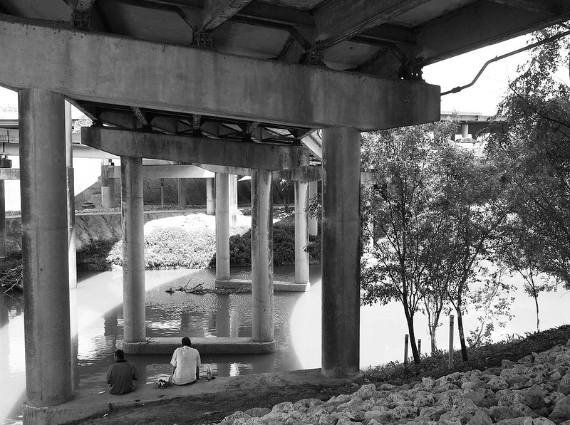
|
|
|
|
With this I think there is a bit too much color on the plastic, especially the greens on the upper left. It places the image on a road. It could be better if it was devoid of the naturalistic aspects, being entirely man-made shapes. I made a really subtle example.  Now, I'm entirely new to photography, just started shooting seriously few days ago. I have some knowledge of composition, colors and poo poo from being a painter, but I'm not sure how well they fit into photography. Here are a couple of things.
|
|
|
|
Triangle posted:Now, I'm entirely new to photography, just started shooting seriously few days ago. I have some knowledge of composition, colors and poo poo from being a painter, but I'm not sure how well they fit into photography. Some thoughts on the composition of the first two of your shots. I struggle to see what you are trying to convey in each one of them. The first shot, the way it's framed, doesn't really let itself be a candid, people-in-a-room shot. You've put a huge amount of emphasis on the ceiling and light, but I don't know why. For the second shot, the crop through her head doesn't work for me. I feel you could have cut her head out entirely, framing just as the neck starts, and had a much more effective picture as a result, if your aim was to have a sense of distance/detachment to the picture. I do like the color tones, though, I dig the washed-out look.
|
|
|
|
Augmented Dickey posted:I want to do something with this one, but something just doesn't look quite right to me. Maybe i would benefit from a tighter crop?  Lake Hayes by Paul.Simpson, on Flickr  Orari by Paul.Simpson, on Flickr
|
|
|
|
Niagalack posted:Could you post a cropped version of it so we could compare? I really like that a lot, thanks! Augmented Dickey posted:Any particular reason that you didn't clone out the thing in the bottom right corner? It's a nice shot other than that, though I wish you had gotten a bit more of the Bahia Negra into the frame. No, that's straight out of the camera. I planned on doing that, or cropping that piece out. I wish I got more of the larger boat in it. I think I might have another one of it.
|
|
|
|
|
| # ? May 12, 2024 15:28 |
|
Triangle posted:
For another opinion, I actually really like your unorthodox compositions. Too many new photographers are eager to attempt to follow the rules and fall short and boring, but it looks like you're genuinely having fun with your camera, as it should be. Everything else will fall into place later, but I can sense here that you've got a handle on what will make a photo interesting for the viewer. I find the third shot particularly startling in its originality for someone who's only been working for a few days. Please keep shooting and never stop. 
|
|
|


