


|
King Metal posted:I wish I got more of the larger boat in it. Vessel  Hotwax Residue posted:
This is absolutely beautiful! Focus and exposure are spot on, and I feel like the stones in the foreground give the viewer a nice sense of scale. Just a macro shot to round out the weekend. 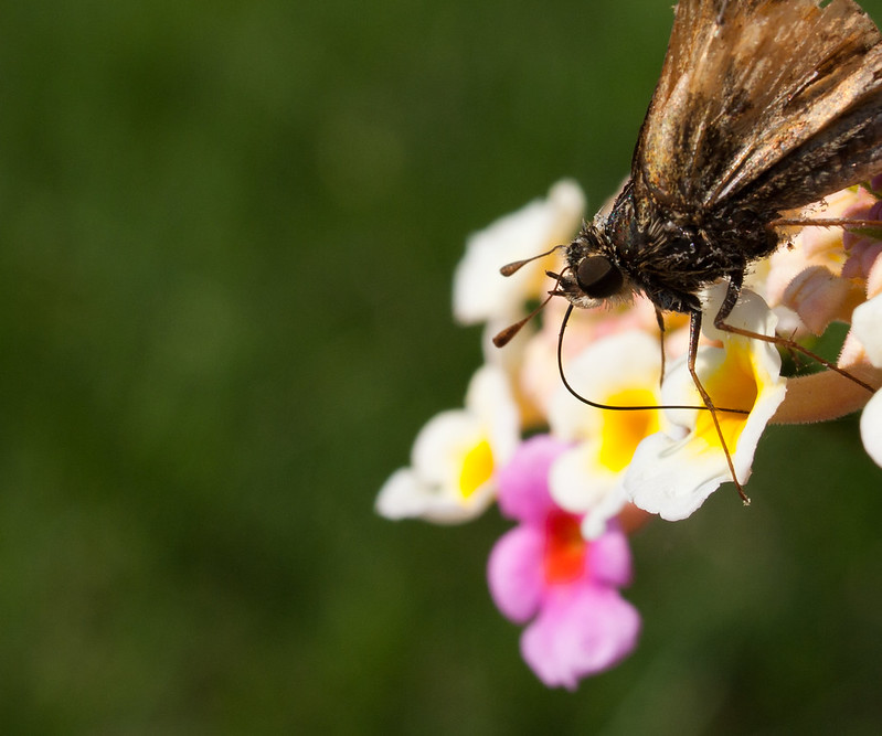 Bouillon Rube fucked around with this message at 02:46 on Apr 9, 2012 |
 #
?
Apr 9, 2012 02:09
#
?
Apr 9, 2012 02:09
|
|


|

|
| # ? May 11, 2024 11:32 |
|
|
King Metal posted:I really like that a lot, thanks! Glad I could help!
|
|
#
?
Apr 9, 2012 02:36
|
|

|
Hotwax Residue posted:
Love the colors on this but I'd like to see some more detail in the trees, especially on the left hand side. Mr. Despair posted:I really like these, although I think the sky is a bit blown out in the last one. Maybe a mask over the horizon to lower the highlights and bring the clouds/blue back out? Also there's a dust spot in the sky on the right half that's bugging me now that I've noticed it. I prefer to keep original aspect rations intact but I'd say the crop on the first works the best. I thought the color in the sky was just from the sunlight, wouldn't have known it was weather had you not mentioned it. Maybe vertically oriented photo framed above the "bald" patch could have emphasized the weather more. Stitch together a few of them to recreate a wider angle to keep the rolling hills thing going. Edmond Dantes posted:I really like this one, but I may have framed it a bit more to the right. I keep seeing both the guy in the couch and the graffiti in the back as a single subject, and it appears to be off-centre. Focus isn't an issue for me since his eyes are shut but I think the background is a bit distracting with the bright background and dark foreground. When I was taking pictures of my dog in harsh sunlight like that, I sometimes used a reflector instead of flash.   I don't remember why I framed the cactus this way (shot this in December). I kinda like it but I don't. Thoughts? 
|
|
#
?
Apr 9, 2012 03:02
|
|

|
HookShot posted:
If you are going to go solid shadow on the right side, I would clone out the light speck where the ear is. The second one is a bit tilted and perhaps if you could lighten up the crowd on the left side of the photo (maybe mask your curves layer or something) it may help. Augmented Dickey posted:I want to do something with this one, but something just doesn't look quite right to me. Maybe i would benefit from a tighter crop? I think it doesn't quite look right because there's no sense of what the viewer should be looking at. I would choose a subject and go for it but right now there's too much/not enough going on. Crosspost from portraits thread: Shot a few musician friends. Please excuse the watermark, I'm linking from a viewing gallery.   
|
|
#
?
Apr 9, 2012 03:42
|
|


|
Oprah Haza posted:I think it doesn't quite look right because there's no sense of what the viewer should be looking at. I would choose a subject and go for it but right now there's too much/not enough going on. Thanks, I think you're right. My subject was the two guys sitting on the embarkment, but the more I look at the shot the more that I realize that none of the other elements in the frame really point the viewer towards them. quote:Crosspost from portraits thread: I really like the first two- lovely lighting and very natural poses. The third seems a little awkward, though. It doesn't really look like a comfortable or natural way to hold a guitar.
|
|
#
?
Apr 9, 2012 04:07
|
|
|
Tshirt Ninja posted:This looks too blue to me. I'm not sure if it's the WB or just that there's a tonne of the same colour but it looks really boring. It shouldn't look that way, because it's obviously an interesting thing but the colours just muck it up, unfortunately.
|
|
#
?
Apr 9, 2012 04:54
|
|


|
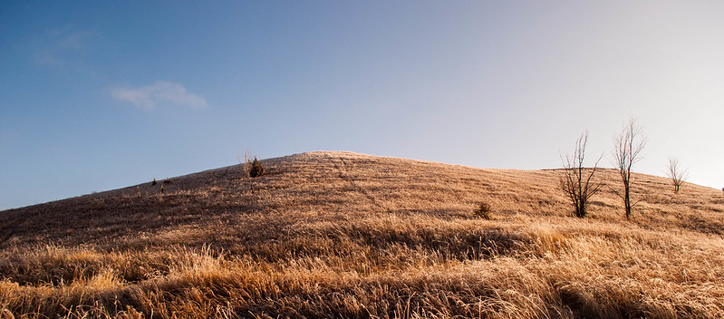
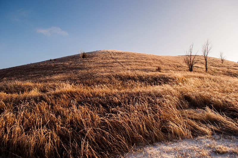
Oprah Haza posted:Crosspost from portraits thread: Besides what the other people said about these, another thing that makes the third one uncomfortable looking is that it's the only one in which the subject is looking directly at the camera. Nondo posted:Nondo posted:I don't remember why I framed the cactus this way (shot this in December). I kinda like it but I don't. Thoughts? Since you're committed, I say crop tighter - maybe to just above the clouds hovering over the cactus on the right. Mr. Despair posted:This is a shot I took a few months ago in the evening as some snow flurries were coming in. I like how there's a nice split down the middle between the incoming snow and the blue skies. I'm not sure which of these crops work better, or if I should try something else with this. I definitely prefer the second. I prefer having the visual interest of the edge of the grass meeting the snow at the bottom. ---------------------------------------------  Nest by RHITMrB, on Flickr 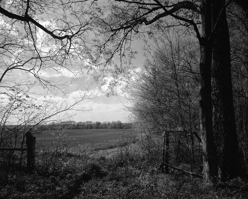 The Edge of the Field by RHITMrB, on Flickr
|
|
#
?
Apr 9, 2012 05:18
|
|

|
Triangle posted:Now, I'm entirely new to photography, just started shooting seriously few days ago. I have some knowledge of composition, colors and poo poo from being a painter, but I'm not sure how well they fit into photography. Although it's unconventional, I like the composition of the first one. I assume it was intentional and I think it's interesting. In the second I like the attention drawn to the form of the arm and how it hangs over the chair. But I think you're balancing on a thin line between interesting and amateur. For instance, in picture 2 you could have composed this better. You're at a somewhat odd angle to the girl and I'm slightly bothered by the crooked lines in the background. I think the third is a flop. However, it seems like overall you have some good ideas so I would keep pushing them and see where they take you. Looking forward to seeing more of your work! MrBlandAverage posted:
I find these to be dull. I don't underestimate how much work went into setting up the camera, developing the film and everything else involved with large format photography, but I just think that at the end of the day you have to take interesting pictures. If you're not taking interesting pictures your indulgence with whatever camera gear is meaningless. I don't like the composition of the first and I don't find the subject interesting enough. (Couldn't quite tell what it was until I clicked and read the description). The second is tremendously conventional, although well composed. The darkness on the trees on the right is a bit harsh for my taste. Surely there are better landscapes. If not in the near area then maybe you should look for the unconventional, yet still interesting, landscape scenes. ...   
|
|
#
?
Apr 9, 2012 06:38
|
|


|
Mannequin posted:I love this. I don't like the other two so much but this one is excellent. The smoke and the outfit and the street make the whole thing really excellent. I thought you said you were done with street portraits?
|
|
#
?
Apr 9, 2012 06:49
|
|
|
I have more to post from prior trips, but I don't think I will be pursuing it any longer. I can't really say for certain, it's very tempting. But I think I want to really focus on doing shoots with models because I can spend more time with them and then I can work on conceptualizing, which is an area I need practice with.
|
|
#
?
Apr 9, 2012 06:53
|
|
|
MrBlandAverage posted:
I'm not sure if there was much more you could do to make this interesting. I don't agree with the comment on it being too dark, as I feel like the trees are 'reaching out' towards the beautiful sky just out of the shadows, over the field. The more I look at it the more I want to reach out myself. Since it's the sky that is catching my attention I'd shoot for brightening that up slightly and contrasting the clouds a bit. See if that does anything for you. Hotwax Residue posted:
I love the atmosphere of this one with the intensity of the water and the ominously cloudy sky. I think it could benefit from evening out the vignette by brightening up the upper left corner and/or while possibly darkening the upper right a bit. I had recently taken a trip to Monterey:  Hi Seagull! by samjack56, on Flickr  Mesmerized by the waves below. by samjack56, on Flickr 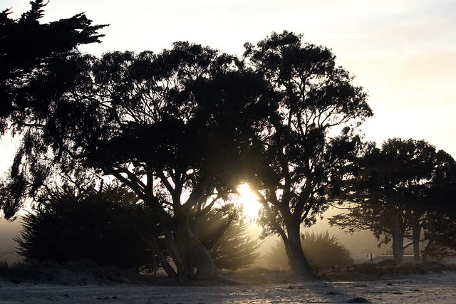 Sandy, windy, sunset. by samjack56, on Flickr
|
|
#
?
Apr 9, 2012 06:54
|
|

|
Schofferhofer posted:This looks too blue to me. I'm not sure if it's the WB or just that there's a tonne of the same colour but it looks really boring. It shouldn't look that way, because it's obviously an interesting thing but the colours just muck it up, unfortunately. Hah, it's Kodachrome. I shot a few rolls before processing stopped, but the only one that turned out was pretty well expired, so it suffered some significant color shift. Oprah Haza, I wish you had shot those guys together. The single portraits make me wonder why lone guys are standing out in a field with their instruments, but together they would probably make a pretty dynamic group.
|
|
#
?
Apr 9, 2012 08:17
|
|
|
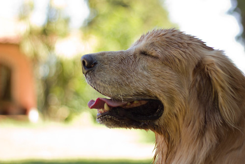
Oprah Haza posted:If you are going to go solid shadow on the right side, I would clone out the light speck where the ear is. And you and King Metal are both right about the tilting on the Venus de Milo. Cheers!
|
|
#
?
Apr 9, 2012 08:50
|
|
|
Mannequin posted:I have more to post from prior trips, but I don't think I will be pursuing it any longer. I can't really say for certain, it's very tempting. But I think I want to really focus on doing shoots with models because I can spend more time with them and then I can work on conceptualizing, which is an area I need practice with. I think I'm going to go out to Sydney tomorrow to try doing some stranger portraits. Not really sure of how I'm going to go about it but I'll give it a shot. Probably just going to take the 67 and hope it attracts people.
|
|
#
?
Apr 9, 2012 09:06
|
|
|
Oprah Haza posted:I think the biggest problem with this guy is the slouching. Each photo you've posted of him, he looks unconfident and huddled. Mannequin posted:I think this has a bit more "character" than your regular stuff, you tend to stick with the "down the street" perspective pretty frequently. samjack56 posted:
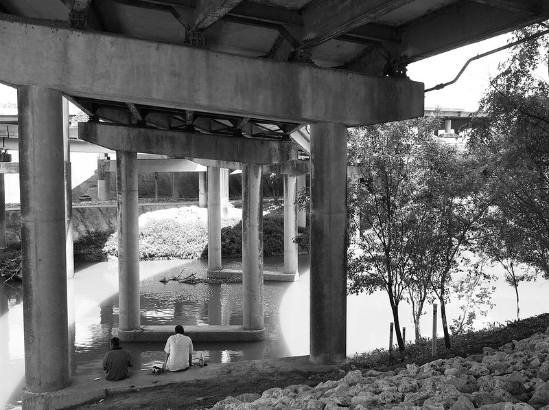
Based on the title I think I understand what you're going for here, but it mostly looks like you found a corpse on a dock. Here's 2 recent photos of mine: 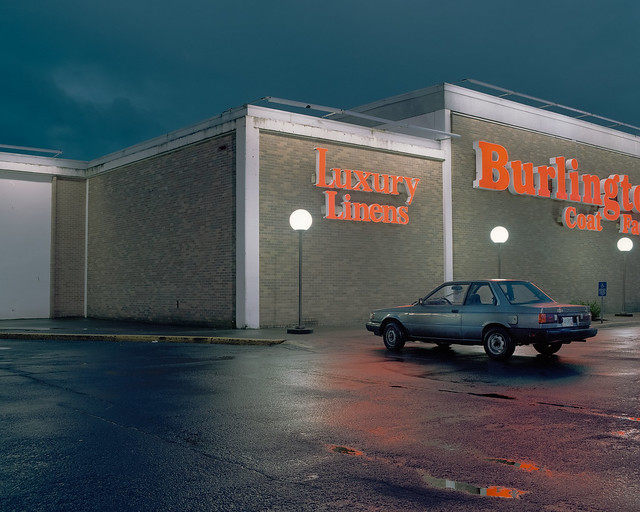 
|
|
#
?
Apr 9, 2012 16:47
|
|

|
samjack56 posted:I had recently taken a trip to Monterey: Thanks for sharing your images. Image 1 - I can see how this shot would have made a good photo, but there's some tweaks that are holding it back. Firstly, the horizon seems a little crooked on my monitor, but that's easily rectifiable. Secondly, given the nature of the coastline, shooting in landscape orientation might have been much more pleasing to the eye. Thirdly, it's just a shame the seagull is flying away rather than toward you. It's one of those luck factors you can't control that just makes a shot come together. Next time, Gadget. Image 2 - It took me a while to realise what was going on in this image. And only then I got the point of it by reading the title. It's great that you have a vision for what story you want to tell. That's the hardest part, sometimes, in fact. Your efforts to render this particular story, I feel, have been unsuccessful. From the angle you shot the subject, it could be a corpse for all we know. Experimenting with different angles will help you best bring your vision to life. Perhaps shooting straight above the subject would have better revealed what he was up to. Shooting from the front might have also worked in this case. As an abstract piece, I can sort of see it, the wood pattern broken up by a shape... but nonetheless the subject is underexposed, and why waste the potential to tell such a great story if you were going for an abstract anyway? Image 3 - A great effort to capture some crepuscular rays (sp?). Unfortunately your exposure is off. It's too dark to get the detail in the trees, but also too light which makes the center light spot too blown out. If I were in your shoes, I would have dropped the exposure by a stop, stop and a half, and seen what the resulting silhouette looked like. Keep in mind, all of your shots were interesting, and the glimmer of interest was there in each. As I said, if you have a clear subject/story, then it's just about learning the tweaks. Thanks for sharing.
|
|
#
?
Apr 9, 2012 16:50
|
|


|
dukeku posted:
Frame 1: I love that. 82nd out by Clackamas Town Center? What I enjoy about your work, is that you can tell how much thought and time went into this. You didnt just stand on a streetcorner pretending to be cool taking boring portraits. Your tonal range is great in this first frame and I would hang this in my house. Good job. Frame 2: Again, it falls into the same reasons I enjoy most of your work. Its something we see everyday in our travels, yet we rarely pay attention to it. You almost force the viewer to try and recognize the location. I like this. Again color is great, subject is something I enjoy, and it isnt some boring street portrait of some smoking hipster. Keep up the great work Dukeku. (USER WAS PUT ON PROBATION FOR THIS POST)
|
|
#
?
Apr 9, 2012 18:02
|
|
|
Mannequin posted:The first one is a really strong portrait, but I feel like it would have been better if you'd gotten her to sweep back the strand of hair that gets in the way of her eye. I also wouldn't have cut off that last sliver of her rear end on the bench. Love the second one, the only thing that bugs me is in the bottom left hand corner there's a thing (I can't tell what it is) but it's pretty distracting, even when just glancing at the photo. There is literally nothing about the third photo I would change, I think it's fantastic and probably one of my favourite photos you've ever taken. I love the positioning of the guy's finger about to hit the shutter button, and the way he's holding his glasses. A couple from yesterday from me: 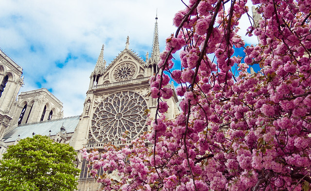 Notre Dame by hookshot88, on Flickr  Notre Dame by hookshot88, on Flickr
|
|
#
?
Apr 9, 2012 18:13
|
|
|
HookShot posted:
I prefer the first one, but in both, I kinda feel like there's too much going on - I'm not sure if I'm looking at a picture of the tree or the building. There's also some haloing around the edges (too much recovery/clarity sliders?), which isn't inherently bad, but it's pretty noticeable here. I actually like this one more, as it doesn't suffer from these two issues. Colors look great, and it's definitely an interesting spot. The things I've pointed out could probably be fixed with some more post work and maybe a tighter crop, so it's worth playing with a little more IMO. After being a goof and shooting several empty film holders, I did manage to get this the other day: 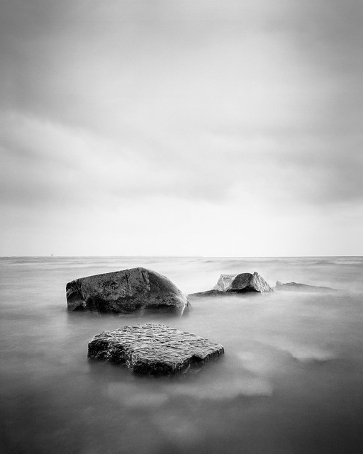 Scan-120408-0002.jpg by richardhkirkando, on Flickr
|
|
#
?
Apr 9, 2012 18:44
|
|
|
Augmented Dickey posted:Vessel I don't like that the wings are cut out at the top or all the negative space out to the left I feel like the photo is all out balance. The color of the flowers distracts from the bug just a bit. That said, you nailed the DoF, which I know can be hard with macro photography. Not to mention even getting a photo in before the drat bug flies away. I did flip through your photostream a bit and you haven't posted this photo here (or I missed it), but I love the lines and abstractness of it... http://www.flickr.com/photos/44029953@N08/7037348481/in/photostream/ Anyway, a couple I did over the weekend at a waterfall-dam thing, which I'd never done before.  Dam by jhunter!, on Flickr  Falls by jhunter!, on Flickr and a flower  Flower by jhunter!, on Flickr eggsovereasy fucked around with this message at 18:57 on Apr 9, 2012 |
|
#
?
Apr 9, 2012 18:51
|
|

|
eggsovereasy posted:waterfall-drat thing http://en.wikipedia.org/wiki/Weir 
|
|
#
?
Apr 9, 2012 18:55
|
|
|
FasterThanLight posted:I prefer the first one, but in both, I kinda feel like there's too much going on - I'm not sure if I'm looking at a picture of the tree or the building. There's also some haloing around the edges (too much recovery/clarity sliders?), which isn't inherently bad, but it's pretty noticeable here. I actually like this one more, as it doesn't suffer from these two issues. Colors look great, and it's definitely an interesting spot. Cool, I think you're right, I'm just being lazy in post. Thanks for the critique, appreciate it! I had to up the luminance of the blues to bring out the sky, since the day was overcast, and that's what caused the halos.
|
|
#
?
Apr 9, 2012 19:19
|
|
|
Musket posted:Hey man, if you want to critique me just come right out and say it. I can handle it. If you're going to say all my shots are starting to look the same I would agree with you, and that's part of the reason why I'm taking a change in direction by working with models and formulating concepts. (Have only done one shoot so far and it was only partially successful). Otherwise, I'm all up for criticism.
|
|
#
?
Apr 9, 2012 21:58
|
|

|
dukeku posted:Here's 2 recent photos of mine: The lighting is really really good. I am not sure how I would have gotten that last one without getting the interior all blown out, but you did it well. I like the first one better, and I think it's because the second one seems a little too close for comfort. I want to see more of the building and the parking lot. The first one has that desolate, abandoned look to it because you're further out, and I think the second one would look better the same way.
|
|
#
?
Apr 9, 2012 22:32
|
|

|
the posted:I am not sure how I would have gotten that last one without getting the interior all blown out, Medium format film and skill. Mannequin posted:Hey man, if you want to critique me just come right out and say it. I can handle it. If you're going to say all my shots are starting to look the same I would agree with you, and that's part of the reason why I'm taking a change in direction by working with models and formulating concepts. (Have only done one shoot so far and it was only partially successful). Otherwise, I'm all up for criticism. Even if the shots look the same, it's because of a theme - street portraits. I don't see this as a valid critique because you can say "shots look the same" for a lot of photo essays/series. bobmarleysghost fucked around with this message at 23:27 on Apr 9, 2012 |
|
#
?
Apr 9, 2012 23:24
|
|


|
Santa is strapped posted:Medium format film and skill. Print film and careful metering. Pretty sure you could still manage to keep highlights under control on 35mm film.
|
|
#
?
Apr 9, 2012 23:44
|
|
|
Since I just posted a crit, here are some photos: IMG_2927 by gronke, on Flickr  IMG_2836 by gronke, on Flickr
|
|
#
?
Apr 10, 2012 00:12
|
|
|
Better than the second one, but it'd be even better if you didn't cut her chin off with the railings.
|
|
#
?
Apr 10, 2012 00:31
|
|
|
dukeku posted:Better than the second one, but it'd be even better if you didn't cut her chin off with the railings. it was either that or her eyes 
|
|
#
?
Apr 10, 2012 00:34
|
|
|
Thanks for the compliments and suggestions, I agree the third is a bit awkward.dukeku posted:These are really quite nice, very well done on the first. Did you do any dodge/burn on the first image? FasterThanLight posted:
I think this is lovely, have you considered this in a square crop? I think what kind of hurts these photos is that you've got a lot going on. The second, for instance... the tower/building is in focus, the person is a person (we tend to notice those) and is high contrast, and the water in the foreground is projecting movement. Tshirt Ninja posted:Oprah Haza, I wish you had shot those guys together. The single portraits make me wonder why lone guys are standing out in a field with their instruments, but together they would probably make a pretty dynamic group. Thanks, I actually did take a few group shots but didn't think they were as strong.    Awesome. There are a few more pictures here (don't want to over-run the thread). Oprah Haza fucked around with this message at 00:49 on Apr 10, 2012 |
|
#
?
Apr 10, 2012 00:46
|
|
|
I think this may be lovely in colour. Any particular reason you went with B&W on this one? Oprah Haza posted:
Going to echo the square crop idea, but I may be biased towards square crops.   _MG_1673-Edit.jpg by AxelDR, on Flickr
|
|
#
?
Apr 10, 2012 03:37
|
|

|
Edmond Dantes posted:I think this may be lovely in colour. Any particular reason you went with B&W on this one? I only had b&w film with me 
|
|
#
?
Apr 10, 2012 04:11
|
|
|
Oprah Haza posted:
I like the first image the best. All of the band members are looking pretty good. It looks as if some of that wind and some good sunlight really makes them look all indie and folky. Their stances look a little bit on the safe side for a band portrait, and that's ok. Also, the fact they're wearing dark clothing really helps balance out all of the brightness. The second and third images have poses that feel sort of forced to me. I get that the third one is supposed to be silly, but I don't think the backdrop of a wooded area on a bright day really fits his stance. When I initially seen it, I thought he was trying to display some maximum metal 'tude. I don't know if that's what was intended. Edmond Dantes posted:Going to echo the square crop idea, but I may be biased towards square crops. Speaking of square crops... I just got through reading Square by Andrew Gibson, and I've been experimenting with some square crops. They're pretty intriguing. If anyone could give me tips on maximizing square formats / crops along with a critique, that'd be cool. I'd like to try and not always conform to the rule of thirds (not saying that I did so in the following pics).  Offshoot by Kiwithing, on Flickr  Mike. by Kiwithing, on Flickr  Carol's Pub by Kiwithing, on Flickr
|
|
#
?
Apr 10, 2012 07:33
|
|

|
I like the warmth and colours in this one, but the in-focus flower is a bit lost next to the other one behind it. I find it helps in shots like this to get colours that contrast with the subject directly behind it to help it stand out. Also the bright lights in the background are a bit distracting. Here are some from me. 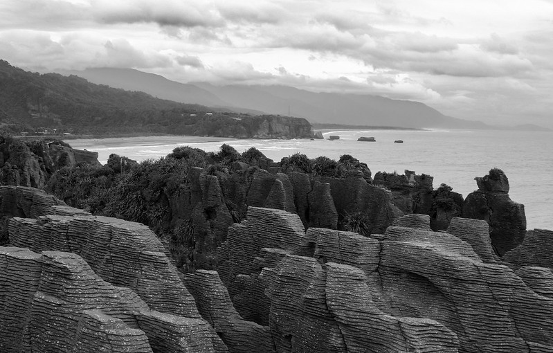 Pancake Rocks by euannz, on Flickr 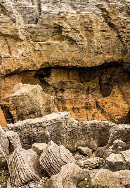 Pancake Rocks 2 by euannz, on Flickr One of many abandoned quake-damaged houses in my city. I'm gonna be slowly working on a bunch of quake-themed photos. 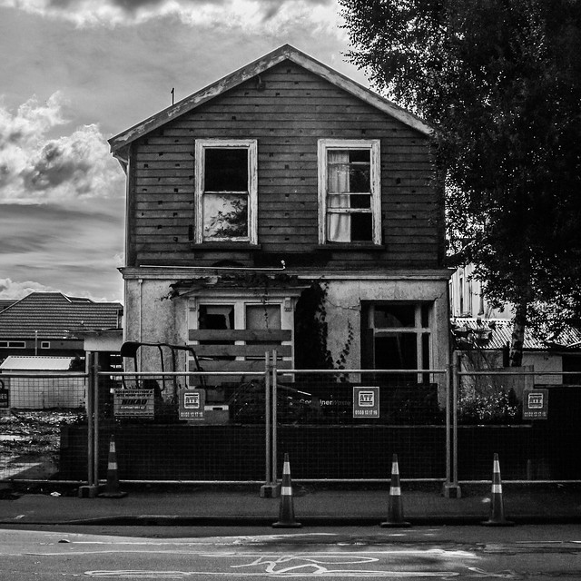 Christchurch.jpg by euannz, on Flickr Wafflecopper fucked around with this message at 09:48 on Apr 10, 2012 |
|
#
?
Apr 10, 2012 09:45
|
|


|
Wafflecopper posted:
I like the first one. I wonder if you could try adjust it and squeeze a bit more of contrast out of it to really bring out the texture of the rocks. I also feel the composition is a little haphazard. Yeah there's cool rocks but there's not a ton you're really doing with them in the photo? The great landscapes I see always manage to have a composition, and don't just really rely on the subject being cool. The second one is neat too. Maybe the sky is a little overdone on this one? There's more detail in the sky versus the building itself and the photo is a little less balanced which detracts a little from the whole, very symmetrical look you're going for in the photo. Also, next time maybe move the cones around? I know it is a nitpicky detail, but again, if you're going for the square on, anything to help maintain the balance helps make it look a bit more interesting. Now me. Yay soundmonkey for dragging me back to this thread after fleeing from it for months at a time. Trying to get all like those sweet Med Format portraitists in the MF/LF thread at 798. 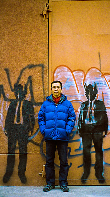 0025 by trambopaline, on Flickr
|
|
#
?
Apr 10, 2012 11:09
|
|
|
Wafflecopper posted:
I'd like to see these shots reversed in terms of colour versus black and white. The second shot looks to have far more compressed tonal range and a good coverage of shadows, being in closer proximity to the rocks there's also more texture present. The first shot is quite jarring - you start off looking at a position in the photo where there isn't really anything, and then you're greeted by the sight of the rocks at the bottom and the coastline to the left. But aside from the rock texture, there's little contrast across the picture despite the comparatively large area.
|
|
#
?
Apr 10, 2012 12:14
|
|

|
Mannequin posted:Ughhhhh. I just revisited your flickr and looked through all your portraits, i suggest you sell your soul to a cigarette company and make a branded photography book because your photos make smoking so drat sexy. FasterThanLight posted:
This is great, being someone that sucks donkeys' at longer exposures on digital i appreciate much more on film. It reminds me of a series by Kim Holterman which is totally kick arse and worth you checking out for more inspiration. http://bumbumbum.me/2010/09/03/tuve-by-kim-h%C3%B8lterman/ I really have no idea where to stay with my images. They original started off as light reflecting off water and i kinda got sidetracked and broke them; i assure you these are photos though.   
|
|
#
?
Apr 10, 2012 15:14
|
|

|
Mannequin posted:Hey man, if you want to critique me just come right out and say it. I can handle it. If you're going to say all my shots are starting to look the same I would agree with you, and that's part of the reason why I'm taking a change in direction by working with models and formulating concepts. (Have only done one shoot so far and it was only partially successful). Otherwise, I'm all up for criticism.  First off, Your ego is pretty big. I wasn't addressing your boring street portraits. I was addressing the fact that Dukeku broke the usual Portland theme of taking street portraits and pics of food. It was a Portland thing well before it was a Manny thing. Good job there buddy assuming I give a poo poo about your Technically good, but creatively boring photos. If I gave a poo poo about your photos, I would have came out with a crit of them sooner. You just happened to make a bad assumption. There is nothing worse than a photographer who has the technical aspect down, that takes boring rear end photos with an ego. Here is your crit Manny. Your stuff is boring. You are a Chinese knock off of Hel-Look meets The Sartorialist. While most of your photos come out "good" thats only because you got the exposure spot on. Its not because your images pop, or have some great theme (that is unless you count boring a theme). You can tell just how comfortable you are now in your photography. On the upside, its good to know your trying to get out of your boring comfortable rut. So I guess there is that. Musket fucked around with this message at 15:40 on Apr 10, 2012 |
|
#
?
Apr 10, 2012 15:17
|
|
|
Revolucion posted:I really have no idea where to stay with my images. They original started off as light reflecting off water and i kinda got sidetracked and broke them; i assure you these are photos though. I'd really like to know what I'm looking at here. I don't say that to be a dick by any means, I'm honestly curious, because I think something really neat could come of it. I like the 2nd and third a lot, and they and some similar ones would look neat printed in a series all next to each other. How are you getting these? ---- Check it out! I'm in PAD and not posting sports photos!  Untitled by PhotoBen27, on Flickr This guy was hanging out near a waterfall in one of the San Diego Zoo aviaries. Is the waterfall/rain too faint to work here? I like the beads of water on his wings, but the rest just feels... off I guess.
|
|
#
?
Apr 10, 2012 16:01
|
|


|

|
| # ? May 11, 2024 11:32 |
|
|
Musket posted:Sorry for the derail here mods. For what it's worth, I have no ego about Mannequin's photos and I thought you were taking a jab at him too.
|
|
#
?
Apr 10, 2012 16:33
|
|