


|
I had to catch up on this thread after a vacation, but I can't get over how clear this shot is. Is there some magical button I can press to make my photos look less hazy? Was it just a very good day to take a photo?
|
 #
?
Apr 10, 2012 19:09
#
?
Apr 10, 2012 19:09
|
|

|

|
| # ? May 11, 2024 09:56 |
|
|
DJExile posted:
Cool photo, I would have liked it will a little more contrast, though. I want to see the bird POP, but he's kind of faded. Maybe up the greens a bit too to make his coat more "lustrous." Also, it looks like you cropped it? I think it would have been nice to see the bird at the end of a branch by maybe framing him off to the side and a bit smaller. Here are two more photos I took of that girl:  IMG_2807 by gronke, on Flickr  IMG_2862 by gronke, on Flickr
|
|
#
?
Apr 10, 2012 19:38
|
|


|
the posted:
Frame 1: You are showing signs of improvement in metering, and composure. Good job. Maybe crop the space above the head down just a bit, If you can bring back her left hand on the rock railing that might help over all as well. Overall you are showing signs of major improvement. Frame 2: too much empty space for me. She has some cool tattoos that kind of seem to get lost in the entire frame due to how far away she appears. Maybe recrop/reshoot with less wall more her.
|
|
#
?
Apr 10, 2012 19:48
|
|
|
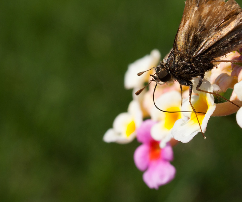
Augmented Dickey posted:Vessel I like how the focus gently fades into the background. More focus on the bug would be nice, though. Did you crop this? I wish I could see the whole insect and not have part of his wings and end cut off. Seattle from Point No Point. Original:  Color:  B&W: 
|
|
#
?
Apr 10, 2012 21:12
|
|


|
I'm not much of a photographer, I'm afraid; I've dabbled in it here and there for a while, but I still have a long way to go before I'm any good. As such, take everything I say with a hearty helping of salt. DJExile posted:Check it out! I'm in PAD and not posting sports photos! I do think the lack of contrast is what feels off. Everything's just sort of grey and a bit hazy and it makes the bird blend into the background too much. His head being a bit out of focus also bugs me (and that and his chest being a little fuzzy don't help with the blending into the background issue). A little more depth of field might have been better to get all of him sharper, though I guess with the lighting conditions that might have been hard. Composition-wise my eye kind of wants to follow the branch and I find myself looking at the background branch more than the bird. A different crop might help that; the branch really isn't very interesting and I feel like it's too visually dominant and distracts from the subject. Not sure how much the overall contrast issue contributes to that, though. It is a cool picture, though, and I do like the water on his wing. Critiquing probated posts isn't probateable, is it?  adamarama posted:First trip out with my first DSLR. Tell me what I did wrong! I like the colors in this one and the exposure is good. The composition kind of bugs me, though; I don't like how the gate and the tree on the right and the pillar on the left are just kind of hacked off. I think maybe a slightly wider shot would have worked better, or perhaps a slightly tighter portrait shot with a little more sky above the house. As it is, I think cropping the current one at the center line of the gate and removing the remaining bits of tree in the upper right would help, though. Overall, it's the best picture of the ones you posted. quote:
Again, I don't really like the composition. What were you going for here? The stairs and the vertical lines draw my eyes to the center of the image and upward, but there's nothing there; even the bars completely blend into the underexposed background behind the wall. The rest of the doorway being cut off doesn't help. The litter at the bottom (and the random plant life poking in from the right) is uninteresting and distracting. The graffiti on the right isn't interesting either and the orange tag on the left might be more visually interesting, but it's almost entirely hidden in shadow. It also looks like you've also got a bit of barrel distortion going on there and the overall effect makes it feel like everything is tilting to the right a bit. quote:
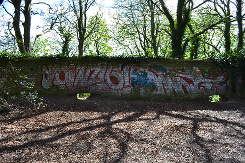
I think the subject has potential (the graffiti is interesting and colorful and I like the juxtaposition of a typically urban feature like graffiti with the more natural overgrown woodsy setting), but the lighting just kills this one. The main subject is a bit underexposed and the sky and background trees' leaves (which make up almost half the image) are badly blown out. Composition also needs some work; the wall is pretty much in the center of the image, which doesn't work well. Read up on the Rule of Thirds. If you can, I'd go back and reshoot this one under better lighting conditions (perhaps early morning/late afternoon when the sunlight is shining on the wall instead of coming from behind it), and cut out the boring foreground in favor of more sky/trees. quote:
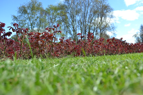
Again, you're not following the rule of thirds here. You're also cutting off the tops of the trees and the sky is pretty overexposed, particularly on the right. The longer blades of grass sticking up in front of the plants are distracting. I'm guessing you were trying to contrast the green trees/grass with the red plant leaves, but it doesn't work very well with this composition. Besides the other issues, I don't think the red is uniform enough in this wider shot to be effective. I think a closer shot of a few leaves on one of the plants contrasted against the green grass or the green trees and blue sky might have worked better here. quote:
I'm not even sure what I'm looking at here. Is it a dead leaf? A bit of litter? There's nothing compelling about it at all; it's literally beige. It doesn't contrast with the grass enough to be interesting in any way. I find my eyes drawn to the trees and sky in the background instead, which are out of focus but still more compelling than the subject. The trash/leaf/beige thing is also in the dead center of the image, which again isn't generally a good idea. And now I guess I should post a few of my own efforts. I should confess that I don't have much of a creative streak, so my thought process when taking a picture is usually something along the lines of "hey, that looks pretty and/or interesting, I should take a photo of it." An artist I am not, but I can appreciate a good picture, I suppose. Think I'll go with a few beach photos; looking forward to my next vacation in a few weeks.  (Click for varying degrees of huge...) (Click for varying degrees of huge...)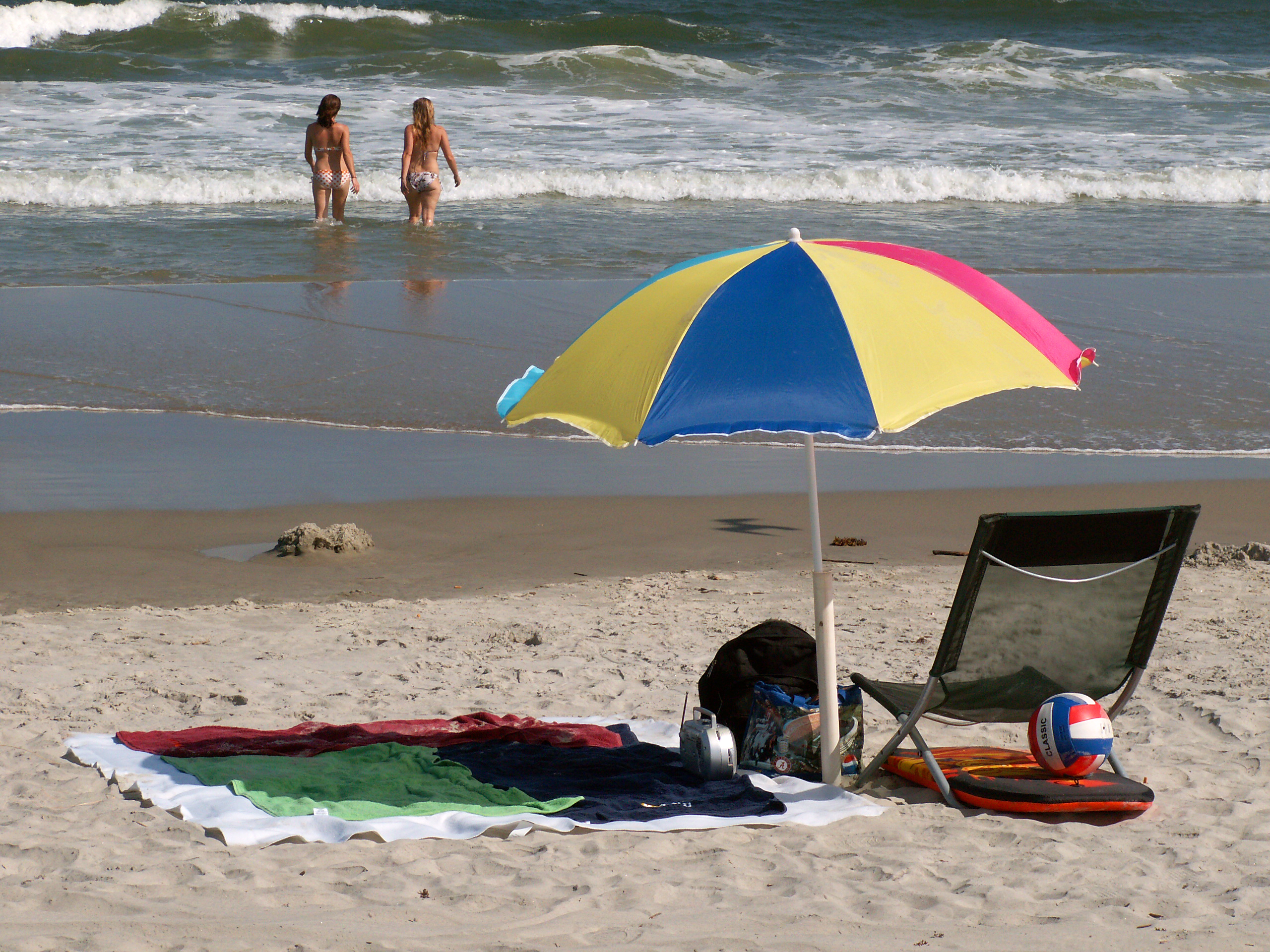 Terribly cliche, but I liked the way all the elements came together (even caught the shadow of a gull passing by overhead). I'm not sure about the lack of a horizon, though; maybe it would have worked better with a slightly wider shot that included a bit of sky? 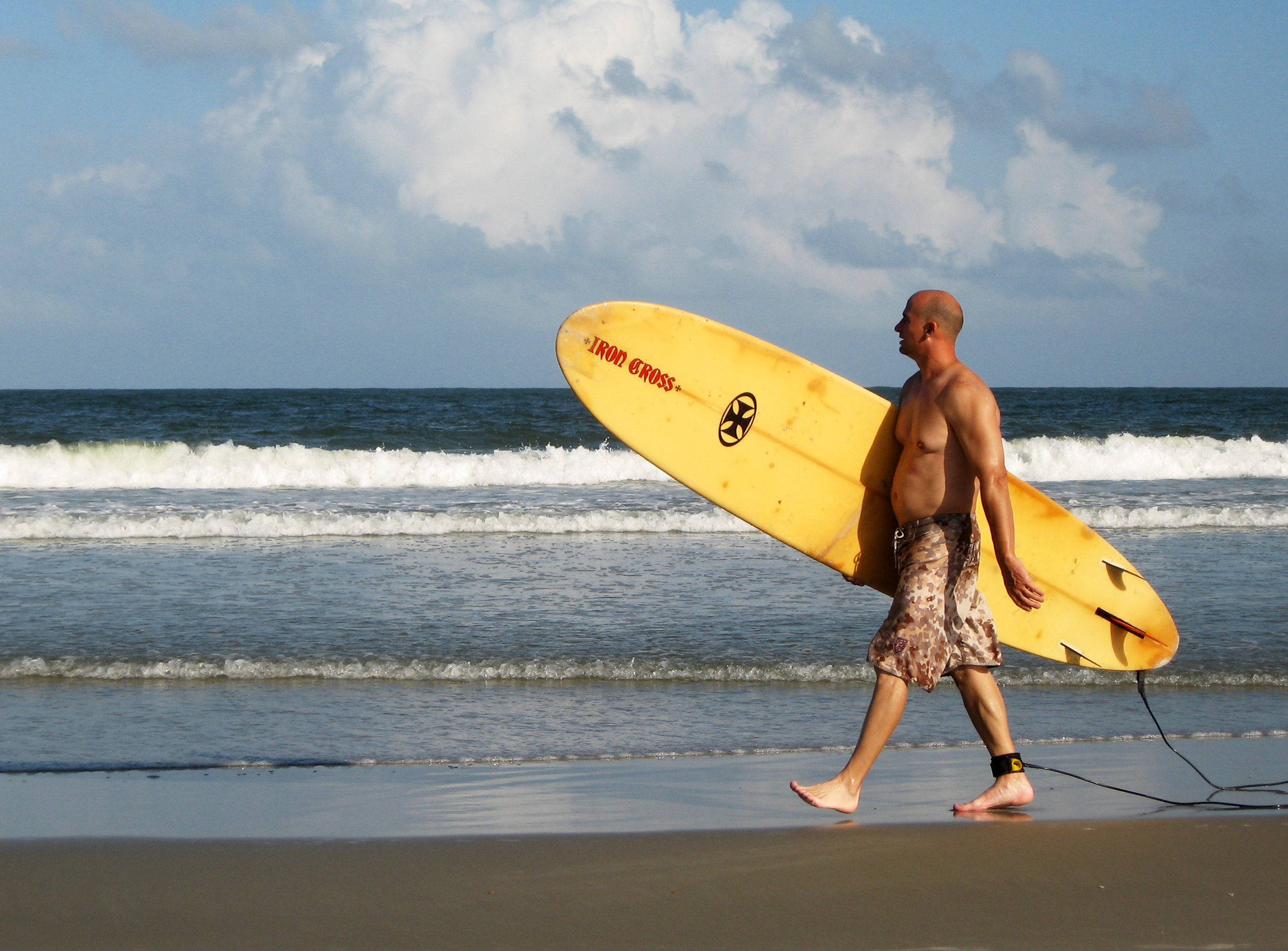 Took a bunch of pictures of surfers walking by and this was the one that turned out the best, I thought. Not sure about the crop though; is there too much empty space on the left? Maybe trimming that down a bit would be better? The breaking wave also bisects the image, which is kinda eh, but I feel like cropping out some sky would make it feel too cramped and center the subject too much. (I guess trimming the left side would help offset some of that effect, though, since there'd be less unbroken wave).  Again, was taking a bunch of shots of this kayaker packing up and got this one of him taking one last look out at the ocean before heading home. dennyk fucked around with this message at 22:36 on Apr 10, 2012 |
|
#
?
Apr 10, 2012 22:33
|
|


|
Pope Mobile posted:I like how the focus gently fades into the background. More focus on the bug would be nice, though. Did you crop this? I wish I could see the whole insect and not have part of his wings and end cut off. Interesting photo but you seem to be looking for the exact exposure. You are attempting a couple of tries expecting something will end up good. There is barely any difference between the 3 in my opinion. Is there anything you are trying to tell us in this photo ? I will repeat myself that is one boring sky, why you chose to show us so much sky? If there was an awesome sunset or some action going on in it, I would not say the same thing. But as of it now there nothing going on.
|
|
#
?
Apr 10, 2012 22:37
|
|

|
Standard precursor to this post - not a pro and still quite new so take any and all of this for what you will.Pope Mobile posted:Seattle from Point No Point. It is a pretty cool image, but I feel that your edits draw too much attention to the wood in the foreground via your contrast adjustments. The city in the distance kind of gets lost more, and to me that is what makes the shot cool. I like the color in the second one and the b&w is well done enough, but to be perfectly honest I prefer the original to either edit.Perhaps try to go back sans extreme contrast and see what you come up with. Not a huge fan of the crops either. dennyk posted:
I looked at this and was like "what the gently caress is this guy doing". Only after seeing your explanation did it make sense, and even then if he was looking towards the ocean I think I would have liked to see that. the posted:Here are two more photos I took of that girl: She seems interesting - pretty but not in a cookie cutter sort of way. Anyways, I feel like I can mentally place the rule of 3rds or golden mean grid from lightroom over your shots - I am guilty of that a lot too. I think the above comment about getting closer on the second one is true - I would have like to see her maybe torso up from the tattoos on her arm, placed on the right 1/3rd of the frame approximately, leaving some space in the direction that she is looking. ----- Ok, so I have been shooting since I last had the pleasure of posting here, but my new daughter has taken too much time to get to edit a lot. This past week I hae been able to get back to it, so I hope to post more here in the next few days. Thee were all shot a few days before said daughter was born, walking around trying to shake that baby out.  Historic by cadence440, on Flickr I don't know if the subject is interesting enough to constitute a photo - I liked the colors and the compactness of the house. I also don't know if the distortion is distracting...I don't have a lens profile for lightroom for this lens and decided to not touch it in that regard, but might go back and do that manually if needed. 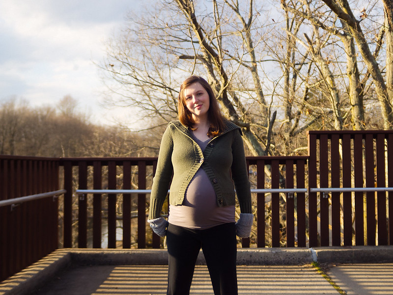 Untitled by cadence440, on Flickr I had admittedly seen a lot of Mannequin's street portraits by this point, and love his style. I didn't pose her or anything. Not used to dead center composition but I felt like it seemed appropriate with the railings and all. 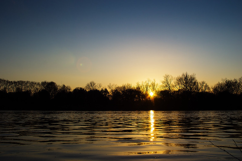 Washington Crossing Sunset by cadence440, on Flickr I don't even know if sunsets are worth it since it seems like it is so overdone, but it was a pretty one, so I took it. I have a few others from this day, so might with them later to get some more help. I have a lot of other questions, though, so might skip them in favor of more recent endeavors.
|
|
#
?
Apr 10, 2012 23:02
|
|

|
Niagalack posted:Interesting photo but you seem to be looking for the exact exposure. You are attempting a couple of tries expecting something will end up good. There is barely any difference between the 3 in my opinion. Is there anything you are trying to tell us in this photo ? I will repeat myself that is one boring sky, why you chose to show us so much sky? If there was an awesome sunset or some action going on in it, I would not say the same thing. But as of it now there nothing going on. Not sure about conveying any sort of message or such. I liked the driftwood shelter with the city way in the background. The sky really did/does annoy me. Cursed overcast Washington winters. I cropped out some of it but didn't want to 'smoosh' the picture by taking out too much.
|
|
#
?
Apr 10, 2012 23:02
|
|
|
DJExile posted:I'd really like to know what I'm looking at here. I don't say that to be a dick by any means, I'm honestly curious, because I think something really neat could come of it. I like the 2nd and third a lot, and they and some similar ones would look neat printed in a series all next to each other. How are you getting these? The lack of contrast on the rain and the quite small bokeh in the background adds up to give a textured background that seems to take away from the contrast of the sharp patterns of the feathers. At a smaller size the bird looks lush and I really love the way the shadows on the green feathers look as they wrap around the side of the bird and the way the drops of water break it up -but unfortunately at full size it just isn't sharp enough and loses the effect. Also, this may be a bit of an over-though: the branch that bends and sticks out at the same angle as the bird seems to play with the balance of the image -it's like an artificial shadow DaveP fucked around with this message at 23:28 on Apr 10, 2012 |
|
#
?
Apr 10, 2012 23:23
|
|
|
removed.
Revolucion fucked around with this message at 21:42 on Nov 29, 2020 |
|
#
?
Apr 10, 2012 23:56
|
|

|
Revolucion posted:
|
|
#
?
Apr 11, 2012 00:26
|
|


|
Musket posted:Here is your crit Manny. Your stuff is boring. You are a Chinese knock off of Hel-Look meets The Sartorialist. I don't think it's that boring. Sure, some of it is a little hit or miss here and there, and maybe lately, it may seem repetitive. But I don't think it's boring. I can think of a lot of things before my street portraits that are boring. Maybe I'm biased. Either way, you are free to your opinion! I'm not a knock-off of those two you mentioned because I don't even know who the first one is, and have only seen very few works by Sartorialist. I do not follow him at all, and get my biggest impressions from the classic photographers -- especially the classic street photographers like Bresson, Frank, Vivan Maier, etc. Avedon is an influence as well. Whether any of this is evident in my work I don't know, but that's who I most admire and follow. Musket posted:While most of your photos come out "good" thats only because you got the exposure spot on. No. Big misconception. None of my pictures happen by accident. Getting a good exposure is only half of the job, or maybe even less than that. First I have to make a connection with somebody whom I've never met, then figure out in a very short period of time, and sometimes under great duress, how to take an interesting picture of them. I ask them to pose in a specific way in specific locations (close to the proximity of where I bumped into them). More important, I have to make them feel comfortable and unafraid. These are tasks you don't see me doing, but are crucial to taking a I suggest you go out and try taking some street portraits. Approach people you've never met who look interesting to you. They might be walking down the street in the opposite direction. Catch their attention, ask if you can spend a couple of minutes with them, 3 or 4 at most. Sure, you say the concept's been done and it's boring and all that, but go out and try it and put yourself in the position of "organizer of a photo shoot", knowing that you don't have very much time because the person is on their way to some place, and you have to take an interesting photograph. How do you do it? Where should they go? How should they stand, with millions of people walking all around you? You have to answer these questions. I encourage you like I encourage everyone who's asked me about it, to go out and try it and overcome the challenges involved. Speaking of photography, I checked your post history for a good 5 minutes for a link to something you may have posted. I guess you could say I'm curious about "the artiste behind the critic" so to speak. But I couldn't find anything, maybe I missed it. Do you take pictures? Can I see them? I won't make judgements, I would just like to see your take on things. Edit: Found it! dukeku posted:Here's 2 recent photos of mine: I love the first one and I like the second one, but I think in the second it seems like you were trying to squeeze too much into the frame, and could have benefited from a wider lens or from standing further back. The carts, in particular, look like they just barely make into frame. Otherwise, I love your style, I like where you're taking your work, and am always interested to see more! the posted:Here are two more photos I took of that girl: My sense is that you don't have a real connection here to your subject. In both shots she is looking away. I sense a shyness. I like the composition of your second shot better than the first because I think there's a little too much head room in the first shot and the linearity of the second is appealing to me. I like where you are going with your work, so keep it up! Mannequin fucked around with this message at 01:33 on Apr 11, 2012 |
|
#
?
Apr 11, 2012 00:34
|
|

|
I find most portraits kinda boring, but I really like a lot of Mannequin's work. Some shots more than others obviously, but he posts some of the best stuff on here. If he can make portraits interesting to me, he's definitely getting more right than just the exposure.
|
|
#
?
Apr 11, 2012 01:05
|
|


|
rio posted:
1) I love how the lighting managed to keep the sky blue and the detail in almost everything. The branch on the top left sticks out like a sore thumb and missing the white picket fence on the right throws me off. Though, the house wouldn't have been centered otherwise. 2) I kind of like this as a family photo, the shadow shows off the baby bump and it looks very naturally posed. I wish the branches on the tree behind her as well as the few leaves were less sharp and in focus like the rest of the background. 3) The way the sun is reflected over and over on each wave is awesome. Clean up the branch on the bottom right and soften up the vignette a little and I would use it for a background. It's peaceful. Revolucion posted:Does anyone else see a sad dog staring at his reflection here? Haha.  Peaking Square by samjack56, on Flickr  Jack BW by samjack56, on Flickr  Om Nom Square by samjack56, on Flickr
|
|
#
?
Apr 11, 2012 07:39
|
|

|
Here is another great read about critiques. http://theawesomephotographer.com/discussing-photo-critiques-forget-the-bokeh-focus-on-the-creativity/
|
|
#
?
Apr 11, 2012 08:55
|
|

|
Pope Mobile posted:I like how the focus gently fades into the background. More focus on the bug would be nice, though. Did you crop this? I wish I could see the whole insect and not have part of his wings and end cut off. Try flipping these so that the wood creates a line guiding us towards the city, rather than a bookend after we've already looked at it.
|
|
#
?
Apr 11, 2012 11:43
|
|
|
samjack56 posted:
If there's one thing that needs to be said about using a zoom lens when making pictures is to not be afraid to center your subject if it makes for a better composition. The rule of thirds isn't an unbreakable law all photographers have to strictly follow so get out there and take some risks when you're making pictures. Also I would strongly recommend you try your hand at getting more up close and personal with your subject matter in the sense you move physically closer rather than relying on the lens to do the job for you. Find something more engaging that makes you excited versus just taking pictures of nature or your friends. Even if you don't consider yourself a photographer it doesn't hurt giving yourself a project or a theme to work on when you're out shooting. Having consistent subject matter to reflect on gives you a better idea of what your skill level is and how you can improve whether it be from a technical standpoint or a conceptual one. Revolucion posted:The main thing that worries me about your series is that I'm not exactly sure what you're trying to achieve. No one can really give you good feedback because we're working on assumptions of your concept and any technical advice we give you probably isn't beneficial because you're doing this in a specific way. But my initial reaction is that you're doing some kind of weird Rorschach test by manipulating focus through a camera lens. Maybe it'd work better in video form. Make your subject more comfortable and definitely try to work with better lighting. The second picture does very little to flatter her figure because she looks like she's being squished between the frame. Also the scale of the second photo looks a bit awkward because the wall texture behind her gives the impression that she's being broken down into sections. Get closer, be confident around your model, and don't let distracting elements get in the way of your subject.
|
|
#
?
Apr 11, 2012 11:46
|
|
|
   These are some old wedding photos I've re-edited and am in the process of putting into a portfolio. ps these are diptychs (USER WAS PUT ON PROBATION FOR THIS POST)
|
|
#
?
Apr 11, 2012 11:57
|
|
|
Mannequin posted:I don't think it's that boring. Sure, some of it is a little hit or miss here and there, and maybe lately, it may seem repetitive. But I don't think it's boring. I can think of a lot of things before my street portraits that are boring. Maybe I'm biased. Either way, you are free to your opinion!  This sums it up very well. It is easy to critique someone who does street shots, but difficult to understand the feeling and emotion behind it. It is definitely hard to approach a complete strange in what is possibly a hostile environment, ie on the street. It is equally difficult to take a good picture of a random stranger without approaching them. There are a lot of great photographers here, including you. This sums it up very well. It is easy to critique someone who does street shots, but difficult to understand the feeling and emotion behind it. It is definitely hard to approach a complete strange in what is possibly a hostile environment, ie on the street. It is equally difficult to take a good picture of a random stranger without approaching them. There are a lot of great photographers here, including you. It is even more impressive that you realize you were in a rut doing the same thing over and over and now you are planning on branching out. Now, I just need to practice my Chinese so I can approach random strangers on the street 
|
|
#
?
Apr 11, 2012 14:50
|
|
|
Pope Mobile posted:I like how the focus gently fades into the background. More focus on the bug would be nice, though. Did you crop this? I wish I could see the whole insect and not have part of his wings and end cut off. Quoting myself so it's easier to look at the original vs most recent edit:  I flipped the image and messed with the curves to bring the city out more and make the wood less harsh. Also Messed with the saturation & color levels to try and pull some reds & purples out of the sky. Getting rid of JPEG artifacts is annoying.
|
|
#
?
Apr 11, 2012 16:28
|
|
|
Sevn posted:
Chinese/Taiwanese people love getting their picture taken! Just motion towards your camera and tell them you love their outfit Although I have to agree that Mannequins portraits get kind of boring. Glad to hear you'll be moving in a different direction. It's just not really special or interesting to do NYC street portraits, considering the sheer number of (good even) photographers that do them. Part of the challenge though! I saw an interesting version where someone did street portraits, but only through the reflection of puddles on a wet day.
|
|
#
?
Apr 11, 2012 16:40
|
|


|
nonanone posted:Chinese/Taiwanese people love getting their picture taken! Just motion towards your camera and tell them you love their outfit I have been here too long, I am past the cute stage of speaking Chinese, I know too much. Now I either have to act like I know nothing, or learn more Either that, or I get business cards and just hand those out when I take a picture :P
|
|
#
?
Apr 11, 2012 17:10
|
|
|
removed.
Revolucion fucked around with this message at 20:48 on Nov 29, 2020 |
|
#
?
Apr 12, 2012 00:20
|
|
|
I try to take pictures of dogs a lot, so I understand that there's not necessarily a lot to work with in any given shot. You don't get to pose it to taste. But with this photo, I dislike the dog sorta staring off frame at something we can't see. Eye contact or a distinct target would have been better I think. On the other hand, I've seen similar photos that "work" and so I'm not entirely sure if I've got the right complaint here. On the positive side, sharpness and subject isolation are excellent and the focus point is dead on. Even more isolation from the background might have been nice, but we're already starting to lose the back of the dog and the lighting does a good job of completing the isolation that the bokeh leaves behind. Here's one I need advice with. I've been struggling a lot with this particular photo. This is a very heavy crop and process, and this version of the photo doesn't really resemble the out of camera photo. I'm also running out of pixels badly. I have some room to play with the crop, but much tighter and I'm sinking under the 2 MP (screen) boundary. Also a lot of banding artifacts; I didn't take this in RAW and have been kicking myself over it. 
|
|
#
?
Apr 12, 2012 01:20
|
|
|
dennyk posted:
The first one is a really busy vacation snapshot. I do think it would be better if you had included some of the sky, if you had gotten lower and tilted up a bit or like you mentioned, got a wider lens. Without it, it cramps the photo and makes it appear even busier. There's a lot going on, but at the same time I'm not really sure what the point of it is or what the focus is - the chair/umbrella or the girls? Did you want me to feel like I want to be there on the beach? Did you just think it was a nice scene? For both of those, I don't think it was successful. Take away some of the clutter and bring in in the horizon - I think that would make it much stronger already. I think the colour of the water is also pretty unappealing in that big wave. For the second, it's not bad but again just looks like a vacation snapshot to me. I don't think the empty space on the left hurts the picture because he's walking into it, not away from it, but it's just kind of boring. The third is your strongest, even though it's the most cliche. However, the harsh contrast between the blown out sun and the kayaker's silouette is a little too strong for me. I think if you had turned left slightly until the sun was just out of frame, you'd have a nice warm coloured sky without the harsh blown out spot of white, which would balance out the black of the guy a lot better. Also I know it wasn't posed, but getting a better angle on the guy or waiting until he was reaching or doing something other than just stand with his arms in front might have helped to decifer his limbs, which would make it more appealing, because right now he's kind of all just mashed together as a black blob. rio posted:Ok, so I have been shooting since I last had the pleasure of posting here, but my new daughter has taken too much time to get to edit a lot. This past week I hae been able to get back to it, so I hope to post more here in the next few days. Thee were all shot a few days before said daughter was born, walking around trying to shake that baby out. I think the first one is the strongest. The colours are pleasing, I like the tilt of the verticals (I rarely do). It reminds me of a creepy old ominous house that still looks nice from the outside. I do think it could use a bit better of a crop. Maybe widen it up a bit, but I feel like the gate is just pinched a little too close to the right. Also the tease of letters on the sign is frustrating - I wish I could either read them or not see them at all. For some reason I'm drawn to the reflections in the windows as well, which I find really interesting. Second one I don't like for a lot of reasons: First and foremost, like you said, you did not pose her. While that can sometimes be a good thing for candid pictures, when people have no guidance whatsoever for a portrait, they usually end up doing what she did: just standing there. You said you liked Mannequin's style, and while he said he doesn't pose them super specifically, he does give them suggestions on how to stand. I would suggest not photographing anyone (and especially a very pregnant lady) straight on, unless you are going for a specific look and have movement or posing in other areas of the body. As it is, she is just standing straight on, feet shoulder widtch apart with her arms at her sides. I kind of expect her to bend over and pick up some dumbells or start doing squats or something. So I would definitely encourage you to at least think about what you want the shot to say about her: is it a fun portrait, is it a pregnancy photo to show off her belly, is it a candid shot? Think about what you want us to think when we see it, and then take it from there. The other main issue I have with that portrait is how you cropped it. I usually hate it when people nag about cropping when it doesn't really affect the photo negatively, but in this case it's a huge no no. You chopped her off right at her knees, which makes her legs look very stumpy and that combined with her straight on pregnant belly just isn't very flattering. She is very pretty but this shot does nothing for her. Do not crop girls right at the knees! Thirdly, you had some pretty nice golden hour lighting there, but because she's standing at a 90 degree angle to it, half of her face/body is very bright and the other half is in complete shadow. I'm not sure if that was intentional or not, but I don't think it adds to the photo. Because the lighting was pretty dramatic, you could have some fun with it to really emphasize the pregnant belly with shadows etc, or shoot backlit or even just shoot in the shade to even out those harsh shadows on her face for a more classic look. I don't mean to rag on you for that one, I just think it had a lot of potential but kind of fell flat. Keep your intentions in mind next time ") Third one is eh...like you said overdone. Clone out those branches on the right and I think you'd have a better shot for what it is. CarrotFlowers fucked around with this message at 01:37 on Apr 12, 2012 |
|
#
?
Apr 12, 2012 01:33
|
|

|
Sevn posted:
Man I tried this yesterday and ended up getting really depressed because I don't have the balls/whatever to just ask people if I can take their photo. I'm ok with running into a crowd and obviously taking someone's photo and then dealing with whatever repercussions come from that but upfront asking for someone's time is actually really poo poo and difficult. And I don't understand how people can label Mannequin's work as boring. They're almost always interesting and unique 'characters' whose personality shows through the photos and creates an interesting scene. Saying "it's been done" is a really really poo poo approach to this sort of work. Perhaps we should stop photographing sunrises because so many other photographers have done that well? A city like New York is a hub for cultural change and a display of the interplay of emerging cultures; if anything we should be documenting it as much as possible and encouraging more people to get out on the street like Mannequin has been doing. I, for one, will be sad to see a decrease in stranger portraits in my flickr feed. Schofferhofer fucked around with this message at 02:07 on Apr 12, 2012 |
|
#
?
Apr 12, 2012 02:04
|
|
|
I think these are good attempts but I don't understand the purpose of these photos. I guess for the first you were trying to show the beauty of the flowers. I think the composition is a little off, namely because you clipped part of the leaf which I feel is somewhat important to include since it seems like it's a part of the main subject. Another part of me feels distracted by the top/right corner which pulls some of my attention because of the similar colors. Overall it's sort-of hard to identify the main subject on its own, it kind of gets lost in amongst the other flowers in the background. I think if you had gotten closer with your lens or even used a macro lens up close to do something with a lot of detail, it could have helped break up the background from the subject. I think the light is nice and the colors, so I think there was some potential here. Otherwise I think it's just a little confusing to see what needs to be seen. For the second... it looks like it's a somewhat thoughtless picture of a buddy in a supermarket, and I don't know the intention behind it. So I think that's confusing to me and I would guess you may not really know your intention either? It almost looks like you are kind of playing around with your camera. That's okay... but I think for your pictures to be successful you should have as clear and defined a goal as possible, and then you'll have some success. But keep going and don't be discouraged! ... nonanone posted:It's just not really special or interesting to do NYC street portraits, considering the sheer number of (good even) photographers that do them. Yeah man, that sounds like a winning attitude. Why bother with fashion or food photography? I mean, drat, there are some (good) photographers who do that stuff. It's not special or interesting, right? Mannequin fucked around with this message at 22:58 on Apr 12, 2012 |
|
#
?
Apr 12, 2012 02:49
|
|


|
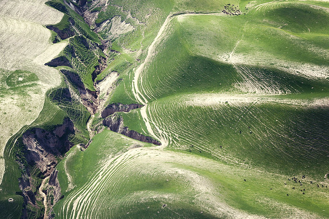
Mannequin posted:Yeah man, that sounds like a winning attitude. Why bother with fashion or food photography? I mean, drat, there are some (good) photographers who do that stuff. It's not special, right? Sorry, but that logic is idiotic. If anything your style makes the genre more interesting, because it's refined and different enough from most of the street work you see out there (good or bad). I hope you take a good break and continue doing them, as they're your best work in my opinion. As someone else said, the best thing about them was how much of the subjects personality came through, which says a lot about your skill in not only shooting, but finding interesting subjects and engaging them. That said, I'm eager to see what you cooked up with a model. I remember years ago telling you to start shooting some portraits because you had such a good technical knowledge, but I wanted you to apply it to something like people. alkanphel posted:
I think this is really nice. You took a normally cliche photo and made it something more. It almost doesn't look like a flower at all. Ambihelical Hexnut posted:Critiques a few posts up. Here are some more loving landscapes. Again. All of your aerials are outright stunning, but this one is my favorite so far. The sense of scale really plays with your head, and I think that's why it's better shot so tight than wide. The compression really enhances the effect, and getting that detail from that far away makes it just feel massive. This kind of landscape work make for really amazing prints, I hope you get to see some of them on a wall. I probably missed the back story, but where is this and what do you do? hepkitten posted:Here are some recent portraits of mine. The subject is an actress/writer that was insanely photogenic. Dark skin on such a bright day was a big challenge, but I was pretty happy with the results.  IMG_9352 by David Childers, on Flickr  IMG_9346 by David Childers, on Flickr  Panorama by David Childers, on Flickr
|
|
#
?
Apr 12, 2012 03:17
|
|

|
Random Task posted:
I was scrolling through the thread pretty quickly and thought "oh just another moon shot" and then I looked a bit closer. Nice work getting the airplane in there too. You might be able to pull it off with just a jpeg, but I would toy with it and lighten the whole thing a little bit. Right now it just feels a bit too dark all around.
|
|
#
?
Apr 12, 2012 05:44
|
|

|
Falco posted:I was scrolling through the thread pretty quickly and thought "oh just another moon shot" and then I looked a bit closer. Nice work getting the airplane in there too. You might be able to pull it off with just a jpeg, but I would toy with it and lighten the whole thing a little bit. Right now it just feels a bit too dark all around. I bumped it a touch, should I go farther?  The shot is actually darkened quite a bit. I love the dramatic effect I get from doing that, but it's very difficult to find the right balance of settings. I tweaked the WB here and it seems to have helped overall. I'm also hitting a nasty noise issue as the exposure goes higher. Blech. The airplane actually just wandered into the shot as I was taking test shots of the moon. I hadn't expected it, so the shot was a haphazard "click the button NOW" rather than being able to set image parameters. I wish I'd gotten a few seconds warning about what I was about to see.
|
|
#
?
Apr 12, 2012 06:21
|
|
|
Bottom Liner posted:Here are some recent portraits of mine. The subject is an actress/writer that was insanely photogenic. Dark skin on such a bright day was a big challenge, but I was pretty happy with the results.
|
|
#
?
Apr 12, 2012 06:29
|
|
|
Bottom Liner posted:
I really like this shot, you're right, she's photogenic, and the texture of the branch plays well in contrast with her skin, given the relatively high key nature of the shot. I don't know how you've edited in post, but I feel her eyes whites might just be a little too white, but it's possible I only think that because of how deep the iris and pupil are. Tonality is good. The subject comes across as calm and confident, I'd be hard pressed to tell you what she did for a living based on this photo, but I don't think that was the intention. Other than that, possibly do a little bit of editing at the exposed pit of the arm?
|
|
#
?
Apr 12, 2012 08:00
|
|

|
Bottom Liner posted:Here are some recent portraits of mine. The subject is an actress/writer that was insanely photogenic. Dark skin on such a bright day was a big challenge, but I was pretty happy with the results. First shot feels forced. It looks less like she's writing and being inspired and more like she's taking notes/sketching. Second shot is an awesome portrait. Third shot throws me off because she's wearing heels in the forest.
|
|
#
?
Apr 12, 2012 08:25
|
|

|
Revolucion posted:That is something i find disarming about posting and critiquing very new or different ideas in PAD, if the poster doesn't have a intention themselves it is near impossible to give decent feedback on improvements. That being said i have no clue about what my intentions are. I was mega stoned during lunch when I watched this earlier today and I was tripping out pretty hard. And yeah, it works much better in video form. Maybe stills would work if they were very small or very large and you made a collage out of them.
|
|
#
?
Apr 12, 2012 09:30
|
|
|
Random Task posted:I bumped it a touch, should I go farther? Yeah I like this better. I think it balances the shot out quite nicely. The plane looks like it's illuminated by the moon, it's a pretty crazy shot.
|
|
#
?
Apr 12, 2012 14:25
|
|
|
the posted:Cool photo, I would have liked it will a little more contrast, though. I want to see the bird POP, but he's kind of faded. Maybe up the greens a bit too to make his coat more "lustrous." Also, it looks like you cropped it? I think it would have been nice to see the bird at the end of a branch by maybe framing him off to the side and a bit smaller. I like this one, could have been framed a bit better (so much space above but so tightly framed near the hand) and the posture could have been a bit better (having her right hand showing in the picture (probably on her waist, for slightly asymetric shot) not hidden behind her) but despite what's been said I enjoyed the vibe and lightning. You get a thumb up from me!
|
|
#
?
Apr 12, 2012 18:12
|
|

|
Bottom Liner posted:All of your aerials are outright stunning, but this one is my favorite so far. The sense of scale really plays with your head, and I think that's why it's better shot so tight than wide. The compression really enhances the effect, and getting that detail from that far away makes it just feel massive. This kind of landscape work make for really amazing prints, I hope you get to see some of them on a wall. I probably missed the back story, but where is this and what do you do? I believe he does something involving helicopters for the Army and is currently in Afghanistan. Someone correct me if I'm wrong.
|
|
#
?
Apr 12, 2012 23:20
|
|
|
Mannequin posted:Overall it's sort-of hard to identify the main subject on its own, it kind of gets lost in amongst the other flowers in the background. I think if you had gotten closer with your lens or even used a macro lens up close to do something with a lot of detail, it could have helped break up the background from the subject. Wafflecopper posted:I like the warmth and colours in this one, but the in-focus flower is a bit lost next to the other one behind it. I find it helps in shots like this to get colours that contrast with the subject directly behind it to help it stand out. Also the bright lights in the background are a bit distracting. Yeah, at first I didn't quite notice how soft the contrast / focus is, but now I can totally see what you two are talking about. At the time I didn't have any sort of macro lens or extention tube. I have an extension tube now, though! I'm hoping that'll improve things the next time I decide to take photos like that. Mannequin posted:I think these are good attempts but I don't understand the purpose of these photos. How complex do these goals have to be? Should I be aiming for "Make sure the subject is in focus and the composition makes sense?" or "Make sure this photo has some sort of artistic meaning?" (I have a feeling it's both.) As far as intentions go: Usually, I take photos because I think something looks cool or catches my eye at a particular moment. I haven't really actively tried injecting a particular purpose or feeling in my pictures because it's a bit intimidating to try to inject meaning into every picture. It just really seems as if some photos are just "Here is a [closeup/wide shot] of this [thing/person]. Admire it, because it looks nice." Maybe it's because I'm missing something? It's frustrating. This stuff makes sense when I'm reading books on composition and theory, but when it comes to everyday photo opportunities, I can't seem to make some of these techniques work. Gotta keep working at it, I guess.  Thanks for the feedback.
|
|
#
?
Apr 13, 2012 02:37
|
|

|
Sharizard posted:Usually, I take photos because I think something looks cool or catches my eye at a particular moment. I haven't really actively tried injecting a particular purpose or feeling in my pictures because it's a bit intimidating to try to inject meaning into every picture. It sounds a bit fuzzy now but as with everything, shoot more and get critique, look at your photos again, then go out and shoot somemore. It takes a long time but you'll see the change slowly happen. Here's an article that might be relevant: http://www.fotocommunity.com/info/Helsinki_Bus_Station_Theory
|
|
#
?
Apr 13, 2012 03:19
|
|
|
|
| # ? May 11, 2024 09:56 |
|
|
Sharizard posted:How complex do these goals have to be? Should I be aiming for "Make sure the subject is in focus and the composition makes sense?" or "Make sure this photo has some sort of artistic meaning?" (I have a feeling it's both.) Well, don't worry so much about the "artistic meaning" or any of that. I really meant just try to focus correctly. Make sure the thing you want to have photographed is clear to the viewer, so getting rid of distracting background elements by changing your position or doing something different, is a start. When I asked about intentions, I guess what I was asking was, why take these pictures? That's the question I ask myself a lot, especially with film because it's expensive to buy and expensive to develop. Each frame costs money. So I ask, "Should I bother with this picture? Is it worth it? Could I take a better picture of something else instead?" When I see photos like your friend in the supermarket I don't think you have real intentions. I think you may have been playing with the camera or aimlessly photographing, so I don't really see the value in it. It's okay to take pictures like this from time to time, but if you put more care into your photographs you will have better outcomes. You don't need to have complicated goals or grand visions. Just take good pictures of things you like and in time maybe you will find a way to incorporate meaning, or think more thoughtfully about your pictures. Does any of that make sense? Mannequin fucked around with this message at 04:55 on Apr 13, 2012 |
|
#
?
Apr 13, 2012 04:46
|
|