|
Falco - that shot is really awesome. You can see a lot more in the edit in terms of detail; it turned out really well. Samjack - thanks for the advice, and I think of your three I like the first one the most. I was looking at it, just interested in the shape of the branch, and I think it took me like 10 seconds to realize the bird was even there. And I mean that in a good way - it was a nice surprise. CarrotFlowers - thank you so much for that lengthy critique. All of that is incredibly useful, and stuff that I will really try to keep in mind in the near future. To respond to a few of your points: 1) Regarding the crop, there is a tiny bit more on the right, which does show more fence but also dome other distracting elements. I was going to go back and work it out but I am only finding the final jpeg at the moment, so I'll have to dig up the raw file to see if I can get anything extra in the frame. 2) All of this is so, so useful. All I had was a manual focus lens with me that I was just getting used to, so I think I really lost touch of what I was trying to do just to get her in focus quickly. That it is apparent to the viewer makes me really want to keep intent in mind when shooting more and more in the future. I didn't even realize that cropping at the knees made that kind of impact, but I totally see it. And the worst part is that as I look back at other, older shots I tend to cut people off somewhere between the knee and ankle very often. A bad habit I will try to break.
|
 #
?
Apr 13, 2012 07:53
#
?
Apr 13, 2012 07:53
|
|


|

|
| # ? May 10, 2024 03:42 |
|
|
dennyk posted:Some very useful feedback I had some trouble with lighting that day as well, it was incredibly bright. I completely take your point on the graffiti image. Where should I be taking a light reading from in a situation like that, ie the foreground being much darker than the background? Would it require two photos for post processing?
|
|
#
?
Apr 13, 2012 10:29
|
|

|
Random Task posted:I bumped it a touch, should I go farther? I think the idea for this shot is awesome, even if the plane was a lucky coincidence, so it's a shame about the technical problems you mentioned. It'd be great closer up, but it does seem like you can't crop much more. It'd probably involve a fair bit of waiting for the right moon/plane alignment (find out if it's a regular flight, and check moon position with TPE) and weather, but if you can reshoot this in RAW with a longer lens and the opportunity to plan for it you could get something really good.
|
|
#
?
Apr 13, 2012 14:25
|
|


|
rio posted:
 Untitled by changezi, on Flickr  Untitled by changezi, on Flickr  Untitled by changezi, on Flickr carcinofuck fucked around with this message at 22:56 on Apr 13, 2012 |
|
#
?
Apr 13, 2012 21:42
|
|

|
Looks like a pretty interesting mountain landscape but I can't actually see any of it thanks to the blown corner/hazy poo poo. So I can mountains in the bottom and moving north makes me feel like I have a hosed cornea.
|
|
#
?
Apr 13, 2012 23:31
|
|

|
carcinofuck posted:It is, I like the same thing about it. It looks tilted though, and it also looks like a shot that would actually benefit from centering the bulk of the object of interest. I like the haze. The only issue for me is the underexposed bottom, but the general feel of the photo is really nice.
|
|
#
?
Apr 13, 2012 23:34
|
|

|
Hi Photo a Day! I've given some thought to the "buy now, pay later" approach with critique (giving crit without posting photos, then later posting photos without crit), and I think I've sort of decided how I'd like it to work. I'd ask that if you plan on doing this (and it's fine if you do), post your crit-free photos the same day as you post your crit. "The same day" is obviously open to interpretation and you don't have to worry about being three minutes past midnight or something. I'd also ask that anyone reporting no-crit posts scroll up a bit to make sure the person didn't provide crit earlier, but I'll also try to do this when I handle the report to make sure nobody gets unfairly probated/shamed. Thanks for making PAD awesome again! (I'm editing this into the OP now)
|
|
#
?
Apr 14, 2012 00:41
|
|


|
carcinofuck posted:It is, I like the same thing about it. It looks tilted though, and it also looks like a shot that would actually benefit from centering the bulk of the object of interest. I'd personally like to see a little more detail from the shadow on the bottom. I think it's a cool shot though, perhaps maybe would have benefited from a landscape view though, but I dont know what else would've been in the shot. My mountain shot, metered off the clouds with polarizer (and heavy editing):   I feel like this one has some potential, but not sure how to make it work. Tighter crop on the guy? I have a black & white version too. 
Munkaboo fucked around with this message at 07:38 on Apr 14, 2012 |
|
#
?
Apr 14, 2012 07:31
|
|

|
ButtMonkey posted:Hi Photo a Day! But it's fine to comment on photos without posting some ourselves that day right?
|
|
#
?
Apr 14, 2012 07:41
|
|
|
Munkaboo posted:My mountain shot, metered off the clouds with polarizer: The classic vista of Yosemite Valley. The photo looks clean and is greatly detailed, however the rising mist from the trees seems to be getting in the way of the picture. I don't mean that it's adding to the eery morning feel off this photo, but rather it feels as though the mist doesn't blend in at all and therefore distracts me from the rest of the picture. Maybe you could try finding a way of blending the mist in the foreground to appear as though it's hiding something mysterious rather than just getting in the way. Other than that, it's a well taken shot of that vista. We had a thunderstorm roll through the Bay Area last night, a fairly uncommon occurrence. I tried some late morning black and white of San Francisco from across the Golden Gate. Does this look a bit over processed? 
|
|
#
?
Apr 14, 2012 07:45
|
|
|
The moon in this shot looks a little bit out of place, it's so small I can't tell if it's the moon or just a speck of light. I personally would probably get rid of it. I like the houses on the hill though, I think they came out quite well. I'd clone out the telephone wires in this one. Also, something seems weird about the colours. I like the vaguely green tint of the house at the front, but then the really strong yellow of the one behind makes it look... off, somehow. It makes it look more unnatural. This could be a good shot, but as has been pointed out, there's not much to see because of the haze. Also, the entire mountain bit closest to the camera is completely black. Maybe if you'd bracketed exposures and combined them to create an evenly exposed image it would have come out better. 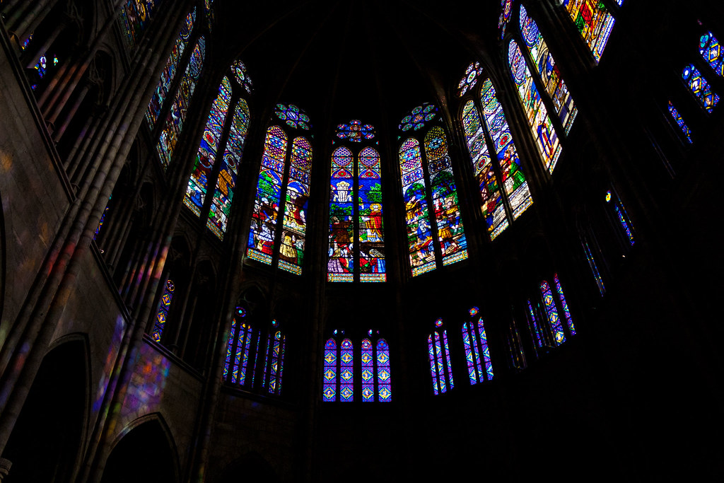 St Denis by hookshot88, on Flickr 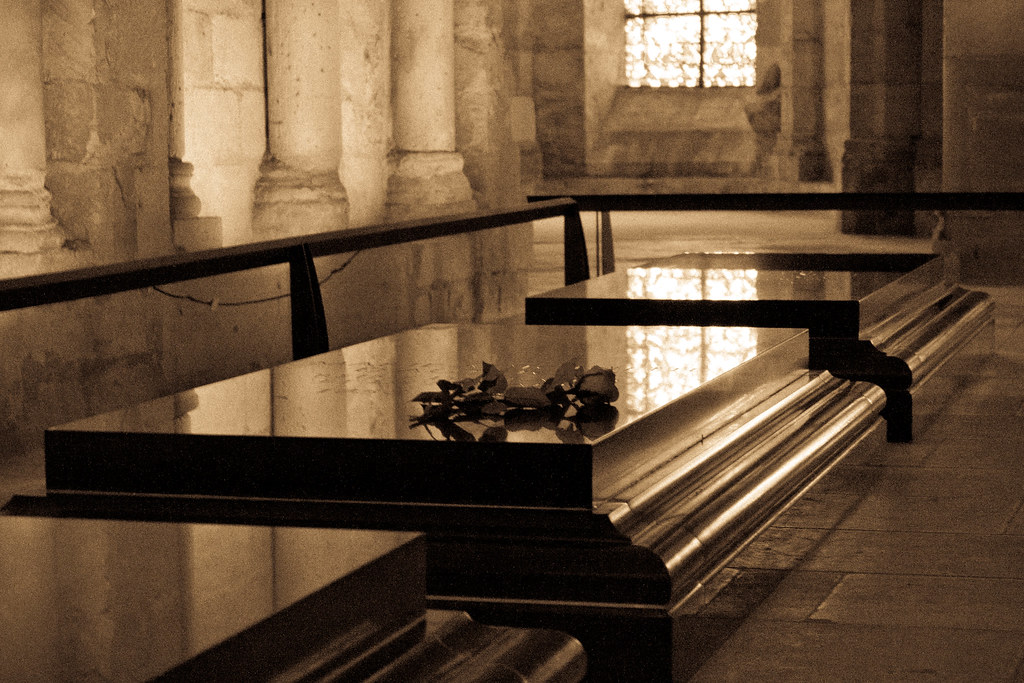 Marie Antoinette by hookshot88, on Flickr  Paris by hookshot88, on Flickr
|
|
#
?
Apr 14, 2012 10:48
|
|
|
Eclogite posted:We had a thunderstorm roll through the Bay Area last night, a fairly uncommon occurrence. I tried some late morning black and white of San Francisco from across the Golden Gate. Does this look a bit over processed? What I would change personally would be the composition. I understand that clouds is the most important part of the picture, but it loses it's effectiveness at 1/3th of upper end. (the blank spot at the upper-right corner kind of saves it, since it gives shape and direction to the clouds) I might be wrong, but do you have a version of the same landscape with 1/3 of water/city and the rest with clouds? The shape of the city buildings gives a great accent to the photo, but I feel that it gets forgotten. Would love to see how it looks photographed with golden rule in mind. Or it might just be worse than what you have now. I have terrible imaginative thinking.  Would have loved to take this while the sky was somewhat clear, since the pollution reflected in the smog-like clouds makes the sky look dull and add no atmosphere to the picture in my opinion.
|
|
#
?
Apr 14, 2012 11:41
|
|
|
Break Fast posted:
The problems I have with this photo is that there is nothing sharp in the image, you're right, there is nothing compelling about the sky and the white balance is off. It looks like it has the potential to be a good long exposure but it looks a little rushed and has had no post work. Did an actors headshots today, here's two of the first ones out of the workflow.  
|
|
#
?
Apr 14, 2012 17:16
|
|
|
Bottom Liner posted:But it's fine to comment on photos without posting some ourselves that day right? Yeah I clarified that in the OP, if you just don't have any photos you want to post, but you want to critique, then by all means please do. This only applies to using that as a "voucher" for later posting photos without crit. There is never a requirement to post photos in PAD, although I mean, I'd strongly recommend it just for the obvious reasons.
|
|
#
?
Apr 14, 2012 17:17
|
|
|
Munkaboo posted:I'd personally like to see a little more detail from the shadow on the bottom. I think it's a cool shot though, perhaps maybe would have benefited from a landscape view though, but I dont know what else would've been in the shot. I like the editing. It does seem very saturated but I think it works for a landscape photo like yours, nice and vivid. I think I prefer the first shot over the second, but I can't really tell why. As for the third shot, the way it is now is awkward. The guy on the far right is a bit too close to the edge of the frame I think. What I would have liked is have the two (or more) people drawing take up the whole frame with the mountain view directly behind them, as in shoot through them. A tighter crop could work, but you would lose overall detail. AceClown posted:The problems I have with this photo is that there is nothing sharp in the image, you're right, there is nothing compelling about the sky and the white balance is off. It looks like it has the potential to be a good long exposure but it looks a little rushed and has had no post work. I think his skin is too red in the first shot. Also I'm not sure if that was your intention, but the background is also reddish in the left corner. To fix his reddish skin, I would warm him up and desaturate at the same time, like so:  I might have gone a bit too far with the desaturation but you get the point, this was a quick edit. -- Cross post from the shooting people thread, I went on a bike ride yesterday with my brother, took some photos.  
|
|
#
?
Apr 14, 2012 17:33
|
|


|
HookShot posted:
Found a new friend at the zoo today...  Emu by Trip Sixes, on Flickr I waited for this fella to move close enough that I could take a picture that didn't just shriek "ZOO PHOTO", and this is what I was finally able to accomplish. The crop is a little tight, but there was some ground debris and a water dish that detracted from the rest of the picture, and cloning attempts did not look natural at all. I really love the myriad of contrasts in his black and gray mottled feathers, hence the B&W treatment, as color didn't bring any additional information to the image and only made him blend even further into that drat rock wall in the background.
|
|
#
?
Apr 15, 2012 02:18
|
|
|
HookShot posted:
I really like this photo. The way the light is highlighting the greens and yellows in the middle of the frame draws the eye. I like the ugly black building as well, it gives an interesting element. I wish it could be just a little more prominent to break things up a little more. I was just messing around here. 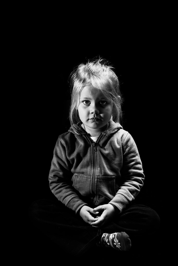 2012-97 by Tom Rintjema, on Flickr Edit: VVV Yes sir, my little girl keeps growing! TomR fucked around with this message at 02:30 on Apr 15, 2012 |
|
#
?
Apr 15, 2012 02:24
|
|
|
krackmonkey posted:Found a new friend at the zoo today... This, like all wildlife (especially zoo) shots, needs isolation of the subject to really work. I see you shot at f/2, which helped, but the background is so close in tone to the subject, it's just hard to get that separation. I think you're right to do this in black and white. Can you push the blacks a bit more? TomR posted:I was just messing around here. Holy crap! Is that the same little girl you frequently shoot? She looks remarkably different in this. Really digging the lighting. I'm not sure how I feel about my own b&w shot. 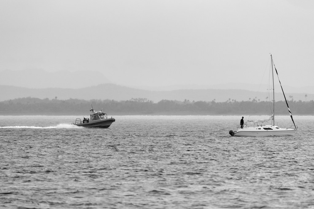 The Chase by torgeaux, on Flickr
|
|
#
?
Apr 15, 2012 02:26
|
|

|
I really like it- I feel like it would be really good as a huge print since there is so much detail and the subjects are a bit far apart. The physical contrast between the two subjects (the motion of the patrol boat versus the stationary sail boat) also makes it captivating. Is there any story behind this? I'm interested in how the situation turned out. A few shots from a bike ride, as always. I've been carrying a longer lens (100mm effective) lately and I'm not sure if they are coming out too tight or not. There is something about this lens that keeps me coming back to it, I'm not sure what though. 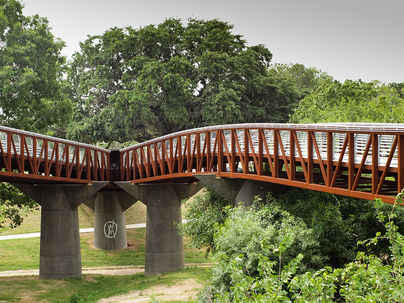  
|
|
#
?
Apr 15, 2012 04:53
|
|


|
TomR posted:I really like this photo. The way the light is highlighting the greens and yellows in the middle of the frame draws the eye. I like the ugly black building as well, it gives an interesting element. I wish it could be just a little more prominent to break things up a little more. This is an awesome dramatic portrait. I don't think it'd be easy to pull off that super dramatic look for such a young subject, but it's fantastic!
|
|
#
?
Apr 15, 2012 05:26
|
|

|
Erg double post
|
|
#
?
Apr 15, 2012 05:36
|
|
|
Augmented Dickey posted:I like the last picture. The effect of the lens does give it a nice flat feeling to the picture and makes it a little cramped. I'm not sure if that's what you're aiming for but I do kinda like it. Do watch out that your camera is straight, the vertical tilt isn't bothering me that much but it feels like the camera is leaning a bit to the right. Break Fast posted:
Nothing is sharp in this picture. I'm assuming you're using a tripod and a long exposure time in this picture. Try weighing your tripod down a bit to stop it swaying a bit in the wind. Also, use mirror lockup so there's not that much of a shake when you take the picture. I've been working on a new project the past few months. I've been looking for things that evoke the feeling of nature in the urban environment. I've been trying to photograph how fake the stuff is and how it doesn't really fit in. Stuff that James Howard Kunstler would call "A Nature Bandaid"   
|
|
#
?
Apr 15, 2012 15:43
|
|
|
Augmented Dickey posted:I like the way that the red pops against the green background here, and the contrast of the sharp angles of the bridge supports against the gentle curve of the bridge itself is also pleasing. The two problems I have with it are 1) the composition is unbalanced - there's a lot more bridge on the right than on the left, and my eye expects more on the left; and 2) the bridge is a strong leading line, but the convergence of the two doesn't lead my eye to any really satisfying conclusive point. There's nothing above it that's of interest, and the bridge supports don't really pop enough to stand out as a point where the eye should go or rest. From last night:  Adjust Seat by TheJeffers, on Flickr
|
|
#
?
Apr 15, 2012 15:45
|
|

|
TomR posted:I was just messing around here. I love this photo, you did an awesome job on the lighting. Great work on the B&W conversion too, Just a couple things I'd would change is first I'd put her in the center of the frame instead of off slightly to camera right (I do like the vertical position). Secondly, I'd clean her hair up a bit unless that's what you were going for. I just don't feel anything is coming together in this frame. I just feel like the subjects aren't prominent enough. The B&W conversion feels drab to me and I don't like the centered horizon. I just get a snapshot vibe. _____ Here are three from the Charleston Area:  Charleston by Ryan-Tamm, on Flickr 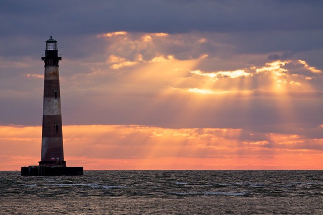 Morris Island Lighthouse (Folly Beach, SC) by Ryan-Tamm, on Flickr 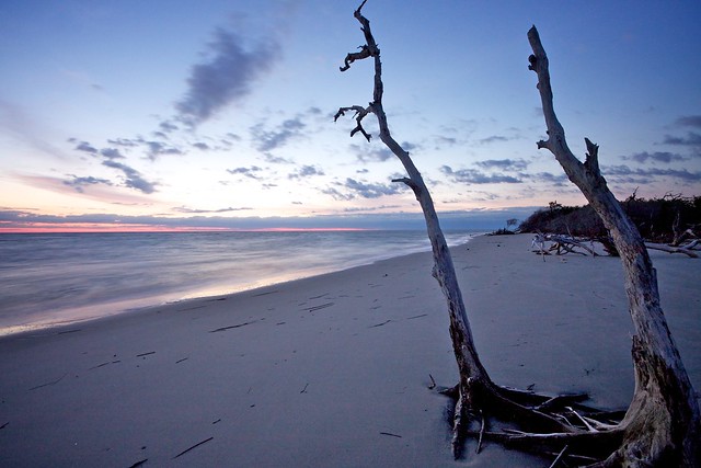 Folly Beach by Ryan-Tamm, on Flickr
|
|
#
?
Apr 15, 2012 15:56
|
|

|
Opinions on the framing with this? It was just a snapshot so he was originally centred and I cropped it, I feel he's still a little too in the middle but it was better to have the traffic lights be more centrally positioned. Also, should there be more space above his head? Below? I don't take a lot of portraits. LN by Cacator, on Flickr TheJeffers posted:From last night: It's too bad that out of focus green towel on the right is in the way, a bit distracting.
|
|
#
?
Apr 15, 2012 19:12
|
|


|
Cacator posted:Opinions on the framing with this? It was just a snapshot so he was originally centred and I cropped it, I feel he's still a little too in the middle but it was better to have the traffic lights be more centrally positioned. Also, should there be more space above his head? Below? I don't take a lot of portraits. I think it would look better with the subject in the center. The background is busy enough that the traffic lights don't need to be centered, I didn't even really notice them until you pointed it out. e. I guess I have taken a picture recently.  Ross Headframe by MrDespair, on Flickr Alternate title: Why the gently caress are there so many cables stretched across this valley? Dr. Despair fucked around with this message at 23:06 on Apr 15, 2012 |
|
#
?
Apr 15, 2012 22:21
|
|


|
TheJeffers posted:
I'm really not "getting" this shot. What was the intention going into it? Was this a seat you stumbled upon and just thought it was interesting or was it the scene as a whole? As I learned from my last critique, giving some indication as to what you are going for goes a long way to helping you get the best critique possible. In my opinion, your backgrounds are too distracting and the seat itself isn't too interesting. I feel like a good bit of what is bothering me is the angle in which it was shot. The way there are three different wall patterns clashing with each other (the brick pattern going into the wall with towels going into the floor) is not doing your shot any favors. I'm a fan of trying to take everyday objects and making them look interesting but I don't think it was achieved in this shot. If possible, try getting your lens a little more open aperture wise to isolate it from everything else. Keep at it! I'm waiting to get a roll of film back today so I'll post something later tonight after I pick it up. Edit: Got it! I was told by some friends to come shoot a BBQ that they have every other Monday. They want me to start doing it every time they have one as they want pictures to get more people interested. So far there are anywhere from 15-30 people attending at a given time. Same location every time. So basically all I did was document the evening and try to take pictures that weren't lovely. I basically shot it like I would shoot an event that I was getting paid for. This is my first time going into shooting with that mindset. I was working with low light and Portra 400 film so long exposures were all I took as I don't own a flash. 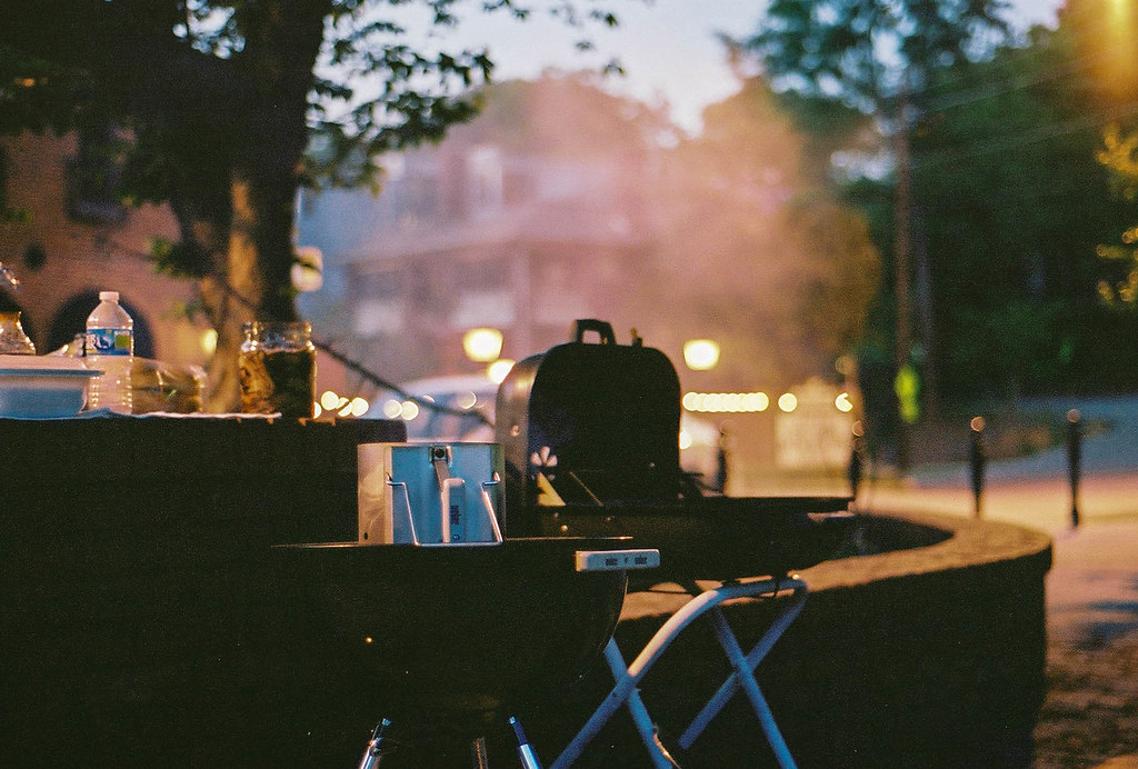 BBQ = grill. Liked the colors I got out of the film and wanted to get the grill while it was cooking food. Don't like the amount of grain but I guess that comes with the territory. I wanted to make sure it was strong compositionally and feel like I got that even if it was only a picture of a grill. 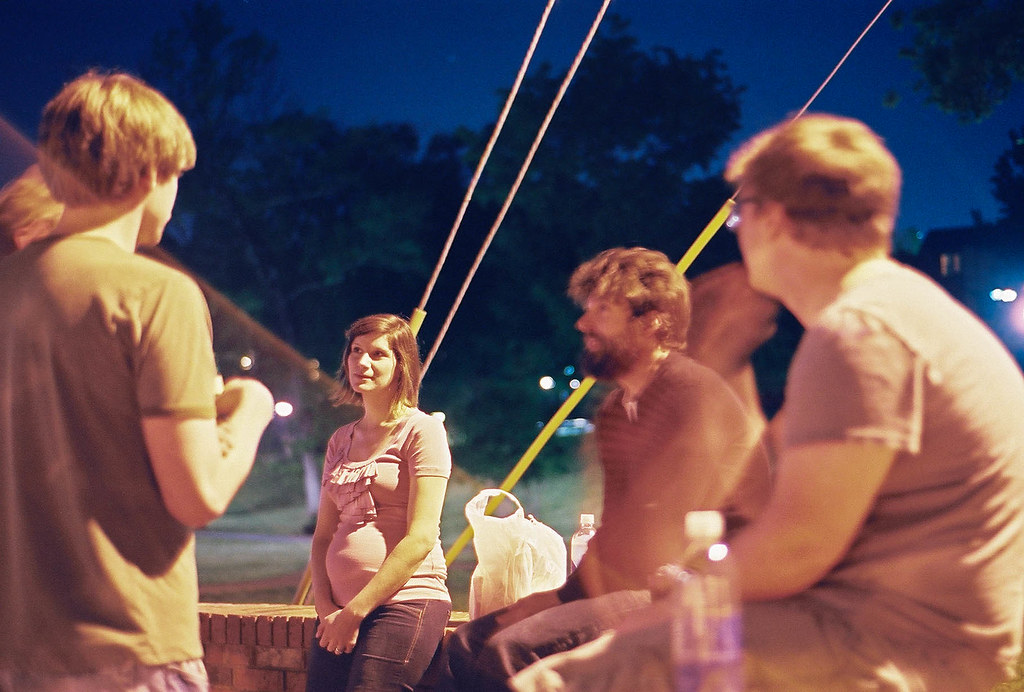 I wanted to get her because she seemed deep in thought in an event filled with motion and talking. I took a good bit of shots like this one where I was trying to capture the feel of the event. All the movement and excitement that usually comes with this shindig. People tend to be drinking a good bit, conversations happening everywhere, and the general feeling of the night being a blur (probably the beer). The lighting there is all over the map though and I wish there was something I could do to better control it yet still maintain that sense of motion that I am going after. 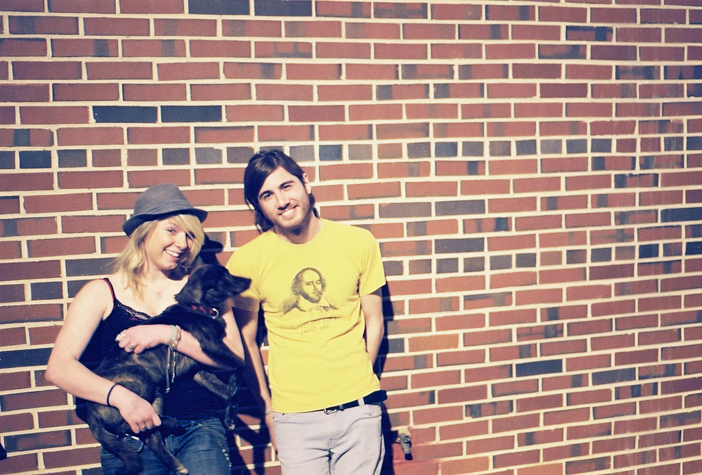 I then started shooting more portrait-esque shots against this brick wall. Basically pulling people aside and telling them to look into the camera. I really don't know much about portraits and directing so I figured it best to get a good bit of drinks into people so their personalities would come out. I think I might go with a center crop next time and avoid getting the water spout in the shot. So basically I'm looking for advice on how to handle event photography as I honestly don't have a clue as to what I am doing and I would like to. pootiebigwang fucked around with this message at 07:58 on Apr 16, 2012 |
|
#
?
Apr 15, 2012 22:54
|
|

|
Cacator posted:Opinions on the framing with this? It was just a snapshot so he was originally centred and I cropped it, I feel he's still a little too in the middle but it was better to have the traffic lights be more centrally positioned. Also, should there be more space above his head? Below? I don't take a lot of portraits. The lighting on this is pretty fantastic. I feel like you could try a tighter crop, I want him to fill up the frame more. Not centering him gives the photo a bit more of a dynamic feeling, if you center him it will feel more static imo, depends on what you are aiming for.
|
|
#
?
Apr 16, 2012 04:50
|
|
|
 17480020.jpg by spikespikespike, on Flickr Any advice on rescuing the text on this page? I pretty blatantly hosed with the exposure and it does not look good...  "Ugh, I think I'm obsessed with gender politics" by spikespikespike, on Flickr
|
|
#
?
Apr 16, 2012 04:55
|
|
|
Haggins posted:
I think you could do with a bump in the exposure on the branches and the lighthouse.
|
|
#
?
Apr 16, 2012 05:10
|
|
|
Awkward Davies posted:
This whole image is very soft. Did you use a tripod?
|
|
#
?
Apr 16, 2012 05:12
|
|
|
Cacator posted:Opinions on the framing with this? It was just a snapshot so he was originally centred and I cropped it, I feel he's still a little too in the middle but it was better to have the traffic lights be more centrally positioned. Also, should there be more space above his head? Below? I don't take a lot of portraits. Try cropping it 8x10, might work. That way the subject will be at 2/3 of the picture (on the right side). Right now for me he's just looking off centered. Nice picture tho ")
|
|
#
?
Apr 16, 2012 05:30
|
|

|
Gracias for the input, y'all. I cropped closer and pushed him towards the right, could have gone a little further but I wanted to keep just a bit more of those trees on the right in. LN by Cacator, on Flickr
|
|
#
?
Apr 16, 2012 08:54
|
|
|
Mr. Despair posted:Alternate title: Why the gently caress are there so many cables stretched across this valley? I'm pretty sure telephone poles/power lines are actively pursued by companies who do not want their property photographed. I know we've all had great shots ruined by enormous wires being strung across the landscape. 
|
|
#
?
Apr 16, 2012 16:04
|
|

|
Cacator posted:Gracias for the input, y'all. I cropped closer and pushed him towards the right, could have gone a little further but I wanted to keep just a bit more of those trees on the right in. I don't think the crop works, it draws attention to the fact that the image isn't quite sharp, which wasn't noticeable before. The wide street in view was what made the photo for me, filling the frame with him more isn't as strong because his pose and expression are a bit deer-in-the-headlights. It was ok in the original frame, but looks awkward here.
|
|
#
?
Apr 16, 2012 16:13
|
|
|
Bottom Liner posted:I don't think the crop works, it draws attention to the fact that the image isn't quite sharp, which wasn't noticeable before. The wide street in view was what made the photo for me, filling the frame with him more isn't as strong because his pose and expression are a bit deer-in-the-headlights. It was ok in the original frame, but looks awkward here. Ah. I'll keep playing around with it. Seems like I should crop wider but keep him off to the right? Centering him is a little boring I'll admit. Edit: Here's the uncropped version for comparison  Edit 2: Let's try again.  LN by Cacator, on Flickr Cacator fucked around with this message at 01:44 on Apr 17, 2012 |
|
#
?
Apr 16, 2012 16:27
|
|
|
Haggins posted:
I spent 3 weeks in Charleston and headed to Folly one day, but didn't make it. I was fighting the sun and lost. Your picture is great- makes me want to get back out there. I really like the framing of it.  Untitled by Eeek5127, on Flickr This is Daughtry. We had to shoot way off, not from a pit, so I stuck on a 2x. Probably should have went without it and just cropped. It is no where as sharp as I would like it.
|
|
#
?
Apr 16, 2012 16:48
|
|

|
xzzy posted:I'm pretty sure telephone poles/power lines are actively pursued by companies who do not want their property photographed. I know we've all had great shots ruined by enormous wires being strung across the landscape. I'm convinced Nashville Electric Service hates photographers
|
|
#
?
Apr 16, 2012 17:02
|
|

|
pootiebigwang posted:I was told by some friends to come shoot a BBQ that they have every other Monday. They want me to start doing it every time they have one as they want pictures to get more people interested. So far there are anywhere from 15-30 people attending at a given time. Same location every time. So basically all I did was document the evening and try to take pictures that weren't lovely. I basically shot it like I would shoot an event that I was getting paid for. This is my first time going into shooting with that mindset. I was working with low light and Portra 400 film so long exposures were all I took as I don't own a flash. OK, I the look of the film here, it adds an arsty feel to the event and it looks pretty hipster ish which is a good look for this sort of event which I'm guessing you were going for here. However, if you're shooting an event I shouldn't have to guess what it's all about, your photos should tell me. You need to get more of what actually goes on at the event becuase to me it looks like 4 people half-assing a BBQ and not doing much. I see a cold grill with nothing happening, a bored pregnant girl and 2 people stood against a wall and it really doesn't compel me too find out more about the event or why I should attend. For this type of event I need to see people having awesome fun, I need to see that grill with some bad rear end food on there, I need to see people laughing and joking and having a better time than I would if I sat at home and typed crits to photos on a Monday night! I need to look at those photos and think "drat, I wish I was there, that looks like a good time" Also "I was told by some friends to come shoot a BBQ that they have every other Monday. They want me to start doing it every time they have one as they want pictures to get more people interested." If you're there anyway as part of the group then go hog wild, if not get fuckin paid son! http://shouldiworkforfree.com/
|
|
#
?
Apr 16, 2012 23:35
|
|
|

|
| # ? May 10, 2024 03:42 |
|
|
adamarama posted:Thanks for this, there's a lot of useful suggestions there to work with. I'll admit, I'm coming into photography pretty cold, so even something like the rule of thirds is pretty new to me. I think I'm at the stage where I understand the workings of the camera enough to begin working on composition. For example, the image of the stairs and the bars. Is there anything I could have done to make that subject interesting? Or is it just not interesting to begin with? There may have been something there that would have made a good photo. A good picture should be one that says something. Even if it's just saying "I think this particular image is beautiful or interesting and is worth looking at," that's still better than nothing. The stair image just seems to say "here's some stairs and some litter and sort of half a gate, I guess..." When you're taking a picture, ask yourself why you're taking that photograph. What drew you to that particular image? What about it makes it worthy of immortalizing forever? There's no right or wrong answer to that question, but whatever your answer is, your photo should try to to capture it and present it to the viewer. quote:I had some trouble with lighting that day as well, it was incredibly bright. I completely take your point on the graffiti image. Where should I be taking a light reading from in a situation like that, ie the foreground being much darker than the background? Would it require two photos for post processing? The lighting situation in the graffiti image is really problematic. Shooting into the sun like that with your subject in shadow almost always turns out badly. There really isn't much you can do to compensate for that; something is going to be underexposed or overexposed no matter which way you go. Taking two images with different exposures and combining them to create a high dynamic range (HDR) image is a possible workaround, but you need to be careful with HDR; it has its uses, but it's terribly overused these days and a lot of amateur HDR photos just look bad. I don't think HDR is the answer to your graffiti photo at all; like I mentioned before, with a static subject like that, you have the option of returning at another time when the lighting conditions are more favorable. Your best bet would be to go back to it when the sunlight is behind you and shining on the wall and trees. Notice how the exposure on the photo of the house turned out well because the sun was at your back and lighting the front of the house. If you're going to shoot in the bright midmorning/midafternoon sun, you'll need to take into account which way it's shining and accept that there will be shots you just won't be able to pull off at that particular time of day.
|
|
#
?
Apr 17, 2012 00:34
|
|