


|
Eeek posted:
This is great. I know you mentioned it's not as sharp as you'd have liked it, but the focus is still perfect on his face. Awkward Davies posted:
You could probably salvage the text by bringing the exposure down by a quarter or half stop in Lightroom. Did you bump up your ISO? I'm seeing a ton of grain here and I'm not sure why you'd do that on a bright, sunny day. The idea is good, but even with the bokeh, the random flowers in the background distract me. Maybe get a more vertical angle, or move her to a more grassy area to get rid of the shadows or extra background material.  Robert Kennedy's grave in Arlington moved me much more than JFK's for some reason. Maybe because it was so lonely.  The exhibit on gigantic mammals at the Smithsonian Natural History museum was nuts! This sucker's antlers were easily 8-10 feet long.  The Jefferson Memorial was my favorite monument in DC, aesthetically anyway. I think the image would've been a bit stronger if people weren't walking around the base of it, though.
|
 #
?
Apr 17, 2012 01:37
#
?
Apr 17, 2012 01:37
|
|


|

|
| # ? May 11, 2024 17:29 |
|
|
Cacator posted:Gracias for the input, y'all. I cropped closer and pushed him towards the right, could have gone a little further but I wanted to keep just a bit more of those trees on the right in. Another hint, to make men look more masculine, angle him so the light is hitting the side of the face that is not facing the camera. Posing Males 101 ") One from me on behalf of the wife.  K J Storey by MrsMcZany, on Flickr
|
|
#
?
Apr 17, 2012 01:40
|
|

|
Mr Yuck posted:
I really like this shot. I've never been there, nor seen a picture of the site before and yet without even reading your comment the immediate impact of the photograph is how solitary the cross is. It's tinged with sadness without being overly sentimental, but also there's a real atmosphere of peace. The out of focus flag at half mast in the background brings an additional sombre tone to proceedings, as well as bringing the eye to (given the context) what is presumably Arlington House. I especially like the way the light is half-catching the cross, and coming from the same side where the cloud sits almost beside the flagpole, it enhances the benevolent and peaceful air of the picture. It's really quite moving. Mine:  Barren by falamhachd, on Flickr (A repost since there was no feedback last time, if that's okay)  cowshed by falamhachd, on Flickr  Synergy by falamhachd, on Flickr
|
|
#
?
Apr 17, 2012 06:00
|
|

|
Mr Yuck posted:
I love the way the shot is framed, but I'm not sure it would be better without people. Having people wandering around makes it seem more alive, provide a sense of scale, and in this case I don't think they detract that much. I think if nobody was there it'd look much more stale, honestly. Or creepy. Possibly both. The Arlington one is great too, I would think about dodging and burning to get the cross a little lighter but it would take a lot away from the feeling and emotion behind the image. It's an isolated, lonely grave site, a cross in the shadow seems to fit. ------ Early April is cherry blossom season in Japan; this year is my first, and while I want to go to some other, bigger places for it next year, where I did go was beautiful (plus I got to hang out under trees in the lovely spring weather with my friends, which is mostly the point anyways ). IMG_1481 by harperdc, on Flickr Cherry blossom trees ringing a nearby reservoir.  IMG_1305 by harperdc, on Flickr A little visual storytelling.
|
|
#
?
Apr 17, 2012 11:25
|
|
|
harperdc posted:Early April is cherry blossom season in Japan; this year is my first, and while I want to go to some other, bigger places for it next year, where I did go was beautiful (plus I got to hang out under trees in the lovely spring weather with my friends, which is mostly the point anyways For the first one, i think the horizon is just a bit slanted. Can be a visual illusion, but it feels a bit wonky to me. Otherwise, I see how you're trying to show how a coastline looks with a ton of cherry trees but i feel the trees are a bit awkwardly cut off and you don't get enough tree in frame for it to dominate properly. If you use a longer lens, the focal length compression might help with something like that to blow up the background for the cherry trees to dominate, though getting just the right angle might be tough. Just my two cents. For the second one, the issue is again rather loosely composed image, you have a second lantern half cut off, a wonky post, a label below that's protruding from the bottom of the frame. Cool idea with the people in the background celebrating hanamatsuri with the lantern with the name on it, but they are a little too out of focus, and it took a while for me to realise it wasn't just about the lantern in this photo. I am assuming a lot, and forgive me if it sounds like i'm just ragging on you at this point, but I think to improve would just take you slowing down a little bit next time and really think about how everything fits together. You got some cool ideas and a really cool event/locations to shoot, which puts you ahead than a lot of people. ------------- So here's me trying to do self portraits. It's tough actually trying to pose someone's head and After a couple of hour's this the only one I like. Trying to look gritty and cool here. Any advice for improvements? 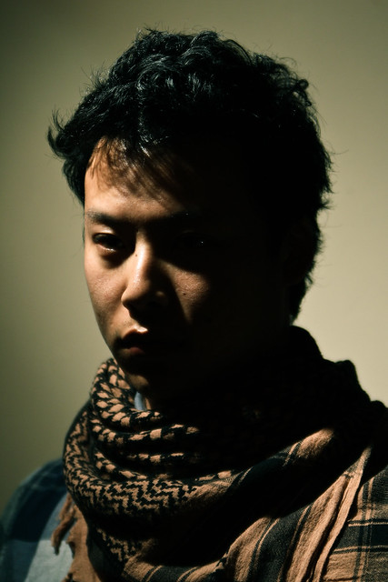 Self Portrait by trambopaline, on Flickr
|
|
#
?
Apr 17, 2012 13:07
|
|
|
Trambopaline posted:For the first one, i think the horizon is just a bit slanted. Can be a visual illusion, but it feels a bit wonky to me. Otherwise, I see how you're trying to show how a coastline looks with a ton of cherry trees but i feel the trees are a bit awkwardly cut off and you don't get enough tree in frame for it to dominate properly. If you use a longer lens, the focal length compression might help with something like that to blow up the background for the cherry trees to dominate, though getting just the right angle might be tough. Just my two cents. I really like the tone on this one. The lighting positioning is also really nice. But it does look like you missed the focus. It looks like some of the scarf and your hair are in focus. It would be much more striking if the well-lit side of your face was crisp. I also think the shadows are a bit strong. Some more ambient light from a higher ISO I think would make it a little less overpowering. Also, one last thing, there's a small galaxy in your left eye. I can't stop staring at it. Not really a critique but I would've removed it. I think it's pretty good overall though. I haven't attempted a self-portrait before because of the tediousness and difficulty. Here's 3 photos from a senior session. I'm trying to find a balance between natural looking photography and photography that's a little more stylized. I think it's necessary to point out that people paid me for this photo shoot.    Here's the entire gallery if anyone is interested in some of the other photos from it. http://www.jaskophoto.com/Seniors/Chris-Wilson-Senior-Pictures/22417426_HBsNDK!i=1792089482&k=555wHSk I've had this business for just under a year and the more I learn, the more I'm doubting myself. I suppose that's a good thing because it promotes hard work but I've been driving myself nuts with the thought; "Is my work decent enough to charge people for?" Lamb of Gun fucked around with this message at 14:15 on Apr 17, 2012 |
|
#
?
Apr 17, 2012 13:27
|
|

|
Trambopaline posted:For the first one, i think the horizon is just a bit slanted. Can be a visual illusion, but it feels a bit wonky to me. Otherwise, I see how you're trying to show how a coastline looks with a ton of cherry trees but i feel the trees are a bit awkwardly cut off and you don't get enough tree in frame for it to dominate properly. If you use a longer lens, the focal length compression might help with something like that to blow up the background for the cherry trees to dominate, though getting just the right angle might be tough. Just my two cents. No worries, thanks for the suggestions. I wouldn't have posted them if I didn't want them critiqued!
|
|
#
?
Apr 17, 2012 14:43
|
|
|
Mr Yuck posted:This is great. I know you mentioned it's not as sharp as you'd have liked it, but the focus is still perfect on his face. 200 iso (or maybe it was 400? Don't remember) film on a Canon AE-1, so ISO wasn't really something I could change. Good advice tho, thank you!
|
|
#
?
Apr 17, 2012 15:15
|
|
|
Lamb of Gun posted:
Could you elaborate one what you're doubting yourself on? I'd love to hear it (or hear what you don't like about the pictures to see if you've nailed it or not) before I give you a fair critique.
|
|
#
?
Apr 17, 2012 15:18
|
|

|
Awkward Davies posted:200 iso (or maybe it was 400? Don't remember) film on a Canon AE-1, so ISO wasn't really something I could change. Good advice tho, thank you! Oh, weird. I'm not sure what would be causing that then. Keep on keepin' on! Thank you for the critiques everyone! I've only been shooting for about a year. I wish I could get away to snap a few shots more than once every couple of months.
|
|
#
?
Apr 17, 2012 18:07
|
|
|
xenilk posted:Could you elaborate one what you're doubting yourself on? I'd love to hear it (or hear what you don't like about the pictures to see if you've nailed it or not) before I give you a fair critique. I'm a little self conscience about my gear (Rebel XSi) for starters but I've pretty much accepted that. I don't know, really. I worry about fundamentals a lot, especially with portraits. I sometimes worry that there are glaring problems with photos that I'm just not aware of because I have less than a year of "professional" experience. I'm not neurotic or anything. I'm confident enough to sell my work. I just hope I'm not like the people in the "terrible photos from other photographers thread" who think their stuff is high-quality but in all reality they are huge issues with their work. Everyone has been happy with my work so far but I guess I'm my worst critic. edit: I swear know the different between they're and their. I have embarrassed myself and my father. Lamb of Gun fucked around with this message at 22:16 on Apr 17, 2012 |
|
#
?
Apr 17, 2012 21:51
|
|
|
Dude, you're being pretty hard on yourself unjustly. Your photos are fine, and you don't have any huge issues, at least not from what you've shared. Also, don't worry about your gear. I actually just posted my first blog post about that very topic, with the point being that any decent camera can take great photos. The three photos in the blog post were taken with a canon XTi, so you're a generation ahead there. http://www.davidchildersphotography.com/Blog/Which-camera-should-I-buy/22480976_tWLJ4p The fact that you constantly worry about fundementals is a good thing, it shows that you know what you need to look out for to not mess up basic principals. as for those three pictures, the third is the best, though his shirt is awkward and his skin tone is a little off. The first is a great composition and the light is really nice, but you missed the focus. The second was shot from a bit too low, and it doesn't flatter the subject. I'd personally say that your eye is better than mine was at a year. Keep shooting, keep sharing, you'll only get better. All said though, your smugmug isn't doing justice to your photos, you could do a lot of cleaning up on your site and maybe even an overhaul. If you're going to market your work, you want your site to be a lot more attractive and match the photos. Bottom Liner fucked around with this message at 22:17 on Apr 17, 2012 |
|
#
?
Apr 17, 2012 22:11
|
|

|
Bottom Liner posted:Dude, you're being pretty hard on yourself unjustly. Your photos are fine, and you don't have any huge issues, at least not from what you've shared. Also, don't worry about your gear. I actually just posted my first blog post about that very topic, with the point being that any decent camera can take great photos. The three photos in the blog post were taken with a canon XTi, so you're a generation ahead there. I read your blog post. It's funny because I say the exact same things to friends and family when I tell them what my gear costs. It's strange how people don't apply some of this stuff to themselves all the time. Sort of like the electrician whose work is neat and precise yet the wiring in his own home is unsafe and messy. I.E. my grandfather. As far as the first picture. I was stoked about it for the reasons you stated. Great lighting and I was happy about the composition. It's probably because I edit on a small laptop screen and don't wear my glasses enough that I don't notice missed focus without zooming in quite a bit. I need to be a little more meticulous about that. Everything you said checks out with me. In the third one I'll agree that his shirt is a little awkward but I weighed the pros and cons and decided his facial expression and smile was the winner there. Thanks for the critique! And the kind words! I've seen a your work around here and it means a a lot coming from you. I get a lot of compliments from family and friends but secretly I don't put much stock in it. Creativity and art isn't exactly rampant in northeast Ohio. It's all about trucks and football up here. I'm planning an overhaul on that smugmug as well. I just need to learn some html or whatever the kids call it these days. Plus there's a few older, less flattering galleries stocked full of heavy vignettes and presets.
|
|
#
?
Apr 17, 2012 23:11
|
|
|
Cyberbob posted:
I would fix the rotation a bit and consider removing the red background in post (you can either desaturate it or replace it with another blue), I'm not a fan of the contrast it creates, as it takes the eyes to it instead of the face. I personally would have added a little bit of lighting from underneath but that's just me. The Clit Avoider posted:
This is quite nice - the horizon is about 1 degree off though. I would like to see a bit more detail in the structure - maybe via some dodging but it's good! Lamb of Gun posted:I've had this business for just under a year and the more I learn, the more I'm doubting myself. I suppose that's a good thing because it promotes hard work but I've been driving myself nuts with the thought; "Is my work decent enough to charge people for?" Looking at your gallery there is a bit of room for improvement but you are on the right track. One thing I would work on is your wildly varying color temperatures - you've got all sorts of green/red/etc. going on. Another would be cropping. The third photo you posted could benefit from a bit coming off of the top. I would also be a bit more discriminating when it comes to the photos you post. The first three in the album are pretty much the same thing and the third probably doesn't need to be there. I could go on a bit more but I'm sure you've got the gist of it. I think Nick's gallery photo 15 is your best shot posted (sepia.......). I would cut down on the heavy vignetting, too. Lamb of Gun posted:I get a lot of compliments from family and friends but secretly I don't put much stock in it. Creativity and art isn't exactly rampant in northeast Ohio. It's all about trucks and football up here. While you should always accept compliments and feel good about them, take them with a grain of salt. Peer review is always much better. If you're interested in just a portfolio site (no buying, though I see the option on your site) you could probably just use a wordpress template or something similar. I personally think Smugmug is just too goddamn ugly. Lamb of Gun posted:I'm a little self conscience about my gear (Rebel XSi) for starters but I've pretty much accepted that. No one gives a poo poo about gear if the photo is good. I have never looked at a great image and thought "I wonder what camera he shot that with" (type of film... maybe....). That doesn't mean, however that good gear is useless... but for senior portrait stuff you should be fine for now. I took a few photos of the Discovery Shuttle today, not sure which is better between the two (some dodging done with the first one).  
|
|
#
?
Apr 17, 2012 23:23
|
|
|
Trambopaline posted:
I don't like that I can't see your eyes. Too much of your face is obscured and that leads to a disconnect with the viewer. I can't make a connection with you because I can't really see your face. I don't know what expression you are making and I can't get an emotion out of the image. I would at least try to get some light on your eyes, they are the most important part of the face.
|
|
#
?
Apr 18, 2012 00:10
|
|
|
Oprah Haza posted:
It's tough to get those shots just right. The sky is so white, but I think the first is moderately better. Composition wise, I'd like to see this with more room in the frame for the plane to move. I took similar shots today: 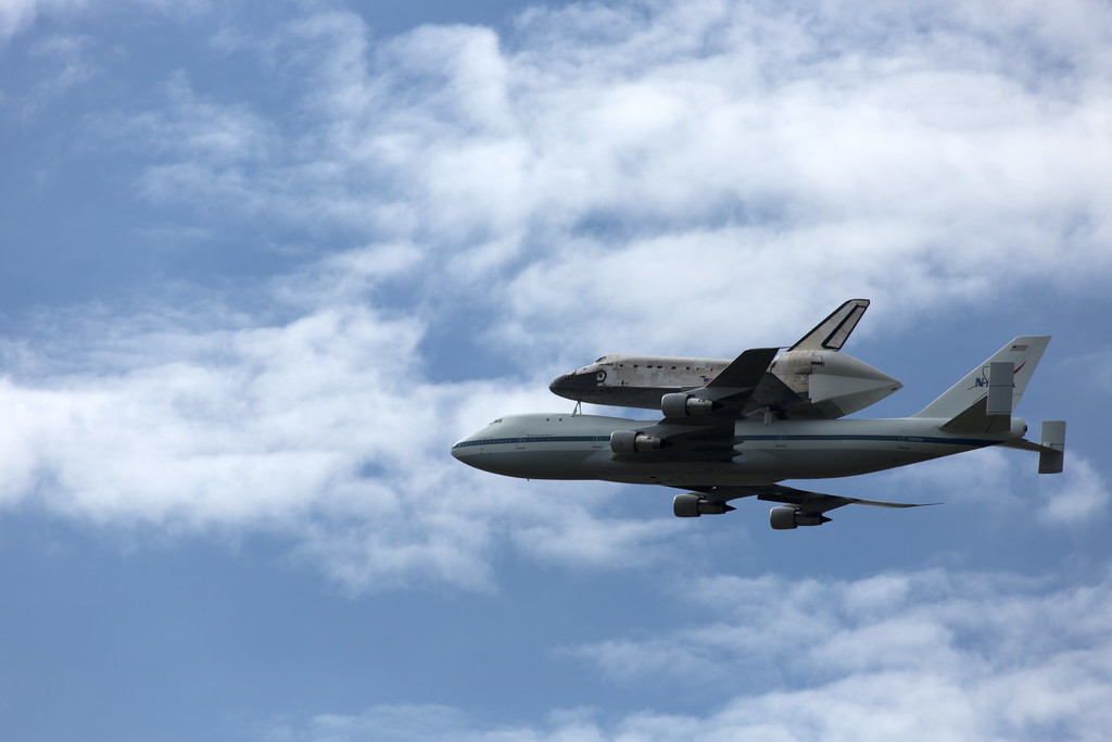 Shuttle1 by torgeaux, on Flickr  Shuttle Flying Away by torgeaux, on Flickr
|
|
#
?
Apr 18, 2012 00:42
|
|

|
torgeaux posted:I took similar shots today: Man, they should have flown that thing around every major metro in America before landing in DC. The outrageous monies it would cost be damned!
|
|
#
?
Apr 18, 2012 02:32
|
|

|
torgeaux posted:It's tough to get those shots just right. The sky is so white, but I think the first is moderately better. Composition wise, I'd like to see this with more room in the frame for the plane to move. Yeah, the white balance was messing with me for a bit but I did indeed go with the first one. Your shots are nice! Have you considered lightening up the craft in the first? Where'd you shoot from? I was at Udvar-Hazy. A few more pics here at blog if you're interested.
|
|
#
?
Apr 18, 2012 03:54
|
|
|
The Clit Avoider posted:
It's a shame that first one got skipped over, I really like it. What you were going for with the repetition of lines from bottom to top and the leading lines from the sides into the middle at the top of the frame both work really well. You also nailed the exposure in a way that works perfectly. You've got dark blacks and bright whites, without losing detail in either, and the black & white treatment really shows off the texture and light of the scene. Sorry that's not more helpful, but I really like it, and just wanted to let you know that what you were going for really worked for me! Your second one, while I like the scene, I think is just a bit too underexposed. I see how you wanted to show these dark, ominous clouds over the collapsing building, but I want to see a little more detail in the stone. Not to the point where the scene looks like a bright, happy afternoon, but just a little bump so I can see some more of that funky foreground. Oprah Haza posted:I took a few photos of the Discovery Shuttle today, not sure which is better between the two (some dodging done with the first one). I like your first one better here. It looks like there's a bit more texture to the clouds around the plane, not just blown highlights. And of all the many photos I've seen of this stunt today, this is actually one of my favorites, because the close-ish view of the front from underneath showcases how beat to poo poo the nose and underside of the shuttle is from re-entry (I assume). torgeaux posted:I took similar shots today: With your first one here, I know you didn't want to blow the highlights in the sky, but the plane/shuttle just seem too dark. You might be able to bump that up a little in post. I like the composition though. Your second one just isn't doing it for me. With that much extra space in the frame, I'd expect some foreground elements, or else some kind of background you're trying to showcase, which in this case isn't particularly interesting. Plus it's heading away from you, and so far off that you can't really see many details of the insanity that is a loving spaceship latched on to an airplane.
|
|
#
?
Apr 18, 2012 14:59
|
|

|
Lamb of Gun posted:I'm a little self conscience about my gear (Rebel XSi) for starters but I've pretty much accepted that. I don't know, really. I worry about fundamentals a lot, especially with portraits. I sometimes worry that there are glaring problems with photos that I'm just not aware of because I have less than a year of "professional" experience. I'm not neurotic or anything. I'm confident enough to sell my work. I just hope I'm not like the people in the "terrible photos from other photographers thread" who think their stuff is high-quality but in all reality they are huge issues with their work. As someone mentioned I think you're being too hard on yourself and toward your gear. Once you know how to use it and you're aware of its weakness(es) (most likely its biggest weakness being lovely high ISO performance) it's pretty much just a matter of working around it. On the more "technical" side of things I'll say that the light/exposure seems good. I'd agree that the white balance might be off one some but I'm thinking you might have used split tone with might be throwing us off? As for the postures, while I personally find it harder to pose a male than a female most of them aren't working for me for two reasons for those three pictures. I find the posture awkward on the first picture and while the lighting is great the crooked background is throwing me off as well. Second picture is not bad, processing wise and posture wise.. I'm not a big fan of hand in pocket but that's me I might have tried to get a few shots closer to the models since full body shots only give you so much and after a while it lacks connection with the subject.The third one is closer, which I like but the shirt and the awkward smile (why would someone smile at nothing) is a bizarre. Also the head position is a bit exaggerated. This posture guide, while old and classic as gently caress, should give you great guidelines to figure out head/body positions that look great (god knows it helped me a lot): http://blog.kitfphoto.com/Zeltsman/ Also http://www.boysbygirls.co.uk/ could probably help even tho some pictures are way heavier on the fashion side.
|
|
#
?
Apr 18, 2012 16:15
|
|
|
Trambopaline posted:So here's me trying to do self portraits. It's tough actually trying to pose someone's head and After a couple of hour's this the only one I like. Trying to look gritty and cool here. Any advice for improvements? I like this, and I like the LEFT side of this image a lot, but I think a reflector sort of below and to the right would help this out a lot. It would bring some catchlighting to the eyes which would bring some definition to the otherwise-black parts of your face. First a still life I threw together - I can't remember if I posted this in SAD way back when, but that's all over and done with anyway. 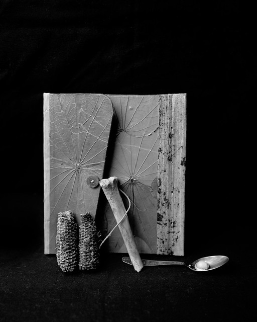 Still Life by iantuten, on Flickr Then a couple shots of a friend from some urban exploration.  Ellen by iantuten, on Flickr  Ellen by iantuten, on Flickr
|
|
#
?
Apr 18, 2012 19:08
|
|

|
QPZIL posted:
I like the still life alright. Nothing jumps out at me about it, and I don't understand the items in it. It looks nice though and is well done. This photo of the girl, what's the idea behind it? She looks to me like she is making a frump face about having her photo taken. The right side of the image is unattractive, from the dark grey empty of the upper right to the odd stance of her hip in the lower right. Also I don't like the band of light above the back of her head. Her eyes are lit well and her face has a nice defining light on it to separate it from the background. I don't know what's out there, but I would have framed her with more space to her front than to her back. Here is a photo of mine: 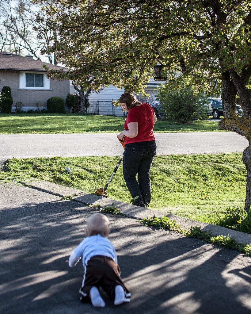 2012-108 by Tom Rintjema, on Flickr
|
|
#
?
Apr 18, 2012 23:55
|
|
|
BobTheCow posted:With your first one here, I know you didn't want to blow the highlights in the sky, but the plane/shuttle just seem too dark. You might be able to bump that up a little in post. I like the composition though. Yeah, I need to do more than basic levels on the first shot. Need to bring up the plane, without blowing out the sky. As for the second, I like the "farewell" aspect of flying away. but if I have to explain it, it's not working.
|
|
#
?
Apr 18, 2012 23:58
|
|
|
TomR posted:Here is a photo of mine: I feel like if you had stopped down to about f8 you could have gotten the baby in focus. As it stands right now, the unfocused part distracts my eye. By that I mean that I see an object in there but cannot see the details; that object leads my eye to the main subject, the woman. If it was more focused I think it would not be as distracting. Either that, or if you were at the baby's level. That would have made it more interesting. PS. That situation is extremely dangerous for the baby. String trimmers throw poo poo all over the place at very high speeds. The trimmer is exactly at eye level of the baby. -- Some after hours shops. 
bobmarleysghost fucked around with this message at 01:00 on Apr 19, 2012 |
|
#
?
Apr 19, 2012 00:57
|
|


|
So I will take another stab at this thread. I was walking around campus yesterday and the sky was really rather moody. 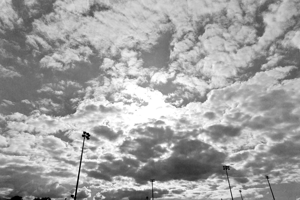 _DSC0463 by jwvgoethe, on Flickr I think it lacks some balance and I was a little unsure of the b&w conversion. I think it has good contrast, the dark posts against the sky. It would work better against a lighter sky I think. To me it makes me think about towering giants. The sun was in the picture adding further contrast.
|
|
#
?
Apr 19, 2012 16:25
|
|

|
jwvgoethe posted:So I will take another stab at this thread. Speaking of noise, here is a photo I took some time ago. It was a rather unfortunate day for shooting, since the sky was gray as.. something gray and had no emotion at all, but I liked the composition at the time.  Another shot in Canarian Islands national park. 
|
|
#
?
Apr 19, 2012 17:50
|
|
|
jwvgoethe posted:So I will take another stab at this thread. I understand that you were just walking around and took this kind of as a snapshot but here are a couple points to consider: 1. There are a number of small elements in the bottom of the frame. Tops of trees it looks like, did you leave these in for a reason? Possibly crop them in post? 2. The light poles seem to be bent in at odd angles, I am guessing this is due to perspective distortion. Did you intentionally leave these as such? Did you consider fixing this in post?` 2a. Did you consider the placement of the light poles? Are they where they are for a reason? If so, could you explain to me why? 3. If these are giants as you tried to convey, then why are they pointed down if you want to show giants reaching up? If your goal is to show them reaching down, then wouldn't it work better with the lights lit? Consider going back and looking at this during the night, possibly reshoot it differently to see if you can convey your meaning in a different manner? Ok now for mine. I am taking a photo class and our first assignment includes some basic portraits with the 3 classic lighting setups (rembrant, side light, and butterfly). I was shooting this with film, but was using my DSLR to get the lighting right first. So I edited a couple of my test shots and here are the results. The model was just a random classmate that I got to sit for me.  and  Self crit, spoilering so that you don't think about it during first viewing of the images: I think that the brightness difference between my key and fill lights was too high. Also, I may need to spend more time finessing the hair light. I actually used 2 lights on him from behind. One was a snooted hair light high and left, the other was a barndoored light directly behind him. I am also not sure if I made him look too orange. The other thing is, have I over sharpened / claritied it? I am pretty happy with how I whitened his teeth, and brightened his eyes in the first shot. But I couldn't get the eyes to pop as much in shot #2 without looking like they didn't match the lighting. On the topic of posing, I wasn't paying as much attention to head position in these shots since they were just test shots for the lighting, but I feel like I need to make sure his head has less tilt (side to side) as well as making sure the model keeps their chin pointed down.
|
|
#
?
Apr 19, 2012 19:44
|
|

|
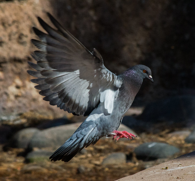 almost there by jankyangles, on Flickr I'm rather new to this and you guys have an insane amount of skill so I'll stick to bashing myself for now. Technical - D3100, 200mm, 1/2000sec, f16, 3200 ISO This was my first time using Manual mode and fought all the auto focus features the entire time. Put it on AF-C despite the lag, I'm just not fast enough for AF-S. I really like the drama but it kills me that the wing extremities are out of focus. And there's so much noise. I feel like it needs more cropping because of the curb on the lower right but the angle prevents it. Then there's the background. It looks distracting. I have a gray scale version that keeps the attention where I want it but it's like the life is sucked out of it. Shooting birds is a ton of fun but it feels like I'm not doing something right to get that crisp frozen in time look. My gear is pretty limited at the moment (kit 18-55 & 55-200) but what can I do to improve? Or just tips in general? Processing ideas on this particular image? I tried dinking around in Lightroom to soften that awful background but everything I tried killed the detail in the pigeon.
|
|
#
?
Apr 19, 2012 20:26
|
|

|
Evilkiksass posted:
Posture, posture, posture. Look at pic #1. See how his neck is forward, and his head is hanging away from his body? Not good. Looks like his head wants to fall off. You know what other creature in nature looks like its head is gonna fall off?  Pic #2 is too square to the camera and it has posture issues too. His shirt is way too big, but the hunched shoulders make it hang baggily.
|
|
#
?
Apr 19, 2012 20:33
|
|


|
I like the posture in the first. He looks kind of like a goofy guy, but his jawline is really great there and I think it works. The second is very awkward though. There is also a lot of issues with hot spots from the lighting and color temp of the skin.
|
|
#
?
Apr 19, 2012 21:05
|
|
|
Maker Of Shoes posted:
You could have isolated the bird better if you had gone with a bigger aperture (which would have given you the chance to bump up the speed as well to freeze it completely), or dropping the ISO. From what I see (1/2000, f/16) you had quite a bit of light to work, so you could have gone with 1/2000, f/3.5 or 5.6 (depending on the lens/distance to the bird, might want to check a DoF calculator somewhere) and ISO at 200 or 400. I'm new as well, so I'd be grateful for someone else's opinion on this. 
|
|
#
?
Apr 19, 2012 21:32
|
|

|
Evilkiksass posted:
Technical Crit The right side is a little too bright and the rim light on the first is a little over powering. The background light is good in both though. Art Crit In the first one I can't tell if it's a sneer or smile, it's making me wonder if he's having fun or mocking someone beneath him. A half smile can work really well to get that amused look but I think it goes too far here and makes me a little uncomfortable. The second one is pretty neutral, I can see it working to balance out a series of photos but on it's own is pretty empty.
|
|
#
?
Apr 19, 2012 21:35
|
|
|
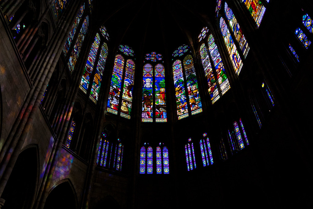
HookShot posted:
The subject is interesting. I definitely dig the darkness versus light vibe going. I don't think you've done it just with this though. I think you've gone in try to encompass too much. First off, when thinking of churches I think of symmetry at the altar areas, if that's not there don't try and force it by getting the whole semi-circle in. The way that the right is in darkness and the left has some detail leaves me wanting a perfectly symmetrical shot, with the light and darkness opposing each other, but you obviously don't have that with that curch. Instaed I would have split this into two shots. On the left hand side you could have the projected colours balancing off the glow of the glass with the light coming through. Like a subject reflecting in water. On the right hand side I think you have the darkness that makes for an ok shot, but the curve of the building would add enough shape to the shot to let the lighted windows work on their own. TheJeffers posted:
I like this. I think the colours grab my attention and it mixes well with the shapes. It's like a strange still life of a weird photo booth. But being a still life everything needs to be perfect. I think the green curtain on the right is dominating too much of the image. My attention should be drawn to the chair and the geometric patterns on the wall while I take in the colours, and then begin to acknowledge the imperfections in the subject. But the green curtain is almost invading the the space of the chair, and definitely taking a chunk out of the shadow, which is another shape that provides interest in what is just a mixture of colour and shapes. Cacator posted:Ah. I'll keep playing around with it. Seems like I should crop wider but keep him off to the right? Centering him is a little boring I'll admit. I'm not getting into this image at all. The composure and idea I could definitely get into but I think it's like you've taken a big hammer in exposure and light to something really very delicate. The lighting behind is extremely bright, too bright for me in that it's almost hurting to look at it. Combine that with the shadows on his face that look like he's playing on a flood-lighted sports pitch (many different light but hard shadows, that give an almost stereoscopic feel) and my eyes dart straight to the edge of the image for relief. And the edge of the image is so bright it does nothing to drive my eye back to the subject. I think if you up'ed your shutter speed just a little to tone down the ambient light, it'd kill off some of the glare for me, and would take some brightness out of the edges of the image and drive me more towards the subject. The other option would be to get even more light on his face, take all shadows away and have the right hand side of his jacket exposed a little better to give a very crisp and detail image against the garishness of the lights. Some images of my own. These were all taken for a relative of mine. She has a house in a scenic part of West Kerry that she rents out to people who want to holiday down there. We drove down Friday night, spent all day Saturday going around taking pictures: of her house in the morning, the town nearby in the early afternoon, the scenic coastline areas in the late afternoon, then some shots of her house again at night. The only real thing I'm going for with the images is to make someone think they'd like the area and the house enough to rent the place. There's three images, the first one is my favourite, because I think it's different to the usual type of stuff that's taken of the area. Unfortunately I was very time limited and couldn't wait for the right light to take the pictures so I had to make do, and I'm not knowledgable to get the right green in lightroom/photoshop, plus I don't really trust myself with it. (Edit: And forgive the bit of dirt I didn't see to clone out.)  The second one is just of a beautiful part of the coast. I don't have a lens wide enough that could take in the whole seascape, although I doubt there actually is a lens wide enough. Even still, this was the basic kit lens and you can see some distortion on the horizon.  Finally there's an interior night-time shot that's trying to get across the idea of a tranquil isolated place, where you can have a quiet night contemplating the heritage and culture of the area. 
Mrenda fucked around with this message at 21:42 on Apr 19, 2012 |
|
#
?
Apr 19, 2012 21:39
|
|


|
Maker Of Shoes posted:Technical - D3100, 200mm, 1/2000sec, f16, 3200 ISO This crit is entirely technical because it sounds like that's what you need a hand with. The photograph itself, I like, because I can never seem to catch birds in action very well myself (at least not on purpose). The center composition does work, though. On a technical side... you probably could have got away with 1/1000 and not had motion blur, and you almost certainly could have got away with f/8 for your depth of field. Going from f/16 to f/8 gets you two stops, so you're down to ISO 800, and 1/1000 gets you another stop still, so you're down to ISO 400, which shouldn't be noisy at all on that body. Play around with Lightroom's noise reduction, it's some of the best I've used. Having said that, I didn't find the noise at all distracting. That gear will probably limit you eventually, but for now I'm sure that's more than enough.
|
|
#
?
Apr 19, 2012 22:26
|
|


|
Maker Of Shoes posted:
I think one thing to consider is where are the birds going to be where they will make it easier for you to shoot? Photography is as much about controlling the situation you shoot as how you shoot it. Are there places near you where certain birds are known to roost? Are you thinking ahead of time and planning your light and angle of approach? Are there going to be other "things" there that may interfere? For example, if you go to a park where people feed birds, you may notice that squirrels will also run up to eat the same food.
|
|
#
?
Apr 19, 2012 22:31
|
|
|
Edmond Dantes posted:You could have isolated the bird better if you had gone with a bigger aperture (which would have given you the chance to bump up the speed as well to freeze it completely), or dropping the ISO. From what I see (1/2000, f/16) you had quite a bit of light to work, so you could have gone with 1/2000, f/3.5 or 5.6 (depending on the lens/distance to the bird, might want to check a DoF calculator somewhere) and ISO at 200 or 400. SoundMonkey posted:This crit is entirely technical because it sounds like that's what you need a hand with. The photograph itself, I like, because I can never seem to catch birds in action very well myself (at least not on purpose). The center composition does work, though. Evilkiksass posted:I think one thing to consider is where are the birds going to be where they will make it easier for you to shoot? Photography is as much about controlling the situation you shoot as how you shoot it. Are there places near you where certain birds are known to roost? Are you thinking ahead of time and planning your light and angle of approach? Are there going to be other "things" there that may interfere? For example, if you go to a park where people feed birds, you may notice that squirrels will also run up to eat the same food.
|
|
#
?
Apr 19, 2012 22:59
|
|
|
Buceph posted:One of the first things I ask myself is "What is the point of what I'm looking at?" I can't tell that with this picture. It seems relatively properly exposed, but what's the point? I'm looking at a fireplace and some books on a coffee table. If it's supposed to be inviting, it isn't. The places I'd imagine sitting in are cluttered and disappearing into the foreground, so I feel like I'm squished in there between the two pieces of furniture. ---------------------- Someone critique this for me 
|
|
#
?
Apr 19, 2012 23:23
|
|

|
the posted:
The nipples have to be pointy. No joke, look at all "art" nudes, all of them have hard nipples.
|
|
#
?
Apr 19, 2012 23:51
|
|
|
Buceph posted:Buceph posted:Here are a couple of my most recent shots:  little guy by razalas_solrac, on Flickr  Abo by razalas_solrac, on Flickr
|
|
#
?
Apr 20, 2012 00:56
|
|
|

|
| # ? May 11, 2024 17:29 |
|
|
Thanks for the critique everyone! I thought I should respond to what was said about the heavy vignettes and the sepia pictures: Those are old galleries from when I first started. I've learned my lesson since then. 
|
|
#
?
Apr 20, 2012 01:44
|
|