


|
the posted:One of the first things I ask myself is "What is the point of what I'm looking at?" I can't tell that with this picture. It seems relatively properly exposed, but what's the point? I'm looking at a fireplace and some books on a coffee table. If it's supposed to be inviting, it isn't. The places I'd imagine sitting in are cluttered and disappearing into the foreground, so I feel like I'm squished in there between the two pieces of furniture. I think the light is great. Not sure about the crop... you can't tell if her arm is folded over her head or if it's just cropped at the joint and straight. Feet is cropped as well but I don't mind as much. Posture overall is nice you get the hourglass feel.
|
 #
?
Apr 20, 2012 02:09
#
?
Apr 20, 2012 02:09
|
|


|

|
| # ? May 11, 2024 14:45 |
|
|
Break Fast posted:Speaking of noise, here is a photo I took some time ago. In the second one the path leads the eye nicely. The light seems a bit harsh and there is some blown highlights between the branches. That is always a problem when shooting trees/forests, the dynamic range is normally to big for your camera's sensor to deal with. Maybe you could reduce the exposure a lot and make it all dark and moody looking. -----  Autumn Poplars by Paul.Simpson, on Flickr  Hay by Paul.Simpson, on Flickr  Baa by Paul.Simpson, on Flickr Edit: VVV straightened the trees, thanks ")
Hotwax Residue fucked around with this message at 07:11 on Apr 20, 2012 |
|
#
?
Apr 20, 2012 02:11
|
|


|
Hotwax Residue posted:
I really like all of these. The only issue I have with any of them is that the trees in the first one seem to be leaning just a little to the right. 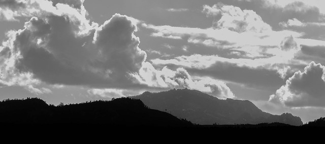 Harney Peak by MrDespair, on Flickr
|
|
#
?
Apr 20, 2012 02:36
|
|


|
Mr. Despair posted:
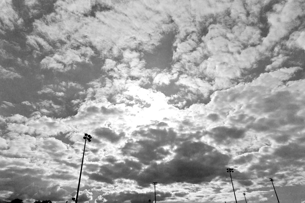
The clouds really dominate this, and they seem terribly flat to me. Half is medium gray, the other half is blown highlights. I know they are supposed to be clouds, but they just don't feel like that. They also blend with the rest of the sky which has almost the same shade of gray. Try adjusting the amount that blue takes part in the b/w conversion to change the sky's shade relative to the clouds.
|
|
#
?
Apr 20, 2012 03:52
|
|


|
Evilkiksass posted:
I know these are from a while ago but flash is what I'm trying to get better at. For the most part the first photo is well-executed and appeals to me. I do wish his posture were a bit better; something as simple as turning his head just a bit more toward the camera would help a lot and his face wouldn't look so far in front of his shoulders. I agree with your note about the difference between key and fill being too great. The intensity of the hair light is good, but I think it's directed on too *much* of his hair. Does that make sense? For the second...it looks like those would be some pretty broad shoulders if they were hoisted upward like he was proud of himself. Also, the way shadows are cast directly on his eyes is a bit strange. I think I point these things out because they're the same flaws and faults I find when I try to work with flash. I haven't taken a shot of myself in quite some time, but I did today. Still not where I want to be.  dan by schmoopybee, on Flickr
|
|
#
?
Apr 20, 2012 06:07
|
|


|
RazalasSol posted:
These are both pretty awesome. Here's a few things I think could be improved though: The first one, do you have any room to play with the crop on the right hand side? Just even an extra 50 pixels would make the frame feel slightly less squished on that side, I think. Also, whatever that light that is coming from and giving him a bit of a blue tint on the eye doesn't really fit with the rest of the earthen/warmer tones of the shot. Play around with it a bit and see if you can't make it look a little bit more natural would be my suggestion. For the second, did you up the luminance enormously? There seems to be a few artifacts in the sky that can happen if you play with the luminance sliders too much, but it could also just be flickr resizing the image, since you don't have the original available. I feel like the snow is blown out just a little bit, but other than that, great work! Love the sunset. Here's a few of mine from Germany the last couple days:  Aachen by hookshot88, on Flickr  Aachen by hookshot88, on Flickr  Koln at Night by hookshot88, on Flickr
|
|
#
?
Apr 20, 2012 13:36
|
|


|
Mr. Despair posted:
I really like how the mountain in the background lines up perfectly with the one in the foreground, so that it looks like a single ridge splits into two. Was that intentional when you framed this? Hotwax Residue posted:
And holy poo poo I love this. Looks almost like an alien planetscape, with the weird clouds + parachute + hay bales. CheddarGoblin fucked around with this message at 17:55 on Apr 20, 2012 |
|
#
?
Apr 20, 2012 17:53
|
|
|
Hotwax Residue posted:
I really like this, but I think that cropping the top down a little bit to remove the tiny bit of shoreline would make it a little more effective.
|
|
#
?
Apr 20, 2012 20:03
|
|
|
Hey, everyone! Thanks for posting awesome photos and awesome critique! Creative Convention Cultural Exchange After talking with a couple people, it seems that some of the people who are newer to PAD might be having trouble being confident giving 'art-based' critique, as opposed to purely technical critique (horizon slightly crooked, etc). To this end, and as an inter-forums goodwill thing, some time next week this thread will be taking a trip to Creative Convention! One of their threads will be visiting us also, perhaps we can offer some technical tips. During this time, you can continue to post as usual, regular PAD rules (and CC rules) apply, basically nothing changes except what subforum the thread is in. We're going to try to get some of the more pro critique people there to come in here and give us their thoughts on whatever pictures we post, and hopefully people will get a little more comfortable going out on a limb with crit. I'll post a thread when this happens, and again, this thread will still be open for posting as per usual, it's not going away or anything. SoundMonkey fucked around with this message at 22:32 on Apr 20, 2012 |
|
#
?
Apr 20, 2012 20:37
|
|


|
SoundMonkey posted:Creative Convention Cultural Exchange That sounds like a great idea. Seeing as it would be a new audience, can we repost some of our stuff to get the more "artistic" opinion? I don't mean everything, but there are a couple I would like to have appraised.
|
|
#
?
Apr 21, 2012 01:56
|
|

|
Edmond Dantes posted:That sounds like a great idea. Seeing as it would be a new audience, can we repost some of our stuff to get the more "artistic" opinion? I don't mean everything, but there are a couple I would like to have appraised. I don't see a problem with that, if people don't go too crazy on it, and if the CC folks actually feel like critiquing it. Again, this will be happening next week some time.
|
|
#
?
Apr 21, 2012 02:25
|
|
|
SoundMonkey posted:Hey, everyone! That is such a great idea!!
|
|
#
?
Apr 21, 2012 03:08
|
|

|
HookShot posted:
These are travel photos, but they seem a little safe. What I mean is: they look like well taken versions of photos that everyone takes in these locations. That's not to say they're bad or even cliched, they're just not hitting me with omg wow. I'll have some images up once I'm done scanning. Gotta turn off the IR dust delete. EDIT: One of a few I'll be uploading soon. This is from my engagement part, just a photo of a friend. Looking for feedback on the processing, especially the cloning:  JCP20120421-6-2s by Josh Conliffe, on Flickr Schofferhofer fucked around with this message at 13:48 on Apr 21, 2012 |
|
#
?
Apr 21, 2012 12:20
|
|

|
Schofferhofer posted:These are travel photos, but they seem a little safe. What I mean is: they look like well taken versions of photos that everyone takes in these locations. Your photo is overall very good from a technical standpoint. The DoF is appropriate, you have a good lighting angle and your focus is pin sharp. As for post processing, you might want another poster to look at that, because I can't tell where or what you cloned. Also processing is difficult because I don't have an original to compare to. But again, it's a very good photo from a technical standpoint. And I only say technical because I'm not nearly as creative as I should be. I thought long and hard about it, and I will give PAD another chance. 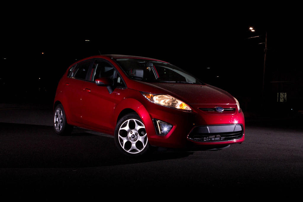 2011 Ford Fiesta by TfordPhoto, on Flickr This photo was a part of a set testing flash theory. My friend taught me how you can actively change the dynamic range of your subject vs the background by changing your ISO and Fstop, and shutter speed respectively. This blew my mind. But in testing it, he was absolutely correct. I was able to independently control the exposure of the subject and background. In this particular photo, I did not change anything but the temperature of the photo. It was a little cool in its RAW form. Overall, I think this is a great photo. But that is why it is here in PAD. Have at it Dorkroom! rcman50166 fucked around with this message at 19:04 on Apr 21, 2012 |
|
#
?
Apr 21, 2012 18:19
|
|

|
rcman50166 posted:Your photo is overall very good from a technical standpoint. The DoF is appropriate, you have a good lighting angle and your focus is pin sharp. As for post processing, you might want another poster to look at that, because I can't tell where or what you cloned. Also processing is difficult because I don't have an original to compare to. But again, it's a very good photo from a technical standpoint. And I only say technical because I'm not nearly as creative as I should be. I shooting cars with a single flash at night is going to be hard. One thing that you should try is to use something like a 30 second exposure, ISO 200 or something like that (assuming you have a tripod) and then walk around the car triggering the flash your self. This way you will get the effect of having multiple flashes with a single flash. One thing to remember about shooting at night is that lights in the background can be kind of distracting. In your photo they would be pretty easy to clone out but it is something to consider when you are selecting a location to do your shoot. --- From the other day at work, really would have preferred a better foreground or something but the sky was too cool to pass up. 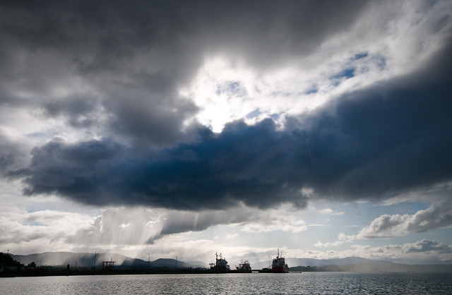
Dread Head fucked around with this message at 18:59 on Apr 21, 2012 |
|
#
?
Apr 21, 2012 18:56
|
|

|
rcman50166 posted:
----- Here are some street shots, taken with a common theme of prayer: 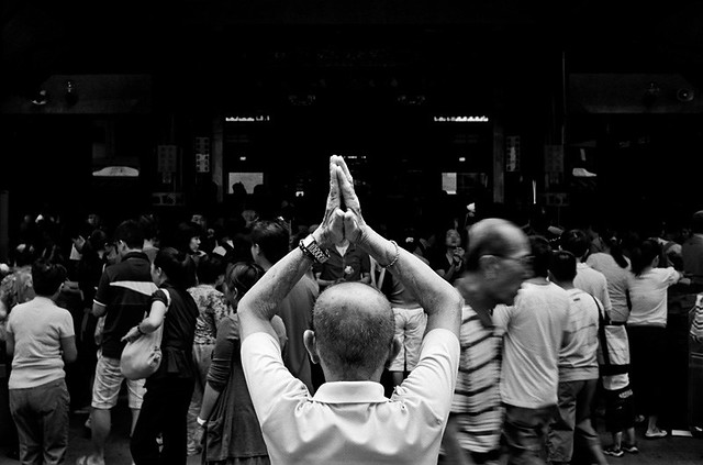 Prayer 1 by alkanphel, on Flickr 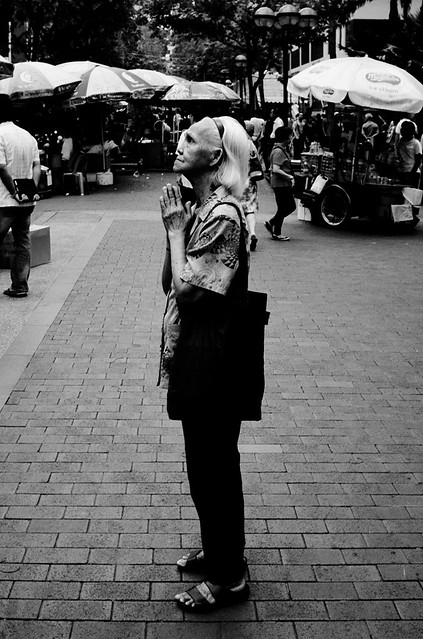 Prayer 2 by alkanphel, on Flickr 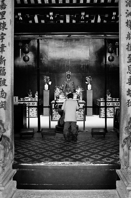 Prayer 3 by alkanphel, on Flickr
|
|
#
?
Apr 21, 2012 19:10
|
|

|
rcman50166 posted:
One thing that bothers me in this picture is the big shadow spot at the front-right corner of the car. Also, the eye naturally tends to go towards the brightest lit area, and for you, that's all the way out at the left edge of the bumper. Physically move the flash so that it's closer to the camera axis may remove the shadow, and aiming it at something interesting like the Ford logo at the front would be a good also.
|
|
#
?
Apr 22, 2012 05:46
|
|
|
This is my favorite of the three; the border around the door really seals everything in for me. I also like the ambiguity of the first and third shots, it's almost like not seeing the prayer's face removes some of the unnecessary intimacy and changes the subject to act of prayer itself. A few unrelated shots from today:   
|
|
#
?
Apr 22, 2012 05:48
|
|


|
Lamb of Gun posted:Here's 3 photos from a senior session. I'm trying to find a balance between natural looking photography and photography that's a little more stylized. I think it's necessary to point out that people paid me for this photo shoot. On the second one, you've chosen an angle that makes his hips and waist look fat and a bit pear shaped.  IMG_8126 by like okay cool dude, on Flickr edit: vvv There's some kind of bug with the Flickr Aperture plugin that sometimes replaces images even when there's been no edits. sensy v2.0 fucked around with this message at 20:05 on Apr 22, 2012 |
|
#
?
Apr 22, 2012 19:35
|
|


|
sensy v2.0 posted:The first one is pretty good. The back light looks good and he's fairly natural. Not as a rule or even a policy or anything, but it'd be cool if people who are hosting from Flickr (nothing wrong with that!) would try to make sure that images posted to PAD stay active for at least a couple days, so people have a chance to take a look at them. Although in this case it looks like the picture exists on Flickr but the image embedding didn't work. ...unless that's actually a really well executed photograph of the Flickr 'photo not available' template, in which case I'm not sure I can even begin to grasp the symbolism. EDIT: Oh, until I reloaded again, for some reason the preview image in the EXIF still existed. I quite like the simplicity of the image and the center-composition works really well in this case (of course it also helps that the subject appears to be almost exactly 2/3 of the frame wide. Did you have any versions where the wall was entirely pure white, without the mild shadows? Did it look too blank that way? SoundMonkey fucked around with this message at 20:05 on Apr 22, 2012 |
|
#
?
Apr 22, 2012 20:01
|
|

|
SoundMonkey posted:Not as a rule or even a policy or anything, but it'd be cool if people who are hosting from Flickr (nothing wrong with that!) would try to make sure that images posted to PAD stay active for at least a couple days, so people have a chance to take a look at them. Although in this case it looks like the picture exists on Flickr but the image embedding didn't work. Also, since this is PAD, and critique to improve the photo is the name of the game, a lot of the time people (including me) will go and make at least some of the recommended changes, and use the "replace" function that flickr has with the improved photo. The downside to this is that when it happens, it always breaks the original link for some stupid reason that I wish flickr would fix, and so I imagine this is why a lot of the links in here are broken.
|
|
#
?
Apr 22, 2012 21:06
|
|
|
sensy v2.0 posted:
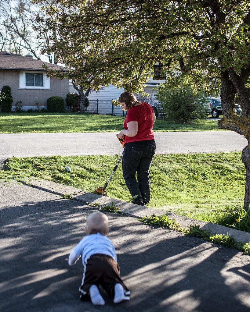
I have no critique here, but it looks great - just wondering, what is it? Baa by Paul.Simpson, on Flickr [/quote] I like each of your 3 shots, but I think my favorite is this one. I really like the angles in the composition, and particularly the background. At first glance, my brain just saw it as a defocused background and not as the water's reflection; it is a very cool effect. I *might* have been tempted to crop down a bit to lose that bit of land in the upper right corner, but would have had to play around with it to see if that would have been an improvement or not. jwvgoethe posted:So I will take another stab at this thread. If you liked the contrast of the posts against the sky, it might have been more effective to get closer to one of them so that they appeared a bit more varied in their heights and placement within the frame. Right now, being all crammed into the bottom they seem like they shouldn't be there, and I don't feel the contrast that you were trying to achieve. Also, the treetops in the bottom left serve no purpose. TomR posted:Here is a photo of mine: Other than the obvious safety issue here, what were you looking to do with this picture? Please don't take this the wrong way, but the beer can on the lawn, the woman and the weedwacking near the baby all make this not a particularly flattering document of this family's life, but maybe I am misunderstanding the point of the picture. I also want to say that I am not trying to be a dick here and I would hope that if the situation was reversed and I was just trying to get a nice photo of my family that someone would point out the things I should think about changing to get better shots in the future. ----- Ok, luckily I have had more editing time lately, so I am going to skip some older shots in favor of getting some advice about more recent endeavors.  Wisteria by cadence440, on Flickr This came from a group of test shots after getting a new lens, but I liked it enough to try to make something out of it. I see shots of certain things sometimes and think "that's pretty", but I would like to try to start differentiating between just shooting a flower and having something that is interesting to look at. 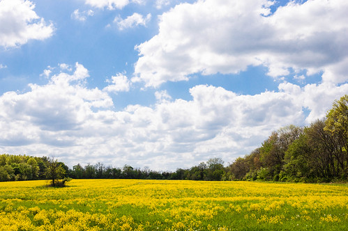 Hidden Field by cadence440, on Flickr Similar problem with landscapes - I haven't tried to shoot too many landscapes, so I am trying to only keep shots that I think might be something interesting. This was the one out of about 20 shots of this place that I decided to keep - trying to just toss anything that is not the best of a batch. Also, a little back story, I was out exploring and found what I thought was a walking/bike path and there was this field partway through. After about 10 minutes on this path I came to the end and it was some dude's house...it was just a really long driveway. 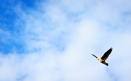 Ascending by cadence440, on Flickr I think I like this one; it has been cropped and worked on as best I could from a kit lens shot of three geese, so it is not as good as it could have been with a zoom.
|
|
#
?
Apr 22, 2012 22:29
|
|

|
Dread Head posted:From the other day at work, really would have preferred a better foreground or something but the sky was too cool to pass up. I agree with your thought's on the foreground, even if it was a bit closer in so you could see a bit more details on the ships. That would mean sacrificing more of that sky though. The rain (I think) falling on the left really makes the shot though, seriously dramatic weather. Been experimenting a bit with triptychs lately: 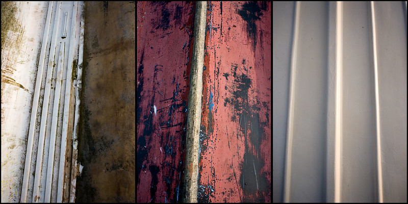 Pretty happy with it but I wish there was a little more going on in the third shot.
|
|
#
?
Apr 22, 2012 22:44
|
|
|
SoundMonkey posted:
For the guy asking, it's a tool for lifting things (like glass) with the power of vacuum. I used it to open my iMac.
|
|
#
?
Apr 22, 2012 23:19
|
|
|
rio posted:I have no critique here, but it looks great - just wondering, what is it? It look like a window holder, 2 suction cup to hold a wind shield or windows.
|
|
#
?
Apr 23, 2012 01:08
|
|
|
Holistic Detective posted:I agree with your thought's on the foreground, even if it was a bit closer in so you could see a bit more details on the ships. That would mean sacrificing more of that sky though. The rain (I think) falling on the left really makes the shot though, seriously dramatic weather. I'd have put the third one in the middle. Since it doesn't have the texture of the other two I think it would be more balanced that way. quote:
This one needs more isolation of the subject, perhaps shooting it from a different angle getting it entirely against the sky or entirely against the wall. Having both in the background isn't working for me. 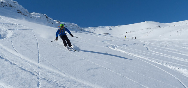 104/366 - Gratuitous Action Shot by fuglsnef, on Flickr  94/366 - Rory by fuglsnef, on Flickr 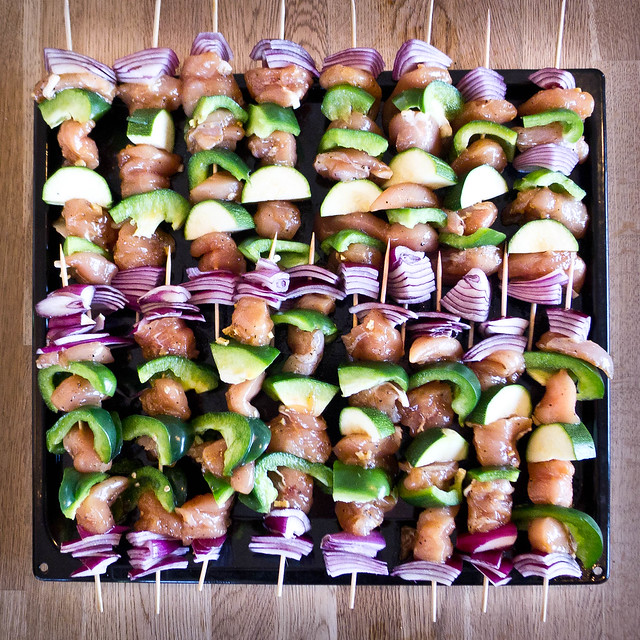 Kebabs by fuglsnef, on Flickr
|
|
#
?
Apr 23, 2012 01:21
|
|
|
David Pratt posted:I'd have put the third one in the middle. Since it doesn't have the texture of the other two I think it would be more balanced that way. Yeah, I was thinking of doing that but I wanted to keep the three on the order I found them: 
|
|
#
?
Apr 23, 2012 02:21
|
|
|
Holistic Detective posted:
I like this but I would prefer it if the images were symmetrical from a common viewpoint. rio posted:
I wouldn't worry about it being shot with a kit lens, it looks fine. It wouldn't stand up a ten jillion times enlargement but who cares. The power of the image isn't in its sharpness in this case. Here are a few more:= My engagement party cake:  Cake by Josh Conliffe, on Flickr I don't usually shoot this sort of thing but I liked this part of chinatown:  Chinatown by Josh Conliffe, on Flickr Some stickering from south sydney that I enjoyed immensely:  Vote Doomlord by Josh Conliffe, on Flickr The third is more of a snapshot, but I'd be happy with critique on any of them. I tried a new technique for getting the WB. These were all shot on 160 film in various states of expiration.
|
|
#
?
Apr 23, 2012 13:26
|
|
|
Schofferhofer posted:My engagement party cake: I don't really get a sense of scale for this one. At first glance it looks like it's a single person cake, but when I consider the decorations it looks like it's a larger cake. I would have liked if there was at least something else in the picture (like a stack of serving plates or some eating or cutting utensil.)
|
|
#
?
Apr 23, 2012 14:58
|
|
|
rio posted:Ok, luckily I have had more editing time lately, so I am going to skip some older shots in favor of getting some advice about more recent endeavors. I actually like the "half and half" background on this one, but I see what David Pratt is saying. A bit more isolation would be nice for the sky part (maybe a shallower DoF?) but I think the problem in the wall bit is that pipe, and I'm not too sure what you can do about that. rio posted:
My first thoughts with this one was that a square crop would fit it nicely, something about it makes me feel like it's just a tiny bit out of balance to work with that framing. I played a bit with cropping it and I can't quite find a crop that I like though.  rio posted:
I really like this one. Don't fret about the gear of having cropped it, I think it works really well like this.
|
|
#
?
Apr 23, 2012 16:16
|
|
|
David Pratt posted:
Also, in the future if possible I would have waited an extra half second for the skiier to get into the turn. It's obvious that there is so much powder in there, but when you're catching the skiier almost in between turns like that, there's very little powder coming up behind them, which gives off the impression that they're going ridiculously slowly. If you'd waited probably an extra half second or so, when the skis start to turn the extra powder would have made it look so much faster than how it looks now. quote:
The highlights are a bit blown out, but I like what you've done with the colours. Maybe crop it in a bit so that one skewer in the top row that's completely visible has the ends cut off like all the others. I love the colours in this one.  Notre Dame by hookshot88, on Flickr  Notre Dame by hookshot88, on Flickr And for something completely different... 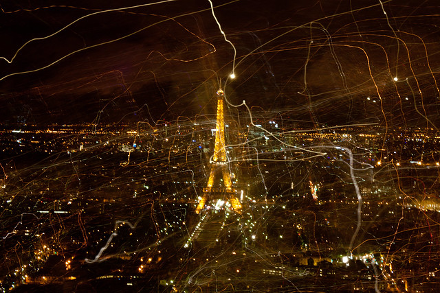 Paris la Nuit by hookshot88, on Flickr
|
|
#
?
Apr 23, 2012 17:28
|
|
|
the nicker posted:I really like how the mountain in the background lines up perfectly with the one in the foreground, so that it looks like a single ridge splits into two. Was that intentional when you framed this? Not really, I was actually up on a ridge shooting some broadcast towers, and when I looked at Harney Peak everything sorta just lined up. nielsm posted:The clouds really dominate this, and they seem terribly flat to me. Half is medium gray, the other half is blown highlights. I know they are supposed to be clouds, but they just don't feel like that. They also blend with the rest of the sky which has almost the same shade of gray. Try adjusting the amount that blue takes part in the b/w conversion to change the sky's shade relative to the clouds. I'll try this, I've swapped hard drives recently so I need to copy my old lightroom folder over still. :/
|
|
#
?
Apr 23, 2012 17:45
|
|
|
I think I may have posted one of these in the previous snapshot a day thread (checked the current locked one and they're not there), so apologies in advance if you've seen them before: _MG_0868.jpg by AxelDR, on Flickr  _MG_0895.jpg by AxelDR, on Flickr  _MG_0959.jpg by AxelDR, on Flickr
|
|
#
?
Apr 23, 2012 18:18
|
|
|
Gotta post a critique dude.
|
|
#
?
Apr 23, 2012 18:22
|
|
|
Mr. Despair posted:Gotta post a critique dude. I did, a few posts up. \/\/\/\/\/ Hahaha, no worries. I usually critique what I'm comfortable discussing with my rather limited knowledge, so it's mostly a few comments on some particular photos, and I'm not taking a lot of pictures lately, so I don't tend to critique/post my pics in the same post. Edmond Dantes fucked around with this message at 18:40 on Apr 23, 2012 |
|
#
?
Apr 23, 2012 18:23
|
|
|
Edmond Dantes posted:I did, a few posts up. My shame knows no bounds 
|
|
#
?
Apr 23, 2012 18:36
|
|
|
Wall o' reply/questions/crits and a new picture that I would love some input on.Edmond Dantes posted:
Thanks for the advice - I think that both your and David Pratt's insights about that flower shot are true - definitely things to keep in mind for the future. The pipe was initially interesting to me (or I thought it was), but in the end I did have issues justifying it being there and agree that it might detract from the scene. The field shot - I had a couple other shots from further over and away from the border of the trees on the right, but they had less flowers visible in the field. That was really the only spot that had that much yellow visible unfortunately. I'll have to play around with the crop a bit as well to see if there is anything that I might find more success with. Also, I'm glad to know that the last image is ok - with lightroom and everything it is pretty easy to pixel peep. HookShot posted:
I really like the tone of the first two shots (both church ones), but I think it is the flow of the 2cond one with the priest that really had me looking at it for longer than the first. Not being Catholic and having no idea what is going on with the smoke, I also find it mysterious and mystical at the same time; I think the whole thing is very well presented. I can't put my finger on why, but I also like the black background between the priest and the smoking thing - it isolates both subjects, compartmentalizing the photo in a good way, and also contributes to the strong flow from right to left by letting my brain first process both parts separately. Question about the Paris shot - how did you do the light trails; is it a double exposure? ----- 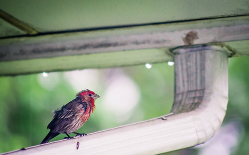 Spring can really hang you up the most by cadence440, on Flickr I was sitting at my computer yesterday and outside the window this bird kept flying in to sit on the rain gutter. Each time he looked more and more haggard - this was one of the later shots of it all drenched. Some of the earlier shots had more of a rain effect in the background and more raindrops hanging on the roof, but the bird's expression I thought trumped those background details. I had a bit more room on all sides, if it seems like the crop doesn't work. I was also tempted to go b&w, but the color of the bird was a nice contrast from the background and overall tone, so I decided to keep it color.
|
|
#
?
Apr 24, 2012 04:27
|
|
|
HookShot posted:
I looooove the second one. I won't go into why I like it so much since I'd pretty much just be repeating what rio said above. The first one didn't really hold my attention though. I think I found the huge, rather dull cross which dominates the shot kind of hard to look at. There's some great symmetry and tones and textures going on in the background, but my eye keeps getting sucked back into the cross, which itself I don't find very interesting. I haven't been out shooting for a while myself, and while I have a big backlog of shots to edit/delete I've just upgraded from a dated laptop to a modern gaming rig and welp... So since I'm critiquing I thought I'd repost a couple of older shots I posted in SAD a while back which I would like some critique on. This one is quite a departure from my normal style, and had quite a lot of processing done. I was going for a moody, atmospheric, slightly abstract forest shot.  The Woods are Dark and Full of Grain by euannz, on Flickr Landscapes are something I'm trying to get better at. I posted one in this thread a while back and it was critiqued (quite fairly) for having awkward composition. How is the composition in this one? Also it was obviously a cloudy day with flat lighting which I know isn't generally considered ideal for traditional landscape photography but I thought the mist and clouds gave a shot a kind of spooky, ethereal feel. However I did have to mess around with some graduated filters in lightroom to make the shot less flat. Did I pull it off? 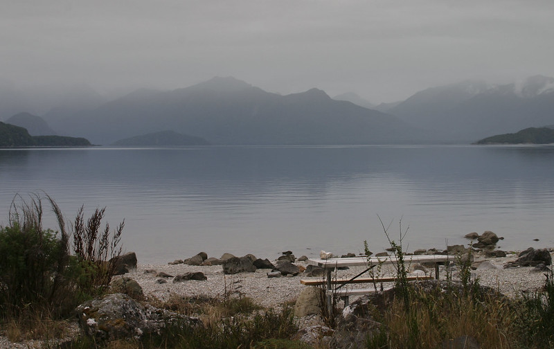 Lake Manapouri 2 by euannz, on Flickr
|
|
#
?
Apr 24, 2012 05:37
|
|


|
rio posted:I really like the tone of the first two shots (both church ones), but I think it is the flow of the 2cond one with the priest that really had me looking at it for longer than the first. Not being Catholic and having no idea what is going on with the smoke, I also find it mysterious and mystical at the same time; I think the whole thing is very well presented. I can't put my finger on why, but I also like the black background between the priest and the smoking thing - it isolates both subjects, compartmentalizing the photo in a good way, and also contributes to the strong flow from right to left by letting my brain first process both parts separately. Cool, thanks for the crit (same to Wafflecopper). I did the Paris shot by setting the camera on the tripod on a 6 second exposure. After three seconds of leaving it on the tripod, I picked up the camera and waved it around for the other three seconds, which is how I got the light trails effect.
|
|
#
?
Apr 24, 2012 06:31
|
|
|

|
| # ? May 11, 2024 14:45 |
|
|
Wafflecopper posted:Landscapes are something I'm trying to get better at. I posted one in this thread a while back and it was critiqued (quite fairly) for having awkward composition. How is the composition in this one? Also it was obviously a cloudy day with flat lighting which I know isn't generally considered ideal for traditional landscape photography but I thought the mist and clouds gave a shot a kind of spooky, ethereal feel. However I did have to mess around with some graduated filters in lightroom to make the shot less flat. Did I pull it off?
|
|
#
?
Apr 24, 2012 07:23
|
|