


|
And with that, it's time for a mystical journey to CC! Hi, CC! Come check out our photos and maybe tell us what you think of them!
|
 #
?
Apr 24, 2012 14:25
#
?
Apr 24, 2012 14:25
|
|


|

|
| # ? May 13, 2024 07:50 |
|
|
rio posted:Spring can really hang you up the most by cadence440, on Flickr I really like this picture, but you mentioned the bird was a nice contrast from the background, and that's because in terms of blocks of color, the dark tones are centered on the bird and vaguely distributed in the underside of the structure. This is just coming from a amateur painter's perspective, if this were a painting of mine, i'd want to have the direction of flow suggested by the pipe and the shadows on the structure's underside lead to something specific, since my eyes are naturally led there; it would serve as a further contrast to the bird. ~cultural exchange~ Stroszek fucked around with this message at 15:34 on Apr 24, 2012 |
|
#
?
Apr 24, 2012 15:32
|
|

|
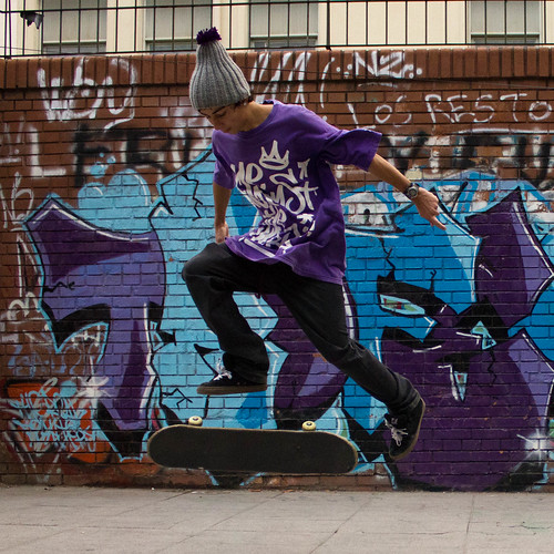
Edmond Dantes posted:I think I may have posted one of these in the previous snapshot a day thread (checked the current locked one and they're not there), so apologies in advance if you've seen them before: I like the concept here, but the background is so busy that it's hard to focus on the skateboarder. Maybe if he was wearing a different colored shirt and pants, something that popped out from a blue/purple backgrounds, but right now he gets lost in the clutter. I don't normally shoot portraits of any kind, but I like how this came out.  A wild hippie strikes. by MrDespair, on Flickr
|
|
#
?
Apr 24, 2012 16:33
|
|


|
I am visiting this thread because of the Cultural Exchange, I typically browse the sketch-a-day thread. I know absolutely nothing about photography, so I don't know if I can offer any critiques, but maybe something from a drawing/painting perspective. HookShot posted:Oprah Haza posted:Trambopaline posted:
|
|
#
?
Apr 24, 2012 18:26
|
|


|
I love this cultural exchange already. It's great having a different perspective on our work.
|
|
#
?
Apr 24, 2012 18:27
|
|

|
Another Drawing-a-Day resident here! I think this exchange thing is a pretty cool idea.Hotwax Residue posted:
I love this. The contrast between the crispness of the foreground and the very painterly reflections in the water works really well. The water looks just like ink and salt washes, all blurred and spotted. Great palette, too, especially that mustard and teal, and the way the trees work as arrows towards the sheep.
|
|
#
?
Apr 24, 2012 19:27
|
|


|
Mr. Despair posted:
I like this a lot. I think the central composition actually works. We're losing a lot of detail on the torso though. Some fill light, or an adjustment brush to up the exposure there would help get some back. Also, maybe it's just me, but have you considered adding a bit of colour to the image? I rarely leave stuff purely greyscale, it's worth experimenting a bit with shadow split-toning in case there's a colour that better fits the mood of the image. Since the cultural exchange is on the go I'm going to post some old stuff: 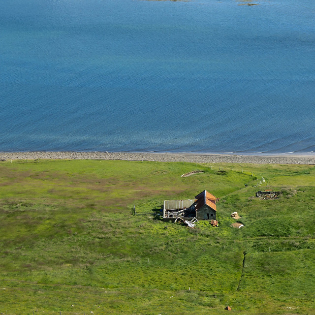 H�s by fuglsnef, on Flickr 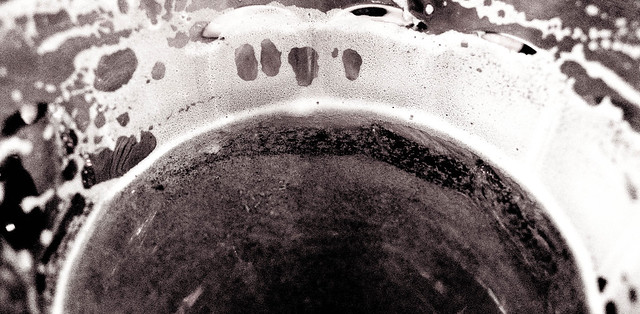 61/366 - The Cause of, and Solution to, All of Life's Problems by fuglsnef, on Flickr 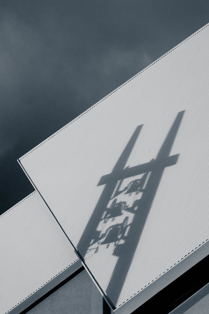 53/366 - Church Bells by fuglsnef, on Flickr
|
|
#
?
Apr 25, 2012 00:16
|
|
|
Extremely nitpicky, but have you considered cloning out the bits of green at the top? For some reason I find them a tad distracting. David Pratt posted:
David Pratt posted:
Love this one, the lines work together really well. Mr. Despair posted:I like the concept here, but the background is so busy that it's hard to focus on the skateboarder. Maybe if he was wearing a different colored shirt and pants, something that popped out from a blue/purple backgrounds, but right now he gets lost in the clutter. I have these as well from that day; I always liked that one because of the guy's pose but yeah, you're right about the colours. It's specially noticeable when thumbnailed, when looking at it in LR it was much better.  Maybe I could get a triptych going with these. Hmmm... Maybe I could get a triptych going with these. Hmmm... _MG_0939.jpg by AxelDR, on Flickr  _MG_0944.jpg by AxelDR, on Flickr  _MG_0890.jpg by AxelDR, on Flickr Edmond Dantes fucked around with this message at 01:08 on Apr 25, 2012 |
|
#
?
Apr 25, 2012 01:02
|
|

|
David Pratt posted:I like this a lot. I think the central composition actually works. We're losing a lot of detail on the torso though. Some fill light, or an adjustment brush to up the exposure there would help get some back. Also, maybe it's just me, but have you considered adding a bit of colour to the image? I rarely leave stuff purely greyscale, it's worth experimenting a bit with shadow split-toning in case there's a colour that better fits the mood of the image. It was shot with black and white film, so there isn't much color to find, and adding color with split toning just looks weird to me. Nothing I've tried before, but I tried messing around with it in light room and couldn't get anything that I liked. Here's a version with the levels tweaked a bit though. I still prefer the darker version myself, I think the bolder colors outweigh the detail in the sweatshirt (since there isn't much there).  
|
|
#
?
Apr 25, 2012 01:50
|
|
|
Edmond Dantes posted:Extremely nitpicky, but have you considered cloning out the bits of green at the top? For some reason I find them a tad distracting. I'll say what someone said before, I think the first two are neat but it sucks that they blend so much with the background. The third one is better for that. Maybe a strobe pointed at the background would of have helped? (Not sure). The square crop does work for me tho!
|
|
#
?
Apr 25, 2012 02:45
|
|

|
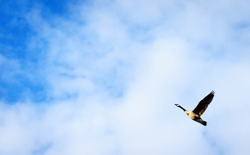
rio posted:Other than the obvious safety issue here, what were you looking to do with this picture? Please don't take this the wrong way, but the beer can on the lawn, the woman and the weedwacking near the baby all make this not a particularly flattering document of this family's life, but maybe I am misunderstanding the point of the picture. I also want to say that I am not trying to be a dick here and I would hope that if the situation was reversed and I was just trying to get a nice photo of my family that someone would point out the things I should think about changing to get better shots in the future. I don't think you're being a dick. I have failed as an artist to make the meaning of my photograph clear. That was not meant to be a nice family snapshot. Instead it was meant to be the exact opposite. My intentions were for you to view this photo and have it make you feel uneasy about the situation. I have received a fair amount of critique on the photo, and while some people were able to guess the intent, it still failed on a few levels. One thing you should do when taking photos of pretty things just for the sake of it is to consider the background. Try to align your subject in a way that the background makes a good contrast with the subject and isn't distracting. This includes thing like poles sticking out of peoples heads and that sort of thing. Also a shallower depth of field to separate the subject from the background would help. Landscapes are best taken when the light is interesting and compliments the land. This is normally in the early morning or late evening when the sun is low in the sky. What you have here is really bright and while it's not ugly, it's suffering from harsh light. The goose photo is pretty good. The placement of the bird in the frame and the timing of it's wings works really well. Here is a photo of mine. 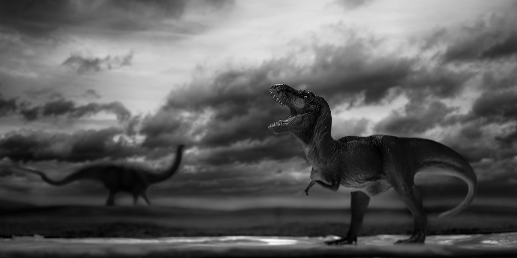 2012-109 by Tom Rintjema, on Flickr
|
|
#
?
Apr 25, 2012 03:19
|
|

|
liwet posted:Another Drawing-a-Day resident here! I think this exchange thing is a pretty cool idea. TomR posted:Here is a photo of mine. ------  Crown Terrace by Paul.Simpson, on Flickr Scott Kelby says you shouldn't take dead tree photos but screw him ")  20120418-_MG_8883-Edit.jpg by Paul.Simpson, on Flickr
|
|
#
?
Apr 25, 2012 04:51
|
|
|
Wafflecopper posted:This one is quite a departure from my normal style, and had quite a lot of processing done. I was going for a moody, atmospheric, slightly abstract forest shot. I love the idea - I too like and have tried the dark and moody forest shot - but it's really too dark. Maybe it's just my monitor at work, but all I see are sillouhuettes and brief hints of light; maybe that's the idea, but to my senses, it's just a little bit too far. I think it's the absence of detail in the trees that's doing it to me, as if the levels look like a U and there's nothing between dark and light. ---- Will we get drawn and quartered for posting Instagram shots? Just curious for now. Best camera is the one you have with you, and all that.
|
|
#
?
Apr 25, 2012 06:45
|
|


|
harperdc posted:Will we get drawn and quartered for posting Instagram shots? Just curious for now. Best camera is the one you have with you, and all that. Normally I'd say no entirely, but in the interests of cultural tolerance and such, I think it's okay if it's a REALLY GOOD cellphone pic. Also this only applies to CC posters 
|
|
#
?
Apr 25, 2012 06:49
|
|
|
TomR posted:
I think you need more DoF around the T-Rex if you want it to look life sized.
|
|
#
?
Apr 25, 2012 07:14
|
|

|
Augmented Dickey posted:I feel like you're being neglected. 1. This is dope. I love, love, love the tonal range and composition. The rays of light pouring in overhead balance the weight of this photo perfectly for me. There's a really cool dreamlike and timeless quality going on here. 2/3. Technically well shot, but the SUV is really distracting and takes me out of the image. The last one is just kinda boring. Try thinking about context when shooting static objects, even if only vaguely implied. Hotwax Residue posted:
1. This feels a little too weighted to the right because of where the hills fall off and the horizon being a little crooked. This is nitpicky stuff for the sake of being nitpicky. It's a landscape and it works. You do these well. 2. This one just seems like it's begging to have more dynamic range or a greater feeling of depth. Maybe dodge some of the highlights a bit more, especially in the background hills, it might help frame the tree better and pop some of the secondary focal points. As an optional homework assignment: after taking a shot like this, try doing it again, but spreading it over 4-10 photos and stitch 'em together (just to humour me!). Shots like this are just begging for MF/LF depth of field control. * * * * * * * * * * * * * * * * * * * * * * * * * * * * * * * * * * * * * * * * * * * * * * * * * * * * * * * * * * * * * * * * * * * * * * * * * I had some fun with a roll Portra 160 and my new FM2n   . . . . 
|
|
#
?
Apr 25, 2012 13:45
|
|


|
Schofferhofer posted:I think you need more DoF around the T-Rex if you want it to look life sized. I was trying to figure out what was off about that photo, and that's it. A stop or two higher aperature would increase the DOF and make the T-Rex look less "toyish". edit-- here, I'll share a couple shots from my latest trip to the US National Whitewater Center  WWC by iantuten, on Flickr  Whitewater Center by iantuten, on Flickr I feel like the colors are a bit off in the second one. Maybe a bit too magenta, but it was as the sun was starting to set so I'm not sure. First shot was on 35mm Ektar, second was on 120 Portra 160NC. Count Thrashula fucked around with this message at 13:51 on Apr 25, 2012 |
|
#
?
Apr 25, 2012 13:48
|
|
|
aliencowboy posted:I feel like you're being neglected. Hey Ottawa buddy! Where do you get your rolls developed? ")
|
|
#
?
Apr 25, 2012 15:22
|
|
|
David Pratt posted:
I like that the composition doesn't make it plainly obvious what the subject is: you can certainly see it after looking at a bit, but it's very easy to discard that thought and let your imagination go where it will: I'm reminded of the very beginning of a nuclear explosion or a star burning in space. I wish the depth of field was a bit less shallow; if the foam on the sides was in focus it'd be easier to see the whole image as flat.  I tried wandering around at night to see how well I could do shooting wide open the whole time. I didn't get much that looks great full-size, but shrunken some are alright.
|
|
#
?
Apr 25, 2012 16:01
|
|


|
Mr. Despair posted:It was shot with black and white film, so there isn't much color to find, and adding color with split toning just looks weird to me. Nothing I've tried before, but I tried messing around with it in light room and couldn't get anything that I liked. In the edited version you've changed the image globally, so the contrast has suffered. I'd have made a mask of just the sweatshirt and reduced the contrast/upped the exposure on that, leaving the rest of the image alone because it already looks good.
|
|
#
?
Apr 25, 2012 16:53
|
|
|
xenilk posted:Hey Ottawa buddy! Where do you get your rolls developed? GPC Labworks on Bank Street, it's next door to the Henry's.
|
|
#
?
Apr 25, 2012 17:18
|
|
|
TomR posted:
I really dig this, but I do feel that the blacks are too deep on the in-focus dinosaur. Maybe burn a tiny bit near the tail to bring it out?
|
|
#
?
Apr 25, 2012 19:38
|
|

|
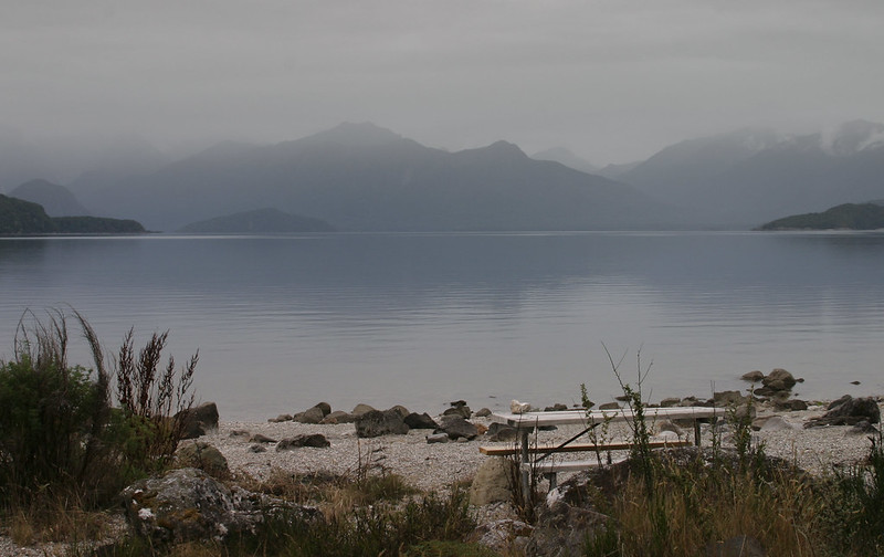
Wafflecopper posted:This one is quite a departure from my normal style, and had quite a lot of processing done. I was going for a moody, atmospheric, slightly abstract forest shot. I think your first one as said before is too black, you need a bit more shadow detail in the shot. I actually tried to do a similar shot that I'll post below. I enjoy your lake shot, the best aspect is the composition. Perhaps not the best foreground but not much you can do there. My shots:   
|
|
#
?
Apr 25, 2012 20:35
|
|

|
aliencowboy posted:1. This feels a little too weighted to the right because of where the hills fall off and the horizon being a little crooked. This is nitpicky stuff for the sake of being nitpicky. It's a landscape and it works. You do these well. I love the simplicity of your second two shots. Who knew a pair of shoes could be interesting! The only nitpick I have is the sky in the third shot is a little bright and drags my eye away from the beautiful tones of the car. Great work as per usual. fivre posted:
|
|
#
?
Apr 25, 2012 23:11
|
|
|
This is gorgeous. The half-blue half-green square composition, the contrasting textures of the water, shore, and grass, all of it. The farmhouse is just kinda there and makes sense visually, but I for some reason I'm not really drawn towards it at all; but it works and I think the image might suffer a little without it, so I guess it's all good in the end.Hotwax Residue posted:
Munkaboo posted:The fact that it's face is so close to the left side and looking out of the frame leaves the right side feeling somewhat empty, neglected and boring, even if there is technically something there. It's part of the animal and should draw at least some visual interest, but it's gaze draws your eyes in the opposite direction. A much stronger composition would probably be for it to be looking in towards the rest of the frame, and even better if you can fill the empty space in front of its face with something visually relevant, if not particularly eyecatching or distracting; a 'pose' where it's looking back across its body (almost over the shoulder) is something I usually try to capture. And generally, animal portraits are much more engaging when taken at eye level; unfortunately, that vantage point is not always available with zoo exhibits. And now for a few of my own.   
|
|
#
?
Apr 26, 2012 02:42
|
|

|
William T. Hornaday posted:This is gorgeous. The half-blue half-green square composition, the contrasting textures of the water, shore, and grass, all of it. The farmhouse is just kinda there and makes sense visually, but I for some reason I'm not really drawn towards it at all; but it works and I think the image might suffer a little without it, so I guess it's all good in the end. Is this better? 
|
|
#
?
Apr 26, 2012 03:12
|
|
|
In my personal opinion, yeah, it's better. Though I might be tempted to go even closer and give it a little upward boost to keep from falling out of the frame.  I dunno. I may not really know what I'm talking about. Grain of salt.
|
|
#
?
Apr 26, 2012 03:43
|
|
|
William T. Hornaday posted:In my personal opinion, yeah, it's better. No no. I think you *do* know what you're talking about, because I like that version even better. Also it has kind of opened my eyes (again) to what a little cropping can do. Okay I'll get back out and stop derailing PAD now.
|
|
#
?
Apr 26, 2012 06:11
|
|


|
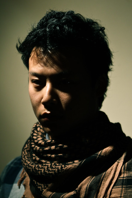
Polegrinder posted:This is also Rembrandt-esq, reminds me of his self-portraits. I do wish the scarf wasn't so crisp. It feels like the face needs to be more in focus. and maybe a bit warmer light on the face to get more detail on that right side, at least so the eye is less in shadow. Hmm yeah. It's really dumb when you finish everything and you realise major technical flaws. I do see it now, as I was just playing with shadows because a more hard lighting type set up has been my latest obsession but it is a little too severe. Will try later when I get more time.
|
|
#
?
Apr 26, 2012 08:50
|
|
|
TomR posted:Here is a photo of mine. I love the hell out of this photo in both concept and execution, but I feel like it's just a little too dark. The lighting adds a lot of drama to the scene, but I think you could show a little more detail without having a detrimental impact. I went out with a photographer friend to a ghost town outside of Vegas and tried shooting some still-life. I pretty much feel super uncomfortable shooting anything that isn't people or animals, so I really didn't know what the gently caress I was doing, but I came out with a couple that I like. The excavator teeth one is probably my favorite shot I've taken in months, but I can't really articulate why. The best I can think to say is that I really like photos of pedestrian objects that are composed in such a way that they call to mind completely unrelated images, and I think the teeth do that to a degree. I suppose the nut photo also looks like a face, but I find that less compelling.   
|
|
#
?
Apr 26, 2012 10:23
|
|


|
mr. mephistopheles posted:Well let's see what we have here. First of all, love the concept of shooting on an abandoned place, as it allows you to give new life / shape to things. Wish I had some nearby. The first image is the one I like the most, precisely because of its anthropomorphic features. Wish the right "eye" was more in focus though, and the foreground of a color other than rust. But I like the shot very much nonetheless. The second image.. I don't like it very much. Can't find a pattern of shapes or colors than make it worthwhile. The third image has the potential of being powerful, but I think the crop pretty much negates that. It could have looked like a dead hand coming out of the soil, but we don't see enough of the "hand" to make the analogy work. Does this all make sense to you? I did like the pictures 1 and 3, but I wanted to provide some critics. As for my own pic, here's one I shot today. More like a lucky encounter, but it's all I got.  Blackbird on Flickr
|
|
#
?
Apr 26, 2012 16:43
|
|

|
Edmond Dantes posted:I have these as well from that day; I always liked that one because of the guy's pose but yeah, you're right about the colours. It's specially noticeable when thumbnailed, when looking at it in LR it was much better. I agree with the other guy who said the first two blend in too much with the background. Do you have a longer/faster lens to create a bit of background blur? Have you tried longer shutter speeds to blur the background/get a sense of motion? William T. Hornaday posted:At first glance I thought the green goo was the remains of a poor frog... - - - I really like the idea of putting this in CC. CC, please tear me a new one:   
|
|
#
?
Apr 27, 2012 09:23
|
|

|
Ringo R posted:I agree with the other guy who said the first two blend in too much with the background. Do you have a longer/faster lens to create a bit of background blur? Have you tried longer shutter speeds to blur the background/get a sense of motion? The first shot has a great eerily empty feel, I really like this shot. The second and third together create an interesting effect that almost hurt my eyes trying to seperate the lines, but seperately I think the third achieves the same effect stronger than the second.
|
|
#
?
Apr 27, 2012 09:33
|
|

|
xenilk posted:I'll say what someone said before, I think the first two are neat but it sucks that they blend so much with the background. The third one is better for that. Maybe a strobe pointed at the background would of have helped? (Not sure). The square crop does work for me tho! Ringo R posted:I agree with the other guy who said the first two blend in too much with the background. Do you have a longer/faster lens to create a bit of background blur? Have you tried longer shutter speeds to blur the background/get a sense of motion? This was one of those cases of "you don't see it until it's pointed out to you", but yeah, the background was a bad choice. I didn't really have another option, the guys were practicing against that wall and I thought it was a cool background (I didn't have the flash at the moment and I honestly wouldn't have thought of using it to lighten the wall), but yeah, you can really lose the skaters against it. Thanks again for the input.
|
|
#
?
Apr 28, 2012 02:15
|
|
|
maxmars posted:
OK, I have only recently taken up photography and am not very comfortable critiquing other people so take this with a grain of salt. I'm going to use the framework in the OP of the thread. First Impressions: I like it! The expression on his face made me smile, and the photo immediately puts me in the situation of a chance encounter with a wild animal. Technical: All seems perfect to me, it's in focus, exposed well, DoF isolates the subject perfectly. Artistic: Composition is good. I kind of wish there was a bit more going on in the picture to look at though, or the background was a bit more interesting. As it stands it seems like a very well-taken snapshot. Obviously it's near-impossible to control that with a wild bird though .Mine:  16/04 by waaarg, on Flickr I like this shot but I'm not really sure why. I'm also not sure about the bus, the text seems a bit distracting. 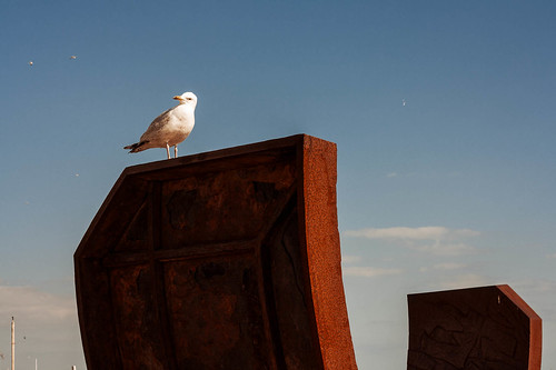 16/04 by waaarg, on Flickr I think my above criticism of maxmars' photo could apply to this one, I'm not sure if the image is strong enough to stand without an obvious story. 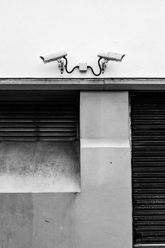 16/04 by waaarg, on Flickr I would love some feedback on the processing of this one, I have no real idea what I am doing with b/w conversions.
|
|
#
?
Apr 28, 2012 13:03
|
|


|
Waarg posted:
I think you did pretty well with the conversion. Tones are well balanced, especially the in bottom 3/4ths of the frame, nice textures showing up too. I do think the top part, with the cameras, did get a little too blown out though. It's close, but the top of each camera doesn't have quite enough definition to pop out from the white wall behind it. You might be able to do some local adjustments to fix it. Good work, and keep shooting.
|
|
#
?
Apr 28, 2012 16:31
|
|

|
Ringo R posted:I agree with the other guy who said the first two blend in too much with the background. Do you have a longer/faster lens to create a bit of background blur? Have you tried longer shutter speeds to blur the background/get a sense of motion? That first shot is awesome. The ambiance/vibe and colors are just right, I like it. The second and third are neat but I feel a bit overwhelmed by the third one, too much information/brightness maybe? Or it's just me being weird. ha ha Here are some of my latests:  IMG_4535 by avoyer, on Flickr  IMG_3999 by avoyer, on Flickr  IMG_4400 by avoyer, on Flickr
|
|
#
?
Apr 28, 2012 16:54
|
|
|
xenilk posted:Here are some of my latests: Love the first one. I really like the second one but the lens flare makes it look like there is a giant coffee stain on his jacket. The third one I really enjoy looking at, it's framed well. I just wish it was a tad sharper, it seems just a touch too soft. -- Should I clone out the crud in the water? I think I'm done shooting birds for now.  drink by jankyangles, on Flickr Maker Of Shoes fucked around with this message at 00:26 on Apr 29, 2012 |
|
#
?
Apr 28, 2012 18:10
|
|

|
Waarg posted:Mine: quote:
Maker Of Shoes posted:Should I clone out the crude in the water? I think I'm done shooting birds for now. Lovely colours, but yeah I think you're right: cloning out the specs in the water would definitely improve it. I'd have preferred the duck to be closer to the top right so he's swimming into the frame more. I spent the last couple of hours mucking about with my flash, ended up using a one of those cardboard tubes whisky bottles come in as a snoot, worked a treat I can't tell which one of these is better, please make my decisions for me!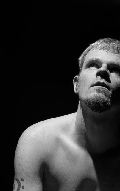 Lit from above self portrait #1 by fuglsnef, on Flickr  Lit from above self portrait #2 by fuglsnef, on Flickr
|
|
#
?
Apr 28, 2012 22:37
|
|
|

|
| # ? May 13, 2024 07:50 |
|
|
David Pratt posted:I'd have preferred the duck to be closer to the top right so he's swimming into the frame more. Argh, I hadn't even thought of that. I get wicked tunnel vision when I'm processing bird shots because of the sheer amount of crap I have to throw out that I completely forget about composition 101.  Thanks a million, you're a life saver.
|
|
#
?
Apr 28, 2012 22:45
|
|