|
David Pratt posted:
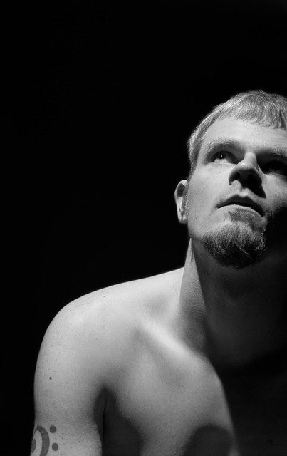
I am terrible with flashes so take my opinion with a grain of salt but I am loving the texture the light is giving your face on the second one. It looks like the very top of your head is unlit, I think if you could get a little bit more light there, it would be pretty sweet. I think the framing on the first one is a little off, it's cut off too close to your eyes for me. Here's a shot from last year, converted to black and white:  Snow on the Lake by i.morrison, on Flickr
|
|
|
|

|
| # ? May 11, 2024 08:09 |
|
big cheese posted:Here's a shot from last year, converted to black and white:
|
|
|
|
big cheese posted:I am terrible with flashes so take my opinion with a grain of salt but I am loving the texture the light is giving your face on the second one. It looks like the very top of your head is unlit, I think if you could get a little bit more light there, it would be pretty sweet. Aye, the snow looks too underexposed, which is a common pitfall when photographing snow. While your camera does say the scene is correctly exposed, it's actually underexposed because your camera is metering for a certain average value in the image. I don't really have time but here's a short quick article on that: http://www.luminous-landscape.com/tutorials/exposing_snow.shtml
|
|
|
|
Maker Of Shoes posted:Should I clone out the crud in the water? I think I'm done shooting birds for now. Tones and contrast are nice, but honestly I just think that this is a boring perspective to shoot birds from- I feel like I've seen more or less the exact same shot a thousand times, probably because it's the most accessible position to shoot aquatic birds from. I think you can go a long way to make shots like this more interesting by trying to get close to eye level with the animal so that it doesn't look so tiny. A few shots from a walk yesterday 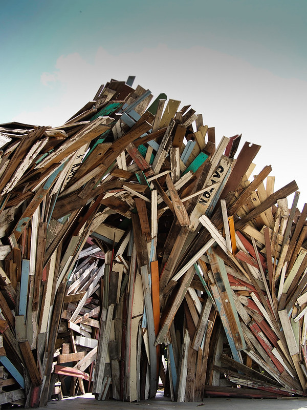 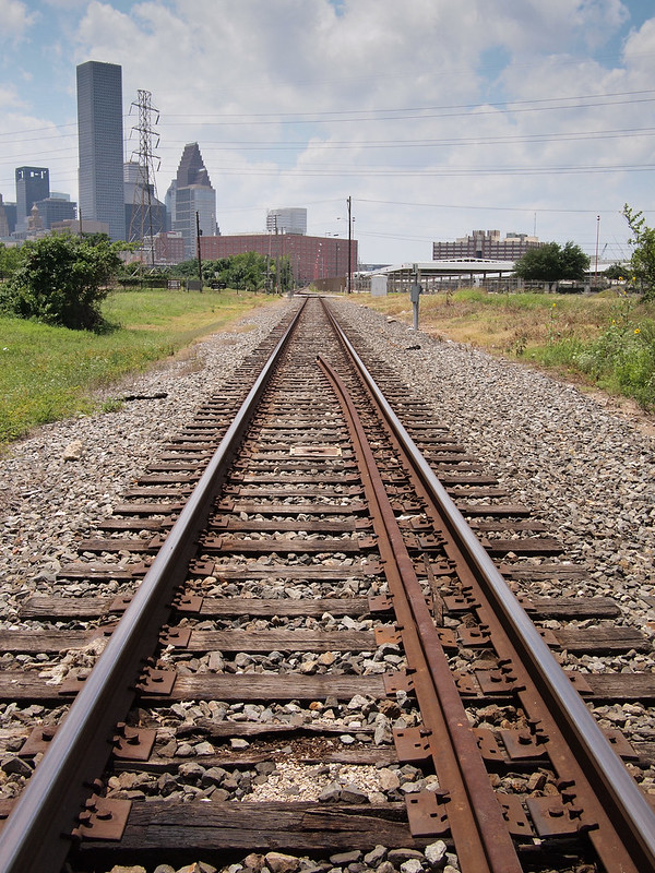 
|
|
|
|
Does the world need more train track photos?
|
|
|
|
dukeku posted:Does the world need more train track photos? Does the world need more portraits/travel photos/shots of monuments/shots of flowers/wildlife photos/concert photos/medical photos/...?
|
|
|
|
Oprah Haza posted:Does the world need more portraits/travel photos/shots of monuments/shots of flowers/wildlife photos/concert photos/medical photos/...? All those things you listed can have some unique quality to them either due to different colors, emotion, or weather. But railroad tracks are always just railroad tracks. Unless something is going on with the tracks, they produce really unremarkable photos.
|
|
|
|
Oprah Haza posted:Does the world need more portraits/travel photos/shots of monuments/shots of flowers/wildlife photos/concert photos/medical photos/...? I'm sorry my critique didn't meet your standards. Let me rephrase. Train tracks are boring. If you're going to critique someone for using an overused angle, don't post your own photos of the same loving thing in the same post. Train tracks are easy, that's why they're clich�. This thread isn't for snapshots.
|
|
|
|
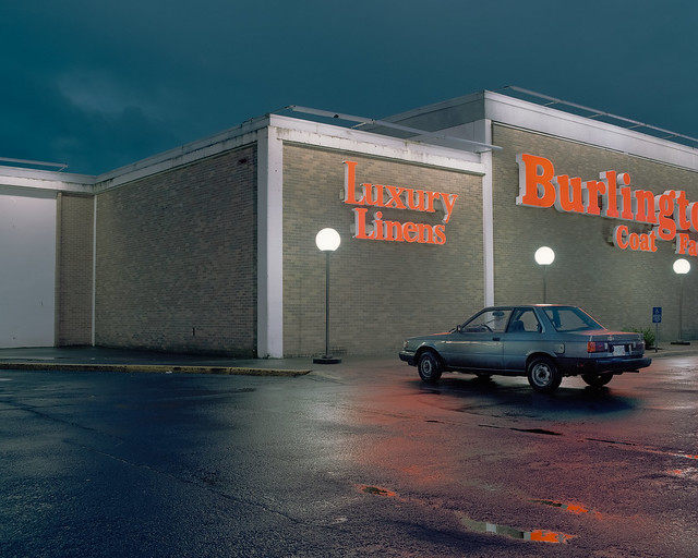
dukeku posted:I'm sorry my critique didn't meet your standards. Let me rephrase. Sorry, I guess I should stick with taking shots of old toyotas in front of the burlington coat factory.
|
|
|
|
Learn to take critique. Jesus Christ.
|
|
|
|
dukeku posted:This thread isn't for snapshots.
|
|
|
|
William T. Hornaday posted:Define 'snapshot' please. Two shots of the same subject in the same post, slightly different, just scream "out taking snapshots" to me. Augmented Dickey posted:Sorry, I guess I should stick with taking shots of old toyotas in front of the burlington coat factory. If you can't take it when someone critiques your photos, this thread isn't for you. bellows lugosi fucked around with this message at 23:03 on Apr 29, 2012 |
|
|
|
dukeku posted:If you can't take it when someone critiques your photos, this thread isn't for you. Did I miss the part where you posted an actual critique? All I saw was 'I don't like train tracks'. If you feel like putting any effort into posting a critique of my shots I would be more than happy to read it. Otherwise I'm sorry that a steam engine raped you as a child or whatever and causes you to vomit in revulsion whenever you see a set of train tracks. (USER WAS PUT ON PROBATION FOR THIS POST)
|
|
|
|
Augmented Dickey posted:Did I miss the part where you posted an actual critique? All I saw was 'I don't like train tracks'. If you feel like putting any effort into posting a critique of my shots I would be more than happy to read it. Otherwise I'm sorry that a railroad raped you as a child or whatever and caused you to vomit in revulsion whenever you see a set of tracks. Those train track photos are basically straight out of a beginners photo book on how to emphasize foreground with a wide angle lens. They are just boring. Vanishing lines can make for an interesting composition but here they just seem randomly stuck in the photo.
|
|
|
|
Augmented Dickey posted:Did I miss the part where you posted an actual critique? All I saw was 'I don't like train tracks'. If you feel like putting any effort into posting a critique of my shots I would be more than happy to read it. How do you give a thought-out response to a photo that you didn't even think about when taking? Your composition is completely contrived. You can't rely purely on two lines moving to a vanishing point to create an interesting photo. The skyline is boring and muddled. The light is flat, the greens look sad and it appears that the vanishing point moves to the left rather than directly to the center.
|
|
|
|
Now, in contrast, if you'd like to say something about my photos - please do. I spend a lot of time taking them and a lot of time considering what I show other people, and I greatly appreciate when someone (especially a detractor) tells me they dislike it. No one has ever improved through misguided praise.
|
|
|
|
William T. Hornaday posted:Define 'snapshot' please. Augmented Dickey posted:A few shots from a walk yesterday I really like the idea you have in the first shot. I am wondering if you intentionally left the "doorway" brighter than the rest of the photo. Is it supposed to indicate the way? What is the story you saw in this photo? I kind of see a weird gateway into a world of planks. The second photo, as has been said, is just a pair of boring tracks like every photo book ever. However, I think I know what you were trying to achieve. That said, to execute that shot properly you would need a long empty area of tracks leading to an amazing skyline in the distance. The problem here though is that the background is not a cool enough looking skyline, and the fore and midground are too busy with random poo poo (extra rail, trees, and small buildings). Also lines dead center don't look nearly as cool. Consider doing the same shot idea, but try and frame it so you have curved tracks like in photo 3 on an open space, leading to a skyline that either A. fills the frame pretty full or B. is tiny and small in the distance but still visible.
|
|
|
|
Just to restate what's said in the OP... If you get negative criticism and think it's bullshit you can: - ignore it - respectfully disagree and let it go - hit the report button if it's really horrible You shouldn't: - get angry on the internet - make angry posts on the internet Seriously if you need to learn how to take criticism, you're currently in exactly the right forum for it probably.
|
|
|
|
dukeku posted:
Evilkiksass posted:The second photo, as has been said, is just a pair of boring tracks like every photo book ever. However, I think I know what you were trying to achieve. That said, to execute that shot properly you would need a long empty area of tracks leading to an amazing skyline in the distance. The problem here though is that the background is not a cool enough looking skyline, and the fore and midground are too busy with random poo poo (extra rail, trees, and small buildings). Also lines dead center don't look nearly as cool. Consider doing the same shot idea, but try and frame it so you have curved tracks like in photo 3 on an open space, leading to a skyline that either A. fills the frame pretty full or B. is tiny and small in the distance but still visible. I really do appreciate the commentary. I guess the shot was better in my head than it was through the camera. My goal was to convey the tracks leading towards the skyline but apparently it just didn't work out in the end. Evilkiksass posted:I really like the idea you have in the first shot. I am wondering if you intentionally left the "doorway" brighter than the rest of the photo. Is it supposed to indicate the way? What is the story you saw in this photo? I kind of see a weird gateway into a world of planks. Yeah, I was trying to highlight the doorway thing to get a point of reference and context. I think without the highlight it just looks like a stack of boards, but again I'm not sure that I conveyed that well enough. The tones in this shot are gorgeous, but I just don't 'get' the subject. I feel like it looks pretty but at the same time it's just an old camry in front of a big box store which seems very profane. I guess what I'm trying to say is that I like this shot, but have no idea why. I'm not a seasoned photographer so I guess I'm still trying to grasp what makes a shot like this appealing to us. Bouillon Rube fucked around with this message at 23:39 on Apr 29, 2012 |
|
|
|
I like this. The subject is cool and I think you framed it well. I think it would look really good in a really contrasty black and white too, don't know if you gave it a try or not. For what it's worth I really like the color in the railroad tracks, something about the saturation or tones or whatever is really pleasing. I tried doing some abstract stuff with buildings downtown today, which I've done a bit in the past, but decided to try and concentrate on it today.   
|
|
|
|
maxmars posted:As for my own pic, here's one I shot today. More like a lucky encounter, but it's all I got. I don't like to give technical criticism too much, but I think you've over sharpened this way too much. I almost looks like a photoshop pencil crayon filter was applied to it. I think the concrete cylinders are more interesting than the bird. I would have framed them and used the bird as a point to draw the eye in the composition. As it stands this is more of a documentation that you happened to see a bird. If you do want a portrait of a bird then I would have put him lower in the frame just a bit. This is mine for today: 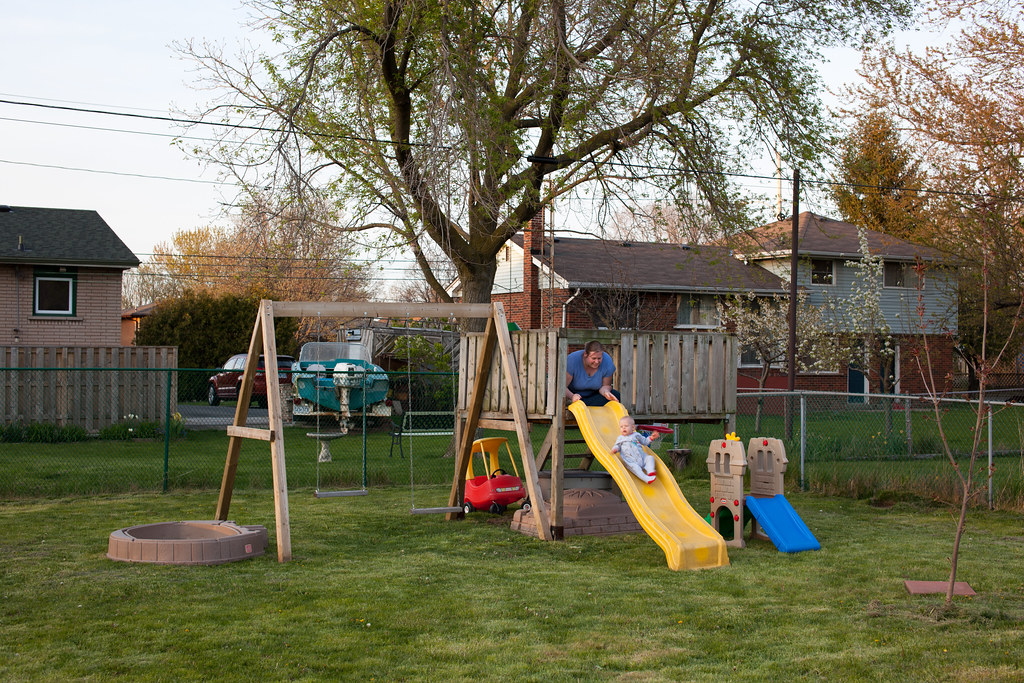 2012-144 by Tom Rintjema, on Flickr
|
|
|
|
TomR posted:This is mine for today: el Brainvomito fucked around with this message at 03:01 on Apr 30, 2012 |
|
|
|
I quite like this one, it gives me the feeling oceans waves breaking actually, just that they are made up of wooden planks.
|
|
|
|
The lines are really nice, and the contrast suits the images really well. You definitely achieved something thats pretty cool to look at, my only problem is that I've seen them before. I know that this is what you were going for, so suggesting that you change your approach doesn't seem appropriate. For my first ever PAD post, a few I worked on this week:  Untitled by bigrhon14, on Flickr  Untitled by bigrhon14, on Flickr 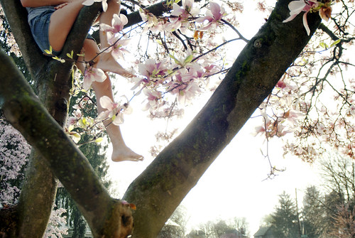 Untitled by bigrhon14, on Flickr
|
|
|
|
TomR posted:I don't like to give technical criticism too much, but I think you've over sharpened this way too much. I almost looks like a photoshop pencil crayon filter was applied to it. This is great. It makes me so uncomfortable to view, and those are the photos I love the best. At first glance it looks so innocent and happy, with the playground plastic colours and the spring grass and buds, but it just feels wrong, and I love that contrast.
|
|
|
|
Your first two don't really grab me - they are not bad, but I'm just not into them. I think the first one looks fine, but I struggle to find what I should be getting out of it - like, the shadow is interesting, but then I see the one above going out of frame and just want to see more of that, rather than the blank wall between windows. I think that there might have been a picture somewhere at your location, but it might not have been where you shot. Just my first impression, though. The second is a flower in the sunlight, and that is pretty much it. Someone might like it framed? Maybe try to keep taking flower shots but challenge yourself to consistently try to 1) ask yourself how you can really exploit both the flower and the location, and 2)try to do something different and better than the last flower you shot. Eventually you will run out of things to do and be forced to get really creative in some ways you might not have yet considered. I mentioned in my last post that I am struggling with "point camera=>produce pretty picture" too, so these are things I have also been trying to think about and produce something with some actual worth. The third one, the one I quoted, I think had the most potential. I think you could have done with a tighter crop, losing the trees at the bottom giving more of an illusion of height and the girl having her head in the clouds. Particularly with all of the strong lines from the tree, the stuff at the bottom seems superfluous and out of place and does not contribute to the overall mood of the photo in my opinion. (edit: I have been trying to find a good crop of what I was thinking of for you, but my eyes are shot for today I think) --- I know I can post three, but I would like some input on just one shot for today. I took several photos of this, from different vantage points that both included the steeply poking through the trees from along the entire bottom border, the same but only on the left of the frame (the right being empty space), and from this vantage point. Here is the original shot, not edited to completion but for reference in terms of what I had to work with. I am still tempted to use it uncropped, but lately I have really been trying to minimize and isolate subjects at the expense of some things that seem like they don't absolutely need to be there in the frame. In this case, it was that lone bird chilling out on the cross atop the steeple. Original:  Solitary (uncropped, unfinished) by cadence440, on Flickr Here is what I ended up with at first, which I did not really like:  Solitary (crop 2) by cadence440, on Flickr And here was the final result:  Solitary by cadence440, on Flickr First of all, if this is just terribly uninteresting then please say so. Secondly, I could really use some help in terms of sacrificing elements in the frame to isolate vs. trying to compose on the spot. The initial shot was as zoomed in as I could get at a 315mm equivalent - I probably would have manually zoomed in closer to what I ended up with in the crop if I had the lens for it, but I still kind of like the original. In fact, just typing this out I like my crop and the final editing less and less, and worse that the editing might detract from the point of the picture. That is why I could really use some help from someone who has not been looking at this all day! rio fucked around with this message at 05:41 on Apr 30, 2012 |
|
|
|
rio posted:Here is what I ended up with at first, which I did not really like: I feel very much the opposite of the way you do. I like in the first of those two how the left spire doesn't meet the corner exactly but eats it up. The large spire looks like it hits it perfectly in the second and that annoys me for who the hell knows what reason. I also looked at your pictures in reverse order by chance and the shingling of the near little spire blending into the large one made my noticing it jarring for a second. Good if that's you're intention, but I feel like having the pair of peaks in the first crop you made makes the third sort of expected without ruining it's magic-eye sort of blending into the big one. I like the little bird and the negative space he seems like he's looking off into. Something about it makes her seem determined. -------- I bought my first DSLR a while ago and took it out today to play for the first time.  Mouth by Matthew K Sears, on Flickr 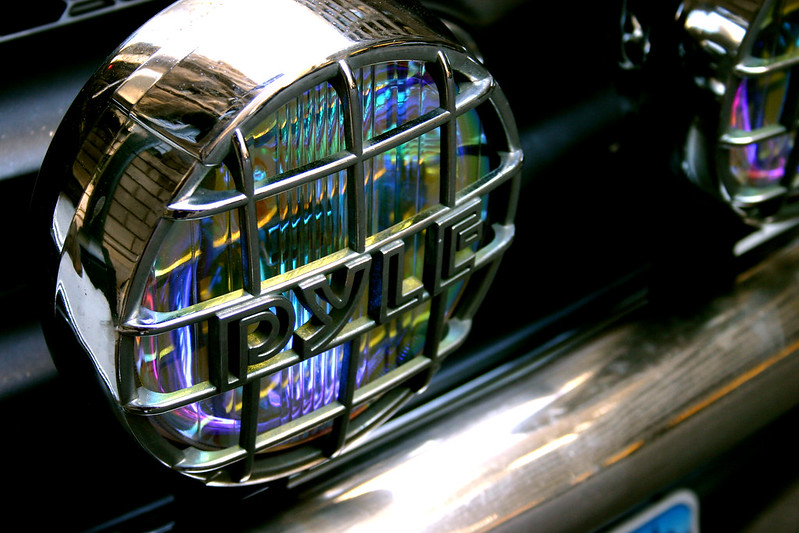 Pyle by Matthew K Sears, on Flickr
|
|
|
|
there's just a little bit of distortion on this one that bugs me. Big blurry thing in the foreground is a bit too distracting and takes most of the frame. At first I was bugged by the negative space in the middle beyond the flower but the more I look at it the more i like the photo. It might be a tad too distracting but it's a nice shot. here's a few shots. dunno how I feel about this one. might need to be a bit warmer?:   while driving and blind shooting out of the sunroof. i-wanted-the-shot: 
|
|
|
|
Hydrocodone posted:I bought my first DSLR a while ago and took it out today to play for the first time. The second one is generally nice; the contrast is very steep but I think it works for this particular shot. The reflection of the bricks on the chrome finish are a little distracting though. Not sure what I'm looking at in the first one.
|
|
|
|
guidoanselmi posted:
1) I don't find this particularly interesting. It's washed out, the shadows aren't dark enough for me, and the sky isn't interesting. 2) I love that the top of the waterfall is hidden by the tree. Equally, I love the position of the log on the right, it feels as though I'm hanging onto something to catch a glimpse of the waterfall. Again, I feel the contrast/exposure are off as the shadows aren't dark enough, though the colors are a lot less washed out than the first. 3) This is the better of the 3, fantastic shot for being out of your sunroof. I sort of want to see the picture straightened based on the grass in the foreground and the browns/reds of the foreground grass brought out a bit more. The portapotty? is distracting and the empty sky leaves me wanting more. But for what it is, I enjoy it. If only that bee had been in focus..  A Happy Landing by samjack56, on Flickr The inside of this was a little dirty however I really enjoyed the yellow glow eminating from the inner petals. 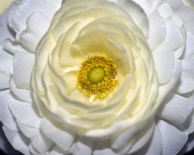 Radiant Glow by samjack56, on Flickr My kitty was soaking up the sun, watching the butterflies, looking beautiful as ever, and waiting to become my new black and white background. (I apologize if she isn't amazing enough to break out of the pet category. I realize the background could have been more amazing.) 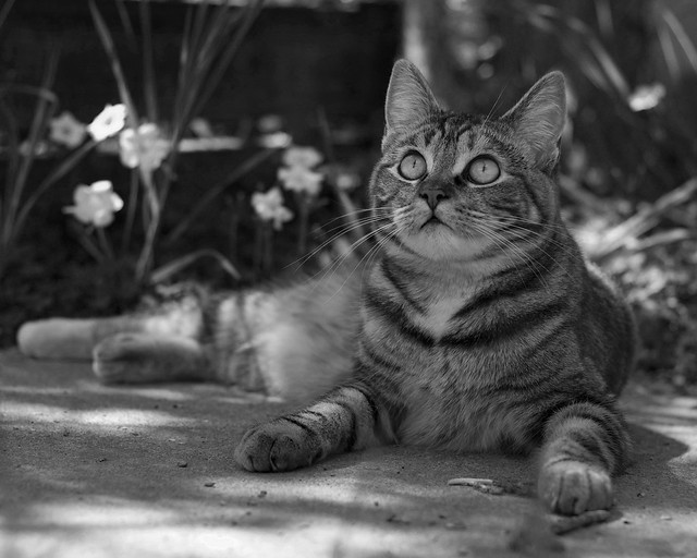 Watching Butterflies BW by samjack56, on Flickr
|
|
|
|
rio posted:
I think it is pretty interesting, and I think that crop2 is the stronger of the two. I know the bird is the thing you were looking at, but I like the triangles so well that letting the bird be a tiny detail breaking up the geometry of the rest of the image is fine with me. So, I've got moths, and I post too many pictures of moths. Since I do that, I probably should make them more better pictures. So, this here is a Cecropia moth:  cecropiaagain by RReiheld, on Flickr I like this position, generally, and find the feet-eyes-antennas to be more interesting than the wings. However, at least in this one it was considerably overexposed, so I cut the gamma on it and cropped off as much of the blown out broomstick as I could. Would it be worth losing some of his extended foot to be rid of more broomstick? I am less annoyed by the trimmed off ends of wings than I expected to be, but if other people find it especially jarring I'll keep it more firmly in mind for the next time around. Again with the drat bug:  cecropia3 by RReiheld, on Flickr Another where I am more interested in the legs and eyes than the wings, and again I hate that my finger is so bright and takes up so much of the frame. So, I need a better flash setup, and a better thing for them to crawl on to position them that won't blow out when I take a picture. They are big enough that I'm not sure I can get enough DoF to get all of it sharp in anything but the most two dimensional poses, so any suggestions on that front would be welcome as well. Slo-Tek fucked around with this message at 06:36 on May 1, 2012 |
|
|
|
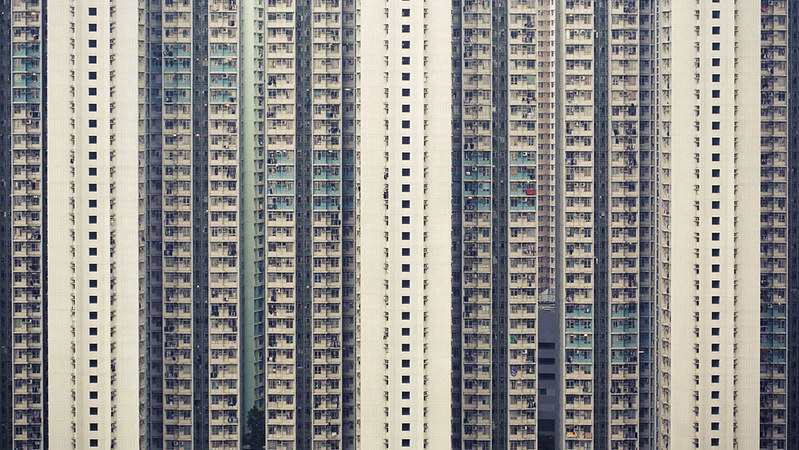
Ringo R posted:I agree with the other guy who said the first two blend in too much with the background. Do you have a longer/faster lens to create a bit of background blur? Have you tried longer shutter speeds to blur the background/get a sense of motion? Good stuff! Reminds me of Michael Wolf's architecture of density.
|
|
|
|
samjack56 posted:
For the first one I don't think I'd call it particularly creative as shooting a bee on a flower is something we've all tried at one point or another. Now that's not a critique or anything but just acknowledging I think, like a landscape, everyone gives it a go. I think this picture suffers a bit from lack of contrast. Nothing in the photo looks very deep or dark. Not saying something has to be black but it feels a touch on the flat side to me. The second picture you can tell it was taken with a flash. Personally I think it could be an impressive photo but it needs to be cropped. Try making a rectangular crop to just outside of the white pedals with the yellow glow, or at least close in there so it's not so obvious a flash was used. The last photo looks a bit too grey to me. There's nothing deep about the contrast at all but the focus is perfect so if you fiddle around with contrast a bit I think you'll have a pretty good pet photo. I'm trying to step outside my comfort zone a bit, I mostly just like shooting people so on a trip I took some photos trying to get some symmetrical photos of stuff. 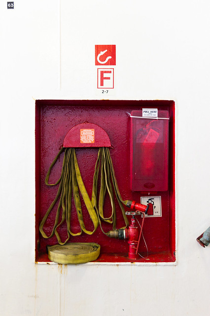 IMG_4433 by Aidan R, on Flickr  IMG_4441 by Aidan R, on Flickr For this I'm trying to get really neutral colours, so not a yellow or blue tinge to anything, as well as slightly smoothing out the skin to make the subject look better without some crazy airbrush job, something I haven't really gone for. I took two photos that are very simlair but edited them slightly different. The other one is IMG_4448 for comparison. I prefer this one but I'd appreciate some feedback from impartial third parties. I want to know which is setting me on the right track.  IMG_4447 by Aidan R, on Flickr doctor 7 fucked around with this message at 20:09 on May 1, 2012 |
|
|
guidoanselmi posted:dunno how I feel about this one. might need to be a bit warmer?: quote:quote:while driving and blind shooting out of the sunroof. i-wanted-the-shot: This shot looks really good. I'd probably crop it a bit so that the electric pole on the left hand side goes, as it stands out a fair bit, definitely more than the other pole, and is a bit distracting. But other than that, well done! A few more snapshots from me:  Amiens by hookshot88, on Flickr  ANZAC Day 2012 by hookshot88, on Flickr  ANZAC Day 2012 by hookshot88, on Flickr
|
|
|
|
|
doctor 7 posted:For this I'm trying to get really neutral colours, so not a yellow or blue tinge to anything, as well as slightly smoothing out the skin to make the subject look better without some crazy airbrush job, something I haven't really gone for. I took two photos that are very simlair but edited them slightly different. The other one is IMG_4448 for comparison. I prefer this one but I'd appreciate some feedback from impartial third parties. I want to know which is setting me on the right track. I'll have a photo up later today when I get home. I'm looking forward to hearing some criticism on my stuff. Also, apologies if the formatting of the post is lovely. Im using the ios app. EDIT: Photo time  Untitled by Herounicorn, on Flickr Ziggy Smalls fucked around with this message at 23:22 on May 1, 2012 |
|
|
|
Clone out that thing on the bottom right and the "63" on the top left, and it'll be much more symmetrical. quote:
Wow, these are both bang-on. Focus is sharp as gently caress and even though it's shallow it's on the right features so you don't notice it too much. On the second one I'd be tempted to increase the contrast on the fingerprint ridges, as at the moment that area is a featureless light blob and it doesn't sit well with the rest of the picture which has tons of detail. My last two 366 project photos: 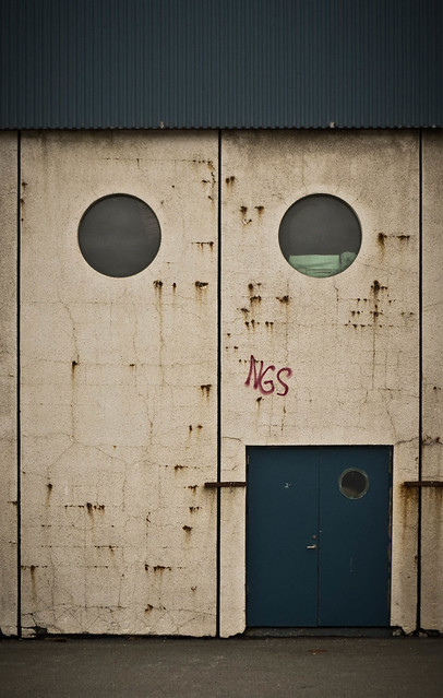 120/366 - Shipyard by fuglsnef, on Flickr  121/366 - Waterfall by fuglsnef, on Flickr
|
|
|
|
Slo-Tek posted:Again with the drat bug: These are both great, the red tones really pop in a pleasing way. I especially love the texture on the moth's legs and body in the second one. David Pratt posted:
I like the simplicity and abstractness of this one, but the star-shaped thing at the bottom (lens flare?) is bugging me. An odd little piece of camera history that was recently found in my grandparent's attic: 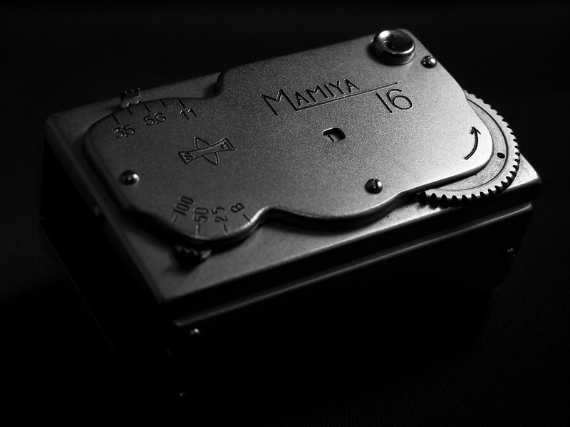
Bouillon Rube fucked around with this message at 03:34 on May 2, 2012 |
|
|
|
Slo-Tek posted:I think it is pretty interesting, and I think that crop2 is the stronger of the two. I know the bird is the thing you were looking at, but I like the triangles so well that letting the bird be a tiny detail breaking up the geometry of the rest of the image is fine with me. Thanks for the suggestions. I think after stepping away from it for a few days and clearing my head, I am preferring that one as well. Also, sick shots!! I love both of them. I think now that I know that is a broomstick, it is a little odd in terms of how it is shaded - ignorance is bliss and I didn't really notice it initially because I was too focused on the stunning insect. You have really capture/portrayed quite a personality in that thing both through the pose in the first shot and in the framing, focus and capture in the second.
|
|
|
|
David Pratt posted:
Interesting effect. However, are those lens flares added in post? They struck me as such which takes away from the photo. It looks like a lot of post was done on the photo in general, which isn't a bad thing necessarily, it's just that the water seems rather.. radioactive. ----------- Here are some self-developed photos I took on 35mm:  1612910-R1-E023 by gronke, on Flickr  1612910-R3-E048 by gronke, on Flickr  1612910-R3-E052 by gronke, on Flickr
|
|
|
|

|
| # ? May 11, 2024 08:09 |
|
Im That One Guy posted:I just started getting into photography so take my opinion as more of a laypersons perspective. I very much like the first two, but I think the third falls short. The lighting on the subject is great. He looks very natural so you succeeded on that part. However the background is incredibly plain. It makes the image look empty. And when its combined with the subject, there is no real contrast which ultimately makes for a boring picture to me. I think the version with the different editing suffers the same problems. If I have to choose between the two, I'd pick posted one because the subject in the other version takes up too much of the image.
|
|
|


