


|
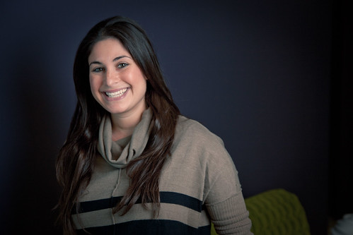
First babby shoot with the new 5d mark 3, I'm seriously in love with this camera. The focus is spot on, and AF is really useful for babbies.  robert5 by francography, on Flickr  351B9936 by francography, on Flickr 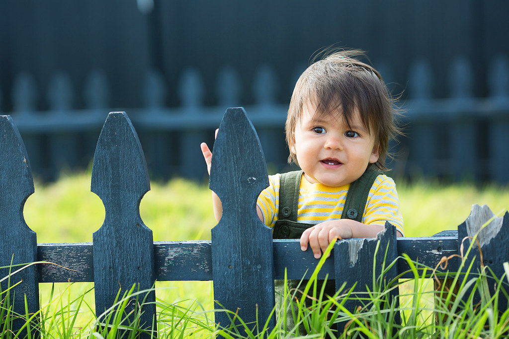 351B9892 copy by francography, on Flickr  robert4 by francography, on Flickr  robert2 by francography, on Flickr
|
 #
?
May 1, 2012 06:10
#
?
May 1, 2012 06:10
|
|


|

|
| # ? May 17, 2024 01:16 |
|
|
Cyberbob posted:Slightly different tones, crops, and poses. Can't decide which I like more. Thoughts? When I scroll back and forth between them, the first one seems dark and flat somehow. This is really picky, but the second one bothers me where her head and the sky meet. Her face is pretty bright, and it's hard to look at because my eyes want to jump up to the super bright sky right above her head. What if you did the #2 processing on #1?
|
|
#
?
May 1, 2012 06:55
|
|


|
somnambulist posted:First babby shoot with the new 5d mark 3, I'm seriously in love with this camera. The focus is spot on, and AF is really useful for babbies. I really like your B&W conversions. Nice tones in the first and the penultimate ones. Did you use Lightroom? As far as portraits go, I like all of them a lot except for the colored one. The right hand looks awkward and the picture looks like it needs to be rotated clockwise.
|
|
#
?
May 1, 2012 07:01
|
|
|
somnambulist posted:
The b&w shots are ok, but the color, lighting, and processing of this image is spot on. Well done, great photos.
|
|
#
?
May 1, 2012 07:59
|
|

|
I too need to know how you did those B&W conversions. Mine always come out just very 'meh' but you'res are quite striking. Tips please!
|
|
#
?
May 1, 2012 11:16
|
|

|
A great starting point for doing BW conversions is with this cheat sheet.
|
|
#
?
May 1, 2012 14:03
|
|
|
A couple of very different photos of the same man, both candid: 
|
|
#
?
May 1, 2012 17:30
|
|


|
Had a prom shoot last weekend really liked the results. Prom! by Back to You Photography, on Flickr  Prom! by Back to You Photography, on Flickr  Prom! by Back to You Photography, on Flickr
|
|
#
?
May 1, 2012 19:00
|
|

|
Verman posted:
Maybe I'm nuts but the white balance seems off. I feel like there's a strong blue hue in all the shadows.
|
|
#
?
May 1, 2012 19:20
|
|

|
Lamb of Gun posted:Maybe I'm nuts but the white balance seems off. I feel like there's a strong blue hue in all the shadows. The white balance was set for my flash so it was probably my fault for trying a slight split tone in post. I was staring at them for a while that day picking between photos for keepers and making edits. When I come back to it, I definitely see what you mean. Considering these were test shots for our corporate head shots that the partners wanted very "editorial" style, should I be limiting how I change the tone in post? Verman fucked around with this message at 19:40 on May 1, 2012 |
|
#
?
May 1, 2012 19:32
|
|
|
Brodieanalog posted:Had a prom shoot last weekend really liked the results.
|
|
#
?
May 1, 2012 19:39
|
|

|
doctor 7 posted:The highlights feel a touch overexposed and I don't know if it's just me but they feel a bit yellow. I was going to say the same thing. The second and third seem a little blown-out, and also a bit orangeish/yellowish. The composition looks pretty nice though.
|
|
#
?
May 1, 2012 19:48
|
|

|
I had a great engagement session yesterday. They were a really awesome couple that looked great together, can't ask for more than that.     
|
|
#
?
May 2, 2012 06:28
|
|
|
Brodieanalog posted:Had a prom shoot last weekend really liked the results. I'm curious, what was the flash setup light for the first 2 shots? Bottom Liner posted:I had a great engagement session yesterday. They were a really awesome couple that looked great together, can't ask for more than that. They must be pretty happy with that! Good job ")
|
|
#
?
May 2, 2012 06:33
|
|

|
Bottom Liner posted:I had a great engagement session yesterday. They were a really awesome couple that looked great together, can't ask for more than that. No1. Their expressions are a little "we'll get through this" rather than "Yay! Married!". What lens did you shoot it on No2. Low contrast black and white is working really well here but her eye appears to have been missed by one of your filters/processing and it's a harder black than everything else in the scene. Freaking me out. New photos from a set I may as well call "An Ode to McMadCow" since he pretty much inspired everything about the shoot.  Anka 4 by TimFPictures, on Flickr  Anka 7 by TimFPictures, on Flickr
|
|
#
?
May 2, 2012 10:36
|
|
|
Bottom Liner posted:I had a great engagement session yesterday. They were a really awesome couple that looked great together, can't ask for more than that. They look like they're repelling each other.
|
|
#
?
May 3, 2012 05:47
|
|


|
XTimmy posted:No1. Their expressions are a little "we'll get through this" rather than "Yay! Married!". What lens did you shoot it on The first was shot on a 50 1.8. The lighting in the second was really weird, but I liked it.
|
|
#
?
May 3, 2012 05:49
|
|
|
Verman posted:The white balance was set for my flash so it was probably my fault for trying a slight split tone in post. I was staring at them for a while that day picking between photos for keepers and making edits. When I come back to it, I definitely see what you mean. I don't think so. I would say that a heavily processed, stylized photo would be inappropriate. A tiny bit of tone correction on these wouldn't hurt at all.
|
|
#
?
May 3, 2012 13:28
|
|
|
Lamb of Gun posted:I don't think so. I would say that a heavily processed, stylized photo would be inappropriate. A tiny bit of tone correction on these wouldn't hurt at all. Ok, I reviewed with the partners yesterday and they liked the initial direction, but I think I'm going to go a little easier on altering the tone. On a side note, they approved for me to rent some lenses. I was shooting with the Tamron 17-50 on my 50D so I was thinking about the 24-70L for a little more reach than 50mm and the 35 1.4L for a wider aperture.
|
|
#
?
May 3, 2012 16:06
|
|
|
Brodieanalog posted:Had a prom shoot last weekend really liked the results.
|
|
#
?
May 3, 2012 16:59
|
|

|
My baby girl had her first communion this past weekend. luci-first-communion2 by ralph-brewer, on Flickr And my big boy started playing teeball.  Max - Teeball by ralph-brewer, on Flickr
|
|
#
?
May 3, 2012 17:45
|
|
|
And here's a baby... Baby by ralph-brewer, on Flickr
|
|
#
?
May 3, 2012 17:59
|
|
|
I'm curious, what was the flash setup light for the first 2 shots? B800 with a softbox camera front left and a B800 with a beauty dish beside the couple on the right ... and thanks for the tips there were a bit yellow
|
|
#
?
May 3, 2012 19:02
|
|
|
dowdy_pants posted:My baby girl had her first communion this past weekend. The center framing is hurting these, but really the first one. The space to the left of your girl is useless. The frame should show the veil blowing to the right, maybe even with some more space to the right of the veil.
|
|
#
?
May 4, 2012 23:19
|
|

|
Shot this one during a trip down the coast a couple of weekends ago. I love love love the Northern California coastal fog.   Emilie Pontelier by McMadCow, on Flickr
|
|
#
?
May 5, 2012 06:23
|
|

|
McMadCow posted:Shot this one during a trip down the coast a couple of weekends ago. I love love love the Northern California coastal fog. Please stop raising the bar. I keep uselessly flailing at it and you keep moving it higher and higher.
|
|
#
?
May 5, 2012 15:45
|
|
|
I need a bit of help with directing people. Often the pictures I take are of good enough quality from the back end of the camera, but I'm not too sure how to direct people into pulling faces and poses that make a picture so much better. Does anyone have any suggestions for this? I want to do it in a way that comes across as sure of myself but not as if I'm a massive wanker.
|
|
#
?
May 6, 2012 12:37
|
|

|
I'm super nervous about posting in this thread  Anyway here's a picture I took: Anyway here's a picture I took: Zaheen by terrorsaurus, on Flickr Does anyone have any advice for how to make it just generally better? If I were going to do it again I'd probably either tilt his head forwards or raise my camera up a little bit, but I am completely new to this, so any advice is welcome.
|
|
#
?
May 6, 2012 14:57
|
|
|
Katarena posted:I need a bit of help with directing people. Often the pictures I take are of good enough quality from the back end of the camera, but I'm not too sure how to direct people into pulling faces and poses that make a picture so much better. Here's a great article that should give you a few pointers. Above all, your subject needs to look natural, and has to fit with the rest of your image. One of the 12 Elements of a Merit Image according to the PPA is storytelling. Look through this very thread and pick out the pictures that really speak to you. It's easy to make up a backstory to them based on the model's expression, surroundings, and perhaps even the post processing. You need to either be able to describe what you're going for and have your model be able to perform as an actor in that role... or you need to be able to demonstrate the posing yourself. With first-time and non-models, you'll almost always start out by demonstrating the poses yourself, at least at first. Unless someone is *extremely* skilled as a model, natural poses always look more... well, natural, so your interaction with the subject is absolutely key. You need to engage the subject, be confident, and build on that interaction, because it's ultimately what your pictures will represent. A natural reaction is always best, and those only come from subjects who are incredibly comfortable or extremely outgoing. It's often the pose that a subject goes to while you're checking your camera's LCD panel or adjusting lights that you want to capture, not the pose that they snap to when they think they have to do modelpose. Make sure to observe your model before and in-between shots to see how they carry themselves naturally, because there's nothing worse than bringing a lovely and energetic girl in for a photo shoot and having their set come out bored and stiff because they were told to do a bunch of poses that didn't suit them at all.
|
|
#
?
May 6, 2012 15:22
|
|

|
Katarena posted:I need a bit of help with directing people. Often the pictures I take are of good enough quality from the back end of the camera, but I'm not too sure how to direct people into pulling faces and poses that make a picture so much better. I actually just wrote a mini guide for posing tips, these are the big ones I use and they work with almost everyone. http://davidchildersphotography.blogspot.com/2012/05/posing-guide.html
|
|
#
?
May 6, 2012 17:07
|
|
|
XTimmy posted:New photos from a set I may as well call "An Ode to McMadCow" since he pretty much inspired everything about the shoot.  Aww man, thanks for the kind words. It's nice to hear that I seem to be doing something right. My very first homage piece! Aww man, thanks for the kind words. It's nice to hear that I seem to be doing something right. My very first homage piece!I like your model's look in that second one. If I were to suggest an improvement, I'd say you might have her be in a little more visually identifiable location- either by your processing or composition. I don't really know what the dark mass is to her left, so I don't really know what her relationship is to it in the frame. Nice work, though, and I always like to see people here trying to do portraiture that isn't just an accessible model engaging the camera. XTimmy posted:Please stop raising the bar. I keep uselessly flailing at it and you keep moving it higher and higher.
McMadCow fucked around with this message at 19:29 on May 7, 2012 |
|
#
?
May 7, 2012 19:27
|
|
|
Pretty much my first time taking portraits with a flash - a friends theatre company had a small show and wanted some photos to promote it. Bright sunshine outside so dunked them in the shade. Really want a fill flash now! These don't compare to a lot of stuff in the thread - you can see I was really hurting for some fill or a reflector or ANYTHING!  IMG_6612 by alctel, on Flickr  IMG_6610 by alctel, on Flickr  IMG_6592 by alctel, on Flickr  IMG_6632 by alctel, on Flickr Alctel fucked around with this message at 00:45 on May 8, 2012 |
|
#
?
May 8, 2012 00:43
|
|

|
If you're hurting for fill outside try balancing your flash with the ambient light, if your models were both in the shade on a sunny day I'm going to assume there was enough light to expose by. Try underexposing that by stop or so, then expose to the flash, the result is a fill light that is a stop under key. Alternatively use the flash as a rim or back light, and let the lovely soft shade light do its work. Also remember that shady light isn't always flat light, placing a subject and yourself close to a wall will result in a bit of bounce (or cut) from that wall, producing shape. Lastly enjoy working with actors, they are often really easy to shoot and you can get some very unique images from them. Anka was an actor and while she overdid it for a few shots (classical trained, very over-active face) in some of them her ability to convey whatever simply through a glance was worth a thousand ultra skinny girls in tight dresses. McMadCow posted:
No worries man, I'm just trying to find a way to get topless girls in my shots  I'm with you on the accessibility and that's what triggered me to mimic your style. I'm getting to a point were an aesthetically pleasing image is relativity simple to achieve if I'm given time and a decent location/subject. Telling story or invoking an emotion is my next step. I think I'll be happy when I can create imagery that has the same impact as the films I shoot, albeit on a smaller scale. To me photography is art and art should invoke a response, it should send a message (look at me being all Brecht) or tell a story. Otherwise it's just pretty things without substance. I do feel I wasted that location a bit, if only because I'm still learning to compose the scenery around the subject. She's standing to the left of this shed.  and I really wish I'd had her standing way out infront of it, looking all inaccessible.
|
|
#
?
May 8, 2012 03:47
|
|
|
 Luci with Sunglasses by ralph-brewer, on Flickr
|
|
#
?
May 8, 2012 14:44
|
|
|
dowdy_pants posted:
Good colors, but the left side of the frame isn't doing much for you. Try cropping it a bit.
|
|
#
?
May 8, 2012 14:49
|
|
|
I had my first studio session. Tell me how badly I went.  These are for a solo songwriter/dancer so we decided upon a contemplative kind of look for his songwriting shots, and I've got some moves to edit upon for his dance side, and these are just the two that I've edited so far out of eleven for the client. First time using a white background...I wasn't going for endless background because I wasn't confident enough to pull it off and because it was university property, is unmaintained and scuffed as poo poo (which I've spent all day cloning/healing/content aware filling away as much as I can, the second one is sort of in progress), and maybe my second time ever using more than one flash. One on camera, and one slave on a tripod. The second one I probably won't use at all just because he isn't looking at the camera, so I think I've hosed it up there. My Photoshop skill is basic to medium at best, so unless there's an easy way to swap out eyes I can do without it looking stupid/terrible, it's not worth me showing it. So, critique away please.
|
|
#
?
May 9, 2012 08:37
|
|

|
Shot number 1, he's underexposed. In the distracting gradient to the right, you can also see that your seamless isn't so seamless. His face also doesn't appear to be totally in focus. The second shot is better technically, and I like to the pose but he just looks really bored. If you want him to appear contemplative maybe you should get a similar shot, but of him writing in a songbook or something. Edit: I just realized you weren't using seamless. Which means the wall is slightly warped. Either way, you could fix it in PS.
|
|
#
?
May 9, 2012 12:43
|
|
|
Shot number 1 has very little shadow, which makes the parts I do see stand out a lot. Try to get rid of it behind the head, near his chin and at the bottom right where his jacket hangs and I for some reason expected a leg.
|
|
#
?
May 9, 2012 13:37
|
|


|
I only take pics of my kids and dogs. I need to branch out a bit. Max by ralph-brewer, on Flickr
|
|
#
?
May 9, 2012 19:06
|
|
|

|
| # ? May 17, 2024 01:16 |
|
|
dowdy_pants posted:I only take pics of my kids and dogs. I need to branch out a bit. I think the vignette is too strong on this one. I understand that you put it there because the background doesn't really do much in terms of framing your subject, but that's probably an indication that you need a more interesting background.
|
|
#
?
May 9, 2012 19:32
|
|