


|
Augmented Dickey posted:A few shots from the driving range yesterday...not sure if they work or not. Lately I've really been enjoying shooting with this fossil of a DSLR for some reason. The picture of the feet and grass is amazing. I love the depth of field and the sense of motion captured in the image. aliencowboy posted:This is really incredible. I love your processing. I wish I knew what it was that you did to make these images look so... I can't even find the words. Your style resonates with me. I had a series of your pictures of some canyons as my desktop backgrounds on my previous computer. --  472-2 by tijag, on Flickr  458-3 by tijag, on Flickr  457-2 by tijag, on Flickr I just recently started taking pictures again. I find I don't know what I like to take pictures of, or what style I should have. I guess I'm reasonably happy with how these turned out, but I look forward for all the critiques you are willing to share with me.
|
 #
?
May 9, 2012 04:57
#
?
May 9, 2012 04:57
|
|


|

|
| # ? May 13, 2024 09:19 |
|
|
For anyone interested, the other-people part of the mod challenge is still open, you might be the person to decide what giant red text "do you feel me" comes back to after being probated for a month. Entries are still by all means accepted.
|
|
#
?
May 9, 2012 05:06
|
|


|
aliencowboy posted:I really like the composition of this shot. The way the driveway leads into the negative space between the house and barn invites me to explore both of those objects and provides a nice place for the eye to rest between them. Your inclusion of the trees in front of the house could have been distracting, but as with the driveway, they provide a nice lead-in to the house and define the space that the house resides in within the picture. I don't like how dark the picture is overall. The gray cast is really heavy and feels at odds with the brightness of the dandelions in the yard. The shadows of the trees also make it feel a little off, since it's clear that there's sun in the scene and they're fairly well-defined. Given how gray the picture is, I would expect the sort of diffuse or nonexistent shadow one would get from a completely overcast sky. I don't know if it's supposed to provide a dark or foreboding feel, but to my eye it looks like underexposure. Overall, very nice!  Cincinnati Bell 2 by TheJeffers, on Flickr
|
|
#
?
May 9, 2012 06:21
|
|


|
TheJeffers posted:I really like the composition of this shot. The way the driveway leads into the negative space between the house and barn invites me to explore both of those objects and provides a nice place for the eye to rest between them. Your inclusion of the trees in front of the house could have been distracting, but as with the driveway, they provide a nice lead-in to the house and define the space that the house resides in within the picture. I like this a lot, although I am a sucker for minimalistic photos of everyday objects. The processing is pleasing and composition-wise I like the way you have the two background shades. The way the wood sneaks into the darker shade of grey makes the subject stand out of the picture a bit more than it would otherwise and makes the phone box more voluminous. The contrasting wood and stainless steel (?) textures work well too. My only gripe is that, personally, I find the bit of rolled up paper irritating and although this sounds a bit fastidious of me, I wish the cable made it out past the wood on the left side and it might be more pleasing to the eye if it had more of a smooth curvature to it, but that's really me being picky. I think these kind of photos work best when viewed years down the line as a catalogue of what was, when technology has moved on. Anyway, like I said I like it a lot! I posted this in the sports thread, but thought I might put it in here as it has divided opinion over there. I want to do a series of dramatic, high-contrast black and white horse-racing photos. My objective is to try and capture the relationship between horse and rider in the chaos of a race. I want to make a departure from the usual horse-racing photos you see of the full field in bright colours. I want to portray grit and determination. This is the first photo from what I hope will be a series of perhaps twenty. I feel I am going in the desired direction with this, but I'd be interested in seeing what you guys think...  "There is no secret so close as that between a rider and his horse." by R-W-P (Rupert in HK), on Flickr
|
|
#
?
May 9, 2012 08:30
|
|
|
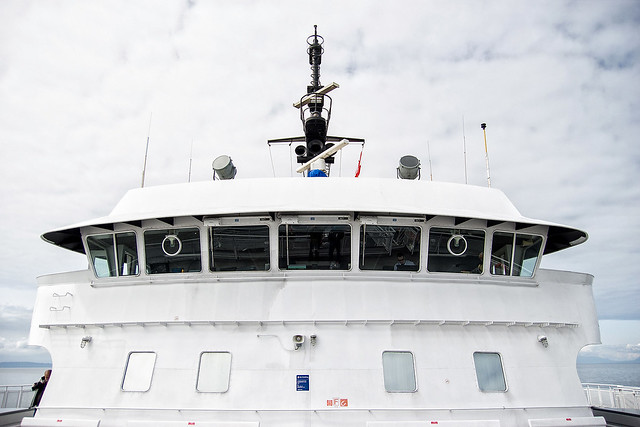
JuanChai posted:I posted this in the sports thread, but thought I might put it in here as it has divided opinion over there. I want to do a series of dramatic, high-contrast black and white horse-racing photos. My objective is to try and capture the relationship between horse and rider in the chaos of a race. I want to make a departure from the usual horse-racing photos you see of the full field in bright colours. I want to portray grit and determination. This is the first photo from what I hope will be a series of perhaps twenty. I feel I am going in the desired direction with this, but I'd be interested in seeing what you guys think... Um...wow. Scrolling through this thread the image absolutely pops and stole my eye immediately; I know your work a little from the HK car porn thread you have, so I know you can edit photos well, and this one is great. Reading through your theme idea, this seems to hit just about every aspect you outline - the chaos of a horse race, the sound and thunder and grit and dirt as opposed to saturated colors. If you do end up with a full set of that theme, this would be one of the prime action shots. A really good point to this speaking to your "connection of rider and horse" is that they're both looking the same way - it's great parallel work. It's impossible to see both their eyes, but I feel like you can fill in that gap yourself as a viewer - the eye protection is visible, and it's enough for me. --------- want to post a couple more in here. Please give me critique and criticism - what I want to work on is cropping and editing. Previously most of the time I'd just shoot JPG and post images straight out of the camera, but I'm starting to shoot RAW (and see how important that is to saving usable pictures!) and do at least a little tweaking and balancing afterwards. This also includes cropping when appropriate, though I still prefer to frame properly the first time.  IMG_1562 by harperdc, on Flickr  IMG_1688 by harperdc, on Flickr  IMG_1696 by harperdc, on Flickr (without poisoning the well - I think I may have gone crazy with the color/temperature editing on the ship picture, and what I hope is that the scene for the third picture is evident - it's just after/part of a goal celebration)
|
|
#
?
May 9, 2012 11:42
|
|
|
aliencowboy posted:Mother of jesus. What lens are you using? I saw in the EXIF that the focal length was 29mm or so. I would give drat near anything to watch you process a photo.
|
|
#
?
May 9, 2012 13:21
|
|

|
Hotwax Residue posted:I'm struggling with this one. It is two exposures blended manually, but I just can't seem to get it to look right to my eyes. If I were you I'd try taking the bright sky and blending it into the water reflection to brighten that part up a bit. I think there's too much a difference between the two and it's throwing things off.
|
|
#
?
May 9, 2012 13:47
|
|


|
aliencowboy posted:Ease up on the luminance of your blues; your sky seems unnaturally dark given that the highlights on the rocks are blown out. The brightness of the tree on the right favours it as a focal point over the tree in the centre and tea house, which throws off the composition on what would otherwise work well. Image 1: What i love about that is how it plays with my imagination. I kind of wonder what the story is of the people that live in that house. Image 2 really catches my eye. Its like a still from a movie. Not much other to say about this one Aliencowboy, its just fantastic.
|
|
#
?
May 9, 2012 14:50
|
|
|
Hotwax Residue posted:I'm struggling with this one. It is two exposures blended manually, but I just can't seem to get it to look right to my eyes. RangerScum posted:If I were you I'd try taking the bright sky and blending it into the water reflection to brighten that part up a bit. I think there's too much a difference between the two and it's throwing things off. I do enjoy the shot overall though. ")
Maker Of Shoes fucked around with this message at 21:46 on May 9, 2012 |
|
#
?
May 9, 2012 21:42
|
|

|
xenilk posted:I'm not even going to bother critiquing that picture. It's freaking awesome. I wish I could follow you with a GPS, would love to shoot at those locations and I know you're near! http://g.co/maps/2778m ") Now that I think about it, I should just start pre-scouting areas with Google street view, it would save some gas. QPZIL posted:Mother of jesus. What lens are you using? I saw in the EXIF that the focal length was 29mm or so. I used the Tamron 17-50 2.8 with a polarizer. For the first picture, I'm alright with how dark it is, but that could vary well just be my monitor settings. I'll check it out on my work computer tomorrow to verify. As for the composition, it's a bummer about that front tree competing with the house. I was hoping the cluster of trees on the left would be enough to offset it, but coming back to it with fresher eyes, I think you're right, Hotwax. Thanks for the feedback/comments, guys. burzum karaoke fucked around with this message at 23:27 on May 9, 2012 |
|
#
?
May 9, 2012 23:21
|
|

|
tijag posted:
I think the first of these is definitely the strongest. There's just too much empty space in the second and that gradient at the top is a bit distracting. I've started shooting film for the first time, here's a few shots from my first roll of B&W:  Untitled by Tim Breeze, on Flickr  Untitled by Tim Breeze, on Flickr  Untitled by Tim Breeze, on Flickr
|
|
#
?
May 9, 2012 23:35
|
|
|
Holistic Detective posted:I think the first of these is definitely the strongest. There's just too much empty space in the second and that gradient at the top is a bit distracting. Thank you for the feedback. Surprisingly I didn't apply that gradient. That's mostly what it looked like out of the camera. I think I will try a tighter crop on the second one and get rid of the emptiness.
|
|
#
?
May 10, 2012 00:29
|
|
|
Huh, in that case I apologise and retract the comment. That is some freaky sky.
|
|
#
?
May 10, 2012 00:31
|
|
|
Holistic Detective posted:Huh, in that case I apologise and retract the comment. That is some freaky sky. It was a storm moving in, and parts of the sky were still blue skys, and parts were rain clouds. Was risking my D7k to take pictures. I know I adjusted the blacks and whites etc, so that part of the sky, which was dark to begin with, got even darker, but the 'gradient' look to it, is what the sky was like.
|
|
#
?
May 10, 2012 00:47
|
|
|
TheJeffers posted:
I dig this. It's a simple shot but done well with good lighting and the composition of it is what really makes it stand out from just being a photo of a payphone. I think something like this could easily be ruined by not paying attention to the background or a annoying shadow. I know that's a big problem of mine. Was it natural lighting? How did the color version turn out? I'd like to see that. Anyhow, I don't do landscape shots often because I find them really difficult to grasp and having aliencowboy post his poo poo makes me feel very inferior. With that being said here is Mt McKinley.  My biggest peeve about this are the clouds obscuring the peak itself. There isn't much I can do about that though. 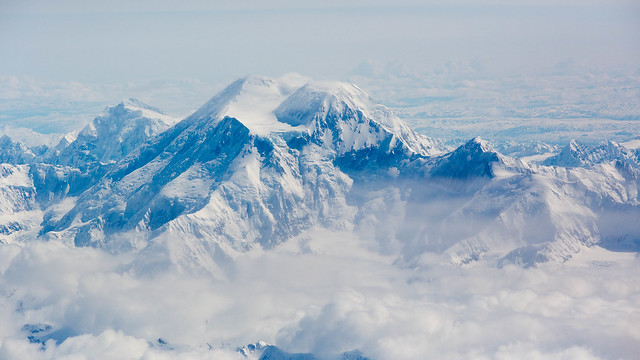
bloops fucked around with this message at 01:31 on May 10, 2012 |
|
#
?
May 10, 2012 01:23
|
|


|
JuanChai posted:
This is absolutely fantastic. The composition is very cramped (not much negative space at all) which really helps convey a sense of speed and urgency. I really haven't seen many sports shots in b&w but it certainly seems to work very well in this case.
|
|
#
?
May 10, 2012 01:31
|
|


|
JuanChai posted:
harperdc posted:want to post a couple more in here. Please give me critique and criticism - what I want to work on is cropping and editing. Previously most of the time I'd just shoot JPG and post images straight out of the camera, but I'm starting to shoot RAW (and see how important that is to saving usable pictures!) and do at least a little tweaking and balancing afterwards. This also includes cropping when appropriate, though I still prefer to frame properly the first time. ============= Here's something I shot on my iPhone while I was walking from one place to the other at work. This was also my first time playing with Snapseed to process the photo.  Arc by alkanphel, on Flickr
|
|
#
?
May 10, 2012 02:23
|
|

|
JuanChai posted:Anyway, like I said I like it a lot! HeyEng posted:I dig this. It's a simple shot but done well with good lighting and the composition of it is what really makes it stand out from just being a photo of a payphone. I think something like this could easily be ruined by not paying attention to the background or a annoying shadow. I know that's a big problem of mine. Thanks for the compliments. I bounced my flash off the opposite wall on a whim while I was refining the picture and it turned out well, so I carried that into the final shot. I wasn't really taken with the color version, but here it is:  Cincinnati Bell In Color by TheJeffers, on Flickr
|
|
#
?
May 10, 2012 02:27
|
|
|
alkanphel posted:I'm really liking the gritty feeling of this photo, especially the musculature of the horse's neck stands out. Augmented Dickey posted:This is absolutely fantastic. The composition is very cramped (not much negative space at all) which really helps convey a sense of speed and urgency. harperdc posted:A really good point to this speaking to your "connection of rider and horse" is that they're both looking the same way - it's great parallel work. It's impossible to see both their eyes, but I feel like you can fill in that gap yourself as a viewer - the eye protection is visible, and it's enough for me. Thanks all! This is some important feedback. I definitely wanted to continue with the tight crops, and I think you've basically confirmed why I've chosen to go down this route.
|
|
#
?
May 10, 2012 03:07
|
|
|
JuanChai posted:
The feeling I had was exactly like the description you provided. I'm seeing chaos, force, concentration and it's getting me. I would frame that picture, you should show it to the rider (if you can!) As for me, just a shot from my first wedding. Used an ND 4 filter on that one, such a sunny day. 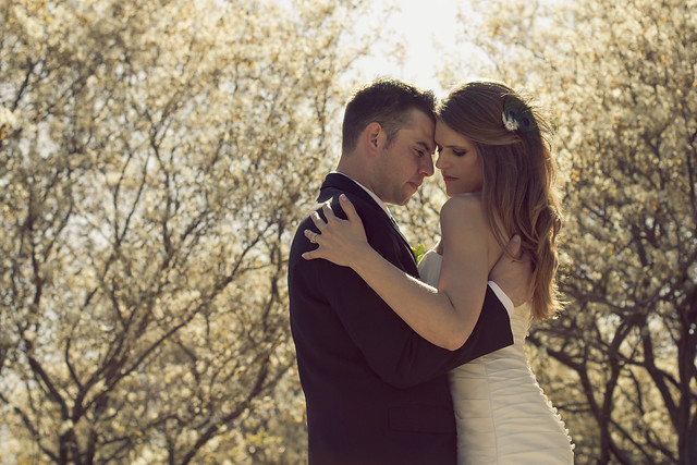 IMG_6284 by avoyer, on Flickr
|
|
#
?
May 10, 2012 05:22
|
|

|
xenilk posted:As for me, just a shot from my first wedding. Used an ND 4 filter on that one, such a sunny day. Take this with a grain of salt since I've never shot a wedding. I like the color, it's muted in all the right ways and soft on the eyes. I like how the couple is placed directly where the trees break and over all I think it's framed well. The bride seems tense to me though. Her shoulder position seems forced. One of mine. Shot with a kit lens and no tripod. I think the composition works but because of the aforementioned kit lens and no tripod the loss of clarity/focus is jarring.  bartop by jankyangles, on Flickr
|
|
#
?
May 10, 2012 05:36
|
|
|
harperdc posted:Want to post a couple more in here. Please give me critique and criticism - what I want to work on is cropping and editing. Previously most of the time I'd just shoot JPG and post images straight out of the camera, but I'm starting to shoot RAW (and see how important that is to saving usable pictures!) and do at least a little tweaking and balancing afterwards. This also includes cropping when appropriate, though I still prefer to frame properly the first time. Honestly, I think you could really up the contrast a fair bit in all of your pictures. They look really flat. I don't like the fact that there is no sky whatsoever in the first picture. Sure, overcast skies do that (or you blew it out, I don't know which, but am assuming it was just an overcast day) but the picture feels a bit "off" to me somehow, like it's missing something, and I suspect that missing something is sky. For your second and third shots, you also definitely need to improve the contrast. Also maybe the vibrance a tiny bit to give the flags that real pop. The advertising boards in the first soccer picture should be cropped out. For the second soccer picture, I had no idea until you said it that it was a goal celebration. Slow down your shutter speed to 1/20th or so and capture some movement in the scene, that would go a lot further towards the effect you're after. Here's a few of mine, I'm so far behind on these now:  Versailles by hookshot88, on Flickr  Versailles by hookshot88, on Flickr  Versailles by hookshot88, on Flickr
|
|
#
?
May 10, 2012 09:47
|
|
|
HookShot posted:Your temperature on the ship picture is fine. The white part of the Russian flag is white, so you're all good. Ok. Contrast...ok. I'll definitely keep that in mind this weekend when I go shooting and then when I process next. I see the work some of my friends do and I wonder, "how did they do that?" with the colors, I guess the contrast (since it's mentioned by a couple people) is one of those things. Yeah, I don't want to make too many excuses, but the ships were on an overcast day (okay for lighting, terrible when the sky's in the picture) and the soccer ones are a bit forced because I'm in the stands. I didn't crop the ad board out of the first one because I thought it would take too much of the flag, but I'll take another look. quote:Here's a few of mine, I'm so far behind on these now: I really like the top image. The vignetting is used really well to frame the image; you've got me thinking of cropping and while a tree is half-cut off, those sheep would be sacrificed to tighten it up on the right...that said cropping in a little on the right of the second photo would be good, there's a random bit of hedge/fence midway up the picture that's a bit distracting. The third image looks a little weird because of the focal length - I'm guessing it's really wide, like below 20 mm? That said those are nits to pick because the colors, temps, etc look really good and what you'd expect of the French countryside. I like 'em.
|
|
#
?
May 10, 2012 11:31
|
|
|
Maker Of Shoes posted:One of mine. Shot with a kit lens and no tripod. I think the composition works but because of the aforementioned kit lens and no tripod the loss of clarity/focus is jarring. The composition is nice, and it's a very cool setting, but it's... "busy", I think is the word. The DOF is deep enough that the two men are obscured by all the bottles and things behind the bar. Cropping out the guy in the background (far right) might help a bit as well.
|
|
#
?
May 10, 2012 13:30
|
|


|
HeyEng posted:Anyhow, I don't do landscape shots often because I find them really difficult to grasp and having aliencowboy post his poo poo makes me feel very inferior. With that being said here is Mt McKinley. Landscapes never really had much to it, some decide to take them at angles that make an ordinary landscape "amazing". I reckon it kind of detracts from the point, imo anyway. I guess what you could have done is tried a smaller aperture and longer exposure, and get something more contrasted without editing. I don't do landscapes much either but it's just an idea I got from the likes of Ansel Adams. I was at a jazz gig earlier tonight. My cousin was playing and I decided to take my camera down. I'd love to post more, I started choosing and ended up picking all the vertical shots just for uniformity. I dunno, just looking for feedback.    Beyond cropping and rotating, I'm never a huge fan of editing my images after I've taken them. Booty Pageant fucked around with this message at 16:13 on May 10, 2012 |
|
#
?
May 10, 2012 13:39
|
|

|
xenilk posted:As for me, just a shot from my first wedding. Used an ND 4 filter on that one, such a sunny day. I have to agree that both the bride and groom look uncomfortable/tense here. TheJeffers posted:Thanks for the compliments. I bounced my flash off the opposite wall on a whim while I was refining the picture and it turned out well, so I carried that into the final shot. Black and white is definitely better for this - it emphasizes form and tone more. HeyEng posted:Anyhow, I don't do landscape shots often because I find them really difficult to grasp and having aliencowboy post his poo poo makes me feel very inferior. With that being said here is Mt McKinley. Shots through airplane windows are always tough but that second one is about as good as it gets. aliencowboy posted:The weather around here is finally starting to be consistently pleasant. It's been motivating me to get up at ungodly hours in the morning and drive out into the country, exploring the back roads before having to scramble back into the city for work. Waiting for the weekend would be easier, but where's the fun in that? There's something about these I don't like quite as much as most of your work. The first one especially seems super flat - I think what makes most of your stuff work is when your processing style emphasizes the directionality of light. --------------- Here are some parking lots.   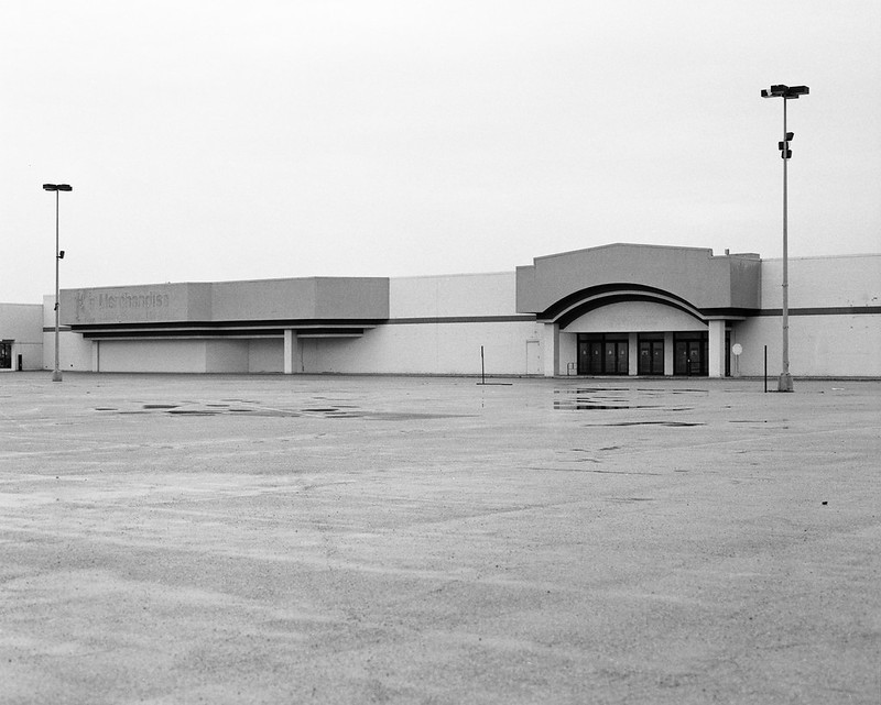
|
|
#
?
May 10, 2012 14:14
|
|

|
MrBlandAverage posted:
Oh parking lots, why can't I quit you? I like the compositions here, interesting, graphic lines that lead your eye through the photo. I do feel that the first two really suffer for having boring skies. They almost feel incomplete to me with the gray dead skies. The last one is great though, it has the most contrast and the white sky just doesn't bother me. The last one is also the one with the least imposing foreground so it feels the most balanced. Here is another one from my city in color series: 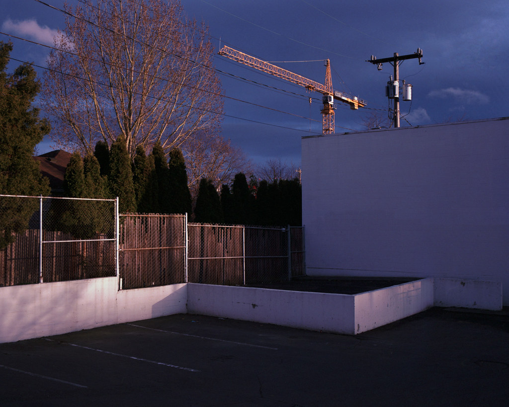
|
|
#
?
May 10, 2012 15:18
|
|


|
s0m3 guy posted:I was at a jazz gig earlier tonight. My cousin was playing and I decided to take my camera down. I'd love to post more, I started choosing and ended up picking all the vertical shots just for uniformity. I dunno, just looking for feedback. Your presentation in this post is problematic: The photos have very similar tone across the entire image, and when you put them right next to each other like this it makes it hard to visually distinguish them. At first glance I thought there was just one photo, but then I noticed the discontinuities. I don't like the compositions very much in there, it seems you are focusing too much on the "incidental gear", the microphones, music stands and such, and not enough on the musicians. They are supposed to be the stars here! The third is the most interesting of them, but again, you brought the entire music stand into view, but cut off the man's right arm and the bottom of his instrument.
|
|
#
?
May 10, 2012 15:49
|
|


|
doctor 7 posted:Continuing with trying to subtly make photos look a bit more flattering I took this snapshot while away with my folks for the weekend.
|
|
#
?
May 10, 2012 20:36
|
|


|
doctor 7 posted:Just reposting these two which seem to got lost in the critique chain I noticed yours got passed over, and it's totally cool to repost them, but we should probably have a thing where you have to crit another photo if you're reposting (not you, I mean, but in the future).
|
|
#
?
May 11, 2012 00:24
|
|
|
What if people had to crit a photo in the post above them? Then some people don't miss out and have to repost in hope of getting it.
|
|
#
?
May 11, 2012 01:29
|
|

|
Danoss posted:What if people had to crit a photo in the post above them? Then some people don't miss out and have to repost in hope of getting it. Then we might as well call ourselves flickr.
|
|
#
?
May 11, 2012 01:37
|
|


|
Well you can't force someone to critique an image they don't want to critique. I would say if you don't get a response then one repost should be allowed. Same rules should apply though, if you post an image you need to critique someone else's work. If the work isn't getting comments in here maybe try the megathreads.
|
|
#
?
May 11, 2012 02:57
|
|
|
8th-samurai posted:Well you can't force someone to critique an image they don't want to critique. I would say if you don't get a response then one repost should be allowed. Same rules should apply though, if you post an image you need to critique someone else's work. If the work isn't getting comments in here maybe try the megathreads. This sounds like an excellent policy, although let's not go through all the hurf durf of it being a rule. So PAD posters, feel quite free to repost your stuff (once) if it was a couple pages / couple days ago and nobody's said anything. Additional crit couldn't hurt!
|
|
#
?
May 11, 2012 04:06
|
|
|
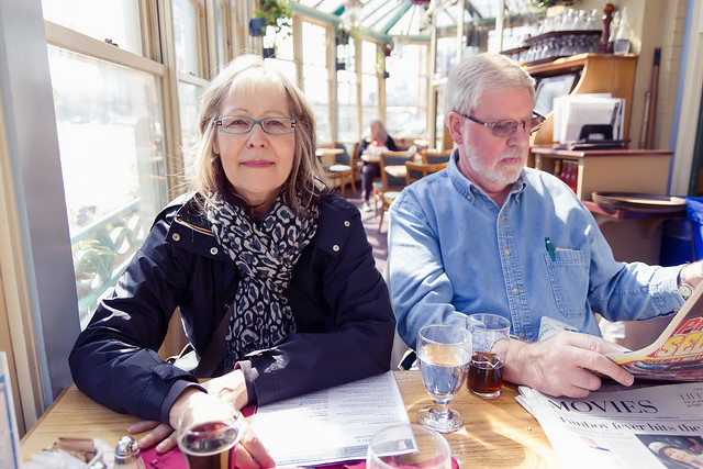
doctor 7 posted:Just reposting these two which seem to got lost in the critique chain I really like the casual nature of the picture with your parents. Actually it looks like it might have been a challenging situation to get a good exposure because of all the shadows and bright lights, but it's really pleasant and nicely exposed. It feels warm and classy and I'd like to have breakfast with you guys.  482-2 by tijag, on Flickr I have never done so much post work on an image. Actually I'm really just trying to learn what the various things in Lightroom do. Here is the original straight out of the camera.  482-3 by tijag, on Flickr Did I do too much/go way over the top? Even 'that sucks I like the original better, and the original sucks too' would be useful critque for me. edit: what the heck it is SOOO much darker on flickr than it is on my computer  what is going on? I exported it as sRGB, 100% jpg. what is going on? I exported it as sRGB, 100% jpg. wtfflickr by tijag, on Flickr tijag fucked around with this message at 05:29 on May 11, 2012 |
|
#
?
May 11, 2012 05:11
|
|
|
tijag posted:edit: what the heck it is SOOO much darker on flickr than it is on my computer Is your browser colour-managed? I seem to remember you had to explicitly turn it on in Firefox. EDIT: Here is an awesome page to find out: http://www.gballard.net/psd/go_live_page_profile/embeddedJPEGprofiles.html
|
|
#
?
May 11, 2012 05:59
|
|
|
Nice shot! Clouds are great and I like the hills and patchy light in the foreground. But the editing you've done to fix the sky has left the foreground looking a bit underexposed - I think the foreground looks better in the original. Try boosting the warmth and/or exposure a bit just in the forground by using a brush or graduated filter.
|
|
#
?
May 11, 2012 06:13
|
|


|
That contrail looking cloud keeps loving with my head, when it's in my peripheral it looks like a jpeg artifact or encoding error or something. I guess that's not a critique, just a comment. It's a weird flaw that really distracts me.
|
|
#
?
May 11, 2012 06:21
|
|

|
MrBlandAverage posted:There's something about these I don't like quite as much as most of your work. The first one especially seems super flat - I think what makes most of your stuff work is when your processing style emphasizes the directionality of light. I agree actually. While I think the lack of contrast works in favour of the mood of the first image, I'm going to see if I can breathe a better sense of depth into it, but overall, I'm pretty happy with this one despite some of its faults. I'm growing increasingly unhappy with the farm one though, especially at the muddiness of where the fence meets the barn on the left. I'll try to rework them over the weekend. burzum karaoke fucked around with this message at 09:46 on May 11, 2012 |
|
#
?
May 11, 2012 09:42
|
|
|

|
| # ? May 13, 2024 09:19 |
|
|
harperdc posted:I really like the top image. The vignetting is used really well to frame the image; you've got me thinking of cropping and while a tree is half-cut off, those sheep would be sacrificed to tighten it up on the right...that said cropping in a little on the right of the second photo would be good, there's a random bit of hedge/fence midway up the picture that's a bit distracting. The third image looks a little weird because of the focal length - I'm guessing it's really wide, like below 20 mm? s0m3 guy posted:I was at a jazz gig earlier tonight. My cousin was playing and I decided to take my camera down. I'd love to post more, I started choosing and ended up picking all the vertical shots just for uniformity. I dunno, just looking for feedback. I like how you got down and shot from below in the third shot, and I think it would have been very interesting to see how the other two shots taken that way would have come out as well, especially of the saxophone player. Here's a few from my set at the Louvre: 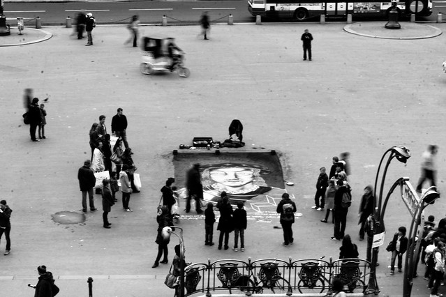 Louvre by hookshot88, on Flickr  Louvre by hookshot88, on Flickr  Louvre by hookshot88, on Flickr
|
|
#
?
May 11, 2012 14:07
|
|